 Alex Martin
In a crowded online space, a website serves as your digital storefront, brand ambassador, and primary conversion engine. For Divi users, the power to build visually stunning websites is readily available, but aesthetics alone do not guarantee success. Truly effective design is a blend of art and science, marrying engaging visuals with seamless functionality, intuitive navigation, and stellar performance.
This is where adhering to established website design best practices becomes critical. These principles are not arbitrary rules; they are proven frameworks that enhance user experience (UX), build trust, improve accessibility, and ultimately drive your business goals. Neglecting them can lead to high bounce rates, frustrated visitors, and missed opportunities, no matter how beautiful your site looks.
This guide moves beyond generic advice. We will provide a comprehensive list of actionable best practices specifically tailored to help Divi creators build websites that are not only visually appealing but also powerful and user-centric. From mobile-first responsiveness and performance optimization to accessibility and conversion-focused design, you will gain practical insights to elevate your projects. Consider this your definitive checklist for creating websites that perform exceptionally well and deliver tangible results.
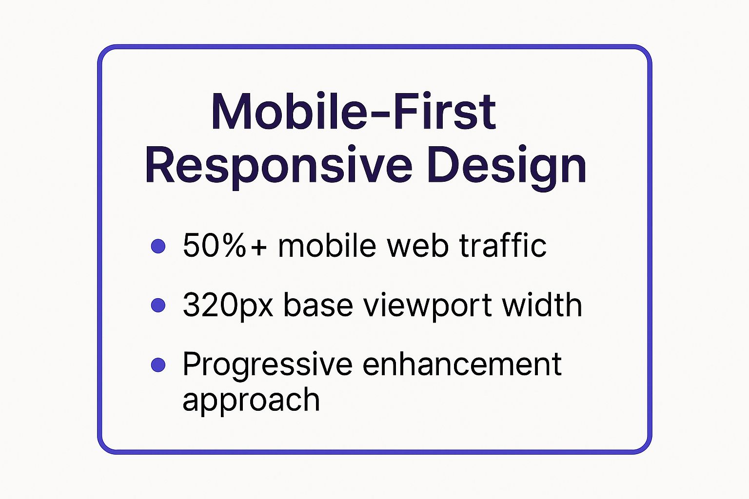
1. Mobile-First Responsive Design
Mobile-first responsive design is no longer a trend; it's a foundational standard for modern web development. This approach flips the traditional design process on its head. Instead of designing for a large desktop screen and then scaling down, you start with the smallest screen, typically a mobile viewport, and progressively enhance the design for larger devices like tablets and desktops.
This methodology directly addresses the reality of user behavior. With a majority of global web traffic originating from mobile devices, ensuring a seamless experience on smartphones is crucial for user retention and conversion. Prioritizing mobile forces you to focus on the most essential content and functionality first, which results in a cleaner, more focused user experience across all platforms. This is one of the most critical website design best practices to implement.
Why It's a Best Practice
Adopting a mobile-first strategy offers significant advantages. It naturally leads to faster loading times on mobile, as you are initially loading only the core assets. This is vital, as mobile users are often less patient and on slower connections. It also improves your site's SEO, as Google has long prioritized mobile-friendly websites in its search rankings through mobile-first indexing.
For a summary of the core principles of this approach, see the key takeaways below.
The data highlights the core tenets of this design philosophy: start with the constraints of a small screen and build up, acknowledging that the majority of your users will likely interact with your site on a phone first.
Actionable Tips for Implementation
To effectively implement this in your Divi projects, follow these steps:
- Start with a 320px Viewport: Begin your design and CSS styling with the narrowest common mobile screen width (320px) as your base. This constraint forces you to prioritize.
- Prioritize Essential Content: Identify the single most important action or piece of information a mobile user needs and make it prominent. Use techniques like progressive disclosure to hide secondary information behind taps or accordions.
- Leverage Flexible Layouts: Use modern CSS like Flexbox and CSS Grid, which are fully supported in Divi's modules and custom CSS options, to create fluid layouts that adapt gracefully to different screen sizes.
For a deeper dive into making your Divi site flawlessly adaptive, you can explore DiviMode's key tips for better Divi mobile responsiveness.
2. Intuitive Navigation and Information Architecture
If responsive design is the foundation, then intuitive navigation and its underlying information architecture are the roadmap. This best practice involves the strategic organization, structuring, and labeling of website content to help users find what they need quickly and efficiently. Good navigation guides users seamlessly, reduces their cognitive load, and prevents frustration, which is fundamental to a positive user experience.
Think of it as the digital equivalent of clear signage in a large department store. Without it, users are left to wander aimlessly, likely abandoning their search and your site altogether. As usability expert Steve Krug famously stated, "Don't Make Me Think." A well-planned navigation system is one of the most impactful website design best practices because it directly translates to higher engagement, lower bounce rates, and better conversion outcomes.

Why It's a Best Practice
A logical information architecture improves usability by making content predictable and easy to find. This directly impacts user satisfaction and trust. When users can effortlessly locate information, they perceive the site, and by extension the brand, as competent and reliable. It also has a significant positive effect on SEO, as a clear structure helps search engine crawlers understand the relationships between your pages, leading to more effective indexing.
For a summary of the core principles of this approach, see the key takeaways below.
Actionable Tips for Implementation
To effectively build an intuitive navigation structure in your Divi projects, follow these steps:
- Follow the "7±2" Rule: Limit your main navigation menu to 5-9 items. This psychological principle suggests that the average person can only hold about seven items in their working memory. This forces you to prioritize what's most important to your users.
- Conduct Card Sorting: Before you build, use a card sorting exercise with real users. Ask them to group topics (your potential pages) into categories that make sense to them. This user-centric data is invaluable for creating a structure that aligns with user expectations, not just your internal logic.
- Use Familiar Conventions: Don't reinvent the wheel. Stick to established patterns like placing the main navigation at the top of the page, the logo in the top-left linking to the homepage, and using common labels like "About," "Services," and "Contact."
- Ensure Keyboard Accessibility: Verify that a user can navigate through all menu items, including dropdowns, using only the Tab key. This is a crucial accessibility requirement that Divi’s menu modules support.
3. Fast Loading Speed and Performance Optimization
In the digital landscape, speed is not just a feature; it's a fundamental component of the user experience. Performance optimization is the practice of ensuring your website loads as quickly as possible, ideally within 2-3 seconds. Slow-loading pages frustrate users, leading to high bounce rates, while fast pages are proven to increase engagement, conversions, and user satisfaction. Real-world data from companies like Walmart and Pinterest shows that even one-second improvements can lead to significant gains in conversions and sign-ups.
This focus on speed directly impacts your bottom line and search engine visibility. Google has made page speed, particularly Core Web Vitals, a critical ranking factor. A slow website is penalized in search results and actively drives potential customers away. Therefore, prioritizing performance is one of the most impactful website design best practices you can adopt, especially for a feature-rich platform like Divi.

The data clearly illustrates the direct correlation between page load time and user retention. As load time increases, the probability of a user leaving your site skyrockets, making speed optimization a non-negotiable aspect of modern web design.
Why It's a Best Practice
A high-performance website delivers a superior user experience, which is the cornerstone of effective design. It reduces friction and allows visitors to access your content and calls to action without delay. Beyond user satisfaction, a fast site is rewarded by search engines with better rankings, leading to more organic traffic. For e-commerce sites, the link is even more direct: faster load times consistently correlate with higher conversion rates and revenue.
To truly achieve lightning-fast loading times for your website, delve into these expert WordPress speed optimization strategies that go beyond the basics.
Actionable Tips for Implementation
To boost your Divi site's performance, integrate these technical optimizations:
- Optimize Your Images: Use modern, efficient formats like WebP. Compress all images before uploading using tools like TinyPNG, and ensure you are serving properly sized images for their containers by using responsive image attributes.
- Leverage Caching and a CDN: Implement a robust caching plugin to serve static HTML versions of your pages. Use a Content Delivery Network (CDN) to distribute your assets across global servers, reducing latency for international visitors.
- Monitor Core Web Vitals: Regularly use tools like Google PageSpeed Insights and GTmetrix to analyze your site's performance. Pay close attention to the Core Web Vitals metrics: Largest Contentful Paint (LCP), First Input Delay (FID), and Cumulative Layout Shift (CLS).
For a comprehensive guide tailored to Divi, discover how to boost your website performance and speed.
4. Accessibility and Inclusive Design
Accessibility and inclusive design are foundational principles for creating websites that are usable by everyone, regardless of their abilities. This practice goes beyond mere compliance and involves proactively designing for people with a wide range of disabilities, including visual, auditory, motor, and cognitive impairments. The goal is to ensure equal access to information and functionality for all users.
Embracing accessibility from the start of a project prevents the costly retrofitting that often occurs after a site launch. It also expands your potential audience, enhances brand reputation, and improves overall user experience for everyone, not just those with disabilities. Integrating these standards is a core component of modern, ethical website design best practices.
Why It's a Best Practice
Adopting an inclusive design mindset is not only a moral imperative but also a strategic business decision. It protects your organization from potential legal action, as seen in cases like Target's multi-million dollar lawsuit settlement which led to significant accessibility improvements. More importantly, it aligns your site with global standards like the Web Content Accessibility Guidelines (WCAG) and improves your SEO, as search engines favor well-structured, accessible content.
This approach ensures that your message and services reach the widest possible audience, fostering loyalty and demonstrating corporate social responsibility. A truly accessible website is a more robust, user-friendly, and future-proof asset.
Actionable Tips for Implementation
To build a more accessible and inclusive Divi website, focus on these key actions:
- Ensure Sufficient Color Contrast: Use a color contrast checker to verify that your text and background colors meet at least the AA standard of a 4.5:1 ratio. This is crucial for users with low vision or color blindness.
- Use Semantic HTML and ARIA Roles: Structure your content with proper heading tags (H1, H2, H3), lists, and other semantic elements. Where Divi’s default modules are not sufficient, use ARIA (Accessible Rich Internet Applications) roles and labels to provide context for screen readers.
- Provide Keyboard Navigation and Focus States: Test your entire website using only the tab key to navigate. Ensure all interactive elements like links, buttons, and form fields are reachable and have a clear, visible focus state so users know where they are on the page. You can customize this in Divi's theme customizer.
- Add Alt Text for All Images: Write descriptive alt text for every meaningful image to convey its purpose and content to users who rely on screen readers. For purely decorative images, leave the alt text empty (
alt="") so screen readers can skip them.
5. Clean and Consistent Visual Design
A clean and consistent visual design is the bedrock of a professional and trustworthy website. This approach prioritizes clarity, predictability, and a strong visual hierarchy to create an interface that is not only aesthetically pleasing but also highly functional. It involves the systematic application of colors, typography, spacing, and layout patterns across every page of your site, ensuring a cohesive user experience.

When users can predict how elements will look and behave, they can navigate your site with confidence and ease. This predictability builds trust and reduces cognitive load, allowing users to focus on your content and offerings rather than trying to decipher a confusing interface. This is a fundamental website design best practice that separates amateur sites from professional ones, with examples like Apple and Stripe demonstrating its power. For a deeper dive into establishing a cohesive online presence, explore valuable insights on website branding strategies that captivate and convert.
Why It's a Best Practice
Visual consistency is crucial for brand recognition and usability. A uniform design language reinforces your brand identity at every touchpoint, making it more memorable. From a usability standpoint, it establishes patterns that users learn once and can apply everywhere on your site. For instance, if a primary call-to-action button is blue on the homepage, it should be blue on every other page, signaling its function instantly. This eliminates confusion and streamlines the user journey, leading to higher engagement and conversion rates.
Actionable Tips for Implementation
To implement a clean and consistent design in your Divi projects, focus on creating a system:
- Create a Style Guide: Before you build, define your visual rules. Document your primary and secondary colors, typography scales (H1, H2, p, etc.), and spacing rules. Divi’s Global Defaults are perfect for setting this up.
- Use a Spacing System: Implement a consistent spacing system, like an 8pt or 4pt grid. Use multiples of your base unit (e.g., 8px, 16px, 24px) for all margins, padding, and layout gaps to create a harmonious visual rhythm.
- Limit Your Color Palette: Stick to a core palette of 2-3 primary colors for branding and key actions. Use shades and tints of these, along with neutrals (grays, white), for the rest of the UI.
- Maintain Form and Button Styles: Define one style for primary buttons, one for secondary, and ensure all input fields and forms look and feel the same across the site. Use Divi's Presets to save and reuse these styles efficiently.
6. User-Centered Design and Testing
User-Centered Design (UCD) is a design philosophy that places the user at the forefront of every decision. Instead of designing based on internal assumptions or aesthetic preferences, UCD involves a deep understanding of user needs, behaviors, and goals through research, testing, and iterative refinement. This approach ensures the final product is not only beautiful but also intuitive, effective, and genuinely useful for its intended audience.
This methodology grounds your project in reality. By continuously gathering user feedback, you can validate your design choices, uncover hidden usability issues, and build a website that resonates with your target users. Companies like Airbnb and Spotify constantly leverage user research to optimize their platforms, proving that listening to users is a direct path to success. Implementing UCD is one of the most impactful website design best practices for creating a truly effective site.
Why It's a Best Practice
Adopting a user-centered approach dramatically reduces the risk of building the wrong thing. It helps you avoid costly redesigns by identifying problems early in the process. This method leads to higher user satisfaction, increased engagement, and better conversion rates because the website is tailored to solve real user problems. It shifts the focus from "what can we build?" to "what does our user need?".
As the video explains, grounding design decisions in user data and feedback is what separates a good website from a great one. It is an investment in creating a product that people will actually want to use.
Actionable Tips for Implementation
To integrate UCD into your Divi workflow, you don't need a massive budget. Start small and build from there:
- Start with Simple Research: Begin with basic user interviews or simple online surveys to define user personas and goals. Understand who you are designing for before you place a single module.
- Test Early and Often: Don't wait for a finished design. Create simple wireframes or prototypes and test them with 5-8 users. This small sample size is often enough to uncover the most critical usability problems.
- Use Behavior Analytics Tools: Install tools like Hotjar or Microsoft Clarity (which has a generous free plan) to see how users are actually interacting with your live Divi site through heatmaps and session recordings.
- Create Realistic Scenarios: When testing, give users specific tasks to complete (e.g., "Find the pricing page and add the pro plan to your cart"). This provides far more valuable insights than asking, "Do you like the design?".
7. Clear Call-to-Actions and Conversion Optimization
A website without clear guidance is like a store with no checkout counter. Clear call-to-actions (CTAs) and conversion optimization are the strategic design and placement of elements that guide users toward a desired outcome, whether that's making a purchase, filling out a form, or subscribing to a newsletter. These elements are the crucial bridge between passive browsing and active engagement, making them essential for turning visitors into valuable leads or customers.
Effective CTAs are a cornerstone of user experience and business success. They answer the user's implicit question, "What should I do next?" by providing a clear, compelling path forward. Dropbox famously grew its user base with a simple, high-contrast "Sign up for free" button, demonstrating that clarity often outperforms cleverness. Implementing this is one of the most impactful website design best practices for achieving business goals.
Why It's a Best Practice
Strategically designed CTAs directly influence your site's conversion rate, the percentage of visitors who complete a desired action. A well-optimized CTA reduces friction and decision fatigue, making it easy for users to proceed. This not only improves key business metrics but also enhances the user's sense of accomplishment and clarity. It's a fundamental principle of conversion rate optimization (CRO) that small changes in CTA design and placement can yield significant results.
For a summary of the core principles of this approach, see the key takeaways below.
The data emphasizes a critical point: a CTA's success depends on its visibility, clarity, and the value it promises. It must stand out visually and communicate a clear benefit to the user to be effective.
Actionable Tips for Implementation
To effectively implement this in your Divi projects, follow these steps:
- Use Action-Oriented Language: Start your CTA text with strong verbs like 'Get', 'Start', 'Join', or 'Discover'. Focus on what the user will receive, for instance, "Get Your Free Quote" is more compelling than "Submit".
- Create Visual Contrast: Ensure your CTA buttons stand out from the background and surrounding elements. Use a bold, contrasting color from your brand palette that draws the eye. Divi’s Button module offers extensive styling options to control color, size, and hover effects.
- Place CTAs at Decision Points: Position your CTAs where users are most likely to take action, such as below a compelling features list, at the end of a blog post, or next to pricing information. Use Divi's global modules to consistently place key CTAs across your site.
For a deeper dive into crafting CTAs that convert, you can explore Unbounce’s guide on creating the perfect Call-to-Action.
8. Search Engine Optimization (SEO) Best Practices
Search Engine Optimization (SEO) is the practice of strategically enhancing your website's structure, content, and technical performance to increase its visibility in search engine results. It's not just about a single action but a continuous process that ensures search engines like Google can efficiently crawl, index, and understand your content, ultimately ranking it higher for relevant user queries.
Integrating SEO from the start of the design process, rather than treating it as an afterthought, is crucial. This means considering everything from site architecture and URL structure to content strategy and page speed. When design and SEO work in tandem, the result is a website that is not only visually appealing and user-friendly but also discoverable by your target audience. This holistic approach is one of the most impactful website design best practices you can adopt.
Why It's a Best Practice
A strong SEO foundation directly translates to more organic traffic, which is highly valuable, targeted, and cost-effective. By optimizing for search engines, you are also inherently improving the user experience; factors like fast loading speeds, logical navigation, and high-quality content are beneficial for both search engine crawlers and human visitors. Good SEO builds credibility and authority over time, establishing your site as a trusted resource in its niche.
Actionable Tips for Implementation
To effectively integrate SEO into your Divi projects, focus on these core areas:
- Optimize On-Page Elements: Use Divi's built-in options or an SEO plugin like Yoast SEO to set custom page titles, meta descriptions, and image alt text for every page. Ensure your main heading (H1) clearly communicates the page's topic.
- Focus on User Intent: Move beyond simple keyword stuffing. Create comprehensive content that thoroughly answers the questions your users are asking. Use tools like Google's "People Also Ask" to understand related queries and build out your content accordingly.
- Leverage Divi's Performance Options: Navigate to
Divi > Theme Options > General > Performanceand enable features like "Dynamic CSS," "Dynamic JavaScript Libraries," and "Defer Gutenberg Block CSS." These settings significantly improve loading speed, a critical ranking factor.
For a deeper understanding of creating content that ranks, Backlinko's guide on writing SEO-friendly content offers invaluable, data-driven insights.
9. Security and Privacy Protection
In today's digital landscape, robust security and privacy protection are not optional features but core components of responsible web design. This practice involves implementing a multi-layered strategy to safeguard user data, protect your website from malicious attacks, and build trust with your audience. It encompasses everything from encrypting data in transit to complying with global privacy regulations like GDPR.
Prioritizing security is fundamental to maintaining your website's integrity and your brand's reputation. A security breach can lead to data loss, financial penalties, and a severe erosion of user trust that is difficult to recover from. Therefore, integrating security measures from the very beginning is one of the most essential website design best practices for long-term success.
Why It's a Best Practice
A proactive approach to security and privacy offers immense value. It protects sensitive user information, such as login credentials and payment details, which is crucial for e-commerce and membership sites. It also defends against common threats like malware injections and DDoS attacks that can take your site offline. Furthermore, clear privacy policies and secure practices demonstrate transparency and respect for user data, which builds credibility.
Beyond general best practices, ensuring your site's security is paramount, and you can learn more about implementing SSL certificates for security and SEO. Search engines like Google actively reward secure websites with better rankings, making security a key factor for visibility.
Actionable Tips for Implementation
To effectively secure your Divi website and protect user privacy, follow these steps:
- Implement HTTPS Across Your Entire Site: Install an SSL certificate to encrypt all data exchanged between the user's browser and your server. This is a non-negotiable standard for all modern websites.
- Keep Everything Updated: Regularly update the Divi theme, WordPress core, and all plugins. Outdated software is one of the most common entry points for attackers.
- Use Strong Password Policies: Enforce the use of strong, unique passwords for all user accounts, especially administrators. Consider implementing two-factor authentication (2FA) for an added layer of security.
- Conduct Regular Security Audits: Use security plugins like Wordfence or Sucuri to scan your site for vulnerabilities and malware. Perform regular manual checks and consider hiring a professional for a comprehensive audit.
For more detailed guidance on locking down your site, you can review DiviMode's post on 6 practices to keep your Divi website safe.
Website Design Best Practices Comparison
| Item | Implementation Complexity 🔄 | Resource Requirements ⚡ | Expected Outcomes 📊 | Ideal Use Cases 💡 | Key Advantages ⭐ |
|---|---|---|---|---|---|
| Mobile-First Responsive Design | Medium – requires planning & testing | Moderate – grid systems, media queries | Enhanced mobile UX, better SEO, faster mobile load | Websites targeting majority mobile users | Improved SEO, faster mobile loads, future-proof |
| Intuitive Navigation & Information Architecture | High – needs user research & testing | High – continuous updates & research | Reduced bounce rates, higher engagement | Content-heavy sites needing clear content discovery | Better UX, SEO, user trust |
| Fast Loading Speed & Performance Optimization | High – ongoing monitoring & tuning | High – technical expertise & tools | Faster load times, increased conversions | Sites needing high performance across devices/networks | Improved UX, SEO, lower server costs |
| Accessibility and Inclusive Design | High – specialized knowledge | Moderate – extra design & testing | Broader audience reach, legal compliance | Any site aiming for inclusivity and ADA/WCAG compliance | Expands user base, legal compliance, SEO |
| Clean and Consistent Visual Design | Medium – design standards & resources | Moderate – design skills and maintenance | Professional look, improved usability | Brand-focused sites prioritizing aesthetics and clarity | Builds trust, usability, consistent branding |
| User-Centered Design and Testing | High – research, testing, iteration | High – budget & specialized expertise | Higher user satisfaction, data-driven decisions | Projects requiring validated user insights | Reduces failure risk, improves engagement |
| Clear CTAs and Conversion Optimization | Medium – strategic design & testing | Moderate – design & ongoing optimization | Increased conversions and revenue | E-commerce, lead generation, goal-driven sites | Boosts conversions, measurable results |
| SEO Best Practices | Medium – ongoing optimization | Moderate – content & technical efforts | Increased organic traffic and authority | Any site targeting search visibility | Long-term traffic growth, cost-effective marketing |
| Security and Privacy Protection | High – technical and legal complexity | High – security tools and monitoring | User trust, breach protection, legal compliance | Sites handling sensitive data and e-commerce | Builds trust, protects data, compliance benefits |
Elevate Your Divi Site From Good to Great
Embarking on a new Divi project can feel like standing before a blank canvas with a full palette of colors. You have incredible tools at your disposal, but the final masterpiece depends on the principles you apply. We've navigated a comprehensive journey through the most critical website design best practices, moving from foundational concepts like mobile-first architecture and performance optimization to the nuanced, yet vital, areas of accessibility and user-centered testing. The goal of this exploration was to arm you with more than just a checklist; it was to instill a strategic mindset that elevates your work from merely functional to truly exceptional.
Mastering these concepts transforms you from a Divi user into a strategic Divi architect. It’s the critical shift from simply dragging and dropping modules to meticulously crafting digital experiences. A website built on these solid principles is intuitive, accessible, fast, and secure. It doesn't just look good; it performs, delivering tangible results that both clients and end-users will appreciate, from higher search rankings to increased conversions and stronger brand loyalty.
Synthesizing Best Practices into a Cohesive Strategy
Individually, each best practice we’ve discussed holds significant weight. A fast-loading site retains visitors, an accessible one welcomes everyone, and an SEO-optimized one gets discovered. However, their true power is unlocked when they are integrated into a single, cohesive strategy. You cannot sacrifice performance for a flashy design, nor can you ignore accessibility for the sake of a particular layout.
The true art of modern web design lies in balancing these elements. It’s about creating a visually stunning interface that is also lightweight, building an intuitive navigation system that is fully accessible to screen readers, and designing compelling calls-to-action that are backed by robust security and privacy measures. This holistic approach is what separates the amateur from the professional and is the definitive standard for website design best practices today.
Your Actionable Path Forward
The journey to mastery is ongoing, built upon continuous learning and practical application. Here are your next steps to internalize and implement what you've learned:
- Audit an Existing Site: Take one of your current Divi websites and critically evaluate it against the nine pillars we've covered. Use tools like Google PageSpeed Insights for performance, WAVE for accessibility, and user feedback sessions to identify areas for immediate improvement.
- Create a Pre-Launch Checklist: Before your next project goes live, build a comprehensive checklist based on these best practices. Ensure every item, from mobile responsiveness to security hardening, is reviewed and signed off. This formalizes the process and prevents crucial steps from being overlooked.
- Experiment with Advanced Tools: For those looking to push the boundaries of interactivity and user engagement, exploring specialized plugins is a logical next step. Tools that extend Divi's native capabilities can be a game-changer for implementing advanced concepts. For instance, creating targeted popups for conversion optimization, implementing dynamic content for personalization, or building sophisticated mega menus for complex information architecture often requires more than the default toolkit.
By consistently applying this framework, you move beyond building websites to engineering successful digital platforms. You create experiences that not only delight users but also achieve specific business objectives, solidifying your value as a top-tier designer or developer in the competitive Divi ecosystem.
Ready to implement advanced popups, mega menus, and other interactive elements without wrestling with custom code? Discover how Divimode plugins for Divi can help you apply these website design best practices effortlessly. Explore the full suite of tools at Divimode and start building more dynamic and effective websites today.
More Articles You Will Like