 Alex Martin
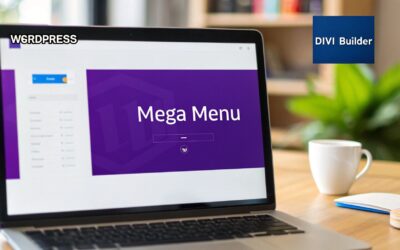
So, what exactly is a WP mega menu? Think of it as a supercharged, expandable navigation panel. It completely blows traditional dropdowns out of the water by displaying multiple columns of links, images, and even other types of content in a single, clean interface. It's the perfect solution for taming complex site structures, especially for e-commerce stores, portfolios, and any other content-heavy website.
Why Your Website Needs a WP Mega Menu
Let's be honest, it's time to move beyond those basic dropdown menus. If your website has more than just a few pages, a standard, single-column menu quickly becomes a frustrating bottleneck for visitors. They're forced to hover and click through multiple nested levels, which often leads to them just giving up and leaving. This is a huge problem for online stores with deep product catalogs or blogs with dozens of categories.
A well-designed WP mega menu cuts right through that confusion. It lays out your site’s entire architecture in a clear, highly visual format. Instead of a long, confusing list, your users get an organized panel that can show off:
- Grouped links with clear, descriptive headings
- Eye-catching promotional banners or featured products
- Calls-to-action for special offers or new content
- Helpful icons and other visual cues to guide them
This simple change fundamentally transforms the user experience. You're no longer making them play a guessing game; you're giving them a guided tour.
The Limits of Traditional Navigation
Think of a standard dropdown menu as a narrow hallway—it only lets you see one thing at a time. A mega menu, on the other hand, is like walking into an open-plan room where you can see all your options at once. That visibility is a game-changer. When users can see the full breadth of what you offer in a single glance, they're far more likely to discover pages they never would have stumbled upon otherwise.
For WordPress sites, which power a staggering 43.3% of the web's CMS market, this is huge. These platforms are built to handle complex content, especially with powerhouse plugins like WooCommerce, which is behind 21.1% of all WordPress installations. A traditional dropdown just can't keep up. A mega menu, however, can elegantly display dozens of links, images, and promotions across the full screen, keeping users engaged instead of frustrated. You can learn more about the rise of mega menus in modern web design.
The number one benefit is clarity. By grouping navigation options and using a smart visual hierarchy, you reduce the mental effort required from your users. They find what they need faster, which has a direct and positive impact on engagement and conversion rates.
Ultimately, adding a WP mega menu is about making your website's content more discoverable. It's a direct investment in user experience that pays off by slashing bounce rates, boosting page views, and creating a navigation system that feels both professional and incredibly intuitive.
Laying the Groundwork with Divi Areas Pro
Alright, now that you see why a WP mega menu is such a game-changer, let's get our hands dirty and build the framework. The magic behind this whole process is a powerhouse plugin called Divi Areas Pro. This tool is designed to let you create custom content "Areas" that you can trigger in all sorts of cool ways—which makes it the perfect choice for our mega menu.
First things first: you'll need to have the plugin installed and activated on your Divi site. With that done, jump into your WordPress dashboard and navigate to Divi Areas > Add New. This is where you'll create the container that will eventually hold your amazing new menu.
Initial Configuration for Your Mega Menu
Before you even think about firing up the Divi Builder, there are a couple of crucial settings on this initial screen. Getting these right from the start will save you a headache later and ensure your menu behaves exactly as it should.
Start by giving your Area a clear, descriptive internal title. Something like "Main Services Mega Menu" works great. This is just for you, but trust me, when you have multiple menus on your site, you'll be glad you stayed organized.
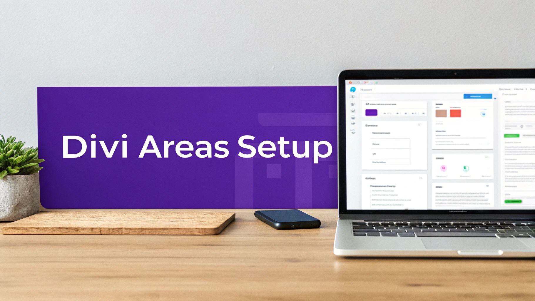
Next, you'll see a panel of settings for the Area itself. For a mega menu, the most important one here is the Area Type. You absolutely have to select "Mega Menu" from that dropdown list. This is what tells the plugin to treat this Area as a navigation element, not a popup or a fly-in.
Below you can see the clean workspace where you'll configure these foundational settings.
This screenshot shows that primary configuration panel—the internal title and the all-important "Area Type" dropdown. Seriously, selecting "Mega Menu" is the non-negotiable first step. It’s what prepares the canvas for the design phase.
Pro Tip: Don't get bogged down with the trigger or display settings right now. Our only goal at this point is to create and save the Area. We'll handle connecting it to your main header navigation a little later on.
Getting the Canvas Ready
Once you've assigned a title and set the Area Type to Mega Menu, go ahead and hit Publish. This saves your initial settings and, more importantly, unlocks the "Edit with Divi Builder" button. This is your gateway into the fun part—the visual design.
By nailing these preliminary steps, you’ve built a solid foundation. Think of it like this: you've just built the container, and now it's time to fill it with your content. If you're curious, you can learn more about the specific features in Divi Areas Pro that improve your business website and see how they can be used for more than just menus.
Now, let's dive into the Divi Builder and start crafting a visually stunning and functional WP mega menu.
Designing Your Menu Layout in the Divi Builder
Alright, with your Divi Area all set up, it’s time for the fun part—jumping into the Divi Builder and actually building this thing. This is where an empty container gets transformed into a rich, multi-column wp mega menu that’s both sharp-looking and genuinely useful. We're moving way beyond simple link lists here. Think of this space as a mini-landing page that drops down right from your main header.
The secret to a great layout really comes down to how you use Divi's rows and columns. I almost always start with a new section and then add a row. A three or four-column layout is a fantastic starting point for most mega menus; it gives you plenty of room to organize content without making things feel cramped or overwhelming.
You could, for instance, dedicate the first column to your main service categories, use the second to pull in a few recent blog posts, and save the third for a can't-miss call-to-action promoting your latest offer. A structure like that immediately puts your site's most valuable content front and center.
Structuring Content With Divi Modules
Once you have your columns in place, you can start dropping in Divi modules. This is where the real power and creativity kick in. Instead of being stuck with just plain text links, you can add pretty much any type of content you can imagine.
Here are a few common scenarios I see work really well for a powerful wp mega menu:
- Images & Icons: Use the Image module to add product photos or custom icons right next to your text links. That little bit of visual context helps people scan and understand their options much faster.
- Headings & Text: Use Text modules to create clear, bold headings for each column. This immediately establishes a visual hierarchy that guides the eye through the different sections of the menu.
- Buttons: Add Button modules for high-priority actions like "Shop New Arrivals" or "Request a Quote." Make them pop with a color that stands out from the rest of the menu.
The fact that WordPress now powers 43.1% of all websites has created a massive need for better navigation solutions. For designers and e-commerce managers, a well-built mega menu isn't just a "nice-to-have" anymore—it’s essential for taming complexity and guiding users where they need to go.
Don't just list links; curate an experience. A great WP mega menu tells a story about what your site offers, grouping related content in a way that feels logical and intuitive to the user.
As you begin to build, you'll find that a handful of Divi modules are particularly well-suited for creating dynamic and engaging mega menus. Here’s a quick-reference table of some of the most versatile modules and how you can put them to work.
Essential Divi Modules for Your Mega Menu
| Divi Module | Best Use Case in Mega Menu | Pro Tip |
|---|---|---|
| Text | Creating headings, lists of links, or short descriptive blurbs. | Use different H-tags (H4, H5) inside the Text module to create a clear hierarchy within each column. |
| Image | Showcasing product photos, team member headshots, or brand logos. | Keep image file sizes small! Optimize them before uploading to ensure your menu loads instantly. |
| Button | Driving attention to a key call-to-action (CTA). | Use Divi's hover effects to add a subtle animation or color change, making the button more interactive. |
| Blog | Displaying recent posts from a specific category, like "News" or "Case Studies." | Set the post count to 2 or 3 to keep the list concise and prevent the menu from becoming too tall. |
| Contact Form | Placing a simple contact form directly within the navigation for easy access. | Keep it minimal—just name and email fields. A "Quick Contact" or "Get a Quote" form works best here. |
| Icon | Adding small, illustrative icons next to links to provide visual cues. | Pair an Icon module with a Text module inside a two-column row for a clean, aligned look. |
These modules give you an incredible amount of flexibility, letting you build a menu that’s far more than just a list of pages.
A Practical Design Recipe
Let’s walk through a tangible example. Imagine you're building a menu for a digital agency. You could set up a four-column layout like this:
- Column 1 (Services): Start with a Text module for a heading like "Our Services." Follow it with more Text modules for each service link, and maybe pop an Icon module next to each one for a little visual flair.
- Column 2 (Case Studies): Drop in a Blog module and filter it to show only the "Case Studies" category. Set it to display the three most recent posts to keep it fresh.
- Column 3 (About Us): Feature a short company bio with a team photo using a combination of Image and Text modules. Don't forget a button that links to the full "About Us" page.
- Column 4 (Contact CTA): Make this column stand out by giving it a slightly darker background color. Add a bold heading like "Ready to Start?" and place a Contact Form module right inside the menu for immediate lead capture.
This kind of approach turns your navigation from a simple directory into an interactive hub that informs and engages visitors from their very first click. And remember, a great menu needs a great home. For more on that, check out our guide on how to create a global header with Divi. This will ensure your new mega menu fits perfectly into a polished and professional design.
Connecting Your Menu with Triggers and Display Rules
A beautifully designed wp mega menu doesn't do much good if it never shows up. This is where the real magic of Divi Areas Pro comes into play, turning your static design into an intelligent, dynamic piece of your site's navigation.
Thankfully, connecting the layout you just built to your main header is surprisingly simple.
With your design saved, head back to your WordPress dashboard and navigate to Appearance > Menus. Find the menu item you want to act as the trigger—let's say it's your "Services" link—and expand its options. You'll see a new "Divi Area" dropdown menu. Just select the name you gave your mega menu Area, save it, and you're done. The connection is live.
Choosing Between On-Hover and On-Click Triggers
Now that your menu is linked, you need to decide how users will open it. Divi Areas Pro gives you granular control over this with triggers. The two most common options are hover and click, and each has a pretty significant impact on user experience.
- On-Hover: This is the classic mega menu behavior. The menu pops open the moment a user's cursor sweeps over the trigger link. It’s fast and feels responsive, but I’ve found it can sometimes be triggered accidentally, which can definitely get annoying.
- On-Click: This requires a clear, deliberate action from the user. It completely prevents those accidental popups and is generally considered more accessible. It’s also a must-have for mobile, since there’s no "hover" state on touch devices.
To set this up, go back to editing your Divi Area and open the "Trigger" settings. This is where you'll define the specific CSS selector of your menu link (something like #main-nav .menu-item-123 a) and choose the event—either hover or click. For most Divi headers, a quick "Inspect Element" in your browser will give you the exact selector you need.
My personal recommendation? Start with on-click. It creates a much more stable and predictable user experience. You'll avoid the annoying "flicker" effect that often happens with hover menus, and it works perfectly across all devices right out of the box.
This simple diagram breaks down the whole design process, from structure to the final styling touches.
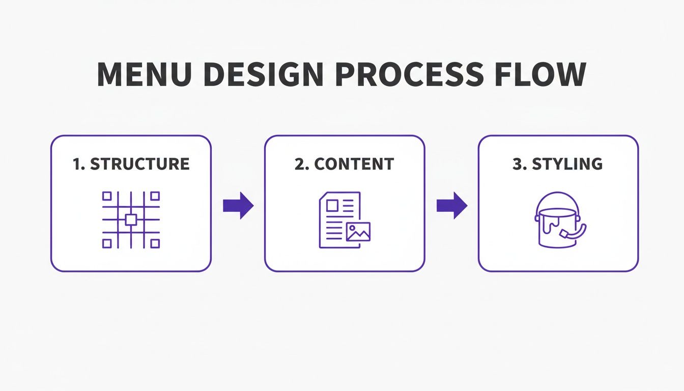
It’s a good reminder that a great menu isn't just a list of links; it’s a careful blend of structure, content, and design.
Advanced Display Rules for Smart Menus
Basic triggers are just scratching the surface. The real power move is setting up display rules to create a personalized, context-aware experience for your visitors.
Imagine showing a special "My Account" mega menu with quick links to order history, but only to users who are logged in. Or maybe you want to feature a unique menu promoting your web design services, but have it appear only when someone is browsing pages in your "Portfolio" category. This is what display rules make possible.
This level of targeting is a huge deal in the WordPress ecosystem, which powers over 43% of all websites worldwide. For agencies and freelancers building sites with Divi, the ability to trigger menus based on device type is particularly crucial, especially when you consider that mobile devices account for 61% of all WordPress content views. With Divi Areas Pro, you can turn a simple wp mega menu into a seriously powerful tool for engagement. You can dig into more WordPress plugin trends on trends.builtwith.com.
You’ll find these rules in the "Display" settings of your Divi Area. You can add multiple conditions and get incredibly specific:
- User Role: Show for a "Subscriber," "Customer," or any other custom role you have set up.
- Page: Display the menu only on specific pages, posts, or even custom post types.
- Device: Create different menus tailored for desktop, tablet, and mobile visitors.
By layering these rules, you transform your navigation. It stops being a static site map and becomes an intelligent guide that actively helps users find exactly what they’re looking for, right when they need it.
Optimizing for a Responsive and Accessible Experience
Let's be honest, your wp mega menu isn't truly finished once the desktop version looks perfect. We live in a world where mobile traffic is king, so your menu has to be flawless on every screen size. If you skip this part, you risk creating a frustrating experience for a huge chunk of your audience, essentially undoing all your hard work.
Fortunately, Divi's built-in responsive tools make this whole process pretty straightforward. Just hop into the Divi Builder, and you can instantly switch between Tablet and Mobile views to see exactly how your menu will look. From there, you can tweak just about every setting—from column layouts to font sizes—specifically for that device.
Fine-Tuning for Mobile and Tablet Views
That gorgeous multi-column layout on your desktop? It's going to feel cramped and unreadable on a phone. The first move is almost always adjusting the column structure so that instead of sitting side-by-side, they stack vertically. This is a quick fix in the Row settings under the Design > Sizing tab.
Once the structure is sorted, it’s time to dial in the details. Here are a few mobile tweaks I always find myself making:
- Font Sizes: Text that’s perfectly legible on a big screen can be tiny or awkwardly large on a phone. Take the time to adjust heading and body text sizes for each device view.
- Padding and Margins: On touchscreens, you need more breathing room. Bumping up the spacing around elements makes links and buttons much easier for fingers to tap accurately.
- Hiding Elements: Is that huge background image or complex module really necessary for mobile users? Sometimes, less is more. Divi lets you hide specific elements on certain devices right from the Advanced > Visibility settings.
If you want to go deeper on this, there are some fantastic key tips for better Divi mobile responsiveness that apply perfectly to mega menus. Getting this right is what makes a menu feel just as intuitive on a phone as it does on a desktop.
Making Your Mega Menu Accessible to Everyone
Beyond just looking good on different devices, your mega menu needs to be fully usable for all visitors. Accessibility isn't just a technical checkbox; it's a core part of building a great user experience. A properly accessible menu means users with disabilities, including those who rely on screen readers or keyboard navigation, can interact with your site just as easily as anyone else.
An accessible website is a better website for everyone. Simple changes like ensuring proper keyboard navigation not only help users with disabilities but also improve the overall usability of your menu for power users and those with temporary limitations.
A great first test is to try navigating your menu using only the Tab key. Can you cycle through all the links and interactive elements in a logical order? You should be able to.
Also, be sure to use proper heading structures (H2, H3, H4) within your menu's content. This creates a clear hierarchy that screen readers can interpret, helping users understand the layout without needing to see it. It's worth exploring the importance of ensuring website accessibility to see how these practices benefit both your users and your business. These aren't just feel-good adjustments; they also send positive quality signals to search engines.
Common Questions About Divi Mega Menus
As you start getting your hands dirty with Divi and Divi Areas Pro, a few questions always seem to come up. Trust me, I've heard them all. Getting these sorted out early on can save you a ton of headaches and help you really push the limits of your new wp mega menu.
Let's dive into some of the most frequent ones I see from designers and developers.
Can I Add WooCommerce Products to My Mega Menu?
Absolutely, and you really should! This is hands-down one of the most powerful things you can do for an e-commerce site. Right inside your Divi Area, you can drop in Divi’s own Shop or Woo Products modules to feature items directly in the navigation.
You can get super creative with this. Imagine a "New Arrivals" column that automatically pulls in your latest products or a "Best Sellers" section to guide new shoppers. It instantly turns your menu from a simple sitemap into a dynamic storefront that actually drives revenue.
How Do I Make My Divi Mega Menu Full-Width?
That clean, edge-to-edge look is a classic for a reason. Divi Areas Pro makes it pretty straightforward. When you’re editing your Area (the main Area settings, not inside the Divi Builder itself), find the "Layout" panel. In there, you can set the width to "Fullwidth."
This tells the Area container to stretch across the entire viewport. From there, you just need to pop into the Divi Builder and make sure your Section and Row are also set to full width. That’s it—your content will now stretch seamlessly across the screen.
Pro Tip: Don't forget to double-check the position settings on the trigger itself. Getting the alignment right ensures your full-width menu appears exactly where you want it, right below the header, without any weird gaps or offsets.
Will a Mega Menu Slow Down My Divi Website?
This is a totally valid concern—site speed is everything. The good news is that when built correctly with a solid plugin like Divi Areas Pro, the performance hit is minimal. The content inside your wp mega menu is loaded dynamically, which is a fancy way of saying it only gets called up when a user actually clicks to open it.
To keep things snappy, stick to these best practices:
- Optimize Your Images: Always compress images before you put them in the menu. Big, unoptimized photos are the number one killer of fast-loading elements.
- Avoid Heavy Scripts: Think twice before adding modules that depend on heavy JavaScript or pull in external scripts. Keep it lean.
- Stay Focused: A mega menu is powerful, but it's not a place to cram your entire website. Make sure the content is relevant, purposeful, and helps the user.
Can I Create Multiple Unique Mega Menus?
Yes, and this is where you can start creating a truly slick navigation experience. Divi Areas Pro doesn’t box you into a one-size-fits-all menu. You can create as many unique Areas as you need.
For example, you could have a rich, multi-column menu packed with visuals for your "Products" link, but a much simpler, text-based one for "About Us." You just create a new Area for each, design them in the Divi Builder, and assign them to their specific menu item triggers. This flexibility lets you build a smarter, more context-aware navigation system for your whole site.
Ready to build a smarter, more engaging wp mega menu that actually converts? Divimode provides the tools and expertise you need. Grab Divi Areas Pro and unlock the full potential of your Divi website today.
Explore Divi Areas Pro on divimode.com
More Articles You Will Like