 Alex Martin
You've probably seen it before: you hover your mouse over some text, and an image magically appears. That's a text hover image effect, and it's one of those slick, dynamic elements that can really make a website feel polished and interactive.
It’s a fantastic way to give visitors instant visual context for something—like a project in your portfolio, a team member's headshot, or a product thumbnail—without cluttering up the page with a big grid of images right off the bat.
Why Bother With Interactive Hover Effects?
In a world filled with static, boring pages, little interactive touches are what make a website feel alive. A text-on-hover image effect isn't just a cool gimmick; it plays a real role in modern web design by making the user experience better and drawing attention where you want it. It flips the script from passive scrolling to active exploration.
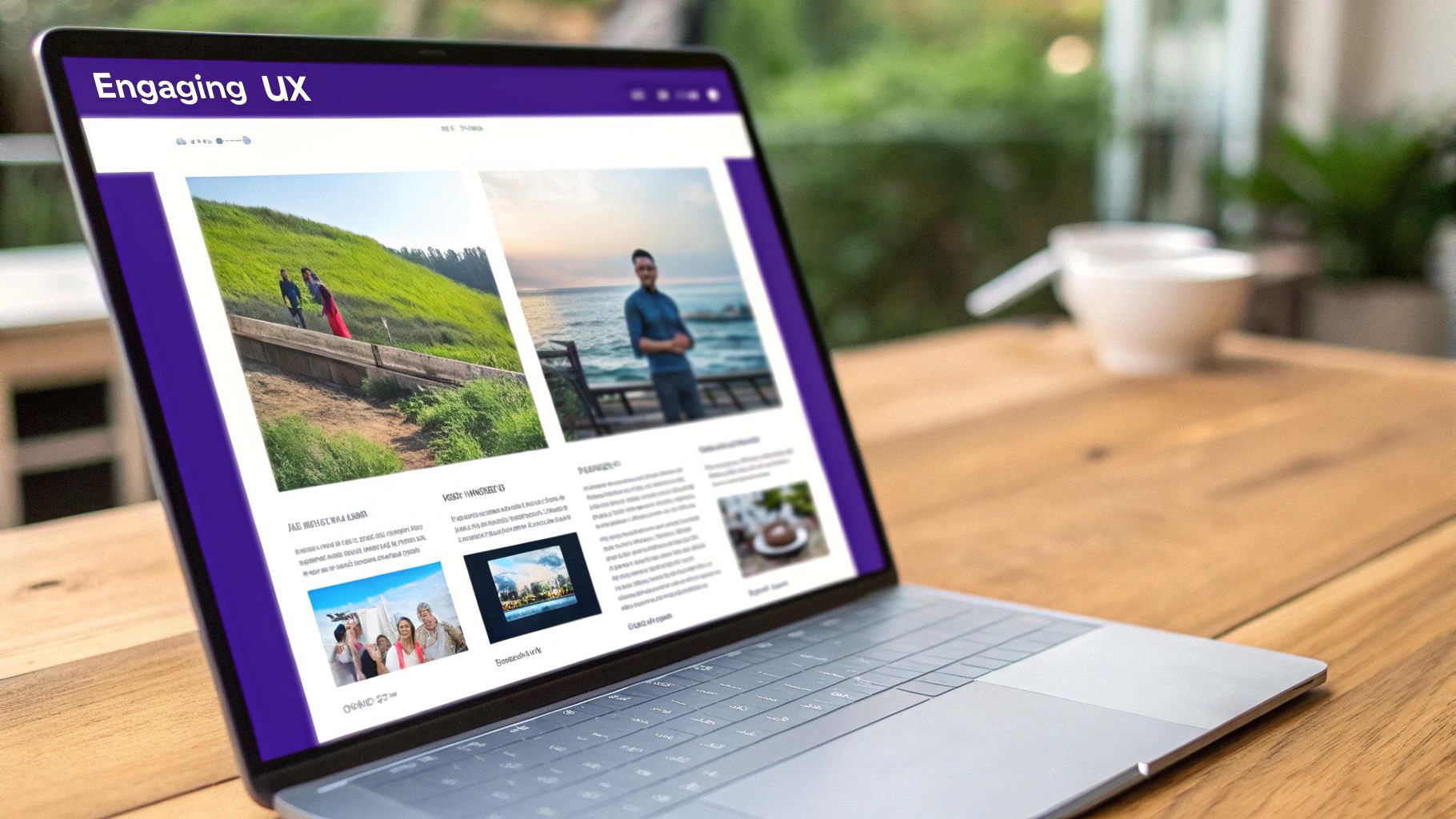
Picture a portfolio page. Instead of a busy grid of project names and thumbnails, imagine a clean, simple list of text links. As a visitor hovers over each project title, a preview image pops into view. It’s a simple trick, but it communicates information way faster and more elegantly.
Boost Engagement and Keep Things Clean
The biggest win here is the ability to offer up more information only when it's needed. This lets you keep your initial page layout clean and minimalist, but you can still provide that deeper context for anyone who shows a bit of interest. It's all about reducing visual noise and preventing that "information overload" feeling we all hate.
Honestly, a well-done hover effect can make a huge difference in how professional and user-friendly your site feels.
I like to think of a great hover effect as a helpful assistant. It pops up with more information exactly when the user needs it, without them even having to ask. It’s one of those small, intuitive details that adds up to a much better experience.
In this guide, I’m going to walk you through three different ways to get this effect working in Divi, each suited for different needs and skill levels.
You’ll learn how to:
- Use Divi's built-in modules for a quick, code-free approach.
- Dive into custom CSS for more precise control and slicker animations.
- Leverage Divi Areas Pro to create complex, content-rich popups that appear on hover.
Each method has its pros and cons, and by the end of this, you’ll know exactly which one is the right fit for your next project, whether you're building a simple team page or a full-blown e-commerce catalog.
Building Your First Hover Effect with Divi Modules
Let's dive right into the easiest method out there, which is perfect if you want to sidestep code and stay within the familiar Divi builder. We're going to create a clean text hover image effect using nothing more than a standard Text module and an Image module.
This approach is a fantastic solution for things like a team page, where hovering over a person's name smoothly reveals their headshot.
The whole trick boils down to layering two modules in the same column and then using Divi’s native hover controls to show and hide the image. It’s a surprisingly simple process that relies completely on Divi’s visual tools.
Setting Up the Modules
First things first, add a Text module and an Image module into the same column. The order isn't super critical, but I usually place the Text module first just to keep things logical. In that Text module, pop in the content you want to act as the trigger—something like "John Doe." Then, drop the picture you want to show up on hover into the Image module.
Now comes the crucial part: positioning. Open up the Image module’s settings, head over to the Advanced tab, and toggle on Position. You’ll want to set the position to Absolute.
This one setting pulls the image out of the normal page flow, letting it sit on top of other elements without shoving them around. Honestly, this is the secret sauce that makes the whole layering effect possible.
Configuring the Hover States
With our modules in place, it’s time for the fun part. The real magic happens in Divi’s hover options, which you can get to by hovering over any setting’s title and clicking that little arrow icon that appears.
We'll start by making the image invisible by default. In the Image module’s Design tab, find the Transform settings.
- Default State: With the default (desktop) icon selected, set the Opacity to 0%. To add a bit of flair, you can also move it slightly. I like setting the Translate Y-axis to
-20pxto make the image slide in from above. - Hover State: Next, click the hover icon. Now, crank the Opacity back up to 100%. If you nudged it before, set the Translate Y-axis back to 0px to return it to its original spot.
This setup tells Divi to make the image fully transparent and slightly offset by default, then bring it to full opacity and its final position only when a cursor hovers over it.
Here's a pro tip I've learned from experience: always adjust the Z Index. In the Image module’s Advanced tab, under Position, set the Z Index to a high number like 10. This guarantees your image always appears on top of the text and anything else nearby.
To smooth everything out, jump back to the Design tab and open the Transition settings. A Transition Duration of around 300ms usually feels just right—quick, but not jarring. And just like that, you have a slick, functional text hover image effect!
For a much deeper dive into what’s possible with these settings, be sure to check out our complete guide on how to create Divi hover effects.
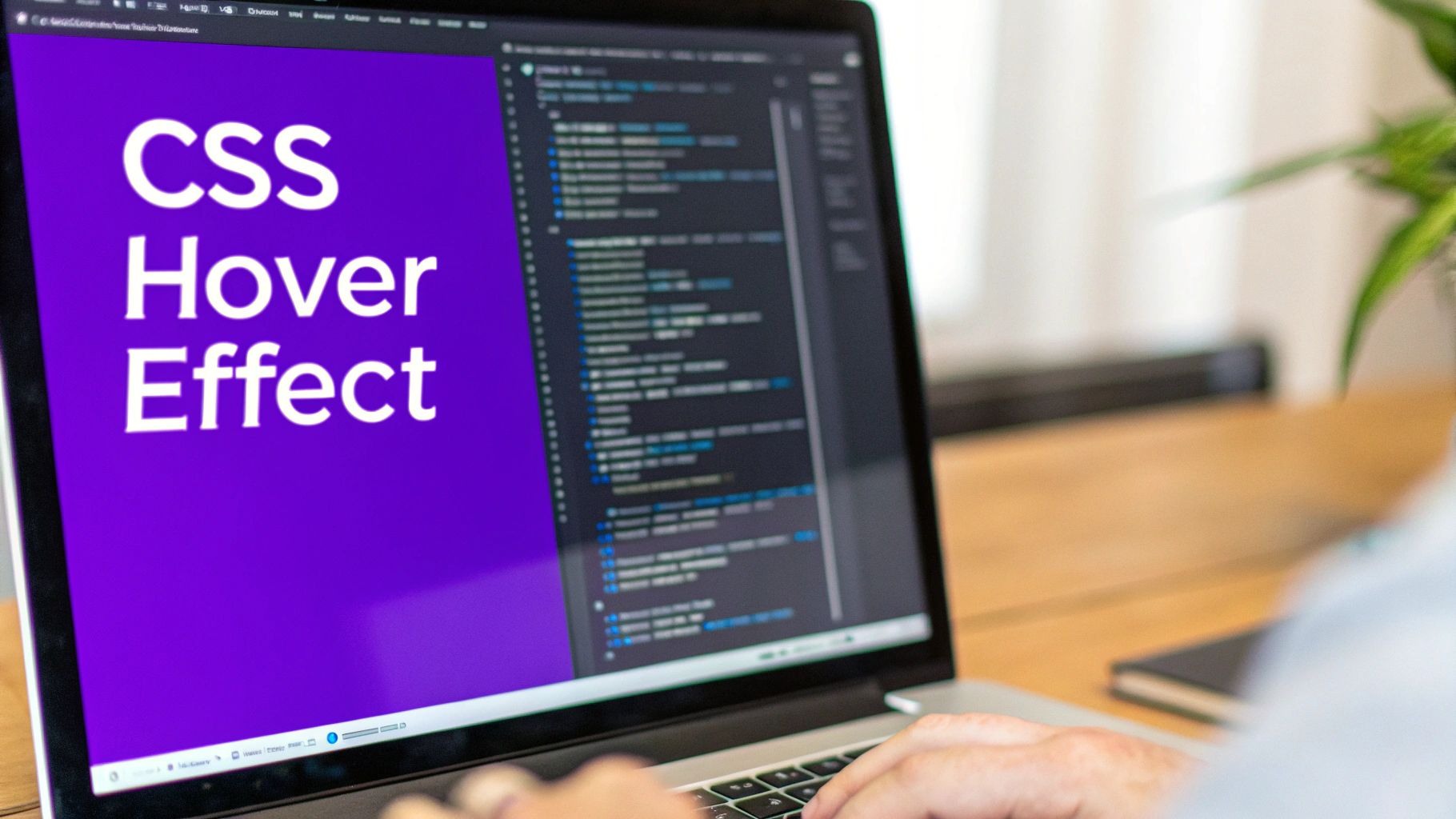
When Divi’s built-in options don’t quite cut it for the vision you have in mind, it’s time to roll up your sleeves with some custom CSS. This is where you get to break free from the standard modules and build something truly dynamic. With a bit of code, you can create interactions that feel more fluid, more impressive, and frankly, more professional.
Think about a portfolio page where a slick thumbnail preview silently follows the user's cursor as they move over different project titles. It’s a premium touch that elevates the user experience, and it’s surprisingly achievable. It all starts by giving your target elements a unique CSS class.
Assigning a CSS Class
First things first, we need a way to tell our CSS exactly which elements to listen to. Head into the Divi builder and find the section, row, or module that holds your text triggers. Pop open the Advanced tab, find the CSS ID & Classes toggle, and assign a unique class name. Something clear like cursor-hover-effect works perfectly.
This is a simple but critical step. It acts like a laser pointer for our code, making sure our fancy new effect only applies right where we want it and doesn't accidentally mess with other parts of the site.
With our target locked in, we can jump into the CSS. The game plan is to have an image that’s initially hidden (display: none;) and positioned absolutely. Then, when a user hovers over our designated text, a little bit of JavaScript will capture the cursor's position, update the image's location in real-time, and make it visible.
Essential CSS Properties Explained
The CSS is what handles the look, feel, and initial state of our hover image. You'll be working with a few key properties to make the magic happen:
position: absolute;: This pulls the image out of the normal page flow. It lets us place it anywhere we want usingtopandleftcoordinates, which our script will continuously update based on the cursor’s movement.pointer-events: none;: This one is crucial. It essentially makes the image invisible to the mouse, allowing the cursor to interact with whatever is underneath it. Without this, you’d get a nasty flickering effect as the image tries to register a hover over itself.transform: translate(-50%, -50%);: This is a neat trick to perfectly center the image on the cursor. Instead of the top-left corner of the image following the cursor, this ensures the dead center of the image does, which looks much smoother.transition: opacity 0.3s ease;: A little bit of polish goes a long way. This property adds a graceful fade-in and fade-out effect, so the image appears and disappears smoothly instead of just popping in and out abruptly.
These kinds of CSS hover effects are pretty much standard fare in modern web design; users have come to expect these little interactive moments. Advanced CSS techniques are used everywhere to animate buttons, reveal information, or create slick overlays. You can dive deeper into some of these advanced CSS hover techniques on sliderrevolution.com.
If you’re trying to decide which method is right for your project, this table should help clarify things.
Comparing Divi Built-in Options vs Custom CSS
Sometimes, a quick and simple solution is all you need, while other times, a project demands a more tailored approach. Here’s a breakdown to help you choose between Divi's built-in tools and writing your own CSS.
| Feature | Divi Built-in Method | Custom CSS Method |
|---|---|---|
| Complexity | Low. Great for beginners. | Moderate. Requires basic CSS and often JavaScript. |
| Speed | Very fast to implement. | Slower initial setup. |
| Customization | Limited to module settings. | Nearly limitless creative freedom. |
| Best For | Simple, standard hover effects. | Unique, dynamic interactions like cursor-following effects. |
| Maintenance | Easy. Managed within the Divi Builder. | Requires managing code snippets in Divi's Theme Options or a child theme. |
Ultimately, Divi’s built-in options get you 80% of the way there with minimal effort, which is often enough. But for that final 20% of custom polish and "wow" factor, custom CSS is your best friend.
This quick visual guide highlights a few best practices for creating effective text hover images, comparing things like transition speed, contrast, and text length.
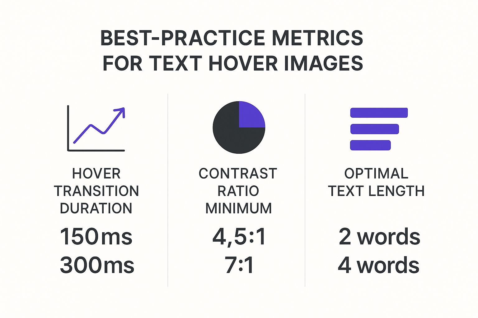
The data makes it pretty clear: faster transition times and better contrast almost always lead to a more accessible and enjoyable user experience.
Taking It a Step Further with Divi Areas Pro
The first two methods are solid, but they have a fundamental ceiling: they can only show a single image. What if you need a text hover image effect that includes more than just a picture? That’s when it’s time to call in a specialist tool like Divi Areas Pro. This plugin blows right past Divi’s native constraints.
Instead of just triggering one module, Divi Areas Pro lets you trigger an entire layout—what the plugin calls a "Divi Area"—on hover. This is a complete game-changer for building rich, informative interactions without touching a single line of code.
Think about an e-commerce site where hovering over a product name reveals a popup card. This card could have the product image, a quick description, the price, and even an "Add to Cart" button. That's the exact kind of sophisticated experience Divi Areas Pro makes surprisingly simple.
How to Build Your First Divi Area
You'll start by creating a new Divi Area right from your WordPress dashboard. This brings up the familiar Divi Builder, where you can design your popup content just like any other page. You're free to add an Image module, a Text module for a heading, a Blurb for a description, and even a Button module for a call to action.
Once your layout is dialed in, you'll jump into the trigger settings. Here, you can set the Area to pop up on hover and even get specific about its position, whether it’s "next to cursor" or in a fixed spot on the screen.
The real magic here is how it separates your trigger from your content. Your main page can stay clean and simple with just text links, while all the complex popup content lives in its own Area. This makes updates incredibly efficient down the road.
With Divi Areas Pro, you're not just creating a simple effect; you're building a fully interactive content block that appears on demand. The plugin handles all the tricky positioning and visibility logic behind the scenes, so you can focus on the design. This method is perfect for complex service listings, detailed team bios, or slick product previews.
Of course, with great power comes great responsibility. To get the most out of popups without overwhelming your visitors, it's worth brushing up on determining the right popup frequency.
A slick text hover image effect is a fantastic touch on a desktop, but it’s completely useless if it breaks on a phone or shuts out users with disabilities. Making sure your creations work for everyone isn't just a box to tick; it’s essential for a good user experience.
The most glaring challenge here is that "hover" doesn't exist on touch devices. You can't hover with your finger, so the effect needs a graceful fallback. For anyone on a mobile or tablet, the goal is to transform that hover interaction into a tap trigger.
Creating Mobile Fallbacks
In Divi, the simplest solution is to use the responsive controls to disable the hover effect on smaller screens entirely. You can just make the image visible by default on tablet and mobile views, turning the interactive element into a static one. This is a quick fix that prevents the image from being permanently hidden from touch-screen users.
If you want to get a bit more creative, you can implement a tap-based interaction. The idea is that the first tap reveals the image, and a second tap would follow the link. While this requires more advanced logic, it does a great job of preserving that interactive feel across all devices.
The key is to avoid a "dead" element on mobile. If a user taps the text and nothing happens, they'll assume it's broken. Your fallback should provide a clear, intuitive experience, even if it's different from the desktop version.
Accessibility Considerations
Accessibility is all about making sure people who use screen readers or other assistive technologies can access your content. For a text hover image, this means the image's information isn't lost just because it's hidden.
- Use Descriptive Alt Text: This is absolutely non-negotiable. Screen readers announce the alt text, so it must accurately describe the image for visually impaired users.
- Consider ARIA Roles: You can use
aria-describedbyto programmatically link the trigger text to the image's description. This helps assistive tech understand the relationship between the two elements.
This principle of adapting interactions for different interfaces isn't new. For instance, hover technology has been adapted for mobile and embedded devices, like GPS systems, to let users preview info without navigating away from a map. You can actually read more about how this technology is being introduced to embedded applications on embeddedcomputing.com. Our goal is similar: adapt our web interactions to provide a seamless experience on any device.
If you're interested in building other accessible interactions, our guide on creating high-converting WordPress popups also dives into user-friendly design principles that are worth a read.
Got Questions About Divi Text Hover Effects?
As you start playing around with these text-on-hover image effects, you'll probably run into a couple of common hiccups. It happens to everyone. Let's get ahead of them now so you don't lose any time troubleshooting later.
Why Is My Hover Image Pushing Other Content Around?
This is a classic. You set up your effect, hover over the text, and suddenly your whole layout gets shoved out of the way. It’s almost always a positioning issue.
When you add an Image module, its default position is "Static," which means it's part of the page's natural flow. When it appears on hover, it physically pushes other elements aside to make room for itself.
The fix is incredibly simple. Just head into the Image module’s Advanced tab, find the Position settings, and switch it to Absolute. This lifts the image out of the normal document flow, letting it float harmlessly above your other content without messing up your carefully crafted layout.
Will This Effect Slow Down My Website?
It's smart to think about performance. The good news is that a few of these hover effects won't make a noticeable dent in your site speed. The real culprit isn't the hover trigger itself—it's the image file size.
Always, always compress your images before you upload them to WordPress. A huge, unoptimized image will be slow no matter how you load it.
If you're planning a whole gallery of these effects on a single page, you might want to consider lazy-loading the images. That way, they only load when a user actually scrolls them into view, keeping your initial page load nice and fast.
The key takeaway here is that performance hinges on the image file size, not the CSS hover trick. Keep your images lightweight, and the effect will feel instant and snappy.
By tackling these common snags from the start, you'll be well on your way to building slick, professional hover interactions that work exactly as you expect them to.
At Divimode, we're all about building tools that make cool Divi interactions like this dead simple. If you want to create even more powerful hover effects, tooltips, and popups without the headache, check out our plugin, Divi Areas Pro.
More Articles You Will Like