Creating a popup with a close button is all about finding that sweet spot between grabbing a user's attention and respecting their experience. Think of it less as a technical feature and more as a handshake—it turns a potential interruption into a polite, powerful marketing moment.
Why a Good Popup With a Close Button Is a Smart Move
Let’s be honest, we’ve all been annoyed by a popup we couldn't close. An intrusive, aggressive popup is the fastest way to send a visitor packing, driving up your bounce rate. But when you give users an obvious and easy way out with a clear close button, you change the entire dynamic. It's no longer a demand for their attention; it's a friendly offer.
This tiny detail builds a surprising amount of trust and can make people far more open to what you have to say.
And the payoff is huge. A well-timed popup can be an absolute game-changer. In e-commerce, for example, a staggering 99% of visitors don’t buy on their first visit. But popups offering a discount or a newsletter signup can convince 75% of those visitors to plan on coming back to make a purchase. The close button is the critical piece of the puzzle that makes this strategy work without alienating the very people you’re trying to win over.
Balancing Persuasion and Experience
A great popup isn’t just a random interruption; it shows up with a purpose at just the right time. The design of your popup—and especially its close button—sends a clear message about your brand. Are you helpful and considerate, or are you pushy and frustrating?
- Reduces Bounce Rate: An easy exit keeps frustrated users on your site instead of having them leave for good.
- Builds Trust: Giving users control shows you value their time and aren't trying to trick them.
- Improves Engagement: When people don't feel trapped, they're much more likely to actually consider your offer.
Here’s a perfect example of a clean, effective popup designed in Divi Areas Pro, where the close button is impossible to miss.

See how the "X" is immediately identifiable? That’s what ensures a smooth user experience. This isn't just about one small element; it's a key part of a respectful and effective marketing funnel. When you integrate this thinking into your broader conversion rate optimization strategies for e-commerce, you'll see just how much of a difference it can make.
Alright, before we get into the fun design stuff, we need to lay a little groundwork. The whole process kicks off right from your WordPress dashboard, where Divi Areas Pro (or Popups for Divi) adds its own menu item. This is basically your command center for every popup, fly-in, or banner you'll ever create.

First things first, you'll create a new "Area." That's the plugin's term for any piece of content you build with it. Give it a name you'll remember later, something clear like "Holiday Sale Popup" or "Newsletter Signup." Trust me, you'll thank yourself later when you're trying to find it in a list.
Next, you need to define the "Area Type." For what we're doing, you’ll choose Popup. This one setting is what tells the plugin to display your content as an overlay on the page. It's a small click, but it's the one that makes all the magic happen.
Building the Basic Structure
With those initial settings out of the way, you’re dropped right into a familiar space: the Divi Builder. That’s the beauty of this plugin—you’re not learning a whole new system. You're just using the same modules and design tools you already know from building your pages.
At this point, don't get bogged down in the details like triggers or fancy animations. The goal is to get the core components in place. I almost always start with this simple trio:
- A Text Module for the headline and offer.
- An Image Module to add a product photo or some eye-catching graphic.
- A Button Module for that all-important call-to-action.
For example, let's say you're making an exit-intent popup to grab email signups. You’d drop in a Text Module with a punchy headline like, “Wait! Get 15% Off Your First Order,” maybe a little more text to explain the deal, and finally, a button that shouts, “Get My Coupon!”
This simple framework gives you everything you need to get your message across. Once these pieces are in place, you've got a functional (if a bit plain) popup ready to go. From here, we can dive into the most critical part of the user experience: adding and styling the popup with close button so visitors have a clear and easy way out.
Designing a Close Button People Actually Want to Use
That little "X" on your popup? It’s more than just a button—it’s the most critical part of your user experience. If it's hard to find, tiny, or feels deceptive, you’ve already lost your visitor's trust. With Divi Areas Pro, you have total control to create a popup with close button that feels like a helpful exit, not a hostile trap.
The first big decision is where to put it. Should it live inside the popup’s main content area, or should it sit on the edge of the screen? There's no single "right" answer, but user expectation is a powerful thing. People instinctively look to the top-right corner. Placing it anywhere else can feel like a trick, even if your intentions are good.
This is even more important on mobile. A small button crammed into a corner is a usability nightmare on a touchscreen. A solid rule of thumb is to make your close button’s tap target at least 44×44 pixels so it’s easy for anyone to press.
Customizing the Close Button Style
Jump into the Divi Areas Pro settings and you'll find the “Close Button” tab. This is where the magic happens. You can ditch the default 'X' and design something that perfectly matches your brand. For a complete walkthrough of every single setting, check out our in-depth guide on how to customize the close button.
Here are a few high-impact tweaks you can make right away:
- Icon & Size: Swap the default icon for something custom, then adjust its size and color to fit your brand. High contrast is your friend here—make sure it’s impossible to miss.
- Background: Give the icon a circular or square background. This simple change dramatically improves its visibility and makes it look and feel more like an actual button.
- Positioning: Get pixel-perfect with its placement. You can tuck it neatly inside the popup or push it to the outer edge for a more modern feel.
Your close button needs to be immediately obvious the second a user sees your popup. If they have to hunt for it, the user experience has already failed. Think of it as a clear, well-lit exit sign in a room—it should provide comfort, not create confusion.
Choosing between placing the button inside or outside the container can affect both aesthetics and user behavior. Let's break down the pros and cons of each approach.
Close Button Placement Comparison
| Placement | Pros | Cons |
|---|---|---|
| Inside Container | • Looks integrated with the popup design. • Keeps all interactive elements in one place. • Standard and familiar to most users. |
• Can get lost if the popup has a busy background. • Reduces the usable content area inside the popup. |
| Outside Container | • Stands out clearly, improving visibility. • Doesn’t interfere with the popup's content or layout. • Offers a modern, clean aesthetic. |
• Can feel disconnected from the popup. • Might be less intuitive for some users. • Requires careful spacing to avoid looking awkward. |
Ultimately, the best choice depends on your design goals. An inside button is safe and conventional, while an outside button can offer a cleaner look if executed well.
The image below highlights just how much placement can influence user interaction and click-through rates for a popup with a close button.
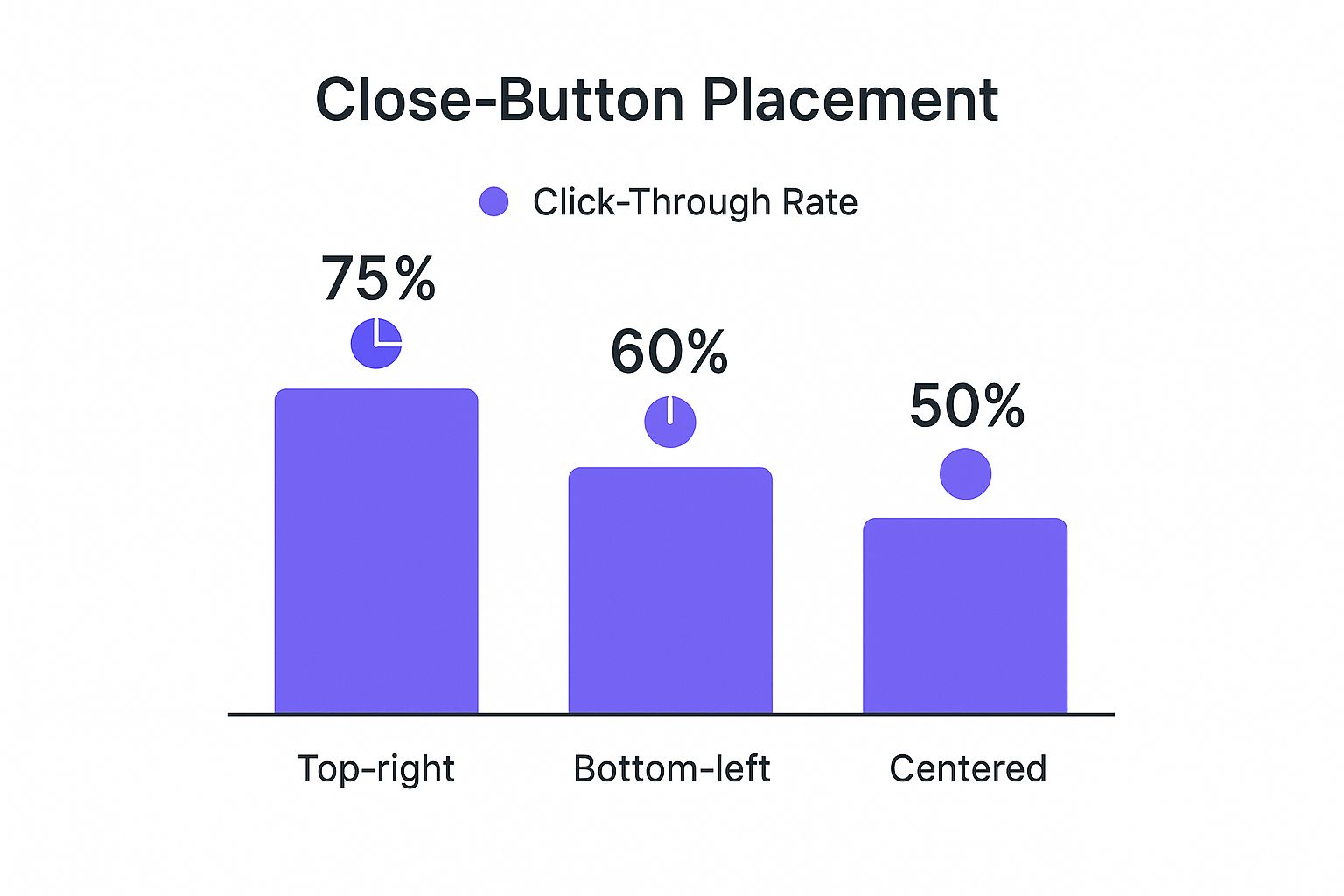
As the data makes clear, the traditional top-right placement is the winner by a long shot. This reinforces a simple but powerful lesson: meeting user expectations is the key to a positive and effective interaction.
Setting Smart Triggers for Your Popup
A gorgeous popup with a close button that shows up at the wrong time is still a bad popup. This is where timing and context become your most powerful tools. With Divi Areas Pro, you can move beyond just creating a popup and start defining the exact moment it appears, turning a potential interruption into a genuinely helpful interaction.
The secret is matching the trigger to what the user is trying to do. For instance, an On-Click trigger is perfect for a "Request a Quote" button—the user is actively asking for the popup, so it feels expected and useful. On the flip side, a Scroll-Percentage trigger works beautifully for a blog post. When a user scrolls 70% of the way down an article, you can offer a related guide, capturing their interest when they're most engaged.
Choosing the Right Trigger for the Job
Beyond the basics, you can get much more strategic. Think about using an Exit-Intent trigger to flash a last-minute discount code when someone’s about to leave your checkout page. That one small move can be the difference between a sale and an abandoned cart.
Here are a few scenarios I find myself using all the time:
- Time Delay: Show a welcome offer after a user has been on your homepage for 15 seconds. This gives them a moment to get their bearings before you present the offer.
- On-Click: Hook up a button or an image to a popup that contains a video, photo gallery, or even a full contact form. It keeps the experience clean and seamless.
- Exit-Intent: Just as a visitor's cursor drifts towards the browser’s back button, offer them a valuable download or a special discount. It's a classic for a reason—it works.
The goal of a smart trigger is simple: make your popup feel like a natural part of the user's journey. It should answer a question or meet a need the very moment it arises.
This idea of a seamless journey also ties into accessibility. It’s critical that when a popup is dismissed, the user's keyboard focus returns to the original button or link that triggered it. This is a must-have for keyboard navigation, ensuring your site is usable for everyone. We actually dive deeper into how modern components should handle this in our guide on creating a popup inside a Divi page. It’s a small detail that makes a huge difference.
Fine-Tuning the User Experience
Once you have the popup’s core mechanics working, it’s time to add the polish that makes the whole experience feel professional instead of clunky. A jarring popup can feel aggressive, but with a few subtle tweaks, you can make its appearance feel smooth and natural.
Inside your Divi Area settings, find the Animation options. My go-to for a clean, modern entrance is the Fade In & Scale effect. It’s not over-the-top, just a simple transition that feels right. I typically set the animation duration to around 300ms—fast enough not to annoy anyone, but slow enough to be noticed.
Enhancing Focus with a Backdrop
Another simple but powerful tool in your arsenal is the Backdrop. This is the overlay that darkens the rest of the page when the popup appears, and it’s a game-changer for directing attention. Enabling it instantly signals to the user where they should be looking.
You can tweak the backdrop's color and opacity to match your site's branding perfectly. Honestly, you can rarely go wrong with a classic semi-transparent dark overlay, like black set to 70% opacity. It clearly communicates that the page content is temporarily on hold, guiding the user to interact with your popup.
A well-configured backdrop and a subtle animation work hand-in-hand to create a professional first impression. It tells the user, "This is important, but we respect your browsing experience."
Now for a quick technical reality check, especially if you have forms on your page. Imagine a user is halfway through filling out a long contact form when your popup appears. If they close it, what happens to their progress? You need to make sure their form data isn't lost. This often means getting into more advanced territory, like using event listeners to save the form's state when the close button is clicked—a common headache in development. If you’re diving into that, you can find more information by researching how developers handle saving form data when a pop-up is closed.
Common Questions About Divi Popups
Even after you've built the perfect popup, a few questions always seem to surface. Let's walk through some of the most common ones I hear, so you can get your popups working exactly how you want them to, without any guesswork.
One of the first things people ask is about customization. Can you use a custom graphic for your close button instead of the standard "X"? Absolutely. Inside the Divi Areas Pro settings for the 'Close Button', just switch the type from 'Icon' to 'Image'. This lets you upload your own branded graphic straight from the media library, giving you total control over the look and feel.
Another huge consideration is how your popups perform on mobile. A popup with close button needs to be just as slick and easy to use on a phone as it is on a big desktop screen.
How Do I Make My Popup Mobile-Friendly?
Getting a seamless mobile experience comes down to focusing on three key areas in the Divi Builder. If you nail these, your popups will look and perform beautifully on any device.
- Responsive Settings: This is your best friend. Dive into the responsive settings to adjust font sizes, margins, and padding specifically for tablet and mobile views. What looks good on a desktop often feels cramped on a small screen.
- Close Button Size: In the 'Close Button' settings, don't be afraid to bump up its size for mobile. Check the position in the mobile preview to make sure it’s big, obvious, and incredibly easy to tap with a thumb.
- Real-World Testing: Previews are great, but nothing beats pulling out your actual phone. This is the only way to know for sure that the layout is clean and that close button is easy to reach.
This attention to detail is non-negotiable. If a mobile user can't easily dismiss your popup, they're gone. They'll just leave your site, which completely defeats the purpose of trying to create a high-converting experience. You can find more insights by reading our guide on how to create high-converting WordPress popups.
Finally, what happens if your popup just isn't showing up? This is almost always a trigger or display setting issue. First, pop over to your 'Triggers' tab and confirm that you actually have one active. Next, review the 'Display Conditions' to ensure it’s set to appear on the correct page. If both of those are set up right, the last culprit is usually your cache—clear your website's cache, as an old version of the page might be stuck.
Ready to create popups that convert without annoying your visitors? With Divimode, you get the power of Divi Areas Pro to build smarter, more effective popups, fly-ins, and more. Get started at https://divimode.com.
More Articles You Will Like


