A pop up lightbox is just a window that appears over a webpage, dimming the background to pull your visitor's attention toward a specific message or call-to-action. When you get it right, it's an incredibly powerful tool for capturing leads and promoting offers without completely derailing the user's browsing experience. The secret sauce? Strategic timing and genuinely valuable content.
Why a Smart Pop Up Lightbox Is a Game Changer

Let's ditch the old idea that popups are just annoying interruptions. When you use them with a clear purpose and a bit of intelligence, a Divi pop up lightbox becomes one of the most effective conversion tools you have. Instead of being a roadblock, it engages users at the perfect moment with a message they actually care about.
Think about the last time you were about to leave a website and an offer for 15% off popped up. That’s a smart lightbox in action. They work because they command attention in a way that side banners or slide-ins just can't. By dimming the background, they create a focused stage for a single, crystal-clear call-to-action.
Boosting Engagement and Conversions
The main benefit here is a direct line to your user's attention. That's pure gold for hitting specific goals that might otherwise get lost in the noise of a busy webpage.
You can use a pop up lightbox to:
- Grow your email list by dangling a compelling lead magnet.
- Slash cart abandonment with a perfectly timed discount code.
- Announce a flash sale or a brand-new product launch.
- Gather valuable feedback with a quick, non-intrusive survey.
A quick look at the tangible benefits a well-implemented pop up lightbox brings to your website's key objectives.
| Strategic Goals for Your Divi Pop Up Lightbox |
| :— | :— | :— |
| Benefit | Impact on Your Website | Example Use Case |
| Lead Generation | Directly captures email addresses and contact information from interested visitors. | Offer a free ebook or checklist in exchange for an email on a blog post. |
| Increased Sales | Presents timely offers, discounts, or promotions to encourage immediate purchases. | Display a 10% discount coupon when a user shows exit intent on a product page. |
| User Engagement | Gathers feedback, guides users to key content, or announces important updates. | A welcome popup for new visitors highlighting your most popular content. |
| Cart Abandonment Reduction | Re-engages users who are about to leave their shopping cart with a special offer. | Trigger a "Wait! Don't go!" popup with a free shipping offer in the checkout. |
This table really just scratches the surface, but it drives home the point that a well-designed popup is a versatile workhorse for your marketing efforts.
The visual focus of a lightbox is a huge business asset. Consider this: the global market for physical light boxes in advertising hit around $363 million. Why? Because they grab attention in crowded spaces—a principle that translates perfectly to the digital world.
The real power of a pop up lightbox isn't just in grabbing attention—it's in delivering a relevant, timely message that feels helpful, not intrusive. This turns a potential interruption into a valuable interaction.
To really get the most out of pop-up lightboxes, it helps to integrate them with broader strategies from effective funnel builder platforms. Getting a handle on the 4 ways popups can help you will also give you much deeper insight into their strategic value.
Your Toolkit for Building Advanced Divi Popups
If you're serious about creating a professional pop up lightbox that actually gets results, you'll quickly find that Divi's built-in options just don't cut it. While Divi is an incredible builder, it lacks the specialized triggers and design flexibility needed for truly effective popups. This is where you need to bring in a couple of specialists.
For our projects, we've come to rely on a powerful combo from Divimode: the free Popups for Divi plugin and its premium big brother, Divi Areas Pro. This duo gives you everything you need to build pretty much any interactive element you can dream up.
The Power Duo Explained
The best way to think about these two plugins is as a dedicated team. Each one has a very specific job, and understanding how they work together is the key to unlocking their full power. It's this separation of duties that makes the whole system so robust and flexible.
Here’s a quick breakdown of what each plugin brings to the table:
- Popups for Divi (The Engine): This free plugin is the brains of the operation. It handles all the logic—the how and the when your popup shows up. This means setting triggers like on-click or exit-intent, defining display rules, and managing the basic popup container itself.
- Divi Areas Pro (The Canvas): This is where you get to be creative. Divi Areas Pro lets you use the Divi Builder you already know and love to design the content that goes inside your pop up lightbox. You’re not stuck with a basic form; you can build out complex, multi-column layouts using any Divi module you want.
By pairing a dedicated trigger engine with a flexible design canvas, you gain complete control over both the user experience and the visual presentation. You're no longer stuck choosing between smart triggers or great design—you get both.
For those who want to take their skills even further, learning about creating custom WordPress plugins can be a game-changer for extending WordPress functionality.
Why This Combination Works So Well
The real magic happens when you use these tools in tandem. Your workflow becomes incredibly simple and intuitive.
You’ll start by creating a new "Area" with Divi Areas Pro, which is essentially a blank canvas for your popup's content. You'll design it just like any other page, using the Divi Builder. Once you're happy with the design, you’ll hop over to Popups for Divi to assign that Area to a trigger, like a button click on your homepage or an exit-intent rule for a landing page.
Anyone who uses Divi will feel right at home with this process. You’re not wrestling with a clunky new interface; you’re just using the Divi Builder in a new, more powerful way. This approach keeps your designs perfectly consistent with the rest of your site and opens up a ton of possibilities for creating dynamic, engaging user interactions that actually drive conversions.
Designing a High-Impact Pop Up Lightbox Layout
This is where the real magic happens. With your tools in place, it’s time to jump into the Divi Builder and start crafting the visual side of your pop up lightbox. The beauty of using a plugin like Divi Areas Pro is that you’re not boxed in by rigid templates. You get a completely blank canvas to build any layout you can dream up, just like you would for a regular Divi page.
Our goal here isn't just to make something that looks nice; it's to create a focused experience that steers the user toward one specific action. Every single element, from the headline right down to the button, has to work together to hit that conversion goal. This is where your design chops meet conversion-focused strategy.
Building Your Layout in Divi Areas Pro
The good news is that creating the layout itself will feel incredibly familiar. Just head over to Divi > Divi Areas in your WordPress dashboard and hit “Add New.” This drops you right into the Divi Builder, where you can start adding sections, rows, columns, and any module you need.
Think of each "Area" as its own little mini-page. You could build a super simple email opt-in with a Text module and an Email Optin module, or you could go all out with a complex promotional popup featuring images, countdown timers, and customer testimonials.
Here are a few practical tips I’ve picked up along the way:
- Keep It Contained: I always start with a single section and give it a defined max-width, something like 700px. This stops the pop up lightbox from completely taking over the screen and feeling intrusive.
- Use Standard Modules: Don't reinvent the wheel. Pull in whatever you need—Image modules for product shots, Button modules for your all-important CTA, and even Video modules if you're showcasing a demo.
- Whitespace is Your Best Friend: One of the biggest mistakes I see is cramming too much into a small space. Be generous with your padding and margins. It makes the content easier to scan and gives the whole thing a more professional, premium feel.
This whole process gives you total creative freedom. You’re not stuck with a pre-built structure, which means your popup’s branding can perfectly mirror the rest of your website.
Conversion-Centric Design Principles
Let's be honest: a beautiful pop up lightbox that doesn't convert is just a pretty distraction. To make sure your design actually works, you need to bake these core principles into your layout from the start.
Visual Hierarchy: You have to guide your user's eye exactly where you want it to go. Your headline needs to be the biggest, boldest thing they see. After that, a short description, and finally, the call-to-action button. This creates a natural, easy-to-follow path for the user.
Compelling Copy: Keep your text short and punchy. Nobody wants to read an essay in a popup. Use a powerful headline that grabs their attention and instantly communicates the value. For instance, instead of a boring "Sign Up for Our Newsletter," try something like "Get 15% Off Your First Order Instantly."
A high-impact pop up lightbox makes the decision process effortless. The user should understand the offer and know what to do within seconds. Clarity always trumps cleverness in conversion design.
The Irresistible Call-to-Action (CTA): Your CTA button is, without a doubt, the most important element on the lightbox. It needs to stand out. Use a contrasting color that really pops against the background. Ditch passive words like "Submit" and go for action-oriented text like "Get My Discount" or "Unlock Free Shipping." The difference in clicks is staggering. You can learn more about how to make an impact by understanding the essentials of color psychology in popups.
By focusing on these principles, you're not just building a popup anymore—you're engineering a conversion machine. This level of detail is what separates a generic, forgettable lightbox from one that actually grows your business.
Setting Up Triggers That Convert, Not Annoy
Even the most beautifully designed pop up lightbox will fall flat if it shows up at the wrong time. Timing is everything. It's what separates a welcome offer from an annoying interruption. This is where the real magic of a plugin like "Popups for Divi" comes into play, letting us move beyond the tired (and often irritating) on-load trigger.
Instead of ambushing visitors the second they land on your page, we can tap into intelligent, behavior-based triggers. These triggers are smart; they react to what your visitors are actually doing, making your lightbox feel like a helpful and relevant part of their journey.
Choosing User-Behavior Triggers
Let's dig into the most effective triggers that respect the user experience. When you align your pop-up with a specific user action, you massively increase your chances of getting a positive interaction.
For most situations, these are my go-to options:
- Exit-Intent Trigger: A classic for good reason. It cleverly detects when a user’s mouse moves toward the browser's close button. This is your last-chance saloon—the perfect moment to present a compelling discount code or a final offer to keep them from bouncing.
- On-Click Trigger: This is the most respectful trigger you can use. The user actively asks for more information by clicking a button, link, or image. Your pop up lightbox simply delivers what they requested. It's ideal for login forms, video galleries, or showing detailed product specs without navigating away.
- Scroll-Depth Trigger: This one waits for a user to scroll a certain percentage down the page. Someone who has scrolled 70% of the way down a long blog post is clearly engaged. That's the perfect time to offer a related content upgrade or invite them to your newsletter.
The flowchart below visualizes the difference between two of the most powerful user actions you can build on.
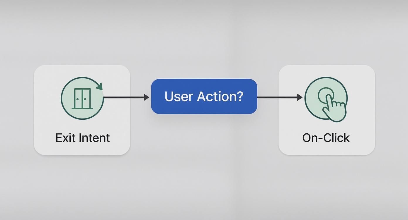
As you can see, your trigger strategy should directly map to specific user behaviors, whether they're passive (like leaving) or active (like clicking).
Bringing Triggers to Life: Practical Scenarios
Theory is one thing, but let's get practical. Say you run a WooCommerce store. A visitor adds a product to their cart but then gets cold feet and moves to exit the checkout page. Bam! An exit-intent trigger can fire a lightbox offering free shipping to seal the deal. That small nudge can make all the difference.
Or, imagine you're a service-based business with a "Request a Quote" button. Instead of jarring users by sending them to a whole new page, an on-click trigger can open a clean, simple contact form right there in a pop up lightbox. It keeps the user on the page, reduces friction, and makes the whole process feel seamless.
The goal is to make your pop up lightbox feel like a natural part of the conversation you're having with the visitor. The trigger is what kicks off that conversation at just the right moment.
For a much deeper dive into getting your timing perfect, you should check out our complete guide on Divi time-based popup triggers.
Choosing the right trigger can feel overwhelming, but it really comes down to what you're trying to achieve. This table breaks down common goals and the best triggers to get you there.
Choosing the Right Trigger for Your Goal
| Trigger Type | Best For | Common Mistake to Avoid |
|---|---|---|
| On-Click | Gated content, login forms, video lightboxes, contact forms. | Hiding crucial information behind a click. The main content should still be accessible. |
| Exit-Intent | Reducing cart abandonment, last-chance offers, lead magnet downloads. | Being too aggressive with the offer or triggering it on every single page. |
| Scroll Depth | Newsletter sign-ups on blog posts, related content offers. | Setting the scroll percentage too low (e.g., 20%). The user isn't engaged yet. |
| Time Delay | Gently prompting newsletter sign-ups or offering help via a chat widget. | Setting the timer too short. A 3-second pop-up is just as bad as an instant one. |
Ultimately, picking the right trigger transforms your pop up lightbox from a potential nuisance into a powerful, conversion-focused tool that actually improves the user experience.
Polishing Your Lightbox with Custom Styles and Animations
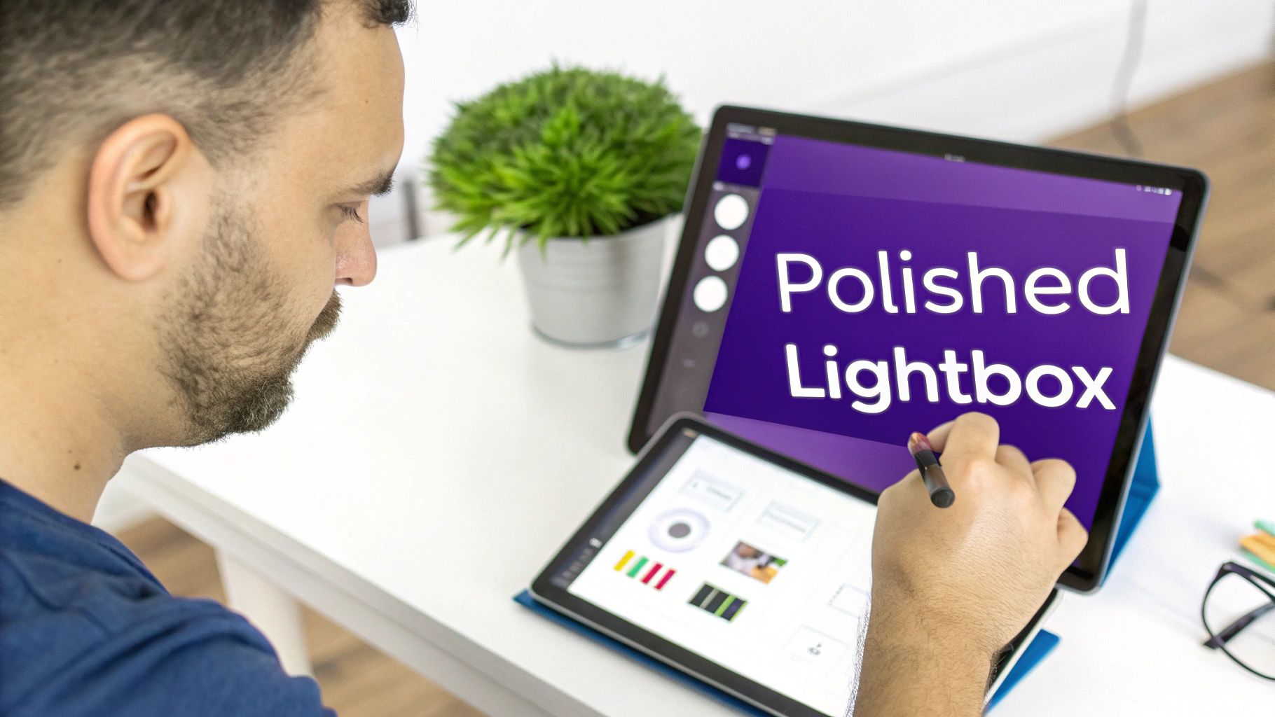
A functional pop-up is a good start, but a beautifully designed one is what truly converts. Now that the core mechanics are in place, we can shift our focus to the finishing touches—those small details that elevate your lightbox from a simple container to a polished element that feels like a natural part of your site.
This is all about refining the user experience. You've already built the layout and set the triggers; now, we'll make it seamless. We'll dive into the styling options in the Popups for Divi plugin, covering everything from the background overlay and close button to the animations that bring it all to life.
Mastering the Background Overlay
The background overlay is one of the most critical yet overlooked parts of a lightbox. Its job is to gently push the main website content into the background, focusing the user's eye on your message without completely obscuring the page they were just on.
You'll find all the controls you need in the Popup > Design tab for your specific popup. Here are the key adjustments I always make:
- Overlay Color: A semi-transparent black is classic, but don't be afraid to pull a color from your brand palette. A dark, desaturated version of your primary brand color can look incredibly sharp.
- Opacity: This is a delicate balance. I've found an opacity between 60% and 80% hits the sweet spot. It's dark enough to create focus but transparent enough that users don't feel like they've left the page entirely.
A well-styled overlay enhances the feeling of a premium, integrated experience. It tells the user, "Pay attention to this," in a way that’s firm but not jarring.
Crafting a Custom Close Button
Never, ever underestimate the importance of the close button. If it’s hard to find or doesn't match your site's style, you can create instant frustration. The goal is to give users who aren't interested a clear, effortless way out.
Head into the Popup > Close Button settings, where you can completely redesign the standard "X". Think about changing the icon, tweaking its size and color, or even adding a circular background to make it stand out. A custom close button is a subtle but powerful signal that you’ve considered every detail of the user experience.
This focus on aesthetics is a huge trend. In fact, the related thin lightbox market was valued at USD 318 million, driven by demand for sleek designs that blend seamlessly into modern websites. Discover more insights about these design trends from Intel Market Research.
Adding Smooth Entry and Exit Animations
Finally, let's make your lightbox appear and disappear with grace. An abrupt pop-up can startle users, but a subtle animation makes the transition feel smooth and intentional.
Under Popup > Animations, you can set separate entry and exit effects. While flashy options like "Bounce" might seem fun, they often come across as unprofessional. For a truly polished look, I recommend sticking to simple, clean animations:
- Fade In / Fade Out: A timeless and elegant choice that just works.
- Slide In Up / Slide Out Down: Adds a bit of dynamic movement without being distracting.
By pairing a subtle fade on the overlay with a gentle slide-in for the content, you create a cohesive, professional-looking pop up lightbox that enhances, rather than disrupts, the user’s journey on your site.
Still Have Questions About Divi Pop Up Lightboxes?
Even with the best tools in your toolbox, a few questions are bound to come up when you're building pop up lightboxes. Let's tackle some of the most common hurdles I see people run into during the design and setup process. Getting these details right is what separates a pop up that converts from one that just annoys.
We'll dig into how you can use these popups in an e-commerce setting, bust some myths about performance, and make sure your creations are accessible and mobile-friendly for every single visitor.
Can I Use a Pop Up Lightbox on a WooCommerce Site?
Absolutely. In fact, you'd be crazy not to. Using a pop up lightbox on a WooCommerce site is one of the most effective ways to boost sales and smooth out the shopping experience. This isn't just about collecting emails; it's a versatile sales and support tool.
Imagine a customer is about to abandon their cart. With an exit-intent trigger, you can flash a lightbox offering a last-minute 10% discount or free shipping. I’ve seen this simple, timely nudge turn a lost sale into a completed order more times than I can count.
Another fantastic use case is for quick-view information. Instead of forcing a user to navigate to a whole new page just to see a size chart, you can set one up with an on-click trigger. They click a "View Size Chart" button, and boom—the chart appears instantly in a clean lightbox. This keeps them right there on the product page, one step closer to hitting "Add to Cart."
Will Adding a Lightbox Slow Down My Website?
This is probably the number one concern I hear, but the short answer is no—not if you build it the right way. High-quality plugins, like the ones we build at Divimode, are engineered with performance as a top priority. The content, scripts, and styles for your lightbox are typically only loaded when the popup is actually triggered, not during the initial page load.
The key to a fast-loading pop up lightbox is just good web hygiene. Performance issues usually come from the content you put inside the popup, not the popup mechanism itself.
To keep your site zippy, stick to these best practices:
- Compress Your Images: Before you even think about uploading an image to your lightbox, run it through an optimization tool like TinyPNG. It makes a huge difference.
- Avoid Heavy Content: Think twice before embedding a high-resolution video or a complicated third-party script directly into your popup. Keep it lean.
- Use Smart Targeting Rules: Make sure the lightbox only loads on the specific pages where it's actually needed. There's zero reason for a checkout offer to load on your "About Us" page.
How Do I Make My Pop Up Lightbox Responsive and Accessible?
Making your lightbox work perfectly for everyone, on every device, is completely non-negotiable. A popup that breaks on mobile or is a nightmare for people using screen readers is worse than having no popup at all.
First off, always use Divi’s built-in responsive editing modes (desktop, tablet, and mobile) to sanity-check your layout. Are the buttons and form fields large enough to be easily tapped with a thumb? Don’t guess—test it. Our Popups for Divi plugin also handles crucial accessibility features right out of the box, like letting users close the lightbox simply by pressing the Escape key.
Always, always ensure your close button is painfully obvious and has a generous click area. For accessibility, it's also critical to include descriptive alt text for any images you use inside the pop up lightbox. This simple step allows screen readers to describe the image to visually impaired users, making your site a more inclusive place.
Ready to build popups that actually convert without trashing your design or performance? Divimode provides the powerful plugins and expert guidance you need to create truly advanced interactive elements in Divi. Start building smarter popups today.
More Articles You Will Like