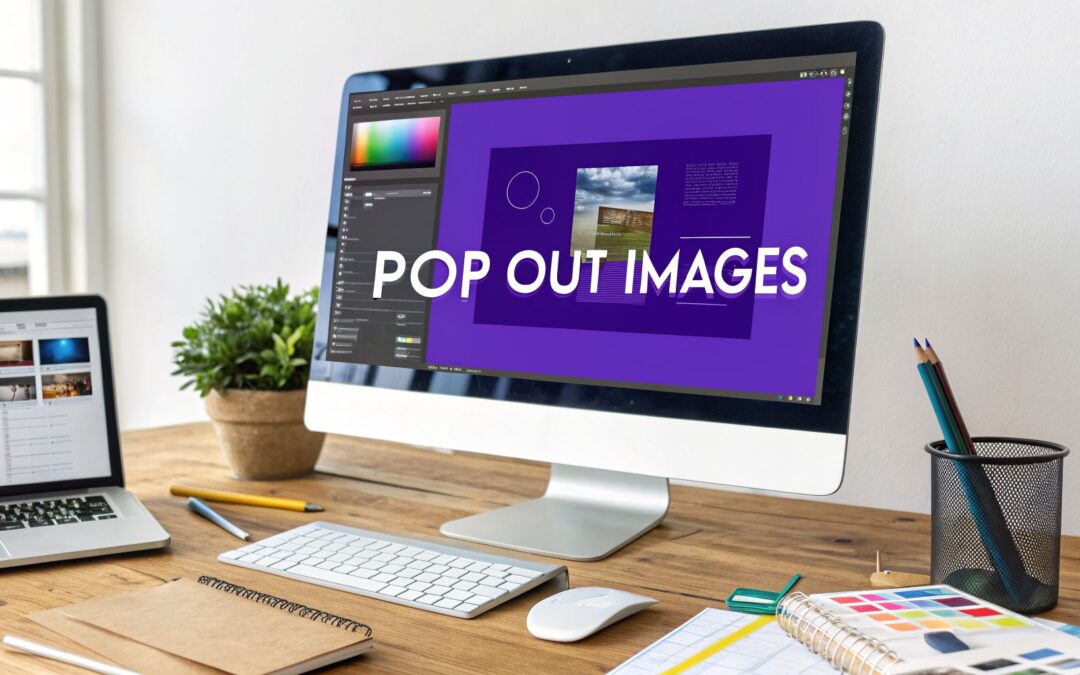
When we talk about a "pop out" image, we're really talking about two different things. It could be a purely stylistic 3D effect where part of the picture breaks out of its frame, or it could be an interactive popup that appears when a user clicks on something.
This guide will show you how to pull off both.
Why Pop Out Images Elevate Your Divi Website

In a digital world overflowing with content, grabbing someone's attention is half the battle. Standard, flat layouts often lead to visitors skimming right past your most important information. This is where pop out images can give you a real edge, turning a static page into something far more dynamic and engaging.
These aren't just cool design tricks; they serve a very practical purpose. By adding a layer of depth or interactivity, you're able to steer the user's focus exactly where you want it. This visual hierarchy helps visitors absorb information more easily and encourages them to stick around and explore.
Strategic Uses for Pop Out Images
These effects are incredibly flexible and can be used to hit specific goals on your site. I've seen them used to great effect in a few common scenarios:
- Highlighting Key Product Features: An e-commerce site could use a pop out effect on a product photo to reveal detailed specs or a video demo when clicked.
- Showcasing Portfolio Pieces: A designer’s portfolio can feature images that subtly break their grid boundaries, immediately drawing a visitor's eye to their best work.
- Creating Immersive Blog Posts: An image inside an article could pop out into a full-screen gallery, telling a richer visual story without making the user navigate away.
The Divi Advantage
Divi's famous flexibility makes it the perfect playground for creating these effects. Since it first launched back in 2013, Divi has become a go-to for countless WordPress users. As of October 2023, it was powering over 2.3 million active websites.
Its powerful framework supports everything from simple CSS tweaks to sophisticated plugin integrations, giving you multiple ways to achieve the perfect pop out. You can find out more about Divi's market adoption and see how it stacks up against other builders.
By creating a more memorable visual journey, pop out images help solidify your brand identity. They signal a commitment to quality and detail, leaving a lasting impression that goes beyond the text on the page.
Building Interactive Popups with Divi Areas Pro
When you want to go beyond a static design and create pop out images that actually react to what your visitors do, a dedicated plugin is your best friend. For those of us in the Divi world, Divi Areas Pro offers a really robust way to build sophisticated, interactive popups right inside the Divi Builder we already know.
This approach isn't just about making an image appear on the screen. It's about crafting an entire experience. You get to design everything inside the popup—the image, sure, but also any accompanying text, buttons, and even contact forms—using the same Divi modules you use every day. That means you keep total creative control over how your pop out images look and feel.
Crafting Your First Divi Area
The central idea in Divi Areas Pro is the "Area." An Area is basically a self-contained piece of Divi content that you can show anywhere on your site, kicked off by a trigger that you set. Think of it as a mini-page built specifically to be a popup, a fly-in, or even a hover effect.
Here’s how a typical workflow for an image popup looks:
- Create a New Area: You'll kick things off by making a new Divi Area from the WordPress dashboard. Give it a clear name you'll remember, like "Portfolio Project Popup."
- Design with the Divi Builder: This is where the fun begins. You launch the Divi Builder and design the popup's content just like you would any other page or section. You could add an Image module, a Text module for a description, and a Button module that links off to a full case study.
- Configure the Area Settings: In the settings panel, you tell the Area how to act. You can set it as a modal popup, pick its size, and choose a slick entrance animation to make it pop.
This process gives you the power to build some really specific pop out images. For instance, you could create a "Meet the Team" page where clicking on a staff member's photo triggers a popup with their bio and social media links. It's a fantastic way to add depth without cluttering up the main page.
The real strength here is the versatility. You're not stuck with just a single image. You can build out a complete, multi-column layout with rich content that appears on command, turning a simple click into a genuinely meaningful interaction.
Real-World Application and Scenarios
To really see what this can do, let's walk through a practical example. Imagine you have an e-commerce store built with Divi. You could set up a pop out image for a featured product that triggers on exit-intent. Just as a user is about to leave the page, a professionally designed popup slides into view with a big product image, a hook like "Wait! Get 15% Off Your First Order," and a direct "Add to Cart" button.
This is worlds more effective than a generic text-only popup. The visual punch of the pop out image grabs attention immediately, and the built-in call-to-action can directly boost sales. Our guide on how to display content with Divi Areas Pro digs into more detailed techniques for these kinds of setups.
The screenshot below gives you a peek at the intuitive Divi Areas Pro interface where you’ll set up the specific behavior for your popup.
As you can see, the settings let you fine-tune everything from triggers and closing behavior to display rules, all from one organized panel.
This is the level of control that makes a premium plugin a worthwhile investment. The popup market for WordPress is crowded, and tools like Divi Areas Pro stand out by offering a truly comprehensive feature set. Its pricing reflects its capabilities, with feature richness ratings often hitting 8 out of 10 for its support of popups, fly-ins, and other interactive elements. You can discover more insights about Divi popup plugins to see how different tools stack up. At the end of the day, a tool like this lets you create pop out images that serve a real strategic purpose—driving engagement and conversions.
Choosing the Right Trigger for Maximum Impact
You can design the most beautiful pop out image in the world, but if it shows up at the wrong time, it's just an annoyance. The real magic happens when you nail the timing. A poorly timed popup gets closed without a second thought, but one that appears at the perfect moment can feel genuinely helpful.
This is where you move from just making popups to strategizing them. It’s about turning a potential interruption into a welcome interaction, and a tool like Divi Areas Pro gives you the control to do just that. It's less about startling visitors and more about responding to their behavior.
Matching Triggers to User Intent
Think about the signals a visitor sends while browsing your site. Every click, scroll, and mouse movement is a clue about what they're looking for. By matching your trigger to their intent, you can make your pop out image feel like a natural part of their journey.
Here are a few of the most common scenarios I run into:
- On Click: This is the gold standard for user-initiated interaction. It puts the visitor firmly in the driver's seat. It's perfect for things like portfolio galleries, where someone actively clicks a thumbnail because they want to see a larger version and get more details. No surprises, just a direct response to their action.
- Exit Intent: This one is your last-ditch effort to grab their attention. When a visitor's cursor darts towards the browser's back button or address bar, it's a clear signal they're about to leave. This is your moment to present a high-value offer—maybe a pop out image advertising a 20% discount or a free guide.
- Scroll Depth: If someone scrolls 70% of the way down a long blog post, they're clearly engaged. This is a fantastic time to trigger a popup with a related offer. You could use a pop out image to link to another relevant article or present a sign-up form for a topic-specific newsletter.
This little flowchart can help you decide what kind of popup to build based on whether your main goal is to simply inform or to drive a specific action.

As the chart shows, informational popups work great for things like image lightboxes or embedded videos. On the other hand, if you're chasing leads or sales, an action-oriented popup is the way to go.
Trigger Selection Guide for Pop Out Images
To help you decide, here’s a quick rundown of common triggers in Divi Areas Pro and where they shine. Picking the right one can make all the difference in whether your pop out image helps or hurts your conversion goals.
| Trigger Type | Best Use Case | Conversion Goal |
|---|---|---|
| On Click | Image galleries, product quick views, "Read More" buttons. | Engagement, Information |
| Exit Intent | Last-chance offers, discount codes, email sign-ups. | Lead Capture, Sales |
| Scroll Depth | Related content suggestions, newsletter forms on blog posts. | Engagement, Lead Capture |
| Timed Delay | Welcome messages, general announcements after a few seconds. | Information, Onboarding |
| Hover | Tooltips, mega menus, quick info for product images. | Engagement, UX Improvement |
Each trigger serves a different psychological purpose. A timed delay gives a visitor a moment to settle in, while an exit-intent trigger creates a sense of urgency. Test them out to see what resonates best with your audience.
Advanced Targeting for Personalized Experiences
Triggers are about when a popup appears, but advanced targeting is about who sees it. This is where you can really dial in the relevance of your pop out images and make them incredibly effective.
Don't show the same message to everyone. A first-time visitor has different needs than a logged-in member. Tailoring your popups to the audience segment makes them exponentially more effective.
For instance, you could configure a "Welcome" popup with an introductory video that only displays for first-time visitors. For a returning customer, you might show a pop out image featuring a new product related to their past purchases.
These small, personalized touches are what separate a generic website from a truly engaging one. If you're interested in the nuts and bolts of setting these up, our guide on Divi popup triggers digs much deeper into the click and hover options specifically. By combining smart triggers with precise targeting, your popups will start adding real value instead of just getting in the way.
Crafting 3D Pop Out Images with Custom CSS
Plugins are fantastic for creating complex, interactive popups, but sometimes you don't need all that firepower. If you're just after a slick visual effect without the extra overhead, you can create some seriously cool 3D pop out images with a little bit of custom CSS.
This technique makes your subject look like it's breaking free from its container, adding an instant hit of depth and dynamism to the page. It’s a perfect touch for hero sections, portfolio grids, or anywhere you want an image to grab a little more attention. Best of all, you can drop the code snippets right into the Divi Builder—either in a specific module’s Advanced > Custom CSS tab or site-wide in Divi > Theme Options.

The CSS Properties that Power the Effect
Creating this "out-of-bounds" look isn't about complex code; it's about understanding how a few key CSS properties work together. Honestly, for anyone new to CSS, this is a great practical lesson.
The magic comes down to three main players:
transform: translate(): This is the property doing all the heavy lifting. It physically moves the image on the page without messing up the layout around it. We'll use it to shift the image up and to the side just enough to make it overlap its container.box-shadow: You can't have a 3D illusion without a good shadow. A subtle, diffused shadow under the shifted image is what really sells the effect, creating the perception of depth that makes the image look like it's floating above the page.transition: This is what makes the effect feel polished. It ensures that when a user hovers over the container, the image glides smoothly into its "popped out" position instead of just snapping into place.
If you're curious about the bigger picture of digital visuals, checking out resources on computer generated imaging can give you some cool background on how these kinds of effects are conceptualized.
A Practical Code Example for Divi
Alright, let's put this into practice. Let's say you have a standard Divi Section with a single Column, and inside that Column is your Image module. To get the image to pop out when someone hovers over it, the first thing you need to do is give the parent Column a unique CSS Class. Let's call it pop-out-container.
With that class in place, you can add the following CSS to your site:
.pop-out-container {
overflow: visible !important; /* This lets the image break free */
}
.pop-out-container .et_pb_image_wrap {
transition: all 0.3s ease-in-out;
}
.pop-out-container:hover .et_pb_image_wrap {
transform: translate(-20px, -20px);
box-shadow: 25px 25px 40px rgba(0,0,0,0.2);
}
Pro Tip: You'll notice the
!importantrule on theoverflowproperty. This is sometimes necessary in Divi to override its default styles, which can otherwise keep your image clipped inside the container. Use it when you need it, but be mindful of overusing it elsewhere.
Ensuring Responsive Behavior
An effect that looks awesome on a desktop can quickly become a mess on a phone. Shifting an image by 20 pixels on a small screen might push it off the edge or just create weird, awkward spacing.
This is where media queries save the day.
To make sure this 3D effect only applies when there’s enough screen real estate to look good, we can wrap our hover styles in a media query that targets larger screens. For more ideas on adapting effects for different screen sizes, our guide on creating an image effect on mouseover has some great tips.
Here’s how you’d tweak the code:
@media (min-width: 981px) {
.pop-out-container:hover .et_pb_image_wrap {
transform: translate(-20px, -20px);
box-shadow: 25px 25px 40px rgba(0,0,0,0.2);
}
}
By adding this simple media query, the pop out animation will only fire on screens wider than 980 pixels (think desktops and larger tablets). On smaller devices, users will just see the standard, un-animated image. It's a small change that keeps the user experience clean and functional for everyone, no matter the device.
Keeping Your Pop Out Images Fast and Accessible

It’s easy to get carried away creating stunning pop out images, but we have to be careful they don't become a performance bottleneck. A slow website is a surefire way to frustrate visitors and take a hit in search rankings. The trick is balancing that eye-catching design with raw speed, and the good news is, you don't have to sacrifice one for the other.
The root of most speed problems with popups is the image file itself. Large, uncompressed images are the usual suspects. Before you even upload anything to Divi, your first job is to optimize those images for the web.
This is all about finding that sweet spot between file size and visual quality. Modern formats like WebP are a game-changer here, often delivering 25-35% smaller file sizes than JPEGs with no visible drop in quality. It's a simple first step, but it makes a huge difference in how quickly your popups load.
Lightweight Plugins and Clean Code
The tools you use to build your pop out effects are just as important as the images. A well-coded plugin like Divi Areas Pro is built with performance as a priority. It loads its assets efficiently and only runs its code when a popup is actually triggered, which keeps your initial page load time lean.
Divi itself already has a solid performance baseline. Independent tests have shown a standard Divi site can hit a mobile Lighthouse score of 84/100 and load in around 2.6 seconds. With some smart optimization, that can drop to just 1.29 seconds. Plugins designed specifically for Divi, like Divi Areas Pro, work within this ecosystem. They use smart techniques like localStorage to remember when a visitor has closed a popup, so it doesn't needlessly load again for them. You can read more about Divi’s performance capabilities to get the full story.
Making Popups Work for Everyone
Performance isn't just about speed—it's also about accessibility. If a screen reader can't understand your popup, you've just put up a wall for a segment of your audience. Making your interactive elements accessible is absolutely crucial for an inclusive user experience.
Accessibility isn't an optional feature; it's a core component of good design. An amazing visual effect is worthless if it creates a barrier for users with disabilities.
To get your popups in shape for accessibility, you need to focus on a few key areas:
- Keyboard Navigation: Can a user get to everything interactive inside your popup (like close buttons or form fields) using only the Tab and Enter keys? They should be able to.
- ARIA Attributes: These are little HTML helpers that give screen readers context. Using attributes like
role="dialog"tells assistive tech what the element is and how to handle it. - Focus Management: This is a big one. When a popup opens, the keyboard focus should jump directly inside it. And when it closes, focus must return to whatever element triggered it. This creates a logical flow for anyone not using a mouse.
Thankfully, a quality plugin will handle most of this heavy lifting for you. Still, it's always a good idea to double-check that your popups are easy for everyone to use.
Got Questions About Divi Pop Out Images?
Whenever you're trying out a new design technique, a few questions are bound to pop up. Let's tackle some of the most common ones I hear about pop out images in Divi, from performance to specific use cases, so you can build with total confidence.
Can I Use These on WooCommerce Product Pages?
You absolutely can, and you absolutely should. This is probably one of the most powerful ways to use interactive pop out images. A tool like Divi Areas Pro is a game-changer here, letting you create unique popups for individual products to show things like:
- A full image gallery that appears when a customer clicks the main product photo.
- Detailed sizing charts or material specifications.
- Special "add to cart" offers that trigger on exit-intent to stop cart abandonment in its tracks.
Suddenly, a static product page becomes an interactive catalog, giving shoppers the exact info they need, right when they need it. It’s a fantastic way to boost engagement and conversions.
Will Pop Out Image Effects Slow Down My Site?
Not if you do it right. The performance hit from a pure CSS effect is practically zero—we're talking about a few lines of incredibly lightweight code.
If you're going the plugin route, performance really comes down to the quality of the tool you choose. A well-built plugin will only load its scripts when they’re actually needed. The single biggest factor, though? Image optimization. Always, always compress your images and use modern formats like WebP. This ensures your popups load instantly without dragging down your page speed.
It's a common myth that all popups are performance hogs. The truth is, a popup with a 50 KB optimized image will load faster than a standard page element with a 2 MB uncompressed photo. Optimization is everything.
How Do I Make Pop Out Images Mobile-Friendly?
Making sure your designs work on mobile isn't just a good idea—it's non-negotiable.
If you're using the custom CSS method, you’ll need to use media queries. This lets you adjust the effect, or even disable it entirely, on smaller screens to prevent any awkward layout shifts. No one wants an image popping out and breaking the whole page on their phone.
Plugins like Divi Areas Pro, on the other hand, handle this natively. You can use the standard Divi responsive controls right inside the "Area" editor to fine-tune every last detail for tablet and mobile. It ensures your pop out images deliver a perfect, polished experience on any device.
Ready to create stunning, high-converting popups without all the guesswork? Divimode gives you the tools and expert guidance you need. Explore Divi Areas Pro today and see just how easy it is to build interactive experiences that truly captivate your audience.
More Articles You Will Like


