 Alex Martin
Let's be honest, a mega menu in WordPress is more than just a fancy dropdown. It's a full-blown navigation overhaul designed to bring order to complex websites. Unlike those classic, single-column menus that make you feel like you're endlessly tunneling through links, a mega menu lays it all out in a clean, multi-column format. It can even incorporate icons, images, and other rich content to help guide your visitors.
This is a game-changer for big e-commerce stores, sprawling blogs, or any site with a lot of pages. The whole point is to show people their options at a glance, cut down on clicks, and get them where they need to go, fast.
Why Your Site Needs a WordPress Mega Menu
If your website's navigation feels like a cluttered maze, you're not just frustrating users—you're probably losing them. Traditional dropdown menus just don't scale well. They force people into a game of hide-and-seek with your most valuable content, and that’s a game you can't afford to play.
This is where a WordPress mega menu completely changes the dynamic.
Think about a big online store. A simple dropdown for "Men's Clothing" might cascade into more dropdowns for "Shirts," then "T-Shirts," then "V-Necks." It's clunky. A mega menu, on the other hand, puts all those options on display at once in a clear, organized panel. You can even spice it up with visuals, like a banner for "New Arrivals" or a graphic highlighting the "Clearance" section. This isn't just about looks; it's a strategic move to slash user friction and guide them straight to a purchase.
Beyond Aesthetics: The User Experience Upgrade
A well-executed mega menu in WordPress is like a visual sitemap. It gives users an immediate, bird's-eye view of everything your site has to offer. That kind of clarity is gold for engagement. Instead of digging through layer after layer of links, visitors can instantly see the full breadth of your products or content.
This structured approach has a real, measurable impact. With WordPress now powering over 42.8% of all websites, the demand for better navigation has skyrocketed. It's no surprise that around 43% of sites are turning to mega menus to handle their complexity. The data backs it up, too—these menus can reduce the clicks needed to find content by 25-30% on larger sites. That’s a huge win, especially when 61% of views are on mobile.
A great mega menu doesn't just show users where to go; it anticipates their needs and presents a clear, organized path. It transforms navigation from a chore into an intuitive, helpful experience that builds user confidence and encourages exploration.
The Hidden SEO Advantage
The perks of a mega menu go way beyond the user interface. From an SEO perspective, it's a powerhouse for improving your site's structure. By laying out a clear hierarchy of your most important links right in the main navigation, you're building a rock-solid internal linking framework.
This framework is a clear signal to search engines like Google, helping them understand the relationships between your pages and identify your core content. Every link in that menu passes authority, telling crawlers which pages are foundational to your site. This is a core part of building effective information architecture and site navigation.
Ultimately, a clean structure helps search engines index your site more efficiently and can lead to better rankings for your key pages. You're not just helping your users—you're handing Google a roadmap to your website, and that's an undeniable competitive edge.
Building Your First Mega Menu with Divi Areas Pro
Alright, enough with the theory. Let's get our hands dirty and actually build something. This is where you'll see just how simple creating a powerful mega menu in WordPress can be, especially when you're working inside the Divi ecosystem. We're not going to follow a rigid, numbered list. Instead, we'll walk through a more natural workflow using Divi Areas Pro.
For this guide, I'm assuming you already have the Divi theme (or the Divi Builder plugin) and Divi Areas Pro installed and activated. The real beauty here is that you'll be using the exact same Divi Builder you're already familiar with. No clunky new interfaces to learn—just pure Divi.
Creating Your First Navigational Area
The whole system behind Divi Areas Pro revolves around the concept of an "Area." Think of it as a standalone piece of content you design with the Divi Builder, which can then be displayed anywhere you want. For our purposes, we're creating an Area that will act as our mega menu.
First, head over to Divi Areas > Add New in your WordPress dashboard. You'll want to give your new Area a clear, descriptive title, like "Main Navigation Mega Menu" or "Apparel Store Menu." Don't worry, this title is just for you; it won't show up on the live site.
Once you’ve named it, you’ll see that familiar purple button: "Use The Divi Builder." Go ahead and click it. This launches the builder just like it would for any page or post, which is exactly what makes this tool so intuitive for Divi users.
Structuring the Menu Layout
Now for the fun part: building the actual menu structure. Let's imagine we're building a site for an online apparel store. The goal is to create a dropdown for the "Shop" link that not only lists categories but also shows off new arrivals and a current sale.
Start by adding a new section and a row. A three or four-column row is usually a perfect starting point for that classic mega menu look. Each column will serve a different purpose.
- Column 1: Men's Apparel: This is where we'll list links for all men's clothing categories.
- Column 2: Women's Apparel: Same idea, but for all the women's clothing links.
- Column 3: New Arrivals & Sale: We'll make this column more visual with an image and a bold call-to-action.
You can populate these columns using the Divi modules you already know. For the first two columns, a simple Text module with a bulleted list of links does the job perfectly. In the third column, you can drop in an Image module to feature a new product and a Call To Action module to promote your sale.
Here's a quick look at how clean the Divi Builder interface looks when you're putting this together.
As you can see, it’s just standard Divi rows and columns. This gives you total creative freedom over the design and what goes inside.
Adding Dynamic and Visual Content
This is where your menu really starts to shine. Let's push beyond boring text links. In that "New Arrivals" column, instead of just another link, use a Divi Image module. You can link that image directly to your "New" category page, giving your visitors a much more engaging visual cue to click.
Right below that image, maybe add a Blurb module with a catchy headline like "Fresh Styles Just Dropped." The ability to mix and match modules like this is what turns your navigation from a simple list into an interactive, visual experience.
The key takeaway is this: anything you can build on a Divi page, you can put inside your mega menu. We're talking sliders, videos, contact forms, even full WooCommerce product grids. This kind of flexibility is what separates a Divi-native solution from most generic menu plugins.
For our apparel store example, let's make that "Sale" promo pop. Use a Call To Action module with a bright, eye-catching background color. Set the title to "Save 30% on Fall Styles" and link the button straight to your sale category. Suddenly, your navigation is an active marketing tool, not just a map of your site. You can get a deeper look at the advanced features that make this possible by exploring an overview of Divi Areas Pro.
Connecting the Area to Your Main Menu
Once you're happy with how your Area looks, go ahead and hit "Publish." The last piece of the puzzle is telling WordPress to show this Area when someone interacts with a specific menu item.
Head to Appearance > Menus in your dashboard. Find the menu item that should trigger your new mega menu—in our case, the main "Shop" link. Click the small arrow on the right to expand its options.
You'll spot a new button added by Divi Areas Pro, usually labeled "Enable Divi Area." Clicking this reveals a dropdown menu with all the Areas you've created. Just select the "Apparel Store Menu" you designed.
From there, you'll also see a few extra settings. You can configure the trigger (hover or click), tweak the menu's position, and even set a slick animation style. For most desktop menus, triggering on hover is the standard, as it gives users instant feedback. Save your menu, and that’s it.
Now, go check out the front end of your site and hover over the "Shop" link. Your beautifully designed, multi-column mega menu—built entirely with the Divi Builder—will spring into view. You've just created a custom mega menu for WordPress without touching a single line of code, all by using the tools you already master.
Using Advanced Triggers and Display Rules
Building a beautiful mega menu is one thing, but making it smart is what really makes your website stand out. A great mega menu in WordPress shouldn't be a static block of links. It needs to be dynamic, responding to who the user is, where they are on your site, and what they're doing. This is where Divi Areas Pro elevates simple design into an intelligent user experience.
The brain behind this intelligence comes down to two key ideas: triggers and display rules. Triggers determine how the menu appears, while display rules dictate when and to whom it appears. Getting these settings right is the difference between a pretty menu and a conversion-focused navigation system.
Choosing Between Hover and Click Triggers
One of the first decisions you'll make is whether your menu should activate on hover or on click. It sounds like a tiny detail, but it has a massive impact on user experience and, just as importantly, accessibility.
For a classic desktop experience, hover is often the go-to. It’s quick, effortless for the user, and gives immediate visual feedback as they explore the navigation.
But don't discount the click trigger. It's a much more deliberate action, which means you'll avoid those annoying accidental pop-ups as a user's mouse zips across the page. Even more critically, click is the only reliable trigger on touch devices, making it essential for mobile. I find a hybrid approach often works best: use hover on desktop but have it automatically switch to a click/tap trigger on mobile devices.
This flowchart gives you a nice visual breakdown of the whole process, from creating a new Area to getting it live.
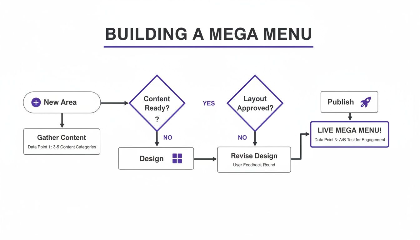
As you can see, the workflow is pretty straightforward: you kick things off by creating a new Area, jump into the Divi Builder to design the layout, and then publish it with the right triggers and rules.
Unlocking Power with Display Rules
This is where the real magic happens. Instead of showing the same menu to every single visitor on every single page, you can create hyper-targeted experiences. This level of control turns your navigation into a seriously powerful marketing and personalization tool.
Here are a few real-world scenarios where I've seen display rules make a huge difference:
- E-commerce Promotions: Let's say you're running a flash sale. You can design a special mega menu with a bold banner advertising the sale and set it to display only on your WooCommerce product and category pages. When the sale ends, you just flip a switch to disable the rule. Easy.
- Member-Specific Content: On a membership site, you could create a unique menu with links to exclusive downloads or account pages. The rule? Show this menu only to logged-in users who have the "Premium Member" role.
- Device-Specific Menus: That complex, four-column mega menu that looks incredible on a desktop? It’s a total train wreck on a phone. With display rules, you can design a completely separate, simplified accordion-style menu Area and set it to appear only on mobile devices.
These granular controls are all about delivering the right information to the right person at the right time, right from your main navigation.
By combining creative design with logical display rules, your mega menu transforms from a simple navigation element into an intelligent, context-aware component of your website's marketing funnel. It anticipates user needs and presents the most relevant options without them having to ask.
Beyond Navigation with Advanced Triggers
While hover and click are the bread and butter for any mega menu in WordPress, Divi Areas Pro has a few more tricks up its sleeve that can turn your menu into a lead-gen machine. A perfect example is the exit-intent trigger.
Picture this: a user is about to leave your site from a product page. Just as their cursor heads for the close button, a special "menu" area pops up. But this one doesn't have navigation links—it has a last-chance offer: "Leaving so soon? Here's a 10% discount code!"
It’s an unconventional use of the tech, but it can be incredibly effective. For more ideas on how to use these, you can learn more about how to trigger an Area based on different user actions. If you think outside the box, your navigation system can actively work to keep visitors on your site and drive more conversions.
Optimizing for Speed and Accessibility

A flashy mega menu is great, but it's only half the story. If it drags down your site speed or locks out users with disabilities, it's doing more harm than good. When building your mega menu for WordPress, you have to be relentless about performance and accessibility right from the get-go.
These two pillars aren't just best practices; they're non-negotiable. A slow menu torpedoes your Core Web Vitals, hurting your SEO and sending visitors packing before they even see what you offer. An inaccessible menu is just as bad, shutting out a huge chunk of your audience and even opening you up to legal trouble.
Keeping Your Mega Menu Fast
Performance comes down to what you decide to pack into your menu. Every single image, icon, or dynamic widget adds a little more weight and complexity.
Unoptimized images are probably the biggest speed killer I see. If you're using a background image or a few product thumbnails, make sure they're compressed and saved in a modern format like WebP. A single, heavy PNG can add megabytes to your page load. It’s wild, but it happens.
Also, resist the urge to build an overly complex layout with dozens of modules. Divi gives you the freedom to build a digital masterpiece, but a leaner, simpler structure will always be faster.
- Lazy Load Content: Ask yourself if every single image in the menu needs to load instantly. For menus packed with visuals, lazy loading can be a game-changer for your initial page speed.
- Limit Dynamic Content: WooCommerce modules that have to look up products in real-time can add a bit of server strain. Use them where they count, not everywhere.
- Keep It Simple: Honestly, a clean, well-organized text menu with just a few key images is often more effective—and way faster—than one loaded up with sliders and videos.
Of course, your mega menu is just one part of the bigger performance picture. To see how it fits into your overall strategy, you can get some great tactics to boost site speed. For a deep dive into our favorite theme, check out our guide on how to speed up your Divi website.
Ensuring Your Menu is Accessible to Everyone
Accessibility isn't a checkbox you tick at the end; it's fundamental to building a professional, inclusive website. An accessible mega menu means that someone using a screen reader or just a keyboard can navigate your site as smoothly as anyone else.
The first test is dead simple: can you get through your entire menu using only the Tab key? Every link needs to be reachable in a logical sequence, and you should always see a clear visual focus state (like an outline) telling you exactly where you are.
An accessible menu is a well-structured menu. Clear headings, logical link grouping, and proper HTML semantics don't just help screen readers—they create a better, more predictable experience for every user.
Mega menus have become a staple for a reason. With WordPress powering 43% of all websites, good navigation is critical. For sites with over 50 pages, these menus can improve user efficiency by a whopping 25-30% by simply reducing the number of clicks needed to find something. And with 61% of web traffic coming from mobile, a solid menu stops people from bouncing out of sheer frustration.
Another key piece of the puzzle is implementing ARIA (Accessible Rich Internet Applications) roles. These are just little HTML attributes that give extra context to assistive tech. The important ones include aria-expanded to signal if a submenu is open or closed, and aria-haspopup="true" on the main menu item. The good news is that a well-built plugin like Divi Areas Pro handles most of this for you, but it never hurts to double-check your work.
So, How Do Other Mega Menu Plugins Stack Up?
While I’m obviously a big fan of how Divi Areas Pro integrates into the Divi ecosystem, it’s always smart to survey the landscape and see what else is out there for building a mega menu in WordPress. For anyone working with Divi, the decision really boils down to one key question: do you want a native, integrated tool or a standalone solution?
Let's break down what that actually means for your workflow.
The Big Divide: Native Integration vs. Standalone Features
Tools like Divi Areas Pro are built specifically for Divi. This is their superpower. You get to use the same Divi Builder you already know and love to design your mega menus. There’s no clunky new interface to learn, and the odds of running into styling conflicts are practically zero since everything lives inside the same design framework.
On the flip side, you have standalone plugins like WP Mega Menu and Max Mega Menu. These are designed to be theme-agnostic, which is great for versatility but often creates friction for Divi users. You'll find yourself working in a separate, proprietary builder that feels disconnected from the fluid Divi experience. More often than not, you'll end up wrestling with CSS overrides just to get the menu's fonts and colors to perfectly match your site.
The core difference is a philosophical one. A native tool extends the power you already have. Want a contact form, a video, or even a WooCommerce product grid inside your navigation? If you can build it in Divi, you can pop it into a menu. It’s that simple.
Standalone plugins come with their own pre-built widgets and features. For instance, WP Mega Menu boasts a 4.4/5 star rating and often ranks well, while Max Mega Menu is known for its handy tabbed sub-menus. But you're limited to the building blocks they give you, which can feel restrictive compared to the wide-open canvas of the Divi Builder. If you want to see how their features stack up, you can get a better sense of their popularity and offerings.
At the end of the day, it all comes down to your workflow. If your goal is total creative freedom and a seamless building process inside Divi, a native solution is the obvious choice. If you need one specific feature that only a standalone plugin offers and you're comfortable working outside the Divi Builder, then it might be worth a look.
The Verdict for Divi Users
For most designers and developers who live and breathe Divi, the choice is pretty clear. The ability to build a mega menu in WordPress using the familiar, powerful Divi Builder isn't just a convenience—it's a massive time-saver and a creative game-changer. It completely removes the headache of learning a new tool and fighting with style inconsistencies.
Divi Areas Pro keeps your entire design process under one roof. This ensures your navigation feels like a true, organic extension of your site's design, not some bolted-on afterthought. That seamless integration is what preserves the "what you see is what you get" magic of Divi, making it the most logical and efficient path to a sophisticated mega menu on any Divi-powered website.
As you start building out a more sophisticated navigation system, a few questions always seem to surface. Getting these sorted out early will save you a ton of headaches and help you build a much better mega menu in WordPress. Let's run through the most common ones I hear from clients and colleagues.
Are Mega Menus Bad For SEO?
Absolutely not. In fact, it's quite the opposite. When you build one the right way, a mega menu is an SEO powerhouse. It creates a really clear, well-organized hierarchy of internal links that helps search engines understand your site's structure and crawl your most important pages.
This structure is fantastic for spreading link equity from your homepage out to your key category or product pages. The only time this backfires is when people get greedy and stuff their menus with hundreds of irrelevant links, which just creates a mess for users. Stick to logical groupings, and your SEO will thank you for it.
A well-designed mega menu doesn’t just guide users; it provides a clear sitemap for search engines, signaling which content is most valuable. This is a foundational element of a strong internal linking strategy.
How Do I Make My Mega Menu Responsive?
This is a big one. Making a complex desktop menu work on a small screen isn't about shrinking it down—that never works. You need a completely different strategy for mobile.
With a tool like Divi Areas Pro, you can lean on Divi’s built-in responsive controls to create a separate, streamlined experience for mobile users. A really effective approach I use all the time is:
- Hide the desktop version: First, set your big, multi-column mega menu to be hidden on tablets and mobile devices.
- Build a dedicated mobile menu: Then, create a separate "Area" designed specifically for touchscreens. Think a simple, single-column layout with accordion-style toggles.
- Set the right display rules: Finally, configure this new mobile Area to show up only on smaller screens.
This way, mobile visitors get a clean, thumb-friendly navigation experience instead of trying to pinch and zoom through a cluttered desktop layout.
Can I Add WooCommerce Products to My Menu?
You bet, and this is where a mega menu in WordPress really starts to shine, turning from a simple navigation tool into a powerful sales channel. Because Divi Areas Pro lets you use the Divi Builder, you can pop any WooCommerce module you want right into your menu.
Picture this: a user hovers over "Shop," and a grid of your "New Arrivals" or "Best Sellers" instantly appears, complete with images and prices. They don't even have to leave the homepage. You can feature specific products, highlight items on sale, or show off entire categories. It turns your menu into an interactive part of your e-commerce strategy.
What Common Design Mistakes Should I Avoid?
The two biggest traps I see people fall into are visual clutter and poor performance. The whole point of a mega menu is to bring clarity, not to overwhelm someone with a wall of links.
Always use clear headings and plenty of white space to group related items. Fight the urge to link to every single page on your site—be selective. On the performance side, make sure you optimize any images you use in the menu. Heavy graphics are a classic mistake that can seriously slow down your page load, which is bad for both users and SEO. And finally, always test the mobile experience. What looks great on a desktop rarely works perfectly on a phone without some dedicated tweaks.
Ready to build a truly intelligent, high-performing navigation system? With Divimode, you can go beyond basic dropdowns and create a custom mega menu that enhances user experience and drives conversions. Get started with Divi Areas Pro today.
More Articles You Will Like