To really cut down on cart abandonment, you have to get inside your customer's head. The two biggest culprits are almost always surprise costs and a clunky checkout process. If you start by being upfront about shipping fees and offer a simple guest checkout, you’re already tackling the main reasons people bail.
Why Do Shoppers Really Abandon Carts?
Before you can fix a leaky bucket, you need to find the holes. Cart abandonment isn't just a lost sale; it's a goldmine of customer feedback. Every single person who leaves a full cart behind is telling you a story about a friction point in your buying process. Your job is to listen.
Think about it: a potential customer spent their valuable time browsing your store and picking out items they wanted. They were this close to buying. For them to just walk away at the very last step means something went seriously wrong.
This isn't a small problem, either. The global cart abandonment rate is hovering around a staggering 70%. That translates to an estimated $4 trillion in lost sales every single year. The number one reason? Sticker shock at the checkout. Research shows that 48% of shoppers will ditch their cart if they’re hit with unexpected costs like taxes and high shipping fees. You can dig into more of these numbers in these e-commerce statistics on analyzify.com.
The Core Reasons People Leave
When you boil it all down, most cart abandonment issues come down to two things: money and effort. Customers are incredibly sensitive to last-minute price hikes and frustrating experiences.
Imagine you've mentally committed to paying a certain price. Then, you get to the checkout page and see a surprisingly high shipping fee tacked on. It feels like a bait-and-switch, and it instantly breaks that trust. The same goes for forcing someone to create an account or fill out a dozen form fields—it turns an exciting purchase into a chore.
Cart abandonment is your single biggest opportunity for growth. It’s not a failure metric; it’s a roadmap pointing directly to the areas of your business that need the most improvement.
A Practical Framework for Quick Wins
It's easy to get overwhelmed by all the data, so let's focus on what really moves the needle. I’ve put together a quick-glance table that breaks down the most common reasons shoppers leave and gives you an immediate, practical fix for each one. Think of this as your checklist for plugging the biggest leaks in your sales funnel.
Here's a look at the top conversion killers and how you can fight back.
Top Cart Abandonment Reasons and Quick Fixes
| Abandonment Reason | Impact on Shopper | Immediate Solution |
|---|---|---|
| Unexpected Shipping Costs | Creates "sticker shock" and breaks trust. The final price feels deceptive. | Display a shipping calculator on the cart page or use a banner for shipping cost thresholds. |
| Forced Account Creation | Adds friction and raises privacy concerns for new or hesitant buyers. | Always offer a prominent guest checkout option. |
| Long or Complex Checkout | Causes frustration and makes the process feel overwhelming. | Reduce form fields to only the essentials. Use progress bars to show completion steps. |
| Lack of Trust Signals | Raises security concerns, making shoppers hesitant to share payment info. | Prominently display security badges (SSL, Norton), return policies, and customer reviews. |
By addressing these common friction points, you’re not just recovering lost sales—you’re building a smoother, more trustworthy experience that encourages customers to come back again and again.
Building a Frictionless Checkout Experience
A clunky, confusing checkout is the final hurdle that trips up so many would-be buyers. They've done the hard part—they've found a product they love and decided to buy it. Our job is to make this last step feel less like an obstacle course and more like a smooth, reassuring victory lap.
We're going to move past the generic advice and dig into specific, battle-tested tactics that build confidence and keep the momentum going right through to that final "Confirm Purchase" click.

The second a customer hits that "Checkout" button, a timer starts. Every extra field they have to fill out, every confusing instruction, every moment of hesitation is another reason for them to bail. The data doesn't lie: long or complicated checkout processes are responsible for around 22% of all abandoned carts.
That’s more than one in five potential sales just evaporating because the process felt like too much work.
Make Guest Checkout Your Default
Forcing someone to create an account before they can give you their money is one of the oldest and most stubborn conversion killers in the book. It’s instant friction. A first-time buyer isn't looking to start a long-term relationship; they just want to buy a thing.
So, make the guest checkout option loud and clear. It should be the easiest path forward. You can always ask them to create an account after the sale is complete, framing it as a handy way to track their order. It’s a simple switch that respects their time and dismantles a huge psychological barrier.
Strip Down Your Forms to the Bare Essentials
Think of every single form field as a tiny piece of work you're asking the customer to do. A few are fine, but too many feel like a chore. It’s time to get ruthless with your checkout form. For every single field, ask yourself: "Is this absolutely essential to get this product to their door?"
- Ditch the optionals. Is a second address line really necessary for most of your orders? Probably not.
- Combine fields. Instead of separate "First Name" and "Last Name" boxes, just use one for "Full Name."
- Get smart with autofill. Use APIs to automatically populate the city and state once a user types in their ZIP code.
The goal is to make the form look as short and unintimidating as possible. Every field you eliminate is one less reason for a shopper to second-guess their purchase.
A great checkout experience is invisible. The customer shouldn't have to think about the process at all; it should feel natural and effortless, guiding them smoothly from cart to confirmation.
Use Visual Cues to Guide the Way
Uncertainty creates anxiety. If a customer has no idea how many steps are left in the checkout, the whole process can feel endless. This is where a simple progress bar or a step indicator (like "Step 1 of 3: Shipping") works wonders.
It manages their expectations, gives them a clear sense of progress, and shows them the light at the end of the tunnel. Each completed step provides a small hit of accomplishment, which encourages them to see it through to the end. To fine-tune this process, you can explore various A/B testing and conversion rate optimization strategies to pinpoint exactly what resonates with your audience.
Build Unshakeable Trust at the Final Step
The moment a customer pulls out their credit card is when their trust in your site is put to the ultimate test. This is no time for ambiguity. Subtle visual reassurances here can make all the difference.
Display security badges from trusted names like Norton, McAfee, or your payment processor. Add a quick reminder of your satisfaction guarantee or easy return policy right on the payment page. These little signals shout that you're a legitimate, secure business that stands behind its products. This gives them that final nudge of confidence they need to complete the purchase, which is crucial since 17% of abandoned carts are blamed on technical issues and site errors. You need a reliable, trustworthy experience from start to finish.
Winning Over Your Mobile Shoppers
If your online store isn't built for thumbs first, you are actively turning customers away. A simple responsive design just doesn't cut it anymore. Today, the entire shopping journey needs to feel intuitive and completely effortless on a small screen. We're talking about a true mobile-first approach that actually anticipates what an on-the-go buyer needs.
This means getting laser-focused on the little details that make or break the experience. Think about thumb-friendly buttons with plenty of space around them, navigation that doesn't force you to pinch and zoom, and checkout forms that are mercifully short. Every single tap should feel logical and move the shopper closer to their goal without a hint of frustration.
This screenshot is a perfect example of what not to do. A multi-column form on a mobile device forces users to scroll both vertically and horizontally, which is a major source of friction. The takeaway here is simple: single-column layouts are non-negotiable for a smooth mobile checkout. They create a clear, linear path that guides the user straight to completion.
Streamline Payments for the Mobile User
One of the most powerful moves you can make is integrating one-tap payment options. Services like Apple Pay and Google Pay are absolute game-changers here. They completely eliminate the painful task of manually punching in credit card numbers and shipping addresses—a process that's especially annoying on a phone.
By offering these digital wallets, you slash the number of steps it takes to make a purchase. I've seen this single improvement dramatically boost conversion rates because it caters directly to the mobile user's desire for speed and convenience.
The data doesn't lie: mobile shoppers abandon carts at a much higher rate than desktop users. If you're serious about capturing every possible sale, optimizing the mobile checkout isn't just a good idea—it's essential.
The numbers really highlight this gap: mobile shoppers have a staggering abandonment rate of 85.65%, while desktop users are closer to 73.07%. This difference is proof that too many mobile checkout experiences are failing to meet basic user expectations. You can dig into more insights on mobile shopping behavior on firework.com to see the full picture.
Key Mobile Optimizations That Drive Sales
To really win over mobile shoppers, you need to think beyond just making things look pretty. The functionality and usability of your mobile site are what truly matter. For anyone looking to do a deep dive, our guide on https://divimode.com/how-to-create-a-mobile-friendly-site/ is an excellent starting point for building a solid foundation.
Here are a few critical areas to focus on for an immediate impact:
- Large, Tappable Buttons: Make sure all your calls-to-action (CTAs) and other interactive elements are big enough to be easily tapped with a thumb. Nothing is more frustrating than accidentally hitting the wrong link.
- Simplified Navigation: Use a clean, simple menu structure, like a hamburger menu. Don't overwhelm users with a dozen choices at once. Keep it focused.
- Minimalist Form Fields: On mobile, every keystroke feels like work. Only ask for the absolute bare-minimum information needed to process the order. Features like address autocomplete can also be a massive help in reducing manual entry.
By dialing in on these specifics, you can transform your mobile store from a point of friction into a powerful conversion engine. You aren't just making it easier to buy; you're showing your customers you respect their time and are committed to giving them a great shopping experience, no matter what device they're on.
Using Exit-Intent Offers to Prevent Abandonment
What if you could make one last compelling offer right at the moment a customer decides to leave? This is the power of a well-timed exit-intent offer. It’s your final, strategic chance to prevent cart abandonment before it happens.
This isn’t about throwing annoying popups at everyone. Far from it. This is a targeted intervention. Using technology that tracks mouse movement, you can detect when a user’s cursor heads for the back button or to close the tab. At that precise moment, you present a helpful, value-driven offer.
Think of it as a friendly store associate asking, "Did you find everything you were looking for?" just as you turn to leave. When done correctly, it feels less like an interruption and more like a helpful hand.
Crafting Offers That Actually Convert
The key to a successful exit-intent popup is the offer itself. It needs to be genuinely valuable and directly address one of the common reasons for leaving. A generic "Don't Go!" message just won't cut it. Your offer has to give them a clear, immediate reason to reconsider.
Here are a few proven offers that work wonders:
- A Surprise Discount: A simple 10% off or $5 off can be just enough to push a price-sensitive shopper over the edge. The key is making it feel exclusive to that moment.
- Free Shipping Code: Since unexpected shipping costs are a top reason for abandonment, offering to waive them is an incredibly powerful incentive. Frame it as a "last-chance" opportunity.
- Save Your Cart: For visitors who are just browsing or need more time, an option to email their cart to them for later is a fantastic, low-pressure way to capture their information and keep your brand top-of-mind.
A great exit-intent offer doesn’t just stop a visitor from leaving; it changes their perception of the interaction. It turns a moment of potential frustration into a moment of unexpected value, reinforcing a positive brand image.
Setting Up Smart Behavioral Triggers
The real magic happens when you pair the right offer with the right trigger. You don’t want to show a discount popup to someone who is happily clicking through your site. With a tool like Divi Areas Pro, you can set up highly specific conditions to make your offers smart. For a deeper dive, our guide on how to increase eCommerce sales with popups provides a detailed walkthrough.
For instance, you could trigger a free shipping offer only for users who have over $50 in their cart and are about to leave the checkout page. This ensures the offer is relevant, timely, and financially sensible for your business. The more tailored your trigger is to the user’s context, the more effective your intervention will be.
Creating a Powerful Cart Recovery Email Sequence
An abandoned cart isn’t a lost cause. Far from it. Think of it as a huge opportunity—a customer has already browsed your store, picked out items they like, and added them to their cart. They're this close to buying. All they need is a little nudge to get them back.
And that's where a well-crafted email sequence comes in.
Forget sending a single, generic "You left something behind!" email. To really make an impact, you need a strategic, multi-touch approach. In fact, campaigns that use a three-part email series have been shown to generate significantly more revenue than those relying on just one reminder. This isn't about spamming; it's about re-engaging customers with timely, helpful, and ultimately persuasive messages.
The goal is to move from a simple reminder to a compelling reason to come back and finish what they started. Your sequence should build momentum, gently addressing potential hesitations and sweetening the deal over time.
This isn't just about the emails, either. Building trust from the moment they land on your product page all the way through checkout is a massive part of preventing abandonment in the first place.
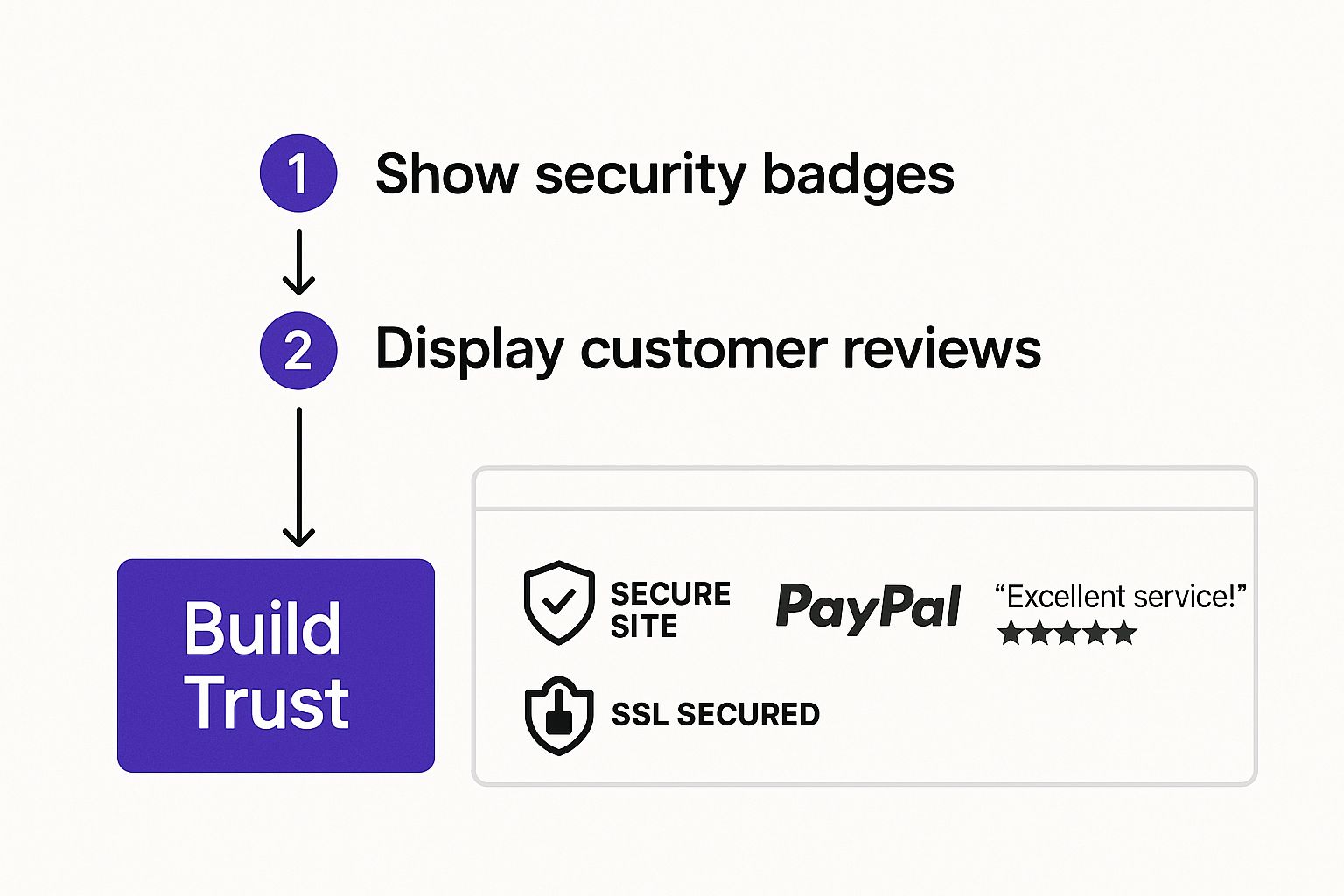
As you can see, things like security badges, clear return policies, and positive reviews aren't just nice-to-haves. They're foundational elements that give a customer the confidence they need to pull out their credit card.
Designing a Three-Part Recovery Sequence
So, how do you build a sequence that actually works? The key is to map it out over a few days, with each email serving a very specific purpose. The timing and tone are everything here—you want to guide them back, not scare them away.
Here’s a simple blueprint for a three-email sequence that I've seen work wonders. You can adapt it for your own store.
Cart Recovery Email Sequence Blueprint
This table breaks down a proven three-email flow. Notice how the objective and content evolve with each step, moving from a gentle reminder to a final, compelling offer.
| Email Stage | Timing | Key Objective | Content Example |
|---|---|---|---|
| Email 1 | 1-4 hours after | Gentle Reminder | A friendly, low-pressure message asking if they ran into any trouble. Feature large, dynamic images of the items they left behind. |
| Email 2 | 24 hours after | Address Obstacles | Offer helpful information. Remind them of your easy returns policy, highlight positive product reviews, or answer common shipping FAQs. |
| Email 3 | 48-72 hours after | Create Urgency | Make a final, compelling offer. Provide a time-sensitive discount, like "10% off for the next 24 hours," to nudge them to act now. |
By spacing out the communication and changing the message, you respect the customer's inbox while strategically re-engaging them at key decision-making moments.
Crafting Emails That Get Opened and Clicked
Of course, the success of your sequence comes down to the details. Generic, boring content will land straight in the trash folder. Every single element needs to be optimized for engagement.
Here’s what to focus on:
- Compelling Subject Lines: Ditch the bland "Your cart is waiting." Get a little creative. Try something more intriguing like, "Did you forget something special?" or even create a bit of urgency with "Your favorite items are selling out fast."
- Dynamic Product Content: This is a non-negotiable. Your emails must automatically pull in high-quality images, product names, and prices of the exact items left in the cart. That visual reminder is incredibly powerful.
- A Crystal-Clear Call-to-Action (CTA): Don't make them think. Use a single, prominent button with unmistakable text like "Return to Your Cart" or "Complete Your Order." The next step should be obvious and effortless.
Your goal is not just to recover a sale, but to solve a problem. Whether it was a technical glitch, a question about shipping, or simply a distraction, your emails should feel like helpful customer service, not just another sales pitch.
When you structure your abandoned cart emails this way, you turn a potential lost sale into a positive, helpful customer interaction.
For even more ways to tighten up your entire sales funnel, check out our deep dive into how to boost your conversion rate with Divi A/B testing. Testing different subject lines, offers, and CTA copy in your recovery emails is a fantastic way to discover what truly resonates with your audience and brings them back to buy.
Got Questions About Cart Abandonment? We've Got Answers.
Even when you've followed every best practice, real-world questions always pop up. It's one thing to read the theory, but another thing entirely to put it into action. This is where the rubber meets the road.
Let's tackle some of the most common questions I hear from store owners who are deep in the trenches, fighting to bring those abandonment numbers down.
What Is the Ideal Number of Checkout Steps?
Everyone wants to know the magic number, but the short answer is: as few as humanly possible.
But here's the thing—clarity actually trumps the raw number of steps. A slick, single-page checkout can be a game-changer, but a multi-step process with a big, bold progress bar can work just as well. Why? Because it breaks a daunting task into small, manageable wins for the customer.
The real enemy here is psychological friction. Don't ambush a customer with a mandatory "Create an Account" page after they've already typed in their shipping details. That's a surefire way to get them to close the tab.
The goal isn't just a short checkout; it's a checkout that feels fast and effortless. Each step should be logical, clear, and focused on one single thing (e.g., shipping, then payment).
How Should I Handle International Shipping Costs?
For international buyers, transparency isn't just nice—it's everything. Surprise shipping fees, duties, and taxes are the #1 conversion killer for this audience. You have to get ahead of it.
- Use a Geolocation App: This is a must. Your store should automatically detect where a shopper is and show them estimated shipping costs and delivery times right away. Don't make them wait until the final step.
- Offer DDP (Delivered Duty Paid): This is a massive trust-builder. It lets international customers pre-pay all duties and taxes at checkout. No scary, unexpected bills from customs when the package arrives.
- Be Crystal Clear: Add a simple line of text on the cart or product page that says whether the price includes taxes and duties. It seems small, but this little bit of clarity prevents a world of confusion and builds massive confidence.
Being upfront manages expectations and completely avoids that last-second sticker shock that sends shoppers running.
Is It Better to Offer a Discount or Free Shipping?
This is the classic debate, and the answer almost always depends on your product's price and your margins.
For lower-priced items, free shipping often has a much bigger psychological punch. When shipping costs 20% or more of the total order value, waiving that fee feels like a huge win for the customer.
On the other hand, for more expensive products, a percentage-based discount like 15% off can feel more substantial and motivating. Taking $45 off a $300 order feels more impactful than just getting free shipping.
My advice? Stop guessing. A/B test both offers relentlessly in your exit-intent popups and cart recovery emails. Your data will give you a clear, undeniable answer about what truly moves the needle for your audience.
Ready to turn those abandoning visitors into loyal customers? With Divimode, you get access to powerful tools like Divi Areas Pro to create the kind of targeted exit-intent popups and helpful content injections we've talked about. Take back control of your customer journey and start recovering sales today at https://divimode.com.
More Articles You Will Like