When we talk about adding hover image text, we're referring to a simple but powerful technique: revealing text or other content when someone moves their cursor over an image. It’s an interactive trick that adds a layer of depth and context to your design without making your pages look cluttered from the get-go.
Why Hover Image Text Transforms Your Website
Interactive elements aren't just flashy add-ons anymore; they're a core part of building a great user experience. A static website can feel a bit lifeless, but introducing subtle interactions like hover effects can instantly make your Divi site feel more polished and dynamic.
Think about how this small detail can completely change different parts of your site. In an online store, hovering over a product image could pop up its price and a quick "Add to Cart" button. For a portfolio, it could reveal the project's title and a link to the full case study. This keeps your layout clean and minimal at first glance, but delivers key information the moment a user shows interest.
Enhancing User Experience and Engagement
At its heart, the magic of hover image text is its ability to provide information right when it’s needed. Instead of making people click away to another page just for basic details, you present it smoothly, right where they are. This simple change reduces friction and makes browsing your site feel much more natural.
And this idea isn’t just for desktops. The thinking behind hover technology has even shaped mobile design, with early concepts exploring ways to mimic mouseover effects on touchscreens. Some early designs let users hover a finger over a link to see a preview, proving how powerful it is to offer info without requiring a full tap or click. You can actually read more about these early developments and how they influenced user interfaces.
By hiding information until it’s relevant, hover effects create a sense of discovery. This tiny interaction encourages visitors to actively explore your content instead of just passively scrolling, turning a simple browse into a more memorable journey.
Practical Applications for Your Divi Site
So, where can you actually use these hover effects to get the biggest bang for your buck? The possibilities are pretty much endless, but here are a few real-world scenarios where hover text really shines:
- Portfolio Grids: Display project names, categories, or even client names when someone mouses over a thumbnail.
- Team Member Sections: Show a person's job title, social media links, or a short bio on hover.
- Service Listings: Use the hover state to give a quick description of a service or add a call-to-action button.
- E-commerce Product Catalogs: Reveal different color options, available sizes, or a "Quick View" button for a faster shopping experience.
Ultimately, adding hover image text is about making your website smarter and more in tune with your visitors. It shows you've put thought into the design and are committed to giving them a better experience, which goes a long way in building trust and keeping them engaged.
Choosing Your Method: CSS vs. Divi Areas Pro
When you’re ready to add hover image text to your Divi site, you’ve got two main roads you can go down. The path you choose really boils down to your comfort level with code, how complex your project is, and of course, your budget.
One route is the classic, hands-on approach using custom CSS. This method is fantastic because it gives you absolute control over every pixel, transition, and animation. Better yet, it's completely free, which is a huge win if you're keeping an eye on costs.
But that total control comes with a learning curve. You’ll need a decent grasp of CSS properties like opacity and transform, not to mention pseudo-classes like :hover. For a simple fade-in text effect, it’s pretty straightforward. But if you’re dreaming up more complex interactions, you can easily sink hours into writing and debugging the code.
The No-Code Alternative: Divi Areas Pro
On the other side of the coin, we have a powerful plugin solution: Divi Areas Pro. This premium tool was built specifically to let you create sophisticated hover content using the Divi Builder you already know and love—no manual coding required.
With Divi Areas Pro, you just build your hover layout using any Divi modules you want—think text, images, call-to-action buttons, you name it. Then, you simply set the trigger to "Hover" and point it at your image. The plugin handles all the tricky code in the background.
This approach is a massive time-saver, especially when you want to build content-rich hover effects that would be a nightmare to manage with custom CSS alone. You can dig into all its capabilities by checking out the features that improve your business website. The trade-off, of course, is that it's a paid plugin, but the time you get back often makes the investment more than worthwhile.
Deciding between CSS and a plugin isn't just about code vs. no-code. It's a strategic choice between raw creative control and zero cost versus speed, convenience, and the power to build far more complex interactions without touching a single line of CSS.
Side-by-Side Comparison
Making the right choice is easier when you see things laid out. This table breaks down the key differences between hand-coding your hover effects and using a dedicated plugin like Divi Areas Pro.
Comparison of Hover Text Methods in Divi
| Feature | Custom CSS Method | Divi Areas Pro Plugin |
|---|---|---|
| Ease of Use | Requires coding knowledge. Can get tricky for beginners. | Visual, drag-and-drop builder. Incredibly intuitive. |
| Cost | Completely free. | Premium plugin with a one-time or annual fee. |
| Flexibility | Limitless control, but you have to code everything from scratch. | High flexibility using any Divi module, but within the plugin's framework. |
| Speed | Slower for complex effects; involves writing and debugging code. | Much faster for building and deploying all types of hover effects. |
| Content Type | Mostly limited to text and simple HTML elements. | Can include any Divi module (buttons, forms, videos, etc.). |
So, which one is right for you?
There's no single "best" answer here. If you’re comfortable with CSS and just need a simple text overlay, the DIY method is a perfect, cost-effective fit. But for anyone who wants to create rich, multi-module hover content quickly and without the headaches of coding, Divi Areas Pro is the clear winner.
How to Create Hover Text with Custom CSS
If you're comfortable rolling up your sleeves and diving into a little bit of code, the custom CSS method gives you absolute control over your hover image text effects. It’s a powerful and free way to build unique interactions right inside Divi.
The whole thing starts with a standard Divi Image module. Once you've got your image selected, pop over to the Advanced tab and open the CSS ID & Classes toggle. In the CSS Class field, you’ll need to give your module a unique class name. Something descriptive like custom-image-hover works perfectly. This class is the hook we'll use to apply our styles.
Just be sure to make your class names specific so you don't accidentally style other elements on your site. For example, image-fade-overlay is much better than a generic class like image.
This graphic breaks down how a few CSS properties work together to create that smooth fade-in effect we're after.
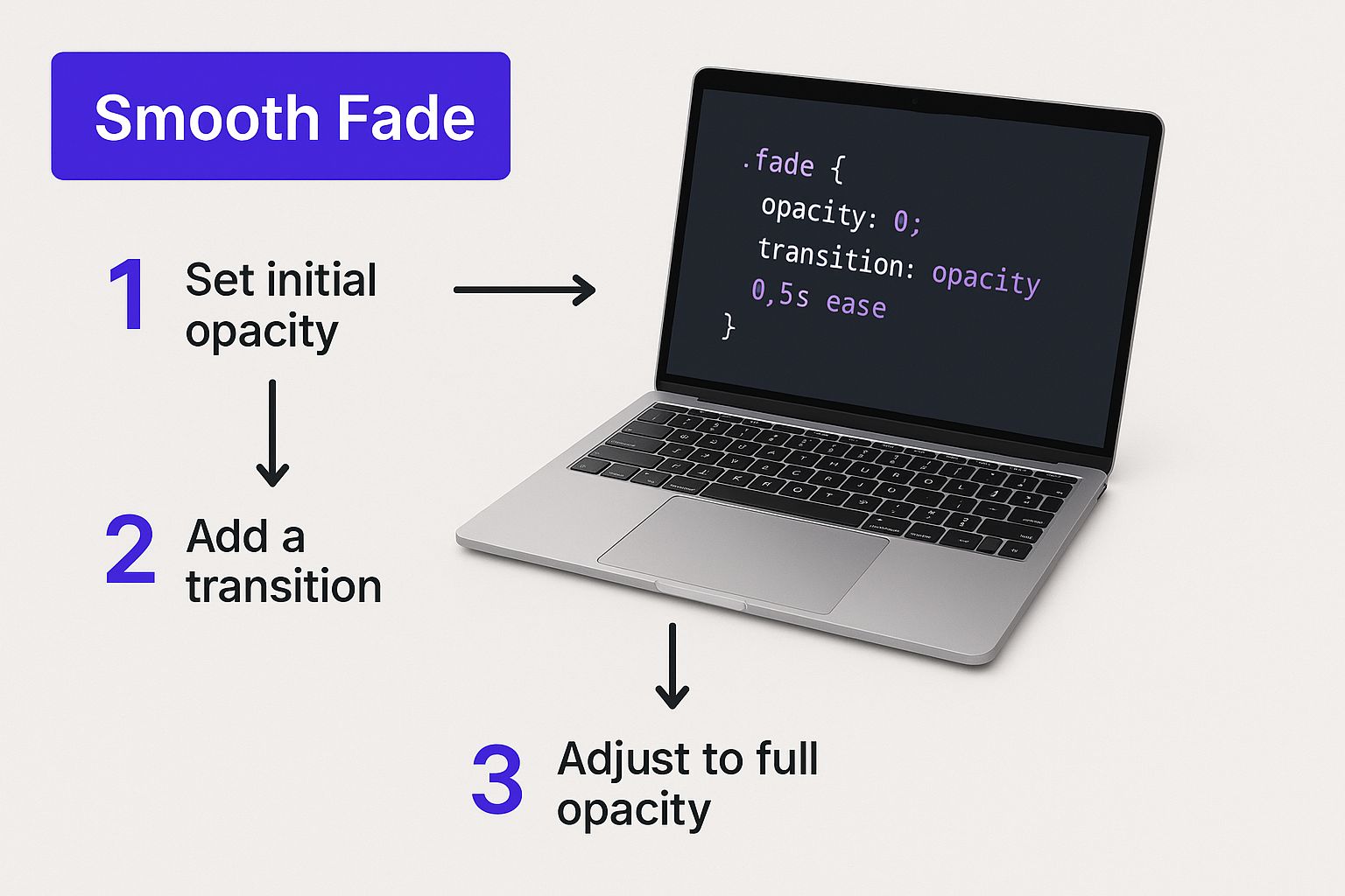
As you can see, combining properties like opacity and transition is the secret sauce. It’s what separates a polished, professional animation from an abrupt, jarring change.
Building a Simple Fade-in Overlay
Let's kick things off with a classic: a semi-transparent overlay and text that gently fades into view on hover. This is one of the most common and effective ways to add a little extra context to an image without cluttering the page.
First, you need to get your text ready. The simplest way to link text to an image in Divi is to use the Title and Caption fields right in the Media Library. When you upload or edit an image, just fill those out. Divi can pull that content in automatically later on.
With your text ready to go, the next move is to add the CSS. You can paste the code below into the Divi > Theme Options > Custom CSS box, or if you're using one, your child theme's style.css file. For a more detailed look at the different ways to handle CSS, you can check out our full guide on how to add text hover over an image.
The CSS Snippet Explained
Here’s a copy-and-paste-ready snippet that will get the fade-in effect working. Notice how we're targeting the .custom-image-hover class we created a moment ago.
.custom-image-hover {
position: relative;
overflow: hidden; /* Keeps overlay contained */
}
.custom-image-hover .et_pb_image_wrap::after {
content: '';
position: absolute;
top: 0;
left: 0;
width: 100%;
height: 100%;
background: rgba(0, 0, 0, 0.6); /* Dark overlay */
opacity: 0;
transition: opacity 0.4s ease-in-out;
}
.custom-image-hover:hover .et_pb_image_wrap::after {
opacity: 1;
}
So, what’s this code actually doing? Let’s break it down real quick:
position: relative;: This is non-negotiable. It creates a positioning context for the overlay we're about to add, making sure it sits perfectly on top of the image.::afterpseudo-element: We're using this to generate a "virtual" element that acts as our overlay. It's a clean way to add the effect without needing extra HTML markup.opacity: 0;: By default, the overlay is completely transparent, so it's hidden from view.transition: opacity 0.4s ease-in-out;: This is where the magic happens. It tells the browser to animate any changes to the opacity over 0.4 seconds, creating that smooth fade.:hoverstate: When someone hovers over the image container, we target the::afteroverlay and crank itsopacityup to 1, making it fully visible. The transition property handles the animation automatically.
Pro Tip: Don't be afraid to experiment with the
rgba()background color. You can change the overlay's color and transparency easily. The last value (0.6 in this snippet) controls the transparency—1 is solid, and 0 is invisible.
Once you get the hang of these core properties—position, opacity, and transition—you can start creating your own variations. Try tweaking the transition duration or swapping out the background color to match your site's branding. This foundational knowledge is your gateway to crafting even more complex and engaging hover image text animations.
How to Build Effects with Divi Areas Pro
For those who want to skip the code and dive straight into creating rich, dynamic hover content, Divi Areas Pro is a game-changer. This powerhouse plugin lets you build your hover effects directly inside the Divi Builder you already know and love, completely bypassing the need for custom CSS.
Instead of being stuck with simple text overlays, you can design a full-blown layout with any Divi module you want—think buttons, contact forms, videos, you name it. This method unlocks a world of creative possibilities, letting you build interactive experiences that would take ages to code from scratch.
The concept is beautifully simple: you create a reusable layout called a "Divi Area," then tell it to pop up when someone hovers over a specific image on your site.
Setting Up Your First Divi Area
First things first, we need to build the content that will actually appear on hover. From your WordPress dashboard, head over to Divi Areas > Add New. Give your new Area a memorable title, like "Project Details Hover," and then fire up the Divi Builder.
This is where the real fun begins. You can now build out your hover layout just like any other Divi page or section.
- Drop in a Text module for a project description.
- Add a Button module with a "View Case Study" link.
- Maybe use an Image module to show a client's logo.
Go ahead and design this layout exactly as you want it to look when it appears. You have all the familiar Divi controls at your fingertips for styling fonts, colors, spacing, and animations. If you need some inspiration, we've put together a deep dive into all sorts of image hover effects.
Configuring the Hover Trigger
With your Divi Area designed and saved, the next step is connecting it to an image. This is where the intuitive power of Divi Areas Pro really shines.
Back in the Divi Area editor, look for the Area Settings meta box. This is your command center for configuring how and where the hover content shows up.
- Trigger: Switch the default from "On Click" to "On Hover". This tells the plugin to activate the Area when a cursor moves over your target.
- Display: Choose "Automatic". This lets you target a specific element on your page using its CSS ID or class, which is exactly what we need.
- Target Element: Now, jump over to the page where your image lives. Open the Image module's settings, go to the Advanced tab, and give it a unique CSS ID (like
#project-image-1). Copy that ID and paste it right into the "Target Element" field in your Divi Area settings.
And just like that, Divi Areas Pro knows precisely which image to watch and what content to show when someone hovers over it.
The idea of showing contextual info on hover has been around for a while, but it's evolved way beyond simple tooltips. Early patents from the 2010s even explored how hover gestures might work on touchscreens, letting a user hold a finger just above an icon to see details without a full tap. It's fascinating to see these foundational concepts, which you can read about in the original patent filings.
Fine-Tuning Position and Animation
Divi Areas Pro doesn't just stop at showing the content; it gives you granular control over the final presentation. In the Position settings, you can define exactly where the hover image text appears relative to the image. You can anchor it to the top, bottom, center, or even have it follow the cursor around for a cool, dynamic effect.
You can also layer in some custom animations to make the interaction more engaging. The plugin comes with built-in options like fade, slide, and flip, allowing you to create a polished and professional user experience with just a few clicks. This level of control, combined with the ease of the Divi Builder, makes it an incredibly powerful tool for adding sophisticated flair to your site.
Styling and Accessibility Best Practices

Getting your hover effect to work is only half the battle. To really make your design shine, that hover image text needs to be both easy on the eyes and accessible to everyone, no matter how they browse the web. A clunky, hard-to-read effect can instantly make a site feel unprofessional or, even worse, be completely unusable for some visitors.
It all starts with solid design principles. That means focusing on readability and creating a smooth, intuitive user experience from the moment the user's cursor touches the image.
Design and Animation Essentials
The styling choices you make are what separate a professional interaction from an amateur one. Your number one goal should always be legibility, especially when you're layering text over a potentially busy background image.
Here are a few design tips I always come back to:
- Go for High Contrast: Make sure your text color pops against the image or the overlay behind it. You can't go wrong with classics like black text on a light gray overlay or crisp white text on a dark one.
- Pick a Legible Font: Steer clear of overly decorative or thin fonts. They might look cool, but they can be a nightmare to read, especially in smaller sizes. A clean sans-serif font is almost always a safe bet for on-screen text.
- Keep Animations Smooth: I’ve found a transition duration between 0.3s and 0.5s hits the sweet spot. It feels responsive without being jarringly fast. Anything quicker feels abrupt, while animations that drag on can make your whole site feel sluggish.
To make sure your hover effects fit into a cohesive and user-friendly design, it's always a good idea to brush up on general website design best practices.
Making Hover Content Accessible for All
Aesthetics are important, but accessibility is absolutely non-negotiable. Hover-based content can throw up major roadblocks for people who use keyboards, screen readers, or other assistive tech. Simply put, if someone can't use a mouse, they might never see the valuable information you've tucked away in that hover effect.
This is where the Web Content Accessibility Guidelines (WCAG) come in. These are the gold standard for making the web usable for people with disabilities, and hover effects are directly in their crosshairs.
A key guideline, WCAG 2.1 Success Criterion 1.4.13, requires that content appearing on hover must be dismissible, hoverable, and persistent. In plain English, this means users need to be able to move their mouse over the new content without it vanishing, and they must be able to close it without having to move their cursor off the trigger element.
This rule is a game-changer for users with motor impairments or those who rely on screen magnifiers because it stops content from disappearing unexpectedly. Building an inclusive effect isn't just about checking a compliance box—it’s about creating a better, more thoughtful experience for every single person who visits your site.
Common Questions About Image Hover Text
When you're diving into interactive elements, it's easy to hit a few snags. Let's walk through some of the most common questions that come up when adding hover text to images in Divi.
Think of this as your quick-start guide to solving those little problems that can get you stuck.
Can I Put a Clickable Button Inside the Hover Text?
Yes, you absolutely can! This is one of the biggest reasons to use a tool like Divi Areas Pro. It lets you drop any Divi module you want—including a Button module—right into your hover layout. You can then style it exactly like you would on a normal page.
If you're going the custom CSS route, you'll have to get a little more hands-on. You’ll need to wrap your content in an HTML link tag (<a>) inside the image's Title or Alt field. From there, you can style that link with CSS to make it look like a button. Just make sure the button is obvious and easy to click for everyone.
One of the most common mistakes I see is making interactive elements inside a hover state too small or hard to click. Give your button plenty of padding and a clear call-to-action to save your users from getting frustrated.
How Do I Make Hover Effects Work on Mobile?
This is a great question. Since mobile devices don't have a "hover" state in the traditional sense, the best practice is to switch over to a "tap" or "click" trigger. This makes the whole experience feel natural for anyone using a touchscreen.
Divi Areas Pro makes this a breeze by letting you set different triggers for desktop and mobile. If you're using a CSS-only solution, you can write media queries to make the text permanently visible on smaller screens. Another clever trick is to use the :focus pseudo-class in your CSS, which can reveal the text on tap.
Why Isn't My CSS Hover Effect Working?
Ah, the classic "it's not working!" moment that trips up even seasoned developers. If your hover image text is playing hide-and-seek, run through this quick checklist:
- Check Your CSS Class: Go back and double-check that the custom CSS class on your Divi module is a perfect match for the one in your stylesheet. Remember, CSS is case-sensitive, so
MyClassandmyclassare two different things! - Clear Your Caches: This is the "turn it off and on again" of web design. Your website's caching plugin (like WP Rocket) and your browser's cache might be serving up an old version of the site. Clear both to make sure you’re seeing the latest changes.
- Inspect for Conflicts: Use your browser's "Inspect" tool (right-click on the element and choose "Inspect") to see if other CSS rules are overriding your custom code. It’s often a specificity issue where another style is taking priority.
Ready to build stunning, code-free hover effects in just a few minutes? With Divimode's Divi Areas Pro, you can create anything you can imagine using the Divi Builder you already know and love. Check out the plugin and unlock your site's full interactive potential at divimode.com.
