 Alex Martin
You've probably hit the same wall most Divi developers hit sooner or later. The desktop menu looks clean, the client approves it, then mobile turns that same navigation into a cramped strip, an oversized hamburger, or a long stacked list nobody wants to dig through.
A horizontal menu scroll can fix that, but only when you use it for the right reason. It's useful when the site has too many important sibling items to collapse cleanly, especially on WooCommerce stores, directories, and content-heavy builds. It's a weak choice when it becomes a shortcut for poor information architecture.
I've built this pattern a few different ways in Divi. The fast CSS version works. A JavaScript-assisted version feels much better. A builder-based setup gives you more control when the navigation itself is part of the product browsing experience. The right option depends on what matters most on the project: speed, polish, accessibility, or editor control.
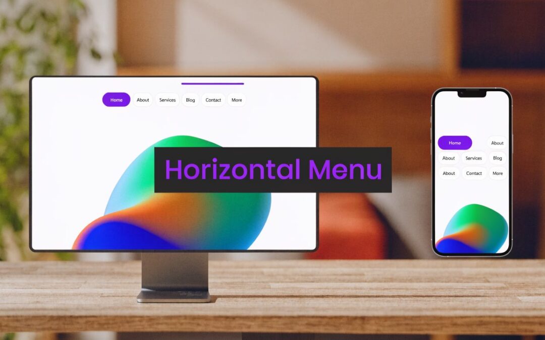
Why Your Divi Menu Needs a Horizontal Scroll
The common scenario is simple. You've got more top-level menu items than the available mobile width can handle, and Divi's default behavior starts forcing hard compromises. Either the menu collapses behind a toggle, or the visible layout starts feeling crowded and fragile.
That pressure isn't unique to Divi. The need for horizontal scrolling grew as interfaces became more content-dense on smaller screens, especially in layouts like calendars, tables, and menus where too many items need to stay visible without truncation or stacking, as reflected in a developer discussion about dense timeline layouts.

When the pattern helps
A horizontal menu scroll usually makes sense in these cases:
- Category-heavy stores: Product families, brands, collections, or seasonal groupings need to stay visible.
- Portal-style sites: Departments, resources, tools, or member sections are all peers.
- Secondary navigation bars: You want users to swipe through filters, child pages, or content hubs without opening another panel.
It can also clean up a header when the alternative is a buried mobile menu with too many taps. If you're already rethinking mobile navigation behavior, this guide on mobile menu design in Divi is a useful companion.
When it doesn't
A horizontal menu scroll is not a magic fix for bloated navigation.
Practical rule: If the menu is overloaded because the structure is unclear, scrolling won't solve the underlying problem.
If users need the menu to understand the site, don't hide core choices off-screen by default. If they already know what they're looking for, a swipeable row can work well. That distinction matters more than the code.
The Quick and Simple CSS-Only Method
The fastest way to build a horizontal menu scroll in Divi is still the classic CSS pattern. The foundation is overflow: auto plus white-space: nowrap, which W3Schools documents as the core technique for making a horizontal navigation area scroll sideways while keeping items on one line in a lightweight, reusable CSS setup, including inline-block links with padding: 14px for practical spacing and tap targets in their example on horizontal scroll menu CSS.

In Divi, I usually apply this to a Menu module, not the default theme header. That gives you cleaner targeting and fewer surprises.
The CSS to paste
Add a custom class to your Menu module, such as horizontal-scroll-menu, then paste this into Divi Theme Options, the Theme Customizer, or your child theme stylesheet:
@media (max-width: 980px) {
  .horizontal-scroll-menu .et_pb_menu__menu {
    display: block !important;
    width: 100%;
  }

  .horizontal-scroll-menu .et_mobile_nav_menu {
    display: none !important;
  }

  .horizontal-scroll-menu .et_pb_menu__wrap {
    overflow-x: auto;
    overflow-y: hidden;
    -webkit-overflow-scrolling: touch;
  }

  .horizontal-scroll-menu .et_pb_menu__menu ul.et-menu {
    display: flex;
    flex-wrap: nowrap !important;
    white-space: nowrap !important;
    gap: 0;
    margin: 0;
    padding: 0;
  }

  .horizontal-scroll-menu .et_pb_menu__menu ul.et-menu > li {
    flex: 0 0 auto;
  }

  .horizontal-scroll-menu .et_pb_menu__menu ul.et-menu > li > a {
    display: inline-block;
    white-space: nowrap;
    padding: 14px;
  }
}
What each part is doing
This works because each layer handles a different problem:
.et_pb_menu__menu { display: block !important; }forces the desktop-style menu structure to remain visible on smaller screens..et_mobile_nav_menu { display: none !important; }hides the hamburger version so you're not running two mobile patterns at once.overflow-x: autocreates the scrollable container.white-space: nowrapandflex-wrap: nowrapstop menu items from dropping to a new line.flex: 0 0 autokeeps each list item at its natural width.padding: 14pxgives each link a more touch-friendly hit area.
If you want a stronger grasp of how these responsive CSS decisions fit together in Divi, this walkthrough on responsive web design with CSS in Divi is worth bookmarking.
What the CSS method does well
This approach is hard to beat for speed. It's light, easy to remove, and works well for brochure sites, small business sites, and simple category rows.
It also keeps the visual weight of the header low. No extra scripts, no interface chrome, no plugin settings panel.
Here's a quick visual walkthrough if you prefer to see the mechanics in action after reading the code:
The gotchas nobody mentions first
The CSS-only version starts to crack under real-world pressure.
A horizontal menu that works in a clean demo can still fail on an actual client site once you add long labels, active states, dropdown expectations, and inconsistent spacing.
A few issues show up often:
- Hidden affordance: Users may not realize the menu scrolls.
- Awkward desktop use: Mouse users don't enjoy dragging a tiny scrollbar.
- Dropdown conflicts: Overflow containers and dropdowns often fight each other.
- Active item visibility: The selected tab can sit off-screen unless you add script to bring it into view.
- Touch quirks: Swipe behavior can feel inconsistent depending on device and surrounding layout.
That's why CSS is a solid baseline, not always the final build.
Enhancing the Scroll With JavaScript
The pure CSS version solves layout overflow. It doesn't solve interaction quality.
Once you test the menu on an actual laptop with a trackpad, a desktop with a mouse, and a phone with touch gestures, the weak spots show up fast. Some users won't notice there's more content. Others will notice, but won't enjoy using it.
Telerik's knowledge base notes that its own Angular menu needs custom arrow-button logic for overflow, and the same reference points out a broader gap in basic tutorials that stop at CSS even though more robust, cross-device behavior often needs JavaScript, as described in their scrollable menu implementation notes.
A practical middle ground
If I want a menu that still feels lightweight but behaves like a finished component, I add three things:
- Previous and next buttons
- Smooth horizontal scrolling
- Scroll state detection, so buttons disable at the ends
Use this markup in a Code module or in the surrounding layout:
<div class="menu-scroll-shell">
  <button class="menu-scroll-btn menu-scroll-prev" aria-label="Scroll menu left">‹</button>
  <div class="menu-scroll-track">
    <!-- Place your Divi Menu module here -->
  </div>
  <button class="menu-scroll-btn menu-scroll-next" aria-label="Scroll menu right">›</button>
</div>
Then use this script:
<script>
document.addEventListener('DOMContentLoaded', function () {
  document.querySelectorAll('.menu-scroll-shell').forEach(function (shell) {
    const track = shell.querySelector('.menu-scroll-track');
    const prev = shell.querySelector('.menu-scroll-prev');
    const next = shell.querySelector('.menu-scroll-next');

    if (!track || !prev || !next) return;

    const updateButtons = () => {
      prev.disabled = track.scrollLeft <= 0;
      next.disabled = track.scrollLeft + track.clientWidth >= track.scrollWidth - 1;
    };

    prev.addEventListener('click', () => {
      track.scrollBy({ left: -220, behavior: 'smooth' });
    });

    next.addEventListener('click', () => {
      track.scrollBy({ left: 220, behavior: 'smooth' });
    });

    track.addEventListener('scroll', updateButtons);
    window.addEventListener('resize', updateButtons);

    updateButtons();
  });
});
</script>
Why this version feels better
Button controls make the overflow obvious. That alone improves the pattern.
This also gives you control over the interaction. Instead of relying on a native scrollbar that may barely appear, you can guide users with visible controls and disable them cleanly when there's nowhere else to go.
A few additions I often include on client builds:
- Auto-scroll the active item into view: Helpful for category pages and account areas.
- Fade masks at the edges: A visual hint that more items sit off-screen.
- Drag-to-scroll on desktop: Good for tab-style menus, but test carefully so you don't interfere with link clicking.
Where JavaScript starts adding maintenance
This version is better, but it's not free.
You're now maintaining selectors, state logic, and event behavior. If the Divi module markup changes, or the menu gets moved inside another overflow context, the script may need adjustment. On content-managed builds, editors can also break assumptions by changing item length or nesting.
Field note: Once a menu needs arrows, active-item centering, and custom behaviors across breakpoints, you're no longer building a quick snippet. You're building a component.
That's the point where some teams should keep coding, and others should switch to a more structured tool.
Building Robust Menus with Divi Areas Pro
Some projects need more than a menu that scrolls. They need a navigation system that editors can manage visually, that designers can shape around promos or filters, and that developers can drop into a larger header strategy without wiring together multiple partial hacks.
That's where a builder-based approach starts making more sense than stacked snippets.

Why code starts feeling cramped
Code-based horizontal menus are fine when the requirement is narrow. Keep items on one line. Allow swipe. Maybe add arrows.
They become awkward when the brief expands:
- add badges or icons beside menu items
- show different content by device type
- place the menu inside a mega menu or fly-in
- pair the navigation with promos, search, or filters
- let non-developers update the layout safely
At that point, the challenge isn't the horizontal scroll itself. It's the surrounding experience.
What a builder-based setup gives you
A tool like Divi Areas Pro lets you build custom header regions, mega menus, fly-ins, and injected content areas with the Divi Builder, then place a horizontally scrolling navigation row inside that larger design system. That means the scroll behavior becomes one part of a managed interface instead of a one-off workaround.
I like this route on WooCommerce and larger content sites because it solves several practical problems at once:
| Need | Code snippet approach | Builder-based approach |
|---|---|---|
| Visual editing | Limited | Strong |
| Reusable layouts | Manual | Built into workflow |
| Mixed content around menu | Clunky | Straightforward |
| Targeting by context | Custom logic needed | Managed in tool settings |
| Team handoff | Fragile | Easier for editors |
For teams already working heavily inside the Divi ecosystem, the article on Divi Areas Pro features every web designer should be using gives a clearer sense of the kinds of interface patterns this approach supports.
Where this method earns its keep
I don't recommend a builder-based solution for every horizontal menu scroll. That would be overkill.
I do recommend it when navigation is part of merchandising or conversion flow. Think product category bars, brand scrollers, account-area nav, or regional menus that need conditional display. In those cases, the ability to combine Divi modules, triggers, targeting, and design controls in one managed area is often worth more than saving a little CSS.
The trade-off to be honest about
A builder-based stack introduces more moving parts than a CSS snippet. There's more interface, more setup, and more decisions for the site owner.
That's acceptable when the menu is a business-critical component. It's not necessary when you just need six links to stop wrapping on mobile.
The cleanest rule is this:
- Use CSS-only when the menu is simple.
- Use CSS plus JavaScript when the interaction needs polish.
- Use a builder-driven system when the menu belongs to a larger, dynamic navigation design.
Comparing Your Horizontal Scroll Options
Once you strip away the implementation details, the decision comes down to trade-offs. Speed against control. Lightweight code against richer interaction. Developer ownership against editor ownership.

Side-by-side reality check
| Method | Best fit | What works | What breaks first |
|---|---|---|---|
| CSS-only | Small sites, simple top-level menus | Fast to implement, minimal overhead, easy to remove | Discoverability, desktop usability, active-item behavior |
| CSS with JavaScript | Client sites that need a more finished feel | Arrows, smooth scroll, better cues, stronger control | More maintenance, more testing, more chances for selector issues |
| Builder-based | Large sites, WooCommerce, dynamic navigation systems | Layout flexibility, visual editing, broader navigation design options | More setup and more complexity than basic sites need |
How I choose on real projects
I usually ask four questions before I pick an approach:
How critical is this navigation?
If the answer is “very,” I avoid treating it like a throwaway snippet.Who maintains the site after launch?
A solo developer can support custom code differently than an in-house marketing team can.Does the menu need extra behavior?
Arrows, current-item centering, contextual display, and mixed content all push the build away from CSS-only.What happens if users miss hidden items?
If missing those items harms product discovery or key flows, the menu needs stronger cues or a different pattern entirely.
The practical recommendation
For most Divi sites, the sweet spot is narrow. Start with the smallest approach that fits.
Don't choose the most advanced implementation because it exists. Choose the one that matches the actual risk of the navigation failing.
A portfolio site can live happily with CSS. A category-heavy store usually wants more help. A large marketing site with layered navigation often benefits from a structured, builder-driven setup because design and content teams will keep touching it long after launch.
Critical Accessibility and Usability Practices
Many horizontal menu scroll implementations fail because of assumptions, rather than the CSS itself.
People often assume users will notice the menu can move sideways. Many won't. Nielsen Norman Group warns that users often miss horizontally scrollable content because they expect vertical movement, and Baymard found 26% of sites tested got inline scroll areas wrong, creating discoverability and interaction problems in patterns like this, as discussed in the NNGroup review of horizontal scrolling usability issues.
Make the overflow obvious
A hidden scroll area is usually a bad scroll area.
Use multiple cues, not just one:
- Visible arrows: Keep them on screen, not only on hover.
- Partial next-item peek: Let the next tab or link show slightly at the edge.
- Edge fading or masks: Subtle visual treatment can signal hidden content.
- Clear labeling: “More categories” or similar context can help when the menu is secondary.
One clue by itself often isn't enough. Arrows help. Peeking helps. Together they work better.
Keep keyboard access intact
A horizontal menu scroll must remain fully usable without touch.
Check these points on every build:
- Tab order stays logical. Users should move through links in the order they appear.
- Focus remains visible. If a link receives focus off-screen, the container should scroll enough for it to appear.
- No focus trap. Users must be able to move into and out of the region normally.
- Buttons are labeled. If you add previous and next arrows, give them meaningful
aria-labelvalues.
Accessibility work gets easier when teams stop treating it as a compliance afterthought and start treating it as interface clarity. If you want a broader refresher on practical UX-minded accessibility habits, this article on simple ways to welcome every visitor is a solid companion read.
Don't hide critical navigation behind a swipe
The biggest mistake is putting essential site paths into a container that some users may never fully explore.
The safer pattern is to use horizontal scrolling for:
- secondary categories
- faceted browsing shortcuts
- account tabs
- optional content groups
It's much riskier for core wayfinding, especially on sites with broad audiences or accessibility requirements.
If a user must find that link to complete a key task, it shouldn't depend on them discovering a sideways gesture.
Test like a user, not like a developer
Developers know the menu scrolls because they built it. Users don't.
Test with:
- mouse
- trackpad
- touchscreen
- keyboard only
- zoomed interface
- screen reader workflow
That's where weak implementations show themselves. A menu can feel polished in the Visual Builder and still become confusing once real people try to use it.
Creating Smarter Divi Navigation
A good horizontal menu scroll in Divi is less about the effect and more about restraint. The pattern works when it solves a genuine space problem and stays easy to understand. It fails when it becomes a convenient place to hide navigation you didn't want to reorganize.
The strongest builds usually start simple. If the CSS version handles the need cleanly, stop there. If the menu needs visible controls and better interaction, add JavaScript with purpose. If the navigation is part of a larger header, mega menu, or shopping flow, move to a more structured solution and treat it like a managed component.
Accessibility should stay in the decision the whole time. WCAG 2.1 Reflow Criterion 1.4.10 is intended to let users zoom content to 400% without requiring two-dimensional scrolling, which is why horizontally scrollable regions become risky when they hide critical navigation, as explained in this discussion of accessibility and horizontally scrollable regions.
If you're thinking more broadly about how navigation choices affect retention and task completion, this piece on optimizing digital presence for user engagement adds useful context.
The practical takeaway is straightforward. Keep primary navigation clear. Use horizontal scrolling where density makes it necessary. Test it on real devices. Then decide whether your project needs a snippet, a component, or a full navigation system.
If you're building advanced navigation patterns in Divi and want more practical examples, plugin workflows, and implementation guidance, Divimode is a useful place to continue from there.
More Articles You Will Like