
 Alex Martin
Your website's header is its digital handshake. It’s the very first thing people see and interact with, and it instantly frames their entire perception of your brand. Far from being just a simple navigation bar, a well-designed header is a powerful tool built to establish trust, guide visitors, and kickstart conversions from the moment they land on your site.
Why Your Header Design Is More Than Just Navigation

Think of your header like the entrance to a physical store. If the lobby is cluttered, confusing, or poorly designed, potential customers will turn around and walk right out. But if it's clean, organized, and welcoming, they'll feel comfortable and want to explore. Your website header works the exact same way.
It’s the one consistent anchor point a user has as they move through your site, offering a familiar guidepost on every single page. This consistency might seem small, but it subconsciously builds a sense of professionalism and reliability.
The Critical First Impression
You can't overstate the power of a first impression online. Study after study confirms that users form an opinion about a website in a literal fraction of a second, with 94% of that judgment being design-related. Your header is the most dominant element in that initial view, making it the single biggest factor in whether a visitor sees your site as credible or sketchy.
This isn't just about making things look pretty; it's about human psychology. A logically structured header signals that you've put thought into the user's experience. That small detail instantly translates into trust for your products or services.
A great header doesn't just show people where to go—it tells them they've come to the right place. It sets the stage for a positive interaction by making key information accessible and predictable.
More Than a Menu: It's a Strategic Tool
Beyond basic navigation, a smart header strategy serves multiple, business-critical functions. This is your prime real estate to direct user attention exactly where you want it to go, which you can achieve with a careful balance of key components.
To create a header that truly works, you need to understand how each piece contributes to the bigger picture. Here’s a quick breakdown of the core components and what they’re meant to accomplish.
Key Header Components and Their Purpose
| Component | Primary Function | Design Goal |
|---|---|---|
| Logo | Brand Recognition | Positioned top-left for immediate brand identification. |
| Navigation Menu | User Guidance | Offers a clear, organized path to key pages. |
| Call-to-Action (CTA) | Conversion | A prominent button to drive a specific action (e.g., "Get a Quote"). |
| Search Bar | Information Access | Allows users to find specific content quickly. |
| Contact Info | Trust & Accessibility | Provides easy access to support or sales channels. |
| Account/Login | User Access | Gives returning customers a direct path to their personal area. |
Each element has a job to do. When they all work together, the user journey becomes seamless. For a deeper dive into header layouts and best practices, check out our extensive guide on headers for website design. The ultimate goal is to make it effortless for a first-time visitor to figure out who you are, what you offer, and what action they should take next—all within seconds.
Mapping Out a User-Focused Header Strategy
Before you even think about opening the Divi Builder, the most critical work happens away from the screen—on paper, or maybe a whiteboard. A truly effective header design website strategy isn't about pretty visuals; it's a direct reflection of your user's needs and your business goals.
Jumping straight into design without a solid plan is like building a house without a blueprint. It’s a recipe for confusion.
First, you have to get inside your visitor's head. What's the absolute first thing they need to find when they land on your site? Fight the urge to stuff every possible link into your main navigation. A cluttered menu just creates decision fatigue, overwhelming visitors and making them more likely to bounce.
Instead, take some time to map out the primary paths for different types of users. On an e-commerce site, a new visitor probably wants to see "Shop" or "New Arrivals." A returning customer, on the other hand, is likely looking for their account icon or order tracking. Identifying these critical pathways is the key to prioritizing what actually matters.
Prioritizing Your Navigation and CTA
Once you have a clear picture of the user journey, you can confidently choose your main navigation links. I’ve found that sticking to five to seven main menu items is the sweet spot. This constraint forces you to focus on the essentials, which almost always leads to a cleaner, more intuitive experience for your users.
Now, let's talk about the most important button in your header: your primary call-to-action (CTA). This needs to align perfectly with your main business objective. Ask yourself: what is the one action I want most visitors to take?
- For a SaaS company: This is probably "Book a Demo" or "Start Free Trial."
- For a local service business: It might be something like "Get a Free Quote."
- For an online store: The obvious choice is "Shop Now" or a can't-miss cart icon.
This CTA absolutely has to stand out. Use a contrasting color, give it a solid background, or make the font slightly larger to draw the eye. It's not just another link; it's the main highway to conversion.
A well-planned header anticipates user needs. By simplifying choices and highlighting the most valuable action, you remove friction and guide visitors exactly where they—and you—want them to go.
Choosing the Right Header Layout
Different websites have different needs, and your header’s layout should reflect that. There's no one-size-fits-all solution here. The best header design website layout depends entirely on your content's complexity and your brand's style.
A minimalist header with just a logo, a few key links, and a CTA works beautifully for a portfolio or a simple brochure site. It’s clean, focused, and keeps the emphasis squarely on the page content below.
However, a massive e-commerce site or a news publication with hundreds of articles needs a more robust solution. This is where a mega menu really shines. It allows you to organize tons of links into logical categories, complete with icons and even images, preventing a single dropdown from becoming an endless, unreadable list.
The key is to choose a layout that serves your content structure, not just one that looks trendy.
Bringing Your Custom Header to Life in Divi
With your strategy mapped out, it's time for the fun part: turning that vision into a real, working header with the Divi Theme Builder. This is where your blueprint for a user-focused header design website stops being a concept and starts becoming a tangible part of your site.
First things first, head over to Divi > Theme Builder in your WordPress dashboard. You'll want to create a new Global Header. This is a game-changer because whatever you build here automatically shows up on every single page of your site. No more copying and pasting—just perfect consistency everywhere.
Building Your Header Structure
Once you're looking at a blank canvas, you'll add a new Section, then a Row. The layout of your columns is basically the skeleton of your header. For that classic look—logo on the left, menu in the middle, and a call-to-action on the right—a simple three-column row is your best bet.
Now, we'll drop in the Divi modules. These are the building blocks that add all the functionality and content.
- Image Module: This is for your logo. Pop it into the far-left column. Here’s a pro tip I always follow: set the "Logo Link URL" to your homepage. It’s an instinct for users to click the logo to get back home, so don't skip this.
- Menu Module: In the center column, add the Menu module. Dive into its settings to pick the WordPress menu you already built. This is also your command center for tweaking typography, link colors, and how your dropdown menus behave.
- Button Module: Your main call-to-action goes here, usually in the right-most column. The Button module is perfect for making it pop and grabbing your visitor's attention.
That's the basic foundation for most headers. From here on out, it’s all about getting into the nitty-gritty of the module and row settings to make it your own.
Customizing Your Core Header Elements
Okay, let's inject some of your brand's personality. Don't just stick with the default settings. This is your chance to fine-tune the spacing, colors, and fonts to make the header uniquely yours.
I always start with the row settings. I usually chop down the default padding quite a bit to get a sleeker, more compact header. Also, play with the Gutter Width to adjust the space between columns. You want everything to feel balanced—not too cramped, not too spread out.
Next, jump into the Menu module's "Design" tab. This is where you get full control over the menu text. Make sure the font, size, and color line up with your brand's style guide. Pay special attention to the link hover color. That little color shift when a user hovers over a menu item is crucial visual feedback, confirming that it's clickable. It’s a tiny detail that makes a huge difference in user experience.
The best headers are a careful balance of solid structure and thoughtful style. Use Divi's controls to get the alignment just right, then layer on your brand's identity with color and typography.
Choosing the right Divi module for each part of your header is key to an efficient build. Some modules are better suited for specific jobs than others.
Divi Module Comparison for Header Elements
Here's a quick rundown of the common modules I use for building headers and what they do best. This should help you pick the right tool for the job without having to guess.
| Header Element | Recommended Divi Module | Key Configuration Tip |
|---|---|---|
| Logo | Image Module | Always set the "Logo Link URL" to your homepage for intuitive navigation. |
| Main Navigation | Menu Module | Link to your primary WordPress menu and customize hover states in the "Design" tab. |
| Call-to-Action | Button Module | Use contrasting colors and clear text like "Get a Quote" or "Shop Now". |
| Social Media Icons | Social Media Follow Module | Keep it minimal. Only include the 2-3 platforms where you are most active. |
| Search Function | Search Module | Enable the "Icon" option for a clean look instead of a full search bar. |
| Secondary Info (Phone/Email) | Text Module | Keep the font size smaller than your main menu text to create visual hierarchy. |
Sticking to these modules for their intended purpose keeps your header clean, fast, and easy to manage down the road.
Now, let's talk about how this design will look on different devices, because that's something you need to be thinking about from the very beginning.
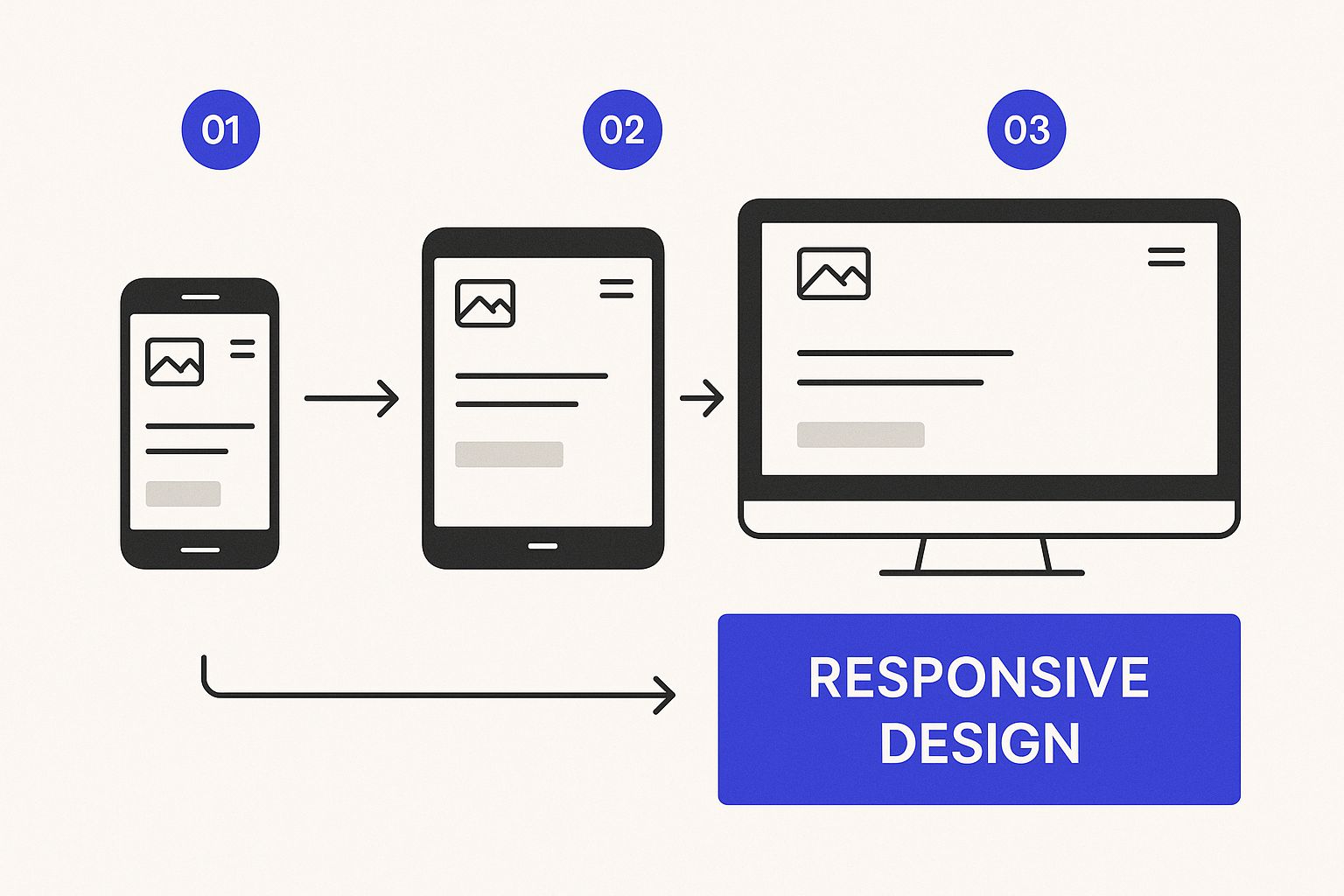
As you can see, a great header has to be fluid. It needs to adapt its layout and functionality to give the best possible experience on desktops, tablets, and phones. With more than half of all web traffic coming from mobile, a "mobile-first" mindset isn't just a buzzword—it's essential. In the next sections, we’ll get into exactly how to make that happen.
Making Your Header Responsive and Interactive
In a world filled with countless screen sizes, a static, one-size-fits-all header just doesn’t cut it anymore. Your approach to header design has to be fluid, creating an experience that feels natural whether it's on a massive desktop monitor or a tiny smartphone screen.
Let's be real: more than 50% of all web traffic now comes from mobile devices. That stat alone means a mobile-first approach isn't just a good idea—it's non-negotiable.
This is where Divi's responsive controls really shine. Just about every setting you can think of—from font sizes and padding to whether a module even shows up—can be fine-tuned for desktop, tablet, and mobile. This lets you move beyond just shrinking your desktop header and instead craft a completely different, totally optimized mobile experience.
Crafting a Mobile-First Header Experience
For mobile headers, the go-to solution is the hamburger menu. We've all seen it—that familiar three-line icon neatly tucks your navigation away, freeing up precious screen real estate for your actual content. It's clean, effective, and everyone knows how to use it.
Here’s how you can pull this off in the Divi Theme Builder:
- Hide the Big Stuff: First, find the row that holds your desktop menu. Head over to the Advanced > Visibility settings and simply disable it on tablets and phones. This stops your beautiful multi-column layout from trying to painfully cram itself onto a narrow screen.
- Build the Mobile Version: Now, add a completely new row just for your mobile header. Inside this row, place your logo and a Menu module. In the module's settings, you'll configure it to display the hamburger icon instead of the full menu.
- Set Its Visibility: Just like you did before, go to the Visibility settings for this new mobile row, but this time, disable it on desktops. Boom. You now have two distinct headers that only show up on their intended devices.
This separation is key because it gives you total creative freedom. You can build a full-featured desktop header with all the bells and whistles and a streamlined, tap-friendly mobile version without either one compromising the other.
If you want to get even fancier, you can explore how to create a responsive Divi popup menu, which gives you an even cleaner, app-like feel on mobile.
Adding Engaging Interactive Elements
Responsiveness makes your header work everywhere, but interactivity is what makes it feel alive and polished. These little touches give users crucial feedback and can seriously improve the usability of your site. They aren't just for show; they're functional enhancements that make navigation feel effortless.
One of the most effective interactive tricks is the sticky header. This feature locks your header to the top of the screen as the user scrolls, keeping your navigation and main CTA in sight at all times. In Divi’s Section settings, you'll find this under Advanced > Scroll Effects > Sticky Position. Just set it to "Stick to Top." It’s a simple tweak that saves users from the annoying scroll back to the top just to get around.
Interactivity transforms a static component into a helpful guide. Subtle effects like hover states and sticky positioning create a more intuitive and less frustrating user journey, which directly contributes to longer session times and lower bounce rates.
Another popular move is the transparent header that sits directly over your hero image or video. This creates a modern, layered look that pulls immediate focus to your most important visual content. You can do this by setting the background color of your header's Section to be fully transparent.
Combine this with the sticky header feature, and you can even have a solid background color appear only after the user starts scrolling. It's a slick transition that takes the header from immersive to functional in a single scroll. To top it off, add subtle hover effects to your menu links and buttons. This provides a clear visual cue that an element is clickable, which is a small detail that makes a big difference.
Pro-Level Techniques for a Polished Header
Ready to take your header from good to genuinely great? Moving beyond the basics means finessing the little details that elevate personalization, performance, and accessibility. This is where truly professional sites set themselves apart.
One of my favorite advanced moves in Divi is using dynamic content. Picture a header that greets returning customers by name. It’s not as complicated as it sounds. With Divi’s dynamic content features, you can pull a logged-in user’s display name right into the header, creating a personal touch that really builds connection and loyalty.
Optimizing Header Performance
Let's be blunt: a gorgeous header is useless if it tanks your site speed. Since that header loads on every single page, its performance has a massive, site-wide impact. And one of the biggest offenders is almost always an unoptimized logo file.
Whenever possible, save your logo as an SVG (Scalable Vector Graphic). SVGs are incredibly lightweight and stay perfectly crisp at any size, which is a huge win. If you absolutely must use a PNG, make sure you run it through an image compression tool first to shed every unnecessary kilobyte.
A fast-loading header isn't just a "nice-to-have"—it's a non-negotiable part of a good user experience. Every millisecond counts, and optimizing your header assets ensures that first impression is a speedy one, not a frustrating wait.
Designing for Everyone with Accessibility
An inclusive header is one that everyone can use, regardless of ability. Following the Web Content Accessibility Guidelines (WCAG) isn't just a box to check; it’s essential for reaching the widest possible audience.
Start with color contrast. Your menu text and any call-to-action buttons absolutely must have enough contrast against their background. The standard to aim for is a ratio of at least 4.5:1 for normal text. This simple check makes a world of difference for people with visual impairments.
Next, make sure your header is fully navigable using only a keyboard. A user should be able to hit the "Tab" key and move logically through every single clickable element—from the logo to the last menu item and the final CTA. For a complete rundown of all the crucial elements, you can check out our detailed guide on website header design.
The demand for high-quality, custom web development is absolutely surging. In fact, the market for web design services is projected to hit around $59.7 billion by the end of 2025. What's more, a solid 72% of agencies are seeing more demand for bespoke work over generic templates, which really underscores the value clients are placing on unique, polished headers.
Building an accessible, high-performing header comes down to sweating these finer details. By personalizing the experience with dynamic content, optimizing every asset for speed, and ensuring WCAG compliance, you’re creating a header that isn't just visually appealing—it's professional, efficient, and welcoming to every visitor.
Answering Your Top Header Design Questions
Even with the best tools in your arsenal, you're going to run into a few head-scratchers when building a custom header. It just comes with the territory. Let's walk through a couple of the most common questions I hear from fellow Divi users.
A big one is, "Can I have a different header for my homepage than for my other pages?" Absolutely. And you should! Your homepage header has a different job to do. With the Divi Theme Builder, you can set up a Global Header that shows up everywhere and then assign a completely different, more immersive header just for the homepage. This is the perfect way to make a strong first impression without weighing down all your other pages.
Another frequent pain point is vertical alignment. Trying to get your logo, menu items, and CTA button to line up just right can feel like an impossible puzzle. My go-to solution is almost always Flexbox. Just pop into your Row settings, go to Design > Sizing, and hit "Equalize Column Heights." From there, you can use the vertical alignment options in each column's settings to get everything perfectly centered. It works like a charm.
Why Does My Header Feel So Hard to Get Right?
If you're finding this whole process a bit of a struggle, trust me, you're not alone. Building a truly effective header is a genuine skill—it's this delicate balance of UX principles, design theory, and technical execution. It’s a specialty that a surprising number of designers just don't spend enough time on.
A great header feels completely effortless to the user. But behind that simplicity is often a ton of work solving complex challenges, from nailing the responsive behavior to establishing a clear visual hierarchy.
The industry stats back this up. Even with more web designers than ever, there's a real shortage of people who truly understand how to design an effective, user-centric header. In fact, a staggering 90% of website designers are considered unhirable because they lack creativity and a solid grasp of human-centered, measurable UX. Too many just fall back on templates, which leads to the generic, cookie-cutter headers we see all over the web. You can read more about this trend in the state of web design talent on agencyhandy.com. This really drives home how valuable it is to master custom header design.
Ready to build headers that actually convert and impress? With Divimode, you can craft dynamic headers, popups, and mega menus that truly captivate your audience. It's time to take full control of your Divi site. Start building smarter user experiences today at https://divimode.com.
More Articles You Will Like