 Alex Martin
You’ve finished a redesign, or you’ve built a product page that finally makes sense, and then you hit the same problem every Divi professional hits. The result is obvious when you look at it, but it’s not obvious to the client or visitor who never saw the mess that came before.
That’s where divi before and after presentations earn their keep. They compress the story. Instead of explaining outdated layouts, cluttered headers, weak conversion paths, or product improvements in five paragraphs, you show the contrast in one interaction.
There isn’t one right way to build these in Divi. Sometimes a simple side-by-side image is enough. Sometimes you need a draggable comparison slider. Sometimes the cleanest solution is custom code, especially if you care about keeping plugin weight under control. And if the goal is leads or sales, display strategy matters as much as the visual itself. That’s where targeted popups and behavioral triggers change the outcome.
Why Before and After Visuals Are a Superpower for Divi Sites
Most redesign portfolios fail at one thing. They show the polished final site, but they don’t show what changed. Visitors see good work, but they don’t immediately see the value of the work.
A before-and-after visual fixes that fast. It gives context to the result. For a freelancer selling redesigns, it proves judgment. For an agency, it shows process. For a local service business, it helps prospects understand the transformation, whether that’s a remodel, a smile makeover, a skin treatment, or a website cleanup.
Why the format works so well
Before-and-after visuals reduce explanation. A visitor doesn’t need to compare two separate case studies or scroll through a long project write-up. They can see contrast in layout, clarity, hierarchy, branding, photography, or product condition in seconds.
That matters in Divi because many users aren’t building hobby sites. A 2019 Elegant Themes survey found that 69% of Divi users rely on it for income, and 48% cite site speed as a top priority according to these Divi usage statistics. That combination tells you a lot. Divi users need visuals that sell work, but they also can’t afford lazy implementations that drag performance down.
Practical rule: A before-and-after element should answer one question clearly. What improved?
When the answer is muddy, the visual underperforms. I’ve seen sliders used on pages where both images are cropped differently, colors don’t match, or the “after” state is just a slightly different angle. That doesn’t persuade anyone. It confuses them.
Where divi before and after performs best
A few use cases keep coming up because they map cleanly to user intent:
- Website redesign portfolios where visitors want proof of modernization. If you handle website redesign and modernization, this format helps prospects grasp the difference between cosmetic tweaks and structural improvement.
- Service businesses that need visual proof, such as cleaning, landscaping, renovation, med spa, fitness, and restoration.
- WooCommerce product pages where the product itself changes appearance, finish, fit, or use case.
- Lead-generation landing pages where social proof needs to be quick and visual.
The key is restraint. One strong comparison usually does more than six weak ones. Use it where contrast is meaningful, not just because the widget looks nice.
The Simple Static Method Using Divi's Native Columns
The fastest way to build a divi before and after section is also the least flashy. Use a standard row, split it into two columns, and place the “before” asset on one side and the “after” asset on the other.
That sounds basic because it is. But basic is useful. It’s easy to maintain, doesn’t require another plugin, and won’t introduce interactive script overhead.

How to build it cleanly
Inside the Divi Builder, add a regular section and choose a two-column row. In each column, drop in an Image module. Put your “before” image on the left and your “after” image on the right. Then add a Text module above each image with clear labels.
A simple stack often works better than decorative styling:
- Add the row first. Keep gutter spacing controlled so both columns feel balanced.
- Use matching image dimensions. If one image is taller or cropped differently, the comparison immediately feels sloppy.
- Label both states clearly. “Before” and “After” is often enough. For product pages, a more specific label can work better.
- Keep surrounding copy short. One sentence of context is usually plenty.
- Check tablet and phone views manually. On smaller screens, stacked images often work better than forcing side-by-side compression.
Where this method shines
This approach works when the comparison doesn’t need interaction. Portfolio pages, case study grids, service pages, and testimonial-backed transformations are all good fits.
It also works when you want total stability. No moving handle. No touch interaction problems. No plugin compatibility question. Just two images and controlled layout.
For image prep, cropping, dimensions, and visual consistency, Divi users usually benefit from a proper guide to using images with Divi. The build itself is simple, but image discipline is what makes the output look professional.
A static comparison often converts better than an interactive one when the audience is scanning quickly on mobile.
What it does not do well
The downside is obvious. It doesn’t invite interaction. Users can compare the two states, but they can’t drag a divider and inspect details in the same frame.
That makes it weaker for:
- Subtle design changes where overlap matters
- Beauty, restoration, or product-detail work where texture needs close inspection
- High-attention landing sections that need more engagement
- E-commerce storytelling where a more tactile experience helps
If you need a low-risk baseline, native columns are still the place to start. I treat this as the control version. If the page needs more engagement later, then I move to a slider.
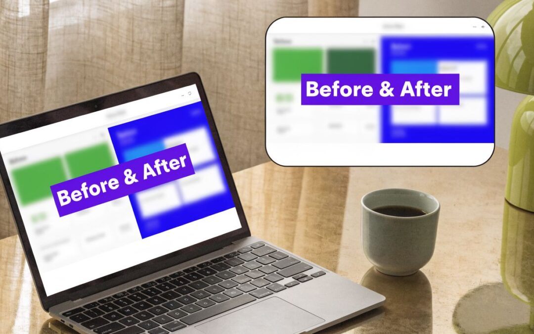
Creating Interactive Comparisons with a Slider Plugin
A visitor lands on a service page, drags a handle across a photo, and understands the result in two seconds. That is why slider plugins work so well for before and after content. They turn a passive comparison into an action, and that extra interaction usually increases attention on visual proof.

I use this method when the change needs overlap to make sense. Design revisions, photo retouching, renovations, cosmetic treatments, and product detail improvements all benefit from a draggable reveal. Users can inspect the same frame instead of mentally comparing two separate images.
Typical plugin workflow
The setup is usually simple inside Divi. Install the plugin, enable its module, drop the before and after module into your layout, then assign the two images and adjust the handle, labels, and orientation.
A clean build depends less on the plugin and more on the prep work.
- Use matched images. Same crop, same focal point, same dimensions.
- Start with horizontal mode. It is easier for visitors to understand and usually works better on mobile.
- Keep the handle obvious. If users miss it, the module loses its value.
- Use labels sparingly. "Before" and "After" is enough in most cases.
- Test on an actual phone. Drag behavior that feels fine with a mouse can feel awkward on touch screens.
If you want a module-level walkthrough, this before and after slider tutorial for Divi shows the basic setup and styling flow.
Here’s a visual walkthrough that helps if you prefer seeing the interface in motion:
The trade-offs that matter
Plugins are the fastest route to interactivity, but they are not automatically the cleanest route. You are adding another layer of CSS, JavaScript, and editor UI to a page that already runs inside Divi. On a simple marketing page, that is often a fair trade. On a heavily customized site, it can become one more thing to debug.
Mobile behavior is where weak plugins usually show their limits. I have seen sliders look fine in a full-width desktop section, then break rhythm inside narrow columns, product templates, or sticky layouts. Spacing issues, awkward handle positioning, and jumpy touch interaction are common problems. Check the module inside the exact layout where it will live, not just on the plugin demo page.
Divi Before/After Method Comparison
| Method | Ease of Use | Interactivity | Performance Impact |
|---|---|---|---|
| Native Divi columns | High | Low | Low |
| Slider plugin | Medium to High | High | Medium |
| Custom CSS and JavaScript | Medium | High | Low to Medium |
A plugin is often the right middle ground for client work. Editors get a reusable visual module, and you avoid writing custom logic for every slider. The limitation is flexibility. If you want tighter control over performance, custom behavior, or advanced display rules, a strong advantage comes from pairing the slider with Divi Areas Pro later so the comparison can appear in a popup, on click, on scroll, or after a delay for lead generation and campaign targeting.
The Pro Approach with Custom CSS and JavaScript
Custom code is the method I reach for when I want control over markup, styling, and behavior without committing to another full-featured plugin. It takes more setup, but you decide exactly what loads and where.
That matters on lean builds, client sites with strict plugin policies, and projects where a generic module never quite fits the design system.

A lightweight structure that works
You can build a basic comparison slider with a Code Module and a small JavaScript helper. The HTML structure is simple: one wrapper, two layered images, and a draggable divider.
Use a Code Module for the markup:
<div class="ba-slider" aria-label="Before and after image comparison">
  <img src="before.jpg" alt="Original version" class="ba-image">
  <div class="ba-resize">
    <img src="after.jpg" alt="Improved version" class="ba-image">
  </div>
  <span class="ba-handle" aria-hidden="true"></span>
</div>
Add CSS in Divi Theme Options or your child theme:
.ba-slider {
  position: relative;
  overflow: hidden;
  max-width: 100%;
}

.ba-image {
  display: block;
  width: 100%;
  height: auto;
}

.ba-resize {
  position: absolute;
  top: 0;
  left: 0;
  width: 50%;
  height: 100%;
  overflow: hidden;
}

.ba-handle {
  position: absolute;
  top: 0;
  left: 50%;
  width: 3px;
  height: 100%;
  background: #fff;
  cursor: ew-resize;
  transform: translateX(-50%);
}
Then add JavaScript in Theme Options integration or your child theme script file:
<script>
document.querySelectorAll('.ba-slider').forEach(function(slider) {
  const resize = slider.querySelector('.ba-resize');
  const handle = slider.querySelector('.ba-handle');

  function updateSlider(x) {
    const rect = slider.getBoundingClientRect();
    let offset = x - rect.left;
    if (offset < 0) offset = 0;
    if (offset > rect.width) offset = rect.width;
    const percent = (offset / rect.width) * 100;
    resize.style.width = percent + '%';
    handle.style.left = percent + '%';
  }

  slider.addEventListener('mousemove', function(e) {
    if (slider.classList.contains('is-dragging')) updateSlider(e.clientX);
  });

  slider.addEventListener('mousedown', function() {
    slider.classList.add('is-dragging');
  });

  window.addEventListener('mouseup', function() {
    slider.classList.remove('is-dragging');
  });
});
</script>
Why custom wins for some builds
The primary advantage isn’t the code itself. It’s control. You can match the divider to the brand system, integrate it into unusual layouts, and avoid loading a larger feature set you don’t need.
This is also where advanced Divi 5 users should think beyond sliders. Divi 5’s native Woo modules can be a plugin-free alternative, and beta user reports say they can be 40% faster to build while avoiding the typical +0.5s load time associated with slider plugins, according to the WordPress plugin discussion referenced here. For product storytelling, that opens an interesting option: build “before” and “after” product states with native templates and loops instead of an image comparison widget.
Custom code is worth it when the comparison is part of a larger system, not just a one-off visual.
What usually goes wrong
The common failures are predictable:
- Editors can’t maintain it if you don’t document where the code lives.
- Touch support gets overlooked if you only test with a mouse.
- Image sizing breaks the illusion when source files aren’t matched.
- Theme updates expose weak placement choices if code is scattered across pages.
If you go custom, keep the implementation centralized. One reusable pattern is better than six slightly different snippets hidden in random Code Modules.
Displaying Your Showcase with Divi Areas Pro Popups
A before-and-after comparison sitting halfway down a page might look good and still do very little. Placement changes the result. Triggering changes it even more.
Behavioral display matters. A strong comparison can work as a popup, fly-in, or injected content block instead of a passive page element. That makes sense for portfolio pages, service pages, and product pages where attention drops before the visitor reaches the proof.

Where the strategy changes
An exit-intent popup showing your strongest redesign can recover attention right when a prospect is about to leave. A scroll-triggered fly-in can surface a product transformation after someone has shown interest. A targeted mega menu panel can display visual proof before the click into a deeper service page.
That’s the angle most divi before and after tutorials skip. They focus on how to build the widget, not how to deploy it when behavior suggests the visitor is ready to act.
If you want the implementation path, this guide on displaying content with Divi Areas Pro covers the trigger logic and placement options.
A practical setup that converts
For e-commerce and lead generation, I like this sequence:
- Build the comparison first. Static, plugin-based, or custom. The format matters less than the clarity.
- Wrap it inside a reusable area. That keeps the asset separate from page content.
- Attach a meaningful trigger. Exit intent, back-button trigger, or scroll depth usually makes more sense than instant display.
- Target the right context. Product pages, case study pages, or service pages with clear commercial intent.
- Pair it with one action. Book a call, view the case study, claim the offer, or add to cart.
This isn’t theory. Displaying offers in exit-intent popups with Divi Areas Pro has produced a 28% conversion recovery rate, and for a site with 1500 monthly visitors and a $29 average order value, that can translate to a $12,000 revenue uplift, according to the Elegant Themes survey results article.
What works and what doesn't
What works is relevance. If the popup shows a before-and-after related to the page the visitor is already on, it feels persuasive. If it interrupts with something generic, it feels like noise.
What doesn’t work:
- Showing the popup too early
- Using weak comparisons just because you have them
- Stacking multiple calls to action
- Ignoring device targeting
- Forgetting to suppress repeat views for engaged users
The popup is not the message. The comparison is the message. The popup is just the delivery mechanism.
Optimization Tips for Performance and Accessibility
A before-and-after element usually fails for boring reasons. The images are too heavy. The container has no reserved height. The drag handle works on desktop but becomes awkward on touch devices. On Divi sites, those small implementation mistakes are what turn a strong visual into a slow, unstable block.
Start with the assets, because that is where performance usually falls apart.
Performance problems usually start with assets
Export each image at the size the layout needs. If the comparison renders at 1200px wide, uploading a 4000px source file just wastes bandwidth. Compress before upload, use modern formats when they make sense, and keep both images identical in dimensions and crop. If they do not match, the slider has to compensate, and that is where odd spacing and jumpy rendering begin.
For teams working through broader website speed optimization, the same rule applies here. A comparison module cannot compensate for oversized media.
Plugin sliders can add their own overhead too. Some load extra scripts and styles on pages that do not need them. Custom builds are often lighter, but they also put more responsibility on you to handle sizing, touch support, and accessibility properly. Native column layouts stay lightest of all, though they obviously do not give you the interactive reveal effect.
Fixing mobile layout shifts
Mobile issues usually come from one of three things. Mismatched aspect ratios, inherited height rules from the surrounding Divi row, or desktop spacing values that were never reduced for smaller screens.
A few habits prevent most of the cleanup work later:
- Match aspect ratios exactly. Do not ask CSS to hide differences in crop or framing.
- Reserve space before the images load. Give the wrapper a predictable shape so the page does not jump.
- Test inside the full context. WooCommerce tabs, accordions, sticky sections, and popup containers can all change how the slider behaves.
- Cut padding on phone layouts. Large desktop spacing often creates empty gaps that look like a broken module.
Here’s a useful CSS pattern for mobile cleanup:
@media (max-width: 767px) {
  .ba-slider-wrapper {
    margin-bottom: 1rem;
  }

  .ba-slider img {
    aspect-ratio: 4 / 3;
    object-fit: cover;
  }
}
That one change solves a lot of “mystery gap” complaints.
If you are placing the comparison inside a Divi Areas Pro popup or fly-in, test it there too. Popup animations, delayed rendering, and scroll locking can expose layout issues that never appear in the normal page flow.
Accessibility is required
A comparison is still content, and content needs context. Alt text should describe the change shown in the images, not just label them as “before” and “after.” If the improvement is a kitchen remodel, skin treatment, product restoration, or design refresh, say that directly.
Interactive sliders need keyboard access and an accessible name for the control. If your plugin does not offer that, check the markup or choose a different method. Custom code gives you more control here, but you have to build it deliberately.
I also recommend adding a short caption under the module on sales pages and lead generation pages. Some visitors will not drag the handle. Others will not immediately understand what changed. A plain-language caption fixes both problems and makes the comparison more useful in popups, landing pages, and service pages where clarity matters more than novelty.
Frequently Asked Questions
A few issues keep coming up when teams add divi before and after elements to client sites. Most of them come down to compatibility, maintenance, and choosing the right method for the page.
FAQ
| Question | Answer |
|---|---|
| Should I use a slider plugin or build it natively? | Use native columns when the comparison is simple and static. Use a slider when overlap matters and interaction improves clarity. |
| Is custom code worth it? | Yes, if you need tighter control, lighter loading, or a design that plugin modules can’t match cleanly. It’s less ideal if non-technical editors need to rebuild sections often. |
| Will Divi 5 affect my current before-and-after setup? | It can. Divi 5 moves from shortcodes to native HTML5 output, and migrated sites often see a 25 to 40% reduction in HTML size, which means plugin compatibility becomes more important if you want to keep those gains, as explained in this Divi 5 migration video. |
| What should I test before launch? | Check desktop, tablet, phone, popup contexts, and any WooCommerce templates where the comparison appears. Pay special attention to image sizing and touch interaction. |
| Can I use before-and-after elements for lead generation? | Yes. They work well in popups, fly-ins, and high-intent sections when the comparison directly supports the page offer. |
| What is the most common mistake? | Using mismatched images. If the crop, angle, lighting, or dimensions change too much, the comparison loses credibility immediately. |
The strongest before-and-after implementations aren’t the most animated ones. They’re the ones that make the change obvious, keep the page fast, and appear at the right moment for the visitor.
If you want to turn a visual comparison into a targeted popup, fly-in, mega menu, or injected content block inside Divi, Divimode publishes practical tutorials and tools built around those use cases. That’s useful when your goal isn’t just to show the transformation, but to place it where it can influence clicks, leads, and conversions.
More Articles You Will Like