When you're building a website, layering a semi-transparent color or gradient over an image is a classic move. We call this a CSS overlay, and it's a game-changer for improving text readability or just nailing a specific design aesthetic. The magic happens with a few core CSS properties like position, opacity, and sometimes the more advanced background-blend-mode.
This isn't just a trendy trick; it's a fundamental technique for modern web design. Mastering it lets you build interfaces that are both dynamic and visually sharp.
Why CSS Image Overlays Are a Developer's Go-To Tool
Before we jump into the code, let's talk about why this technique is so valuable. At its heart, an overlay solves a very common problem: making text readable when it’s sitting on top of a busy background image. We've all seen it—vibrant photos that clash with headlines, making for a clunky and frustrating user experience. An overlay cleans that right up.
But their usefulness goes way beyond just legibility. Overlays are a powerful tool for directing a user's attention and reinforcing a brand's visual identity. Think about a hero section with a big call-to-action. A subtle, dark overlay can make the headline and button pop, drawing the user's eye exactly where you want it. You'll see this everywhere, from e-commerce product shots to the hero banners on portfolio sites.
Practical Applications in Modern Web Design
The real beauty of CSS overlays is their versatility. They aren't just for static hero images. You can bake them into dynamic, interactive components that seriously elevate a site's usability and overall feel.
Here are a few scenarios where I find myself reaching for overlays all the time:
- Interactive Hover Effects: On a portfolio grid, you can have an overlay slide in on hover, revealing project details or a "View More" link. It’s a simple way to add a layer of interactivity that feels clean and modern.
- Promotional Banners: E-commerce sites constantly use color overlays on product images to highlight sales or new arrivals. A quick overlay in a brand color can instantly signal a special offer.
- Video Thumbnails: Slapping a play button and a title over a video thumbnail is standard practice. A dark overlay behind them makes it crystal clear that the element is a playable video.
Key Takeaway: A well-executed CSS overlay enhances both form and function. It boosts readability, directs focus, and strengthens brand consistency—all without needing heavy JavaScript or slowing down your page.
Once you get comfortable with this technique, you'll find it adds a layer of professionalism to just about any project. It’s a foundational skill that opens the door to creating more polished and effective user interfaces. As we dig into the different ways to create these overlays, keep these practical uses in mind. Each method has its own strengths, giving you the flexibility to pick the perfect solution for your specific design challenge.
The Foundational Absolute Positioning Method
When it comes to creating a classic CSS overlay, the absolute positioning method is the old reliable. It's the workhorse technique that pretty much every developer learns first, and for good reason: it gives you precise control and is universally understood. The whole trick hinges on a simple parent-child relationship in your HTML.
First up, you'll need a container element—a <div> is perfect for this—that will wrap both your image and the overlay. This container becomes the boundary for our overlay. Inside it, just drop your <img> tag and another <div> that will serve as the actual overlay.

This structure is clean, makes semantic sense, and perfectly sets the stage for the CSS magic to come.
The CSS Positioning Dance
The real key to making this work is the interplay between position: relative and position: absolute. By setting the parent .image-container to position: relative, you're essentially telling the browser, "Hey, create a new positioning context right here." This ensures that any absolutely positioned children will be placed relative to this container, not the entire webpage.
Next, you grab the .overlay element and give it position: absolute. This effectively lifts the overlay out of the normal document flow, letting it sit right on top of the image. From there, you just need to stretch it to cover the entire container.
.image-container {
position: relative;
width: 100%; /* Or any specific size */
}
.overlay {
position: absolute;
top: 0;
left: 0;
right: 0;
bottom: 0;
background-color: rgba(0, 0, 0, 0.5); /* Semi-transparent black /
opacity: 0; / Hidden by default for hover effects */
transition: opacity 0.3s ease;
}
.image-container:hover .overlay {
opacity: 1; /* Show overlay on hover */
}
Pay close attention to the rgba() value for the background color. That 'a' stands for alpha, and it's what controls transparency. By setting it to 0.5, we're creating a 50% transparent black overlay, which lets the image underneath peek through. For a deeper dive into foundational methods like this, check out these top techniques for text over images HTML.
Centering Text for Maximum Impact
An overlay isn't much use without some content, and usually, you'll want that content perfectly centered. Thankfully, modern CSS makes this a piece of cake with Flexbox. Just a few extra properties on your .overlay class, and you're good to go.
.overlay {
/* … existing styles … /
display: flex;
justify-content: center; / Center horizontally /
align-items: center; / Center vertically /
color: white; / Make text readable */
text-align: center;
}
This simple addition ensures your text is perfectly centered, no matter the container's size. It's a clean, modern way to handle alignment that just works.
This approach has been a cornerstone of web design ever since responsive design became the standard. It’s proven to be a reliable way to keep overlaid text legible against all kinds of different image backgrounds.
This absolute positioning method for css overlay images is incredibly robust. It’s a solid foundation you can easily build upon with slick transitions, animations, or more complex content, making it the perfect starting point for just about any project.
Creating Leaner Overlays with CSS Pseudo-Elements
While dropping an extra <div> in your markup for an overlay gets the job done, modern CSS gives us an even slicker way to pull off the same effect: pseudo-elements. By using ::before or ::after, you can conjure up a virtual element right from your stylesheet. This means no extra fluff in your HTML, keeping your code both lean and semantic.
Think of a pseudo-element as a phantom child element. It lives inside its parent, you can style it just like a real one, but it doesn’t actually exist in the DOM. This makes it the perfect tool for purely decorative jobs, like creating a CSS overlay, and lets you keep your HTML focused entirely on content and structure.
Harnessing the Power of ::before
To create our overlay, we'll attach a ::before pseudo-element to our main image container. Just like the absolute positioning method, the parent container still needs position: relative to act as an anchor. The pseudo-element will then be absolutely positioned to stretch across the entire container.
The real magic happens in the CSS. You'll notice the HTML is much simpler now—no dedicated .overlay div in sight.

Now for the stylesheet. The content: '' property is absolutely essential; without it, the pseudo-element simply won't show up. From there, it's the same absolute positioning game we played before to make it cover the container.
.image-container-pseudo {
position: relative;
/* Make sure the container has its own dimensions /
width: 100%;
display: inline-block; / Helps contain the pseudo-element nicely */
}
.image-container-pseudo::before {
content: ''; /* This is required for the pseudo-element to render /
position: absolute;
top: 0;
left: 0;
right: 0;
bottom: 0;
background-color: rgba(98, 0, 238, 0.6); / A vibrant purple overlay /
z-index: 1; / Sits above the image but below the text */
opacity: 0;
transition: opacity 0.4s ease-in-out;
}
.image-container-pseudo:hover::before {
opacity: 1; /* Fades the overlay in on hover */
}
When to Choose Pseudo-Elements
So, when is this method the right call? It really shines when your overlay is purely decorative—think a simple color, a smooth gradient, or a subtle pattern. Since you can't stuff more HTML elements inside a pseudo-element, it's not the best fit if your overlay needs to house complex content like buttons, icons, or multiple paragraphs of text.
To help you decide which approach works best for your project, here’s a quick rundown of how the two methods stack up.
Overlay Technique Comparison
| Feature | Absolute Positioning Method | Pseudo-Element Method |
|---|---|---|
| HTML Markup | Requires an extra <div> |
No extra HTML needed |
| Code Cleanliness | Slightly clutters the HTML | Keeps HTML semantic and clean |
| Overlay Content | Can contain complex HTML (buttons, text) | Limited to what CSS can generate (colors, gradients) |
| Use Case | Best for interactive overlays with multiple elements | Ideal for simple, decorative overlays |
Ultimately, both methods are powerful tools in your CSS arsenal. Your choice will depend on the specific needs of your design.
The infographic below breaks down the fundamental steps for creating a color overlay with CSS, a process that applies to both techniques we've covered.
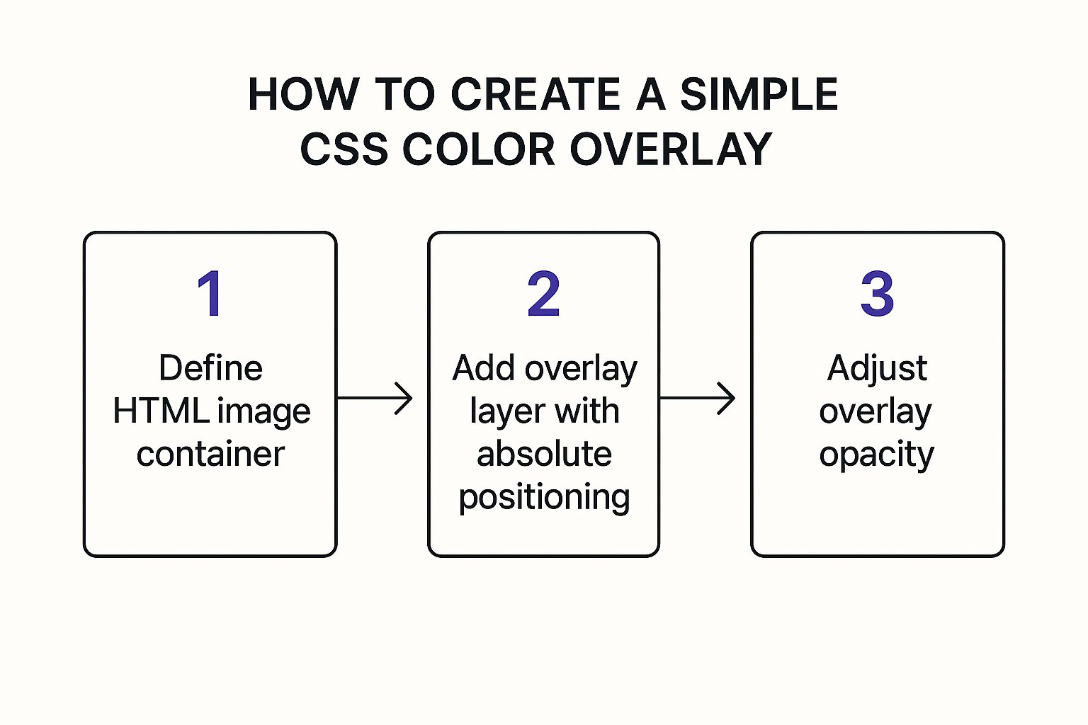
This visual really drives home the core concept: you're just positioning one layer on top of another. It’s the foundation for all effective css overlay images.
Pro Tip: One of the biggest wins for this method is code maintainability. By keeping stylistic elements out of your HTML, you make your templates cleaner and far easier to manage down the road. This is a lifesaver on large-scale projects or when working within a CMS.
This technique is also fantastic for building subtle, interactive effects. If you're looking to dive into more complex interactions, check out this great guide on how to create Divi hover effects for some advanced ideas. At the end of the day, deciding between an extra <div> and a pseudo-element all comes down to the complexity of your overlay's content.
Unlocking Creative Effects with CSS Blend Modes
So far, we’ve stuck to solid colors and simple gradients. But what if you want to get a little more artistic? This is where CSS blend modes come into play, letting you create effects that used to be the exclusive domain of tools like Photoshop, right inside the browser.
Blend modes essentially tell the browser how two layers should visually interact. For our purposes, that means we're blending our overlay's color with the pixels of the image beneath it. This opens up a whole world of creative possibilities that go way beyond a simple transparent tint.
Mix-Blend-Mode vs. Background-Blend-Mode
CSS gives us two properties to play with here: mix-blend-mode and background-blend-mode. They can produce similar results, but they're applied in totally different contexts.
background-blend-mode: You'll use this one when you have multiple background layers on a single element. Think of setting a background image and a background gradient on the samedivand then blending them together.mix-blend-mode: This property is for blending separate, stacked elements. It’s a perfect fit for the absolute positioning or pseudo-element methods we've already covered, as it blends our overlay element with the image element sitting below it.
When it comes to creating CSS overlay images, I find that mix-blend-mode is usually the more flexible and intuitive option, since it just works with the HTML structures we've already built.
Popular Blend Modes and Their Effects
There are quite a few blend modes available, but a handful really stand out for their practical and aesthetic value. Let's look at three of the most useful ones for making some really stunning image overlays.
multiply: This is my go-to for creating a darker, more dramatic effect. It multiplies the colors of the overlay and the image, which is fantastic for moody, atmospheric hero images. A dark blue overlay on a cityscape photo, for instance, can instantly create a rich, cinematic nighttime feel.screen: The exact opposite ofmultiply, this mode brightens everything up. It’s great for creating ethereal, washed-out looks or for blending light-colored textures over an image to add a subtle, dreamy quality.color: This one is super useful. It takes the hue and saturation from your overlay and combines it with the brightness of the image underneath. It’s the perfect way to create duotone or tinted photo effects while keeping all the original details and shadows intact.
A Quick Word on Performance: Blend modes are a bit more work for the browser than a simple
opacitychange. Modern browsers handle them just fine, but if you're planning on using them all over a page with dozens of other elements, it's something to keep in mind to ensure a smooth experience.
The artistic use of these effects is definitely on the rise. We're seeing creative CSS image overlay effects become incredibly popular, with over 50 different styles being used widely across the web. In fact, some analyses show that sites using animated overlays and creative effects see average session durations that are 30% longer than sites with just static images. You can explore a bunch of these techniques over at Prismic.io.
Putting It Into Practice
Let's see just how easy it is to apply a blend mode. We can take our pseudo-element example from before and just swap out the opacity property for mix-blend-mode.
.image-container-blend::before {
content: '';
position: absolute;
top: 0;
left: 0;
width: 100%;
height: 100%;
background-color: #ff007f; /* A bold magenta /
mix-blend-mode: multiply; / The blend mode does all the work */
}
That's it. With just one line of code—mix-blend-mode: multiply;—we've completely changed how the overlay and image interact. This simple property gives you the power to create unique, branded imagery that grabs a visitor's attention and sets a specific tone for your entire site.
Building Overlays That Are Fast and Accessible
A slick-looking overlay is great, but it's worthless if it grinds your website to a halt or makes your content impossible for some people to read. The real trick to creating effective css overlay images is striking that perfect balance between style, speed, and accessibility. A beautiful design should never, ever come at the cost of usability.
Performance is a big deal, especially if you’re getting fancy with animations or blend modes. One of the easiest wins here is to use modern image formats. From a performance perspective, CSS background image overlays are a fantastic practice. In fact, studies show that sites combining CSS overlays with next-gen image formats like WebP saw page load times improve by up to 25% compared to sites using older techniques. You can dig into these performance findings on itsmybot.com to see just how much of a difference it makes.
Prioritizing User Experience for Everyone
Beyond pure speed, making sure everyone can access your content is non-negotiable. Accessibility isn't just a box to check; it’s a fundamental part of good design.
- Color Contrast: Text on an overlay has to be readable. Period. The overlay's opacity needs to be just right to create enough contrast between your text and the background image. I always have a tool like the WebAIM Contrast Checker open in a tab to make sure my color combos meet WCAG guidelines.
- Hardware-Accelerated Animations: Want smooth hover effects or slick transitions? Stick to animating the CSS
transformandopacityproperties. The browser hands these off to the GPU, giving you fluid animations that don’t stutter or slow down the main thread. - Screen Reader Compatibility: If your overlay is interactive—like a popup or a clickable banner—it has to make sense to a screen reader. Using ARIA (Accessible Rich Internet Applications) attributes like
aria-labelorrole="button"gives crucial context to anyone using assistive tech.
Remember, an accessible design is simply a better design for everyone. Clear contrast and a logical structure don't just help users with disabilities; they improve the experience for every single person who visits your site.
When you're building a modal or popup overlay, giving users a clear way out is crucial. This usually means a well-designed, accessible close icon. Our guide on how to create a custom close button walks you through the steps to build one that’s both stylish and easy to use.
By weaving these performance and accessibility practices into your workflow, you can build overlays that aren't just beautiful—they're also fast, inclusive, and genuinely user-friendly.
Common Questions About CSS Image Overlays
Even once you get the hang of a few techniques, you'll inevitably run into some quirky challenges when building css overlay images. I've seen the same questions pop up time and time again, so let's tackle a few of the big ones. Think of this as a quick-reference guide to get you past those common roadblocks.
One of the first hurdles everyone hits is responsiveness. How do you make sure your slick overlay and its text don't fall apart on a tiny mobile screen? The secret is to stop thinking in fixed pixels.
Instead, embrace relative units. Using vw (viewport width) for font sizes or leveraging the powerful clamp() function will create fluid typography that scales beautifully. For things like padding and width, stick to percentages. This ensures the layout just adapts, preventing text from awkwardly spilling out of its container.
Handling Browser Compatibility
Another pain point I hear about is browser support, especially for newer CSS properties like mix-blend-mode. Support is pretty solid across the board these days, but you can still run into trouble with older browsers or certain mobile clients. So what's the game plan?
My go-to strategy is progressive enhancement using CSS feature queries. With @supports, you can check if a browser understands a property before applying it. This lets you code a reliable fallback for everyone and then layer on the fancy stuff for browsers that can handle it.
Here’s a quick example:
.overlay {
/* This is our fallback for older browsers */
background-color: rgba(20, 20, 80, 0.6);
}
@supports (mix-blend-mode: multiply) {
.overlay {
/* And here's the enhanced version */
background-color: hsl(240, 60%, 20%);
mix-blend-mode: multiply;
}
}
This approach guarantees a functional, good-looking design for all users while still delivering that "wow" factor to those with modern browsers.
Key Insight: Don't think of fallbacks as a downgrade. Consider them a solid baseline experience. Building with progressive enhancement ensures your core design is robust and reliable—a true hallmark of professional front-end work.
And a final question: can you stack multiple overlays on one image? Absolutely. This is where pseudo-elements become your best friend. You can use both ::before and ::after on the same container to create some really cool layered effects.
For instance, you could use ::before for a solid color tint and then layer a subtle noise pattern on top with ::after. The only thing to watch is your z-index values to keep the stacking order straight. It's a fantastic trick for adding depth without bloating your HTML.
Speaking of more complex layouts, sometimes managing intricate overlays calls for a more powerful tool. For interactive content like popups, our comparison of the top Divi popup plugins is a great resource.
