Attracting traffic to your Divi website is only half the battle. The real challenge lies in turning those visitors into customers, subscribers, or leads. This is where Conversion Rate Optimization (CRO) becomes your most valuable strategy. It’s a systematic process of refining your website to enhance user experience and guide more visitors to take a desired action, like making a purchase or filling out a form. However, knowing where to start can feel overwhelming.
That’s why we’ve created this definitive conversion rate optimization checklist. This guide moves beyond generic advice, offering a structured, step-by-step list of actionable tasks. We'll provide specific, high-impact strategies tailored for Divi users, equipping you to systematically boost your site's performance.
This is not a list of vague ideas. Instead, you will find a practical roadmap designed to deliver measurable results. We will cover critical tasks including:
- A/B testing headlines and value propositions.
- Optimizing call-to-action (CTA) button design and copy.
- Streamlining forms to reduce friction and increase submissions.
- Improving page speed and technical performance for a better user experience.
- Adding social proof and trust signals to build credibility.
- Enhancing mobile responsiveness for users on any device.
- Implementing behavioral triggers like exit-intent popups.
Whether you're a seasoned marketer or a designer looking to add more value for your clients, this checklist provides a structured path to identify opportunities, test hypotheses, and achieve meaningful growth in your conversion rates. Let's transform your site from a digital brochure into a high-performing conversion machine.
1. A/B Test Your Headlines and Value Propositions
Your headline is the digital equivalent of a first impression. It’s often the single most influential element on your landing page, determining in seconds whether a visitor stays to learn more or clicks the back button. A compelling headline, paired with a clear value proposition, immediately communicates why a visitor should care about your offer. This crucial first step in any conversion rate optimization checklist involves systematically testing different versions of your headlines and subheadings to find what truly connects with your audience.
The goal is to move beyond guesswork and use data to discover the language that drives action. A/B testing, also known as split testing, is the methodology for this. It involves creating two or more versions of a page (e.g., Version A with the original headline, Version B with a new headline) and showing them to different segments of your audience simultaneously. By tracking which version leads to more conversions, you can definitively identify the more effective messaging.
Why This Is a Critical First Step
Starting with headline testing is strategic because it has a disproportionately large impact on user behavior. Even a small change can yield significant results. For example, the project management tool Basecamp famously increased signups by changing their headline to focus on a direct, organizational benefit. Similarly, Unbounce, a leader in landing page optimization, has demonstrated that benefit-driven headlines consistently outperform feature-focused ones.
The principle is simple: your headline must answer the visitor’s core question, "What's in it for me?"
Actionable Tips for Headline & Value Proposition Testing
- Isolate Your Variables: To get clean, reliable data, test only one element at a time. If you change the headline, the subheading, and the button text all at once, you won't know which change was responsible for the lift (or drop) in conversions.
- Focus on Benefits, Not Features: Customers buy solutions to their problems. Instead of saying "Our software has a 256-bit encryption," try "Keep your data safe with military-grade security."
- Use Clear, Specific Language: Vague statements like "The best solution for your business" are forgettable. Instead, try something specific and tangible like, "Build Your Online Store in 30 Minutes or Less."
- Match Message to Audience: Ensure your headline aligns with the ad copy or link that brought the visitor to the page. A disconnect between the ad's promise and the landing page's headline creates confusion and kills conversions.
To help visualize the core parameters of a successful headline test, here is a quick reference on what to expect.
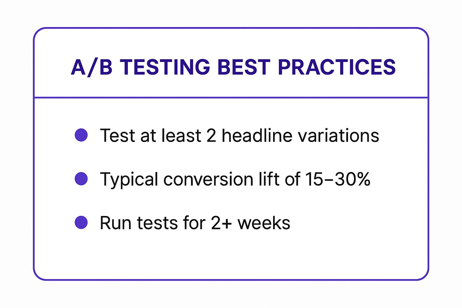
As the data highlights, a structured approach involving at least two variations and a sufficient testing period is essential for achieving a meaningful conversion lift. By following these guidelines, you can ensure your headline tests produce statistically significant results that inform your optimization strategy.
2. Optimize Your Call-to-Action (CTA) Buttons
The Call-to-Action (CTA) button is the gateway to your conversion. It's the final, decisive step a visitor takes before becoming a lead, a subscriber, or a customer. A poorly optimized CTA can stop an otherwise interested user in their tracks, while a compelling one acts as a powerful magnet for clicks. This crucial part of any conversion rate optimization checklist involves methodically testing every aspect of your buttons, from color and size to placement and text, to maximize user action.

The process is about more than just making a button look good; it’s about using psychology and design principles to remove friction and create a clear, irresistible path to conversion. By split-testing variables like button copy, shape, and visual contrast, you can gather hard data on what motivates your specific audience, moving from assumptions to evidence-based decisions that directly impact your bottom line.
Why This Is a Critical Conversion Point
The CTA is the culmination of your entire page's effort. You can have a perfect headline, persuasive copy, and stunning visuals, but if the final instruction is weak, unclear, or unappealing, the conversion is lost. CRO specialists like Michael Aagaard and Unbounce co-founder Oli Gardner have built entire methodologies around this single element.
Success stories are abundant. For instance, Performable (now part of HubSpot) famously boosted its click-through rate by 21% with a simple copy change from "Start your free 30-day trial" to the more personal "Start my free 30-day trial." This highlights how even subtle tweaks can have a massive impact on user psychology and action.
Actionable Tips for CTA Optimization
- Use First-Person, Action-Oriented Language: Frame the button text from the user's perspective. Instead of "Download Your Guide," test "Download My Guide." Verbs that convey value and immediacy, like "Get," "Start," "Join," or "Claim," are typically more effective than passive words like "Submit."
- Create Strong Visual Contrast: Your CTA should be impossible to miss. Use a color that stands out from the rest of the page's color scheme. The goal isn't to find the "best" color universally but the most attention-grabbing color for your design.
- Test Button Placement and Size: Don't assume the best spot for your CTA. Test it above the fold, below the fold, and even as a sticky element. Ensure the button is large and easy to tap on mobile devices without being obnoxiously oversized.
- Add "Click Triggers": Reduce user anxiety by placing small reassurances near the button. Text like "100% free," "No credit card required," or "Cancel anytime" can significantly boost confidence and click-through rates. To dive deeper into crafting these elements, you can learn more about how to create high-converting CTA buttons.
3. Reduce Form Fields and Optimize Form Design
Your forms are the final gatekeepers to conversion. They represent the last step a user takes before becoming a lead, a subscriber, or a customer. Every field you add introduces friction and cognitive load, giving users a reason to abandon the process. Optimizing your forms by reducing fields and improving the user experience is a foundational element of any conversion rate optimization checklist, directly impacting your bottom line by making it easier for users to complete their goals.
The principle is simple: the less work you make a user do, the more likely they are to do it. This involves a careful balance between gathering enough information for your sales or marketing team and minimizing the effort required from the user. Form optimization is about making this final, crucial interaction as seamless and painless as possible.

Why This Is a Critical First Step
Form abandonment is a major conversion killer. Each unnecessary field increases the time and effort required, raising the probability of a user leaving. For example, Expedia famously discovered that removing a single, optional "Company" field from their booking form increased their annual profit by $12 million. Likewise, Marketo saw a 10% conversion lift by cutting their form from nine fields to five.
These examples, popularized by experts like Dan Zarrella and Conversion Rate Experts, prove that form length is directly correlated with conversion rates. By simplifying this final hurdle, you remove psychological barriers and capture more conversions from visitors who are already interested in your offer.
Actionable Tips for Form Field & Design Optimization
- Ask Only What You Absolutely Need: Scrutinize every field. Is "phone number" essential for a newsletter signup? Do you need a "company name" for a simple ebook download? Postpone asking for non-essential data until later in the customer lifecycle.
- Use Inline Validation: Provide real-time feedback as a user fills out the form. A green checkmark for a correctly formatted email or an immediate red notice for an error prevents frustration and avoids forcing the user to re-submit the entire form.
- Group Related Fields: Use logical groupings (e.g., "Contact Information," "Shipping Details") to make the form feel more organized and less intimidating. For Divi users, this can be achieved with section dividers or distinct visual blocks.
- Test Layouts and Defaults: A single-column layout is often easier to scan and complete, especially on mobile devices. Test it against a multi-column layout. Also, leverage browser auto-fill capabilities and smart defaults (like pre-selecting the user's country based on IP) to reduce manual entry.
By implementing these form optimization strategies, you can significantly reduce friction at the most critical point of the conversion funnel. This ensures that more of your hard-won visitors successfully complete the desired action, turning your website traffic into tangible business results.
4. Improve Page Loading Speed and Technical Performance
In the digital world, speed is not a luxury; it is a fundamental requirement for a positive user experience and a key driver of conversions. Improving page loading speed involves a series of technical optimizations designed to deliver your website's content to the visitor as quickly as possible. This is a non-negotiable part of any serious conversion rate optimization checklist because even a one-second delay can lead to significant user frustration and abandonment.
The logic is simple: slow pages kill conversions. Modern users have high expectations, with most anticipating a page to load in under three seconds. When a page lags, potential customers don't wait around; they leave, often for a competitor's faster site. This immediate drop-off directly impacts your bottom line, making technical performance optimization one of the highest-ROI activities you can undertake.
Why This Is a Critical Performance Metric
The impact of page speed on revenue is not theoretical; it's a proven fact backed by extensive data from industry giants. For instance, Walmart discovered that for every one-second improvement in page load time, its conversions increased by a full 2%. Amazon famously calculated that a mere 100-millisecond delay could cost them 1% in sales. Similarly, when Pinterest reduced its perceived wait times by 40%, it saw a 15% increase in both sign-ups and search engine traffic.
These examples underscore a universal truth: a faster website feels more professional, reliable, and user-friendly, which builds the trust necessary to encourage a conversion. Google also uses page speed as a ranking factor, meaning a faster site can improve your visibility and attract more organic traffic to convert.
Actionable Tips for Performance Optimization
- Measure and Benchmark: Use tools like Google PageSpeed Insights and GTmetrix to analyze your site's current performance. These tools provide a baseline score and a list of specific, actionable recommendations.
- Optimize Your Images: Large, uncompressed images are often the biggest cause of slow load times. Compress your images before uploading and use modern, efficient formats like WebP. Ensure you are using correctly sized images for their containers.
- Minimize HTTP Requests & Leverage Caching: Each element on your page (scripts, stylesheets, images) requires an HTTP request. Reduce these by combining CSS and JavaScript files. Use browser caching to store parts of your site on a visitor’s device, so it loads much faster on subsequent visits.
- Prioritize Above-the-Fold Content: Use techniques like lazy loading for images and videos that are not immediately visible. This allows the critical content at the top of the page to load first, improving the perceived performance for the user.
- Test on Real Devices: Your site may load quickly on your powerful office computer, but it's crucial to test its performance on various mobile devices and slower network connections to understand the real-world user experience. For a more detailed guide, you can learn more about decreasing website loading time by 50% on divimode.com.
5. Add Social Proof and Trust Signals
One of the biggest hurdles to conversion is visitor skepticism. Users are inherently cautious, and they need reassurance that your product, service, or company is legitimate and effective. Social proof and trust signals build that essential credibility by showing that other real people have had positive experiences with your brand. This step is a cornerstone of any conversion rate optimization checklist because it leverages the powerful psychological principle of consensus; we are wired to follow the actions of others, especially when we are uncertain.
The goal is to alleviate doubt and build confidence at every stage of the user journey. By strategically placing evidence of customer satisfaction, you shift the narrative from a company selling a product to a community of happy customers who have already benefited. This validation makes the decision to convert feel safer and more logical for new visitors, reducing friction and hesitation.
Why This Is a Critical Step
Integrating social proof is critical because it addresses a fundamental human need for validation before making a commitment. It answers the subconscious question, "If it worked for them, will it work for me?" The travel giant TripAdvisor built its entire empire on this concept, using user reviews as its primary value proposition. Similarly, Crazy Egg famously increased their conversion rate by 64% simply by adding specific customer testimonials to their landing page, demonstrating the direct impact of peer validation.
These signals transform your marketing claims into believable, third-party endorsements, which are significantly more persuasive.
Actionable Tips for Adding Social Proof & Trust Signals
- Use Specific, Detailed Testimonials: Generic praise like "Great service!" is easily ignored. A testimonial that says, "This tool helped me cut my project management time by 5 hours a week" is far more compelling because it details a specific, desirable outcome.
- Include Photos and Names: Attaching a real face and name to a testimonial dramatically increases its authenticity. It shows that a real person stands behind the statement, making it more trustworthy than an anonymous quote.
- Place Trust Signals Near Conversion Points: Position your best testimonials, customer logos, or security badges (like SSL certificates) right next to your "Add to Cart" or "Sign Up" buttons. This provides a final nudge of reassurance at the most critical moment of decision.
- Keep Your Social Proof Fresh: An outdated testimonial from five years ago can unintentionally signal that your business is no longer relevant. Regularly update your reviews and case studies to show ongoing success and customer satisfaction. To effectively leverage social proof, exploring various social proof examples can provide valuable insights for your CRO strategy.
6. Optimize for Mobile Users and Responsiveness
In an era where mobile traffic frequently surpasses desktop traffic, failing to optimize for mobile users is no longer an option; it's a direct path to lost conversions. Mobile optimization ensures your website delivers a seamless, intuitive, and effective experience on smartphones and tablets. This item on our conversion rate optimization checklist focuses on adapting your site's design, content, and functionality to meet the specific needs and behaviors of on-the-go users.
The core concept, heavily influenced by pioneers like Luke Wroblewski and Ethan Marcotte, is to build a responsive design that automatically adjusts to any screen size. However, true mobile optimization goes beyond just a flexible layout. It involves simplifying navigation, ensuring touch targets are easily tappable, and streamlining every step of the user journey to minimize friction on a smaller screen. For Divi users, this means leveraging its robust responsive editing tools to tailor the mobile experience deliberately.
Why This Is a Critical Optimization Step
Ignoring mobile users means ignoring a massive, and often majority, segment of your audience. Google's mobile-first indexing initiative already prioritizes the mobile version of your site for ranking, directly linking mobile-friendliness to visibility. More importantly, a clunky mobile experience creates frustration, leading to high bounce rates and abandoned carts.
The impact of mobile optimization is well-documented. L'Occitane, for instance, boosted its mobile conversions by 17% after implementing a responsive design. Similarly, AutoAnything saw a staggering 45% increase in mobile sales after a dedicated optimization push, proving that a user-centric mobile site directly translates to revenue.
Actionable Tips for Mobile and Responsiveness Optimization
- Test on Real Devices: While Divi's responsive mode and browser developer tools are excellent for initial checks, always test your site on actual iOS and Android devices. This helps you identify real-world usability issues related to touch accuracy, load speed, and rendering that emulators can miss.
- Ensure Tappable Targets: Buttons, links, and form fields must be easy to tap with a thumb. Follow Apple's and Google's guidelines by making primary touch targets at least 44-48 pixels high and wide to prevent frustrating "fat finger" errors.
- Simplify Forms and Reduce Typing: Long, complex forms are a major conversion killer on mobile. Reduce the number of fields, use drop-down menus, and enable auto-fill options wherever possible. For Divi forms, break them into multiple steps to make them feel less intimidating.
- Optimize for Mobile Viewports: Use Divi’s responsive settings to hide or redesign elements that are unnecessary or cumbersome on mobile. Replace large, complex hero sections with a simpler, more direct message. Ensure images are properly compressed and sized to maintain fast load times on mobile networks.
7. Test and Refine Your Value Proposition Above the Fold
The space "above the fold" refers to the content a visitor sees on your page without having to scroll. This digital real estate is your most valuable asset for making a strong first impression. Optimizing this area ensures that your core value proposition, key user benefits, and primary call-to-action (CTA) are immediately visible, capturing attention and persuading visitors to engage further. This step is a cornerstone of any effective conversion rate optimization checklist because it directly influences whether a user stays or leaves within the first few crucial seconds.
The goal is to answer a visitor’s key questions instantly: "What is this about?", "What’s in it for me?", and "What should I do next?". By placing these critical elements front and center, you remove friction and guide users toward your desired conversion goal. This involves a strategic combination of compelling copy, impactful visuals, and a clear, unmissable CTA.
Why This Is a Critical First Step
Research from usability experts like Jakob Nielsen has long confirmed that users spend the vast majority of their attention above the fold. What they see here frames their entire perception of your brand and offer. If this initial view is confusing, unappealing, or irrelevant, most visitors will not bother to scroll down to discover more. Great above-the-fold design acts as a powerful hook. For example, Dropbox achieved explosive growth with a minimalist above-the-fold design that featured a simple headline, a short explainer video, and a single CTA, making their value proposition crystal clear.
Similarly, Slack's initial success was fueled by an above-the-fold area that clearly articulated its solution to team communication chaos, paired with a prominent "Get Started" button. These examples prove that a well-crafted first impression is not just a design choice; it's a strategic conversion driver.
Actionable Tips for Above-the-Fold Optimization
- Run the 5-Second Test: Can a brand-new visitor understand who you are, what you offer, and what they should do next within five seconds? If not, your messaging needs simplification and clarification.
- Ensure Your Primary CTA is Visible: Your main call-to-action button should never require scrolling. It must be prominently placed and visually distinct from other elements on the page.
- Use Contrasting Colors Strategically: Make your CTA and other key elements pop. Use your brand’s color palette to create high contrast for buttons and important text, drawing the user's eye directly to them.
- Test Hero and Headline Combinations: The hero section’s image or video should complement the headline. Test different visual and copy pairings to see which combination resonates most strongly with your audience and leads to higher engagement.
- Align Content with User Intent: Tailor the above-the-fold experience to the traffic source. A visitor from a specific ad campaign should see a message that directly matches the ad's promise, creating a seamless and reassuring user journey.
8. Implement Exit-Intent and Behavioral Triggers
Losing a potential customer at the last second is a common frustration in digital marketing. A visitor browses your products, reads your content, but then moves their cursor towards the back button or to close the tab. This is where exit-intent and behavioral triggers come in. This tactic involves using smart pop-ups or overlays that appear based on specific user actions, providing one last opportunity to engage them before they leave for good. By interrupting the exit pattern with a compelling offer, you can recapture attention and convert visitors who would otherwise be lost.
This step is a crucial part of any modern conversion rate optimization checklist because it acts as a safety net. Instead of passively letting visitors abandon your site, you proactively intervene with a targeted message. These triggers can be based on cursor movement (exit-intent), time spent on a page, scroll depth, or even inactivity. The goal is to present the right message at the right moment to a user who has already shown interest in your site.
Why This Is a Critical Recovery Tactic
Implementing behavioral triggers is strategic because it targets a high-value segment: users on the verge of leaving. They have already invested time on your site, making them more receptive to a final, valuable offer than a cold visitor. For example, OptinMonster reports that its users see an average conversion rate of 3-5% from exit-intent campaigns. Neil Patel famously used this tactic on his blog to increase email subscribers by 10%, demonstrating its power beyond just e-commerce sales.
The principle is to make an offer they can't refuse at the exact moment they are about to walk away. This turns a potential bounce into a lead, a sale, or a subscriber. For a deeper look into this strategy, you can learn more about how exit-intent pop-ups boost sales on DiviMode.com.
Actionable Tips for Exit-Intent & Behavioral Triggers
- Offer Genuine, Irresistible Value: A simple "Don't Go!" message is ineffective. Instead, provide a concrete reason to stay, such as a 15% discount, a free downloadable guide, or an exclusive content preview.
- Segment Your Triggers: Don't show the same pop-up on every page. A visitor leaving a blog post might respond well to an ebook offer, while someone abandoning a cart needs a shipping discount or a promo code.
- Test Everything: A/B test the timing (immediate vs. 3-second delay), the messaging (benefit-driven vs. scarcity), and the design (colors, images, form fields) of your triggers to find the highest-converting combination.
- Ensure an Easy Escape: The pop-up must be easy to close. Forcing a user to engage will create frustration and damage your brand's reputation. A clear "X" or "No, thanks" button is non-negotiable.
- Use Different Triggers for Different Actions: Go beyond just exit-intent. Trigger a pop-up when a user scrolls 70% down a long sales page or has been inactive on the checkout page for over a minute.
Conversion Rate Optimization Checklist Comparison
| Strategy | Implementation Complexity 🔄 | Resource Requirements ⚡ | Expected Outcomes 📊 | Ideal Use Cases 💡 | Key Advantages ⭐ |
|---|---|---|---|---|---|
| A/B Test Your Headlines and Value Propositions | Medium – requires testing setup & traffic | Moderate – traffic volume & tools | Moderate to High conversion lifts (15-30%) | Improving messaging effectiveness and conversion | Quick wins, better customer motivation insights |
| Optimize Your Call-to-Action (CTA) Buttons | Low – simple changes on page elements | Low – design & testing tools | Immediate conversion rate improvements | Final conversion step optimization | Easy to implement, fast measurable ROI |
| Reduce Form Fields and Optimize Form Design | Medium – form redesign & validation | Moderate – form tools & UX expertise | High conversion increase, reduced abandonment | Lead capture forms needing friction reduction | Improves UX, boosts mobile conversions |
| Improve Page Loading Speed and Technical Performance | High – technical and coding expertise | High – dev resources & ongoing maintenance | Significant bounce rate reduction & 20%+ conversion increase | Sites with slow load times needing performance boost | Enhances UX & SEO, broad impact |
| Add Social Proof and Trust Signals | Low to Medium – content creation & placement | Low to Moderate – content management | Moderate to High trust & credibility boosts | New or skeptical audiences, credibility building | Builds trust, manages objections |
| Optimize for Mobile Users and Responsiveness | High – responsive design & device testing | High – design & development | Significant increase in mobile conversions | Sites with substantial mobile traffic | Captures mobile users, improves UX & SEO |
| Test and Refine Your Value Proposition Above the Fold | Medium – content & design refinement | Moderate – design and UX focus | Immediate impact on bounce and conversions | Paid traffic landing pages, first impression focus | Maximizes key messaging impact |
| Implement Exit-Intent and Behavioral Triggers | Medium – popup setup & behavior tracking | Moderate – tools & copywriting | Moderate uplift in conversions and email captures | Recovering abandoning visitors | Recovers lost visitors, personalized targeting |
Putting Your CRO Plan into Action
You have now worked through a comprehensive conversion rate optimization checklist, moving from high-impact CTA tweaks and headline tests to foundational technical audits and sophisticated behavioral triggers. This detailed roadmap isn't just a one-time to-do list; it's the blueprint for a continuous cycle of improvement that can fundamentally transform your Divi website’s performance. The journey from a static site to a dynamic, high-converting machine is built on the principles we've explored: understanding user intent, removing friction, building trust, and validating every assumption with real data.
Merely reading this guide is not enough. The true value is unlocked when you transition from knowledge to action. The most successful web designers, e-commerce managers, and agency owners are those who embrace a culture of perpetual testing. They don't just "set it and forget it." They view their website as a living entity, constantly evolving based on user feedback and performance metrics.
From Checklist to Continuous Improvement
The path forward can seem daunting, but it begins with a single, manageable step. Don't try to implement all eight strategies at once. This approach, often called "test everything," typically leads to confusing, inconclusive data and eventual burnout. Instead, adopt a methodical, prioritized approach.
Start by identifying the low-hanging fruit. Which items on this conversion rate optimization checklist represent the least effort for the potentially highest reward?
- Quick Wins: Could a simple change to your CTA button text, from "Submit" to "Get My Free Quote," dramatically increase clicks? This is a fast, easy A/B test to run using Divi's built-in capabilities.
- Friction Reduction: Can you remove one or two non-essential fields from your contact or checkout form? The impact on completion rates can be immediate and significant.
- Trust Building: Is your site lacking testimonials or security badges? Adding these elements is a straightforward task that can instantly alleviate user anxiety and boost credibility.
By starting with these smaller, more focused experiments, you build momentum. Each successful test provides not only a lift in conversions but also a valuable insight into your audience's psychology. You learn what language resonates, what design choices facilitate action, and what hesitations are holding users back.
The Power of an Iterative Mindset
As you gather data and confidence from these initial tests, you can graduate to more complex optimizations. This is where you move from tactical tweaks to strategic overhauls. You can begin A/B testing entirely new page layouts above the fold, experimenting with different value propositions, or implementing advanced exit-intent popups that offer targeted, last-minute value to abandoning visitors.
Remember the golden rule of testing: isolate your variables. If you change the headline, the CTA button color, and the primary hero image all at the same time, you'll have no way of knowing which change was responsible for the resulting lift (or drop) in conversions. Test one major element at a time to ensure your data is clean and your conclusions are accurate.
This iterative process creates a powerful feedback loop. You hypothesize, you test, you measure, you learn, and you repeat. With each cycle, you get closer to a perfectly optimized user experience. You're no longer guessing what your audience wants; you're building a website that is a direct reflection of their needs and behaviors, proven by data. Embracing this conversion rate optimization checklist as an ongoing process is how you turn a good website into a great one, driving sustainable growth and maximizing the return on every visitor.
Ready to supercharge your Divi CRO efforts without wrestling with code? Many of the advanced strategies in this checklist, like targeted popups and dynamic content, are made simple with tools from Divimode. Explore our powerful plugins at Divimode to start implementing sophisticated conversion tactics on your Divi site today.
More Articles You Will Like