 Alex Martin
The bad advice about brutalism web design is that it's just a license to make a site look unfinished. That reading misses the point. Brutalism works when the roughness is intentional, the structure is honest, and the interface still helps people get where they came to go.
The style has always been more than shock value. Its web revival is generally traced to 2016, when designers started using raw digital interfaces as a reaction against polished template sites, especially as tools like Squarespace and Wix made highly refined layouts feel ubiquitous (Jarrod Michael Studios). That timing matters because it explains why brutalism became a statement about identity, not just appearance.
Why Brutalism Web Design Is More Than Ugly Aesthetics
Brutalist sites are often called ugly because they're measured against polished marketing pages. That's the wrong test. The style is built around functional honesty, exposed structure, and a visible refusal to hide the interface behind decorative layers.
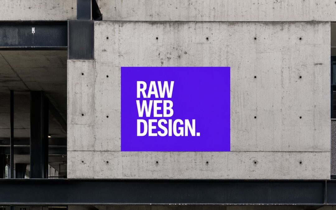
Brutalist pages are repeatedly described as using oversized typography, hard edges, stark colors, asymmetry, and HTML that feels close to the surface rather than buried under visual polish (Jarrod Michael Studios). That isn't laziness. It's a design decision that says the content, links, and structure should stay readable even when the aesthetics are aggressive.
Practical rule: if the design loses its meaning when you strip away gradients, shadows, and ornamental UI, it probably wasn't brutalist in the first place.
The reason this style keeps resurfacing in 2026 is simple. It gives brands a way to look independent, blunt, and culturally distinct in a web environment full of glossy sameness (DesignMantic). That can be powerful for portfolios, editorial sites, art projects, and experimental brand work.
The catch is equally simple. The more memorable the surface becomes, the more carefully you need to protect usability underneath it. Brutalism wins when it sharpens attention. It fails when it makes people guess.
The Historical Roots of Brutalist Web Design

The web version of brutalism didn't appear out of nowhere. Its language reaches back to 1950s Europe, where Brutalist architecture emerged after World War II with a focus on exposed materials, resource efficiency, and a rejection of decorative excess (DesignMantic). The name itself comes from the French béton brut, meaning raw concrete.
From Concrete to Code
That architectural logic maps neatly to the digital version. Instead of exposed concrete and structural beams, designers expose browser-native elements, plain layouts, and unembellished type. The result is visual honesty, or at least the feeling of it.
By 2016, brutalism had become a recognizable digital revival, used intentionally as a reaction against polished template-based websites (Jarrod Michael Studios). The style's identifying marks became clear enough to repeat across sites, including raw HTML-style structure, underlined links, limited color palettes, oversized type, and minimal navigation (DesignMantic).
That matters for practitioners because it separates an aesthetic from a gimmick. A brutalist site is not a site with one rough-looking button. It's a system of repeated choices that keeps the structure legible even when the surface feels confrontational.
Why the Style Survived
By 2026, the conversation around brutalism still frames it as a deliberate strategy rather than a short-lived trend (DesignMantic). That endurance comes from the same place as the original architecture. It signals restraint, directness, and a refusal to over-decorate.
A brutalist site usually feels strongest when it looks like it could have been built fast, but still works with discipline.
The historical thread matters because it keeps the style from collapsing into “make it weird.” If you know where it came from, the choices stop looking random and start looking purposeful.
Core Principles and Visual Characteristics of Brutalism

A good brutalist interface has a few things in common no matter the brand. It shows its structure, relies on blunt typography, and avoids decorative flourishes that don't serve the page.
What the Eye Should Notice First
The visual language usually includes hard edges, high contrast, system fonts or a single typeface, and layouts that feel intentionally unbalanced. That can look rough, but the point is not chaos. The point is to make the hierarchy obvious without softening it with design sugar.
Carl Barenbrug's code-of-practice is useful here because it favors system fonts, one typeface, clean CSS, no unnecessary JavaScript, and high-contrast colors as practical implementation choices (Carl Barenbrug). Those choices don't just support the look, they support legibility and maintenance.
What the Browser Should Do
Agence Wagner pushes the technical side further by recommending a zero-CSS start, then adding only rules with a functional purpose, while keeping total page weight under 50 KB excluding fonts (Agence Wagner). That's not a style flourish. It's a rendering strategy.
Implementation truth: if a visual effect doesn't support a task, remove it.
The practical consequence is direct. Fewer assets mean less to transfer, fewer computed styles, and a simpler critical rendering path. The interface also stays easier to maintain because the HTML structure remains visible instead of buried under layers of framework chrome.
For Divi users who want a cleaner baseline before going raw, a useful contrast point is this overview of minimalistic web design. Brutalism pushes past minimalism by leaving more edges exposed, but the underlying discipline is similar.
The mistake many teams make is equating brutalism with visual negligence. Real brutalist work is disciplined, selective, and technically light. It looks spare because every rule had to earn its place.
Pros and Cons of Brutalism for Real-World Websites
Brutalism can be excellent for brand recall and terrible for task completion. Both can be true on the same site. The trade-off depends on whether the audience needs a memorable statement or a frictionless path to action.
Where Brutalism Helps
A raw interface can give a brand a stronger point of view. It can signal independence, seriousness, or cultural confidence, especially when the category is crowded with polished competitors. It also fits projects where the site itself is part of the artistic message.
There's another practical upside. The style often rewards lighter build choices, so a site can feel simpler to render when the implementation stays close to browser defaults and avoids heavy visual ornamentation (Agence Wagner).
Where Brutalism Breaks
The risk starts when the rawness leaks into interaction design. If navigation becomes ambiguous, links blend into text, or the hierarchy stops helping users scan, the site slips from brutalist into frustrating. NN/g's guidance is clear on this point, brutalism should stay a visual strategy and not damage information architecture or interaction design (Nielsen Norman Group guidance summarized in the provided brief).
That warning matters most for e-commerce and lead-gen pages. If the interface looks memorable but the path to purchase becomes harder, the aesthetic has started working against the business.
Trade-Offs at a Glance
| Dimension | Brutalism Advantage | Brutalism Risk |
|---|---|---|
| Brand identity | Feels distinct and hard to ignore | Can feel confrontational if the audience expects polish |
| Usability | Can surface structure with plain browser primitives | Can obscure navigation if hierarchy is weak |
| Performance | Often supports a lighter build | Poor implementation can still become bloated |
| Maintenance | Simpler layouts can be easier to edit | Inconsistent raw styling can become messy fast |
| Conversion | Strong for attention and recall | Weak if forms, CTAs, or product paths feel harder |
The decision is less about whether brutalism is good and more about where it sits on that curve. A portfolio can afford more attitude than a checkout flow. A campaign landing page can tolerate more tension than a pricing page.
Implementing Brutalist Design Patterns in Divi
Divi can handle brutalism well if you stop treating it like a polished component factory. The goal is to keep the builder's flexibility while stripping away anything that suggests default corporate smoothness.
Start With Structure, Not Decoration
Use uneven section widths, offset columns, and visible module boundaries. Divi's design tabs make it easy to add spacing, but brutalism works better when the spacing feels blunt and deliberate rather than rhythmically perfect. If a section needs to look raw, let borders, padding, and alignment do the work instead of relying on box shadows or decorative backgrounds.
Typography should be blunt too. Pick a system font stack or a single typeface and commit to it. Oversized headings are part of the language, but they only work when body text stays readable and the hierarchy is obvious.
Keep Colors and Imagery Sparse
A brutalist palette usually works best with limited color, often monochrome or near-monochrome with one harsh accent. Images should feel direct, not filtered into brand softness. Hard crops and editorial photography usually fit better than glossy stock imagery.
For deeper Divi building patterns, the Divi page builder can still support this style if you resist the urge to layer in excessive motion or skin-level polish. A plain module, a strong heading, and a visible CTA can carry more weight than a heavily styled layout.
Add Interaction Without Softening the Edge
Divi Areas Pro is useful when you need interactions that stay bold but not clumsy. Fly-in blocks can reveal supporting copy without forcing a new page load, popup modals can handle secondary actions, and tooltip overlays can clarify dense content while preserving the raw layout. The trick is to keep the interaction utilitarian, not theatrical.
For a broader view of what the builder can support, Divi for site builders is a helpful reference point, especially if you're comparing how different builders handle reusable layouts and interface control.
If an interaction draws attention to itself more than the content it reveals, it's probably too decorative for brutalism.
Popups for Divi is the simpler option when you only need straightforward modal behavior inside the native builder. Use it for announcements, lead capture, or brief clarifications, then keep the styling sharp and minimal so the popup feels like part of the system rather than an interruption.
Accessibility and SEO Considerations for Brutalist Sites
Brutalism becomes a problem fast when the visual aggression hides essential information. A site can look raw and still be accessible, crawlable, and responsive, but only if the structure stays standards-based.
The Accessibility Baseline
Start with color contrast, visible focus states, semantic headings, and link styles that don't disappear into surrounding text. The checklist is simple: use proper landmarks, describe meaningful images, and make sure interactive controls still read clearly to screen readers. For a practical reference on the testing side, how to check color contrast is a useful starting point before a brutalist palette goes live.
The SEO and UX Baseline
SEO usually breaks when minimalist navigation becomes too sparse. Internal linking still has to make sense, and important pages still need enough contextual structure for crawlers and users to understand the relationship between sections. Oversized type is fine, but it shouldn't create layout jumps that make the page feel unstable.
The best brutalist pages keep visible links, clear hierarchy, and recognizable browser primitives. That approach preserves affordance and makes the site easier to index because the structure remains obvious instead of hidden behind custom UI tricks.
For a more complete implementation checklist, website accessibility best practices are worth reviewing before you publish anything raw-looking to the public.
Brutalism works best when the interface looks unconventional but behaves conventionally.
That's the compatibility test. If a designer can make the page feel blunt without making it hard to use, then the style has been handled properly. If not, the site is just sacrificing usability for mood.
Neobrutalism and the Future of Raw Web Aesthetics
Pure brutalism is not always the smartest choice anymore. Neobrutalism keeps the blocky, high-contrast feel, but restores more structure and usability, which makes it a better fit for projects that still want personality without undermining the path to action (Dialectic article in the provided brief).
That shift makes practical sense. Most business sites need some degree of clarity, especially when forms, product pages, or lead capture are involved. Pure anti-polish can work for portfolio work, cultural publishing, and experimental campaigns, but neobrutalism is usually the safer choice when conversion matters.
When you're deciding between the two, start with audience expectation. If the visitor needs trust, legibility, and quick decisions, soften the edges. If the site is meant to provoke, differentiate, or feel more like an artifact than a storefront, the rougher version still has a place.
For a quick pre-publish pass, how to check color contrast is still the first thing I'd use before deciding whether a raw palette is brave or just unreadable.
Divimode helps Divi users build sharper sites without losing control over performance or interaction quality. If you want to experiment with brutalist layouts, fly-ins, popups, and targeted content without turning the experience into a usability mess, visit Divimode and see how its tools fit a more deliberate, high-contrast design system.
More Articles You Will Like