 Alex Martin
Let's be honest, just telling someone about a transformation is one thing. Showing them is another. That's where before and after sliders come in—they're a powerful way to turn static images into a hands-on experience, letting your visitors see the results for themselves.
Think of them as a mini-story your user gets to control, revealing the "after" with a simple drag of the mouse.
Why Before and After Sliders Are So Dang Effective
Have you ever landed on a website and found yourself immediately playing with a cool little feature? That’s the magic of interactive content. Before and after sliders are a prime example of this in action, instantly turning passive browsers into engaged users.

This isn't just a neat trick. The simple act of sliding a handle across an image creates a satisfying "reveal" that keeps people on your page longer. And as we know, more time on page is a fantastic signal to send to search engines.
Turning Pictures into Persuasion
The real power of these sliders is how they build instant trust. They offer undeniable, visual proof that what you do actually works. It’s one thing to describe your results, but it’s far more convincing to let people see the change happen right before their eyes.
Just imagine these scenarios:
- A landscaping company shows a messy, overgrown yard becoming a pristine garden oasis.
- A cosmetic dentist reveals a stunning smile transformation after a whitening treatment.
- A software company contrasts a cluttered old interface with their sleek, new design.
In every case, the slider cuts through the noise and answers the visitor's most important question: "Can you deliver?" By providing clear, visual proof, you build credibility and confidence far more effectively than a block of text ever could.
Let's break down exactly why these sliders are such a valuable addition to your site.
Key Benefits of Using Before and After Sliders
This table highlights the core advantages of using before and after sliders, showing how a simple design element can lead to real business results.
| Benefit | Business Impact |
|---|---|
| Increased Engagement | Longer time on page, which can improve SEO rankings and keep users invested in your content. |
| Visual Proof of Value | Instantly demonstrates the effectiveness of your product or service, overcoming skepticism. |
| Higher Conversion Rates | Builds trust and confidence, making potential customers more likely to take the next step. |
| Enhanced User Experience | Provides an interactive, memorable element that makes your site stand out from competitors. |
Simply put, sliders don't just look cool—they work hard to turn curious visitors into convinced customers.
Before and after sliders are a fantastic starting point for creating an interactive website that really connects with your audience. They've become a go-to tool for any business that relies on showing results.
By letting users interact directly with your proof, you create a far more memorable and persuasive experience. This isn't just a design gimmick; it’s a smart conversion strategy.
Ultimately, these sliders bridge the gap between your marketing claims and the real-world value you offer. In our guide, we’ll explore how to https://divimode.com/how-to-add-interactive-content-on-your-divi-website/, and we're starting with this incredibly effective tool.
Choosing Your Method: Plugins vs. Native Modules
So, you want to add a before and after slider to your Divi site. Great choice. Your first big decision is how you're going to build it. Are you going to grab a dedicated plugin, or are you going to roll up your sleeves and build it yourself using Divi's own modules?
There's no single right answer here. The best path really depends on what you need for your project, how comfortable you are with a bit of code, and how much time you have. Let's break down both options.
The Plugin Advantage: Speed and Features
Going with a dedicated plugin is almost always the fastest and easiest way to get this done. If you're a designer or marketer who just wants to get a great-looking, feature-rich slider on the page without fussing with code, this is your route.
Tools like Divi Supreme Pro come with a pre-built "Image Comparison" module that does all the hard work for you. You can have a professional slider up and running in a matter of minutes.
What I love about these plugins is they come loaded with options that would be a real headache to build from scratch. You usually get things like:
- Vertical Sliders: A simple toggle can flip the slider's orientation from horizontal to vertical. Super handy for certain types of images.
- Custom Handles: You can easily change how the slider handle looks to make sure it perfectly matches your brand.
- Label Customization: Want to change the "Before" and "After" text? Or style it? It's all right there in the module settings.
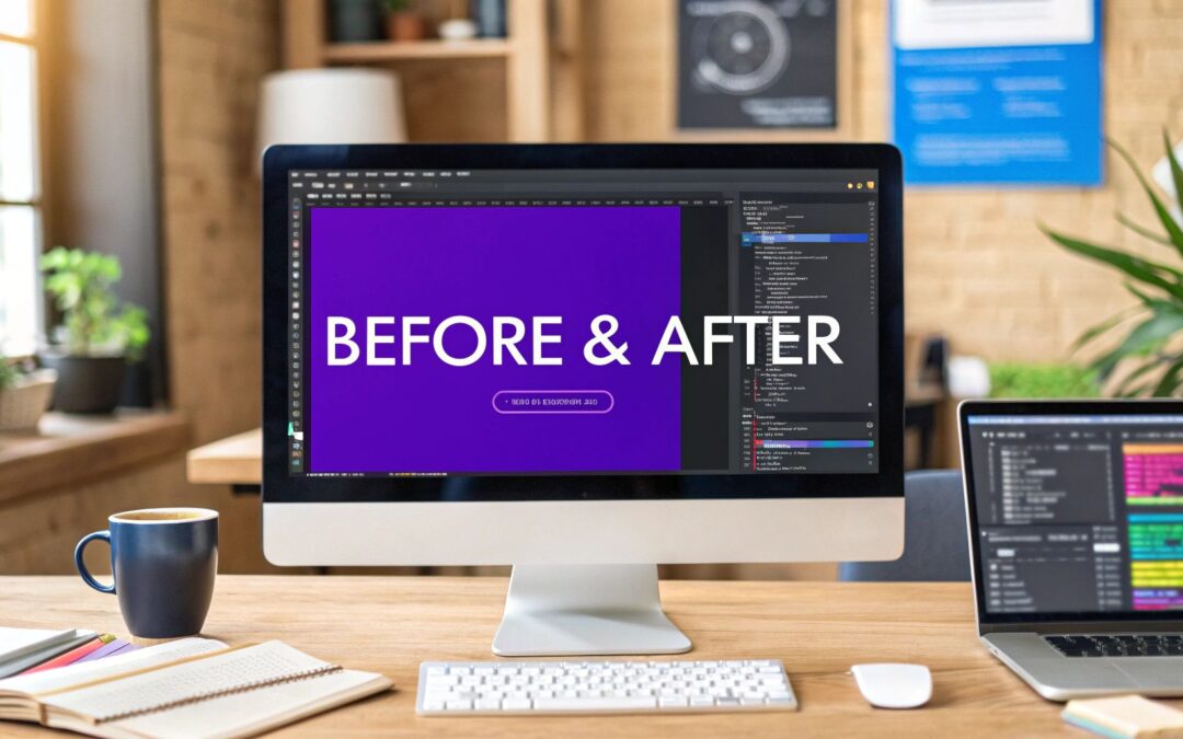
This screenshot from Divi Supreme Pro gives you a good idea of how simple it is.

As you can see, everything you need is right inside the Divi Builder. It's a completely visual process. The only potential downside is that adding another plugin can sometimes add a little extra weight to your site, which might have a minor impact on performance.
The Native Module Path: Control and Performance
Now for the other approach: building it yourself. By combining Divi's native image and code modules with some custom CSS and JavaScript, you can create a completely bespoke before and after slider.
This DIY method gives you maximum control and is incredibly lightweight. You're only adding the exact code needed for the effect, which is fantastic for site performance. If you're a developer or someone who obsesses over page speed and minimal bloat, this is probably the path for you.
You won't have a convenient settings panel to click through, but you'll have total authority over every pixel and every animation. It definitely takes more effort and a basic grasp of CSS, but the end result is a lean, highly optimized feature that's tailored perfectly to your site.
The core decision boils down to a classic trade-off: plugins offer speed and convenience, while the native approach provides total control and the best possible performance.
To make it even clearer, here's a quick side-by-side look:
| Factor | Dedicated Plugin | Native Modules + CSS |
|---|---|---|
| Ease of Use | Excellent: No code required, all visual settings. | Fair: You'll need to be comfortable adding custom code. |
| Speed to Implement | Very Fast: You can be done in under 5 minutes. | Slower: Requires more setup and code implementation. |
| Features | Extensive: Comes with pre-built options like vertical sliders. | Limited: You build only what you need. |
| Performance | Good: Can add slight overhead to your site. | Excellent: Minimal code means it's super lightweight. |
| Control | Good: You're limited to the plugin's built-in options. | Total: You have complete control over styling and function. |
Ultimately, if you need a powerful slider with lots of options and you need it done now, a plugin is your best bet. But if you're a developer who prioritizes performance and wants a completely custom solution, building it yourself is the way to go.
How to Use a Dedicated Divi Plugin
While you can definitely build a before and after slider with Divi's native modules, let's be honest—it's not always the quickest route. For most projects, a dedicated plugin is the most efficient and practical way to get the job done. These tools are built specifically to plug right into the Divi Builder, giving you a user-friendly module with all the settings you need in one place. You get to focus on picking the perfect images, not fighting with custom code.
Let's walk through a common scenario. Imagine you run a photo editing service and want to show off a dramatic retouch. A plugin is the perfect tool to create a clean, professional slider that lets your work speak for itself. Most premium plugins work in a very similar, intuitive way.
Getting Started with Installation
First things first, you'll need to pick a plugin. There are a handful of really solid options out there that add an "Image Comparison" or "Before & After" module straight into your Divi library. If you're not sure where to begin, our guide on the best third-party Divi plugins is a great starting point for your search.
After you install and activate the plugin, its new module will simply appear in your Divi Builder module list. From there, you can add it to any page just like you would a standard Divi text or image module.
This quick visual breaks down the typical workflow you'll follow.
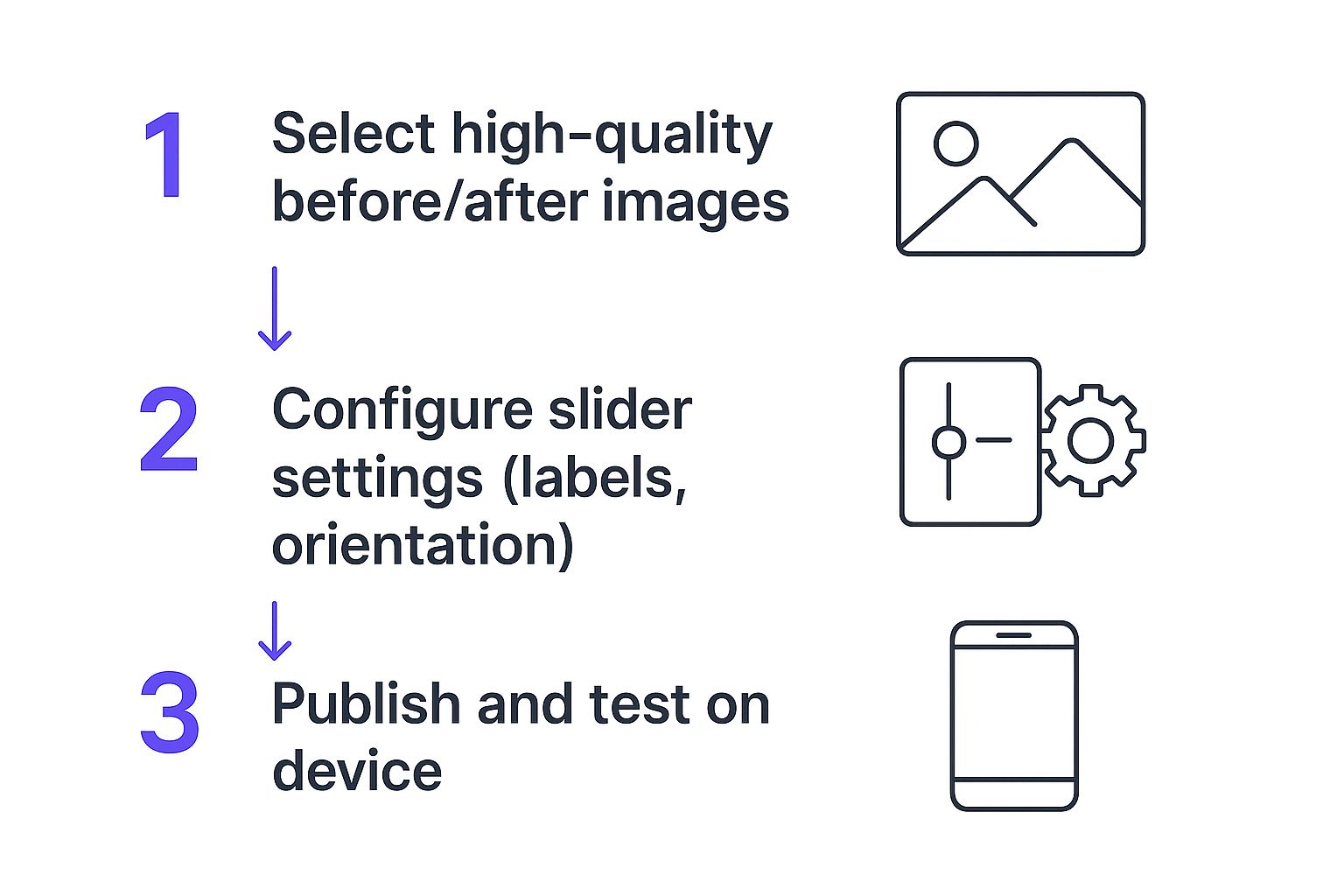
As you can see, it’s a simple progression from selecting your images to tweaking the settings and checking your work. You don't need to be a developer to get a great result.
Configuring Your Before and After Slider
Once the module is on your page, everything is handled visually. Inside the module's "Content" tab, you'll find the core settings. The most critical step is uploading your images into the 'Before Image' and 'After Image' slots.
My Pro Tip: For a seamless, professional look, make sure both images have the exact same dimensions. Mismatched sizes will cause the layout to jump as the user drags the slider, which instantly cheapens the effect.
From here, you can start dialing in the user experience. You can change the slider's starting position—setting it to 50% is a classic choice that shows half of each image. Or, you could try something like 75% to give users just a tempting glimpse of the final result, encouraging them to interact. Don't just upload and move on; think about the story you're telling.
Advanced Styling and Customization
This is where a good plugin really earns its keep. Pop over to the "Design" tab, and you'll find a whole suite of options to make the slider look like a natural part of your website's design.
You'll usually find controls for things like:
- Slider Orientation: Switch between a horizontal and vertical slider with a single click.
- Custom Labels: Change the default "Before" and "After" text to something more creative, or just remove them for a minimalist aesthetic. Font, color, and size options are standard.
- Handle & Separator: Tweak the color, thickness, and style of the dividing line and the slider handle itself to match your site's branding.
The impact of these tools is huge. Big brands have been using them for years. L’Oreal Paris, for instance, uses sliders to let customers see the real effects of their beauty products, which helps build confidence before a purchase. Bodybuilding.com uses them to showcase incredible client transformations, providing social proof that inspires new members. By using a simple plugin, you can bring that same level of professional polish and persuasive power to your own Divi site without breaking a sweat.
Building a Before and After Slider the "Divi Native" Way
If you're like me and prefer to keep your Divi sites lean and fast, you'll love this. You can actually build a really sharp before and after slider using nothing but a couple of Divi modules and a sprinkle of CSS. No extra plugins needed.
This approach gives you total control and is super lightweight, which is a huge win for site performance. The magic here is pretty simple: we'll stack two Image modules. The "after" image will be on top, and we'll use a bit of CSS to clip it, revealing the "before" image underneath as the user moves a slider handle.
Ready to dive in?
Getting the Divi Modules in Place
First things first, fire up the Divi Builder and add a new section with a single-column row. This is where our slider will live.
Inside this column, add two separate Image modules. The trick is to add the "after" image first, then the "before" image right below it. This ensures the "after" image sits on top in the layer stack, which is critical for the effect to work.
To keep things neat and make our CSS targeting a breeze, we need to assign a custom class.
- Open the settings for the Row that's holding your two images.
- Hop over to the Advanced tab.
- Find the CSS ID & Classes section and drop
native-slider-containerinto the CSS Class field.
This class becomes our unique hook, letting us style this specific slider without accidentally messing up anything else on your site. One more crucial tip: make sure both of your images are the exact same size. This prevents any weird jumping or layout shifts.
Making it Work with Custom CSS
Now for the fun part. We've got our structure, so let's bring it to life with some code. The easiest way to do this is with Divi's Code module. Just add one right below your two Image modules, inside the same column.
Go ahead and paste the following snippet into the Code module. Just be sure to wrap it in <style> tags so the browser knows it's CSS.
This little block of CSS is the heart of our slider. It takes the top image, positions it perfectly over the bottom one, and then uses the
clip-pathproperty to hide half of it. The::afterpseudo-element cleverly creates our draggable handle right down the middle.
This code gives you a perfect static split. To make the handle fully draggable requires a bit of JavaScript, but for a simple, clean visual comparison, this CSS-only method is a fantastic starting point. It's a great reminder that you don't always have to reach for a plugin to create cool, interactive elements in Divi.
Optimizing Sliders for Performance and SEO
A gorgeous before and after slider is a fantastic tool, but not if it sinks your website's performance. A slow, clunky slider will send visitors bouncing and can even ding your search engine rankings, which completely defeats the purpose. The real work happens before you even upload your photos.
The biggest performance killer, without a doubt, is image size. You need high-resolution photos for that sharp, professional look, but those files are often huge. Your first move should always be to compress them.
I'm a big fan of tools like TinyPNG for this. They can shrink file sizes dramatically with almost no visible difference in quality. It's also worth looking into modern image formats like WebP, which provides much better compression than old-school JPEGs and PNGs.
Perfecting Your Images and Alt Text
Once you've got your file sizes down, the next detail to nail is consistency. For that slider effect to be seamless, your 'before' and 'after' images must be the exact same dimensions. If they aren't, the layout will jump and shift as the user moves the handle, which just looks sloppy.
It's one of those small things that makes a massive difference in perceived quality.
Just as important is what search engines and screen readers can understand. Every single image needs good, descriptive alt text—this is non-negotiable for both SEO and accessibility. Don't just stuff it with keywords; describe what's actually in the picture.
- Before Image Alt Text: "Worn, faded wood deck with peeling paint before restoration."
- After Image Alt Text: "Fully restored wood deck with a rich, dark stain and clean finish."
This gives search engines crucial context about your page content. If you want to dive deeper, we cover this in our full guide on optimizing images for WordPress.
Enhancing User Experience and Load Times
To give your page speed an extra boost, make sure lazy loading is turned on for your sliders. This smart technique waits to load the images until a user actually scrolls them into view, which can make your initial page load time much, much faster. Most good slider plugins for Divi will have this feature built right in.
And remember, your slider is just one piece of the puzzle. It won't matter how fast your slider is if the rest of your site is a mess on smaller screens. Having a truly mobile-friendly website is foundational to a good user experience.
The visual punch a slider delivers is undeniable. Research consistently shows that people are about 65% more likely to remember information when it’s paired with relevant images. This makes before-and-after sliders an incredibly effective way to prove your value and keep visitors glued to your page.
Your Top Divi Slider Questions, Answered
As you start experimenting with before and after sliders in Divi, you're bound to run into a few questions. Whether you're wrangling a plugin or building a slider from scratch, getting quick, clear answers can save you a ton of time and headaches. Let's go through some of the most common things Divi users ask.
Do I really need a plugin for this? The short answer is no, but it certainly makes life easier. Dedicated plugins give you the smoothest path with a ton of features right out of the box. But if you're comfortable with a bit of custom CSS, you can absolutely build a simple, effective slider using Divi's own modules. It all comes down to how much control you want and your comfort level with code.
Functionality and Mobile Responsiveness
A lot of people want to know if they can create a vertical slider instead of the standard side-to-side one. If you're using a solid third-party plugin, the answer is almost always yes. Good plugins usually have a simple toggle in the module settings to switch the orientation, which is perfect for comparing taller, portrait-style images.
Making sure your slider looks sharp on a phone is non-negotiable. So, how do you make it mobile-friendly? Most plugins are built to be responsive from the get-go and will adapt automatically. If you’re going the manual CSS route, the trick is to use relative units (like percentages) instead of fixed pixels. Always, always use Divi’s responsive view modes to test how it looks and behaves on different screen sizes.
It's easy to get so focused on the design that you forget about performance. A heavy, unoptimized slider can absolutely crush your page speed, which is bad for users and your SEO. This is a fixable problem, but you have to be proactive about it.
Performance and Best Practices
This brings us to one of the biggest concerns: will this slider slow down my website? It can, but only if you ignore optimization. The main culprits are almost always huge, uncompressed images.
Before you upload anything, make sure you:
- Run both the 'before' and 'after' images through a compression tool like TinyPNG.
- Ensure both images have the exact same pixel dimensions. This prevents the layout from jumping around as the slider loads.
- If you're using a plugin, look for one that supports lazy loading. This handy feature tells the browser not to load the slider images until a visitor actually scrolls down to them, which dramatically improves your initial page load time.
These small steps keep your site fast and snappy for everyone.
Frequently Asked Questions
Here are some quick answers to the questions we hear most often about creating before and after sliders in Divi.
| Question | Answer |
|---|---|
| Can I create a Divi before and after slider without a plugin? | Yes, you can! It requires using Divi's native modules (like two overlapping Image Modules) and applying custom CSS to handle the interactivity and slider mechanism. It's best for those comfortable with code. |
| Are the images in the slider SEO-friendly? | It depends on the implementation. When using a plugin, check if it allows you to add alt text to your images. If you're building it manually with Divi's Image Module, you can add alt text directly, which is great for SEO and accessibility. |
| What's the best image size for a slider? | Both images should be the exact same dimensions. As for size, it should be no larger than the maximum width of the container it will be in on your site. For a full-width slider, 1920px wide is a common starting point, but always compress the images heavily before uploading. |
| Can I put more than just images in the slider? | With a plugin, maybe. Some advanced slider plugins allow you to compare entire Divi sections or modules, not just images. If you're building it yourself with CSS, you're generally limited to comparing two image files unless you're an advanced developer. |
| How do I make the slider handle draggable on touch devices? | Any reputable before and after slider plugin will have touch and swipe support built-in. This is one of the biggest advantages of using a dedicated plugin over a DIY CSS solution, which can be tricky to get working smoothly on mobile. |
Hopefully, these answers clear things up and help you build a fantastic before and after slider for your next project.
At Divimode, we build tools to help you create more engaging and effective Divi websites. With Divi Areas Pro, you can take your interactive content to the next level by creating dynamic popups, fly-ins, and mega menus that trigger based on user behavior. Learn more and elevate your Divi projects.
More Articles You Will Like