 Alex Martin
A before and after slider is one of those slick, interactive elements you’ve probably seen online. It’s a simple concept: two images are layered on top of each other, and a handle lets the user slide back and forth to reveal the difference. It’s the perfect way to visually prove the impact of your work, product, or service.
The Power of Visual Proof in Web Design
Static images are fine, but they don't always tell the whole story. When you need to showcase a clear, powerful transformation—a cluttered room turned into a design masterpiece, a dull photo brought to life with editing, or the results of a fitness program—nothing beats letting your audience see the change for themselves. This is where the interactive magic of a before and after slider truly shines.
This isn't just about showing two pictures. It creates a hands-on experience. Your visitors aren't just passively looking; they're actively participating in the reveal. That single action builds instant trust and makes your claims far more believable than simple side-by-side photos ever could.
Why Visual Comparison Is So Effective
The human brain is wired to process visuals incredibly fast, and comparison is one of the most fundamental ways we evaluate things and make decisions. A before and after slider taps right into this instinct by presenting a direct, irrefutable comparison in a single frame.
- It’s undeniable proof. Seeing is believing, right? When a customer can literally slide a handle and watch a dramatic change unfold, it erases any doubt about how effective your offering is.
- It captures and holds attention. The interactive nature of a slider is just plain engaging. It encourages people to play with it, keeping them on your page longer.
- It simplifies complex results. Instead of writing paragraphs trying to describe a change, you can show it in a couple of seconds. This is especially useful for service-based businesses, from home renovation to cosmetic procedures.
To really see what I mean, just look at how designers use them to showcase compelling interior staging transformations. This method has become a go-to for countless businesses. For instance, the beauty industry often relies on sliders to demonstrate the effects of skincare products, building trust through visible, comparative results.
The key takeaway is simple: A well-executed before and after slider isn't just a neat feature; it’s a powerful conversion tool that tells a story of transformation.
The best part? Adding this to your Divi website doesn't require you to be a coding wizard. With the right plugin, you can build and customize a professional-looking slider right inside the Divi Builder.
Choosing the Right Tool for Your Divi Slider
Before you can build that impressive before-and-after slider, you've got to pick the right tool for the job. In the Divi world, this usually comes down to two paths: a specialized plugin built for this one purpose, or a more versatile, multi-purpose tool that has slider functionality baked in.
Honestly, the "right" choice really depends on your project's scope and how you like to work.
Dedicated plugins, like the Divi Before After Slider Module, are all about getting it done fast. Their main advantage is pure simplicity. You install it, drop the module onto your page, pop in two images, and you're pretty much set. This is the perfect route if you just need a quick, no-fuss solution for one project and want to move on.
On the other hand, multi-purpose plugins like our own Divi Areas Pro bring a different kind of value to the table. Sure, they can create a fantastic before-and-after slider, but they also handle popups, mega menus, and all sorts of other dynamic content. This approach makes a ton of sense if you know you'll be building multiple interactive elements across your site and want to keep your plugin list lean and mean.
Comparing Divi Before and After Slider Tools
A quick look at the key differences between leading plugin options for creating your slider in Divi.
| Feature | Dedicated Slider Plugin (e.g., Divimode) | Multi-Purpose Plugin (e.g., Divi Areas Pro) |
|---|---|---|
| Primary Focus | Does one thing really well: sliders | A suite of tools for various dynamic content |
| Ease of Use | Extremely simple and fast to set up | Slightly more of a learning curve, but powerful |
| Flexibility | Limited to slider functionality | High; can be used for popups, menus, etc. |
| Site Performance | Adds one plugin to your site | Can replace multiple plugins, leading to a leaner site |
| Best For | Quick, single-use case projects | Feature-rich sites needing multiple interactive elements |
Ultimately, the best tool is the one that solves your immediate problem without boxing you in later. If you just need a slider and nothing else, go dedicated. If you're building out a more complex, feature-rich site, a multi-tool is often the smarter long-term investment.
This image really highlights some of the key design principles to keep in mind for a clean, effective slider.
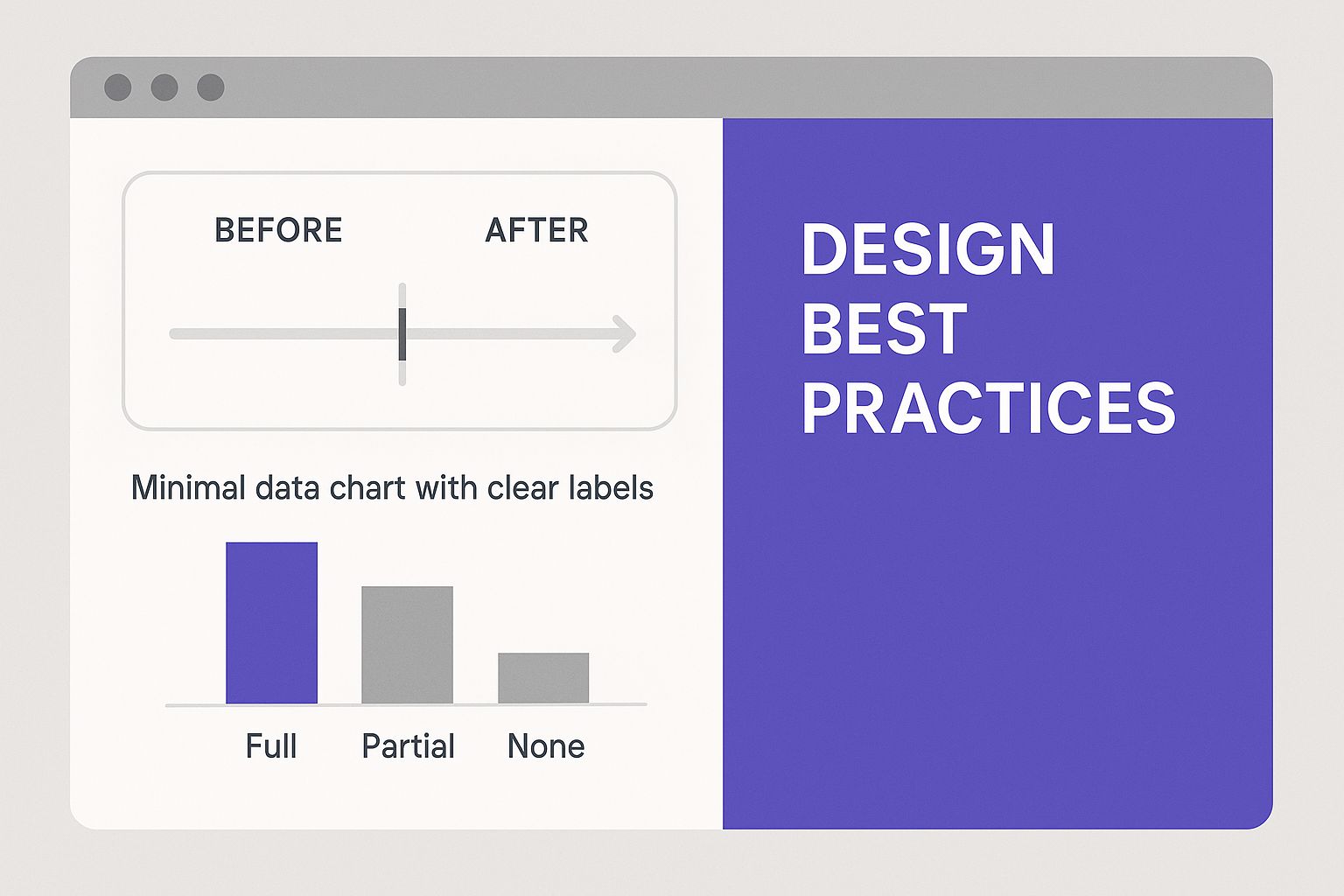
As you can see, a successful before-and-after slider leans on a clean transition and minimal distractions. You want the images themselves to be the star of the show.
Building Your First Before and After Slider
Alright, let's roll up our sleeves and get your first before and after slider built. I'll walk you through the whole process, from dropping the module onto your page to tweaking the most important settings.
For this walkthrough, let's pretend you're a photographer showing off your photo retouching skills. It’s the perfect real-world scenario for this kind of tool.
First things first, once you have your plugin installed and activated (like the Divi Before After Slider Module), everything happens right inside the Divi Builder you already know. Just open the page where you want the slider to live and fire up the Visual Builder.
Find the spot where you want the comparison to appear and add a new module. In the module list, you'll see a dedicated "Before After Slider" module. Go ahead and select it. This will open up the settings panel, which is basically the control center for your new interactive element.
Adding Your Comparison Images
This is where the magic begins. The module settings are incredibly straightforward, with two big upload areas waiting for your "Before Image" and "After Image."
- Before Image: This is for the original, untouched photo.
- After Image: This is for the final, polished version.
Here’s a crucial tip I’ve learned from experience: for the best results, you absolutely must ensure both images have the exact same dimensions. This alignment is what makes the transition feel seamless and professional, preventing any awkward jumps or resizing as the user drags the handle. Trust me, a size mismatch can completely ruin the effect.
Remember, the goal is to create a smooth, satisfying reveal. The only thing that should change is the result of your work, whether that's color correction, removing an object, or a complete style overhaul.
This screenshot shows you just how clean and intuitive the interface is inside the Divi Builder.

As you can see, the settings are neatly organized, so you can get your images uploaded and running without any guesswork.
Configuring the Core Settings
With your images in place, it’s time to fine-tune how the slider works. You can set the initial position of the handle—for example, starting it at 50% to show both images equally—and even switch the orientation from horizontal to vertical. These basic settings give you immediate control over the user experience.
This kind of interactivity is exactly what modern users have come to expect. It's an engaging way to demonstrate a transformation, which is why visual tools like these are becoming essential.
You can also get creative with how you present the slider. For instance, what if you wanted it to appear when a user clicks a button? You could easily place the slider inside a popup. If you're using a tool like Divi Areas Pro, our guide on how to create a popup area will show you exactly how to set up more advanced interactions like that.
Just by following these first few steps, you’ll have a functional, impressive before and after slider live on your page in minutes.
Customizing Your Slider for Maximum Impact
A default slider gets the job done, but a truly custom before-and-after slider is what makes a design feel intentional and reinforces your brand. Moving beyond the basics is where you can turn this simple tool into a standout feature on your site.
Many Divi slider modules have advanced settings right in the content tab, which is the best place to start for some easy wins. You can often switch the slider's orientation from the standard horizontal drag to a vertical one. This can be a really refreshing change, especially for taller, portrait-style images, like showing off a full-body fitness transformation.
Fine-Tuning the Design Elements
Once you've got the basic functionality sorted, it's time to dive into the Design tab. This is where you can really make the slider look and feel like it belongs on your site.
- Handle and Divider Styling: Change the color and thickness of the dividing line and its handle to match your brand’s palette. A subtle color change here can make a world of difference in tying the whole design together.
- Label Personalization: Don't just stick with "Before" and "After." You can customize the text, fonts, and colors of these labels to better fit your project's tone. For example, a home renovator might use "The Original Space" and "The Dream Kitchen" to add a bit more personality.
- Borders and Shadows: Use Divi’s native design options to add a border or a subtle box shadow to the entire slider container. This simple trick helps it pop off the page and feel more integrated with your layout.
The goal is to make the slider look like an intentional part of your design, not just a third-party element dropped onto the page. Every detail you customize contributes to a more cohesive and professional user experience.
These customizations are often built directly into the module, which is great. But you can also combine these interactive elements with other tools for even more creative results. Imagine triggering your fully styled slider to appear inside a lightbox for a more focused reveal. If you want to explore this technique, you can learn how to create a popup inside a Divi page to build more complex and engaging user flows.
By thoughtfully styling every component, from the divider line to the text labels, you ensure your before-and-after slider doesn't just show a transformation—it becomes a testament to your brand's attention to detail.
Pro Tips for an Engaging User Experience
 Getting a functional before and after slider on your page is a great start, but making it genuinely engaging is what keeps visitors hooked. The magic is usually in the small details—the ones that make the interaction feel intuitive and fast.
First up, and this is a big one: optimize your images. Nothing kills a user's patience faster than waiting for giant, uncompressed files to load. Before you even think about uploading, run your "before" and "after" images through a tool like TinyPNG. Even better, consider using a modern format like WebP to slash file sizes without wrecking image quality. A snappy, fast-loading slider makes a great first impression.
Prioritize User Control and Mobile Experience
Next, let’s talk about control. It’s tempting to have sliders auto-play, but the data is clear: users hate it. Research consistently shows that auto-playing carousels have abysmal click-through rates, sometimes as low as 1%. In stark contrast, when a user initiates the action, engagement goes through the roof. One study found that a whopping 72% of mobile slider interactions were deliberate, showing that people want to be in the driver's seat. You can dig into more of these stats over at Orbit Media.
Your goal should be to create a tactile, satisfying experience. Let the user discover the transformation at their own pace—don't force it on them.
Finally, think mobile-first. And I mean really think mobile. Grab your phone and test your slider. Is the handle easy to grab and drag with a thumb? Does it respond smoothly across different screen sizes without breaking the layout? These little usability wins add up.
This user-first mindset applies to more than just sliders. Think about popups, for instance. A popup that's a pain to close on mobile is just as frustrating. For more on that, you can check out our guide on how to add popups in Divi with six different options to get more ideas for creating user-friendly interactions.
Got Questions About Your Divi Slider?
As you start piecing together your interactive comparisons, a few questions always seem to come up. I've been there. Let's get them answered so you can sidestep any potential headaches.
One of the first concerns I hear is about page speed. "Will this before and after slider slow down my site?" The honest answer is: it all comes down to your images. Heavy media will always be a performance bottleneck, but the fix is simple—optimization. You absolutely have to compress your images before you upload them. Using a modern format like WebP helps a ton, too. A solid plugin paired with optimized images will barely make a dent in your load times.
Then there's the mobile question. "Is it responsive?" You can breathe easy here. Any modern Divi slider plugin worth its salt is built to be fully responsive right out of the box. They’re designed to adapt to smaller screens, with drag-and-swipe functionality that feels natural on touch devices. That said, I always pull out my own phone for a final check to make sure the experience is as smooth as I expect it to be.
How Do I Choose the Best Images?
This is where the magic really happens. Picking the right visuals is what makes or breaks the effect.
Here’s my non-negotiable rule: Always use two images with the exact same dimensions and framing. The only thing that should change is the subject. A perfectly aligned "before" and "after" shot is what delivers that dramatic, satisfying reveal your visitors are looking for.
And what about video? It's a common ask. Most dedicated before-and-after plugins are built strictly for static images. You can't just drop a video file into one of the slots. However, if you're feeling adventurous, you could get creative and have the slider image trigger a video lightbox on click. Just know that this is a more advanced setup and not a standard feature.
Ready to build more than just sliders? Divimode unlocks the full power of Divi with Divi Areas Pro, letting you create popups, mega menus, and other dynamic content. Take full control of your Divi site at https://divimode.com.
More Articles You Will Like