 Alex Martin
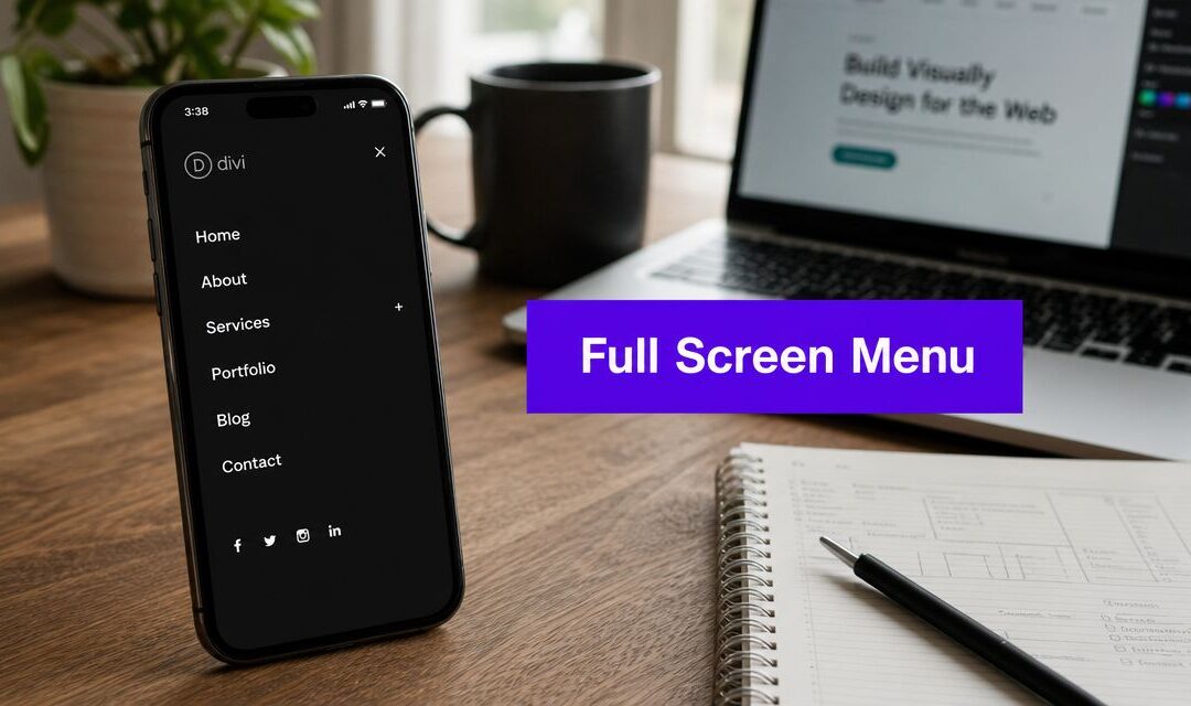
You're probably looking at Divi's default mobile menu on a phone and thinking the same thing most of us think at some point: it works, but it doesn't feel finished.
The icon is there. The links open. Nothing is technically broken. But the experience often feels cramped, dated, and disconnected from the rest of the site. On a brochure site that might be tolerable. On a store, membership site, or content-heavy build, it starts to cost you clarity.
A full screen mobile menu can fix that, but only if you choose the right implementation. That's the part most tutorials skip. They jump straight to CSS or a plugin setup without helping you decide whether the pattern fits your site, your workflow, or your users.
I've built these three ways in Divi: with native tools, with plugins, and with custom code. Each approach can work. Each one also creates different problems. The smart move is picking the method that matches the site in front of you, not the method that looks coolest in a demo.
Why Your Divi Site Needs a Better Mobile Menu
The usual trigger for this upgrade is easy to recognize. You open your site on an iPhone, tap the hamburger icon, and get a narrow dropdown that feels like an afterthought. The links are small, spacing is tight, and any branding you nailed on desktop disappears the moment the menu opens.
That's why the full screen mobile menu became such a common pattern. It gives mobile navigation room to breathe. You can use larger tap targets, clearer hierarchy, stronger contrast, and space for things that matter on mobile like account links, a search field, contact options, or a prominent shop category list.
The real tradeoff
There's a catch. A full screen mobile menu usually relies on hidden navigation, and hidden navigation has a real UX cost. In Nielsen Norman Group's quantitative study of hidden navigation, users completed tasks 15% slower on mobile when navigation was hidden compared with combo navigation, and content discoverability dropped by more than 20% versus visible or combo navigation, according to Nielsen Norman Group's research on hamburger menus.
That doesn't mean you should avoid fullscreen menus. It means you should design them with intent.
Practical rule: If users need to move fast, don't hide too much, don't animate too much, and don't make the open state feel clever at the expense of clarity.
For Divi sites, that usually means keeping the trigger obvious, making the icon easy to tap, and structuring the opened menu so people can scan it immediately. A beautiful overlay that slows shoppers down is still a bad menu.
Why wireframing matters before styling
A lot of menu problems start before Divi is even open. Teams pick a fullscreen pattern because it looks modern, then realize later they never decided what the mobile user needs first. Primary nav? Search? Cart? Phone number? Login? Category shortcuts?
That's where mobile-first planning helps. If you're still shaping the structure, AppStarter's wireframe design guide is useful because it pushes you to decide hierarchy before you start decorating the menu panel.
A solid full screen mobile menu usually includes:
- A clear primary action like shop, get a quote, book, or contact
- A short top-level list instead of dumping the whole desktop nav into mobile
- A visible close control that doesn't rely on guesswork
- Enough spacing for thumbs, not mouse pointers
If you're working inside Divi and want examples of how the mobile nav behavior and styling can be improved before going all the way to fullscreen, DiviMode's guidance on mobile menu design in Divi is a practical reference.
Good mobile menus don't feel hidden once opened. They feel obvious.
Choosing Your Method A Quick Comparison
There isn't one right way to build a full screen mobile menu in Divi. There are three practical routes, and the right one depends on how much control you need, how comfortable you are with code, and how often the menu logic is likely to change.

The short version
If you want the fastest route with no extra tools, use the Divi Theme Builder. If you need better triggers, targeting, and cleaner workflow, use a plugin approach. If you care most about lean output and exact behavior, use custom code.
Here's how I usually break it down:
| Method | Best fit | Strength | Limitation |
|---|---|---|---|
| Divi Theme Builder | Simple brochure sites, budget-conscious builds | Uses native Divi tools already available | More workaround-heavy for toggle logic |
| Divi Areas Pro | Agency builds, marketing sites, stores | Better control over triggers, overlays, and conditions | Adds plugin dependency |
| Custom Code | Developer-led projects | Maximum control over structure and behavior | Slower to build and maintain |
How to choose without overthinking it
Use the native route if the menu only needs to do one job: open full screen, show links clearly, close cleanly.
Choose a plugin if the menu is part of a broader interaction system. That includes different menus for different pages, conditional content, more polished open and close behavior, or cases where you want marketing content inside the menu without hacking Divi's header.
Go custom if you already work comfortably with JavaScript, CSS, and child themes. That route is strong when performance and exact behavior matter more than editor convenience.
A simple decision framework:
- Pick native when the site owner needs something maintainable inside Divi and won't touch code.
- Pick plugin when the menu is also a campaign surface, promo area, or conversion tool.
- Pick custom when you need full control over scroll locking, focus handling, transitions, and markup.
The wrong method usually reveals itself later in maintenance, not on launch day.
Method 1 Building a Menu with the Divi Theme Builder
This is the cleanest place to start because you're using the tools Divi already gives you. No extra purchase. No external framework. No dependency beyond Divi itself.
By the 2010s, full-screen mobile menus became a standard responsive design pattern. Major design systems now treat them as default components. For example, the Folwell Design System states its mobile menu is “set to display full screen by default”, which tells you this pattern is no longer unusual or experimental.

The native build structure
The basic idea is simple. You create a custom header in Theme Builder, place your usual header bar at the top, then create a separate section that acts as the fullscreen overlay on mobile.
That overlay section should contain:
- A Menu module with your mobile links
- A close icon or button
- Optional extras like search, contact info, social icons, or a CTA button
The overlay section needs to be hidden by default and positioned so it covers the viewport when activated.
A practical setup in Divi
- Create a Global Header in Theme Builder.
- Build the visible header bar with logo on one side and a menu icon on the other.
- Add a second section below it for the fullscreen panel.
- Set that panel to:
- Position fixed
- Top 0
- Left 0
- Width 100%
- Min height 100vh
- High z-index
- Use Divi responsive settings so the fullscreen panel only applies on phone and tablet if that's your target.
- Style the inner row and Menu module for large spacing, readable type, and easy thumb tapping.
Where native Divi gets awkward is the toggle. Divi doesn't give you a built-in fullscreen mobile menu system with polished open and close logic out of the box, so you often end up using CSS classes and a little script to add or remove an active state.
What works well with this method
For straightforward sites, this method is enough.
It's especially good when:
- The site has a small navigation tree
- You want the client to stay inside familiar Divi controls
- The design doesn't need advanced entrance animation
- You're fine adding a small amount of CSS or lightweight JS if needed
Keep the native build boring in the right places. A stable open and close interaction matters more than a fancy transition.
A useful walkthrough for the general setup process is below:
Where the native method starts to strain
The limits show up when the menu needs more than a simple overlay.
Common friction points:
- Trigger logic gets clumsy if you want different buttons to open the same menu
- Conditional display is limited compared with popup-style tools
- Close behavior often needs extra handling for anchor links or secondary actions
- Animation options are possible, but they're not elegant to manage in pure Divi UI
If you only need a cleaner mobile navigation layer, native Divi is enough. If the menu is becoming an interaction system, you'll hit the ceiling quickly.
Method 2 The Professional Approach with Divi Areas Pro
The workflow simplifies. Instead of forcing a header section to behave like a popup, you build the menu as a dedicated area and trigger it intentionally.
That matters because a full screen mobile menu isn't just a visual overlay. It's an interaction pattern. Recent advanced menu examples put a lot of focus on animation, icon morphing, and pointer-event control, but the bigger issue is interaction design for conversion and accessibility, not visual drama alone, as discussed in this advanced fullscreen menu walkthrough.

Why the plugin route is more practical
When I use a dedicated tool for this, I'm usually trying to solve one of these problems:
- the client wants different mobile menus in different sections of the site
- the menu needs clean trigger targeting
- the opened overlay needs more reliable animation and dismissal behavior
- the menu includes promotional or conversion-focused content, not just links
With Divi Areas Pro content display controls, you can build the menu as a Divi layout and assign display conditions and trigger behavior without turning the header into a pile of workarounds.
I'm mentioning Divi Areas Pro here because it directly fits this use case. It lets you create popup-style content areas with Divi, then control where and how they appear. That includes menu-like overlays triggered by a class, button, or other interaction pattern.
What this improves immediately
The biggest upgrade is separation of concerns. Your header stays your header. Your menu overlay becomes its own managed object.
That gives you a few practical advantages:
- Cleaner maintenance because the menu content lives in one area
- Better targeting when different templates need different navigation treatments
- More polished entrance behavior without hand-rolling every detail
- Easier experiments with CTA blocks, featured links, or search inside the overlay
For stores and lead gen sites, that last point matters. A mobile menu can be a dead-end list of links, or it can guide the next action. Sometimes that means featuring top categories. Sometimes it means putting a call button or booking link in the first screenful.
A fullscreen menu should help the user decide what to do next. If it only looks cinematic, it's underperforming.
When I recommend this route
I'd choose the plugin method over native Divi when any of these are true:
- You build sites for clients regularly and want repeatable workflow
- The menu changes by page type or campaign
- You care about interaction polish more than “no plugins” purity
- You need less friction in the builder and fewer manual hacks
I wouldn't use it just to say a plugin is involved. If the project is tiny and the menu is simple, native Divi is still the leaner choice.
But on serious builds, the plugin route often saves time because it matches the problem better. You're creating an overlay interaction. It helps to use a tool designed for overlay interactions.
Method 3 The Custom Code Fallback for Developers
Sometimes the right answer is still code.
If I'm working on a performance-sensitive build, or I need exact control over behavior, I'd rather write the fullscreen menu myself than bend a visual system into shape. This is also the route I take when the header needs custom markup or when I want predictable control over classes, focus, and animation states.
The two bugs most tutorials ignore
A common but underserved problem with DIY full-screen menus is viewport-height reliability and body-scroll locking on mobile. Many guides don't deal properly with the page continuing to scroll underneath the overlay, which is a frequent issue on iOS and Android, as noted in this practical fullscreen mobile menu fix guide.
Those are the two things that usually separate a decent custom menu from an amateur one:
- The overlay must completely fill the visible mobile viewport
- The page behind it must stop scrolling while the menu is open
A solid baseline structure
Use a simple markup pattern in your header:
<button class="menu-toggle" aria-expanded="false" aria-controls="mobile-menu">Menu</button>

<nav id="mobile-menu" class="mobile-menu-overlay" aria-hidden="true">
  <button class="menu-close" aria-label="Close menu">Close</button>
  <ul class="mobile-menu-list">
    <li><a href="/">Home</a></li>
    <li><a href="/shop">Shop</a></li>
    <li><a href="/about">About</a></li>
    <li><a href="/contact">Contact</a></li>
  </ul>
</nav>
Then style the overlay so it behaves like a fixed layer:
.mobile-menu-overlay {
  position: fixed;
  inset: 0;
  width: 100vw;
  min-height: 100vh;
  opacity: 0;
  visibility: hidden;
  pointer-events: none;
  overflow-y: auto;
  z-index: 9999;
  background: #111;
  color: #fff;
  padding: 24px;
}

.mobile-menu-overlay.is-open {
  opacity: 1;
  visibility: visible;
  pointer-events: auto;
}

body.menu-open {
  overflow: hidden;
  touch-action: none;
}
The JavaScript that actually matters
You don't need much JavaScript. You need the right JavaScript.
<script>
document.addEventListener('DOMContentLoaded', function () {
  const toggle = document.querySelector('.menu-toggle');
  const closeBtn = document.querySelector('.menu-close');
  const menu = document.querySelector('#mobile-menu');

  function openMenu() {
    menu.classList.add('is-open');
    document.body.classList.add('menu-open');
    toggle.setAttribute('aria-expanded', 'true');
    menu.setAttribute('aria-hidden', 'false');
  }

  function closeMenu() {
    menu.classList.remove('is-open');
    document.body.classList.remove('menu-open');
    toggle.setAttribute('aria-expanded', 'false');
    menu.setAttribute('aria-hidden', 'true');
  }

  toggle.addEventListener('click', openMenu);
  closeBtn.addEventListener('click', closeMenu);

  document.addEventListener('keydown', function (e) {
    if (e.key === 'Escape') closeMenu();
  });
});
</script>
That gets you a dependable open and close state, updates accessibility attributes, and locks background scroll.
The mobile viewport fix most builds need
On some mobile browsers, 100vh can behave inconsistently because browser UI changes height while scrolling. When that happens, the fullscreen panel can leave a gap or push items behind browser chrome.
My practical rule is simple:
- start with fixed positioning and
inset: 0 - allow the menu content to scroll inside the overlay
- add enough bottom padding so the last links aren't trapped near mobile browser controls
- test with the address bar expanded and collapsed
If the menu looks perfect in desktop DevTools but breaks on a real iPhone, you don't have a finished menu.
This route gives you the most control, but it also puts testing, accessibility, and future maintenance on you. That's fair when you're a developer. It's not fair when the client expects to edit everything visually later.
Accessibility Performance and Final Checks
The build method matters less if the finished menu is frustrating to use. Many fullscreen mobile menus fall short on this point. They open nicely, but keyboard users get stuck, focus disappears, or the panel loads with too much visual weight and too little clarity.

Accessibility checks you shouldn't skip
A mobile menu still needs to work beyond touch.
Run through this list on every build:
- Keyboard access: Make sure users can open the menu, move through links, and close it without a mouse or touch.
- Focus behavior: Move focus into the opened menu, then return it to the trigger when the menu closes.
- State communication: Use
aria-expanded,aria-controls, and hidden-state handling so assistive tech can understand what changed. - Readable contrast: Large overlays often use dark backgrounds. Check that text, icons, and buttons remain clear.
- Motion fallback: If you use animated entrances, keep them subtle and provide a reduced-motion-friendly version.
If you want a broader reference point for this side of the job, DiviMode's guide to website accessibility best practices is worth keeping nearby during QA.
Performance and UX go together
A menu can be visually rich and still feel quick, but you have to be disciplined. Don't stuff it with oversized images, heavy icon libraries you don't need, or long animation chains that delay interaction.
For many business sites, the smarter move is a restrained overlay with fast response, obvious navigation groups, and one clear next step. That aligns with broader advice on how to improve website UX for higher conversions, especially when navigation supports action instead of distracting from it.
A quick final pass I use before launch:
| Check | What to verify |
|---|---|
| Responsiveness | Test portrait and landscape on phone and tablet |
| Cross-browser behavior | Open and close on Safari, Chrome, and Android browsers |
| Scroll handling | Confirm the page behind the menu doesn't move |
| Link behavior | Make sure menu links, anchor links, and close actions all behave predictably |
| Editing workflow | Confirm the client can update the menu without breaking structure |
The professional difference isn't the fullscreen effect. It's whether the menu still feels easy after the novelty wears off.
A full screen mobile menu should make navigation simpler, not louder. If the menu is clear, reliable, and easy to maintain, you chose the right method. If it needs constant patching, the method was wrong even if the design looked sharp on day one.
If you want a cleaner way to build advanced overlays, menus, and interactive Divi content without forcing everything through header workarounds, Divimode is a useful place to start. Their tutorials and tools focus on practical Divi interactions, which helps when a mobile menu is only one part of a bigger site experience.
More Articles You Will Like