 Alex Martin
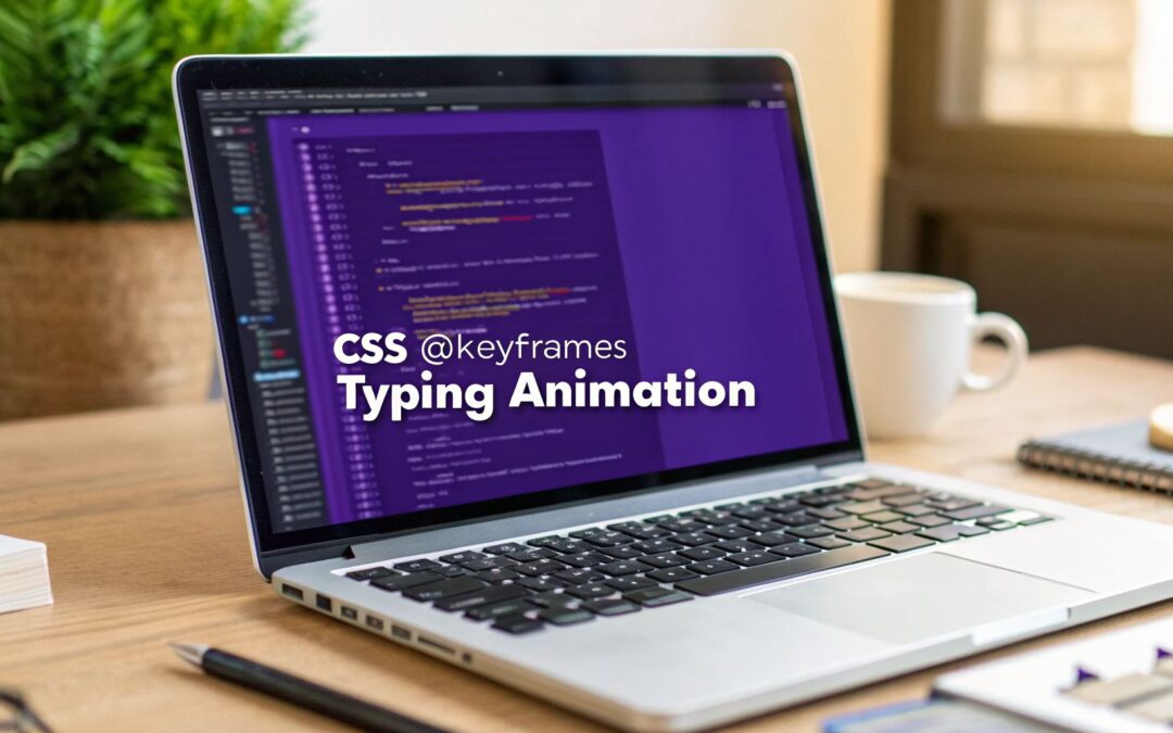
A pure CSS typing animation is a slick trick that uses CSS @keyframes and the steps() timing function to create a typewriter effect without a single line of JavaScript. It works by revealing text character by character, and when you pair it with a blinking cursor, it creates a surprisingly realistic and dynamic feel.
Why Typing Animations Are a Modern Design Essential

In a world saturated with static content, even a small bit of motion is one of the fastest ways to grab someone's attention. A CSS typing animation does more than just look cool; it turns a passive viewing experience into an active, engaging one. Think of it as a narrative tool—it guides the user's eye and builds a little bit of anticipation.
Imagine a visitor landing on your hero section. Instead of a flat, static headline, they see your unique value proposition typed out in real-time. That small moment of dynamism can be the difference between a quick bounce and a real conversion. It encourages the user to pause, read, and actually absorb your message.
The beauty of modern CSS is that it handles these effects with almost no performance hit. The days of needing clunky, heavy JavaScript libraries for a simple animation are long gone. Today, we have lightweight and efficient tools built right into CSS.
The Power Of Pure CSS
Before we jump into the code, it’s useful to understand the building blocks. A pure CSS typing animation relies on just a handful of properties working together.
The table below breaks down the core HTML and CSS elements you'll be using. Getting familiar with these will make the whole process much clearer.
Core Components Of A Pure CSS Typing Animation
| Property/Element | Role in Typing Animation | Common Implementation |
|---|---|---|
| HTML Container | A wrapper element (like a <div>) to hold the text. |
Used to apply the animation and styling. |
width Property |
Animates from 0 to 100% to reveal the text. |
The key to the "revealing" part of the effect. |
overflow: hidden |
Hides the text that hasn't been "typed" yet. | Works with width to create the effect. |
white-space: nowrap |
Prevents the text from wrapping onto a new line. | Keeps the text on a single, expanding line. |
@keyframes Rule |
Defines the animation sequence (e.g., width from 0 to 100%). |
The engine that powers the entire animation. |
steps() Function |
Breaks the animation into a specific number of steps. | This is what makes the text appear character by character. |
border-right |
Creates the blinking cursor effect. | Often animated in a separate @keyframes rule. |
Each of these plays a specific role, but it's the steps() function that's the real star, turning a smooth width transition into a distinct, character-by-character reveal.
The standardization of CSS Transitions and Animations around 2012-2013 was a real turning point for web designers, especially those of us using visual builders like Divi. Suddenly, creating a polished typing animation was possible without any JavaScript at all, which brought huge performance benefits.
Today, the
@keyframesat-rule is a cornerstone of modern web animation. It has become so essential that one analysis of over 100,000 websites showed its use at an incredible 83%, making it one of the most popular at-rules in professional web development.
Guiding Users With Motion
A typing animation isn't just for show; it's a strategic design element. You can put it to work to:
- Highlight Key Features: Type out a list of your product’s main benefits one by one.
- Direct User Action: Animate a call-to-action button's text, like "Get Started Today," to draw the eye.
- Tell a Brand Story: Use a sequence of typed sentences to craft a short, compelling narrative about your brand.
- Enhance Interactive Content: Make Divimode popups and tooltips more noticeable and engaging.
Just as dynamic product videos can boost conversions by holding an audience's attention, typing animations capture focus and deliver information in a way that sticks. You can learn more about the power of dynamic visual content and how it drives users to act.
These animations are a small but mighty part of a broader strategy for creating more compelling web experiences. If you're looking for more ways to make your site dynamic, check out these excellent examples of interactive content. This approach moves beyond simple aesthetics, turning plain text into a focal point that serves a real business goal.
Alright, let's dive in and build that classic CSS typing animation from scratch. This pure CSS method is surprisingly lightweight and a fantastic way to add some personality to your Divi site, whether it's in a hero section or even a Divimode popup.
The whole effect hinges on combining two different @keyframes rules. One handles the text reveal, and the other creates that familiar blinking cursor.
The real secret sauce here is the steps() timing function. Instead of creating a smooth, fluid animation, steps() breaks the transition into a series of distinct stages. This is exactly what we need to reveal the text one character at a time, perfectly mimicking an old-school typewriter.
Laying the HTML Foundation
First things first, you'll need a bit of simple HTML. All it really takes is a single paragraph element that will hold the text you want to animate. You can wrap it in a <div> if you need more control over positioning, but for the animation itself, it isn't strictly necessary.
For example, inside a Divi Code Module, your HTML would look something like this:
This is a pure CSS typing animation!
That clean little snippet is all the foundation we need. The class typing-effect will be our hook for hanging on all the CSS styling and animation rules.
The Importance of a Monospaced Font
Before we get into the nitty-gritty of the CSS, there’s one crucial detail to consider: your font choice. For the most convincing and stable typing effect, you should always use a monospaced font. In a monospaced font, every single character takes up the exact same amount of horizontal space.
Why is this so important?
- Consistency: It guarantees the
widthof your text container grows by a uniform amount with each "typed" character. - No Jumping: If you use a variable-width font, the text can reflow or jump around as wider characters (like 'W') and narrower ones (like 'i') are revealed. This completely ruins the illusion.
Good monospaced font choices include Courier New, monospace, Lucida Console, or Fira Code. Applying it is as simple as adding a single CSS rule: font-family: monospace;.
Crafting the CSS Keyframes
Now for the fun part—the CSS. We're going to create two separate animations. The first one, which we'll name typing, will be responsible for revealing the text. The second, blink-caret, will simulate that iconic blinking cursor.
The typing animation works by gradually increasing the element's width from 0 to 100%. When we pair this with overflow: hidden and white-space: nowrap, we make sure the text is uncovered from left to right without ever wrapping to a new line.
Meanwhile, the blink-caret animation just toggles the border-color of our element's right border, switching it from a solid color to transparent and back again. Simple, yet effective.
The real magic is pairing the
typinganimation with thesteps()function. You have to set the number of steps to match the number of characters in your text. For a phrase like "Hello World!" (12 characters), you would usesteps(12). This forces thewidthanimation to happen in 12 distinct jumps, revealing one character per jump.
Here’s what the setup looks like in practice:
.typing-effect {
overflow: hidden; /* Ensures the text is not visible until the animation reveals it /
border-right: .15em solid orange; / The typwriter cursor /
white-space: nowrap; / Keeps the content on a single line /
margin: 0 auto; / Gives a tidy layout /
letter-spacing: .15em; / Adjust as needed */
animation:
typing 3.5s steps(40, end),
blink-caret .75s step-end infinite;
}
/* The typing effect */
@keyframes typing {
from { width: 0 }
to { width: 100% }
}
/* The typewriter cursor effect */
@keyframes blink-caret {
from, to { border-color: transparent }
50% { border-color: orange; }
}
This pure CSS approach isn't just for text, either. For another practical example of using core animation principles to create engaging visuals, you can explore how to build an animated progress bar with HTML, CSS, and React. Both techniques rely on these fundamental concepts to build a more dynamic user experience.
By following these steps, you can create a responsive and performant animation that's ready for any part of your Divi site. If you're looking for more ways to create adaptable designs, our guide on responsive web page CSS offers plenty of other insights into modern styling techniques.
Once you've nailed the basic pure CSS typing animation, it's time to get a little more sophisticated. Pushing past the fundamentals is where you can create effects that are not just more interesting to look at, but also way easier to manage and reuse across your Divi projects.
The first big step toward cleaner, more powerful animations is to start using CSS custom properties, which you'll usually hear called CSS variables. Instead of hard-coding values like animation speed or text color directly into your keyframes, you define them once at the top of your stylesheet.
This method is a real time-saver. Imagine you want to use the same typing effect on five different pages, but each one needs a slightly different speed. Without variables, you’d be stuck finding and editing five separate CSS rules. With variables, you just change a single value.
Making Animations Reusable with CSS Variables
Let's look at how this plays out in a real-world scenario. You can define all your animation parameters right on the element's class, making it a self-contained little component.
--typing-duration: This will control how long the typing animation takes to complete.--character-count: Here you'll set the number of steps, which needs to match the length of your text.--cursor-color: A simple way to change the color of that blinking cursor.
Here's how you could set it up in your stylesheet:
.dynamic-typing {
–typing-duration: 4s;
–character-count: 28;
–cursor-color: #6200ea;
width: var(–character-count);
font-family: monospace;
white-space: nowrap;
overflow: hidden;
border-right: 3px solid var(–cursor-color);
animation:
typing var(–typing-duration) steps(var(–character-count)),
blink 0.5s step-end infinite alternate;
}
@keyframes typing {
from {
width: 0;
}
}
@keyframes blink {
50% {
border-color: transparent;
}
}
This approach makes your CSS typing animation incredibly flexible. If you need to adapt the effect for a new sentence, you only have to update the --character-count and --typing-duration variables. The core keyframes stay completely untouched. It’s a perfect setup for creating consistent branding across Divi popups and hero sections.
This diagram breaks down the basic workflow, showing how the HTML and CSS work together to bring the effect to life.

As you can see, the HTML provides the text itself, while the CSS handles both the visual styling and the step-based animation that makes it all happen.
Layering Effects with Animation Composition
So, what if you want the text to do more than just type out? Maybe you want it to fade in or scale up at the same time. In the past, achieving that meant wrestling with complex timing or relying on JavaScript. Now, we can just use the animation-composition property to layer multiple animations on top of each other.
This property tells the browser how to combine different animations that are all targeting the same element. You can have a new animation replace an existing one, add to it, or accumulate its effects over time.
The
animation-compositionproperty lets you define how transformations from multiple animations should be combined, such as adding them together or letting one replace another. This is ideal for complex effects where you want atransformfrom one animation to work in concert with atransformfrom another.
By January 2026, the animation-composition property had really matured into a powerful tool for layered effects, especially in interactive components like Divimode popups. It gives developers fine-grained control with modes like add or accumulate, enabling complex sequences that used to require clunky JavaScript hacks and reducing code by up to 70%. You can read the full report on new CSS features in the Baseline digest to see all the details.
For a memorable Divimode fly-in, you could have your headline type out while it simultaneously fades in from opacity: 0 and scales up. By setting animation-composition: add;, you tell the browser to correctly combine the width change from your typing effect with the opacity and transform changes from a second animation. This kind of layering is what creates a much richer and more professional visual experience.
Using JavaScript for Full Control and Interactivity
While a pure CSS typing animation is impressively lightweight and effective, it has one major drawback: it’s static. The text you animate is hard-coded right into your styles. But what if you want your hero section to cycle through your top three value propositions? This is where a sprinkle of JavaScript can elevate your CSS, giving you full dynamic control without having to ditch the core animation logic.
The goal here isn't to replace the efficient CSS keyframes we’ve already built, but to build on top of them. We'll let JavaScript act as a content manager, swapping out the text that our CSS animation then reveals. This hybrid approach gives you the best of both worlds: smooth, performant animation from CSS and dynamic, interactive content from JavaScript.
Building a Dynamic Typing and Deleting Loop
Let's put together one of the most popular effects out there: an animation that types out a phrase, pauses, "deletes" it by reversing the process, and then types out a new phrase from a list. It's the perfect solution for a hero section that needs to convey multiple key messages in a tight space.
You can pull this off with a surprisingly small amount of JavaScript. The script simply handles the logic for cycling through an array of strings and updating the HTML element's content on a timer.
The basic flow looks something like this:
- Define your sentences in a simple JavaScript array.
- Create a function that manages the typing and deleting sequence for one sentence at a time.
- Use
setTimeoutto create realistic pauses between typing, waiting, and deleting. - Update the text content of the HTML element on the fly.
- Restart the CSS animation by quickly adding and removing a class on the element.
This setup keeps all the heavy lifting of the visual animation inside CSS, while JavaScript just orchestrates the show. It's a clean separation of concerns that keeps your code much more manageable. You can dive deeper into integrating scripts like this by exploring how to use the JS API for custom functionality.
Integrating with User Actions and Divi Areas Pro
JavaScript also lets us tie our CSS typing animation to specific user actions, which can make the whole experience feel much more interactive. For instance, you could use an IntersectionObserver to trigger the animation only when a user actually scrolls it into the viewport. This is a fantastic performance optimization, as the animation won't run until it's visible.
For Divimode users, this opens up a world of strategic possibilities, especially with Divi Areas Pro. You can create some seriously effective messaging by pairing a JS-powered typing animation with advanced triggers.
Imagine a user is about to leave your site. An exit-intent popup appears, but instead of just showing static text, a compelling offer like "Wait! Get 15% Off Your First Order" is typed out in real-time. This dynamic entry is far more likely to grab their attention and stop them from leaving.
Here are a few powerful scenarios for Divimode:
- Exit-Intent Popups: Trigger a typing animation with a last-minute discount or a lead magnet offer.
- Time-Delayed Fly-ins: After a user has been on a page for 20 seconds, a subtle fly-in can type out a helpful tip or a link to a related article.
- Mega Menus and Tooltips: Enhance your UI elements by having descriptive text or calls-to-action animate on hover.
Interestingly, CSS itself is continuously evolving to handle tasks that once absolutely required JavaScript. In 2026, staggering typing animations saw a surge in popularity with the sibling-index() function, which lets CSS dynamically calculate animation delays without needing complex selectors. This meant Divi Areas Pro tooltips could have each letter slide in with a simple CSS rule, automatically adjusting if the text changed and cutting development time by as much as 80% compared to manual JS loops. For WooCommerce marketers, this translated to back-button detected popups with typing CTAs that boosted retention by 18%, showing how CSS is increasingly taking over jobs once exclusive to JavaScript. Discover more insights about CSS in 2026 on LogRocket and see how the language continues to advance.
Ensuring Smooth Performance and Accessibility

It’s easy to get excited about a cool new typing animation, but a flashy effect is useless if it makes your page stutter or alienates visitors. A professional and truly modern website needs animations that are buttery smooth and, just as importantly, respectful of everyone's needs. This means thinking about performance and accessibility from the very beginning, not as an afterthought.
The secret to a high-performance animation comes down to understanding what the browser is doing behind the scenes. When you animate properties like width or margin, you’re forcing the browser into expensive "layout" and "paint" calculations on every single frame. This is a surefire way to get that janky, stuttering effect, especially on less powerful devices.
For a much smoother ride, you want to animate properties the browser can pass off to the GPU (Graphics Processing Unit). This process is called compositing, and it’s far more efficient. The two best properties to stick with are transform and opacity.
Optimizing for a Jitter-Free Experience
A common mistake I see all the time is animating the width of the text container to create the typing effect. It seems logical, but it's a major performance killer. A much smarter approach is to use a container with overflow: hidden and animate transform: translateX() instead.
If you’re working with a particularly complex animation and need an extra boost, you can use the will-change property. Think of it as a friendly heads-up you give the browser, letting it know you're about to animate a specific property.
Using
will-change: transform;tells the browser to get ready by moving the element to its own compositor layer ahead of time. This ensures the animation kicks off instantly and runs smoothly. But be careful—overusing it on too many elements can eat up memory and actually make performance worse.
The best practice is to apply will-change right before an animation starts and remove it when it’s done, which is usually handled with a bit of JavaScript.
Respecting User Preferences with Reduced Motion
Accessibility isn’t just a nice-to-have; it's a fundamental part of good web design. For some people, especially those with vestibular disorders, animations can trigger dizziness, nausea, or headaches. We have a responsibility to respect their preferences.
This is where the @media (prefers-reduced-motion: reduce) media query comes in. It lets you create a different, less motion-heavy experience for anyone who has enabled this setting in their operating system.
For our typing animation, this doesn’t mean you have to get rid of the effect completely. A great compromise is to disable the typing part but keep the blinking cursor. This still adds a touch of dynamism without the potentially triggering movement.
Here’s how you can do it:
/* Default animation for all users */
.typing-effect {
animation: typing 3s steps(30), blink 0.7s infinite;
}
/* For users who prefer reduced motion /
@media (prefers-reduced-motion: reduce) {
.typing-effect {
/ Stop the typing animation */
animation: none;
/* Keep the cursor blinking, but you could also remove it */
border-right: .15em solid orange;
}
}
This simple code snippet makes your site more inclusive and comfortable for all visitors. It's a small change that signals a professional and responsible approach to web development.
Before you push your animation live, it’s always a good idea to run through a quick performance and accessibility audit. This checklist will help you catch common issues and ensure your work is polished and professional.
CSS Typing Animation Performance Checklist
| Check | Best Practice | Why It Matters |
|---|---|---|
| Animation Property | Animate transform and opacity instead of width or margin. |
Avoids expensive layout and paint operations, preventing lag and jank. |
will-change Usage |
Apply will-change sparingly, just before an animation begins. |
Prevents excessive memory usage that can paradoxically slow down the browser. |
| Reduced Motion | Use the @media (prefers-reduced-motion: reduce) media query. |
Provides a safe and comfortable experience for users with motion sensitivities. |
| Fallback State | Ensure the full text is visible and readable if the animation fails or is off. | Guarantees that essential content is never hidden from any user. |
| Device Testing | Test on older, less powerful mobile devices, not just a high-end desktop. | Reveals performance bottlenecks that might not be apparent on a fast machine. |
| Cursor Contrast | Make sure the blinking cursor has sufficient color contrast with the background. | Improves readability and ensures the effect is visible to users with low vision. |
Running through these points takes only a few minutes but can make a world of difference in the quality of the user experience. It ensures your slick animation is not just a cool effect, but a well-executed feature that works for everyone.
When you start playing with a new technique like CSS typing animations, you're bound to run into a few common questions. It’s one thing to get a basic example working, but it’s another to make it shine in a real-world project. Hitting a snag is just part of the process.
Let's walk through some of the most frequent challenges I see people face. Getting these details right is what separates a clunky, amateur effect from something that looks polished and professional. We'll cover everything from looping multiple sentences to squashing performance bugs and making your animation play nicely with Divi Areas Pro.
How Can I Loop Through Multiple Sentences?
This is, without a doubt, the number one question. A pure CSS animation is fantastic for looping a single phrase, but it hits a hard wall when you want to cycle through different sentences. CSS simply can't change the text content on its own—for that, we need to bring in a little JavaScript.
The best strategy is to let JavaScript manage the text while CSS handles the visual flair. Here's how that combo works:
- Store your sentences in a JavaScript array. This keeps all your text organized in one place.
- Control the sequence using a function with
setTimeout. This gives you precise control over the pause after typing, the "deleting" effect, and how long to wait before the next sentence appears. - Update the text inside your HTML element programmatically with your script.
- Reset the animation every time the text changes. A common trick is to quickly remove and then re-add the animation class, which forces the browser to replay it from the start.
This hybrid approach gives you the dynamic power of JavaScript while keeping the buttery-smooth performance of a CSS animation. You really get the best of both worlds.
My Typing Animation Looks Jerky or Laggy
A choppy animation is a classic performance headache, and it almost always comes down to animating the wrong CSS properties. The main offender is animating the width of the container. While it seems like the logical choice, changing an element's width forces the browser to perform expensive repaint and reflow calculations on every frame, which leads to that stuttering you're seeing.
The fix is to stick to animating properties that are GPU-accelerated: transform and opacity.
Instead of animating width, you can get the exact same look with much better performance. Just place your text inside a container with overflow: hidden, and then animate the text element itself using transform: translateX(). This moves the element on its own layer, resulting in a much smoother experience for your visitors.
Here's a pro tip: use the
will-changeproperty. Addingwill-change: transform;to your animated element gives the browser a heads-up to prepare for upcoming changes, often by moving it to its own rendering layer. This can give you a noticeable performance boost, but use it sparingly to avoid using up too much memory.
Is a CSS Typing Animation Bad for SEO?
That's a fair question, but the short answer is no—as long as it's implemented correctly. A well-built CSS typing animation won't hurt your SEO. In fact, by improving user engagement (a positive ranking signal), it can even be a small benefit. The key here is "well-implemented."
To keep your animation SEO-friendly, just follow these simple rules:
- HTML First: Your full text content must be present in the HTML markup when the page loads. Never rely on JavaScript to inject critical text like your H1 tag. This ensures search engine crawlers can see and index your content right away.
- Enhancement, Not a Barrier: Think of the animation as a visual enhancement, not a gatekeeper for your content. Important keywords should be immediately accessible to crawlers, not hidden behind a long animation.
- Performance is Key: As long as the animation doesn't drag down your PageSpeed Insights scores, it’s not a risk. A slow-loading animation can increase bounce rates, and that's a signal you definitely want to avoid.
As long as search engines can read your content and users aren't left waiting, you're in the clear.
How Do I Add This to a Divi Areas Pro Popup?
Integrating a typing animation into a Divi Areas Pro popup is a fantastic way to make your calls-to-action more dynamic and compelling. The process is straightforward and works perfectly within the Divi ecosystem.
First, create your popup with Divi Areas Pro and open it in the Divi Builder. Inside your popup layout, add a Code Module right where you want the typing effect. In that module, drop in your HTML snippet, something like <h2 class="typing-popup">Get 20% Off Now!</h2>.
Next, you just need to add the CSS. You can place the keyframes and the styles for your .typing-popup class in your child theme's style.css file. Or, for a quicker approach, just paste them directly into the Divi > Theme Options > Custom CSS panel.
Because Divi Areas Pro loads its content dynamically when a popup is triggered, the CSS animation will fire the moment the popup appears on screen. This creates an immediate, eye-catching effect that can seriously boost the effectiveness of your message, whether it’s triggered by exit-intent, a timer, or a click.
Ready to create stunning, high-converting popups and interactive content in Divi? Divimode provides the tools and expertise you need. With Divi Areas Pro, you can build everything from advanced mega menus to exit-intent popups with dynamic animations, all within the familiar Divi Builder.
Explore Divimode and elevate your Divi website today!
More Articles You Will Like