 Alex Martin
Your blog layout is so much more than just a pretty design. It’s the roadmap that guides visitors, keeps them engaged, and ultimately turns casual readers into loyal fans. Getting this right means moving beyond Divi's default templates to build a unique experience that directly impacts how long people stick around—and how likely they are to convert.
This guide will show you exactly how to do that using the powerhouse that is Divi's Theme Builder.
Why Your Blog Layout Is More Than Just a Design
Let's be honest—the default blog layout that comes with most themes is pretty uninspired. It’s functional, sure, but it rarely does anything to truly captivate an audience. A well-thought-out design, on the other hand, tells visitors where to look, what to read next, and why your content is worth their time.
Without that clear direction, you risk having amazing content that simply gets lost in the shuffle. Your blog's structure is a critical piece of your content marketing funnel. It's that first impression that determines whether someone clicks away or dives deeper into what you have to offer.
The Power of a Custom Divi Layout
This is where Divi really shines. Its true strength is the ability to break free from generic, cookie-cutter structures. By jumping into the Divi Theme Builder, you get complete control over every single pixel of your blog. You can design custom headers for specific categories, create unique post formats, and build archive pages that actually encourage people to explore.
This level of control is why Divi is a favorite among freelancers and agencies. Its versatility is reflected in its massive adoption. As of early 2025, Divi holds a robust 6% market share among the top one million websites using WordPress. That translates to over 12,000 high-traffic sites relying on its powerful layout system. You can explore more about these statistics and Divi's popularity if you're curious.
Your blog layout is your silent salesperson. It can either create a confusing, cluttered experience that pushes visitors away or a clear, engaging journey that turns readers into subscribers and customers.
Key Benefits of a Strategic Design
Investing time in a custom blog Divi layout delivers tangible results that go far beyond just looking good. It directly influences user behavior and your most important website metrics.
- Improved User Engagement: A logical, visually appealing layout keeps readers on your site longer. This means lower bounce rates and more page views per session.
- Enhanced Brand Identity: A unique design reinforces your brand's personality, making your content more memorable and recognizable in a sea of look-alike blogs.
- Higher Conversion Rates: By strategically placing calls-to-action, email opt-in forms, and related post sections, you can guide users toward specific goals—like subscribing to your newsletter or buying a product.
- Better SEO Performance: Search engines love a well-structured site. A layout with proper heading hierarchy and a mobile-first design can give your content a serious ranking boost.
Before we get into the nitty-gritty of building, it's crucial to have a clear roadmap. We'll start by breaking down the core layout types and figuring out which one is right for you. This foundation is key to building a blog that not only looks incredible but performs exceptionally well.
Mastering the Divi Theme Builder for Your Blog
If you want to build a truly custom blog divi layout, the Divi Theme Builder is your command center. Forget the old way of tweaking individual posts one by one. This is where you design a single, global template that gives your entire blog a consistent and professional look. It's the secret to creating a scalable and beautifully branded reading experience.
Instead of boxing ourselves in with a generic, pre-built layout, we’re going to build this from the ground up. Doing it this way gives you total control over every single element, from the hero section all the way down to the author bio. Let's jump in and create a new template that will automatically apply to all your blog posts.
Setting Up Your First Blog Post Template
First things first, head over to Divi > Theme Builder in your WordPress dashboard. This is the hub for all your site-wide templates—headers, footers, body layouts, you name it. You'll likely see a default template already there, but we're going to create a dedicated one just for our blog posts.
Click on "Add New Template," and a settings box will pop up. This is where you tell Divi exactly where this new design should be used. To make a template for every single blog post on your site, just check the box next to "All Posts." Simple as that. Now, any article you publish will automatically use the design you're about to create.
This step alone is what separates high-quality, professional blogs from amateur ones. It guarantees consistency and saves you countless hours you’d otherwise waste formatting each article by hand.
Defining the Core Template Structure
Once you’ve assigned the template to "All Posts," you’ll see three main areas you can customize: the Global Header, Global Footer, and a "Custom Body." Our focus will be on the Custom Body, since this is where the unique content of each blog post will actually appear.
Go ahead and click "Add Custom Body" and then select "Build Custom Body." This will launch the familiar Divi Builder, but with one critical difference: you'll be using special modules that pull in content dynamically.
This whole process is a strategic move designed to guide, engage, and ultimately convert your blog's visitors.
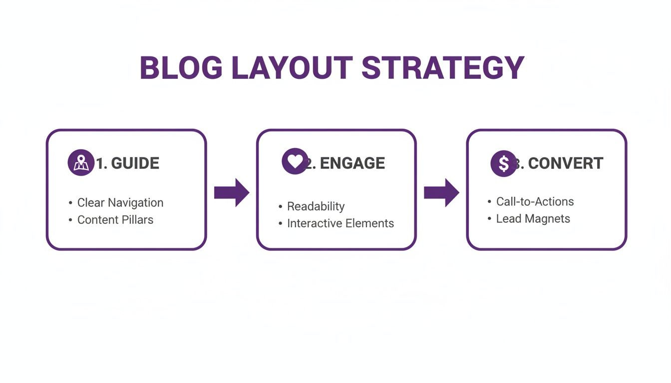
As you can see, a successful layout isn't just about looking good; it's a funnel built to drive specific user actions.
Harnessing the Power of Dynamic Content
Dynamic Content is the magic that makes the Theme Builder so incredibly powerful. Instead of typing in static text or uploading one-off images, you'll use modules that automatically pull in the correct information for each individual blog post.
Think of it like a mail merge for your website. You design the template once, and Divi automatically fills in the blanks with that specific post's title, featured image, author name, and body content. For anyone creating content regularly, this level of automation is an absolute game-changer.
Here are the essential modules you'll be working with:
- Post Title Module: This is your go-to for displaying the post's title, author, date, categories, and even the featured image. You can toggle each of these elements on or off to get the exact look you want.
- Post Content Module: This is the most important module of them all. It acts as a dedicated placeholder that renders the entire content of your blog post, just as you wrote it in the WordPress editor.
- Comments Module: Simply place this at the bottom of your layout to display and manage your reader comments.
- Author Box Module: This is a great way to add a personal touch. The module dynamically pulls the author's bio and profile picture from their WordPress user profile.
I like to think of a blog post template as a custom frame for your artwork. The frame should complement the art—your content—without overpowering it. Dynamic Content ensures every piece of art fits perfectly inside that frame, every single time.
If you'd rather skip the manual setup, a fantastic option is to explore pre-designed templates for Divi. These often come with creative layouts and optimized modules ready to go, giving you a professional starting point in minutes.
Building a Custom Hero Section
Alright, let's put this theory into practice and create a visually striking hero section. A really common and effective design is to use the post's featured image as a full-width background with the post title overlaid on top.
It's easier than it sounds:
- Add a Section: Start by adding a new regular Section to your Custom Body layout.
- Set a Dynamic Background: In the Section Settings, head to the
Backgroundtab. Instead of picking a color or uploading an image, click the small "Dynamic Content" icon (it looks like a little database cylinder). From the list, choose "Featured Image." - Add the Post Title: Now, inside that section, add a
Post Titlemodule. In the module'sElementssettings, turn off everything except for "Show Title." From there, you can hop over to theDesigntab to style the typography and make it pop against the background. You may need to add a dark background overlay to your section to ensure the text is readable.
With just those few steps, you've created a stunning, automated hero section that adapts to every single blog post you publish. It’s this kind of custom touch that makes a huge difference in perceived quality and professionalism, which is absolutely crucial for keeping readers engaged.
Laying Out Your Post and Archive Pages
Alright, with our global blog post template in place, it’s time to get into the details of the two most important views on any blog: the individual post page and the main archive page. These are the workhorses of your blog Divi layout. One is where people dig into your content, and the other is where they discover it.
Nailing the design of these two templates is what separates an average blog from one that feels polished, professional, and keeps people clicking. We're moving past the basic skeleton and into the fine-tuning.

As we build, it's helpful to think about how our content will flow and adapt across different devices. A little background knowledge on topics like dynamic versus fixed layouts can really sharpen your design instincts for a truly responsive experience.
Let's dive into the single post first.
Perfecting the Single Post Layout
Your single post template is arguably the most critical piece of your entire blog. This is where your best content lives, so readability and user experience are everything. The whole point is to create an environment that encourages someone to settle in and read, not just skim and bounce.
The Post Content module is the star of the show here. It's the magic module that dynamically pulls in whatever you've written in the WordPress editor for that specific post. While you don't style the content itself here, you control everything around it.
A classic mistake I see all the time is making the content area too wide. For comfortable reading, you want to aim for 50 to 75 characters per line. In Divi, this usually means setting a max-width somewhere between 700px and 900px on the row containing your Post Content module.
Styling Post Meta for Clarity
Post meta—the author, date, categories, and tags—gives readers crucial context at a glance. The Post Title module can display this for you, but the default styling is often a bit plain. A few tweaks can make it much more useful.
Don't just leave it as a line of text. Try some of these simple upgrades:
- Add Icons: A small calendar icon next to the date or a folder next to the categories adds a nice visual touch and makes the info scannable.
- Create Hierarchy: Use a slightly smaller font size or a lighter text color for the meta. It should be easily found but shouldn't compete with the main headline.
- Make Categories Clickable: Make sure your category links look like links. An underline on hover is a classic cue that encourages readers to explore related articles.
Think of your post meta as little signposts. Good meta design instantly tells a reader "who wrote this," "when it was published," and "what it's about." This builds trust and makes your blog easier to navigate.
Creating a Comment Section That Invites Conversation
The default Divi comments module gets the job done, but it can feel a bit cold. With a few quick design adjustments, you can make it feel like a more welcoming space for discussion, which is a fantastic signal of an engaged audience.
Jump into the Comments module settings and head to the Design tab. Pay special attention to the Fields and the Button. Giving the input fields a soft background color and a subtle border helps them stand out. And most importantly, style that "Submit" button to match your primary brand colors—make it pop.
Crafting the Perfect Blog Archive Page
Your archive page is your content's storefront. Its primary job is to showcase your articles in a way that makes people say, "Ooh, that looks interesting," and click through to read more. You'll be using the Blog module for this, and it comes with three excellent layout options out of the box.
Let's break down the three main types so you can pick the right one for your blog.
| Layout Type | Best For | Key Advantage |
|---|---|---|
| Grid | Visually-driven blogs (travel, food, design) where images are the heroes. | A clean, balanced look that's super easy to scan. Every post is a uniform card. |
| Fullwidth (List) | Content-heavy blogs (tutorials, news, case studies) where headlines matter most. | Maximizes space for text, letting you use longer excerpts to hook the reader. |
| Masonry | Creative blogs or portfolios with images of different shapes and sizes. | A dynamic, puzzle-like layout that eliminates awkward white space. |
Fine-Tuning Your Archive Display
Once you've picked your layout, the work isn't done. Inside the Blog module's settings, you get to control exactly what information shows up on your archive cards.
Look for the Elements toggle. From there, you can show or hide:
- The Featured Image
- The "Read More" Button
- Author, Date, and Categories
- The Post Excerpt
For most blogs, a combination of the featured image, excerpt, and a clear "Read More" button is the sweet spot. Be mindful of your excerpt length; around 150 characters is usually enough to give a teaser without cluttering the page.
And finally, give that "Read More" button some love. Don't leave it as the default gray button. Style it to match your site's main call-to-action. Use your brand colors, adjust the font, maybe add an icon. This tiny detail can have a real impact on your click-through rate, turning casual browsers into loyal readers.
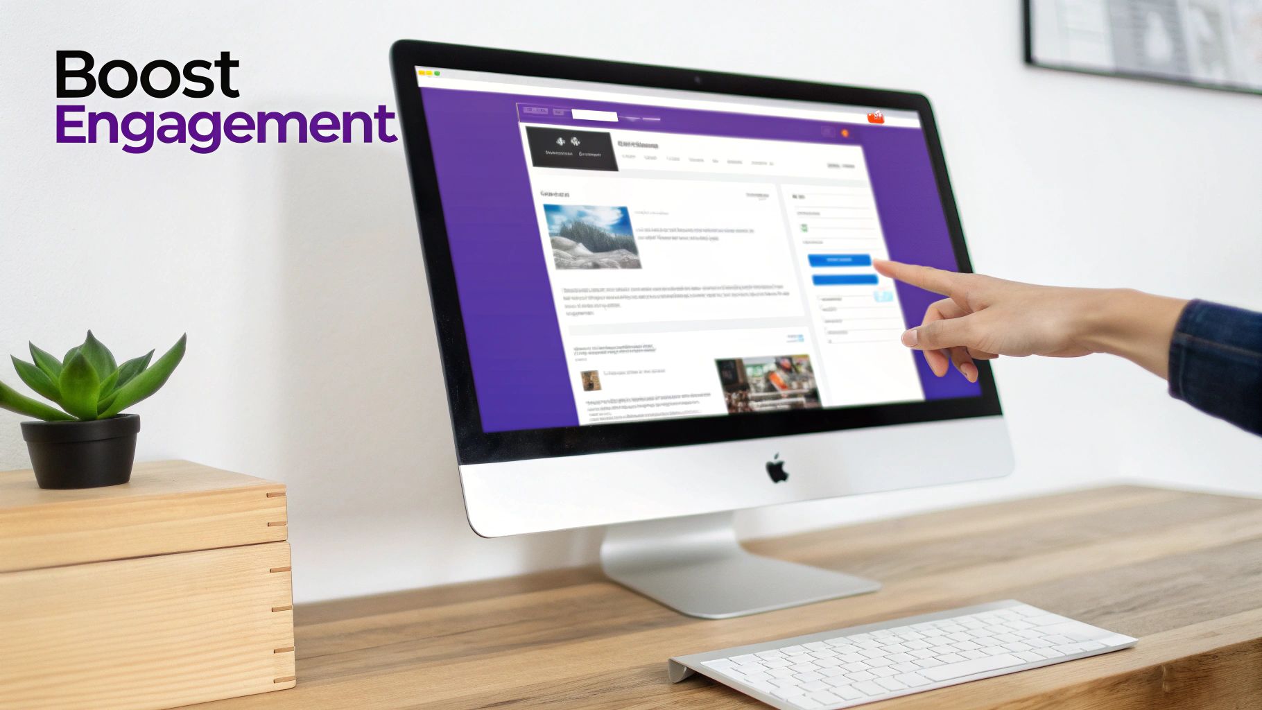
7. Add Interactive Elements to Boost Engagement
A killer blog Divi layout is your foundation, but a static design can only get you so far. The real magic in keeping readers hooked—and turning them into loyal fans—is creating an experience that feels alive and responsive. We're talking about adding dynamic, interactive elements that show up at just the right moment.
These aren't just flashy gimmicks. They are powerful, strategic tools designed to grab attention, offer real value, and gently guide your visitors where you want them to go. Think of a welcome popup for a first-timer offering a free guide, or a helpful slide-in suggesting more articles when someone scrolls deep into a post.
Going Beyond Standard Divi Modules
While Divi’s built-in modules are solid, pulling off sophisticated, targeted interactions usually calls for a more specialized tool. This is exactly where plugins like Divi Areas Pro from Divimode step in, letting you build almost any interactive element you can dream up, all within the Divi Builder.
You can craft custom popups, slide-ins, tooltips, and even inject content dynamically right into your blog posts. The game-changer here is the ability to control exactly who sees these elements and when they see them.
Real-World Scenarios for Interactive Content
Let's get practical. A static layout treats every visitor the same way, but an interactive one can adapt to their unique journey. This kind of personalization is what separates a good blog from a great one.
Here are a few ideas you can put into action right away:
- The Welcome Mat: For first-time visitors, trigger a friendly popup after 10 seconds offering your best freebie, like an ebook or a handy checklist. It’s an instant way to build your email list with people who are already interested.
- The Content Upgrade: Automatically inject a targeted call-to-action (CTA) inside blog posts from a specific category. For example, in your "SEO Tips" category, you could insert a banner for your SEO course about halfway through each article.
- The Exit-Intent Offer: Just as a user is about to leave a product review, you can trigger an exit-intent popup with a special discount code. This one last nudge can be surprisingly effective at preventing a lost sale.
This screenshot shows how you can use the Divi Builder to create a custom popup area that can be triggered based on user behavior.
This visual approach is a massive time-saver, letting you design complex interactive elements without ever leaving the familiar Divi interface. For more inspiration, check out these examples of interactive content to get your own creative ideas flowing.
The Power of Precise Triggers and Targeting
The real genius behind these interactions is the triggers. A generic popup that fires instantly is just plain annoying. But a helpful resource that slides in after a reader has scrolled 70% down the page? That feels relevant and genuinely helpful.
Interactivity isn't about interrupting the user; it's about enhancing their experience. The goal is to provide the right information at the right time, making your blog feel less like a static page and more like a helpful conversation.
Think about the level of control this gives you. You can set up triggers based on things like:
- Time Delay: Show a promotion after a user has been on the page for 30 seconds.
- Scroll Depth: Trigger a related posts slide-in when a reader is nearing the end of an article.
- Exit Intent: Grab their attention one last time as their cursor moves to leave the browser window.
- User Role: Display a special message or offer that only your logged-in members can see.
Integrating Popups for Maximum Impact
Let's be honest, popups have a bad reputation. But when used correctly, they're one of the most effective conversion tools out there. The secret is to make them valuable, not disruptive. Ditch the generic "Subscribe Now!" popup on every page and start tailoring your offers to what the user is actually reading.
Imagine someone is on your post, "10 Vegan Dinner Recipes." An effective popup wouldn't just ask for their email; it would offer a free PDF download of a "Vegan Weekly Meal Planner." This hyper-relevant offer provides immediate value and dramatically increases the odds of a sign-up.
As you implement these elements, the goal is always to create a compelling experience that grabs and holds your reader's interest. By tying your popups and slide-ins directly to your user's journey, you transform a potential interruption into a welcome opportunity. To learn more, explore these strategies to captivate your audience and keep them coming back for more.
Optimizing Your Divi Layout for Speed and SEO
Building a knockout blog Divi layout is a fantastic start, but it's really only half the job. What's the point of a stunning design if it takes an eternity to load or stays hidden from search engines? All that creative effort goes right out the window.
In this day and age, a fast, well-structured website isn't just a "nice-to-have." It's an absolute must if you want to keep visitors around and earn your spot on Google. Think of this final step as your pre-flight checklist. We're going to dial in the essential performance tweaks and SEO best practices to make sure your new layout doesn't just look amazing—it performs at its absolute peak.
Fine-Tuning Divi for Peak Performance
Page speed has a direct, undeniable impact on user experience, and by extension, your SEO. Slow pages mean high bounce rates, and you can bet Google is paying attention. The good news is that Divi comes packed with some powerful, built-in tools to speed things up, no performance guru required.
Your first stop should be Divi > Theme Options > General > Performance. This is your speed command center. Here are the settings you’ll want to flip on immediately:
- Dynamic Module Framework: This clever feature makes sure Divi only loads the code for the modules you're actually using on a page. No more loading up your site with unnecessary baggage.
- Static CSS File Generation: Divi takes all the CSS your design needs, processes it, and saves it into a single static file. Browsers can grab and load these files much, much faster.
- Defer jQuery and jQuery Migrate: This setting is key for preventing "render-blocking" JavaScript. It lets the visual parts of your page load first, giving visitors something to see right away while the scripts load in the background.
Think of Divi's performance settings as a decluttering tool for your website's code. By enabling these options, you're telling Divi to only serve what's absolutely necessary, resulting in a lighter, faster experience for every visitor.
Beyond Divi's built-in settings, image optimization is absolutely non-negotiable. Always, always compress your images before you upload them to WordPress. Giant, unoptimized image files are one of the most common—and easily fixed—causes of sluggish page speeds.
Structuring Your Layout for Search Engines
Good SEO is about much more than just keywords; it's also about clear structure. Search engine crawlers need a logical roadmap to understand your content's hierarchy. This is where a proper heading structure in your Theme Builder template becomes critical.
Make sure your Post Title module is set to use an H1 tag. This is the single most important heading on the entire page, signaling the main topic. From there, any headings you use within your post content should follow a logical sequence (H2, then H3, and so on). Don't skip levels, like jumping from an H2 to an H4, as this can confuse crawlers.
For a much deeper look into this, check out our complete guide on making the most of Divi and SEO.
Ensuring a Flawless Mobile Experience
Let's be real: your blog is far more likely to be read on a phone than on a desktop. A design that isn't responsive is an instant deal-breaker for both your visitors and for search engines that prioritize mobile-first indexing.
This is where Divi's responsive editing tools become your best friend. As you're building your templates, get in the habit of constantly switching between the Desktop, Tablet, and Phone views. You're looking for common offenders like:
- Font sizes that are way too big or unreadably small on mobile.
- Padding and margins that create awkward gaps or squished content.
- Elements that add clutter and could be hidden on smaller screens for a cleaner experience.
Here’s a pro-tip I use all the time: adjust the column layout for rows on mobile. A three-column row that looks great on a desktop will almost always look better stacked vertically into a single column on a phone. Making these small adjustments ensures your layout isn't just functional, but genuinely a pleasure to use on any device. That commitment to a great mobile experience sends a powerful signal to Google that your site is worth ranking.
As you get deeper into designing your own Divi blog layout, you're bound to run into a few questions. I see the same ones pop up all the time, so I've put together some quick answers to the most common hurdles Divi users face. Let's clear these up so you can get back to building with confidence.
Can I Create Different Layouts for Different Blog Categories?
You bet. This is hands-down one of the most powerful features of the Divi Theme Builder. Its real strength is in its precise assignment conditions, which let you design a unique template and apply it only to posts within a specific category.
Here’s how it works: you create a new template in the Theme Builder, style it however you want, and then dive into the Template Settings. Instead of assigning it to "All Posts," you'll tell Divi to apply it to "Posts In Specific Categories."
This is a game-changer. You can tailor everything—from the hero section to the sidebar—to perfectly match the content. For instance, your "Case Studies" category could get a clean, professional layout, while a "Behind the Scenes" category might have a more personal, image-heavy design.
Will Using the Divi Theme Builder Slow Down My Website?
This is a valid concern, but the short answer is no, not necessarily. While any complex design can potentially add weight to a page, a custom layout built smartly will perform just as well—if not better—than a generic one. Divi has some seriously robust optimization features baked right in to help with this.
The secret is knowing how to use Divi's built-in performance tools.
A well-optimized custom blog layout is always faster than a bloated, poorly configured generic theme. Performance is less about using the Theme Builder and more about how you build with it.
Just head over to 'Divi > Theme Options > General > Performance' and enable features like Static CSS File Generation. This one setting alone can make a huge difference. Combine that with best practices like image compression and a good caching plugin, and you can build something that's both fast and beautiful.
How Do I Make My Custom Divi Blog Layout Responsive?
Divi makes this incredibly straightforward. You don't need to touch a line of code to get your layout looking perfect on any device, thanks to the responsive design controls built into every single module, row, and section.
Inside the Divi Builder, you can instantly switch to Tablet or Phone view to see how your design stacks up. From there, you can fine-tune almost any setting specifically for that device.
Here are a few of the most common adjustments I make for mobile:
- Shrink font sizes for headlines and body text to make them more readable on smaller screens.
- Tweak margins and padding to give the content some much-needed breathing room.
- Hide certain elements (like a busy sidebar) on mobile to create a simpler, more focused experience.
Make it a habit to check your design in these responsive modes before you hit publish. It's a final sanity check that ensures every visitor has a great experience, no matter how they're viewing your site.
Ready to create popups, slide-ins, and other interactive elements that take your Divi blog to the next level? Divimode provides the tools you need to build a truly dynamic and high-performing website. Explore our powerful plugins and start building a more engaging blog today.
More Articles You Will Like


