
 Alex Martin
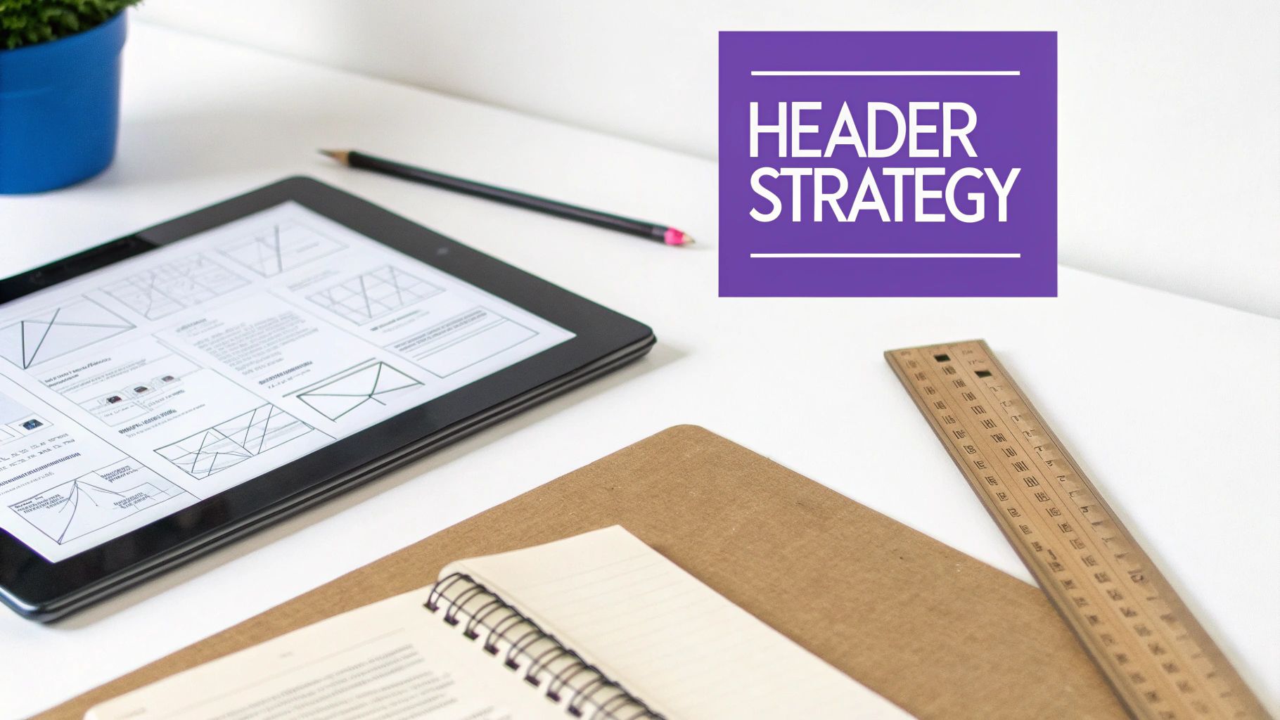
Before you even think about opening the Divi Builder, you need a game plan. Designing a header that actually works—one that guides users, generates leads, or makes a bold brand statement—starts with strategy. This means mapping out user journeys and sketching a rough wireframe first. Get this foundation right, and your final design will be both beautiful and effective.
Laying the Groundwork for Your Divi Header
Jumping straight into Divi without a plan is like building a house without a blueprint. I've seen it happen countless times. The result is usually a header that looks okay but doesn't perform. The best headers, the ones that feel intuitive and drive results, are always born from thoughtful strategy, not just a sudden burst of creativity.
Remember, your header is often the very first thing a visitor interacts with. It sets the tone for your brand and signals how easy (or difficult) your site will be to use.
The stakes are high. Studies show that 94% of first impressions are design-related, which means your header has just milliseconds to earn a visitor's trust. A well-planned, intuitive header can make a huge difference, with clean navigation being linked to 30% lower bounce rates.
Define Your Header’s Core Purpose
So, before you pick a single color or font, ask yourself one simple but critical question: What is this header's main job? Your answer will steer every design choice you make from here on out.
Here are the most common goals I see:
- Navigation-Focused: The primary goal here is to help people find what they're looking for, fast. This means clear, descriptive menu links, a logical hierarchy, and maybe a prominent search bar. This is the go-to approach for e-commerce sites and content-heavy blogs.
- Lead Generation-Focused: Is your main objective to get sign-ups or inquiries? If so, you'll want to feature a bold call-to-action (CTA) button like "Get a Quote" or "Start Free Trial" right in the header, where no one can miss it.
- Brand-Focused: For portfolio sites, creative agencies, or any brand where personality is key, the header can serve as a bold statement piece. Think unique logo placements, custom animations, or unconventional layouts that scream creativity.
Once you've nailed down your primary goal, you've got a clear direction. You can move from a vague idea of what you want to a concrete, actionable wireframe.
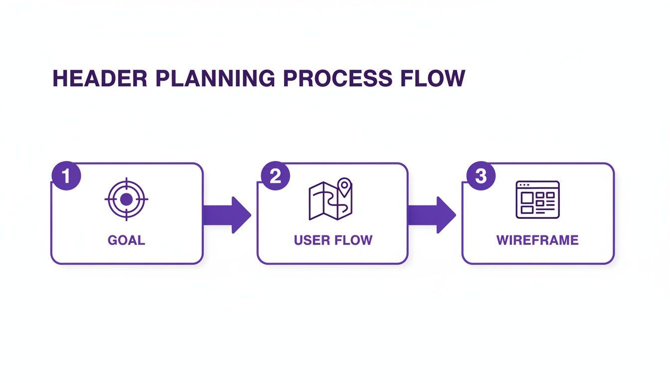
This process shows how a clear goal informs everything that follows, from mapping the user's journey to structuring the final wireframe. When you know your objective, your layout choices become much simpler, ensuring every element has a strategic purpose.
And as you're laying this groundwork, don't forget the technical fundamentals. It's the perfect time to integrate essential website accessibility best practices by planning for proper semantic HTML and a logical structure from the start.
Essential Header Components and Their Roles
To help you get started, here's a quick rundown of the key elements you'll likely be working with and the strategic purpose they serve. Think of this as your toolkit for building a high-performing header.
| Header Element | Primary Function | Best For |
|---|---|---|
| Logo | Brand recognition and a link to the homepage | Virtually all websites |
| Primary Navigation | Directing users to top-level pages and key content areas | Sites with more than a few pages |
| CTA Button | Driving a specific, high-value user action | Lead generation, SaaS, service businesses |
| Search Bar | Allowing users to find specific content quickly | E-commerce, large blogs, knowledge bases |
| Contact Info | Providing quick access to phone numbers or email | Local businesses, service providers |
| Social Icons | Linking to brand's social media profiles | Brands with an active social media presence |
| Account/Login Link | Allowing users to access their personal accounts | Membership sites, e-commerce, online courses |
Using this table as a checklist ensures you’re not just filling space but strategically placing elements that align with your header’s core purpose. A brand-focused header might prioritize a large, central logo, while a lead-gen header will make that CTA button impossible to ignore.
Building Your Header in the Divi Theme Builder
Okay, with a solid plan in hand, it’s time to jump into the Divi Builder and bring that wireframe to life. This is where we’ll use the power of the Divi Theme Builder to create a global header that appears across your entire site. The process is pretty straightforward, moving from the big-picture structure to the nitty-gritty module settings.
First things first, head over to Divi > Theme Builder in your WordPress dashboard. This is your command center for all global site elements. You'll see dedicated slots for a Global Header, Body, and Footer. Go ahead and click “Add Global Header,” then “Build Global Header” to open a fresh, blank canvas in the Divi Builder. This is where the magic happens.
Structuring Your Header Layout
Think back to your wireframe. Did you sketch out a simple, single-row design or something a bit more complex? Your header’s structure always starts with Sections, Rows, and Columns.
For that classic layout—logo on the left, navigation on the right—you’ll just need to add a single section with a two-column row. It’s a popular setup for a reason: it’s balanced, clean, and exactly what users expect to see.
What if your design included a top bar for, say, contact info or a special announcement above the main navigation? No problem. You’d simply add a second section above the first. This modular, building-block approach is what makes Divi so incredibly flexible.
The Theme Builder gives you a clean, visual overview of your site's templates. This centralized control is perfect for managing and assigning custom headers, keeping your entire website consistent.
Placing and Configuring Core Modules
Once your columns are in place, it’s time to drop in the essential Divi modules. These are the functional pieces that make your header work.
- Logo: In your left column, add an Image module. Upload your logo file. Now, this next part is critical for user experience: go to the "Link" tab and set the "Image Link URL" to your homepage. It’s a non-negotiable best practice.
- Navigation: Pop a Menu module into the right column. Use the dropdown to select the WordPress menu you want to show. From there, you can easily tweak the alignment—usually to the right—to get that classic, balanced look.
- Call-to-Action: If you planned for a CTA, just add a Button module right next to your menu. Customize the text, link it up to your contact or services page, and you're good to go.
Pro Tip: Always think dynamically when building. Instead of manually typing your homepage URL for the logo, use Divi's Dynamic Content feature. Just click that little database icon next to the URL field and select "Site URL." This guarantees the link always points to your homepage, even if you change domains down the road.
This initial setup gives you a solid foundation to build upon. If you want a more granular walkthrough of every single setting, our guide on how to create a global header with Divi dives much deeper into the specifics.
Once you save your changes and exit the builder, this new header will automatically replace Divi's default header across your entire site. It's that simple.
Mastering Responsive Design for a Flawless Mobile Header
Let's be honest: a gorgeous desktop header that completely falls apart on a smartphone is a rookie mistake, but it's one I see all the time. Your audience is overwhelmingly mobile, and if your navigation is a clunky, broken mess on their device, you’ve already lost them.
This isn't just a feeling; it's backed by hard numbers. With 63.15% of all web traffic now coming from mobile devices, a responsive header is simply non-negotiable. Get this right, and you’ll see tangible benefits—websites with solid mobile UX see bounce rates that are, on average, 22% lower.
Fine-Tuning for Different Devices
Divi’s responsive editing mode is your best friend here. You can jump into it by clicking the little phone icon at the bottom of the Divi Builder or inside any module’s settings. This lets you toggle between Desktop, Tablet, and Phone views, so you can apply unique styles for each breakpoint without messing up the others.
Start with the fundamentals for smaller screens. This usually means dialing a few things back:
- Shrink Your Fonts: Those big, bold heading fonts that look great on a desktop will completely overwhelm a mobile screen. Scale them down for readability.
- Tighten Up Spacing: The generous padding that creates a clean, airy look on desktop just wastes precious real estate on mobile. Trim down the padding and margins on your sections, rows, and modules.
- Hide Non-Essential Elements: Does that secondary CTA or extra contact number just add clutter to the mobile view? Pop over to the Visibility settings in the Advanced tab and hide specific modules on tablets or phones. It's an easy win.
As you get the hang of this, it helps to have a solid grasp of the bigger picture. Understanding what is a responsive web design and its advantages will make all your little tweaks in Divi feel much more intuitive and purposeful.
Creating an Intuitive Mobile Menu
On mobile, that sprawling desktop menu needs to transform into something clean, compact, and touch-friendly. While Divi’s Menu module automatically converts your navigation into a hamburger icon on smaller screens, you can—and absolutely should—customize it.
Dive into the Menu module’s design settings while in mobile view. This is where you can change the hamburger menu icon color, style the dropdown menu’s background, and tweak the text size of the mobile menu links to make sure they’re big enough to tap easily.
For ultimate control, I often hide the desktop header entirely on mobile and build a separate, mobile-only section. This is a popular technique for a reason: it lets you craft a perfectly optimized mobile header from scratch, often with a more prominent logo and a simplified menu that just works better.
This approach gives you the cleanest user experience by far. For more hands-on advice, check out these key tips for better Divi mobile responsiveness.
Adding Sticky Effects and Interactive Elements
A static header gets the job done, but a dynamic, interactive one? That’s what elevates the user experience from merely functional to memorable. A little motion and subtle feedback don't just grab attention; they make the whole navigation experience feel more responsive and intuitive. This is where you can really start to refine your header design, turning a simple nav bar into an engaging tool for your visitors.

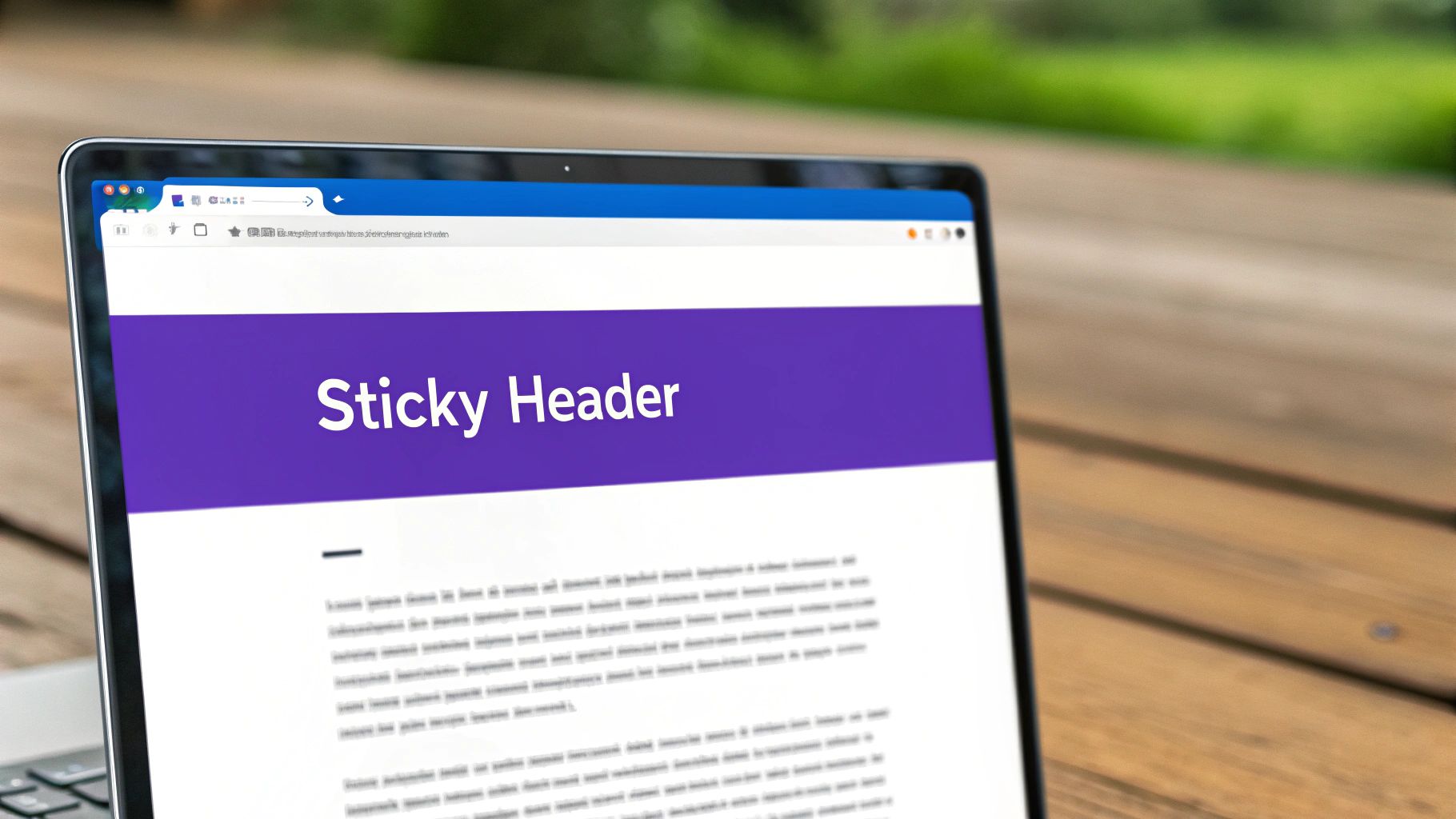
The easiest win here is the sticky header. It’s probably the most effective interactive element you can add. It just keeps your navigation locked in place as users scroll, saving them the hassle of having to scroll all the way back to the top just to find another page. It's a tiny tweak with a massive impact on usability.
Creating a Sticky Header in Divi
Thankfully, Divi makes creating a sticky header ridiculously easy, with some powerful built-in options that don’t require a single line of code.
Here's how you do it:
- Jump into the Divi Theme Builder and open your header section’s settings.
- Head over to the Advanced tab and find the Scroll Effects toggle.
- From the Sticky Position dropdown, just select "Stick to Top."
And boom, your header is now sticky. But we can take this a step further. What really separates a basic sticky header from a pro-level one is a smooth transition effect. A really popular choice is to have the header shrink a bit or change color once the user starts scrolling.
To get that shrinking effect, you can set the sticky section's padding to a smaller value right inside the scroll effects options. For instance, if your default padding is 30px on the top and bottom, you could set your sticky state padding to just 15px. Divi handles the animation automatically, creating a really slick, polished effect.
Adding Hover Effects and Animations
Interactive elements give users that crucial visual feedback, letting them know something is clickable. Even simple hover effects on your menu items and buttons can make your header feel much more alive.
You can add these right inside the Menu or Button module’s design settings.
- For Menu Items: In the Menu module settings, navigate to Design > Menu Text. You can set a default text color and then a different one for the hover state. A subtle color shift or an underline effect is usually all you need to get the job done.
- For Buttons: In the Button module settings, go to Design > Button. Here, you can define custom styles just for the hover state, including the background color, text color, and even border styles.
Don't overdo it. The goal is subtle feedback, not a distracting light show. A simple, quick transition provides the necessary cue without pulling focus from your page content.
Sticky headers are way more than just a trend—they’re fast becoming a standard for effective site navigation. As the web design market keeps growing, you'll find scroll-triggered animations on over half of modern sites, and for good reason—they contribute to significant increases in user interaction. You can find more insights on the latest web design statistics if you're curious.
These little interactive details might seem small, but they all add up to a user experience that feels thoughtful and professional. They show an attention to detail that builds trust and keeps visitors engaged with your site.
Unlocking Advanced Functionality with Divi Areas Pro
While Divi’s built-in tools are incredibly capable, sometimes you hit a ceiling. You want your header to do more than just navigate. This is exactly where a powerhouse plugin like Divi Areas Pro steps in, transforming your header from a simple menu bar into a dynamic, intelligent marketing tool.
Think of it as the bridge between a standard header and a truly interactive user experience.
Imagine swapping out a clunky, text-heavy dropdown for a visually stunning mega menu. Instead of a boring list of links, you could be showcasing featured products with images and pricing, pulling in your latest blog posts with thumbnails, or even embedding a promotional video. You build all of this right inside the Divi Builder and then trigger it from a single header link.
This completely changes the game for how you can design a header, turning it into a rich content hub.
Creating Conditional and Dynamic Headers
The real power move? Crafting headers that adapt to who's visiting your site. Divi Areas Pro lets you set up specific display rules to show different header layouts based on certain conditions. It’s all about delivering a personalized experience that can seriously move the needle on conversions.
Here are a few real-world scenarios I use all the time:
- Exit-Intent Offers: Just as a user is about to leave, you can trigger a completely different header to slide into view. Maybe it has a last-chance discount or a compelling reason to stick around.
- User Role Targeting: Show logged-in members a unique header with quick links to their account dashboard, while new visitors see a bold "Sign Up" button right where they'd expect it.
- Page-Specific Banners: You can display a promotional banner in the header, but only on your shop pages, keeping the rest of your site clean and uncluttered.
This level of targeting ensures the right message finds the right person at the perfect moment. The possibilities are practically endless.
The key takeaway is that your header doesn't have to be a one-size-fits-all element. By using conditional logic, you can make it an active part of your marketing funnel, dynamically responding to user behavior to drive specific actions.
Triggering Popups and Fly-Ins from Header Links
Another one of my favorite features is triggering popups, fly-ins, or slide-ins directly from a header link or button. This is a brilliant way to keep your main navigation tidy while giving users instant access to important actions.
Instead of forcing someone to a separate page for a simple task, you keep them right where they are. For instance, a "Contact" link in your header could open a sleek contact form popup. A "Login" button could trigger a smooth slide-in login panel. You can learn more about how to display content using Divi Areas Pro to master these techniques.
This approach creates a much smoother user journey. By cutting out unnecessary page loads, you reduce friction and keep your users engaged. It's one of those subtle changes that makes a website feel remarkably professional and thoughtful.
Getting Performance and Accessibility Right
A slick header design doesn't mean much if it’s sluggish to load or impossible for people with disabilities to use. Let’s get one thing straight: performance and accessibility aren't just checkbox items to tick off at the end of a project. They’re core to a good user experience and, frankly, a non-negotiable part of modern web design.
A heavy, slow header can single-handedly tank your site's load time, dragging down your Core Web Vitals scores. And a header that can't be navigated with a keyboard or a screen reader might as well have a "keep out" sign for a huge chunk of your audience. Getting these details right from the start means your header works for everyone.
Putting Your Header on a Diet for Better Performance
When it comes to header performance, the name of the game is minimizing weight. Every single kilobyte matters, especially for users on spotty mobile connections.
Your first target is almost always the logo. It’s shocking how often I see a beautiful site slowed to a crawl by a massive, uncompressed PNG or a bloated SVG file.
- Compress Your Logo: Drag and drop your logo into a tool like TinyPNG. It’s a five-second task that can shave significant weight off your image without any noticeable quality loss. If you're using an SVG, run it through an optimizer to strip out junk code.
- Go Easy on the Animations: Look, I love a smooth hover effect as much as the next designer. But complex, JavaScript-heavy animations in the header are a recipe for lag. Keep your transitions simple, clean, and CSS-based whenever possible.
- Use System Fonts Strategically: Custom web fonts are fantastic for branding, but each one adds another file for the browser to download. If you can get away with using a system font for less critical text in your header (like secondary menu items), you'll cut down on load time.
A fast-loading website isn't just nice for users; it's a major ranking factor for Google. Because the header is usually one of the first things to appear on the screen, a lightweight one is a huge win for improving your Largest Contentful Paint (LCP) score.
Making Sure Your Header Is Accessible to Everyone
Accessibility (often shortened to a11y) is about making your site usable for as many people as possible. An accessible header is one that works just as well for someone using a screen reader or keyboard as it does for someone using a mouse.
First, test your keyboard navigation. Can you hit the Tab key and move logically through every interactive element? That means the logo, every single menu link, and any buttons. The focus state—that outline that appears when you land on an element—needs to be crystal clear. Don't disable it!
Next, think about users who can't see the screen. Screen readers depend on clean HTML and proper labels to make sense of your site. This is where ARIA (Accessible Rich Internet Applications) labels come in handy. For example, that slick hamburger menu icon is meaningless to a screen reader on its own. It needs a label to announce its purpose.
Adding an attribute like aria-label="Open main menu" tells the screen reader exactly what that button does. Finally, don't forget color contrast. Text that’s hard to read against its background is a massive barrier for users with visual impairments. Use a contrast checker to make sure you pass WCAG guidelines.
Stuck on a Divi Header Problem? Let’s Fix It.
Even when you have a great plan, building a custom header in Divi can throw a few curveballs your way. I've been there. Let’s walk through some of the most common questions and roadblocks Divi users hit, so you can get unstuck and polish off that design.
How Do I Create a Different Header for a Specific Page?
This comes up all the time, especially when you need a streamlined header for a landing page or a completely different layout for, say, a blog section. The good news is that Divi is built for exactly this scenario.
The magic happens in the Divi Theme Builder. All you need to do is create a new template and tell Divi where to use it. You can assign it to a single page, a post, a specific category—whatever you need.
Once you’ve assigned the template, you can create a "Custom Header" just for it. This new header will automatically override your global one, but only on the pages you selected. Simple and incredibly powerful.
Can I Add a Search Bar to My Header?
Absolutely. In fact, if you have a content-heavy site like a blog or a store, you probably should. A search bar is a huge win for user experience. Divi has a dedicated Search module that you can drop right into your header layout.
For a cleaner look, a lot of designers will just show a search icon that expands into the full search field on click. It's a nice, modern touch. You can set this up by going into the module's "Elements" toggle and telling it to only show the icon by default. This gives you all the function without cluttering up your navigation.
It's easy to forget that a great header is more than just a pretty design—it's a tool. Adding something like a search bar helps people find what they need faster, which is a massive boost for usability and can even help lower your site's bounce rate.
What Is the Best Way to Create a Transparent Header?
A transparent header that turns solid as you scroll is a classic, elegant effect that really elevates a design. The best part? You can do this with Divi’s built-in scroll effects, no custom code required.
Here’s the quick and dirty breakdown:
- Set the Default State: Open your header's section settings. Under the Background options, just slide the color's transparency all the way down to zero.
- Define the Scroll State: Now, hop over to the Advanced tab > Scroll Effects.
- Enable Sticky Position: Flip the "Sticky Position" setting to "Stick to Top."
- Add Sticky Styling: You'll now see options for the sticky state. This is where you set the background color you want to appear after the user starts scrolling.
That’s it. You now have a professional, dynamic header that cleanly adapts as your visitors interact with the page.
Ready to build headers that do more than just navigate? Divimode gives you the tools to create dynamic, conversion-focused headers with mega menus, conditional logic, and seamless popups. Learn more at https://divimode.com.
More Articles You Will Like