
 Alex Martin
To create a website that works beautifully on a phone, you need a responsive design—one that fluidly adapts your content to fit any screen, big or small. This means prioritizing fast load times, simple navigation, and text that’s easy to read, ensuring a smooth experience for anyone visiting on a smartphone or tablet.
Why A Mobile-First Approach Matters Now More Than Ever
In the early days, "mobile optimization" was often an afterthought. We'd build a big, beautiful desktop site and then create a stripped-down, clunky version for phones. Those days are long gone. Today, mobile is the main event.
Google's mobile-first indexing isn't just a friendly suggestion; it's a hard-and-fast rule that heavily influences your site's visibility. If your site isn't built with mobile users at the forefront, search engines will notice, and it can push you down in the search results. A great mobile experience is directly tied to your SEO performance, a topic we cover in-depth in our guide on mobile optimization's effect on WordPress SEO.
The numbers don't lie. Mobile devices now drive the majority of web traffic worldwide. As of April 2025, a massive 62.54% of global website traffic comes from mobile, a huge leap from just 35% back in 2015. This isn't a passing trend; it's a fundamental shift in how people browse, shop, and connect online.
The Real Cost Of A Poor Mobile Experience
A clunky, slow mobile site does more than just annoy visitors—it actively damages your brand and sinks your sales. When people are forced to pinch, zoom, and hunt for tiny buttons, they simply give up and leave. In fact, 61% of consumers say they are far more likely to buy from a mobile-friendly site. A bad experience sends them running right to your competition.
This is exactly where the mobile-first philosophy comes in. Instead of designing for a sprawling desktop monitor and then trying to shrink it all down, you start with the smallest, most constrained view first. This simple shift in perspective forces you to focus on what's truly essential:
- Clarity: Is the core message immediately obvious without any distractions?
- Speed: Does the page load almost instantly, even on a spotty cellular connection?
- Usability: Can someone complete a key action—like making a purchase or filling out a form—with just their thumb?
Before you get into the nitty-gritty of mobile-first design, it's helpful to have a strong grasp of the importance of overall web design for any business. A good foundation in core design principles makes the transition to mobile-first thinking feel much more natural and effective.
To really nail this down, it helps to see the core differences side-by-side. Thinking mobile-first isn't just about smaller screens; it's a completely different way of prioritizing content and functionality.
Mobile vs Desktop Core Design Principles
| Design Aspect | Mobile-First Priority | Desktop-First Priority |
|---|---|---|
| Layout & Content | Essential content only; vertical scroll | Complex layouts; multi-column grids |
| Navigation | Minimalist; hamburger menu; thumb-friendly | Expansive menus; hover effects |
| Performance | Speed is paramount; lightweight assets | Rich media; more tolerant of larger files |
| Interaction | Touch-based; large tap targets | Mouse-based; precise clicks & hovers |
Ultimately, this table shows that starting with mobile forces a discipline that benefits everyone. You build a lean, fast, and focused foundation.
A mobile-friendly website isn't just about making things look good on a small screen. It's about building trust and driving conversions from the very first tap. Every slow-loading image or hard-to-read paragraph is a potential customer walking out the door.
By putting the mobile experience first, you ironically end up creating a better, more streamlined experience for all users, no matter what device they're on. It’s not about making a site that just works on mobile; it’s about making one that truly excels.
Building Your Responsive Foundation in Divi
Alright, let's move from theory to action and get our hands dirty with Divi’s powerful built-in tools. Building a fluid, responsive layout doesn’t mean you have to write a single line of code. It’s all about a strategic approach to how you set up your sections, rows, and modules right from the start. This is where you lay the foundation for a truly design a mobile-friendly website.
The heart of Divi’s responsive power is right at the bottom of the Builder: the device previews. Toggling between Desktop, Tablet, and Mobile views lets you make specific tweaks for each screen size. Best of all, a change you make in the Mobile view won't mess up your Desktop design. It's that granular control that makes all the difference.
This visual process is central to modern web design, impacting everything from user experience to performance and even SEO.
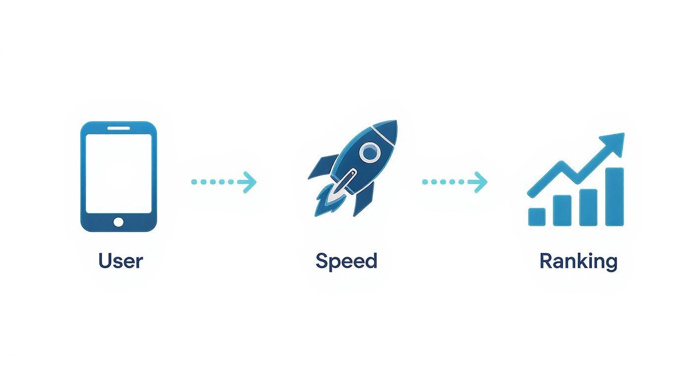
As you can see, focusing on the mobile user has a direct and positive effect on your site's speed and how well it ranks in search engines.
Fine-Tuning Spacing and Sizing
One of the most common mistakes I see is people using fixed pixel values for everything. Sure, pixels are fine for things like borders, but they can create a real mess on different screen sizes. If you want true scalability, you need to start thinking in relative units.
- VW (Viewport Width): This is your best friend for creating full-width elements or typography that scales perfectly with the browser window. For instance, setting a headline's font size to 5vw will make it resize dynamically. It's incredibly satisfying to see in action.
- EM (Element): This unit is relative to the font size of its parent element, which makes it fantastic for keeping spacing and proportions consistent within a specific module or section.
When you switch over to the Tablet or Mobile view in Divi, you can easily override these settings. That huge 100px padding that looks great on a desktop can be dialed back to a more sensible 30px for mobile, stopping your content from getting awkwardly jammed against the edges of the screen. Our full guide to responsive design best practices dives much deeper into these concepts.
Thinking in relative units instead of fixed pixels is a game-changer. You create a design that doesn't just "break" at specific points but adapts smoothly across all screen sizes. This is a fundamental shift you need to make in your approach to responsive styling.
Controlling Element Visibility
Let's be honest: not every element on your desktop site belongs on the mobile version. Those ornate dividers, massive background images, or secondary call-to-action buttons? They often just add clutter and slow down page loads on a smaller screen.
Thankfully, Divi makes it incredibly easy to hide these elements where they aren't needed.
Just open any Section, Row, or Module, head over to the Advanced tab, and find the Visibility settings. From there, you can simply check the boxes to disable an element on Phone, Tablet, or Desktop. It's a simple trick, but it's one of the most effective ways to declutter your mobile layout and focus the user’s attention on the most critical content. That's the real goal when you design a mobile-friendly website.
Crafting Better Mobile Menus with Divi Areas Pro

Let's be honest: the default hamburger menu is functional, but it's rarely inspiring. While it does a decent job of tucking navigation away, it often feels like a dead end for users—just a plain list of links. This is a huge missed opportunity to create a genuinely helpful experience when you design a mobile-friendly website.
This is exactly the problem Divi Areas Pro was built to solve. It lets you completely break free from the standard menu and build something far more valuable for your mobile visitors. Instead of a basic list, you can design custom popups, sleek slide-in panels, or even full-screen overlays that act as a central hub for your site.
Building Your First Mobile Menu Area
Getting started is surprisingly simple. From your WordPress dashboard, you just create a new "Area." Think of this as a blank canvas where you can design anything you want using the full power of the Divi Builder. If you can build it on a Divi page, you can put it inside your mobile menu.
The real magic happens when you connect it to a trigger. You can set your new Area to launch when a user clicks on a specific element, like a hamburger icon in your header. This completely replaces Divi's default menu with your custom-built, feature-packed alternative. It puts you in the driver's seat. For a deeper dive into the "why" behind this approach, check out our detailed post on effective mobile menu design.
More Than Just a List of Links
This is where you can start thinking beyond simple navigation. A well-designed mobile menu can do so much more than just list pages. Since you have the entire Divi Builder at your disposal, you can integrate virtually any module to create a much more dynamic and useful experience.
Here are a few practical ideas for your custom menu Area:
- Integrated Search Bar: Don't make users hunt for a search icon. Place a search bar right at the top of your slide-in menu for immediate access.
- Key Contact Info: Add click-to-call buttons, email links, or even a compact contact form. Make it effortless for visitors to get in touch on the go.
- Social Media Icons: Drop in some social icons to encourage visitors to connect with your brand on their favorite platforms.
- Featured Promotions: Use an image or text module to spotlight a current sale or offer, grabbing attention the moment they open the menu.
This approach transforms your menu from a simple utility into a powerful engagement hub. Don't underestimate the impact of these thoughtful touches. By 2025, companies with well-optimized mobile sites are seeing up to a 67% increase in purchase likelihood, and a great mobile design can boost conversion rates by up to 40%.
By using Divi Areas Pro for your mobile menu, you're no longer stuck with a predefined structure. You can craft a navigation experience that directly supports your business goals and, more importantly, makes life easier for your users.
Ultimately, this level of customization is what separates an adequate mobile site from an exceptional one. It shows your visitors that you've truly considered their journey and have given them the tools they need, right where they expect to find them.
Optimizing Content for Mobile Readability
Getting your layout to respond to different screen sizes is a massive first step, but honestly, it’s only half the job. If your content is just a wall of tiny text, people are going to bounce, no matter how perfectly the structure adapts. When you design a mobile-friendly website, you have to go deeper and optimize the content itself for how people actually read on their phones—which is usually quickly and while they're distracted.
This whole process really starts with typography. A classic mistake I see all the time is using beautiful, decorative fonts that look incredible on a desktop but turn into an unreadable mess on a small screen. For mobile, clarity is king. Stick with highly readable sans-serif fonts like Open Sans, Lato, or Roboto for your body text.
Your base font size is just as crucial. It might feel a bit large at first, but setting your body text to at least 16px is a solid best practice. That size is comfortable enough for most people to read without having to pinch and zoom—a major point of friction that will send visitors heading for the exit.
Structuring Content for Scanners
Let's face it: mobile users are scanners. They almost never read every single word. Instead, their eyes dart down the page, looking for headings, keywords, and bullet points that catch their attention. You have to build your content to cater to this exact behavior.
Break up your text into super short paragraphs, ideally just one to three sentences each. This creates that all-important white space that makes the content feel less intimidating and way easier to digest on a narrow screen.
You also need to use formatting to your advantage:
- Clear Headings: Use H2s and H3s to break up different ideas. They act like signposts, telling the reader exactly what each section is about at a quick glance.
- Bullet Points: Group related items or steps into lists. They are infinitely easier to scan than a dense paragraph of text.
- Bold Text: Use bolding strategically to emphasize key terms or important takeaways. This guides the reader’s eye straight to the most critical information.
The goal here is to create a clear visual hierarchy. A user should be able to scroll through your page and get the main points without ever having to read a full paragraph. When you achieve that, you've nailed mobile readability.
This shift towards mobile optimization has completely reshaped the web. It's estimated that by 2025, a whopping 62% of the world’s top-ranking websites will be fully mobile-optimized, proving this is no longer just a "nice-to-have" but a flat-out requirement for success. You can dive deeper into these web design trends and their impact over at Hostinger.com.
Optimizing Images for Mobile Speed
Finally, no conversation about mobile content is complete without talking about images. A stunning, high-resolution photo can bring your desktop site to life, but that exact same file can absolutely murder your mobile load times. And we all know slow-loading pages are the number one reason visitors bounce.
Before you upload a single image to your Divi site, make sure it’s compressed. Tools like TinyPNG are fantastic for this; they can slash file sizes without a noticeable drop in quality. Also, double-check that you’re using the right format—JPEG for photos, PNG for graphics that need transparency. These small, simple steps make sure your visuals enhance the user experience, not sabotage it.
Putting Your Mobile-Friendly Website to the Test

Designing inside the Divi Builder is one thing, but how your site actually performs in the real world is what really counts. Just because it looks pixel-perfect in the preview doesn't mean it's going to translate flawlessly to every phone and tablet out there.
That's why a solid, multi-step testing process is absolutely non-negotiable before you even think about pushing that "publish" button. This final check is where you catch the small hiccups that cause big headaches for your visitors, ensuring all your design work results in a genuinely smooth experience.
Start with Browser Developer Tools
Your first line of defense is built right into your web browser. Tools like Chrome DevTools have a device simulator that's perfect for a quick first pass. You can see how your site will look on a range of popular smartphones, which makes it incredibly fast to spot obvious layout problems.
Think of this as your rapid-fire check. Is text overflowing its container? Are images not scaling down properly? You can tweak a margin in Divi, hit refresh, and see the result instantly. I find this is the most efficient way to iron out about 80% of the visual bugs without ever leaving my computer.
But here’s the thing: a simulation is not a substitute for reality. While fantastic for catching layout issues, developer tools can't truly replicate the feel of a touch interface or the quirks of a real device's network performance.
Nothing Beats Real Device Testing
Once you’ve squashed the most obvious bugs using the simulator, it’s time to grab some actual phones. There's simply no replacement for holding a device and interacting with your site just like a user would. Ideally, you want to test on both an iOS device (like an iPhone) and an Android device to cover the biggest chunks of your audience.
As you navigate your site, run through a practical checklist:
- Navigation Flow: Can you tap the menu open easily? Are the links big enough for a thumb to hit accurately? A good rule of thumb is to aim for tap targets of at least 44×44 pixels.
- Form Functionality: Try to fill out every single form on your site. Is it a pain to select the fields? Does the on-screen keyboard cover up the "submit" button?
- Readability: Is the text comfortable to read without having to pinch-and-zoom? Do your headings and short paragraphs make the content easy to scan?
- Interactive Elements: Test any sliders, accordions, or popups you built with Divi Areas Pro. Do they open correctly? More importantly, can you close them without any trouble?
Gather Objective Data with Online Tools
The last step is to get an unbiased opinion from the tools that Google and your users care about most. Human testing is invaluable for usability, but automated tools give you the hard data you need on technical performance.
Two tools are essential here:
- Google's Mobile-Friendly Test: This is a simple pass/fail gut-check straight from the source. It tells you if Google considers your page mobile-friendly, which is a big deal for your SEO.
- PageSpeed Insights: This tool is all about performance. It analyzes your site's loading speed on mobile connections and gives you a score from 0-100, along with specific, actionable advice to make things faster, like compressing images or minifying code.
By combining browser simulation, real-world device interaction, and data-driven analysis, you're not just guessing. You're building a complete testing process that ensures the mobile site you designed not only looks great but performs flawlessly for every single user.
Divi Mobile Design FAQs
Even with the best tools in your arsenal, questions are bound to pop up when you're deep in the trenches of mobile-friendly design. I get it. Here are some quick, no-fluff answers to the common hurdles Divi users hit, designed to help you sharpen your responsive skills and get past those roadblocks.
Is a Responsive Theme All I Need for a Mobile Site?
Not quite. Starting with a responsive theme like Divi is absolutely the right first move, but it’s just the foundation. It handles the fluid grid and gives you the settings, but a truly great mobile experience is built on top of that.
What else matters?
- Blazing-Fast Speed: Mobile users are notoriously impatient. Slow-loading sites are a dealbreaker. This means optimizing your images and keeping your design lean is non-negotiable.
- Fonts People Can Actually Read: Your typography needs to be crisp and clear. A good rule of thumb is to keep your body text at a minimum of 16px so people aren't squinting at their screens.
- Simple Navigation: Your mobile menu needs to be clean and easy to tap. A jam-packed, confusing menu is one of the fastest ways to frustrate a visitor into leaving.
- Short, Sweet Forms: Ever tried filling out a massive form on your phone? It's a nightmare. Keep them simple, or you’ll watch your conversion rates plummet.
Think of it this way: the theme is the chassis of the car, but you're still the one who has to tune the engine and make sure the ride is smooth.
A responsive theme makes your site work on mobile. But it's the thoughtful optimization of your content and performance that makes it a joy to use. The theme handles the structure, you handle the experience.
Will Switching to Tablet or Mobile View in Divi Affect My Desktop Design?
Nope, and this is where Divi's magic really shines. When you hop into the Tablet or Mobile view inside the Divi Builder and start tweaking a setting—whether it's font size, padding, or even hiding an element entirely—that change only applies to that specific view and any smaller screens.
Your desktop design stays perfectly intact, exactly how you left it. This is huge because it gives you the freedom to create completely different, tailored experiences for each device without the fear of accidentally breaking your main layout. It’s the secret to getting that pixel-perfect look on every screen.
How Big Should My Buttons and Links Be for Mobile?
Remember, on mobile, people are using their thumbs, not a hyper-precise mouse pointer. That makes the size of your tap targets incredibly important. A button or link that’s too small is a one-way ticket to user frustration.
As a solid best practice, I always aim for a minimum tap target size of 44×44 pixels. This gives most users enough room to tap accurately without hitting something else by mistake. It’s also smart to leave a little breathing room around your buttons to prevent those "fat-finger" errors. It’s a small detail that makes a world of difference for usability.
Ready to build mobile menus and popups that actually get results? The tools you need for a better mobile experience are waiting for you at Divimode. Level up your site with the advanced features in Divi Areas Pro.
More Articles You Will Like