
 Alex Martin
You’ve probably seen it before: you’re scrolling down a webpage, and the background image seems to move at a different speed than the text and images in front of it. That slick, 3D-like effect is called parallax scrolling, and it does more than just look cool. It transforms a flat, static page into a dynamic experience that can pull visitors right into your story.
What a Parallax Scrolling Website Can Do for You
Think of parallax not as a gimmick, but as a powerful storytelling tool. It creates a real sense of depth and guides the user's eye, turning a simple scroll into an interactive journey. By controlling the speed and movement of different layers, you can highlight key messages, draw attention to a call-to-action, or just show off some stunning visuals.
This isn't just about aesthetics, either. An interactive design keeps people engaged. When visitors are captivated by the experience, they naturally spend more time on your page, which is a fantastic way to lower your bounce rate. This is especially true for a single-page website, where keeping the user scrolling is the name of the game. Get more tips on that here: https://divimode.com/how-to-create-a-single-page-website/
Boosting Engagement Through Design
There's a reason parallax has become such a huge web design trend: it makes your site memorable. When your website feels alive and responsive to a user's actions, it leaves a lasting impression that a standard, static design just can't compete with.
Of course, just slapping a parallax effect on your site won't guarantee success. It needs to be done thoughtfully, aligning with the core principles of effective website design to really make an impact.
Parallax design is all about turning passive viewing into active participation. It invites users to explore, rewarding every scroll with a new visual reveal or animation. It just makes the whole experience feel more intuitive and compelling.
The best part? You don't need to be a coding wizard to create a professional parallax scrolling website. Modern tools like Divi have these advanced features baked right in, making it surprisingly straightforward to build these kinds of immersive effects. Throughout this guide, we'll be using Divi to bring these ideas to life.
Getting Your Assets Ready for a Flawless Parallax Effect
Before you even think about opening the Divi builder, spending a few minutes prepping your assets is one of those small steps that makes a massive difference. A killer parallax scrolling website lives and dies by its visuals, but I’ve seen it a hundred times: large, unoptimized images are the #1 reason a cool effect feels sluggish and ruins the entire experience.
The trick is finding that sweet spot between image quality and file size. Your images have to be sharp enough to look professional but light enough to load in a snap. This is where optimization is your best friend. Modern formats like WebP are a game-changer here, often slashing file sizes by 25-35% compared to old-school JPEGs without any visible quality loss.
Choosing and Optimizing Your Images
When you're picking images, you need to start thinking in layers. Look for photos with a really clear separation between the foreground and background—that's what creates that awesome sense of depth. A classic example is a landscape with mountains way in the back and some trees right up close. That's parallax gold.
Once you’ve got your shots, it's time to get them web-ready.
- Compress Like You Mean It: Use a tool like TinyPNG or a good image optimization plugin to shrink those file sizes before you even upload them to WordPress.
- Size Them Right: Don't just upload a massive 5000px wide photo for a section that will never be wider than 1920px. Resize your images to the largest size they'll actually be displayed.
- Go Modern with Formats: Seriously, convert your images to WebP. You get the best of both worlds: great quality and speedy performance.
A slow-loading parallax effect is honestly worse than having no effect at all. If you prioritize asset optimization from the start, your design will feel smooth and professional, not clunky and frustrating.
Structuring Your Page in Divi
With your optimized assets good to go, the last bit of prep happens right inside Divi. Instead of just dropping modules onto a blank page, build out the page structure first. Go ahead and create all the Sections and Rows you'll need for your layout.
Think of it like building the skeleton of your page before adding the muscle. This organized approach makes it so much easier to apply parallax effects in a logical way and maintain full control over your design's flow. If you want to dive deeper, you can learn more about optimizing images for WordPress to keep your whole site lightning-fast. Trust me, this little bit of prep work streamlines the entire creative process.
Creating Your First Parallax Effect in Divi
Alright, let's roll up our sleeves and build that classic parallax hero section using Divi's built-in settings. The goal here is simple: make the background image move slower than the foreground content, creating that slick depth effect without a single line of code. We’re just going to use the native toggles that Divi gives us to get some impressive results, fast.
First things first, jump into the Divi Builder. Find the first blue Section on your page—this will be the container for our entire effect. Open its Section Settings, then head over to the Background tab to add a high-quality, optimized image. This image is the star of the show, so make sure it looks great.
Finding the Parallax Settings
Once you've got your image loaded, a new option will pop up right below it: Use Parallax Effect. Go ahead and flip that switch on.
As soon as you do, Divi will give you two choices for the Parallax Method: CSS and True Parallax. This decision might seem minor, but it's actually pretty important. The method you pick has a real impact on how smooth the animation feels and how it affects your site's performance, which is a huge deal for user experience.
My Personal Takeaway: For almost every project I work on, I stick with the CSS Parallax method. It's just so much smoother, more reliable across different browsers, and way kinder to your page load times because it taps into modern, efficient browser tech.
True Parallax, which relies on JavaScript, can sometimes feel a bit jittery and is definitely more resource-intensive. It has its moments for very specific, complex effects, but for a clean, classic parallax background, CSS is the clear winner.
Configuring the Effect
With the CSS method locked in, your background will immediately start moving at a different speed than your content. Now you can drop in any Divi modules you need—maybe a Text module for a punchy headline and a Button for your call-to-action—inside a Row. As you scroll the page, you'll see these foreground elements glide right over the slower-moving background, creating that awesome illusion of depth.
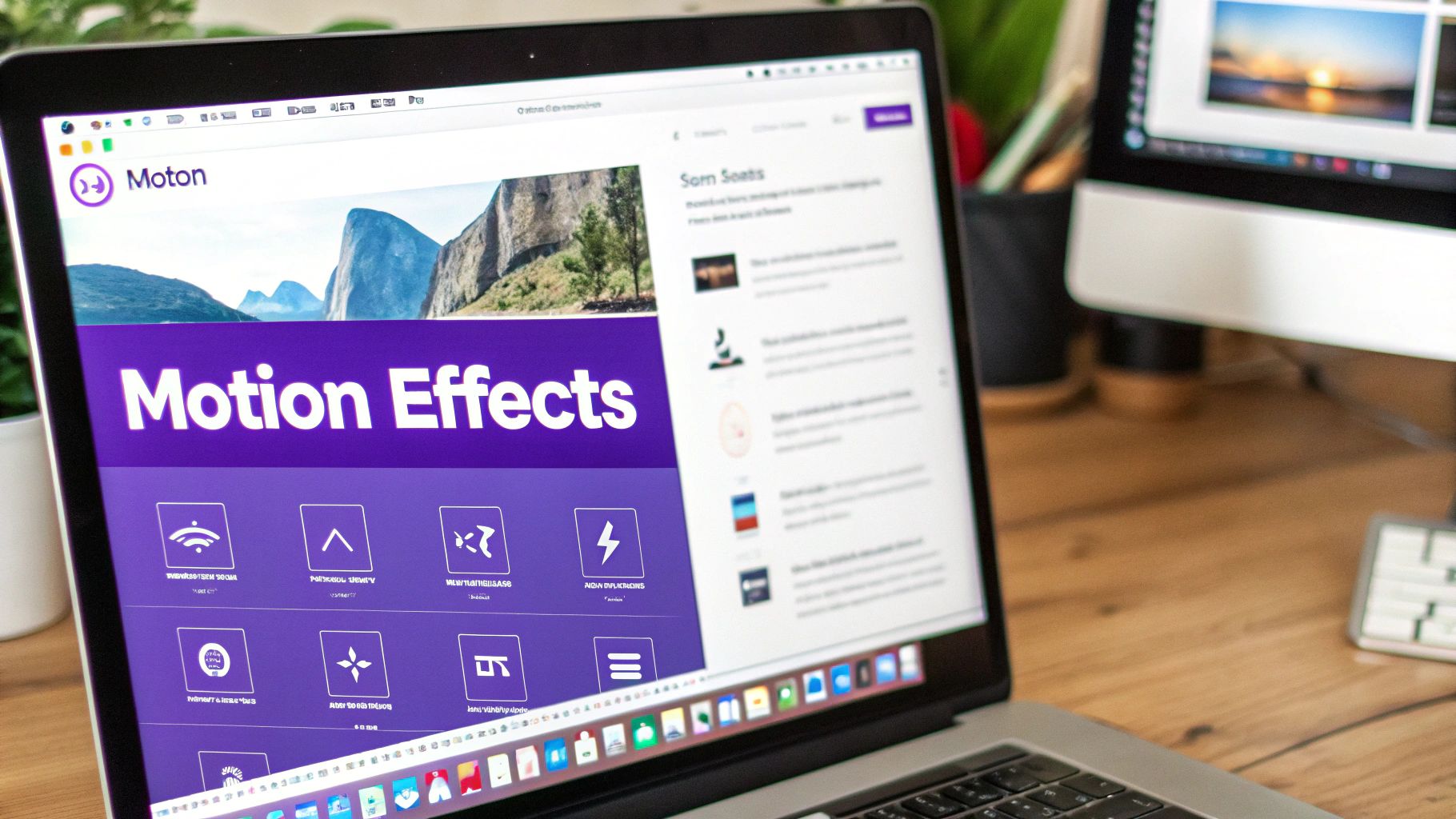
Before you dive in, this quick visual breaks down the workflow for getting your assets ready.
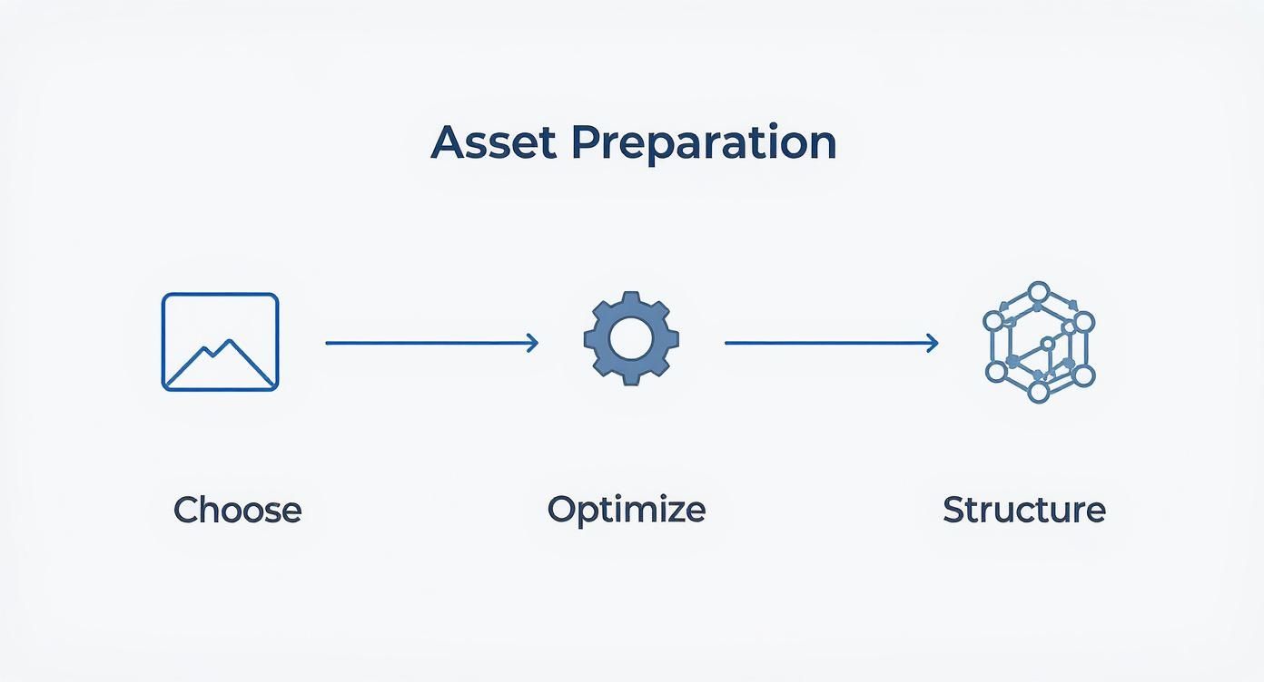
Following this simple process of choosing, optimizing, and structuring your content ensures your parallax effects are built on a solid, high-performance foundation. With your first effect now live, you've just built a professional-looking hero section that instantly elevates the feel of your page. You're officially on your way to building a great parallax scrolling website.
Mastering Advanced Scroll Motion Effects
A moving background is a great starting point, but the real magic of a modern parallax scrolling website happens when you start choreographing the movement of individual elements. This is where you elevate a simple effect into a dynamic, multi-layered scene that truly wows your visitors.
With Divi’s built-in Scroll Effects, you can make any module—text, images, icons, you name it—dance as the user moves down the page.
Let’s think about a real-world scenario: a "Features" section with three columns. Each column has an icon at the top and a text module right below it. Instead of letting them just sit there, we can bring them to life as they enter the screen. The goal is to create an animation that feels polished and intentional, guiding the user's attention without being a distraction.
Applying Independent Motion Effects
To get started, just open any module's settings and head over to the Advanced tab. In there, you'll find a panel called Scroll Effects. This is your control center for creating all sorts of sophisticated animations.
This is a huge leap from the simple background parallax. Here, you have six distinct motion effects that you can mix and match:
- Vertical Motion: Makes the element move up or down as you scroll.
- Horizontal Motion: Slides the element left or right across the page.
- Fading In & Out: Controls the element's transparency.
- Scaling Up & Down: Makes the element grow or shrink in size.
- Rotating: Tilts or spins the element as the user scrolls.
- Blur: Adds or removes a blur effect based on the scroll position.
Going back to our features section example, let’s make the icon gently slide in from the left while fading into view. To do this, we'll enable both Horizontal Motion and Fading In & Out.
Then, for the text module just below it, we can apply a subtle Vertical Motion effect so it slides up from the bottom. By giving each element its own unique animation, you create a layered, choreographed entrance that feels incredibly professional.
The key is subtlety. A little motion goes a long way. The best scroll effects are the ones that feel natural and enhance the content, rather than overwhelming it.
Fine-Tuning with Viewport Settings
The real power move is fine-tuning the viewport settings. For each effect you apply, you can define exactly when the animation starts and stops based on where the element is on the screen.
Think of the user's screen (the viewport) as a scale from 0% (the very bottom) to 100% (the very top).
For instance, you can set an animation to begin when the element is at 40% of the viewport height (just entering from the bottom) and end when it reaches 60% (right in the middle of the screen). This precision allows you to create animations that feel perfectly timed, ensuring elements come to a graceful stop exactly where they belong.
This level of control is what separates an amateurish effect from a truly professional parallax scrolling website.
To help you get a handle on these powerful options, here’s a quick breakdown of what each setting does and how you can use it for your parallax effects.
Divi Scroll Effect Settings Explained
| Setting | What It Controls | Pro Tip for Parallax |
|---|---|---|
| Enable [Effect] | The main toggle for each of the 6 motion types (Vertical, Horizontal, Fade, etc.). | Start by enabling just one or two effects. Combining too many at once can look chaotic. |
| Starting/Middle/Ending Offset | Defines the element's state at different points in the animation (e.g., start at -50px, end at 0px). | For a subtle slide-in, set the starting offset to a negative value and the ending offset to 0. |
| Viewport Bottom/Middle/Top | Determines when the animation triggers based on the element's position on the screen. | A common setup is to start the animation at 40% (Viewport Bottom) and end it at 60% (Viewport Middle). |
| Motion Effect Trigger | Specifies whether the animation is tied to the element itself or the entire section/row it's in. | "Middle of Element" is usually the most intuitive and reliable trigger for individual modules. |
Mastering these settings will give you the granular control needed to build truly stunning and responsive scroll animations that feel custom-coded, all without touching a single line of CSS.
Keeping Your Parallax Site Fast and SEO-Friendly
Building a beautiful parallax scrolling site is one thing. Making sure it’s fast, responsive, and actually visible to search engines is the real challenge. The very techniques that create these rich, immersive experiences—like layered images and complex scripts—can easily bog down your site if you're not careful.
https://www.youtube.com/embed/mxHoPYFsTuk
Let's be real: parallax effects can add a lot of weight to a page, increasing HTTP requests and slowing everything down. That's a huge problem, especially when you consider that over 70% of internet traffic now comes from mobile devices. For those users, a slow site is a non-starter. You can read more about the technical impact of parallax scrolling at instawp.com.
The good news? Divi has a powerful set of built-in tools to help you fight back against the bloat.
Your Performance Checklist
Before you dream of hitting that "Publish" button, run through this quick checklist. These are my non-negotiables for any parallax site I build.
- Flip on Divi's Performance Toggles: Head over to Divi > Theme Options > General > Performance. You'll want to enable "Minify and Combine JavaScript Files" and "Minify and Combine CSS Files." These two settings are your best friends—they'll clean up your code, shrink file sizes, and give you an instant speed boost.
- Embrace Lazy Loading: This one is crucial. Always lazy load your images. This simple trick tells the browser not to load images until they're just about to scroll into view, which drastically improves that initial page load time. Divi has a native option for this, so make sure it’s switched on.
- Kill Heavy Effects on Mobile: Use Divi’s responsive controls to turn off demanding motion effects on tablets and phones. A simpler, faster experience on a smaller screen will always win over a sluggish, animation-heavy one.
A fast user experience isn't just a "nice-to-have" anymore; it's a major ranking factor for Google. Sacrificing speed for animations is a trade-off that almost never pays off in the long run.
If you really want to get into the weeds of site performance, our complete guide on how to optimize your WordPress speed covers absolutely everything you need to know.
Structuring Your Content for Search Engines
Just because you have a long, single-page design doesn't mean you can forget about SEO fundamentals. Search engines need a clear roadmap to understand your content.
This is where your heading tags (H1, H2, H3) come in. Use them logically to create a clear hierarchy. Your main page title should be your one and only H1 tag, with each subsequent section neatly organized under H2s and H3s. This helps Google crawl and index your parallax site effectively, which is key to ranking for the keywords you're targeting.
Of course, technical tweaks are only part of the puzzle. A solid content strategy is the backbone of any successful online business. To learn more, check out these ecommerce SEO best practices for some great ideas.
Answering Your Divi Parallax Questions
As you start experimenting with parallax scrolling, a few questions inevitably pop up. I’ve built countless Divi sites with motion effects, and these are the issues that come up time and time again. Getting them right is what separates a truly polished design from a clunky, frustrating experience for your visitors.
Let's start with the big one: SEO. Can all these cool animations actually hurt your Google rankings? The short answer is yes, but only if they slow your site to a crawl. Heavy effects, especially those using large, unoptimized images, will absolutely increase your page load time—a metric Google cares about a lot. The fix is simple: always compress your images and lean on Divi’s built-in performance features to keep things snappy. It's also crucial to maintain a clear heading structure (H1, H2, H3) on long scrolling pages so search crawlers can still understand your content hierarchy.
Mobile Performance and Parallax Methods
Another question I get all the time is about mobile devices. While parallax can work on mobile, it’s often a better idea to tone it down or turn it off completely for smaller screens. Divi gives you the controls to disable or adjust motion effects on a per-device basis. I strongly recommend using this for any heavier animations to guarantee a smooth, fast experience for the majority of users who will be on their phones.
Here’s my go-to advice: always prioritize the mobile experience. A clean, fast design on a phone beats a sluggish animation built for a desktop every single time.
Finally, what’s the difference between "True Parallax" and "CSS Parallax" in Divi's background image settings? This one’s easy. For the best performance, you should almost always stick with the CSS method. It taps into modern browser technology to create a much smoother effect that’s way less demanding on the user's device. "True Parallax" is the older method that relies on JavaScript, and it can sometimes feel a bit jittery or laggy, especially on less powerful machines.
Ready to build more than just parallax effects? With Divimode, you can create advanced popups, fly-ins, and mega menus that truly engage your visitors and drive conversions. Explore what's possible at divimode.com.
More Articles You Will Like