At its heart, a single-page website is all about telling a focused story in one seamless, scrolling narrative. Think of it as guiding your visitors down a clear path, section by section, from a compelling introduction right to your main call-to-action. We'll build the layout, set up smooth navigation with anchor links, and make sure the whole experience feels intuitive.
Why a Single Page Website Might Be Your Best Move
In a digital space crowded with sprawling, multi-page websites, the sheer simplicity of a single-page design can be a game-changer. Instead of making visitors hunt and click through a maze of links, you present your entire story in one fluid scroll. This isn't just a design trend; it's a strategic choice that puts user experience and clarity first.
For a lot of projects, this format just makes sense. It's an absolute powerhouse for:
- Creative Portfolios: You get to showcase your best work without forcing potential clients to navigate a complex site.
- Event Promotions: All the key details—what, when, where, and how to register—are laid out logically on one easy-to-digest page.
- Product Launches: It's perfect for building hype and capturing leads by keeping all the focus on one killer offer.
- Small Business Sites: A straightforward way to explain what you do, prove your value, and make it incredibly easy for people to get in touch.
The Power of a Focused User Journey
The biggest win with a single-page website is your ability to control the story. You guide visitors from your intro, through your services, past social proof like testimonials, and straight to your call-to-action. There are no distracting sidebars or menus pulling them away from the finish line. This linear journey keeps people engaged and often leads to higher conversion rates because the path to action is crystal clear.
This focused approach really shines on mobile. We know that while 73% of small businesses have a website, a whopping 84% of visitors expect a great mobile experience. Single-page designs often deliver that, thanks to their simplicity. You get rid of tiny, hard-to-tap navigation links and offer a smooth scrolling experience that feels natural on a smartphone. You can dig into more small business website statistics to see just how important this is.
By cutting out unnecessary pages and clicks, you’re not just simplifying your website—you’re respecting your visitor’s time. A single-page design sends a clear message: "Everything you need is right here." That builds trust and encourages users to keep scrolling.
Single Page vs. Multi-Page Website: A Quick Comparison
Deciding between a single-page and a multi-page website really comes down to your goals and the amount of content you have. One is a concise, focused narrative, while the other is a comprehensive library of information. Here's a quick breakdown to help you see which approach fits your project best.
| Feature | Single Page Website | Multi-Page Website |
|---|---|---|
| Navigation | Simple scrolling & anchor links | Traditional navigation menu |
| User Experience | Linear, story-driven, focused | Exploratory, user-led |
| Content Scope | Best for a single, clear topic | Ideal for multiple topics/services |
| SEO Strategy | Targets a primary keyword/niche | Targets a broad range of keywords |
| Maintenance | Quick and easy to update | More complex to manage |
| Best For | Portfolios, events, launches | E-commerce, blogs, corporate sites |
Ultimately, the choice depends on the story you need to tell. If it's a short story with a single, clear ending, a one-pager is perfect. If you're writing a novel with multiple chapters and subplots, you'll need a multi-page site.
SEO and Maintenance Advantages
From an SEO perspective, a one-page site concentrates all its authority on a single URL. Instead of spreading your keywords and backlinks across multiple pages, you create one powerful, content-rich page that can rank very well for a specific niche. This makes it a potent strategy if your business has a clear, singular focus.
Maintenance is also a breeze. With just one page to update, you’ll spend way less time managing content, fixing broken links, and doing technical upkeep. This low-maintenance model frees you up to focus on what really matters—running your business or creating your next big thing.
Planning Your One Page Narrative Before You Build
I know how tempting it is to jump straight into the Divi Builder. You've got all these design ideas and you're ready to start dragging and dropping modules. But trust me on this one: a truly great single-page website starts with a solid plan, not a blank canvas.
Think of your page as a story. Every section needs to flow logically into the next, guiding your visitor on a journey that starts with curiosity and ends with them taking action. Before you touch a single setting, let's map out that narrative.
First things first, you need to define your website's single most important goal. What is the one thing you absolutely want a visitor to do when they land on your page? Without this clarity, your design will feel scattered and unfocused.
Your primary goal might be to:
- Generate leads: Get people to fill out your contact form or sign up for a newsletter.
- Showcase creative work: Guide potential clients through a stunning portfolio to get them to book your services.
- Sell a specific product: Funnel users directly toward a "Buy Now" button for a single, focused offer.
- Promote an event: Drive registrations and ticket sales.
Every single element on your page—from the main headline to the very last button—should be working to support this one core objective.
Mapping Your Story Section by Section
With your main goal locked in, you can start outlining the essential scenes of your story. While every project is different, most compelling single-page sites share a similar set of core components. The trick is arranging them in an order that builds trust and keeps people scrolling.
Here’s a blueprint I often use for a visitor's journey:
- The Hero Section: This is your big opening. It has to grab attention instantly with a powerful headline, a short subheading explaining what you do, and your main call-to-action (CTA).
- Services or Features: Time to explain what you're offering. I find that using icons and short, punchy descriptions makes this section super scannable and easy to digest.
- About Us: Briefly introduce yourself or your company. This is your chance to build a real connection and start establishing some trust.
- Portfolio or Case Studies: Show, don't just tell. This is where you provide the visual proof that you know what you're doing.
- Testimonials: Let your happy clients do the selling. Social proof is incredibly persuasive and helps overcome any lingering hesitation from a visitor.
- Contact Form: Make it dead simple for people to take that final step. This is usually the last stop before the footer.
The order here is everything. You're introducing a problem in the hero, presenting your services as the solution, building confidence with an about section and social proof, and then making it easy to act.
A well-structured one-page website isn't just a collection of information; it's a persuasive argument. Each section builds upon the last, making a compelling case for why a visitor should take action.
Gather Your Assets Before You Start
One of the biggest momentum killers in web design is having to stop mid-build to go hunt for an image or write copy on the fly. To keep your creative flow going and ensure the final design feels cohesive, get all your assets together before you even open Divi. A little prep work here will save you hours of frustration later.

Here's a quick pre-build checklist I recommend:
| Asset Category | Specific Items to Prepare |
|---|---|
| Written Content | Finalized copy for every section, including all headlines, body text, and button text. |
| Visuals | High-resolution images, product photos, portfolio examples, and any graphics or icons you'll need. |
| Branding Elements | Your logo (in a few different formats), your brand's color hex codes, and any specific fonts. |
| Contact Details | Your business email, phone number, and links to your social media profiles. |
Having all of this organized in a folder means you can just focus on the fun part: building the page. This proactive approach is a hallmark of an efficient designer and is fundamental to learning how to create a single page website that not only looks amazing but actually gets finished on time.
Building Your Foundation with Divi and Divimode
Alright, with your plan in hand and your assets ready to go, it’s time for the fun part: turning that vision into a real, live website. We're moving from the blueprint stage to the actual build, laying down the digital foundation for your single-page story. First things first, we'll get your core tools set up—WordPress and the Divi theme—before jumping into the Divi Builder itself.
Your digital home base starts with WordPress. It’s the undisputed king of content management systems for a reason, powering nearly 44% of all websites on the internet. That incredible popularity means you have a massive ecosystem of plugins, tutorials, and support at your fingertips. It's the perfect platform for building a powerful single-page site, even if you don't have a ton of technical experience.
Once WordPress is installed on your hosting account, the next move is to get the Divi theme up and running. Think of Divi as less of a theme and more of a complete design framework. It gives you the power to build pretty much anything you can dream up, right on the front end of your website.
Mastering Divi's Building Blocks
The real magic of Divi is its visual, drag-and-drop builder. To build an effective one-page website, you really just need to get your head around its three core components. I like to think of them like Russian nesting dolls—each element fits neatly inside the other to create a clean, organized layout.
- Sections (Blue): These are your biggest containers. They represent the main content areas of your page. In the plan we mapped out, your "Hero," "Services," and "About" zones would each live inside their own Section.
- Rows (Green): Inside every Section, you’ll place Rows. These define the column structure for your content, letting you organize things side-by-side. For instance, you might use a three-column row in your services section to neatly display icons and text.
- Modules (Gray): These are the bits your visitors actually see and interact with—text, images, buttons, contact forms, you name it. Divi has a huge library of modules to cover just about anything you'll ever need.
This simple hierarchy is the key to a well-structured single-page design. The image below shows how a designer might visualize this grid-based approach during the planning phase, long before touching any code.
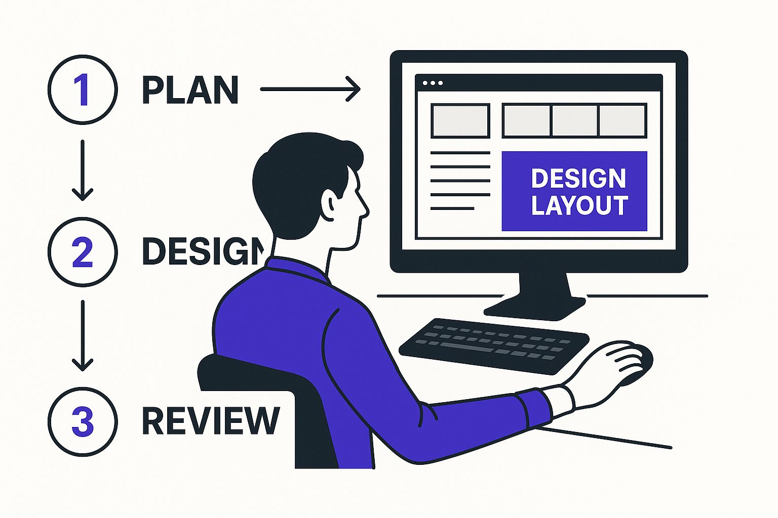
As you can see, having a clear layout structure from the start is what makes the final design work. It ensures every element has its place before you even start building.
Accelerating Your Workflow with Divimode
While Divi provides the core framework, plugins from Divimode are like power-ups that can seriously speed up your workflow and unlock more advanced designs. Instead of building every complex element from scratch, Divimode gives you specialized tools that slot right into the Divi builder.
For example, when you get to your contact section, you could use a standard Divi form module. Or, with a tool like Divi Areas Pro, you could create a sleek popup form that triggers when someone clicks a button. This keeps your main page clean and focused, improving the user experience by showing information right when it’s needed. If you want to dive deeper into what the builder can do, check out our full guide to the Divi page builder.
The key to an efficient build is knowing which tool to use for the job. Combining Divi’s core builder with targeted plugins from Divimode lets you work smarter, not harder, and get professional results in a fraction of the time.
Constructing Your Page Section by Section
Now, let's put this into practice. Create a new page in WordPress and fire up the Divi Builder. Start with your hero section by adding a new, full-width blue Section. Inside that, place a one-column green Row. Now you can add your modules: a Text module for your killer headline and subheading, and a Button module for your main call-to-action.
Repeat this process as you build out each subsequent section—Services, About, Portfolio, etc. Add a new Section for each distinct block of content. This modular approach is super important for single-page sites because it keeps everything organized and makes it easy to add anchor links for smooth scrolling navigation later.
Here’s a huge time-saving tip: use Divi’s global settings. Before you start tweaking individual modules, pop over to the Divi Theme Customizer. From there, you can set your brand's primary colors, default fonts, and button styles. By setting these globally, every new module you add will automatically inherit your brand's look, ensuring perfect consistency without all the manual adjustments. It’s a simple step that transforms your workflow from repetitive to streamlined.
Creating Flawless Navigation and Dynamic Content
A single-page website lives and dies by its navigation. Without a smooth, intuitive way for visitors to move between sections, your carefully crafted narrative just falls apart. The entire experience hinges on making the scroll feel intentional and effortless. This is where we bridge the gap between a static page and an interactive journey, starting with rock-solid anchor links.
Think of anchor links as an internal GPS for your page. When someone clicks "Portfolio" in your menu, you don't want them to just guess where to scroll. You want them to be whisked directly to that section, instantly. Getting this right in Divi is surprisingly straightforward and absolutely essential for a professional feel.
Setting Up Seamless Anchor Link Navigation
The whole process boils down to two simple parts: naming your destinations (the sections) and then pointing your navigation links to those names. It's a fundamental skill for anyone learning how to create a single page website that feels polished.
First up, you need to assign a unique identifier, known as a CSS ID, to each major section of your page. Just open your page in the Divi Builder and run through these steps:
- Hover over the blue Section you want to link to (like your "Services" section).
- Click the gear icon to open the Section Settings.
- Jump over to the Advanced tab.
- Find the field labeled CSS ID & Classes.
- In the CSS ID field, type a simple, one-word name for that section. Make sure it's all lowercase and has no spaces. Good examples are
services,about, orportfolio.
Do this for every section you plan to include in your main navigation menu. Keep your IDs simple and memorable—you'll need them in a moment.
With your sections properly labeled, head back to your WordPress dashboard and go to Appearance > Menus. This is where you'll connect your main menu to the CSS IDs you just created.
Instead of adding a standard page to your menu, you'll use the Custom Links option.
- In the URL field, enter your full website address followed by a hashtag (#) and the CSS ID. For example:
https://yourwebsite.com/#services. - In the Link Text field, type the name you want to see in the menu, like "Services".
- Click Add to Menu and repeat for each section.
Once you save the menu, go check out your live site. Clicking the menu items should now smoothly scroll the visitor to the corresponding section. Just like that, you've built the core navigation system for your single-page website.
The magic of a one-page site is its controlled narrative flow. Anchor links are the tool that makes this flow possible, turning a long scroll into a guided tour where the visitor is always just one click away from the information they need most.
Elevating Interactivity with Divi Areas Pro
Smooth scrolling is a great start, but modern websites often need more. What about content that doesn't fit neatly into the main story, like a detailed project description, a full team bio, or a contact form? Cramming all of this onto one page creates clutter and can easily overwhelm your visitors. This is a classic challenge, and it's where dynamic content comes into play.
This is where a tool like Divi Areas Pro becomes a game-changer. It lets you create hidden content "areas"—like popups, slide-ins, or fly-ins—that only appear when a user takes a specific action, like clicking a button. This keeps your main page clean and streamlined while still offering rich, detailed information on demand.
Imagine a portfolio section. Instead of just showing a thumbnail, you could have a "Learn More" button. When clicked, a sleek popup appears with a full case study, a video walkthrough, and client testimonials for that specific project. This approach provides depth without ever disrupting the user's journey.
Creating this kind of dynamic content is surprisingly simple. You build the content for your popup using the familiar Divi Builder, then set a trigger—it could be a click on a button, a link, or even an image. The plugin handles the rest, ensuring the content appears exactly when and how you want it to. To get a full sense of the possibilities, you can explore a complete guide on how to use Divi Areas Pro to design dynamic content for your site.
By combining smooth anchor navigation with on-demand dynamic content, you solve the two biggest user experience challenges of a single-page design. You provide a clear path through your main story while making deeper content instantly accessible—without ever forcing the user to leave the page. It’s how you create a site that feels both simple and powerful.
Giving Your Site an Edge with Speed and SEO
Alright, your single-page site is looking sharp and the interactive elements are slick. But all that great work is for nothing if the site is slow or invisible to search engines. Let's make sure people can actually find and enjoy it.
Optimizing a one-page design comes with its own unique set of challenges. Unlike a traditional site that can spread its SEO efforts across dozens of pages, we're putting all our eggs in one basket—a single URL. This means we have to be incredibly strategic about how we structure our content and target keywords.
How to Structure Content for Search Engines
Search engines like Google don't see your page like a human does; they read the code to understand the hierarchy of your content. Using heading tags (H1, H2, H3) correctly is like giving Google a clear roadmap of what's important. For a single-page site, getting this right is non-negotiable.
Here’s how to think about it:
- Your H1 Tag: You only get one. This should be the main headline in your hero section, and it absolutely must contain your primary keyword. If you’re a freelance photographer in Austin, your H1 might be something like, "Austin Wedding Photographer for Modern Couples."
- Your H2 Tags: These are the big-picture titles for each major section of your page (
services,portfolio,about). Each H2 is an opportunity to target a related, long-tail keyword. For example, "Candid Wedding Photography Services" or "My Austin Photography Portfolio." - Your H3 Tags: Use these to break down content within your larger sections. An H3 under your "Services" section could be "Engagement Photo Sessions," giving search engines even more specific context.
This clean hierarchy helps Google understand that your page covers several distinct topics, rather than just seeing a jumbled wall of text.
Nailing Your Keyword Strategy on a Single Page
With just one page to work with, your entire SEO strategy lives and dies by a single primary keyword and a cluster of related long-tail keywords. You can't afford to be vague. Your job is to pick the one search term that best describes what you do and build everything around it.
Weave your primary keyword into your H1 tag, the first paragraph, and a few other key spots where it feels natural. Then, use each section of your page to target those longer, more specific phrases. This laser-focused approach is crucial for ranking. While direct traffic makes up a huge chunk of visits—58% globally—organic search still brings in 29%, and those organic results get a whopping 73% of all clicks. A tight keyword strategy is how you claim your piece of that pie.
On a one-page site, every section is a chance to rank for a different angle of your main topic. Your 'About' section isn't just a bio; it's where you highlight your experience as a [primary keyword]. Your 'Services' section is where you detail the different types of [primary keyword] you offer.
A No-Nonsense Performance Checklist
A fast website is no longer a "nice to have." Slow speeds will kill your user experience and send your search rankings plummeting. The good news is that Divi has some powerful performance tools baked right in.
Here’s a quick-and-dirty checklist to get your site running at top speed:
- Crush Your Images. Large image files are the #1 reason websites are slow. Full stop. Use a tool like TinyPNG or an optimization plugin to compress every single image before you upload it.
- Flip on Divi’s Performance Switches. Head over to Divi > Theme Options > General > Performance. You'll want to enable options like "Dynamic Module Framework" and "Dynamic CSS." This tells Divi to only load the code that's actually being used on the page.
- Get a Good Caching Plugin. Caching plugins like WP Rocket or W3 Total Cache are miracle workers. They store static versions of your site, which means pages load almost instantly for returning visitors.
- Cut Down on HTTP Requests. This sounds technical, but the concept is simple: the fewer files your site has to load, the faster it will be. Divi’s performance settings help with this by automatically combining and shrinking CSS and JavaScript files for you.
For a much deeper dive into performance, our guide on how to speed up your Divi website covers more advanced techniques. If you really want to get into the weeds, there are some great articles on how to improve website speed that cover the technical side of things.
By pairing a smart SEO structure with solid performance tuning, you'll make sure your single-page site doesn't just look amazing—it'll perform brilliantly, too.
Common Questions About Building Single Page Websites

Even with a solid plan, jumping into a single-page website build can bring up some valid questions. It's a different way of thinking about web design, especially when you start considering things like long-term growth and visibility.
Let's walk through some of the most common concerns that pop up. My goal is to clear the air so you can move forward with confidence.
Is a Single Page Website Bad for SEO
This is, without a doubt, the question I hear most often. The short answer is a firm "not necessarily." While it's true you won't be targeting a massive list of keywords like a multi-page site can, a one-pager is brilliant at dominating a specific niche.
You're essentially focusing all of your content, authority, and backlinks onto a single, powerful URL. This creates a hyper-focused resource that search engines can easily understand and categorize. The key is structuring your content perfectly with H1, H2, and H3 tags to signal a clear hierarchy. For a business with a laser-sharp focus, this concentrated approach can be an incredibly potent SEO strategy.
Think of it this way: instead of trying to be a jack-of-all-trades, your single-page site becomes the undisputed master of one. That level of focus is something search engines often reward.
Can I Add a Blog to My Single Page Website
Yes, absolutely! And honestly, this is a fantastic hybrid strategy that gives you the best of both worlds. You get the streamlined, conversion-focused experience of a one-page site for your main offerings, all while reaping the powerful content marketing benefits of a blog.
Getting this set up in WordPress is straightforward:
- Just create a new, blank page (call it "Blog," "Articles," etc.).
- Head over to your WordPress reading settings and set that new page as your "Posts" page.
- Add a link to your main navigation menu.
When someone clicks that link, they're seamlessly taken to a traditional, multi-page blog archive. This approach keeps your primary marketing page clean and direct, while the blog works its magic in the background, attracting new audiences through organic search.
When Should I Choose a Multi-Page Website Instead
A single-page design isn't a silver bullet for every project. A traditional multi-page website is the clear winner in a few specific scenarios.
You should definitely opt for a multi-page structure if:
- You run an e-commerce store with lots of product categories and filtering options.
- Your business offers several distinct services that each need detailed explanations, case studies, and unique calls-to-action.
- You're building a content-heavy site like a news portal, a large resource library, or a publication with multiple authors.
Basically, if you need to target a wide range of keywords or guide users through complex decision-making processes, the organized hierarchy of a multi-page site is going to serve you—and your visitors—much better.
How Should I Handle Contact Forms
You’ve got two excellent options here, and both maintain the sleek feel of a one-page design.
The most direct method is to simply embed a contact form into a dedicated "Contact" section, usually placed near the bottom of your page. You can do this in seconds using Divi's built-in Contact Form module.
For an even cleaner user experience, you can use a tool like Divi Areas Pro. This lets you trigger a contact form inside a popup when a user clicks a button or link. This approach keeps your main page totally uncluttered and only presents the form when the user is actively ready to engage. From my experience, this little tweak can be a fantastic way to improve conversions.
Ready to build dynamic, high-converting content for your Divi site? Divimode provides the tools and expert guidance you need. Elevate your designs with Divi Areas Pro and start creating advanced popups, slide-ins, and more. Explore Divimode's powerful plugins and tutorials today!
More Articles You Will Like