 Alex Martin
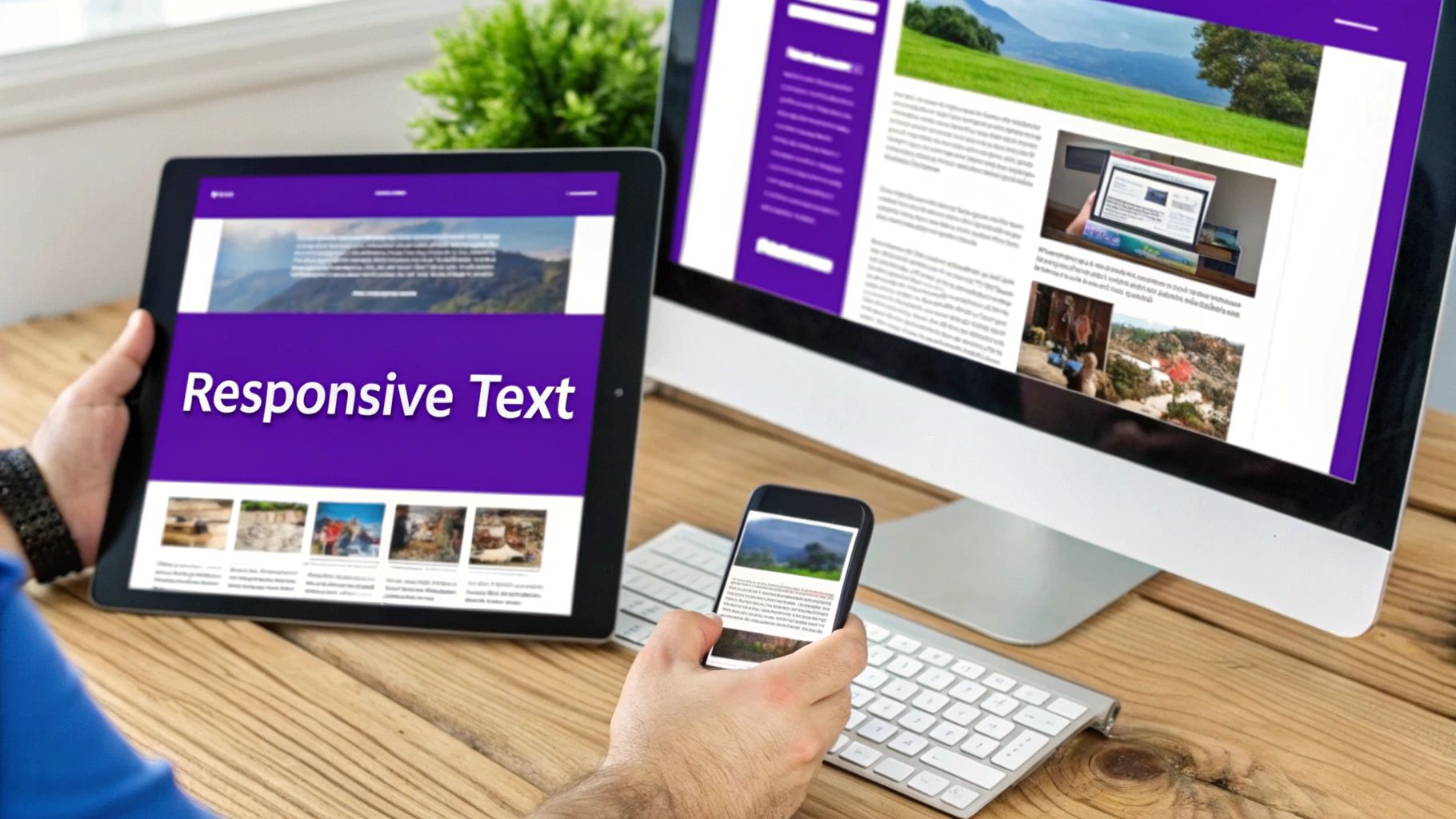
When we talk about responsive web design, we're really talking about using CSS—specifically media queries—to build fluid layouts that just work, no matter the screen size. It's the magic that makes a website look and feel right on a massive desktop monitor, a tablet, and a tiny smartphone screen. This isn't just a "nice to have" anymore; it's the foundation of modern web design.
Why Custom CSS Is a Game Changer for Divi
Let's be honest, Divi's built-in responsive settings are fantastic for quick fixes and basic adjustments. But they can only take you so far.
When you need pixel-perfect control, unique layouts that break the mold, or solutions to problems the visual builder simply can't handle, custom CSS becomes your superpower. This guide is all about moving past the basics and showing you how to truly master responsive web design with CSS in your Divi projects.
We're going to dive into the core concepts that let you break free from the theme's limitations. Get ready for a hands-on approach that will teach you how to build layouts that not only look fantastic but also deliver a flawless user experience on any device.
Moving Beyond Divi's Default Options
Divi’s visual toggles for desktop, tablet, and mobile are convenient for tweaking margins, padding, or hiding modules. Super handy in a pinch. However, they lack the granular control needed for more complex design challenges.
For example, what if you want to completely reorder elements within a row for mobile viewers? Without custom CSS, you're often stuck duplicating content and hiding the original—a clunky workaround that's bad for SEO and site performance.
This is exactly where custom CSS shines. With modern tools like Flexbox and CSS Grid, you can achieve sophisticated, dynamic layouts that are simply impossible with the standard Divi interface.
Mastering responsive CSS isn't just about making things look pretty. It's about building more efficient, maintainable, and professional websites. Over time, this proficiency leads to smoother workflows that can actually help reduce software development costs.
The Mobile-First Reality
If you're still not convinced, the data tells a clear story. Smartphones now account for roughly 59.16% of all global web traffic. That means for every ten visitors, six are likely on a phone. A mobile-first mindset isn't just a trend; it's a necessity.
In fact, it's estimated that around 90% of all websites now use responsive techniques to ensure they function perfectly everywhere. Digging into custom CSS isn't just leveling up your design skills—it’s about building for the web as it exists today. You can check out even more responsive design statistics to see just how critical this is.
To get started, it helps to have a quick reference for the key CSS techniques you'll be using. I've put together a simple table that breaks down the core tools for building responsive Divi sites.
Core CSS Techniques for Divi Responsiveness
Here's a quick overview of the essential CSS properties that form the backbone of a solid responsive workflow in Divi.
| CSS Technique | Primary Use in Divi | Best For |
|---|---|---|
| Media Queries | Applying styles at specific breakpoints (e.g., tablet, mobile). | The foundation of all responsive design; changing layouts for different screen sizes. |
| Flexbox | Controlling the alignment, spacing, and order of elements in a row or column. | Reordering modules, creating equal-height columns, and vertically centering content. |
| CSS Grid | Creating complex, two-dimensional layouts with precise control over rows and columns. | Building advanced module layouts, custom post grids, and asymmetrical designs. |
| Relative Units | Using units like vw, vh, rem, and % for fluid typography and spacing. |
Ensuring fonts, margins, and padding scale proportionally with the screen size. |
Think of these as your core toolkit. While Divi handles some of this behind the scenes, knowing how to apply them yourself gives you ultimate control over every pixel.
Getting Your Divi Environment Ready for Custom Code
Before you even think about writing a line of CSS, it’s worth taking a moment to set up your workspace properly. Where and how you add your custom code isn't a small detail—it directly impacts your site's performance, how easy it is to maintain, and whether you can scale it up later.
Getting this foundational step right will save you from a world of headaches down the road.
Divi gives you a few different places to drop in custom CSS, and each has its pros and cons. Understanding your options is the first real step toward building like a pro.
Where Should You Add Your Custom CSS?
The most obvious spots are the Divi Theme Options, the Customizer, or even a specific module's Advanced tab. These are totally fine for quick, one-off tweaks. But as your site grows, that code can get messy and become a nightmare to manage.
For any project you’re serious about, a child theme is the only way to go. It’s the industry standard for a reason. A child theme inherits all of Divi’s power but keeps your customizations neatly tucked away in a separate style.css file. This means your hard work is completely safe from being wiped out when you update the main Divi theme.
Using a child theme isn't just a "nice-to-have" for developers. It's a core best practice that separates a fragile, hard-to-maintain site from a robust, professional one. It’s the difference between a temporary fix and a permanent solution.
If you're new to the concept, don't worry. You can learn more about building a solid foundation by checking out our guide on responsive design best practices for Divi.
Get Friendly With Your Browser's Developer Tools
Your browser’s built-in developer tools are your absolute best friend when writing CSS. You can’t style an element if you don’t know what to call it, right? These tools let you peek under the hood of your Divi layout and see the exact CSS classes and IDs assigned to everything.
Here’s a quick workflow I use every single day:
- Find the element you want to change on your live page and right-click on it.
- Choose "Inspect" from the little menu that pops up. This will open a new panel.
- Inside that panel, you’ll see the page’s HTML structure and all the CSS that applies to it.
- Here’s the fun part: you can edit the CSS right there in the browser to test changes in real-time. It’s a perfect little sandbox for experimenting because nothing you do is permanent until you add it to your stylesheet.
This process completely eliminates guesswork. No more fumbling with vague selectors. You can pinpoint the exact class you need in seconds.
For even better control, get in the habit of assigning a custom CSS Class to your Divi modules in the Advanced tab. This gives you a unique, stable hook to apply styles that won't be affected by future Divi updates. Mastering this is an essential skill for writing clean, effective CSS that just works.
Implementing a Mobile First Strategy with Media Queries
It’s so tempting to design for that beautiful, wide desktop screen and then just try to squish everything down for mobile. I get it. But this "desktop-down" method almost always ends in a mess of complicated CSS overrides and layout headaches on smaller devices.
Let's flip the script. By adopting a mobile-first strategy, you save yourself a world of pain.
This is the modern approach to responsive design with CSS. You start small, building a clean, functional, single-column layout that looks perfect on a phone. From there, you use CSS media queries to progressively enhance the layout as the screen size gets bigger. Trust me, it's a total game-changer for writing cleaner, more efficient code.
Understanding Divi Breakpoints and Media Queries
At its heart, a media query is just a simple CSS rule that says, "If the screen is at least this wide, then apply these new styles." To do this effectively, you need to know the breakpoints Divi uses for its own responsive settings.
Here are the defaults:
- Desktop: Screens wider than 981px.
- Tablet: Screens between 980px and 768px.
- Mobile: Screens 767px and smaller.
When we write mobile-first CSS, we're almost always going to use min-width media queries. This tells the browser to apply styles only when the screen meets a minimum width. For example, any styles inside @media (min-width: 768px) { ... } will kick in for screens 768px or wider—covering both tablets and desktops.
Back in 2015, mobile browsing had already overtaken desktop usage, and that trend has only snowballed. A mobile-first approach is non-negotiable now, especially when 90% of smartphone searches lead to a purchase or a visit. People expect a flawless mobile experience; one study found 61% of users will just go back to Google if a site is a pain to read on their device. You can find more stats on mobile user behavior on genetechsolutions.com.
Practical Example: From Mobile to Desktop
Let's say you have a standard Divi row with three Blurb Modules. On mobile, Divi stacks them into a single column, which is perfect. Now, let's use a media query to create a clean three-column layout for tablets and desktops.
First, pop over to your row's settings and give it a custom CSS class. Something memorable like blurb-grid-row will do the trick. Then, head to your child theme's stylesheet and drop in this CSS.
/* Mobile-first styles (no media query needed) */
.blurb-grid-row .et_pb_column {
width: 100%;
}
/* Tablet and up styles */
@media (min-width: 768px) {
.blurb-grid-row .et_pb_row_inner {
display: flex;
}
}
This tiny snippet targets our custom row and tells the inner row element to use Flexbox once the screen hits 768px. Flexbox automatically arranges the columns side-by-side, transforming your single-column mobile view into a slick three-column grid. It's that easy.
Creating Custom Breakpoints
Sometimes, Divi's default breakpoints just don't cut it. You might notice a layout looks a bit awkward on a large phone in landscape mode or on a small tablet—those pesky "in-between" sizes. This is where custom media queries become your best friend.
For instance, maybe you need to tweak font sizes or spacing specifically for devices around 480px wide.
You can create a custom breakpoint that targets a specific range:
/* Custom styles for large phones */
@media (min-width: 480px) and (max-width: 767px) {
.special-heading {
font-size: 28px;
}
}
This level of granular control ensures your design looks polished and intentional across the entire spectrum of devices. It's the key to delivering a truly professional user experience, no matter how someone is viewing your site.
Building Flexible Layouts With CSS Flexbox
Sometimes, Divi’s standard column structures just don’t cut it. When you hit a wall trying to get things perfectly aligned or spaced out, CSS Flexbox is the tool you need to reach for. Think of it as a one-dimensional layout model that gives you serious control over how items behave inside a container.
In the Divi world, a row is your container, and the columns inside are the items. Flexbox lets you do all the things that are normally a headache—perfectly centering columns, forcing them to be the same height, or even flipping their order on mobile—all with just a few lines of CSS. It’s a foundational skill for any serious responsive web design with css.
Unlocking True Alignment Control
Let's solve a classic Divi problem: making info boxes with equal heights. We've all been there, manually tweaking heights and hoping they don't break on a different screen size. Flexbox makes this ridiculously simple.
When you apply display: flex to a Divi row, you're telling the browser to treat it as a flex container. The immediate result? All the columns inside will automatically stretch to match the height of the tallest one. Problem solved.
Here’s how to pull it off:
- Jump into your Divi row settings and give it a custom CSS class, something memorable like
equal-height-cols. - Next, pop this little snippet into your child theme's stylesheet or Divi's Theme Options CSS box:
.equal-height-cols .et_pb_row {
display: flex;
}
That’s it. Your columns will now line up perfectly, regardless of how much content is in each one. It's a small tweak that instantly makes your layouts look more polished and professional.
Flexbox is more than just a layout tool; it's a problem-solver. It empowers you to fix those small but nagging imperfections that separate an amateur site from a truly professional one. Once you get the hang of it, you’ll spend less time fighting Divi's UI and more time creating.
Responsive design isn't just about looks; it has a real impact on performance and how users interact with your site. The proof is in the numbers.
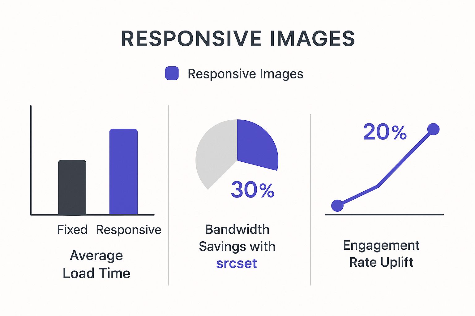
As you can see, these techniques don't just save bandwidth—they drastically cut down load times, which is a huge factor in keeping visitors engaged and happy.
Mastering Justify-Content and Align-Items
Equal heights are just the beginning. Flexbox's real power comes from two properties: justify-content and align-items. These are your secret weapons for precision alignment.
justify-content: This controls horizontal alignment and spacing along the main axis. You can use values likespace-between,space-around, orspace-evenlyto distribute your columns. Want to push everything to the right?flex-endis your friend.align-items: This handles vertical alignment. Thecentervalue is a lifesaver for vertically centering content inside a row, a task that can be surprisingly tricky to do with Divi's built-in settings alone.
Let’s say you're building a custom header in Divi Areas Pro. You have a logo on the left and a menu on the right. To make sure they are always perfectly centered vertically, no matter their individual heights, Flexbox is the answer.
.custom-header-row .et_pb_row {
display: flex;
align-items: center;
justify-content: space-between;
}
This tiny bit of code ensures your header elements are vertically aligned and pushed to opposite ends of the container. The result is a clean, balanced, and professional-looking header. This is the kind of control you need to build custom layouts that stand out from the standard Divi templates.
Flexbox vs CSS Grid: When to Use Which in Divi
Flexbox is fantastic, but it's not the only modern layout tool at your disposal. CSS Grid is its powerful two-dimensional cousin. Knowing when to use each one is key to building efficient and clean layouts in Divi. Here's a quick breakdown to help you decide.
| Criteria | CSS Flexbox | CSS Grid |
|---|---|---|
| Best For | Aligning items in a single row or column. Perfect for navigation, headers, and component-level layouts. | Complex, two-dimensional layouts with rows and columns. Ideal for entire page layouts or intricate galleries. |
| Dimensionality | One-dimensional. It handles either a row or a column at a time. | Two-dimensional. It manages both rows and columns simultaneously, creating a grid. |
| Divi Use Case | Vertically centering items in a row, creating equal-height columns, or spacing out buttons. | Building a complex magazine-style blog layout or an asymmetrical portfolio where items span multiple rows and columns. |
| Complexity | Easier to learn and apply for simple alignment tasks. | Steeper learning curve but incredibly powerful for structuring an entire page from the ground up. |
Ultimately, Flexbox and Grid aren't competitors; they're collaborators. For most of your day-to-day alignment fixes inside Divi modules and rows, Flexbox is your go-to. When you need to orchestrate the entire page structure, CSS Grid is the master planner.
Crafting Advanced Structures with CSS Grid
While Flexbox is the undisputed champ for one-dimensional layouts, CSS Grid is your secret weapon for complex, two-dimensional structures. It manages both rows and columns simultaneously, letting you finally break free from Divi's standard column options.
If you've ever felt boxed in by Divi's rows, this is for you. Think magazine-style layouts, asymmetrical portfolios, or designs with slick overlapping elements—things that just aren't possible with the visual builder alone. CSS Grid unlocks a whole new level of creative freedom.
Setting Up a Divi Row as a Grid Container
The process starts by telling a Divi section or row to act as your grid container. The real magic happens when you apply display: grid; to that container, giving you the power to define a precise grid for all the modules you place inside.
Let's walk through a classic real-world example: creating an overlapping image and text layout.
First, you'll need to add a custom CSS class to the Divi row you want to transform. We'll use advanced-grid-row for this example.
Next, just drop two modules inside that row—an Image Module and a Text Module will work perfectly.
Now, pop the following CSS into your child theme's stylesheet or Divi's theme options.
.advanced-grid-row .et_pb_row {
display: grid;
grid-template-columns: repeat(2, 1fr);
align-items: center;
}
This simple snippet instantly turns your row into a two-column grid where each column takes up an equal amount of space. With that foundation in place, you can start placing your modules with pinpoint precision.
CSS Grid is a massive step forward in web layout technology. It’s a perfect example of how new CSS is shaping responsive web design, offering more control than ever. Advanced tools like Grid and Flexbox often let you build complex, responsive structures with fewer media queries, a trend you can read more about in this guide to responsive design trends.
Placing and Overlapping Grid Items
With your grid defined, you now have total control over where each module sits. We'll do this by targeting the specific modules inside our custom row and assigning them to exact grid column and row positions.
Let's say we want the image to span across both columns, with the text sitting on top of the image in the second column. We can pull this off with just a few more lines of CSS.
.advanced-grid-row .et_pb_image {
grid-column: 1 / 3; /* Start at line 1, end at line 3 */
grid-row: 1;
}
.advanced-grid-row .et_pb_text {
grid-column: 2;
grid-row: 1;
padding: 40px;
background-color: rgba(0,0,0,0.7);
color: #fff;
}
This CSS tells the image module to stretch across the entire grid width (from column line 1 to 3). Meanwhile, the text module is placed neatly in the second column, creating that stylish, layered effect.
Just like that, you've created a visually dynamic layout that would be a real headache to build with Divi's standard settings. For more practical advice on designing for different screens, check out these steps to create a mobile-friendly site. This hands-on approach is what separates a standard theme user from a skilled Divi customizer.
Common Questions About Responsive CSS in Divi
Diving into custom CSS feels like unlocking a new level in Divi, but it’s natural to hit a few snags along the way. Let's walk through some of the most common questions and hurdles people face when they start getting serious about responsive web design with CSS.
Getting these answers straight from the get-go will help you build with more confidence and troubleshoot like a pro.
How Do I Find the Right CSS Selector?
This is probably the number one question. The most reliable way, hands down, is to use your browser's Developer Tools. Just right-click on the element you want to style and hit 'Inspect'.
This pops open a panel that shows you the exact HTML structure and all the classes and IDs attached to that Divi module. It takes the guesswork out of the equation.
For maximum stability, I always recommend assigning a custom CSS Class to your module in the Advanced tab. Why? Because this gives you a clean, predictable hook for your CSS that won't be affected by future Divi updates. It’s a simple practice that saves a ton of headaches.
Can I Use These Techniques with Other Divi Plugins?
Absolutely. The beauty of the Divi ecosystem is that plugins built for it, like our own Divi Areas Pro, share the same core structure.
That means you can apply Flexbox, Grid, and media queries to create incredibly responsive popups, headers, or slide-ins just like you would with a standard Divi section.
For example, you could use Flexbox to perfectly center content inside a popup on every screen size. Or you could write a media query that completely changes a notification bar’s layout on mobile, turning a horizontal bar into a stacked, readable block. The principles are universal.
What to Check When My Custom CSS Isn't Working?
It's one of the most frustrating moments for any developer—you write the code, refresh the page, and… nothing. Before you start pulling your hair out, run through this quick mental checklist.
- Syntax errors are the usual suspects. A single missing semicolon
;or curly brace}can break the whole thing. Double-check your code. - Is your selector specific enough? Divi's own stylesheets can be pretty specific. If your style isn't applying, your selector might be getting overruled. Try adding another class from the inspector to make it more powerful.
- Did you clear the cache? This gets everyone. Make sure you clear your browser cache, Divi's static CSS file generation, and any caching plugins or server-level caching you have running.
If all else fails, you can use !important to force a style, but treat it as a last resort for troubleshooting. It’s always better to figure out the specificity issue than to rely on this heavy-handed override.
Pro Tip: Don't feel like you have to do everything with custom code. I find the most efficient workflow is a hybrid approach. Handle simple tweaks like font sizes and padding with Divi's built-in responsive settings. Then, save your custom CSS for the heavy lifting—complex alignments, reordering elements on mobile, or crafting those unique grid layouts that Divi can't do on its own.
This blend gives you the best of both worlds: the quick-and-easy convenience of the visual builder for everyday tasks, and the limitless power of CSS when you need to create something truly custom and perfectly responsive.
At Divimode, we believe in empowering you with the tools and knowledge to build better websites. Take your responsive designs to the next level with Divi Areas Pro and create interactive, device-aware popups, fly-ins, and headers that engage your audience. Learn more about Divi Areas Pro.
More Articles You Will Like