
Exit-intent pop-ups are your secret weapon. They're that last-ditch effort to connect with a visitor right at the moment they decide to leave your site. By tracking mouse movements toward the browser's close button, this tech triggers a perfectly timed offer, giving you one final shot to turn that visitor into a lead or customer.
Why Exit Intent Pop Ups Actually Work
Let's get right to it: a lot of people find pop-ups annoying. I get it. But the psychology behind an exit-intent pop-up is completely different. Instead of rudely interrupting someone mid-browse, it appears when their journey is already over. Think of it as a strategic safety net, designed to grab attention only after a visitor has decided to move on.
Consider this—over 95% of first-time visitors will leave your website and never come back. An exit pop-up serves as a pattern interrupt. It breaks that automatic "close tab" muscle memory and presents a new, unexpected choice. That single interaction can be the difference between a bounced visitor and a new email subscriber for your list.
Turning Abandonment into Opportunity
The real magic here is in the timing and relevance. A well-crafted offer doesn't feel like a pushy interruption; it feels like a helpful, last-minute suggestion. You’re not blocking them from reading your content; you're offering something valuable they would have missed entirely.
The benefits are pretty clear:
- Lead Capture: Offering a free resource like an ebook, a checklist, or a webinar sign-up in exchange for an email is one of the most effective ways to grow your list.
- Reduced Cart Abandonment: For e-commerce sites, this is a game-changer. A last-second discount code or a free shipping offer can be just the nudge a hesitant buyer needs to complete their purchase.
- Lower Bounce Rates: By re-engaging a user for even a few more seconds, you’re keeping them on your site longer. This can send positive signals to search engines about your site's engagement.
The core principle is simple: provide the right value at the right moment. An exit pop-up isn't just a sales gimmick; it’s a customer service opportunity. It's your chance to address a potential reason for leaving, like price or unanswered questions, before they're gone for good.
Ultimately, using exit-intent pop-ups aligns perfectly with broader strategies to increase website conversions. It’s all about understanding user behavior and using that insight to give them a compelling reason to stick around. Studies have shown that a well-optimized campaign can recover a huge chunk of otherwise lost visitors, which directly impacts your bottom line. You can learn even more about how to boost sales using exit intent popups with Divi in our detailed guide.
Alright, let's get down to business. We've covered the "why" behind exit-intent pop-ups, so now it's time to roll up our sleeves and get into the "how." This is where we stop talking and start building your first pop-up, all from within the Divi ecosystem. The best part? You've got total creative control, and you won't touch a single line of code.
Your first move is to actually design the pop-up itself. This isn't done on a regular page. Instead, you'll head over to the Divi Library. Just navigate to Divi > Divi Library from your WordPress dashboard and hit "Add New."
Give your new layout a clear name—something like "10% Off Exit Pop-up"—and be sure to set the type to "Layout." This creates a standalone canvas where you can use the Divi Builder you already know and love to design your pop-up, making sure it fits your brand's look and feel perfectly.
Configuring The Exit Intent Trigger
Once you've got your pop-up designed and saved in the Divi Library, the next step is to tell Divi when and where to show it. This is where the exit-intent magic happens. You'll handle these settings either in your main Divi Theme Options or, if you're using a dedicated tool like Divi Areas Pro, within its specific interface.
You'll create a new pop-up configuration and link it to the Divi Library layout you just made. The most important piece of this puzzle is the Trigger setting. Forget about time delays or scroll percentages. You're going to select "On Exit Intent." This one setting activates the technology that watches a visitor's mouse movements, and it will only display your offer the moment their cursor darts toward the browser's close button.
Just look at what a well-timed pop-up can do for your conversion rates.
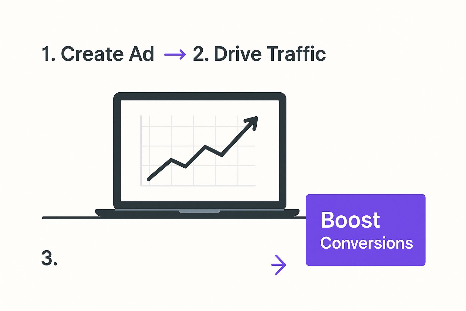
That upward trend says it all. Re-engaging visitors who are about to leave has a direct and positive impact on the numbers that matter most to your business.
Setting Display Conditions and Rules
Simply choosing the right trigger isn't quite enough. A truly effective exit-intent strategy depends on showing your pop-up to the right people on the right pages. This is where Display Conditions come in.
Inside the pop-up's settings, you'll find a whole suite of options to control its visibility. You could show it everywhere, but for maximum impact, you’ll want to get more targeted.
I've seen this work wonders in different scenarios:
- For an e-commerce store: A free shipping offer that only appears on the cart and checkout pages can be a powerful tool against cart abandonment.
- For a blog: Offer a relevant content upgrade, like a PDF checklist, but only on that specific blog post. It feels way less intrusive and much more helpful.
- For a service-based business: A pop-up offering a free consultation should probably only show up on your main service pages, where people are actively considering what you offer.
To help you get started, here's a quick rundown of the essential settings you'll be working with. Think of this as your cheat sheet for setting up the pop-up's behavior in Divi.
Essential Divi Pop Up Trigger Settings
| Setting | Function | Recommended Configuration |
|---|---|---|
| Trigger Type | Determines what action causes the pop-up to appear. | On Exit Intent. This is the core of the strategy. |
| Display Location | Controls which pages or posts the pop-up can show on. | Specific Pages/Posts. Start targeted, like on checkout or high-traffic blog posts. |
| User Conditions | Defines which visitors see the pop-up (e.g., logged in, first-time). | All Users is a good start, or Logged-Out Users for lead-gen. |
| Cookie Expiration | Prevents the pop-up from showing again to the same visitor. | 14 to 30 days. Avoid annoying repeat visitors. |
Mastering these display conditions is what separates a generic, slightly annoying pop-up from a high-performing conversion machine that actually helps your visitors.
Pro Tip: Don't sleep on the cookie settings. Seriously. You need to set a rule to prevent the same visitor from seeing that pop-up for at least 14 or 30 days. Showing the same offer every single time someone tries to leave is a surefire way to create a bad experience. This small tweak respects your audience and keeps your offer feeling special, not spammy.
Designing Pop-Ups That Convert, Not Annoy
Getting the technical side of an exit-intent pop-up right is only half the battle. You could have the perfect trigger, but if the design is jarring or the message falls flat, it’s all for nothing. I’ve seen it time and time again: what separates a high-converting pop-up from a disruptive one is a thoughtful blend of smart design, compelling copy, and a real understanding of user psychology.
You need to craft an offer that feels less like a hard sales pitch and more like a genuinely helpful suggestion. The goal here is to connect with the user’s potential reason for leaving, turning that moment of departure into an opportunity.

Crafting a Compelling Headline
Your headline is the single most important part of your pop-up. Seriously. You have about three seconds to grab a user's attention before they click away for good. Your headline absolutely must be direct, benefit-driven, and speak to their immediate situation.
From my experience, a few approaches work really well:
- Acknowledge Their Action: A simple "Wait! Before You Go…" can be surprisingly effective. It’s direct and addresses what they’re doing right now.
- Lead with a Clear Benefit: Headlines like "Get 10% Off Your First Order" or "Download Your Free SEO Checklist" leave no room for confusion. The user instantly knows what’s in it for them.
- Ask a Re-Engaging Question: Something like "Leaving So Soon?" can make a visitor pause and reconsider your offer.
The key is to avoid vague or overly clever language. Clarity always wins, especially when you’re dealing with a visitor who already has one foot out the door. You can dive deeper into this in our guide on how to create high-converting WordPress popups.
Writing Concise Copy with a Singular Focus
Once the headline has done its job, the body copy needs to seal the deal—fast. This isn't the place for long paragraphs or complex stories. Keep your message short, scannable, and laser-focused on a single, powerful call-to-action (CTA).
Every element—the headline, the short descriptive text, and the button—must guide the user toward one specific action. Don't ask them to subscribe and follow you on social media. Pick one goal and build the entire pop-up around it.
A common mistake I see is trying to do too much. A great pop-up has one job. Whether it's capturing an email or preventing cart abandonment, make sure every word and design choice serves that single purpose.
Of course, the words you choose are just one piece of the puzzle. The principles of engaging and converting website content apply here, too, and are crucial for getting results.
Ultimately, effective design isn't just about looks; it's about performance. Industry benchmarks show that well-designed exit-intent pop-ups typically see conversion rates between 2% and 5%. If you're falling below this range, it might be a sign that your messaging or offer needs a tweak. If you’re exceeding 5%, you've likely hit on a formula that truly resonates with your audience—well done! This data gives you a solid baseline for measuring the success of your Divi pop-up designs.
Advanced Targeting for Maximum Impact

Alright, a generic, site-wide exit pop-up is a solid start. But if you want to see real gains, you have to move beyond the one-size-fits-all approach. This is where advanced targeting turns your pop-up from a blunt instrument into a precision tool, letting you deliver hyper-relevant offers that connect with what a visitor actually wants.
This is where things get strategic. Instead of flashing the same discount at every single person, you can customize the message based on the page they’re about to leave. It’s this level of personalization that makes a pop-up feel genuinely helpful, not just intrusive.
Harnessing Page-Level Precision
The single most powerful way I’ve found to boost the effectiveness of exit intent pop-ups is with page-level targeting. Divi’s display conditions make this incredibly simple to set up, giving you the power to craft unique offers that perfectly match the page content.
Think about these real-world scenarios I've used for clients:
- On a specific product page: A visitor is checking out your premium hiking boots but heads for the exit. Instead of a generic "10% off," your pop-up appears: "Wait! Get Free Waterproofing Spray with Your Hiking Boot Order." It’s a directly related, high-value offer that solves a potential problem for them.
- On a high-traffic blog post: Someone just finished your guide on "10 Tips for Better SEO." As they move to leave, a pop-up offers a "Free Downloadable SEO Checklist." This is the perfect content upgrade, building on the value they just got from your article.
- On the checkout page: This is the make-or-break moment. If a user tries to abandon their cart, a pop-up offering "Free Shipping on Your Order" or "Complete Your Purchase Now for an Extra 5% Off" can be the final nudge they need.
This targeted approach makes your offer feel less like an ad and more like a thoughtful suggestion. You're showing you understand the visitor's journey and are offering something relevant to their immediate needs.
When you start using page-level targeting, you're no longer just trying to stop someone from leaving; you're actively enhancing their experience by providing context-aware value. This shift in strategy is fundamental to maximizing conversions.
A/B Testing Your Way to Success
So, how do you really know if your headline is grabbing attention? Or if a 15% discount pulls better than a free gift? Guesswork will only get you so far. To scientifically prove what works, you need to A/B test your exit-intent pop-ups. This is where Divi Leads becomes your secret weapon.
Divi’s built-in split testing feature lets you pit different versions of your pop-up against each other to see which one performs best. I usually create two variations of a pop-up layout in the Divi Library, changing just one key element at a time to get clean data.
This data-driven method takes all the emotion and guesswork out of optimization. While some marketing gurus promise insane results, a more realistic analysis shows that a well-targeted exit intent pop-up typically yields a 5-10% increase in conversions. This proves that while they provide a solid lift, the key is consistent optimization, not chasing fantasy numbers. You can learn more about realistic conversion rate increases from detailed studies that back this up.
Ultimately, testing is how you discover what your specific audience responds to, ensuring you squeeze the best possible results out of every pop-up.
Proven Exit Pop Up Scenarios and Offers
Okay, let's move from theory to where the real magic happens: putting this stuff into practice. The true power of an exit-intent pop-up comes down to offering the right thing at precisely the right moment. A generic, site-wide offer is a decent start, but customizing your message for a specific scenario is what really moves the needle on conversions.
Let's break down two of the most common—and powerful—situations where exit-intent pop-ups absolutely shine. Think of this as your playbook of high-impact ideas you can steal and adapt for your own Divi website.
Combatting E-commerce Cart Abandonment
For any online store, the cart and checkout pages are the final frontier. This is it. When a visitor with items in their cart heads for the "X" button, it’s a make-or-break moment. Now is your prime opportunity to tackle the biggest reasons for cart abandonment head-on, like surprise shipping costs or simple price hesitation.
Forget a generic newsletter sign-up here. You need to present a highly relevant financial incentive.
- Offer Free Shipping: This is a classic for a good reason. Unexpected shipping costs are the #1 killer of online sales. A pop-up that simply says, “Wait! Complete your order now and get FREE shipping,” can be incredibly effective.
- Provide a Last-Minute Discount: A time-sensitive discount code, like “Get 10% off for the next 15 minutes,” injects a dose of urgency that pushes people to act now. It's one of the most direct ways to increase e-commerce sales with popups.
The key is to make the offer directly tied to completing the purchase. At this stage, the user isn’t thinking about your blog or your brand story; they're weighing a financial decision. A small, well-timed nudge can make all the difference.
Growing Your List on Content-Heavy Sites
Now, let's switch gears. For blogs, news sites, or any business focused on lead generation, the game is completely different. Your visitors are here for information, not necessarily to buy something on the spot. When they finish an article and decide to leave, your goal is to extend that relationship beyond a single visit.
This is where a lead magnet becomes your best friend. You're offering something of real value in exchange for their email address.
- Content Upgrades: This is my favorite tactic. If a visitor just read your amazing, in-depth article on "10 Ways to Improve Your Garden," your exit pop-up could offer a "Free Printable Garden Planning Checklist." It’s a perfect, no-brainer extension of the content they just proved they were interested in.
- Exclusive Resources: Offer access to a locked video tutorial, an exclusive webinar, or a comprehensive ebook related to your site’s main topic. This move positions you as an authority and gives them a compelling reason to subscribe.
The data absolutely backs this up. A well-executed exit-intent pop-up can boost a store’s conversion rate by up to 20% and turn 4-7% of abandoning visitors into new email subscribers. In one real-world case I've seen, a perfectly timed 50% discount offer hit a 13.73% conversion rate, directly saving sales that would have otherwise vanished.
These aren't just vanity metrics. They highlight the massive, tangible value that thoughtful exit pop-ups can deliver when you get the strategy right.
Of course, even with the best game plan, questions are bound to surface. When it comes to using exit-intent pop ups with Divi, I've seen a few of the same concerns come up time and time again. Let’s tackle them head-on so you can move forward with total confidence.
One of the biggest worries I hear is about search engine optimization. It’s a completely valid concern, but let me put your mind at ease: a well-implemented exit pop up won’t hurt your SEO rankings.
Google’s main gripe is with those annoying interstitials that block content the second you land on a page. That's a terrible user experience, especially on mobile. But since exit-intent tech only kicks in when a user is clearly on their way out, it doesn't disrupt that crucial first impression. Just make sure your design is clean, loads fast, and has an obvious close button on all devices. Do that, and you'll stay in Google’s good graces.
What Are the Best Offers to Use?
This is the million-dollar question, and the answer almost always comes down to context. There’s no single "best" offer, but I've seen certain formulas work like a charm in different situations.
- For E-commerce Sites: Your main goal here is to stop cart abandonment in its tracks. A time-sensitive discount (like "10% off for the next 15 minutes"), an offer for free shipping, or a small gift with purchase can be incredibly powerful for closing the sale.
- For Lead Generation: If someone's on a blog post or service page, your mission is to capture their email. This is where you offer a high-value content upgrade—think a PDF checklist that complements the article, an exclusive video tutorial, or a free consultation slot.
The real key is to provide immediate, relevant value that directly addresses why they might be leaving in the first place.
Remember, a great exit offer isn't just a sales pitch. It's a customer service opportunity. You're making one last, helpful suggestion based on what you know about their journey on your site.
How Can I A/B Test My Divi Pop Ups?
Guesswork won't get you very far. The only way to truly know what works is to test, and thankfully, Divi makes this incredibly simple. Divi’s built-in A/B testing feature, Divi Leads, is your best friend here.
It's a straightforward process. You can create two (or more) different pop up layouts in your Divi Library, maybe one with a different headline and another with a completely different offer or design.
Then, when you set up your pop up, just enable Split Testing and point it to your layouts. Divi takes over from there, automatically showing the variations to different segments of your audience and tracking all the performance data. This lets you ditch the assumptions and go with the statistically proven winner, ensuring your exit-intent pop ups are working as hard as they possibly can for you.
Ready to build pop ups that actually convert? Divimode gives you the tools and know-how to create high-performing pop ups, fly-ins, and more, all with Divi. Take your site’s engagement to the next level by checking out our solutions.
More Articles You Will Like