To really get a handle on your bounce rate, you first need to play detective. Figure out why people are leaving your site and what a realistic goal even looks like for you. The big levers you can pull are boosting your page speed, fine-tuning the user experience (UX), and making sure your content is a perfect match for what people searched for.
It's also worth remembering that not every bounce is a bad thing. Sometimes a visitor pops in, finds exactly what they needed in a few seconds, and leaves happy. That's a win, even if analytics calls it a bounce.
Why Visitors Leave Your Website and What It Means
Before you can start fixing a high bounce rate, you have to understand the story behind the number. A "bounce" is just a single-page session. Someone lands on your site and leaves without clicking anything else. The real question is why.
Think about these two very different scenarios:
- Someone googles your business hours, lands directly on your contact page, gets the info, and closes the tab. That’s technically a bounce, but it’s also a successful visit.
- Someone clicks a link expecting to see a specific product, but instead, they land on a slow, confusing homepage. They get frustrated and leave immediately. That’s a problematic bounce—the kind you absolutely need to fix.
Getting this distinction right is the first, most crucial step. It helps you focus your energy on fixing real problems instead of chasing a meaningless number.
Not All Bounce Rates Are Created Equal
Context is everything. What’s considered a "good" bounce rate completely depends on your industry, the type of website you run, and where your traffic is coming from. If you want a broader look at the problem, there are some great comprehensive strategies for reducing high bounce rates that can offer more perspective.
This infographic breaks down how much bounce rates can vary just by the type of website.
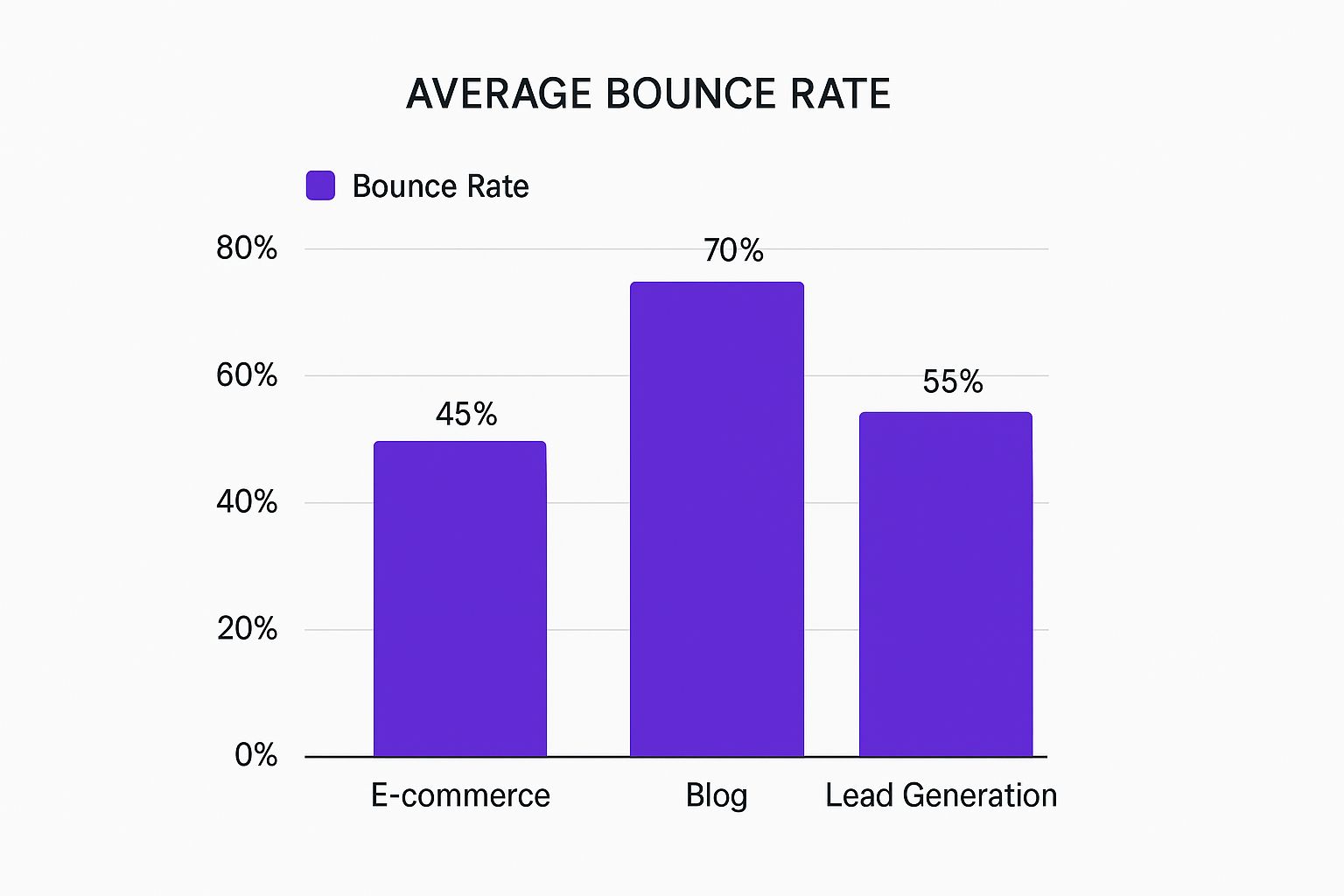
As you can see, it's totally normal for a blog to have a higher bounce rate. People often read one article and then they're done. An e-commerce site, on the other hand, is built for browsing, so you'd expect a lower bounce rate.
A high bounce rate isn't a red flag on its own. It's a signal to dig deeper. The goal isn't to get to a 0% bounce rate; it's to cut down on the bounces caused by a poor user experience.
Bounce Rate Benchmarks by Industry
A quick look at average bounce rates across various sectors to help you contextualize your own website's performance.
| Industry | Average Bounce Rate |
|---|---|
| E-commerce & Retail | 45.2% |
| Finance | 51.7% |
| B2B | 52.4% |
| Real Estate | 49.5% |
| Travel & Hospitality | 49.9% |
| Blogs & Content Sites | 65% – 80% |
| Landing Pages | 70% – 90% |
These industry benchmarks really drive the point home. It makes sense that a finance site (~51.7%) or a car-buying site (~52%) would have higher bounce rates. People are doing heavy research, and they might pop in and out of many different sites before making a decision.
Understanding these nuances is key to setting realistic goals for yourself. Once you have an achievable baseline in mind, the strategies that follow will be much more effective.
Speed Up Your Site to Make a Better First Impression

Nothing kills a visitor’s interest faster than a slow website. We live in a world of instant gratification, and every second your site takes to load is a test of your visitor's patience—a test you’re probably going to fail. Even a one-second delay can spike your bounce rate and tank your conversions.
The good news is you don’t have to guess what’s slowing you down. Tools like Google PageSpeed Insights act like an x-ray for your website, pinpointing the exact elements dragging down performance. It gives you a clear, prioritized list of what to fix first, which is a massive help when you're trying to figure out how to reduce bounce rate.
More often than not, the usual suspects are large, unoptimized images, bloated code from having way too many plugins, and sluggish server response times. Tackling these issues is one of the most direct ways to improve that critical first impression and convince visitors to stick around.
Diagnose and Fix Common Speed Killers
Once you've run the diagnostics and have your report card, it's time to get to work. I've found that some of the highest-impact fixes are surprisingly straightforward. You just have to tackle them one by one. A great place to start is your images—are they massive files that could be compressed without any noticeable drop in quality?
Another huge factor is your site’s code. Over time, websites accumulate messy CSS and JavaScript files that add precious milliseconds (or even seconds) to your load time. Minifying these files strips out all the unnecessary characters and comments, making them much lighter and faster for a browser to process.
Research consistently shows that nearly 70% of consumers admit that page speed impacts their willingness to buy from an online retailer. A fast, snappy experience isn't just a technical nice-to-have; it's a core part of building trust and encouraging people to explore your site.
High-Impact Speed Optimization Tactics
To really move the needle on your site speed, you need to attack the problem from a few different angles. Here are three key areas I always focus on for immediate and lasting results:
Smart Image Compression: Don't just "save for web." Use modern formats like WebP. These next-gen formats provide fantastic quality at a much smaller file size compared to old-school JPEGs or PNGs. This one change can dramatically slash load times, especially on image-heavy pages like galleries or product listings.
Implement Browser Caching: Caching is a simple instruction that tells a visitor's browser to save static parts of your website, like your logo, CSS files, and fonts. When they visit a second page or come back later, the site loads almost instantly because those assets are already stored on their device. This is a huge win for repeat visitors and encouraging multi-page sessions. For anyone on the Divi theme, our guide on how to speed up your Divi website has specific caching strategies you can implement today.
Use a Content Delivery Network (CDN): Think of a CDN as a global network of servers that all hold a copy of your site. When someone visits your website, the CDN serves them the files from the server closest to their physical location. This drastically cuts down the distance the data has to travel, making your website feel lightning-fast for everyone, no matter where they are in the world.
Design a User Experience That Encourages Exploration
 A great user experience (UX) is your secret weapon for keeping people on your site. If page speed is the first handshake, UX is the engaging conversation that follows. A confusing layout, hard-to-read text, or a clunky mobile view will send visitors scrambling for the back button faster than a slow server.
Think of your website like a physical store. You wouldn't stick around if the aisles were cluttered, the signs were impossible to read, and you couldn't find what you were looking for. Your digital storefront is no different. A clean, intuitive design makes exploration feel effortless and practically invites visitors to see what else you have to offer.
This is especially true when you start looking at how people browse on different devices. Behavior shifts dramatically between a desktop computer and a smartphone, and that directly impacts your bounce rate.
Prioritize a Mobile-First Experience
It's no secret that mobile traffic now accounts for the majority of website visits worldwide. If your site isn't designed for a smaller screen, you are actively pushing away more than half of your potential audience. A "mobile-friendly" site isn't just one that shrinks to fit—it’s one that’s easy to navigate with a thumb.
This means paying attention to the details:
- Large, tappable buttons: Tiny links are just plain frustrating to hit accurately on a touchscreen.
- Simple navigation: Complex mega-menus that are a godsend on desktop become impossible to use on mobile. Keep it simple.
- Vertical-friendly content: Your content has to flow logically in a single column without any of that awkward side-scrolling.
Recent data shows just how much user experience can vary by device. For instance, some platforms see a bounce rate that is a whopping 25% lower on desktops compared to mobile. That points to a serious gap in mobile usability. On the flip side, a site like WhatsApp.com shows almost no difference in bounce rates across devices, proving that a consistent, high-quality experience is totally achievable. You can explore more website statistics and their device-specific insights to see how the top sites stack up.
When a visitor has a seamless experience on their phone, they’re far more likely to trust your brand and explore further. A poor mobile experience, however, is a guaranteed way to send your bounce rate through the roof.
Make Your Content Easy to Consume
Even with a beautiful design, a solid wall of text is intimidating. Let's be honest, visitors rarely read every single word. They scan. They hunt for key information. So, making your content scannable isn't just nice—it's crucial for keeping them engaged.
Break up your text with clear, descriptive headings and subheadings. Stick to short paragraphs, ideally no more than two or three sentences, to give your readers' eyes a break. You should also lean on bullet points and numbered lists to serve up information in a much more digestible format.
These simple formatting wins make your content less of a chore to get through and help people find what they're looking for quickly. When users can easily absorb your message, they are far more inclined to click an internal link, watch a video, or do something—anything—that prevents a bounce.
Build Smart Internal Linking Pathways
A single page view can easily blossom into a deep exploration of your site, but only if you guide visitors effectively. An intelligent internal linking strategy is one of the most powerful tools you have to reduce your bounce rate.
Don't just scatter links randomly. Think about the visitor's journey. What question might they have next? What related topic could provide even more value?
Place contextual links right inside your content that point to other relevant articles, products, or resources on your site. For example, if you mention a specific feature in a blog post, link directly to its detailed product page. This does more than just keep visitors on your site longer—it also shows off your authority and helpfulness, building a much stronger connection with your audience.
Create Content That Delivers on Its Promise
Your content is the handshake. It’s the first impression and the whole reason someone bothered to click through in the first place. If you get it wrong, they're gone.
When there's a disconnect between what your headline promised and what your page actually delivers, you’ve basically paved a superhighway straight to the back button. This isn't just about writing well; it's about surgically aligning your content with what your visitor was searching for.
Put yourself in their shoes. They clicked your link because they thought you had an answer. Your one job is to give them that answer, and fast. Don't bury the good stuff under three paragraphs of fluffy introduction. Give them the payoff right away.
Go Beyond Just a Wall of Text
Let's be honest, a page crammed with plain text feels like homework. To grab someone's attention and keep them from bouncing, you need to make your content more dynamic. The days of static, text-only pages are over. Interactive, media-rich content is what keeps people on the page.
Think about weaving in some of these elements:
- Embed Relevant Videos: A quick, well-made video can break down a complex idea in seconds. It could be a product demo, a short tutorial, or even a clip from an expert interview. Getting someone to watch a video is a huge engagement signal.
- Use High-Quality Custom Images: Stock photos are generic and easy to ignore. Custom graphics, useful infographics, or crisp product photos make your content feel unique and far more professional.
- Add Interactive Elements: Things like calculators, simple quizzes, or polls can turn a passive reader into an active participant. Once someone has invested even a little bit of time interacting with your page, they're much less likely to leave.
The very nature of a website plays a massive role in its ability to keep visitors around. Sites built on dynamic, engaging content consistently see lower bounce rates. It's simple: interaction is the key to keeping users on-site.
You can see this play out on some of the world's biggest websites. YouTube, with its endless stream of video content, has a surprisingly low bounce rate of 34.29%. Meanwhile, Google sits higher at 43.44%, even with more overall traffic. This shows that media-heavy platforms built for consumption and interaction are just stickier. If you want to dive deeper, you can explore more data on bounce rate statistics and see how different types of sites stack up.
Structure Content for Scanners, Not Just Readers
Okay, so you’ve created some fantastic, engaging content. Now you have to format it for how people actually read online. Spoiler alert: they don't. They scan.
Use this behavior to your advantage.
Break your content into small, digestible chunks using clear H3 and H4 subheadings. Keep your paragraphs short—two or three sentences, max. This adds valuable white space and makes the page feel less overwhelming. Use bullet points and numbered lists to lay out information cleanly.
By making your content easy to scan, you help visitors find what they need in a flash, which actually encourages them to stick around and explore more.
Use Popups and CTAs Without Driving Visitors Away
Let's be honest, popups have a terrible reputation. And in most cases, they've earned it. When they're slapped onto a page without any thought, they feel like aggressive, in-your-face ads that make people instinctively reach for the "back" button.
But here’s the thing I've learned over the years: when used with a bit of finesse and intelligence, they can be one of your best tools for lowering your bounce rate and actually guiding visitors toward a conversion.
The secret is a simple mindset shift. A popup shouldn't be an interruption; it should be a helpful, well-timed intervention. Forget blasting every new visitor with a generic "Subscribe Now!" popup the second their page loads. Instead, think about their context and what they're trying to accomplish.
Target with Precision Using Exit-Intent
One of the most powerful—and respectful—ways to use a popup is with exit-intent technology. This is a clever feature that tracks a user's cursor movement. When it detects the cursor heading for the browser's back button or address bar, it knows the person is about to leave. That's the moment to present a targeted offer.
This is your final opportunity to turn a potential bounce into something more valuable. You aren't trying to block the exit; you're just giving them a compelling reason to reconsider before they go.
Imagine a visitor on your e-commerce site. An exit-intent popup could work wonders:
- A first-time purchase discount: "Wait! Take 15% off your first order."
- A free shipping code: "Leaving so soon? Here's free shipping on us."
- A cart reminder: "Don't forget these great items!"
This simple change in timing completely transforms the popup from a nuisance into a genuinely helpful offer, delivered exactly when it matters most.
Exit-intent popups are a game-changer. A famous case study showed they helped slash bounce rates by up to 60% by converting abandoning visitors into subscribers and customers. It’s all about making the right offer at the right time.
Craft Helpful and Context-Aware CTAs
Your calls-to-action (CTAs) and popups must feel like they belong. A generic offer just feels lazy and irrelevant, but a tailored one feels like a natural next step in the user's journey.
For example, if someone is reading your blog post on dog training tips, an exit-intent popup offering a free "Puppy Training Checklist" is a no-brainer. If they're browsing a specific product category, a popup that highlights a sale on those exact items will get their attention.
This is where a tool like Divimode's Divi Areas Pro really shines. It allows for advanced targeting based on user behavior, the specific page they’re on, or even if they're a return visitor.
Just look at Divimode's own homepage. It's focused on clear, value-driven actions rather than disruptive popups.

The design itself guides you toward specific plugins and resources, making the next step obvious without ever feeling pushy.
By personalizing the experience, you make the popup feel less like a disruptive ad and more like a helpful concierge guiding them to more value. Of course, the design of the button itself is also crucial. For some actionable guidance on that, check out our in-depth article on how to create high-converting CTA buttons that people actually want to click.
Frequently Asked Questions About Bounce Rate
Diving into bounce rate metrics often stirs up more questions than answers. As you start putting these strategies into practice, you'll probably find yourself wondering about industry benchmarks, how this all ties into SEO, and just how long you need to wait to see any real changes. Let's clear up some of that confusion.
Figuring out what's "normal" is always the best place to start.
What Is a Good Bounce Rate?
There isn’t a single magic number here. What counts as a “good” bounce rate really depends on your type of website and what you're offering. That said, some general benchmarks can give you a feel for where you stand:
- 26% – 40% is exceptional. You're doing a fantastic job keeping people engaged.
- 41% – 55% is a perfectly healthy, average range for most websites.
- 56% – 70% is on the higher side, but it can be completely normal for blogs or news sites. People often land, get the answer they need, and leave feeling satisfied.
Here's the thing to remember: context is everything. If a blog post gives a visitor the perfect answer to a very specific question, them leaving without clicking anything else isn't a failure—it’s a sign your content did its job. Your goal should be to fix bounces caused by a bad experience, not just obsess over a single number.
Can a High Bounce Rate Hurt My SEO Rankings?
This is a tricky one. Google has stated that bounce rate isn't a direct ranking factor. But, and this is a big but, a high bounce rate is often a massive red flag for underlying issues that absolutely tank your SEO. Think of it as a symptom, not the disease itself.
For instance, a sky-high bounce rate could be pointing directly to:
- Slow Page Speed: This is a known, direct ranking factor.
- Poor User Experience: Things like dwell time and other engagement signals definitely matter to search engines.
- Mismatched Content: Your page simply isn't delivering on the promise of its search result.
When you fix these root problems, you’ll naturally improve the user engagement signals that Google and other search engines reward. Tackling these issues is a huge part of learning how to retain visitors on your Divi website.
How Long Until I See Results from My Changes?
You've put in the work, now you want to see the payoff. I get it. But with analytics, patience is a virtue. After you’ve implemented major changes like optimizing your site speed or overhauling your content, you should start seeing some initial movement in your data within a couple of weeks.
However, to know for sure if your efforts are working, you need enough data to see a real trend emerge. I always recommend waiting at least 30 to 60 days before making any firm conclusions. This buffer gives you a large enough sample size to confidently say the improvements are from your hard work, not just the usual daily ups and downs of web traffic.
Ready to turn those bouncing visitors into loyal, engaged users? Divimode gives you the tools to create smart, targeted popups and inject dynamic content that grabs attention without getting in the way.
Explore Divimode's powerful plugins today.
More Articles You Will Like