Before you can dream of capturing a user's attention, you first have to earn their patience. The absolute first step in boosting website engagement is ensuring your site is fast, responsive, and reliable. This isn't just a technical "nice-to-have"—it's the very bedrock of the entire user experience.
Think about it. A slow, clunky website sends a clear message to visitors: "We don't value your time." That's a surefire way to send them packing, straight into the arms of your competitors. Your site's performance is the first promise you make. When someone clicks a link, they expect a smooth ride. If pages lag or elements fail to load, that promise is broken, and trust vanishes in an instant.
Pinpoint and Fix Common Speed Killers
The good news? You don't need to be a coding wizard to make a real difference. From my experience, most performance bottlenecks come from a few usual suspects that are surprisingly straightforward to fix.
A great starting point is running your site through a tool like Google PageSpeed Insights or GTmetrix. These will give you a clear report card on your site's health and, more importantly, a list of actionable fixes. You'll likely find the biggest culprits are:
- Unoptimized Images: This is a big one. Huge, high-resolution images are a primary cause of sluggish load times. Simply compressing your images before you upload them can slash page weight without any noticeable drop in quality.
- Bloated Code: Over time, websites tend to accumulate junk code from old plugins, themes, or custom scripts. Sticking with a lightweight theme and doing a regular spring-cleaning of unused plugins can make a massive difference.
- No Browser Caching: Caching tells a visitor's browser to save parts of your site locally. This means on their next visit, the browser doesn't have to re-download everything from scratch. It’s often a simple one-click setting in your hosting panel or a performance plugin.
The Real-World Impact of Site Speed
The link between site speed and user engagement isn't just a theory; it’s backed by cold, hard data. Even a one-second delay in page load time can torpedo page views by 11% and slash customer satisfaction by 16%.
What's really eye-opening is that nearly half of all users (47%) will ditch a site if it takes more than two seconds to load. That makes speed one of your most critical tools for retention. You can dive deeper into various website statistics to see the full, sobering picture.
This chart shows a familiar story for underperforming websites, where metrics like bounce rate and session duration tell a tale of users leaving in frustration.
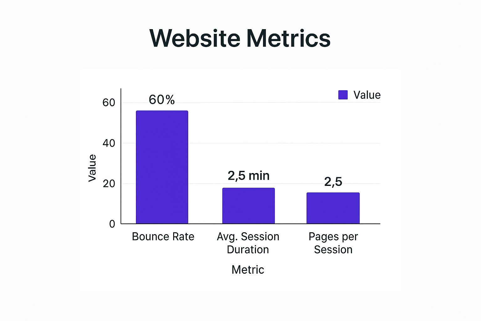
The data clearly illustrates how high bounce rates and short sessions are often direct symptoms of poor site performance. Users just aren't sticking around.
Let's look at a real-world scenario. I once worked with an e-commerce store selling beautiful handmade goods, but they were plagued by a sky-high bounce rate. A quick audit revealed the problem: their gorgeous, high-quality product photos were completely uncompressed. This was causing product pages to take over five seconds to load.
By simply compressing their images and enabling browser caching, we cut their average load time to just under two seconds. The result was immediate and dramatic: their bounce rate dropped by 30%, and the average time users spent on each page nearly doubled.
This just goes to show how a simple performance tweak can directly translate into better engagement. A fast site respects your visitor's time, creating a positive first impression that encourages them to explore. Nailing this foundation makes every other engagement strategy you deploy infinitely more effective.
Key Performance Metrics and Their Impact on Engagement
To truly get a handle on your site's performance, you need to know which numbers matter. Below is a breakdown of the key metrics, what you should aim for, and why they're so crucial for keeping users happy and engaged.
| Performance Metric | Ideal Target | Impact on User Engagement |
|---|---|---|
| Time to First Byte (TTFB) | Under 200ms | A fast TTFB means your server responds quickly, reducing the initial wait time and preventing early abandonment. |
| Largest Contentful Paint (LCP) | Under 2.5 seconds | Measures when the main content is visible. A low LCP assures users the page is loading and is highly valuable. |
| First Input Delay (FID) | Under 100ms | Reflects how quickly your site responds to user interaction (like a click). A low FID creates a smooth, non-frustrating experience. |
| Cumulative Layout Shift (CLS) | Below 0.1 | Prevents annoying layout shifts where elements jump around as the page loads, which can cause mis-clicks and major user frustration. |
| Total Page Size | Under 1.5 MB | Smaller pages load faster, especially on mobile networks. This is critical for retaining users on the go. |
| HTTP Requests | Fewer than 50 | Each request adds to load time. Minimizing them streamlines the loading process and speeds up the entire experience. |
Focusing on these specific metrics provides a clear, actionable roadmap. Improving them isn't just about pleasing search engines; it's about creating a fundamentally better and more engaging experience for every single person who visits your site.
Turn Passive Visitors into Active Participants

A fast, well-structured site is a fantastic start, but let's be honest—static pages rarely get people excited. To really get your website engagement humming, you need to pull visitors out of their seats and into a conversation. It’s all about turning them from passive readers into active participants. This is where interactive content becomes your secret weapon.
Interactive elements are so effective because they break the passive scroll-and-scan cycle. Instead of just reading, your visitors are doing something—clicking, choosing, calculating, and discovering. This two-way street makes your brand far more memorable and delivers incredible value to both you and your visitors.
Use Quizzes to Segment and Personalize
Quizzes are much more than just a fun distraction; they're brilliant tools for understanding your audience on a deeper level. A well-crafted quiz can help you pinpoint a visitor's needs, pain points, or preferences in a way that feels natural and enjoyable. The payoff? You get priceless data, and they get a personalized recommendation. Win-win.
Think about a skincare brand. Instead of a one-size-fits-all product page, they could launch a "Find Your Perfect Skincare Routine" quiz. The questions could cover things like:
- Skin Type: (Oily, Dry, Combination)
- Primary Concerns: (Acne, Fine Lines, Redness)
- Lifestyle Factors: (Sun Exposure, Daily Stress Levels)
Based on the answers, the user lands on a curated results page showing them the exact products for their skin. This is lightyears more engaging than forcing them to sift through dozens of options. They feel seen and understood, and you've just expertly guided a potential customer straight to a purchase.
Demonstrate Value with Calculators
Calculators are one of the hardest-working pieces of interactive content you can create, especially if you're in the B2B or service-based world. They take an abstract idea—like cost savings or return on investment—and make it concrete and personal for the user.
A financial advisor might build a retirement savings calculator. A marketing agency could create an ROI calculator to project the potential returns from a new campaign. These tools are powerful lead magnets because they offer instant, personalized value.
A user who spends five minutes plugging their data into your calculator is no longer just a passive visitor. They are an invested, high-intent lead who has actively engaged with your brand to solve a real problem.
For a calculator to really hit the mark, make sure it tackles a key pain point for your audience and presents the results in a clear, "aha!" moment. Your goal is to showcase your expertise and the tangible value you bring to the table.
Gather Instant Feedback with Polls and Surveys
Want to know what your audience is thinking? Just ask. Simple polls and surveys are fantastic for boosting website engagement because they make people feel heard and valued.
You could embed a quick, one-question poll at the end of a blog post asking, "What topic should we cover next?" For more in-depth feedback, a fly-in survey about a new website feature works wonders. This direct line to your audience is invaluable for shaping your content and business strategy. To get this right, you first need to be mastering your website content strategy to ensure every piece you create is geared toward user needs.
You can also get more dynamic. For instance, you can learn how to create high-converting WordPress popups that trigger based on specific user behaviors, like when someone is about to leave your site. This is the perfect time to pop a short survey asking why they're leaving, turning a potential bounce into a valuable learning opportunity.
By making your website a place for interaction, not just information, you create a far more dynamic and rewarding experience. This shift from a one-way monologue to a two-way dialogue is the key to building real, lasting engagement and a loyal audience.
Create Smarter Interactions with Behavioral Triggers

Truly great engagement feels like a helpful conversation, not a series of interruptions. I've seen too many static, one-size-fits-all websites that fail because they treat every visitor the exact same way. The real magic happens when you use behavioral triggers to deliver the right message at the perfect moment.
This is how you transform your site from a passive brochure into an active, intelligent guide. Instead of shouting at everyone with the same generic popup, you can whisper a relevant suggestion to an interested user. It’s all about anticipating their needs and offering a solution before they even have to ask.
This kind of proactive assistance is a game-changer for engagement because it adds genuine value to the user's journey. It makes your site feel incredibly intuitive and helpful, which is exactly what keeps people coming back.
Go Beyond Basic Popups with Exit-Intent
One of the most powerful tools in your arsenal is the exit-intent trigger. This clever bit of tech tracks a user's mouse movements and senses when they're about to leave your site—you know the motion, when the cursor zips up toward the back button or to close the tab. This is your last chance to make an impression.
Instead of just letting them walk away, you can trigger a targeted offer that recaptures their attention. Let's say a visitor has been browsing your product pages but hasn't added anything to their cart. As they move to leave, a polite, well-designed popup appears.
This last-minute interaction could offer:
- A 10% discount on their first order.
- An invitation to a free webinar related to the products they just viewed.
- A link to a helpful buyer's guide that answers common questions.
The goal isn't just to be disruptive; it's to address the reason for their departure. An exit-intent offer acknowledges their hesitation and gives them a compelling reason to stick around.
By tailoring the message to their on-site behavior, you can turn a potential bounce into a genuine conversion opportunity. For those of you using Divi, you can get a deep dive into setting this up by checking out this guide on how to use popups for sales promotions.
Use Scroll-Depth to Offer Contextual Help
Not every interaction has to be a sales pitch. Sometimes, the best way to boost engagement is by simply being helpful. Scroll-depth triggers are perfect for this. They allow you to display a message only after a user has scrolled a certain percentage down a page.
Picture this: you have a long, detailed blog post. A visitor who scrolls 75% of the way down is clearly invested in the topic. This is the ideal moment to trigger a subtle fly-in at the bottom corner of the screen.
This fly-in could suggest:
- Another highly relevant article on a similar topic.
- A downloadable checklist that summarizes the post's key takeaways.
- An invitation to subscribe to your newsletter for more deep-dive content.
This strategy works because it respects the user's reading flow. You wait until they've demonstrated real interest before you offer the next step. It feels less like an ad and more like a thoughtful recommendation from an expert who gets what they're looking for.
Guide Users with Smart Tooltips and On-Click Events
Behavioral triggers aren't limited to popups and fly-ins. You can bake them right into your user interface to provide on-demand clarification without cluttering the page. This is where elements like tooltips and on-click reveals really shine.
Take a complex pricing page with multiple tiers and features. Instead of hitting users with a wall of text, you can place a small "i" icon next to more technical terms. When a user hovers over or clicks this icon, a tooltip appears with a simple, jargon-free explanation.
This keeps the main interface clean while empowering curious users to get more info right when they need it. You're putting the control in their hands, which is a cornerstone of great UX.
The same logic applies to other on-page elements. A simple "Show me an example" link can trigger a content area to appear directly below it, providing a real-world case study without forcing the user to navigate to a new page. These small, contextual interactions make your site feel alive and responsive, guiding users smoothly toward their goals and keeping them actively engaged.
Amplify Engagement with Social and Video Content
Your website should never be an island. To really get a handle on how to increase website engagement, you have to think of it as the central hub of your entire online world, deeply connected to the fast-paced realms of social media and video.
It’s not enough to just have social media profiles and drop some share buttons at the bottom of a post. The real magic happens when you create a fluid, two-way street where your social energy fuels your site and your site sends engaged users back to your social channels. We're talking about weaving the vibrant, real-time pulse of your social accounts directly into your website's fabric. This move keeps your site feeling fresh and uses powerful social proof to build trust.
Bridge the Gap Between Your Site and Social Feeds
A static website can feel stale almost immediately after you hit "publish." One of the best ways I've found to fight this is by embedding a live social feed directly onto key pages. Picture a live Instagram feed on your homepage showing off your latest products, or a real-time Twitter feed on your "About Us" page sharing company news.
This one strategy hits several engagement goals at once:
- Fresh Content: It automatically pumps new, dynamic content onto your site without you lifting a finger to update pages every day.
- Social Proof: It instantly shows visitors you have an active, thriving community, which is a massive credibility booster.
- Reduced Friction: It lets website visitors see what you're up to on social media without ever leaving your site, keeping them in your ecosystem longer.
Of course, this only works if your social content is actually compelling. Once you have great content, the next step is making sure people see it. There are tons of proven tips to boost your Instagram engagement rate out there that can make your embedded feed far more powerful.
Harness the Power of Video for a Deeper Connection
Video isn't just a "nice-to-have" anymore; it's a non-negotiable driver of modern user engagement. From quick tutorials to heartfelt customer testimonials, video grabs attention and gets a message across in a way text just can't compete with.
A smart content strategy that marries video and social media is a surefire way to get your engagement metrics climbing. By 2025, it's estimated there will be 5.42 billion social media users globally. Video completely dominates these platforms—a staggering 78% of people prefer watching short videos to learn about new products. Marketers have caught on, with 93% planning to ramp up their investment in social video marketing.
But integrating video effectively is about more than just embedding a YouTube link. You need to think strategically about where it fits into the customer journey:
- Product Pages: Add short video demos showing your product in action. This is a fantastic way to answer questions visually and help customers get over that final hurdle to purchase.
- Blog Posts: Got a detailed "how-to" article? Supplement it with an embedded video tutorial that walks users through the process.
- Testimonials: Ditch the static quotes and use compelling video testimonials from happy customers instead. Seeing and hearing a real person share their positive experience is incredibly persuasive.
User-generated video content (UGC) is the gold standard here. Encourage your customers to share videos of themselves using your product, and then feature those clips on your site. It’s the ultimate form of social proof and builds a sense of community that polished corporate videos just can't replicate.
When you create these connections, you build a seamless experience. A user can go from watching your Instagram Story to a product page, see a video testimonial, and make a purchase—all in one smooth, engaging session. You can even use a well-timed popup to promote a related video or social channel when a user shows interest in a certain topic. To do this right, you need to know how to increase eCommerce sales with popups without being annoying.
By weaving social and video into the very fabric of your website, you transform it from a static brochure into a dynamic, interactive hub. This integrated approach builds community, radiates authenticity, and ultimately converts passive social followers into deeply engaged website users.
Design an Effortless User Journey
When a website is truly engaging, it feels almost invisible. Visitors shouldn't have to hunt for what they need or think twice about where to click next. The path forward should feel natural, smooth, and completely intuitive. This is the heart of a great User Experience (UX), and it's one of the most powerful ways to boost engagement. When you design an effortless user journey, you guide people toward their goals without them even noticing, which keeps them on your site longer and encourages them to explore.
Think of your website's navigation as a GPS for your visitors. If the directions are confusing or the map is a mess, they’ll get lost, frustrated, and ultimately just leave. It's a common problem. One study found that while 73% of companies invest in design to stand out, many still miss the mark on the fundamentals of a simple user journey. The real goal is to make getting from point A to point B so seamless that the interface just fades into the background.
Simplify Your Site Navigation
Let’s start with the most obvious place: your main menu. This isn’t the spot to get clever with fancy wording. It's all about clarity. Use simple, predictable language that tells a user exactly what they'll find on the other side of a click. Ditch the vague corporate jargon like "Solutions" or "Resources" and opt for direct terms like "Our Services" or "Blog."
Your navigation should also be logical and shallow. A visitor should be able to get to any important page on your site within three clicks, max. If they have to drill down through multiple layers of dropdown menus, their patience will wear thin fast. As a rule of thumb I've learned from experience, try to stick to seven main menu items at the absolute most.
Implement a Powerful Search Function
No matter how perfectly you organize your site, some people will always prefer to use a search bar. A prominent, high-performing internal search function isn't just a nice-to-have; it's a critical part of a modern user journey. It's a shortcut for users who know exactly what they want, and it can dramatically improve their experience.
A truly useful search bar should include features like:
- Autocomplete: Suggests relevant queries as the user starts typing.
- Typo Tolerance: It should be smart enough to understand and correct minor spelling mistakes.
- Clear Results Page: Presents the findings in a clean, scannable format that’s easy to digest.
By making your search bar a reliable tool, you empower people to find what they need in seconds. That's a huge win for user satisfaction and engagement.
Design Clear and Compelling CTAs
Your Calls-to-Action (CTAs) are the signposts that direct the entire user journey. They tell visitors precisely what you want them to do next, whether it’s "Buy Now," "Download the Guide," or "Contact Us." For a CTA to work, it has to be visually distinct and use punchy, action-oriented language.
Your CTA isn't just a button; it's the culmination of your page's promise. It should be the most visually prominent, clickable element on the page, leaving no doubt in the user's mind about their next step.
Think carefully about the contrast, size, and placement of your CTAs. A button that uses a color that pops against the background will naturally draw the eye. Placing it "above the fold" or repeating it after a long section of text ensures it's always within reach the moment a user decides to act.
For example, I see this all the time:
- Before: A services page with a tiny, gray "learn more" link buried at the very bottom. The user has to actively hunt for it, and the language is completely passive.
- After: A bright, bold "Get Your Free Quote" button is placed right under the main headline and then repeated at the end of the page. The command is crystal clear, and the design makes it impossible to miss.
This single change can transform a page from a passive information dump into an active conversion tool. By focusing on creating an effortless, intuitive path, you remove friction, build trust, and create an environment where visitors are genuinely happy to stay, explore, and engage.
Your Top Website Engagement Questions, Answered
When you first start digging into website engagement, it’s easy to feel like you're drowning in advice. Everyone has an opinion, but not all of it is practical. I want to cut through that noise and tackle the most common questions I get from site owners just like you.
Let’s clear up these common sticking points so you can get back to building a site your visitors love.
What Engagement Metrics Actually Matter?
It's tempting to look for that one magic number, but honestly, a single metric will never tell the whole story. You need a more holistic view. That said, I always recommend starting with a core trio that paints a pretty clear picture of user behavior.
- Bounce Rate: This is the percentage of people who land on a page and leave without clicking anywhere else. A high bounce rate can be a major red flag, often pointing to slow load times, confusing design, or content that just doesn't match what the visitor expected.
- Average Session Duration: Simply put, how long are people sticking around? Longer sessions are a great sign. It usually means your content is hitting the mark and people are genuinely engaged with what you have to say.
- Pages per Session: This one shows how many different pages a visitor checks out in one visit. A higher number is fantastic—it suggests they’re curious and exploring other parts of your site, not just the page they landed on.
Now, if you run a content-heavy site like a blog, I'd absolutely add scroll depth to that list. It tells you if people are actually reading your articles or just glancing at the headline. For an e-commerce store, conversion rate and add-to-cart rate are obviously king. The "most important" metrics are always the ones tied directly to your business goals.
Will Popups Wreck My SEO?
This is a big one. And the short answer is: they absolutely can, if you do them wrong. We’ve all seen them—those annoying, intrusive popups that block the entire screen the second you land on a page, especially on a phone. Users hate them, and Google knows it. That kind of experience can definitely earn you a penalty.
But here’s the thing: when used intelligently, popups are one of the most effective engagement tools you have. The secret is to follow a few simple rules I’ve learned from experience:
- Trigger them smartly. Don't just throw a popup at everyone immediately. Use behavioral triggers. My favorites are exit-intent (when a user is about to leave) or after they've scrolled, say, 70% of the way down a page. This shows they're already engaged.
- Offer real, undeniable value. A popup should be a gift, not a demand. Offer a juicy discount, a genuinely helpful PDF guide, or access to an exclusive video. Make it a no-brainer for them.
- Make closing it dead simple. Never, ever hide the 'X' or make it a puzzle to close the popup. A frustrated user is a lost user.
When you get this right, a popup stops being an interruption and starts feeling like a helpful, timely suggestion.
A well-timed popup is a conversation starter, not an interruption. It should feel like a helpful assistant anticipating your needs, not a pushy salesperson blocking the doorway.
How Often Should I Be Publishing New Content?
Ah, the classic "how often" question. My answer is always the same: consistency over frequency. I've seen so many businesses burn out trying to churn out multiple posts a week.
It is far, far better to publish one incredible, in-depth, genuinely useful article per month than four mediocre posts that nobody reads or shares.
For a big news site or a blog in a super competitive niche, yeah, multiple posts a week might be the cost of entry. But for most service businesses or online stores, one or two high-value blog posts a month is a fantastic rhythm. You can supplement that with regular social media activity to keep the conversation going.
The real goal is to create a predictable schedule. You want your audience to know when to expect something new and valuable from you. And just as important—don't forget to go back and update your old "cornerstone" content. Keeping your best articles fresh and accurate is a huge win for both users and search engines.
At Divimode, we believe creating an engaging website shouldn't feel like an uphill battle. Our tools, like Divi Areas Pro, are built to give you the power to implement these kinds of advanced strategies—from smart popups to triggered content—without needing to be a developer. If you're ready to turn your Divi site into an interactive powerhouse, check out what we've built at https://divimode.com.
More Articles You Will Like