That little "X" in the corner of your popup? It’s far more than a simple design element. Think of it as the critical escape hatch that single-handedly determines whether your popup is a helpful guide or a frustrating roadblock for your visitors.
Get the close button right, and you build trust by respecting the user's control. Get it wrong by hiding it or making it clunky, and you're practically begging for higher bounce rates.
The Importance of Your Popup Close Button

A popup is essentially a brief conversation with your visitor. The close button is their polite way of saying, "Thanks, but not right now." If they can't find that button, the conversation instantly feels like a trap, which can do immediate damage to your brand's perception. A clear, intuitive exit is just fundamental to good design and respectful marketing.
User Experience and Trust
At its core, the popup close button is all about giving users control. When visitors feel they can easily dismiss an offer, they’re much more likely to view the interaction—and your brand—positively. Hiding the button or making it a pixel-hunting game creates a negative psychological effect, making you seem manipulative.
This one simple element is a cornerstone of effective popup etiquette. We actually dive much deeper into this in our detailed guide on popup best practices and rules for success.
Impact on Conversions and Engagement
It might sound strange, but a clear, visible close button can actually help your conversions. By minimizing user frustration, you stop them from rage-quitting your site altogether.
For instance, one analysis found that mobile popups have an average interaction rate of 62.17%. That's a huge number of people engaging with either the offer or the close button. A clear exit path ensures that those who aren't interested can leave gracefully, letting the genuinely interested users proceed without friction.
A popup close button is a non-negotiable part of the user journey. It's not just a UI element; it's a promise to your visitor that you respect their time and autonomy. Getting it right is essential for building a positive relationship.
Ultimately, this little button directly influences key metrics like bounce rate and time on page. Moving beyond the technical setup, understanding its role in the user journey is a vital part of mastering overall digital experience design.
Adding and Styling Your First Close Button
Alright, let's get our hands dirty and add your first popup close button. Using a tool like Divi Areas Pro makes this process incredibly simple. The plugin conveniently adds a dedicated close button option right into its settings, so you don't have to build one from scratch.
Honestly, this built-in approach is the quickest way to get a functional, accessible button up and running.
Once you add a Divi Area, you'll find the close button settings waiting for you in the main configuration panel. You can enable it with a single click and immediately jump into customizing its look and position. This is where you can really start to make it feel like a part of your site's design.
Choosing the Right Placement
Where you put the close button is one of the most critical decisions you'll make. It might seem small, but it has a big impact on user experience. Most of us instinctively look to the top-right corner of a box to close it, which makes it the safest and most intuitive choice.
Divi Areas Pro gives you simple dropdowns to position the button inside or outside the popup and in any of the four corners.
- Inside Top-Right: This is the gold standard. It keeps the button neatly contained within the popup's frame, perfect for clean, modal-style designs.
- Outside Top-Right: Placing the button outside the content area can give your design more breathing room. This is especially useful for full-screen popups where the button needs to stand out against a busy background.
- Inside Top-Left: A less common choice, but still a solid option, particularly for right-to-left language sites or designs where the top-right corner is already cluttered.
- Bottom Corners: I'd generally steer clear of this. Placing a close button at the bottom is unconventional and can easily be missed by visitors.
When you're deciding, always keep the overarching best practices for user interface design in mind. The goal is to make exiting feel obvious, not like a puzzle.
Customizing with the Divi Builder
Once you've nailed down the button's position, the real fun begins: styling. Because Divi Areas Pro is built to work with the native Divi Builder, you get access to all the design controls you already know and love. You can tweak colors, icon size, spacing, and even add a background to make your close button blend seamlessly into your design.
For example, maybe you want to give the button a subtle, circular background that matches your brand’s primary color. You can do that in a few seconds by hopping over to the design tab and adjusting the background and border-radius settings.
Pro Tip: Make your close button easier to tap by adding generous padding around the icon. This is a game-changer for mobile users, as it creates a larger tap target and reduces the chance of accidentally hitting other elements. It's a small detail that makes a huge difference in usability.
Getting these initial styling choices right is fundamental. For a deeper dive, our guide on creating a popup with a close button walks through even more examples and techniques. By using these built-in tools, you can create a professional and effective close button without ever having to touch a line of code.
Advanced Styling with Custom Icons and CSS
There comes a point where Divi’s built-in design options just won’t get you the exact look you’re after. When you hit that wall, custom CSS is your best friend. It’s the key to unlocking total creative freedom over your popup close button, letting you tweak everything from its shape and animation to how it behaves on hover.
This is the path you take when you need a design that’s truly one-of-a-kind and perfectly aligned with your brand. With a few lines of CSS, you can go way beyond standard squares and circles. Think subtle transitions, eye-catching hover effects, or even complex animations that guide the user’s eye without being obnoxious.
To make it clearer, think of it like choosing a development path. You have three main options for styling your close button, ranging from the out-of-the-box settings to diving into your own code.
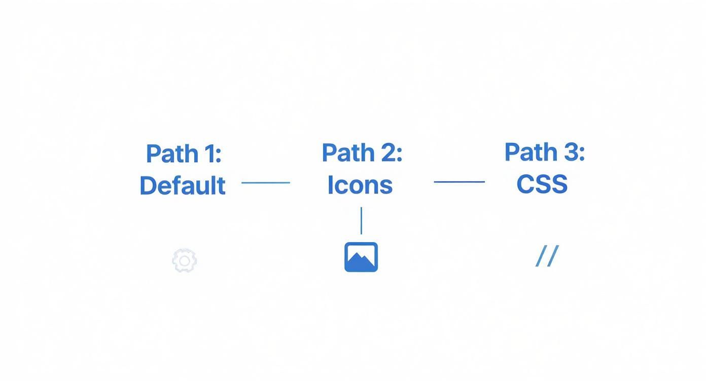
As you can see, the default options are the fastest way to get a button on your popup. Icon libraries give you more variety. But if you want a completely unique, branded design, custom CSS is where the real magic happens.
Replacing the Default Icon
The standard "X" icon is a classic for a reason—everyone knows what it does. But let's be honest, it doesn't always vibe with a site's aesthetic. Swapping it out for a custom icon is a simple but powerful way to elevate your popup's design.
You could pull in an icon from a library like Font Awesome or, even better, upload a custom-designed SVG. I’m a huge fan of using SVGs here. They're incredibly lightweight and scale perfectly on any screen without losing quality, so your button looks sharp on a tiny phone screen and a massive desktop monitor.
For example, you could replace the "X" with a sleek arrow, a house icon to take users back to the homepage, or even a simple minus sign for a more minimalist feel.
Pro Tip: If you're using a custom icon or image, always set the
cursorproperty topointerin your CSS. It’s a tiny detail, but that little hand icon is a crucial visual cue. It immediately tells users, "Hey, you can click this," which makes a big difference in usability.
Applying Custom CSS for Unique Effects
Now for the fun part. By targeting the specific CSS class of your close button (usually something like .divi-area-close-button), you can apply styles that aren’t available in the Divi Builder.
Here are a few ideas to get you started:
- Circular Shape: Tired of squares? A single line of code—
border-radius: 50%;—will transform your button into a perfect circle. - Hover Transitions: Add a
transitionproperty to the button. This lets you smoothly change its background color, rotate the icon, or scale it up a bit on hover. It’s a great way to add a subtle, interactive feel. - Pulse Animation: You can create a gentle pulse effect using CSS keyframes. This can draw just enough attention to the close button without being distracting, guiding users who are looking for a way out.
Let's walk through a quick example. Say you want your popup close button to rotate 90 degrees and fade from a transparent background to a soft gray when someone hovers over it.
Here’s the CSS to make that happen:
/* Target the Divi Areas Pro close button */
.divi-area-close-button {
transition: transform 0.3s ease, background-color 0.3s ease;
}
.divi-area-close-button:hover {
transform: rotate(90deg);
background-color: #f0f0f0;
}
This simple snippet adds a layer of polish that makes the user experience feel more dynamic and professional. Don't be afraid to experiment with different CSS properties. You can create a close button that not only works perfectly but also genuinely enhances your site's overall design.
Controlling Popup Close Behaviors
A truly effective popup close button is more than just an exit; it's a strategic part of the user journey. Once you move past simple styling, you get into the world of intelligent user interaction—controlling how and when users can close your popups to guide their experience and make sure your message is seen.
Think about it: you don't always want a popup to disappear with a single, accidental click. Sometimes, you need the user to pause and read a critical announcement. Other times, you want to provide multiple, convenient ways to dismiss a less urgent offer. This is where a basic UI element becomes a powerful engagement tool.
Creating a Delayed Close Button
One of the most useful tricks in the book is a delayed close button. Imagine you have a welcome popup with a short video or an important first-time offer. If that little "X" is visible immediately, many users will click it out of pure habit before they even process what's on the screen.
By delaying the button's appearance for a few seconds—say, 3-5 seconds—you create a small window for your message to land. This simple tactic ensures your content gets the attention it deserves without feeling like you're trapping the user. It’s all about striking a balance between getting your point across and respecting their control.
Alternative Closing Methods for Accessibility
Relying solely on a clickable "X" isn't always enough. Good UX and accessibility demand more. Providing multiple ways to close a popup creates a more intuitive and less restrictive environment for everyone.
Here are a few essential alternatives you can configure in plugins like Divi Areas Pro:
- Escape Key Close: This is a web standard, plain and simple. Power users and those who navigate with keyboards expect the
Esckey to dismiss modals and popups. Enabling this is a quick win for accessibility. - Overlay Click Close: Allowing users to click the semi-transparent background (the overlay) to close the popup is another common and intuitive behavior. It provides a massive, easy-to-hit target.
Of course, you have to be strategic. For a critical "Terms and Conditions" popup, you might want to disable the overlay click to ensure the user actively engages with the content or the designated close button.
Forcing a user to interact with a specific button is a powerful choice. Use it sparingly for must-see information, but default to offering flexible closing options for standard marketing popups to avoid user frustration.
Before we dive into custom actions, it helps to see how these different closing methods stack up. Each one serves a different purpose, impacting both the user's experience and your conversion goals.
Popup Close Method Comparison
| Close Method | Best For | Consideration |
|---|---|---|
| Standard "X" Button | Universal clarity; the most recognized method for closing any UI element. | Can be missed on mobile devices if too small. Placement is key. |
| Delayed "X" Button | Ensuring a key message or video is seen before the user can dismiss it. | Can frustrate users if the delay is too long. Best for short delays (3-5 seconds). |
| Escape Key | Accessibility and keyboard navigation; a must-have for power users. | Non-visual, so it's a secondary method. Not all users know about it. |
| Overlay Click | Providing a large, easy-to-hit close target, especially on mobile. | May lead to accidental closures. Disable for critical notices. |
| "No, Thanks" Link/Button | Explicitly confirming a user's decision, often used in sales funnels. | Requires more space than an "X" but can be used for custom close actions. |
Ultimately, the best approach often involves a combination of these methods—like an "X" button paired with Escape key and overlay click support—to create a flexible and user-friendly experience.
Custom Close Actions and Scenarios
Your popup close button doesn't just have to close the popup. With the right tools, it can trigger custom actions, opening up a world of strategic possibilities.
Think about this: research shows that mobile popups have a 42.04% higher engagement rate than desktop versions. Formats like modal popups, which feature clear close buttons, achieve a solid signup rate of 2.95%. This data highlights the delicate balance between visibility and UX—a well-behaved close button often outperforms an aggressive, full-screen takeover. You can explore more data on popup performance to fine-tune your own strategies.
With that in mind, you can program your close button to perform specific tasks:
- Redirect on Close: Instead of just closing, you can send the user to a different page. This is perfect for "No, thanks" options on a sales popup, where you could redirect them to a lower-priced offer or a blog post that explains the product's value in more detail.
- Prevent Closing: In some rare cases, you might want to prevent the popup from closing entirely. This is an extreme measure but can be necessary for things like a mandatory age verification gate where proceeding is the only option.
By thoughtfully configuring these advanced behaviors, your popup close button evolves from a simple exit into a dynamic part of your website's user flow.
Going Deeper with Hooks and Custom Close Triggers
While the Divi Builder gives you a ton of control right out of the box, developers and power users can tap into a whole other level of functionality with PHP hooks and JavaScript events. These are the tools that let you step outside the visual interface and take programmatic control over your popups, especially the popup close button. This is where you can start crafting some truly dynamic and slick user experiences.
Instead of being stuck with the default close button, you can turn literally any element on your page into a custom close trigger. A simple text link, an image, or another button tucked inside your Divi layout can be tasked with closing a popup. This is incredibly handy for creating interactive flows where a user's action seamlessly guides them to the next step.
Creating Custom Close Triggers
Let's imagine a real-world scenario: you have a "Terms and Conditions" popup. Inside, there's a link that says, "I've read and agree to the terms." In this case, a separate "X" button feels clunky. What you really want is for that specific link to close the popup and maybe even trigger another action. That's totally achievable with a simple trigger.
Plugins like Divi Areas Pro often provide a specific CSS class, like divi-area-close, that you can just drop onto any Divi module. By adding this class to a button, text module, or image, you instantly make it a working close trigger. No code required. It's a surprisingly elegant way to build multi-step guides or confirmation modals where closing the popup is part of the main call-to-action.
This approach gives you ultimate flexibility. You can design a beautiful, on-brand button in the Divi Builder, add the trigger class, and it just works—perfectly matching your site's aesthetic.
This method is a game-changer for building more intuitive user interfaces. For a detailed guide on getting this set up, you can dig into the specifics of JavaScript actions for Divi Areas close buttons and see how to apply them in your own projects.
Closing Popups Programmatically with Hooks and Events
The real power for developers, though, is in programmatic control. Picture this: a user successfully submits a contact form inside a popup. You don't want to make them manually hunt for the close button afterward. The best experience is to have the popup close automatically right after the form is sent.
This is exactly what JavaScript events and PHP hooks are for. Divi Areas Pro, for instance, broadcasts JS events like divi-areas-pro/show and divi-areas-pro/hide. You can listen for these events and fire off your own custom scripts.
So, for that form submission, you could hook into the form's "success" event and then programmatically call the popup's close function. This creates a seamless flow: the user fills out the form, clicks submit, sees a success message, and the popup just gracefully fades away. It removes friction and gives the user clear, positive feedback, making the whole interaction feel polished.
Troubleshooting Common Close Button Issues
Even with the best tools, you're bound to run into a few hiccups with your popup close button. The good news is that most issues I see have surprisingly simple fixes. From buttons that won't click to display problems on mobile, a few common culprits are almost always to blame.
More often than not, the problem isn't the button module itself but how it's interacting with other elements on your page. Think of it like a stacking issue, where an invisible layer is sitting on top, blocking your clicks.
Why Is My Popup Close Button Not Working?
A non-clickable close button is probably the most frequent support question I come across. This is almost always caused by a CSS z-index conflict. Something else on your page, like a sticky header or another plugin's widget, has a higher z-index value, creating an invisible layer right over your button. It's there, but you just can't "reach" it.
To fix this, you'll need to inspect the popup and its button using your browser's developer tools. Look for the conflicting element and either lower its z-index or, more simply, increase the z-index of your popup container. I've also seen this happen because of a JavaScript error from a conflicting plugin, so always check the browser console for any red flags.
A quick way to test for a
z-indexissue is to temporarily add a ridiculously high value (likez-index: 99999;) to your popup's main container via CSS. If the button suddenly works, you've found your culprit.
How to Make a Popup Close Button Mobile-Friendly
A button that works perfectly on a desktop can be a usability nightmare on mobile. Small screens demand a different approach to make sure that "X" is easy to see and, more importantly, easy to tap.
- Increase the Tap Target: Don't just make the icon bigger; add generous padding around it. This creates a larger, invisible clickable area, which makes a world of difference for users and reduces the chance of them accidentally tapping something else.
- Stick with Proper Placement: Keep it in the top-right corner. It's a universal convention, and mobile users are conditioned to look there first. Avoid placing it too close to the edge where it might be hard to reach or interfere with the phone's own UI elements.
- Test on a Real Device: Emulators are great for a quick check, but nothing beats testing on an actual phone. This is the only way you'll spot real-world issues like the button being hidden by a sticky header or other mobile-specific elements.
Using a Custom Image for the Close Button
Absolutely. Instead of a standard icon, you can easily use a custom-designed PNG or SVG that perfectly matches your brand's aesthetic. All you need to do is add an Image module inside your popup layout in the Divi Builder.
To make it functional, just assign it the specific CSS class your popup plugin uses for the close trigger. For Divi Areas Pro, this is often a class like divi-area-close. This one simple step transforms your static image into a fully functional popup close button. Just remember to add a touch of CSS (cursor: pointer;) to give users that essential visual feedback that the image is, in fact, clickable.
Ready to build powerful, user-friendly popups without the headaches? With Divimode, you get the tools and expert guidance to create engaging experiences in Divi.
