 Alex Martin
Effective mobile menu design is all about creating a navigation experience that just feels right on a small screen. It needs to be intuitive, easy to access, and guide people through your site without them having to think too much. This is about more than just slapping a hamburger icon in the corner; it’s a make-or-break piece of your user experience and, ultimately, your conversion rates.
Why Mobile Menu Design Is Your Silent Salesperson
Think of your website's mobile menu as the front door to your digital shop. If that door is hidden, hard to open, or leads into a messy, confusing lobby, potential customers will just turn around and leave. But a great mobile menu? That acts like a silent salesperson, effortlessly showing visitors exactly where they need to go.
It’s the difference between walking into a chaotic, disorganized store and one that’s perfectly laid out with clear signs and aisles. One experience is frustrating, the other is a pleasure. A poorly designed mobile menu creates that same frustrating impression, and it’s no surprise that 57% of users won't recommend a business with a clunky mobile site.
The Direct Impact on Business Goals
A truly intuitive menu has a direct, measurable effect on your bottom line. When people can easily find your products, services, or contact info, they stick around, they engage, and they're far more likely to convert.
This isn't just a design theory; we see it play out in the real world every day. Look at the restaurant industry, where mobile ordering has exploded. Projections show mobile devices will handle over 70% of fast-casual food orders by 2025. That’s a massive number, and it hinges entirely on menus that make ordering quick and painless. If you want to dive deeper, you can explore more about mobile UX for on-the-go diners to see just how critical this is.
A well-designed mobile menu is more than a navigation tool; it is a core business asset that enhances user experience, builds trust, and directly drives engagement and conversions.
The link between your menu's quality and your business's success is undeniable. A clean, logical design reduces cognitive load—that's the mental effort someone has to put in to use your site. Less effort means a happier, more engaged user. A confusing menu does the exact opposite: it ramps up frustration, hurts your brand's reputation, and actively sends potential customers packing.
To really bring this home, let's look at the clear-cut outcomes of good versus bad mobile menu design.
Business Impact of Mobile Menu Quality
The table below breaks down the starkly different results you can expect from an effective mobile menu compared to an ineffective one.
| Business Metric | Effective Design Outcome | Ineffective Design Outcome |
|---|---|---|
| User Retention | Visitors easily explore multiple pages, increasing session duration. | Visitors leave after one page, resulting in a high bounce rate. |
| Conversion Rate | A clear path to "Buy Now" or "Contact Us" boosts sales and leads. | Confusing navigation causes users to abandon carts and forms. |
| Brand Perception | An effortless experience builds trust and portrays professionalism. | A frustrating experience signals a lack of care and damages credibility. |
| Accessibility | All users, including those with disabilities, can navigate the site. | The site becomes unusable for a portion of your audience, limiting reach. |
As you can see, the stakes are high. Investing the time to get your mobile menu right isn't just a "nice-to-have"—it's a fundamental part of building a successful online presence.
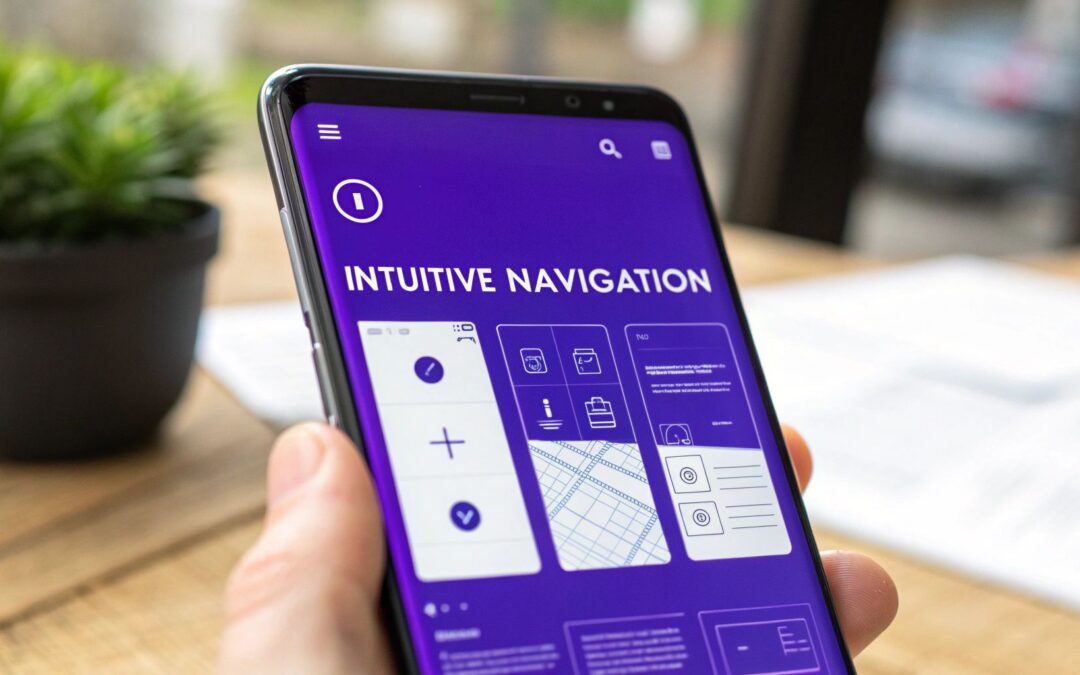
Choosing the Right Mobile Menu Pattern
Picking the right mobile menu pattern is a lot like choosing the right tool for a job. You wouldn't use a sledgehammer to hang a picture frame, right? In the same way, the navigation pattern you select needs to fit your website's size, content, and what you want your visitors to do. Get it right, and people will glide through your site. Get it wrong, and even the most beautifully designed site can feel frustrating and clunky.
This decision is a cornerstone of your mobile design process. It’s about more than just looks; it’s about making sure your visitors can find what they need without a second thought. Let's break down the most common patterns and figure out where each one really shines.
This infographic nails a key point: responsive menus, often symbolized by the universally recognized hamburger icon, are fundamental to modern mobile design.
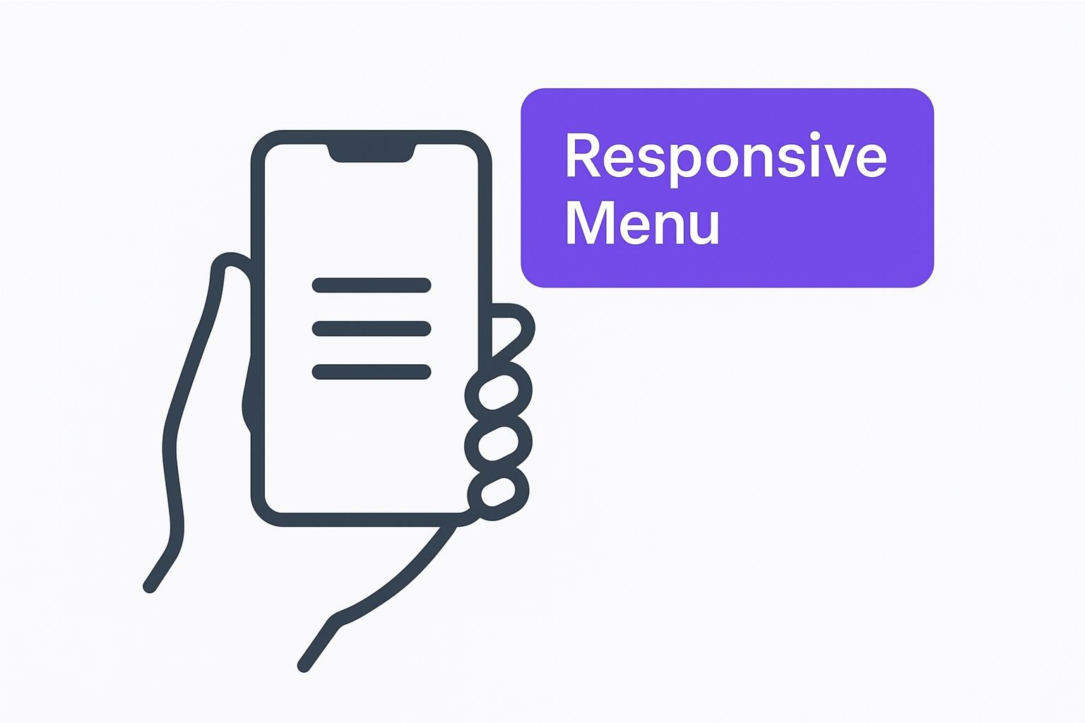
That simple icon is a promise to the user—a promise that a clean, organized navigation experience is just a tap away.
The Hamburger Menu: A Space-Saving Toolbox
You've seen it everywhere. The hamburger menu, with its iconic three horizontal lines, is the most common pattern out there. Think of it as a compact toolbox for your website. It keeps all your navigational links neatly tucked away, leaving the screen clean and focused on your content.
This minimalist approach is fantastic for content-heavy sites where you want to eliminate as much visual clutter as possible. But its greatest strength can also be its biggest weakness.
Pros:
- Maximizes Screen Real Estate: By hiding the navigation, it puts your page content front and center.
- Highly Recognizable: Almost every mobile user on the planet knows what those three lines mean.
- Scalable: It can easily handle a long list of menu items without looking messy.
Cons:
- Reduced Discoverability: "Out of sight, out of mind" is a real risk here. Users might not explore your site as thoroughly if the main navigation is hidden.
- Requires an Extra Tap: There's always a bit of friction since accessing the menu requires an additional action from the user.
The Tab Bar: A Car Dashboard
Next up is the tab bar, which is a navigation bar that stays fixed, usually at the bottom of the screen. I like to think of it as a car's dashboard—it gives you instant, one-tap access to the most vital controls like your speedometer, fuel gauge, and music.
This pattern is a perfect fit for apps and task-focused websites where users frequently jump between a few core sections. Think of a social media app with its "Home," "Search," and "Profile" tabs.
By keeping the primary navigation constantly in view, the tab bar makes it incredibly easy for users to move between the most important parts of your site. It's a powerhouse for platforms built around user engagement.
The catch? It has limited space. You can realistically fit only three to five items before it gets cramped and unusable. This makes it a poor choice for sites with a lot of different pages and complex navigation.
The Mega Menu: A Department Store Directory
For huge websites overflowing with content—like a massive e-commerce store or a sprawling news portal—the mega menu is your best bet. Picture it as the directory at a giant department store. It doesn't just list the floors; it shows you all the key departments on each floor, all at once.
Mega menus expand to show a multi-column layout of links, often grouped by category and sometimes spiced up with icons or images. This structure lets users scan a ton of options quickly and jump straight to the deeper pages they're looking for.
It's no surprise they're a go-to for complex sites. In fact, research shows that 61.5% of web designers believe poor navigation is the #1 reason people bounce from a website, which really underscores the power of a clear, comprehensive menu.
If you're using Divi and have a content-heavy site to build, you're in luck. This powerful pattern is well within your reach. For a complete step-by-step guide, check out our tutorial on how to create a mega menu.
Applying Core UX Principles for Intuitive Navigation
A truly great mobile menu doesn't feel like a tool you have to operate. It feels like an extension of your own thoughts, almost predicting what you need before you've fully formed the question. This isn't magic—it's just solid user experience (UX) design, built on principles rooted in how our brains work. When you understand how people actually think and interact with their screens, you can build navigation that feels completely effortless.
The real goal here is to create a menu that doesn't make people think. Every single element, from the words you choose to the size of your buttons, has to work together to create a smooth, obvious path through your website. Let’s get into the nitty-gritty of what turns a basic menu into a high-performing navigation system.
Reduce Mental Effort with Low Cognitive Load
Ever tried to assemble furniture with a phonebook-sized manual full of confusing diagrams? Compare that to getting a simple, one-page instruction sheet. The first one is a headache that requires a ton of mental energy. The second is a breeze. That mental energy is what we call cognitive load, and your number one job as a designer is to keep it as low as humanly possible.
A cluttered menu, stuffed with too many options, vague labels, or a confusing layout, forces your visitor to stop, squint, and try to figure out what they’re even looking at. That friction is a conversion killer. It dramatically increases the chances they’ll just give up and leave. A streamlined menu, on the other hand, lets them find what they need almost instantly, creating a positive experience that keeps them moving forward.
The best mobile menus are practically invisible. They work so well that users don't even notice them; they just find what they need and move on. That’s the true sign of low cognitive load.
Every design choice you make should be laser-focused on reducing this mental workload. Group similar items together, use icons people already recognize, and make sure the path from point A to point B is as short and logical as it can possibly be.
Guide Choices with Hick's Law and Visual Hierarchy
Why does a menu with five options feel manageable, while one with fifteen feels like a pop quiz? The answer is a classic UX principle called Hick's Law. It states that the more choices you give someone, the longer it takes them to make a decision.
This is exactly why simplifying your navigation is so incredibly powerful. By limiting your main menu items to only the most critical categories (the sweet spot is usually between 4-7), you drastically cut down on that decision time. The user's journey becomes faster, smoother, and way less stressful.
Of course, limiting options is only half the battle. You also need to guide their eyes with a strong visual hierarchy. Think of it like using headlines, subheadings, and bold text in an article—it tells the reader what's most important and where to look first. In a menu, you can achieve this through:
- Font Size: Making your top-level items noticeably larger than the sub-menu items under them.
- Color and Contrast: Using a bold, standout color for your main Call-to-Action (CTA) button so it can't be missed.
- Whitespace: Giving important elements plenty of space around them so they can breathe and draw attention.
This hierarchy needs to respect how people naturally scan screens. We know from research that users don't read menus line by line; their eyes tend to dart around in predictable patterns. In fact, one statistical analysis found that while people spend an average of 109 seconds reading a menu, their eyes often follow a 'Z' shape, starting near the top-right. You can learn more about how menu layouts influence user choice and use these kinds of insights to your advantage.
Create Clarity with Practical Design Rules
Beyond the big-picture theories, a few non-negotiable, practical rules are what really make a mobile menu work. Getting these small details right has a massive impact on how usable your site feels.
1. Use Descriptive and Action-Oriented Labels
Clarity is everything. Your labels need to be crystal clear and instantly understandable to a first-time visitor. Ditch the corporate jargon and vague terms like "Resources" or "Solutions." Nobody knows what those mean. Instead, use simple, direct language that tells people exactly where they're going.
- Good: "Contact Us" vs. Bad: "Contact"
- Good: "View Case Studies" vs. Bad: "Insights"
- Good: "Shop All Products" vs. Bad: "Products"
2. Design for Touch with Generous Targets
Remember, fingers aren't nearly as precise as a mouse cursor. One of the most common frustrations on mobile is trying to tap a tiny link or button that's sandwiched between two others. You have to make sure every interactive element has a generous touch target size. Apple's official recommendation is a minimum of 44×44 pixels. This simple tweak prevents mis-taps and makes your navigation feel forgiving and effortless to use.
3. Provide Immediate Visual Feedback
When a user taps a button, they need instant confirmation that the website registered their action. This visual feedback can be a subtle change in the button's color, a quick animation, or the immediate slide-in of the next screen. It’s a small detail, but it reassures the user that the interface is alive and responding, which builds trust and confidence in your entire website.
Building Your Custom Mobile Menu with Divi
Alright, enough with the theory. It's time to roll up our sleeves and get our hands dirty. This is where we jump from design principles into the practical, real-world process of actually building a custom mobile menu from scratch using the Divi Theme Builder in WordPress.
This isn't just a step-by-step-click-here guide. My goal is to show you the why behind each action. By the time we're done, you'll be able to confidently build a clean, professional mobile menu that’s perfectly suited for your own site.
Accessing the Divi Theme Builder
Our journey starts in the Divi Theme Builder. Think of this as the command center for your entire site's structure. It's where you create global templates, like a header that appears everywhere, or assign custom designs to specific pages. This is way more powerful than tweaking headers one page at a time.
First, head to your WordPress dashboard. On the left-hand sidebar, find Divi and then click on Theme Builder. This is your mission control for all global elements.
The Theme Builder gives you a visual map of your site’s layout—header, body, and footer templates. It's a clear overview of what's running where.

From here, you can either edit an existing global header or, what we'll be doing, click "Add Global Header" and then "Build Global Header" to start fresh.
Designing the Mobile Header Layout
Once you're in the builder, you'll see the familiar Divi interface. The most important thing to remember here is to think mobile-first. Even though we'll make it look good on all screens, our primary focus is nailing that mobile experience from the get-go.
Let's start by adding a new section and then a row. A two-column row is a classic, effective layout for a mobile header. It's balanced, clean, and just works.
- Column 1 (The Logo): In the left column, pop in an Image module and upload your site's logo. This is standard practice and instantly orients your visitors.
- Column 2 (The Hamburger Icon): In the right column, add Divi's Menu module. This is the workhorse that will transform into our hamburger icon on mobile.
After you've added the Menu module, you'll need to tell it which WordPress menu to use. Then, the fun begins in the Design tab. This is where you can style everything from text colors to the background. Critically, this is also where you'll find the controls to make sure it collapses into a hamburger icon on smaller screens.
The Divi Menu module is already responsive right out of the box. It’s smart enough to switch from a full desktop menu to a mobile hamburger icon automatically. Your job is to style it so it looks like it belongs on your site and is easy to spot.
If you want to get fancier with your interactions, like creating a slick full-screen overlay, you can dive into more advanced tutorials. This guide on how to create a responsive Divi popup menu is a great next step for taking your menu to another level.
Configuring the Menu Behavior and Style
With the basic structure in place, it's time to fine-tune the details. We need to polish the look and feel of both the hamburger icon itself and the menu that slides into view when someone taps it.
First, let's focus on the icon. In the Menu module's design settings, find the "Icons" section. You can change the color of the hamburger icon here. Make sure it has strong contrast against your header background. A washed-out, hard-to-see icon is a huge usability mistake. Make it pop!
Next up is the dropdown menu that appears on tap. You'll find a whole host of options for it:
- Dropdown Menu Background Color: Pick something that aligns with your brand.
- Dropdown Menu Text Color: Just as important, make sure the text is crystal clear against the background you just chose.
- Active Link Color: Give users a visual cue of where they are on your site by setting a distinct color for the current page's link.
Finally, always design for touch. In the Sizing options, add some padding to your menu links. This increases their touch target size, making them way easier to tap with a thumb and avoiding those frustrating "fat-finger" errors. Apple’s human interface guidelines suggest a minimum target size of 44×44 pixels, which is a great rule of thumb.
Once you're happy, save your work and—this is crucial—test it on an actual phone. It's the only way to be 100% sure everything looks and feels exactly how you planned.
Adding Advanced Features to Your Mobile Menu

So, you’ve built a solid, working mobile menu. That’s a great start. But now it’s time to take it from a simple navigation tool and turn it into an intelligent, dynamic part of your user experience. This is what separates the good sites from the great ones—those extra layers of convenience that make your site feel polished and genuinely user-focused.
Think of a standard menu like a basic paper map; it gets the job done by showing you the main roads. An advanced menu, on the other hand, is like a full-featured GPS. It gives you live traffic updates, points of interest, and personalized routes. It’s just far more helpful.
Let's look at how you can implement these kinds of powerful upgrades right inside Divi.
Enhance Clarity with Menu Icons
Sure, text labels are necessary, but let's be real: our brains are wired for visuals. In fact, the human brain processes images 60,000 times faster than text. By adding simple, recognizable icons next to your menu items, you give users an instant visual shortcut. This small tweak does wonders for reducing cognitive load and speeding up navigation.
For example, a small house icon next to "Home" or a cart icon next to "Shop" makes these key destinations instantly clear. In Divi, you can easily add icons right in the Menu module's settings or get fancy with custom CSS for more fine-tuned control.
Organize Complexity with Multi-Level Menus
If your website has a lot of pages and a deep structure, a single, flat list of links is a recipe for overwhelm. This is exactly where multi-level menus (or sub-menus) become your best friend. They let you neatly tuck away secondary pages under their main parent categories, keeping things clean.
This approach gives you a tidy, organized top-level menu while ensuring every page is still accessible. A well-designed multi-level menu uses clear visual cues, like a chevron or a plus icon, to signal to users that a tap will reveal more options. It’s all about preventing clutter and making even a massive site architecture feel manageable on a small screen.
A well-structured multi-level menu transforms a long, intimidating list into a tidy, hierarchical system. It respects the user's attention by showing them only what's relevant at each stage of their journey.
Create a Smarter Menu with Conditional Logic
Why should every visitor see the exact same menu? With conditional logic, you can display different menu items based on specific criteria, like whether a user is logged in or which page they’re currently viewing. This makes the whole navigation experience feel more personal and relevant.
An e-commerce site is a perfect use case for this. You could use conditional logic to:
- Show a "My Account" link only to users who are logged in.
- Hide the "Login" link for users who are already authenticated.
- Display a "Logout" button exclusively to logged-in visitors.
This simple bit of intelligence cleans up the menu by cutting out irrelevant options and tailoring the experience directly to the user's current status. With a plugin like Divi Areas Pro, you can set up these kinds of conditions without ever having to write code.
To give you a better idea of what’s possible, here’s a quick rundown of some popular advanced features you can implement in Divi.
Advanced Mobile Menu Features in Divi
This table is a quick-reference guide for some of the most common customizations you might want to add to your mobile menu using the Divi Theme Builder and related tools.
| Feature | Implementation Overview | Best For |
|---|---|---|
| Menu Icons | Use Divi’s built-in icon options in the Menu module or add them with custom CSS for more control. | Improving scannability and quick recognition of common links like "Home," "Shop," or "Contact." |
| Multi-Level Menus | Structure your menu in WordPress (Appearance > Menus) with parent and child items. Divi will render them as dropdowns. |
Sites with deep content structures, such as large e-commerce stores, blogs with many categories, or corporate sites. |
| Conditional Logic | Use a plugin like Divi Areas Pro to set display rules for menu items based on user status (logged-in/out), page, etc. | Membership sites, online stores, and any site where the user journey changes based on their authentication status. |
| Embedded CTA | Add a custom link or button as the last item in your menu and style it differently using CSS or Divi’s button module. | Driving conversions for key actions like "Get a Quote," "Request a Demo," or "Sign Up" by making them highly visible. |
These features take your menu from a simple list of links to a powerful tool that guides users and supports your business goals.
Drive Conversions with an Embedded CTA
Your mobile menu is one of the most-viewed elements on your entire site, which makes it prime real estate for a high-impact Call-to-Action (CTA). Instead of just listing pages, why not embed a standout button directly inside the menu?
This transforms your navigation from a passive directory into an active conversion machine. A brightly colored "Get a Quote" or "Book a Demo" button placed at the top or bottom of the menu ensures it gets seen every single time a user opens their navigation, dramatically boosting its chances of getting a click.
Common Mobile Menu Mistakes to Avoid
Building a great mobile menu isn't just about what you include; it's also about what you leave out. I've seen some common design blunders that can single-handedly tank a website's user experience, sending frustrated visitors straight to a competitor. Once you know what these pitfalls are, you can sidestep them entirely.
Think of it like being a chef. Knowing which ingredients clash is just as important as knowing which ones create a masterpiece. One bad ingredient can ruin the whole dish, and one poor design choice can derail a user's entire journey on your site.
Hiding Navigation Behind Unclear Icons
The hamburger icon—those three simple horizontal lines—is universally understood. It’s the global symbol for "menu," plain and simple. Yet, some designers can't resist the urge to get creative, swapping it out for abstract shapes or branded icons. This is almost always a mistake. When a user can't instantly figure out where your menu is, they just feel lost and annoyed.
The Fix: Just stick with the standard hamburger icon. Its immediate recognizability eliminates all the guesswork and ensures every visitor knows exactly where to tap. When it comes to core navigation, clarity beats cleverness every single time.
Using Vague or Jargon-Filled Labels
Menu labels like "Resources," "Solutions," or the dreaded "More" are just frustratingly vague. They force people to tap and explore just to figure out what's hiding behind them, which adds unnecessary friction and mental effort. Your navigation labels need to be crystal clear, telling the user exactly what they'll find on the other side of that tap.
"Solutions," for example, tells a user absolutely nothing. Is it a list of product features? Case studies? Blog articles? That ambiguity makes people hesitate, and hesitation leads to confusion and abandonment.
Your menu isn't the place for marketing fluff. It’s a functional tool for direction. Every label should be a clear, concise signpost that helps users get where they want to go with zero confusion.
Creating Overly Long Scrolling Menus
Have you ever opened a mobile menu only to be hit with a wall of text—a seemingly endless list of two dozen links? This is a classic symptom of poor information architecture. A marathon-scrolling menu is overwhelming and makes it nearly impossible to scan for important items. This is a real phenomenon known as choice paralysis.
The Fix: Group related items into logical sub-categories. If you have a bunch of products, put them under a single "Products" or "Shop" item that expands to show the different categories. A well-organized, multi-level menu is so much more effective than a single, intimidating list. This is especially true when you're managing lots of options, like those you might display using some of the best WordPress popup plugins for targeted offers.
Designing Tiny Touch Targets
Here's a simple truth: fingers are not as precise as mouse cursors. One of the most common and aggravating mobile usability issues is designing buttons and links that are too small or packed too closely together. It leads to mis-taps, frustration, and a clunky, unforgiving experience that makes people want to throw their phones.
The Fix: Give every interactive element in your menu a generous touch target. Apple’s own guidelines recommend a minimum tap area of 44×44 pixels. Don't forget to add plenty of padding around your links to give users' thumbs a forgiving target that's easy to hit, even when they're on the move.
Still Have Questions About Mobile Menus?
Alright, let's wrap this up by tackling some of the questions that almost always come up when you're deep in the weeds of mobile menu design. Think of this as a quick-fire round to clear up any lingering doubts and help you nail down those final details with confidence.
What’s the Best Icon for a Mobile Menu?
The three-line "hamburger" icon is king. It’s not just a trend; it's the undisputed, universally understood symbol for a menu. It can be tempting to get clever with a custom icon, but when it comes to navigation, clarity trumps creativity every time. Stick with the hamburger—your users will instantly know where to go, and that's the whole point.
How Many Items Should I Put in a Mobile Menu?
Try to stick to four to seven top-level items. This isn't an arbitrary number; it's grounded in solid UX principles like Hick's Law, which basically says that the more choices you give someone, the longer it takes them to decide. If you've got a lot more to show, start grouping related links into logical sub-categories. This keeps the main menu tidy and prevents that dreaded "analysis paralysis."
When you limit the choices, you make the user's decision faster and the entire experience smoother. It's one of the simplest yet most powerful things you can do to improve your mobile menu.
Should the Mobile Menu Go on the Left or Right?
Placing the menu icon on the top-right is the standard for a reason, making it the safest bet. It stays out of the way of the site logo, which usually lives on the left, and it's a natural thumb-reach for the majority of right-handed users. The most important thing here is to be consistent and put it right where people expect to find it.
Are Full-Screen Menus Better Than Slide-In Menus?
This really boils down to your brand's personality and the story you're telling. A full-screen overlay pulls the user into an immersive, focused state. It’s a great choice for minimalist sites or when you want to put a powerful call-to-action front and center. On the other hand, a slide-in menu is less of an interruption, letting the user keep an eye on the page content while they navigate.
Ready to build menus, popups, and fly-ins that don't just work, but actually captivate your audience? With Divimode, you can transform your Divi website into a high-performing, interactive experience. Learn more about Divi Areas Pro and unlock powerful design capabilities today.
More Articles You Will Like