 Alex Martin
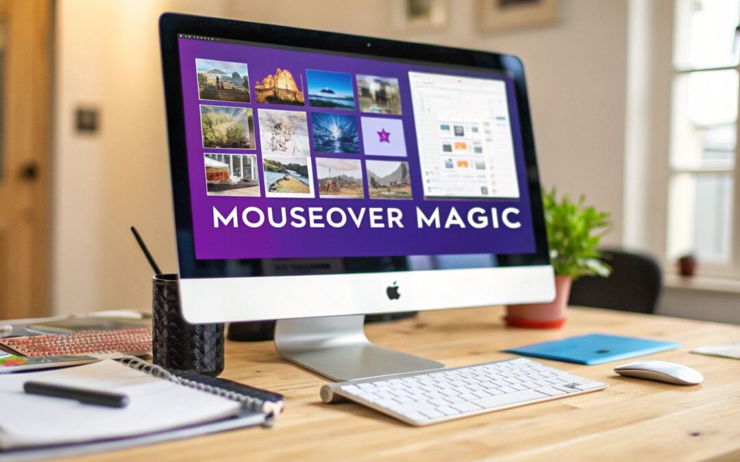
Adding an image on mouseover effect is one of those simple, yet surprisingly powerful, tricks you can pull to make a website feel more alive and interactive. The idea is basic: when a user moves their cursor over an image, it instantly swaps to a different one. No clicks needed, just pure visual feedback that enriches the whole experience.
Why Image Hover Effects Actually Matter
Let’s be honest, tiny interactive details often make the biggest difference. An 'image on mouseover' effect isn’t just a neat animation; it's a smart design choice. This one feature can genuinely improve how people use your site by offering instant feedback, cutting down on clicks, and guiding them more intuitively.
These effects turn a static page into something that feels responsive and dynamic. They’re a subtle signal to your visitor, telling them, "Hey, you can interact with this," which naturally encourages them to explore more.
A Smoother Ride for Your Visitors
Imagine an e-commerce store where hovering over a product shows it in a real-world setting. Or a team page where a professional headshot flips to a more relaxed, candid photo, adding a much-needed human touch. These aren’t just for looks—they serve a real purpose by packing more information into the same space. It just makes your site feel more modern and efficient.
The real win here is simple: hover effects give users more information with zero clicks. You’re respecting their time and making their journey smoother.
The Power of a Visual Nudge
This concept isn't some new fad; its effectiveness has been clear for a long, long time. One of the earliest studies on this from Microsoft Research discovered that people found information much faster using image thumbnails than with text alone. On a second visit, the time it took to find things with visual cues was cut nearly in half, dropping from 20 seconds to just 10.
Ultimately, adding an image-on-mouseover effect is a subtle change that delivers a real impact on usability. And if you’re looking for something truly next-level, consulting with specialized hover effect design agencies can open the door to some seriously impressive solutions.
Your Essential Toolkit for Divi Hover Effects
Before we get into the fun stuff, let's talk about setup. A little prep work now saves a ton of headaches later. Think of it as your pre-flight check to make sure building your image on mouseover effects goes off without a hitch.
First things first, you'll obviously need an active Divi theme. But more importantly—and I can't stress this enough—you absolutely should be using a Divi child theme. This isn't just a friendly suggestion; it's the professional standard for keeping your custom code safe. Without one, any brilliant CSS or scripts you add could vanish the next time Divi pushes an update.
Your Asset Checklist
With the technical foundation sorted, it's time to gather your visuals. Getting your images right is the secret to a smooth, professional-looking hover transition.
The most critical rule? Your initial and hover images must have the exact same dimensions. If the sizes are mismatched, you'll get that clunky, awkward jump when the effect triggers, which is a dead giveaway of an amateur build.
Here’s a quick rundown of what you need on hand:
- Active Divi Theme: The core of your entire project.
- Divi Child Theme: Non-negotiable for protecting your custom work.
- Optimized Images: Make sure both your default and hover images are compressed and ready for the web.
- Matching Dimensions: Double-check that both images have the same pixel height and width.
Getting your assets and workspace in order right now sets the stage for a frustration-free creative process. When you nail the fundamentals, you can focus on designing a killer effect instead of troubleshooting silly setup mistakes.
Building Hovers with Divi's Native Tools
If you're looking to create an impressive image on mouseover effect without touching a single line of code, your first stop should be Divi's own native tools. Many designers jump straight to custom CSS, but you'd be surprised how much power is already baked right into the module settings.
This built-in functionality is perfect for whipping up clean, effective hover interactions in minutes. You get to manage everything inside the familiar Divi Builder, which means no more jumping between files or second-guessing your CSS syntax. It’s an incredibly efficient way to add a polished layer of interactivity to your designs.
Mastering the Hover Tab
The real magic happens inside any module that handles images, like the standard Image module or my personal favorite, the versatile Blurb module. Just open up the module's settings and head over to the Design tab.
You'll notice that a lot of the options—like Background, Filters, or Box Shadow—have a tiny arrow icon next to them. This is the gateway to Divi's hover states.
Clicking that icon lets you toggle between the "default" and "hover" states. It’s a beautifully simple system that lets you set one style for the normal view and a completely different one that only appears on mouseover. For example, you can have a full-color image in the default state and apply a grayscale filter on hover with just two clicks.
The key takeaway here is that you don't need to be a developer to create professional hover animations. Divi's interface is designed to empower visual creators, turning complex interactions into simple toggle settings.
Real-World Example: A Portfolio Grid
Let's walk through a common scenario: building a portfolio grid. You want a clean grid of project images, but when a user hovers over one, you want to show a color overlay and some text.
Instead of swapping the entire image, we can just use an overlay. Here's how I'd tackle it with a Blurb module:
- Start with the Blurb: Add a Blurb module for each portfolio item. Set your main project image as the module's image and add your project title and a short description in the content fields.
- Set the Default State: In the Design tab, find the "Overlay" settings. For the default state, make sure the "Use Icon" toggle is off and the background color is fully transparent.
- Configure the Hover State: Now, click the hover icon next to the Overlay background color. Choose a semi-transparent color (like a dark blue at 75% opacity) and, if you like, enable an icon like a magnifying glass.
Just like that, you've created a dynamic, informative grid without writing any code. The text you added earlier will now appear beautifully over the color overlay when a user hovers.
For a deeper dive into more advanced techniques, you can find our full guide on how to create Divi hover effects here.
When you’ve pushed Divi’s built-in options to their limit and still want more, it’s time to roll up your sleeves and dive into custom CSS. This is where you trade pre-made settings for complete creative control. You can build an image on mouseover effect that’s not just a simple swap, but a fluid, engaging animation that perfectly captures your brand’s personality.
With custom CSS, you get to dictate every last detail. Want a super-fast transition? Done. A subtle rotation on hover? Easy. You can define the exact speed, angle, and softness of any effect, creating something truly bespoke instead of settling for a template.
Just imagine how a little interactivity can transform a standard product grid. A simple hover can reveal a different product angle, a lifestyle shot, or key details, turning a static page into a dynamic shopping experience.
This kind of immediate visual feedback is a small touch that makes a huge difference in user engagement, especially on e-commerce sites.
Understanding the CSS Building Blocks
Before you start pasting code, it’s helpful to know what you’re actually working with. A few core CSS properties are the foundation for almost every hover effect out there. Grasping these essentials means you can start tweaking snippets with confidence, not just blindly copying and pasting.
Think of these as your primary colors for web animation:
- Opacity: This one’s straightforward—it controls an element's transparency.
opacity: 0;makes it invisible, whileopacity: 1;makes it fully visible. It’s your go-to for creating slick fade-in and fade-out effects. - Transition: This is the magic ingredient. The
transitionproperty smooths out the change between an element’s default state and its hover state. Without it, your effects will be abrupt and jarring; with it, they become fluid and professional. - Transform: This powerhouse lets you mess with an element's shape, size, and position. You can use it to
scale()an image for a zoom effect,rotate()it for a cool tilt, ortranslate()it to shift its position slightly.
By combining these properties, you can create nearly any effect imaginable. For instance, a subtle zoom-in is just a
transform: scale(1.1);on hover, smoothed out with atransition: transform 0.3s ease;.
Quick Comparison: Built-in vs. Custom CSS
So, when should you use Divi's hover options versus writing your own CSS? It really depends on what you're trying to achieve. Here’s a quick breakdown to help you decide.
Comparing Divi Hover Methods
| Feature | Divi Built-in Options | Custom CSS |
|---|---|---|
| Ease of Use | Very easy; no code needed. Great for beginners. | Requires basic CSS knowledge. Steeper learning curve. |
| Speed | Extremely fast to implement directly in the module. | Slower; requires adding classes and writing/pasting code. |
| Customization | Limited to the options available in the Divi Builder. | Virtually unlimited. Your imagination is the only limit. |
| Performance | Generally well-optimized. | Can be highly performant, but poorly written code can lag. |
| Best For | Simple effects like color changes, basic zooms, or fades. | Unique, multi-step animations and brand-specific effects. |
Ultimately, Divi's built-in options are perfect for quick, standard effects. But for anything that needs to feel unique and polished, custom CSS is the way to go.
Putting CSS into Practice with Divi
Ready to try it out? The best place to add custom CSS in Divi is usually the Theme Customizer > Additional CSS field. For more complex sites, a child theme’s stylesheet is the professional choice. A good first step is to learn the ropes by applying different hover effects for images using custom CSS classes.
First things first, you need to give Divi a target. Open the module you want to animate, go to the Advanced tab, and find the CSS ID & Classes toggle. In the CSS Class field, add a unique name like custom-image-hover.
Now you can use that class to work your magic. Let's say you've set a second image as the background in the hover state within the Divi module settings. To make the original image fade out smoothly to reveal it, you could use this snippet:
.custom-image-hover .et_pb_module_inner {
transition: opacity 0.4s ease-in-out;
}
.custom-image-hover:hover .et_pb_module_inner {
opacity: 0;
}
This code targets the inner wrapper of your module, telling it to fade out gracefully when you hover, revealing the new background you set up. Simple, clean, and a great starting point for more advanced effects.
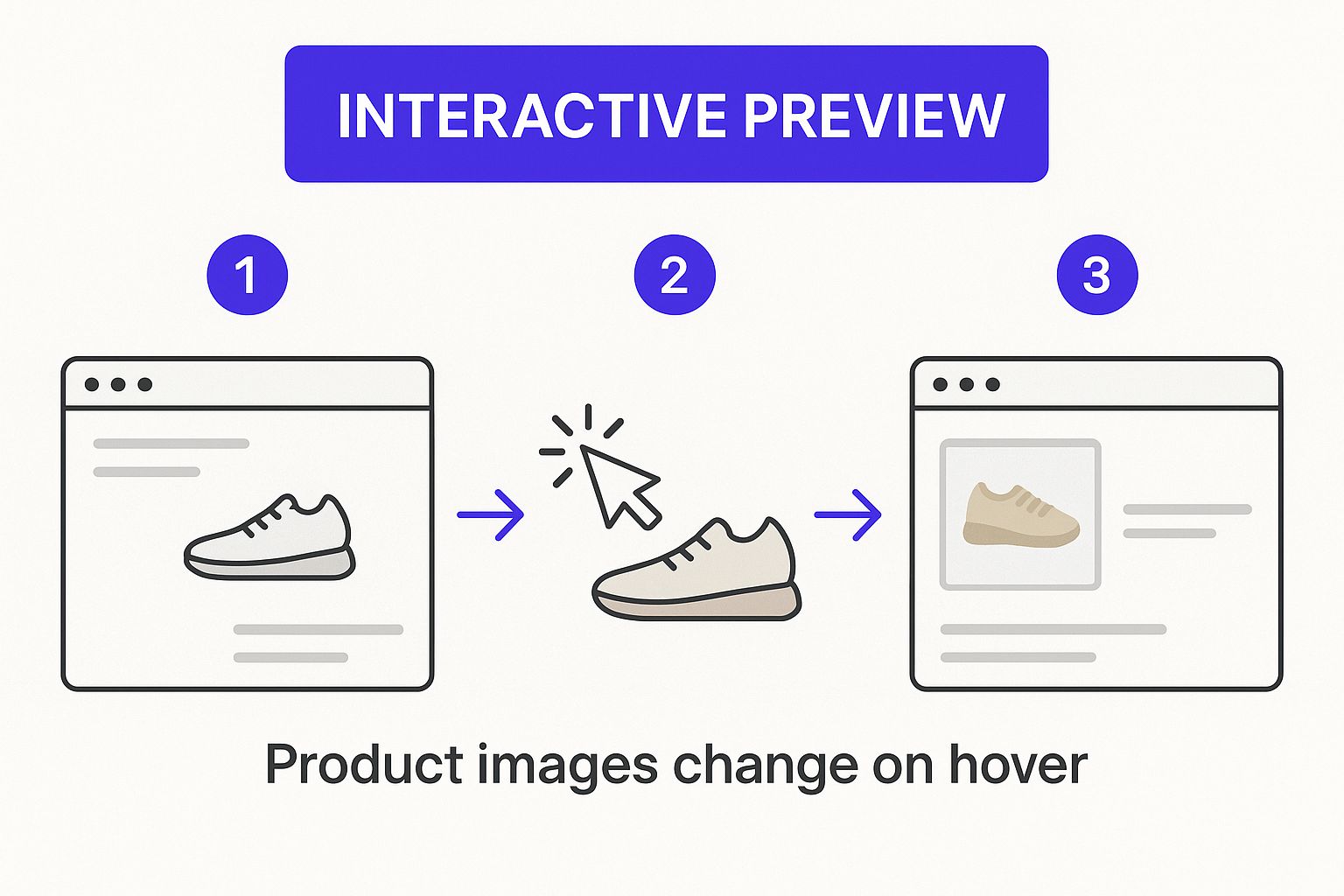
Advanced Image Previews for E-commerce
If you're running an online store, a simple image swap on mouseover just doesn't cut it anymore. Shoppers have come to expect a much richer, more informative experience right from the product grid, especially for things like apparel or electronics where the details matter. This is where you need to go beyond CSS and bring in a bit of JavaScript.
A small JavaScript or jQuery snippet, dropped into a Divi Code Module, can completely transform your product listings. Instead of showing just one alternate image, you can let users hover over a product and cycle through several different angles or variations. It’s the kind of seamless functionality you see on major retail sites, and it’s surprisingly achievable in Divi.
Elevating the Customer Experience
This kind of advanced image on mouseover effect isn't just a gimmick; it’s a direct response to how people shop now. In fact, e-commerce usability research shows that for many products, a single hover image is now seen as the bare minimum. Shoppers want to see the front, back, and a detail shot without ever leaving the category page. This helps them make faster, more confident decisions. You can see the full breakdown on this in Baymard Institute’s 2024 study.
Yes, this requires a bit of code, but the payoff is huge. You’re not just adding a cool effect—you’re actively reducing friction in the customer journey. You're giving them the visual information they need to turn from a casual browser into a buyer. This approach fits perfectly with modern online shopping trends, where speed and convenience are everything.
By letting customers instantly preview multiple product angles, you dramatically reduce the need for them to click through to individual product pages. This streamlines their path straight to the checkout.
So, how does it work in Divi? You'll first get your gallery of images ready. Then, you'll use a Code Module to hold a small script that listens for a mouseover on your product. When a user hovers, the script dynamically swaps the main image with others from a predefined list of URLs. It’s a powerful way to make your product listings do more of the heavy lifting.
Common Questions About Divi Image Hovers
Even when you follow a guide to the letter, a few questions always seem to pop up. When it comes to something like an image on mouseover effect, I've seen the same handful of concerns come up time and again. Let's tackle them head-on so you can build with total confidence.
Will These Hover Effects Slow Down My Site?
They can, but only if you let them. In my experience, the number one culprit is almost always image size. It's so easy to forget, but you absolutely have to compress both your starting and your hover images before uploading them. Get those file sizes as small as you can without turning them into a pixelated mess.
For pages that are loaded up with these hover effects, make sure you've got lazy loading enabled for anything below the fold. It's a lifesaver.
And a pro tip? Stick to CSS-based transitions whenever possible. They're far more lightweight and performant than roping in complex JavaScript just for a simple animation.
How Do I Make Hover Effects Work on Mobile?
Here's the short and sweet answer: you don't. Mobile devices don't have a "hover" state—they have taps. This means your design has to look complete and be fully functional before anyone interacts with it.
If you've tucked critical information into that hover state, you'll need to rethink it for mobile. Offer a click or tap event instead. Otherwise, the hover effect should be purely decorative and not essential for getting around your site.
This isn't a limitation; it's just smart, mobile-first design.
Can I Apply These Effects to a Divi Gallery or Blog Feed?
Absolutely, and this is where things get really cool. You can use the exact same techniques on dynamic modules like the Gallery, Blog, or Portfolio.
It just requires a little bit of custom CSS to target the right classes for each item in the grid. For example, blog posts usually use the .et_pb_post class. A few lines of CSS, and you can create a consistent, dynamic hover effect that applies across every single item the module generates automatically.
Ready to build more than just slick hover effects? Divimode has you covered with powerful tools like Divi Areas Pro, perfect for creating advanced popups, fly-ins, and mega menus that really get your visitors' attention. Unlock your site's full potential today.
More Articles You Will Like


