
 Alex Martin
When someone asks how to make a site mobile friendly in Divi, it really boils down to three main strategies: getting the most out of Divi’s built-in responsive settings, writing custom CSS for fine-tuned control, and bringing in smart plugins when you need more advanced features. Think of this guide as your roadmap to turning your site from a mobile headache into a genuine asset that drives conversions.
Why A Mobile-First Divi Site Is Non-Negotiable
Let's skip the obvious and talk about what a bad mobile experience is actually costing you. This isn't just about making things look pretty; it's about your revenue and your reputation.
A clunky, slow, or hard-to-use mobile site directly kills sales and erodes the trust you've built with your audience. When visitors can't easily navigate your site on their phone, they don't just get frustrated—they leave. And most of the time, they never come back.
Today, almost every customer journey starts on a smartphone. A great mobile experience isn't a "nice-to-have" anymore; it's the absolute baseline. The numbers don't lie.
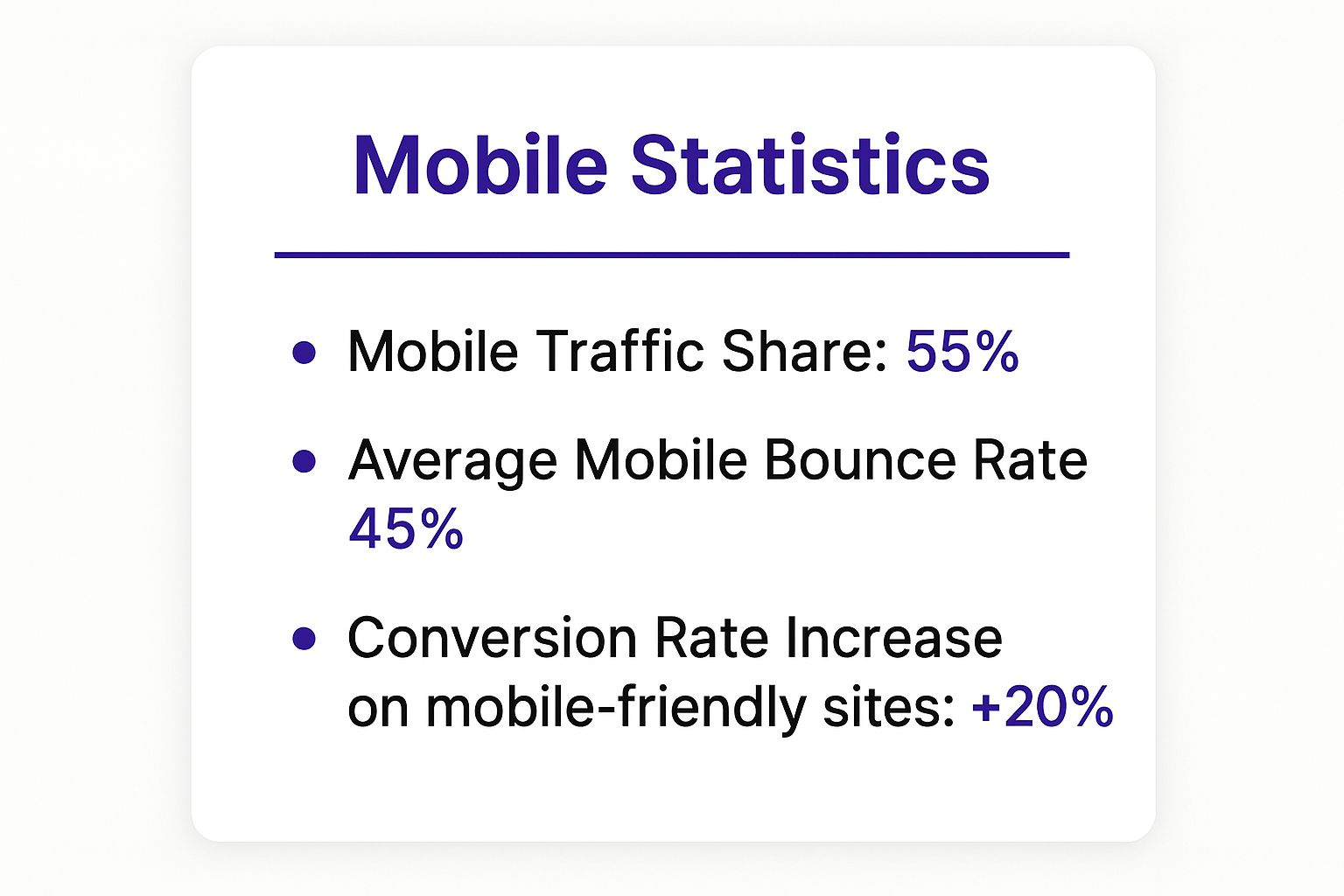
The data tells a simple story: most of your audience is on mobile, but their patience for a poor experience is incredibly thin. This directly impacts your ability to grow.
The Financial and Branding Impact
The stakes are incredibly high. By 2025, mobile devices are expected to drive roughly 73% of all e-commerce growth around the world. But here's the catch: 53% of mobile users will ditch a site if it takes more than three seconds to load.
It gets worse. 61% say they're unlikely to return after a bad experience, and 57% won't recommend a business with a poorly designed mobile site.
A non-responsive website doesn't just look bad; it actively tells over half of your potential customers that their business isn't a priority. This silent message can be more damaging than any negative review.
Connecting Mobile Design To SEO Success
Beyond the user experience, you have to remember Google's mobile-first indexing. This means the mobile version of your site is the primary one used for ranking in search results. A site that performs poorly on mobile will struggle to show up, making you practically invisible to new customers.
The impact of mobile optimization on WordPress SEO is huge, affecting everything from your traffic numbers to your domain authority.
While getting your Divi site mobile-ready is the first step, you'll also want a solid grasp of mobile SEO to really see the benefits. This mobile SEO checklist is a fantastic resource for that. By putting mobile first, you're not just improving usability—you're making a core business decision that directly boosts your bottom line.
To simplify, let's break down the three core approaches to tackling Divi's mobile responsiveness. Each has its place, and most projects end up using a mix of all three.
Core Pillars of Divi Mobile Optimization
| Strategy | Primary Tools | Best For | Complexity |
|---|---|---|---|
| Divi Responsive Settings | Divi Visual Builder, Breakpoint Controls | Quick layout adjustments, hiding/showing elements, and basic font/spacing changes. | Low – Ideal for beginners. |
| Custom CSS & Media Queries | Theme Customizer, Child Theme Stylesheet | Fine-tuning specific elements, fixing tricky layout issues, and creating pixel-perfect designs. | Medium – Requires some CSS knowledge. |
| Specialized Plugins | Divimode Plugins (e.g., Divi Areas Pro) | Adding advanced functionality like conditional popups, mega menus, or unique mobile-only content. | Low to Medium – Depends on the plugin. |
Mastering these pillars gives you a complete toolkit. You can start with the basics in the Visual Builder and gradually layer in CSS and plugins as your skills and project needs grow.
Mastering Divi’s Built-In Responsive Controls
Before you even think about custom CSS or fancy plugins, the best place to start is right inside the Divi Visual Builder. Divi comes packed with powerful responsive controls that are surprisingly easy to use. This code-free approach gives you instant, real-time feedback on how your design looks on smaller screens, letting you tweak and perfect the user experience on the fly.
These controls are built directly into the module settings you're already familiar with. By clicking the Tablet and Phone view icons at the bottom of the screen, you can see exactly how your layout shifts and make specific adjustments that only apply to that device. This is ground zero for building a truly responsive website.
This method empowers you to move beyond a "one-size-fits-all" mentality. Instead of just hoping your desktop design shrinks gracefully, you get to proactively shape it for every single visitor.
Fine-Tuning Typography and Spacing
One of the most common issues on mobile is text that's either way too big or frustratingly small. A bold, impactful headline on a desktop monitor can completely dominate a phone screen, forcing users to scroll past it just to see what’s next.
Fixing this is simple. Just open any module with text, switch to the Phone view, and look for the little mobile icon next to settings like Font Size or Line Height. Clicking that icon lets you set a unique value just for mobile, leaving your desktop style completely untouched.
For instance, you might have a 54px headline on desktop that you shrink to a much more reasonable 28px on mobile. The same logic applies to spacing. You can dial in the margin and padding for sections, rows, and modules on a per-device basis to create a cleaner, more readable mobile layout.
- Top/Bottom Padding: On mobile, I almost always reduce the padding on sections to tighten things up and cut down on unnecessary scrolling.
- Left/Right Padding: I also like to shrink this on rows and modules to give the content a bit more room to breathe on those narrow screens.
- Column Stacking: Don't forget that Divi automatically stacks columns vertically on mobile. It's a good idea to adjust the bottom margin on your columns to ensure there's a nice, even gap between them once they stack.
Using Responsive Visibility Controls
Let's be real: sometimes an element that’s perfect on desktop is just a pain on mobile. A complex contact form with a dozen fields, for example, is a major friction point on a tiny screen. This is exactly where Divi's visibility controls save the day.
You can find them in the Advanced tab of any section, row, or module. The Visibility settings let you hide elements on specific devices. Just check a box to disable something on Phone, Tablet, or Desktop.
A fantastic real-world use case is to hide a detailed contact form on mobile. In its place, you can show a super-simple section with a single "Tap to Call" button. This gets straight to what a mobile user likely wants and makes their experience so much better.
This technique is a cornerstone of learning how to make a site mobile friendly because it lets you craft fundamentally different experiences based on the device. You're not just resizing content; you're delivering the most effective call-to-action for the user's context.
Rearranging Column Order
By default, Divi stacks columns from left to right. This means your first column on desktop appears at the top on mobile. But what if that’s not the ideal order?
Imagine a two-column layout with a product image on the left and a big "Buy Now" button on the right. On mobile, that button would end up below the image, forcing users to scroll down to find it. With a tiny snippet of custom CSS in the row's advanced settings, you can easily reverse this order for mobile devices, pushing that critical call-to-action right to the top. It’s a small tweak, but it can make a huge difference for your conversion rates.
Using Custom CSS for Pixel-Perfect Adjustments
Divi’s built-in responsive controls are fantastic and will get you 95% of the way there. But what about that last 5%? You know the moments I’m talking about—when a sticky header stubbornly overlaps content on scroll, or a paragraph’s line height just feels off on a phone.
For those situations, custom CSS is your secret weapon. It gives you the granular, pixel-perfect control that the visual builder can't always provide on its own.
Think of it as the final layer of polish. We’re not talking about coding your whole site from scratch. Instead, it’s about writing a few targeted lines of CSS to squash those small but annoying issues that can ruin an otherwise clean mobile experience. Honestly, it's often the fastest way to solve those tricky little layout problems.
Getting comfortable with this is essential for anyone serious about how to make a site mobile friendly. It’s the tool you pull out when the standard options just don’t cut it, and it's a core skill for any Divi power user.
When to Reach for Custom CSS
Knowing when to stop fighting with Divi’s settings and just write a quick CSS rule will save you a ton of frustration. You'll find it's the perfect solution for very specific, targeted fixes that need to go beyond the standard module options.
Here are a few common scenarios where a touch of custom CSS is the ideal fix:
- Adjusting Element Spacing: Sometimes, you need to tweak the margin or padding on just one specific element on mobile without affecting others. A classic example is reducing the space between an icon and its text, but only on phone screens.
- Fine-Tuning Typography: While Divi’s responsive font sizes are great, you might want to adjust letter spacing or line height for a single headline to make it more readable on a narrow display.
- Fixing Sticky Element Issues: This is a big one. A sticky header that looks perfect on a desktop can eat up way too much precious screen real estate on mobile. With CSS, you can easily change its height or even tell it to stop being sticky on smaller devices.
- Overriding Default Styles: Every now and then, a plugin or even a specific Divi module might have some default styling that clashes with your mobile design. A well-aimed CSS rule can override it cleanly and efficiently.
Where to Add Your Custom CSS in Divi
Okay, so you have your CSS snippet ready to go. Where should you put it? The best method really depends on how widely you want the change to apply.
- Module’s Advanced Tab: For a change affecting a single, specific element, this is the place to be. Head to the module’s Advanced tab > Custom CSS. It keeps your code perfectly organized and tied directly to the element it modifies.
- Theme Customizer: If you’ve got a style that needs to apply across your entire site—like, say, adjusting the font size for all H3 tags on mobile—add it under Appearance > Customize > Additional CSS.
- A Child Theme Stylesheet: For bigger projects, this is the gold standard. Using a child theme keeps all your customizations completely separate from the parent theme, which means they are safe and sound when you update Divi.
Take it from me: keeping your CSS organized will make your life so much easier down the road. There’s nothing worse than hunting through three different places to find a single line of code you wrote months ago. A little organization now saves a massive headache later.
For a deeper dive into the mechanics of CSS and how it applies to responsive layouts, our guide on responsive web page CSS covers more advanced techniques and examples. It’ll help you write cleaner, more effective code for your mobile visitors.
Advanced Mobile Tuning with Divi Plugins
Let's be real. Divi's built-in controls and a bit of custom CSS can get you 90% of the way to a mobile-friendly site. But what about that last 10%? Sometimes you hit a wall—a mobile design challenge that the standard toolkit just can’t solve cleanly.
This is where you graduate to the next level and bring in third-party Divi plugins. These aren't just fancy add-ons; they're specialized tools that can save you hours of hair-pulling and custom coding.
Think of plugins as the final, expert-level step when you're learning how to make a site mobile friendly. They're built to solve those specific, often frustrating, mobile usability issues and can turn a good mobile site into a truly exceptional one.

From creating sleek, app-like mobile menus to showing completely different content to mobile users, the right plugin can seriously elevate your site's professionalism. Honestly, they’re the secret ingredient many top Divi designers use to nail that polished, seamless experience on any device.
Solving Complex Issues with Specialized Tools
One of the most common frustrations I see is dealing with Divi’s default breakpoints. You might get your design looking perfect on a standard phone and a big desktop monitor, but it completely falls apart on a small tablet or a larger "phablet." This is where a plugin like Divi Responsive Helper becomes invaluable, giving you the power to add custom breakpoints for precise control over your layout on more screen sizes.
Another classic mobile headache? The navigation menu. Divi’s default mobile menu is functional, sure, but it’s not always the most intuitive or engaging experience. A plugin like Divi Mobile is built to fix this.
- Problem: The default hamburger menu feels generic and doesn't match your site's unique branding.
- Solution: You install a dedicated mobile menu plugin to create a custom, app-style navigation experience.
- Result: Suddenly, you can design a slick slide-in menu, a full-screen overlay, or even a bottom bar menu that mobile users find far easier to navigate.
These kinds of targeted fixes are what separate an "okay" mobile site from a great one. They focus on smoothing out the small friction points that, when added up, can easily convince a user to leave.
Creating Targeted Mobile Experiences with Divi Areas Pro
For the ultimate in mobile customization, a tool like our own Divi Areas Pro opens up a whole new world of possibilities. It’s not just about resizing elements anymore; it’s about delivering entirely different content based on the device. This is a total game-changer for mobile conversions.
Let’s say you have a complex pricing table on your desktop site. Trying to cram that onto a phone screen is a design nightmare.
Instead of trying to force a complex desktop element onto a small screen, use a plugin to create a completely different experience. With Divi Areas Pro, you can hide the desktop pricing table on mobile and display a simple, touch-friendly version created in a Divi Area, triggered to appear only for mobile visitors.
This approach lets you design a cleaner, faster, and much more effective user journey. You can use this exact same logic to build mobile-specific popups, unique calls-to-action, or simplified forms that are perfectly optimized for someone on the go. It’s a huge step beyond simple responsiveness and into true mobile-first design.
Boosting Mobile Conversions with Smart UX
Getting your site to look right on a phone is only half the battle. If the mobile layout is clunky and frustrating to use, you’re still bleeding customers. This is where we move from just learning how to make a site mobile friendly to mastering the mobile user experience (UX) and how it directly fuels your conversion rates.
It's a mindset shift. You have to stop thinking about just making things fit on a small screen and start actively making them easier to use. Put yourself in your visitor's shoes: they're probably distracted, in a hurry, and trying to navigate your entire site with one thumb.
Every little thing, from the size of your buttons to the length of your forms, either adds friction or removes it. Getting rid of that friction is the secret to turning a mobile-friendly site into a mobile-first conversion machine.
Simplify Everything for the Mobile User
On mobile, simplicity isn’t just an aesthetic—it's a hard requirement. Cluttered layouts, tiny text, and confusing navigation are absolute conversion killers. Your one and only goal should be to create the fastest, most obvious path from point A to point B.
A perfect place to start is with your calls-to-action (CTAs). Take a look at your buttons. Are they big enough for a thumb to tap easily without accidentally hitting something else? The industry-accepted standard for any touch target is a minimum of 44×44 pixels. Anything smaller is asking for trouble.
Next, give your forms a hard look. A long, intimidating contact or checkout form is one of the biggest reasons people bail.
- Slash Your Form Fields: Be ruthless. Only ask for the absolute bare essentials. Can you get away with just an email for now and follow up later? Do it.
- Use the Right Input Types: This is a small but mighty UX win. Using proper HTML input types (like
emailortel) automatically brings up the correct keyboard on a phone. It's a simple touch that makes a huge difference. - Break Up Long Forms: If you absolutely must ask for a lot of info, don't show it all at once. Break the form into a multi-step process with a progress bar. It feels way less daunting and keeps people moving forward.
Streamlining the Path to Conversion
The data on mobile user behavior couldn't be clearer: every extra step, every second of confusion, costs you money. Globally, the average e-commerce conversion rate limps along between 2.5% and 3%. But the real horror story is mobile cart abandonment, which averages a staggering 85.65%.
Research has shown that simple landing pages with fewer than 10 elements can dramatically improve conversions—a critical lesson for the limited real estate on mobile screens. In fact, businesses that obsess over responsive design and a personalized UX have seen conversion rates climb past 11%.
A streamlined checkout is non-negotiable. If a user has to pinch-to-zoom to enter their credit card number or hunt for the "Next" button, you've already lost the sale. Your mobile checkout has to be a clean, linear, and totally reassuring process.
Nailing these UX details is the heart and soul of conversion rate optimization. For a more structured plan of attack, our comprehensive conversion rate optimization checklist gives you a step-by-step guide to finding and crushing these friction points across your site. When you put the user first, you don't just create an experience that looks good on mobile—you build one that actually performs.
Fixing Common Divi Mobile Design Mistakes
We’ve all been there. You’ve spent hours getting a design pixel-perfect on your desktop, only to pull it up on your phone and find a jumbled mess. It’s frustrating, but tackling these common issues is a core part of mastering truly responsive design in Divi.
Things like overlapping text are usually a dead giveaway for fixed heights or absolute positioning that just doesn’t play nice on smaller screens. That beautiful, high-resolution hero image? It might look amazing on a 27-inch monitor, but it’s probably crippling your mobile load times. These aren’t failures—they’re just opportunities to get better.
Troubleshooting Frequent Mobile Glitches
Most mobile design headaches in Divi fall into a few predictable buckets. Once you learn to spot the patterns, you can jump straight to the right fix instead of just randomly tweaking settings and hoping for the best.
Here are the usual suspects I run into:
- Excessive Padding: What looks like generous spacing on a desktop can quickly squeeze your content into a tiny, unreadable column on a phone.
- Fixed Element Heights: A section with a fixed height is a ticking time bomb. It might look great with a single line of text on desktop, but the moment that text wraps on mobile, it overflows and breaks your layout.
- Unoptimized Images: Huge image files are probably the number one reason for slow mobile performance. It’s a classic mistake, but one that’s easy to fix.
The impact of these little glitches is bigger than you might think. Poor mobile design isn’t just an annoyance; it actively pushes people away. In fact, a staggering 57% of users say they won’t recommend a business with a poorly designed mobile site. These experiences directly hurt your brand.

To consistently catch these problems before your visitors do, it’s smart to build some solid automated quality assurance testing into your workflow. It helps guarantee a smooth, professional experience for everyone, no matter what device they’re using. By systematically hunting down and fixing these common mistakes, you’ll build a much more reliable and impressive mobile presence.
Ready to build truly dynamic, mobile-first experiences? Divimode provides the ultimate toolkit for Divi users. With our premium plugin, Divi Areas Pro, you can create targeted popups, conditional content, and unique mobile-only elements that drive conversions. https://divimode.com
More Articles You Will Like