 Alex Martin
Your site probably didn't start with a navigation problem.
It started with a handful of pages, a normal dropdown, and a header that felt clean. Then the site grew. Categories multiplied, content types split, WooCommerce collections expanded, and now the main menu is doing too much with too little space. Visitors have to hunt. Important sections get buried. Editors keep asking for “just one more link” in the header.
That's where an Extra Theme mega menu stops being a nice design upgrade and starts being a structural fix.
Extra was built for content-heavy websites, so this isn't a theme being forced into a pattern it was never meant to support. The question is simpler: should you use the native Extra and Divi method, or should you switch to a builder-based setup with a tool like Divi Areas Pro when the menu becomes part navigation, part content surface, and part conversion layer?
Why Your Standard Navigation Is Holding You Back
A visitor lands on a content-heavy Extra site, opens the main menu, taps into a category, then hits a stack of narrow dropdowns that hide half the options. One wrong cursor movement closes the panel. On mobile, the same menu often turns into a long accordion that forces users to dig for pages that should have been obvious from the start.
That friction shows up on magazine sites, learning platforms, documentation hubs, and larger stores. Standard dropdowns work for small architectures. They break down once the header has to surface categories, subcategories, featured destinations, and campaign links at the same time. The issue is not just visual clutter. The menu no longer reflects how people browse a larger site.
Extra was built with content-heavy navigation in mind, including menu options that can surface posts instead of only static links. That matters because the theme already leans toward editorial information architecture rather than a basic brochure-site header. Good menu decisions still depend on core UX principles, though, especially grouping, hierarchy, and reducing the number of decisions a user has to make in one moment.
What a mega menu fixes
A well-structured mega menu solves a few specific problems fast:
- Less scanning across fragile flyouts. Related links appear in one panel, so users do not have to chase nested hover states.
- Better visibility into section depth. Visitors can understand what sits under a top-level item before they click.
- Stronger priority for high-value paths. Key categories, featured content, support links, or promotions can get placement that reflects their importance.
Standard dropdowns hide structure. Mega menus expose it.
That does not make mega menus automatically correct. I have replaced plenty of oversized panels that tried to compensate for poor taxonomy with more columns, more icons, and more noise. If the underlying content model is messy, a bigger menu only makes that mess visible faster.
Native Extra tools vs a builder-based approach
For Extra, there are two sensible paths.
| Approach | Good fit | Main limit |
|---|---|---|
| Native Extra and Divi menu setup | Sites that need a clean multi-column link layout | Works best for straightforward link groupings, not richer content blocks |
| Builder-based menu with Divi Areas Pro | Sites that need images, promos, forms, dynamic content, or tighter layout control | Adds flexibility, but also adds design and performance responsibility |
The simpler question is which problem you are solving.
If users just need clearer access to a lot of links, native Extra tools are often enough and usually lighter to maintain. If the menu also needs to merchandise products, surface featured articles, capture leads, or adapt by audience segment, native options reach their limit quickly. At that point, an Extra Theme mega menu stops being a visual improvement and becomes part of the site's content and conversion system. That is usually the point where Divi Areas Pro starts making practical sense.
Planning Your Mega Menu Information Architecture
A common mistake is planning a mega menu directly inside WordPress.
The menu editor is good at arranging links. It is bad at telling you which links belong together, which items deserve top-level visibility, and which pages should stay out of the header entirely. Good information architecture happens before the build.

Start with user intent, not your sitemap
Extra works well for content-heavy sites, so teams often try to expose too much at once. That usually creates a menu that mirrors the CMS instead of helping visitors reach the next useful page.
The better question is simple. What does a visitor need from the header before they are ready to browse deeper?
For a publisher, that might be sections, trending topics, and a featured story. For a service business, it is usually services, proof, pricing context, and contact paths. For ecommerce, it may be category access, promotions, and account actions. Those are very different menu jobs, and they should not be planned the same way.
A practical planning pass usually includes these decisions:
- List your highest-value destinations. Start with the pages people need early, not every page stakeholders want included.
- Group links by intent. “Learn,” “Shop,” “Support,” and “Company” reflect different user goals.
- Cut header clutter. Legal links, low-traffic archives, and utility pages usually belong in the footer, account area, or a secondary nav.
- Choose what earns visual emphasis. Featured posts, promos, or seasonal campaigns can justify a larger slot, but only if they support the user journey.
- Flag content that needs a landing page instead. If a section needs explanation before choice, a mega menu is the wrong container.
Validate the structure before you build it
I still sketch mega menus on paper or in a quick wireframe before touching Divi. That step catches bad grouping fast.
Give each proposed top-level item its own panel. If one trigger needs five unrelated columns, the label is probably too broad. If another trigger holds two plain links, it probably does not need a mega menu at all.
That exercise also forces a decision between the native Extra approach and a builder-based one. Native mega menus are strongest when each column is a clean group of links. Once the panel needs featured images, post modules, badges, opt-ins, or layout control that goes beyond WordPress menu hierarchy, you are no longer solving a simple navigation problem. You are designing a content surface. That is usually the point where a tool like Divi Areas Pro becomes the better fit.
If your header is already being rebuilt beyond the default theme structure, it also helps to review how a global header with Divi changes the way navigation components are managed across templates.
This is also the right stage to apply a few core UX principles that matter in navigation design, especially hierarchy, consistency, and recognition over recall. Users should not have to guess which label hides the content they need.
Practical rule: If a top-level item cannot be explained in one short phrase, it is not ready to become a mega menu trigger.
A simple planning framework
Use this checklist before buildout:
- Top-level labels: Keep them short, distinct, and written in the language your audience uses.
- Column logic: Each column should represent one clear group. Mixed-purpose columns confuse people fast.
- Priority order: Put the most used or most valuable links where eyes land first.
- Fallback paths: Deeper content should still be reachable through search, archives, category pages, or landing pages.
- Mobile simplification: Plan the mobile version separately. Desktop mega menus rarely translate well without cutting content.
A well-planned Extra Theme mega menu feels obvious. A poorly planned one feels heavy, even if the visual design is polished.
Creating a Basic Mega Menu with Native Extra Theme Tools
For many projects, the built-in method is enough.
If your goal is a structured, multi-column dropdown of links, Extra and Divi already support that without a separate menu plugin. The native workflow is configuration-driven. You build the menu structure in WordPress, then activate the mega menu behavior by applying the mega-menu CSS class to the top-level trigger. Elegant Themes documents that this setup can include up to four parent links, with nested submenu items collapsing into one wide dropdown in the Divi mega menu documentation.

How the native method works
The native setup is less “design a mega menu” and more “structure a WordPress menu in the right hierarchy.”
You create a top-level menu item that acts as the trigger. Under that trigger, you place parent items that become the column headings. Under each of those, you nest the actual destination links. Then you add the mega-menu CSS class to the top-level trigger item.
That class tells Divi and Extra to treat the submenu differently. Instead of separate cascading dropdowns, the grouped children display together in a wider panel.
Step-by-step setup in WordPress
Follow this order:
- Open Appearance → Menus and select the menu assigned to your main header.
- Create the trigger item at the top level. This might be something like Shop, Topics, Services, or Resources.
- Add parent items under that trigger. These become your main column groups.
- Nest child links under each parent item to build the actual destinations shown in each group.
- Enable CSS Classes in Screen Options if that field isn't visible.
- Add
mega-menuto the top-level trigger item and save the menu.
Here's the part many people miss: the class belongs on the top-level trigger, not on one of the nested items. Put it lower in the structure and the panel won't render as intended.
What this method does well
The native approach is strong when your requirements are clear and restrained.
- Editorial hubs: News categories, topic clusters, and archives map well to grouped link columns.
- Service businesses: Core services, industries, and support resources can sit in a tidy structure.
- Brochure and corporate sites: The menu stays maintainable because content editors can manage it directly in the standard WordPress interface.
If you're also working on a custom header, it helps to pair the menu structure with a well-built theme header. This guide on building a global header with Divi is useful when the menu itself is only one part of the navigation system.
Keep the native version boring on purpose. It's at its best when the menu is primarily a wayfinding tool, not a mini landing page.
Where native Extra menus start to break down
This is the candid part. The native method isn't weak. It's just narrow.
It handles column-based link organization well. It becomes awkward when clients ask for any of the following:
- Images inside the panel
- Buttons or campaign blocks
- Custom promotional layouts
- Complex spacing and alignment rules
- Dynamic post modules or product-focused content surfaces
- Different desktop and mobile content strategies from one menu source
You can force some of this with CSS and careful markup, but that's where maintenance starts getting expensive. Every workaround becomes another thing to test after theme updates, plugin changes, or client edits in the menu editor.
Native menu decision filter
Use the native Extra Theme mega menu if most of these are true:
| Use native tools when | Reconsider native tools when |
|---|---|
| You need grouped text links | You need rich media or promotional modules |
| Editors should manage structure in Menus | Designers need layout freedom inside each panel |
| The panel content is mostly static | The panel content changes with campaigns or featured content |
| Mobile can be simplified to a standard stacked menu | Mobile needs a separate interaction model |
That's why I still recommend starting native for smaller builds. It keeps complexity low. But once the menu becomes a designed interface element instead of a structured list, the native route usually turns into a patchwork of custom CSS, menu hacks, and compromises.
Building Advanced Mega Menus with Divi Areas Pro
There's a point where a menu stops being “navigation with columns” and becomes “header content with interaction.”
That's the line where I stop using the native Extra method and switch to a builder-based setup. Divi's class-based mega menu has been around for a long time, but more recent integrations show the platform moving toward builder-level menu design rather than simple class activation, as described in this overview of Divi mega menu evolution and integrations.

When a dedicated tool becomes necessary
Native menus start fighting you when the panel needs to include anything beyond nested links.
A few examples:
- An ecommerce menu that needs category images, sale highlights, and a call-to-action button
- A publisher header that should show featured articles or curated topic blocks
- A course site that needs audience segmentation in the menu itself
- A support menu that includes contact options, docs links, and account actions in separate visual groups
In those cases, a dedicated tool isn't about flashy design. It's about using the Divi Builder for navigation content instead of trying to fake layouts inside the WordPress menu editor.
How the workflow changes
With Divi Areas Pro, you build the dropdown content as a Divi layout area, then assign that area to a menu trigger. That changes everything about maintainability.
Instead of treating the mega menu like a hierarchy hack inside Menus, you treat it like a designed content region. You can place regular Divi modules inside it, style spacing visually, reuse saved layouts, and update the content without rebuilding menu structure every time.
If you want the mechanics, this walkthrough on how to display content using Divi Areas Pro shows the core assignment pattern.
A builder-based menu is essential when stakeholders want the header to carry editorial, merchandising, or conversion responsibilities.
What you can build that native menus can't handle cleanly
Plugin-based mega menus prove their worth.
You can create panels with:
- Blurb modules for category icons and descriptions
- Image modules for product families or featured collections
- Button modules for promotions, demos, or signups
- Blog-style content blocks for recent or featured posts
- WooCommerce-oriented sections that feel like a storefront shortcut
- Conditional or targeted content when the navigation needs to adapt to context
That last point matters on larger builds. The menu becomes part of the site's interaction system, not just a list of places to click.
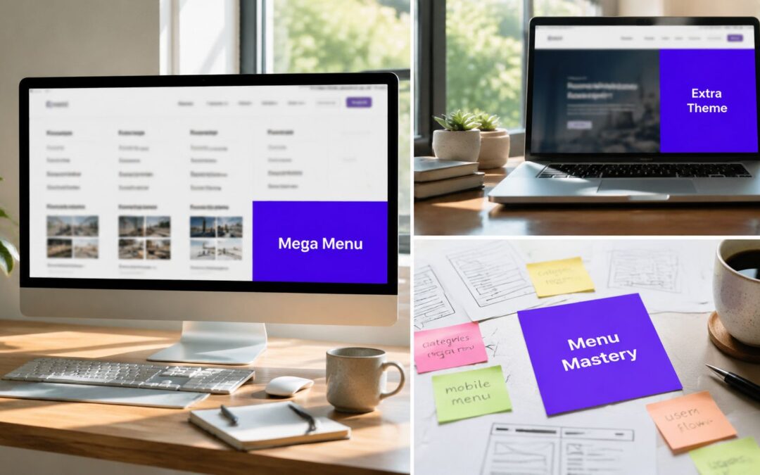
Here's a useful visual reference if you want to see the concept in action:
The trade-off most people ignore
Builder freedom can make a menu worse if nobody sets boundaries.
I've seen teams turn a perfectly serviceable navigation into a slow, overdesigned panel packed with banners, duplicate links, moving parts, and too many visual priorities. The extra flexibility is only worth it if you use it to clarify decisions, not multiply them.
A builder-based Extra Theme mega menu works best when:
- the top row communicates category choice quickly
- only one or two elements get visual emphasis
- promotional content supports navigation rather than replacing it
- every module in the panel earns its place
My practical rule for choosing Divi Areas Pro
I reach for it when any two of these are true:
| Requirement | Native menu | Divi Areas Pro |
|---|---|---|
| Multi-column text links | Good fit | Also works |
| Rich visual layout | Limited | Strong fit |
| Marketing blocks in menu | Awkward | Natural |
| Ongoing campaign changes | Clumsy | Easier to update |
| Design consistency with Divi modules | Partial | Direct |
If your menu is still mostly a categorized list, stay native. If it needs to act like a designed experience, use the builder-based route and keep the structure disciplined.
Optimizing Your Mega Menu for Mobile and Performance
The desktop version gets the attention. Mobile and performance decide whether the implementation survives.
Many mega menu builds go sideways: The team celebrates a polished wide dropdown on a large screen, then ships a mobile experience that collapses into a long accordion full of tiny tap targets and oversized assets. Or they load image-heavy menu panels that look good in staging and feel sluggish on real devices.
Recent setup guides often focus on how to create a mega menu, but they tend to skip the operational questions. How many columns are too many. Whether image-heavy panels affect rendering. When a smaller menu plus better discovery would work better. That trade-off is discussed well in this article on Divi mega menu styling and practical limits.

Mobile needs a different menu, not a squeezed desktop one
A wide desktop panel doesn't translate directly to touch screens.
On mobile, the winning pattern is usually simpler. Fewer options per level. Larger tap areas. Less visual density. In many projects, I'll keep the same top-level categories but reduce the submenu content instead of trying to preserve every desktop grouping.
A solid mobile review should check:
- Tap comfort: Links need enough spacing to avoid accidental taps.
- Expansion behavior: Click-based reveals are usually more reliable than hover-dependent interactions.
- Panel depth: If users need to expand multiple nested layers just to find a common destination, the menu is too deep.
- Exit paths: Users should be able to close the menu quickly and predictably.
If you're tuning the broader responsive experience around the header, this guide to optimizing Divi for mobile devices is a useful companion.
Performance rules that actually matter
The biggest performance problem isn't the idea of a mega menu. It's what teams stuff inside it.
Keep the panel light
If a menu includes images, use only the ones that help users choose. A category thumbnail can help. A decorative banner usually doesn't.
Reduce duplicate pathways
Don't repeat the same destination in the top nav, mega menu, promo card, and utility bar unless there's a clear reason. Duplicate links increase cognitive noise.
Audit by behavior, not opinion
Look at click distribution, device-specific engagement, and whether users interact with the lower-priority items in the panel. If those links get ignored, remove them. A smaller menu often performs better because it asks users to make fewer decisions.
The strongest optimization move is often subtraction.
A quick decision framework
Use this when reviewing your menu after launch:
| If you notice | It usually means | Better move |
|---|---|---|
| Users open the menu but don't go deep | The panel is visually busy or poorly grouped | Simplify columns and raise key links |
| Mobile engagement feels clumsy | Desktop logic was forced onto small screens | Build a separate mobile pattern |
| The menu looks impressive but rarely gets used | Search, landing pages, or internal links are carrying discovery | Shrink the menu and strengthen those paths |
A fast, focused menu beats a spectacular one that gets in the user's way.
Troubleshooting Common Extra Theme Mega Menu Problems
Most Extra Theme mega menu problems come down to structure, scope, or CSS conflicts.
When debugging, start with the simplest question first: is this a menu hierarchy problem or a display problem? If the structure is wrong in the WordPress menu editor, no amount of styling will save it. If the structure is right but the output looks broken, then start looking at CSS, header containers, or plugin interactions.
The menu won't expand into columns
Symptom: The dropdown behaves like a normal submenu instead of a wide mega menu.
Likely cause: The mega-menu class is attached to the wrong item, or the child items aren't nested in the expected hierarchy.
Fix: Move the mega-menu class to the top-level trigger item. Then confirm your grouped submenu items sit directly under that trigger, with their own nested children beneath them.
The layout looks broken after styling changes
Symptom: Columns wrap strangely, spacing collapses, or the panel overlaps other header elements.
Likely cause: Custom CSS from the theme, child theme, or another plugin is overriding menu styles.
Fix: Inspect the menu container and parent header elements first. In Divi and Extra builds, the menu is often fine but constrained by row width, overflow settings, or z-index issues in the header layout.
Don't debug the dropdown in isolation. Debug the header container around it.
The advanced menu content feels impossible to maintain
Symptom: Every content change requires menu reordering, CSS edits, or duplicated work.
Likely cause: The build outgrew the native method, but the implementation never switched tools.
Fix: If the menu now needs images, promotions, or custom layouts, rebuild it with a builder-based pattern instead of patching the WordPress menu editor further. This is usually the point where a dedicated content area approach saves time.
Mobile behavior is messy
Symptom: Users have trouble expanding items, links are too close together, or the menu becomes a long stack of clutter.
Likely cause: The desktop mega menu was effectively ported to mobile without simplification.
Fix: Reduce the mobile menu to the top decisions users need. Remove decorative elements, shorten labels, and flatten the hierarchy where possible.
The menu doesn't appear at all
Run this short checklist:
- Menu assignment: Confirm the correct menu is assigned to the active header location.
- Header template: If you're using Theme Builder, make sure the intended global header is active.
- Cache and optimization layers: Clear caching, minification, and any front-end optimization that may be holding old markup.
- Plugin conflicts: Temporarily disable nonessential styling or menu-related plugins to isolate conflicts.
A reliable mega menu isn't the one with the most features. It's the one your team can understand, update, and keep stable after launch.
If your navigation has outgrown the native Extra setup, Divimode offers a practical path for building builder-based mega menus and other interactive Divi patterns without forcing everything through the default WordPress menu structure.
More Articles You Will Like