Exit intent pop-ups are the digital equivalent of a friendly salesperson catching you at the door to make one last, can't-refuse offer. They're a smart marketing tool that cleverly detects when a visitor is about to leave your site and, at that exact moment, presents a targeted message.
The whole point is to re-engage someone who has already mentally checked out, giving you a final shot to turn that abandoning visitor into a subscriber or a customer.
Why Exit Intent Pop-Ups Still Drive Conversions
Before we jump into the "how-to," it's worth understanding why this technology is still so effective years after it first appeared. When done right, an exit pop-up isn't just another annoying interruption. It’s a valuable, final touchpoint with a visitor who has already decided to walk away.
This technique works because it's all about timely intervention. You're presenting a relevant offer precisely when a user disengages, which can be just the thing to overcome their hesitation or give them that last little nudge they needed to convert.
The Tangible Business Impact
The results really do speak for themselves. Exit intent pop-ups have a proven track record for recovering sales that would otherwise be lost forever. On average, a well-implemented pop-up can convert an additional 2% to 4% of abandoning visitors.
I've even seen some incredible campaigns report conversion rates as high as 13.73% just by showing a compelling, last-minute 50% discount. That's a huge win from traffic you were about to lose. You can find more stats like this in our guide on how Divi exit intent pop-ups boost sales.
This is exactly where a powerful tool like Divi Areas Pro comes into play. It gives you the control to create these highly targeted messages without ever having to touch a line of code. You can finally move beyond generic, one-size-fits-all offers and build specific, context-aware pop-ups that genuinely add value.
Key Takeaway: An effective exit intent pop-up isn't about blocking the exit. It's about changing the visitor's mind with a relevant, timely, and valuable offer they can't refuse.
Before we dive into the data, let's take a quick look at the core benefits these pop-ups bring to the table. The table below breaks down their primary advantages and shows how they translate into real-world business impact.
Key Benefits of Using Exit Intent Pop-Ups
| Benefit | Impact on Your Business | Common Use Case |
|---|---|---|
| Reduced Cart Abandonment | Recovers potentially lost revenue by addressing last-minute friction points like shipping costs or price. | Offering a surprise 10% discount or free shipping to a user leaving the checkout page with items in their cart. |
| Increased Lead Generation | Grows your email list by capturing contact information from engaged but not-yet-ready-to-buy visitors. | Presenting a lead magnet (e.g., a free ebook or checklist) to someone who just finished reading a blog post. |
| Improved User Navigation | Keeps visitors on your site longer by directing them to other relevant content or popular products. | Suggesting a related article or a best-selling product category to a user leaving a product page. |
| Enhanced User Feedback | Gathers valuable insights by asking visitors why they are leaving, helping you improve your site or offerings. | Displaying a quick one-question survey ("What were you looking for today?") before a user exits. |
As you can see, the strategic applications are vast and directly tied to key business goals. These pop-ups are a simple but effective form of automation that can significantly improve your website's performance. For a broader look at how this fits into your overall strategy, check out this great article on improving conversion rates with automation.
By putting this strategy to work, you're essentially creating another valuable opportunity to hit your targets, whether that's growing your email list, guiding users, or closing more sales.
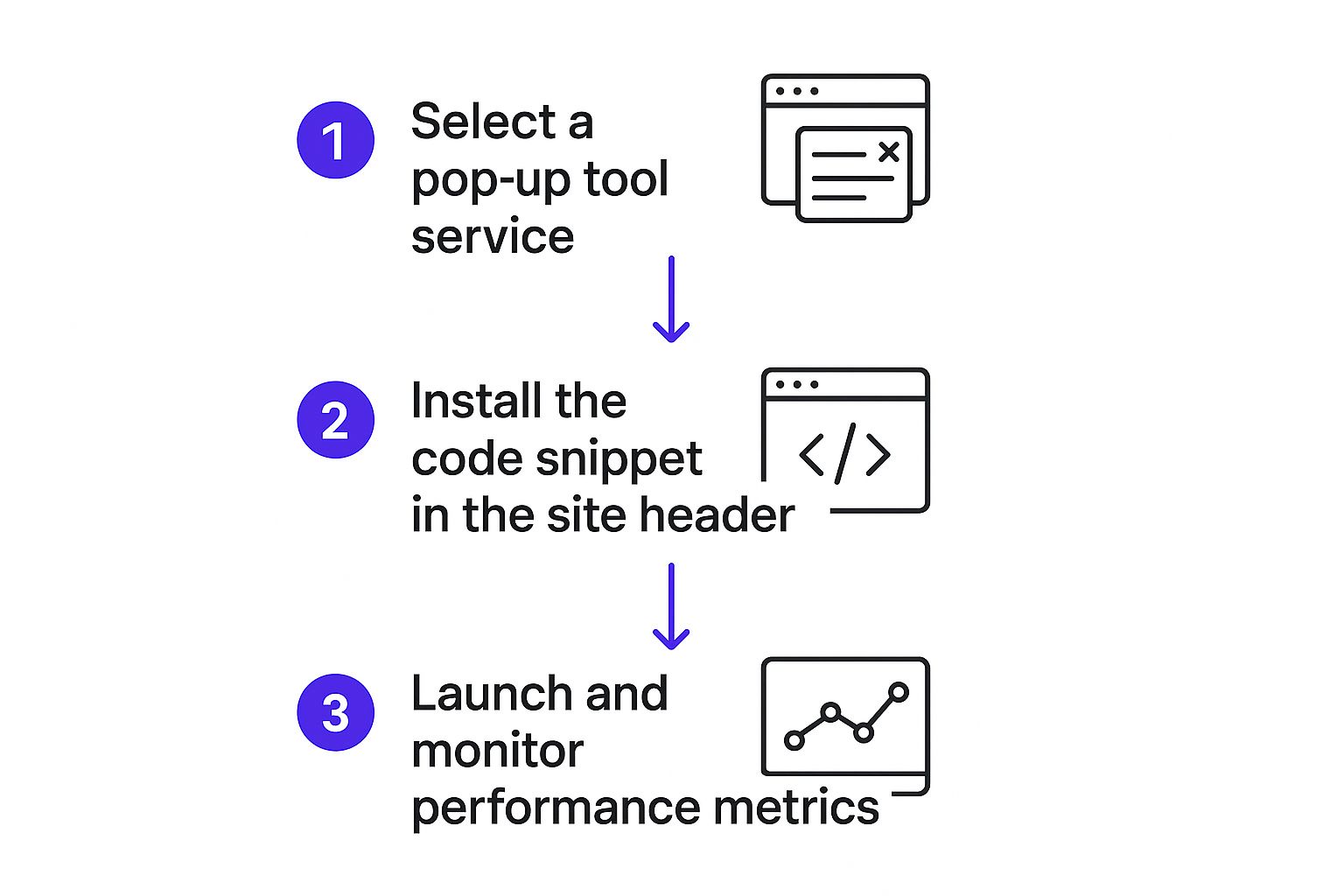
Alright, we've covered the why—now it's time to roll up our sleeves and get into the how. Firing up Divi Areas Pro for the first time is a breeze, designed to get you from zero to a live pop-up in just a few minutes. Naturally, the very first thing you need to do is get the plugin installed on your Divi site.
Once you have the plugin installed and your license is good to go, you’ll spot a new "Divi Areas" menu item in your WordPress dashboard. This is your command center for everything you’ll build, including the exit intent pop-up we're focused on. If you need a hand with the initial setup, our guide on how to install and activate Divi Areas Pro walks you through it step-by-step.
Getting Around the Divi Areas Dashboard
When you open up the dashboard, you’ll see it's clean and straightforward. There’s a list of any "Areas" you've made (which will be empty right now) and a big "Add New" button. Before we jump in, let’s get a handle on one key concept.
Divi Areas Pro lets you create different kinds of dynamic content, which it calls "Areas." When you make a new one, you have to assign it an Area Type. This is a critical choice because it defines exactly how that content is going to behave on the front end of your site.
Here's a quick rundown of your options:
- Popup: This is our go-to for this guide. It creates a classic modal window that appears over your page content—perfect for grabbing a visitor's attention with an exit offer.
- Fly-In: Think of this as a pop-up's less aggressive cousin. It slides in from a corner of the screen, making it a bit more subtle.
- Inline: This type injects your content right into the page's layout, great for things like a special announcement banner or a call-to-action section within your blog posts.
- Hover: Just like it sounds, this content only shows up when someone's mouse hovers over a specific trigger element.
For our mission—building a high-converting exit intent pop-up—the ‘Popup’ type is the only one that makes sense. It gives us that necessary overlay effect to stop a visitor in their tracks just as they’re about to leave.
Creating Your First Divi Area
Let's get our pop-up's container built. From the Divi Areas menu, hit that "Add New" button. First, you'll need to give your new Area a title. Do yourself a favor and be descriptive here. Something like "Cart Abandonment Offer" or "Blog Subscriber Pop-up" will make your life much easier down the road.
I can't stress this enough: be specific with your titles. When you have dozens of Areas running, a generic name like "Popup #1" is totally useless. A title like "Q4 Sale – 20% Off Exit Popup" tells you exactly what it is and what it does at a glance.
After you've titled it, you’ll land on a familiar-looking editor screen. Look over to the right-hand side for the "Area Settings" meta box. This is where you’ll set the core behavior of your pop-up.
For now, we only need to worry about two things:
- Area Type: This is the big one. Set it to Popup.
- Layout: This lets you choose between the standard WordPress editor and, more importantly, the Divi Builder. You’ll always want to select the Divi Builder to tap into its awesome design capabilities.
Once you’ve set the Area Type to "Popup" and enabled the Divi Builder, go ahead and click "Publish." You've just created a blank canvas—a published, but still totally invisible, Divi Area. This is the foundation we’ll use to design our eye-catching pop-up in the next section.
Designing a Pop-Up People Won't Hate

Alright, with our blank Divi Area ready to go, we can get to the fun part—the design. A great offer is one thing, but if the pop-up itself is clunky, confusing, or just plain ugly, you’ve lost the battle before it even started. The last thing you want to do is frustrate a visitor who is already heading for the door.
The beauty of using Divi Areas Pro is that you’re not learning a new tool. You’re right at home in the familiar Divi Builder, with every module, design setting, and layout option you already know and love at your fingertips.
Core Design Principles for Pop-Ups
Your pop-up should feel like a natural, helpful extension of your website, not some jarring third-party ad that just appeared out of nowhere. The easiest way to achieve this is by aligning the design with your existing brand identity.
Here are a few key elements I always focus on getting right:
- Color Palette: Use your brand’s primary colors to build instant trust and consistency. Then, use a contrasting accent color for the call-to-action (CTA) button to make it pop. You want their eye to go right there.
- Typography: Stick to the same fonts you use across your site. Make sure the text is big enough to be easily readable, with a clear visual hierarchy between your main headline, the body text, and any fine print.
- Visuals: A single, high-quality image or even a simple, clean icon can make your pop-up far more engaging than text alone. Just be sure it’s relevant to the offer and optimized so it doesn’t slow things down.
Remember, the goal is to grab attention without being obnoxious. Good design respects the user's time and makes your message dead simple to understand in a split second. For a deeper dive, we’ve put together a whole guide on pop-up etiquette and best practices.
Structuring Your Layout for Maximum Impact
How you arrange the elements inside your pop-up is just as important as how they look. You have maybe three seconds to communicate your offer and its value, so clarity is king. A proven layout I stick to includes a compelling headline, a very brief snippet of explanatory copy, and a single, crystal-clear call-to-action.
Think about the user's visual path. Their eyes will almost always hit the headline first, then glance at the image or body text, and finally land on the CTA button. Arrange these elements in a logical flow to gently guide them toward the action you want them to take.
My personal pro-tip is to keep form fields to an absolute minimum. If you're asking for an email, just ask for the email. I’ve seen it time and time again: every additional field you add will cause your conversion rate to drop. Keep it simple and frictionless.
Placement on the screen also plays a surprisingly huge role in performance. An extensive study from Wisepops that analyzed over a billion pop-ups found something fascinating: pop-ups positioned at the bottom-center of the page converted best, at 12.88%. Those tucked into the bottom corners, on the other hand, performed poorly.
Ultimately, you’re aiming for a design that feels helpful, not intrusive. By using familiar branding, a clear layout, and persuasive copy, you create an experience that adds one last bit of value just as your visitor is about to leave.
Configuring Your Exit Intent Trigger
You’ve got a beautifully designed pop-up ready to go. Now it's time to set up the brains of the operation. This is where you tell your Divi Area precisely when and how to appear, turning it from a static design into a smart, responsive marketing tool. All the magic happens in the Triggers and Display Conditions settings within Divi Areas Pro.
The trigger we’re focused on here is, of course, exit intent. This clever bit of tech tracks the user's mouse velocity and direction. When their cursor makes a quick move toward the top of the browser—a classic sign they're about to close the tab or hit the back button—it fires the pop-up.
Setting Up the Main Trigger
Jump into your Divi Area editor and find the "Behavior" tab in the "Area Settings" meta box. The very first option you'll see is "Trigger." Give that a click, and you'll get a dropdown list of all the powerful ways you can make your Area appear.
This screenshot shows just how many trigger options are baked right into Divi Areas Pro.
As you can see, the list covers everything from a simple click to advanced options like scroll depth and inactivity. Our focus, though, is squarely on "On Exit Intent."
Selecting this option immediately activates the exit-detection script for this specific pop-up. A subtle but powerful feature here is the ability to adjust the trigger's sensitivity. I usually recommend starting with the default setting—it's well-calibrated to feel natural—but you can always fine-tune it if you find it’s firing a touch too early or too late.
Layering Rules for Smarter Targeting
Just setting the trigger to "On Exit Intent" is only the beginning. The real power comes from layering this with Display Conditions to make sure your message is not only timely but also incredibly relevant. A generic pop-up shown to everyone is better than nothing, sure, but a targeted one converts at a much, much higher rate.
The key takeaway here is that launching is just the final step. The real work is in selecting the right tool and configuring it for peak performance.
Think about how you can layer your display rules with these real-world scenarios:
- E-commerce Cart Abandonment: Set the pop-up to trigger on exit intent, but only on your
/cartand/checkoutpages. This is your chance to present a last-minute discount code or a free shipping offer to the people closest to making a purchase. - Targeted Content Upgrades: Show a pop-up with a downloadable checklist, but only on blog posts within a specific category. A visitor reading about SEO is far more likely to want an "SEO Checklist" than someone reading about web design.
- Welcoming New Visitors: You can combine the exit intent trigger with a user role condition. Configure the pop-up to show only to "Guests" (users who aren't logged in) to grow your email list without bugging your existing members.
Pro Tip: Don't forget about timing conditions. You can add a rule that stops the pop-up from showing until the user has been on the page for at least 15 seconds. This ensures you're only targeting visitors who have shown some real engagement, making your offer that much more impactful.
By thoughtfully combining these triggers and conditions, you elevate your exit intent pop-ups from a simple interruption to a personalized, context-aware tool that delivers the right message, to the right person, at the perfect moment.
Optimizing Your Pop-Up for Better Performance
Simply launching your exit intent pop-up is the starting line, not the finish. A good pop-up is nice, but a high-performing conversion machine is what we're really after. To get there, you need to get into a mindset of continuous improvement, and that means moving beyond guesswork and starting to test everything.
The single most effective way to do this is with A/B testing, sometimes called split testing. It’s pretty straightforward: you create two versions of your pop-up (an 'A' version and a 'B' version) and show each one to a different segment of your audience. The data will tell you which one performs better.
What to A/B Test for Maximum Impact
You can test just about any element of your pop-up, but I've found it's best to start with the components that have the biggest potential to sway user behavior. You'd be surprised how small tweaks can lead to some seriously large gains.
Here are a few high-impact elements I always recommend starting with:
- The Headline: Try pitting a question against a statement. For example, test "Get 10% Off Your First Order" against something more engaging like "Want to Save 10% Today?"
- The Offer: Is a 15% discount more compelling than free shipping? Does a free guide convert better than a webinar sign-up? The only way to know for your specific audience is to test them head-to-head.
- The Call-to-Action (CTA): This is a big one. Test the button copy ("Get My Coupon" vs. "Claim Discount") and even the button color. I've seen a bright, contrasting color draw way more clicks than something that blends in.
- Visuals: Does an image of the product outperform a lifestyle photo? Or—and this can be a real dark horse—does a pop-up with no image at all perform best?
By systematically testing one element at a time, you gather clean, undeniable data on what truly resonates with your audience. This lets you make informed decisions to improve your results, aligning your efforts with broader conversion rate optimization best practices to boost your site's overall performance.
A/B Testing Ideas for Your Exit Pop-Up
To get you started, here's a table with some concrete ideas for your first few split tests. The goal is to isolate a single variable and see how it impacts a key metric.
| Element to Test | Variation A (Control) | Variation B (Test) | Metric to Watch |
|---|---|---|---|
| Headline | "Join Our Newsletter" | "Get Insider Tips First" | Conversion Rate |
| Offer | 10% Off Coupon | Free Shipping | Conversion Rate |
| CTA Button Text | "Submit" | "Get My Discount" | Click-Through Rate (CTR) |
| CTA Button Color | Blue (brand color) | Orange (contrast color) | Click-Through Rate (CTR) |
| Image | Product Image | No Image | Conversion Rate |
| Form Fields | Name & Email | Email Only | Conversion Rate |
Pick one of these to start, run the test until you have a statistically significant result, and then move on to the next. This iterative process is how you build a pop-up that truly works.
Tracking the Right Metrics
To know if your tests are actually working, you need to track the right performance metrics. Don't get lost in vanity numbers; focus on the data that directly reflects your goals. Industry benchmarks show that a typical exit intent pop-up converts between 2% and 5% of visitors. If your rate is sitting below that, it’s a clear sign your messaging or design needs another look.
Keep a close eye on your pop-up’s conversion rate. If it's performing above 5%, you've likely found a highly effective combination of offer, copy, and design. That's a huge win.
Beyond that main conversion rate, you should also be monitoring these key indicators:
- Impressions: The total number of times your pop-up was displayed.
- Click-Through Rate (CTR): The percentage of people who clicked your CTA button after seeing the pop-up.
- Close Rate: The percentage of users who closed the pop-up without converting. A high close rate is a red flag that your offer isn't compelling enough or the 'X' is too tempting.
Using this data allows you to move from "I think this will work" to "I know this works." This commitment to continual optimization is the secret to unlocking the full potential of your exit intent pop-ups.
Of course, even with the best tools in your arsenal, some questions are bound to pop up. When you're implementing something as critical as an exit-intent strategy, getting straight answers is key to getting it right. Let's tackle some of the most common questions I hear about using exit pop-ups with Divi.
It's probably the number one concern I hear from site owners, and for good reason.
Will Exit Intent Pop-Ups Hurt My SEO?
Short answer: No, as long as you do it right.
Google's beef is with intrusive interstitials that wreck the user experience, especially on mobile. Think of those annoying pop-ups that block the entire screen the second you land on a page. Nobody likes those, including search engines.
But exit-intent pop-ups are different. They only show up when someone is already heading for the door. Because they don't get in the way of a user actually reading your content, they're generally considered SEO-friendly. The key is to make sure they aren't disruptive and are super easy for a user to close.
How Do I Know If My Pop-Up Is Effective?
This one's all about the numbers. The single most important metric you need to watch is the conversion rate. This is simply the percentage of people who see your pop-up and then actually do the thing you're asking them to do—like signing up for your newsletter.
As a rule of thumb, a good benchmark to shoot for is a conversion rate between 2% and 5%. If you’re consistently falling below that, it’s a huge red flag that your offer, design, or copy needs a rethink. Anything above 5% is fantastic and means you've really hit on something that resonates with your audience.
Beyond that, you’ll want to keep an eye on a few other key indicators:
- Click-Through Rate (CTR): How many people who saw the pop-up actually clicked your call-to-action button?
- Impressions: This is the total count of how many times your pop-up was shown to visitors.
- Close Rate: If a huge percentage of users are closing your pop-up without a second thought, your offer probably isn't compelling enough.
Can I Show Different Pop-Ups On Different Pages?
Yes, you can—and you absolutely should! This is where a powerful tool like Divi Areas Pro really shines with its Display Conditions. A generic, one-size-fits-all pop-up just can't hold a candle to a message that feels relevant and timely.
Think about the possibilities. You can create highly specific pop-ups tailored to exactly what the user is doing.
For instance:
- On your cart and checkout pages, offer a last-minute shipping discount to nudge a user towards completing their purchase.
- For someone leaving a blog post about web design, you could offer a free checklist of design principles.
- On your homepage, you could show a general newsletter signup form, but only to first-time visitors.
This kind of targeting makes your message feel helpful, not intrusive, and that's what dramatically boosts your chances of getting that conversion.
Ready to build smarter, higher-converting pop-ups on your Divi site? Divimode provides the tools and expertise you need. Grab Divi Areas Pro and start turning abandoning visitors into loyal customers today.
More Articles You Will Like