 Alex Martin
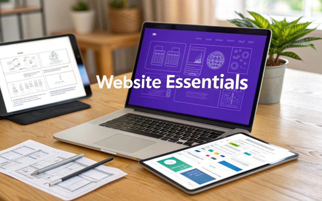
In 2026, an aesthetically pleasing website is simply table stakes. To truly capture attention, drive meaningful engagement, and ultimately boost conversions, a modern site must function as a sophisticated blend of user psychology, powerful technology, and strategic design. Many designers become fixated on visual flair alone, overlooking the foundational components that transform a digital brochure into a high-performance business asset. The most successful websites are built upon a framework of carefully selected interactive and structural components designed to guide the user journey effectively.
This comprehensive guide moves beyond the basics to explore the 10 most crucial elements of a website design that deliver tangible results. We will provide actionable strategies for creating a truly effective digital experience, focusing on the specific features that drive user action and satisfaction. We'll examine everything from dynamic popups that intelligently capture leads to the critical performance optimizations that prevent user abandonment. You will learn not just what these elements are, but how to implement them for maximum impact within the Divi ecosystem.
Whether you are a seasoned Divi developer managing complex client projects or a business owner aiming to enhance your WooCommerce store, these elements provide a definitive blueprint. This article is designed to help you construct a website that not only looks professional but is meticulously engineered to achieve its core business objectives, turning visitors into loyal customers. Forget generic advice; prepare for a deep dive into the specific mechanics of a website that converts.
1. Interactive Popups and Modal Windows
Interactive popups and modal windows are powerful user interface elements that appear as an overlay on top of existing website content. They are designed to grab immediate attention and deliver a focused message without navigating the user away from their current page. These dynamic elements are among the most effective tools for lead generation, promotions, and user guidance when implemented thoughtfully.

Unlike static banners, popups are triggered by specific user behaviors, making them a highly relevant part of a website's design. Triggers can include time on page, scroll depth, or exit intent, where the popup appears just as a user's cursor moves towards the browser's close button. This behavioral targeting ensures the message is delivered at the most opportune moment.
Best Practices for Implementation
To maximize effectiveness while respecting the user experience, consider these actionable tips:
- Use Exit-Intent Triggers: This is the least intrusive method. It captures abandoning visitors, offering them a last-minute discount or a reason to subscribe without interrupting those who are still actively browsing.
- Segment Your Audience: Don't show the same popup to everyone. Use advanced tools like Divi Areas Pro to display unique offers to logged-in users, first-time visitors, or customers who have purchased specific products.
- Provide an Obvious Exit: A popup without a clear and easy-to-find close button (the "X") creates frustration. Always prioritize user control to avoid a negative experience that could lead to a higher bounce rate.
- Optimize for Mobile: Ensure your popups are responsive and do not cover the entire screen on smaller devices, as this can be particularly disruptive and penalized by search engines.
Popups are crucial elements of a website design for driving conversions, from e-commerce sites recovering abandoned carts to blogs building their newsletter lists. To master their implementation, it's essential to understand both the art and the science behind creating popups that sell.
2. Mega Menus and Advanced Navigation
Mega menus are expansive navigation systems that present a large number of choices in a multi-column dropdown layout. Instead of a simple list, they can display links, images, and even interactive elements, offering a comprehensive overview of a site's structure at a glance. These advanced navigation solutions are critical elements of a website design for large e-commerce stores or content-heavy sites, as they dramatically improve user journey efficiency.
Unlike traditional dropdowns that can lead to frustrating "tunnel vision," mega menus group content logically, reducing the number of clicks required to reach a destination. Major retailers like Amazon and Best Buy use them to organize vast product catalogs into clear, digestible parent and child categories. This approach not only enhances usability but also provides an opportunity to visually showcase featured products or promotions directly within the navigation.
Best Practices for Implementation
To build a mega menu that guides rather than overwhelms, follow these actionable tips:
- Establish a Clear Hierarchy: Group related links under logical parent categories. Use visual cues like bold headings and indented sub-links to make the structure immediately understandable for users.
- Keep it Concise: While comprehensive, the top-level navigation should remain focused. Limit the main menu items to 5-7 key categories to prevent choice paralysis before the user even interacts with the menu.
- Enhance with Visuals: Use icons or small images to help users scan and identify sections more quickly. This is particularly effective for e-commerce sites wanting to highlight different product lines.
- Optimize for Mobile Devices: A mega menu designed for desktop will not work on smaller screens. Implement a mobile-friendly alternative, such as an accordion-style menu or a simplified list, to ensure a seamless experience for all visitors.
Mega menus are powerful tools for improving site architecture and user experience, especially for sites with complex information hierarchies. For Divi users, plugins like Divi Areas Pro simplify the creation process, allowing you to build dynamic and content-rich menus that engage users. You can learn how to build an effective mega menu in Divi to elevate your site's navigation.
3. Fly-In Widgets and Sliding Content Panels
Fly-in widgets and sliding content panels are dynamic user interface elements that animate into view from the screen's edges. They are designed to present contextual information or calls-to-action in a way that is less disruptive than a full-screen popup. These elements are highly effective for offering support, capturing leads, and displaying timely promotions without obstructing the main content.
Unlike popups, fly-ins typically occupy a smaller portion of the screen, such as a corner or a side banner. They are often triggered by user actions like scrolling down a certain percentage of the page or spending a specific amount of time on site. This behavioral triggering makes them feel like a helpful and relevant part of the browsing experience, commonly seen in live chat widgets like Intercom or social proof notifications.
Best Practices for Implementation
To integrate fly-ins effectively and enhance user engagement, consider these actionable strategies:
- Mindful Positioning: Place fly-ins where they will not cover critical navigation elements, main headlines, or primary call-to-action buttons. The bottom-right corner is a common and user-friendly position.
- Use Subtle Animations: Keep animations brief and smooth, ideally between 300-500ms. A quick, elegant slide or fade-in is more professional and less distracting than a complex, slow animation that can hurt performance.
- Prioritize High-Value Interactions: Reserve fly-ins for important actions that add value, such as offering live chat support, presenting a limited-time discount, or providing a quick contact form for inquiries.
- Ensure an Easy Exit: Always include a clearly visible and persistent "close" or "minimize" button. Forcing users to interact with a fly-in creates a negative experience and can increase your bounce rate.
Fly-in widgets are crucial elements of a website design that balance visibility with user experience. They allow you to deliver targeted messages without interrupting the user's journey. You can explore how to create a custom fly-in menu to add this sophisticated functionality to your own Divi website.
4. Tooltips and Contextual Help Systems
Tooltips are small, contextual information boxes that appear when users hover over or interact with specific interface elements. They are designed to provide brief, helpful hints, explanations, or additional details without cluttering the main content. These dynamic micro-interactions are crucial elements of a website design for improving usability and guiding users through complex features or forms.

Unlike dedicated help pages, tooltips deliver information precisely when and where it is needed. They are often triggered by a mouse hover on desktop or a tap on mobile devices, offering immediate clarification. For example, a tooltip on a form field can explain password requirements, or one on a dashboard icon can clarify its function, significantly reducing user confusion and support requests.
Best Practices for Implementation
To maximize the effectiveness of tooltips while ensuring a seamless user experience, consider these actionable tips:
- Keep Text Brief and Scannable: Limit your tooltip text to a short phrase or a single sentence (around 10-20 words). The goal is to provide a quick hint, not a detailed explanation. Use clear, simple language and avoid technical jargon.
- Ensure Mobile Accessibility: Hover-triggered tooltips do not work on touch devices. Implement a tap-based trigger or a persistent info icon ("i") that users can tap to reveal the information.
- Use for Clarification, Not Critical Info: Tooltips should offer supplementary guidance. Never place essential information that every user must see inside a tooltip, as some may not discover it.
- Position Consistently: Place tooltips in a consistent location relative to their trigger element (e.g., always above or to the right). This predictability helps users know where to look and improves the overall user interface coherence.
Tooltips are indispensable for guiding users through form fields, explaining complex pricing options on an e-commerce site, or clarifying features in a web application. When used correctly, they enhance clarity and build user confidence, making them a subtle yet powerful element of any thoughtful website design.
5. Content Injection and Dynamic Block Insertion
Content injection is a powerful technique that programmatically inserts, replaces, or modifies content on specific pages or sections based on predefined conditions, user behavior, or context. This dynamic approach allows for deep personalization, A/B testing, targeted advertising, and conditional messaging without altering the core page template. It is one of the more advanced elements of a website design, crucial for creating truly responsive and intelligent user experiences.
Unlike static content that remains the same for every visitor, injected content adapts to the user. For instance, a WooCommerce store could show different product recommendations based on purchase history, or a blog could display a unique call-to-action for subscribers versus first-time visitors. This level of customization ensures that the content is always relevant, significantly boosting engagement and conversion rates.
Best Practices for Implementation
To implement dynamic content effectively without compromising site performance or user clarity, follow these actionable tips:
- Define Clear Targeting Conditions: Use a precise set of rules to determine who sees what. Conditions can be based on location, user role, device, or even the date, allowing you to inject seasonal banners or promotions automatically.
- Establish Naming Conventions: As you create more dynamic rules, a clear and consistent naming convention for your injected content blocks (or "Areas") is essential. This prevents confusion and makes maintenance much easier for your team.
- Test Injected Content Thoroughly: Always verify your dynamic blocks across different devices and user scenarios. Ensure the injected content integrates seamlessly with the existing layout and does not cause visual or functional issues.
- Monitor Performance Impact: Poorly configured injection rules can lead to excessive database queries, slowing down your site. Use tools like Divi Areas Pro that are optimized for performance and provide a clean, efficient way to manage dynamic content.
Content injection is a game-changer for marketers and designers aiming to deliver personalized web experiences. From showing location-specific messaging to swapping out entire sections for different user segments, it transforms a static website into a dynamic, user-centric platform. To explore how this can be achieved in Divi, learn more about advanced content display rules.
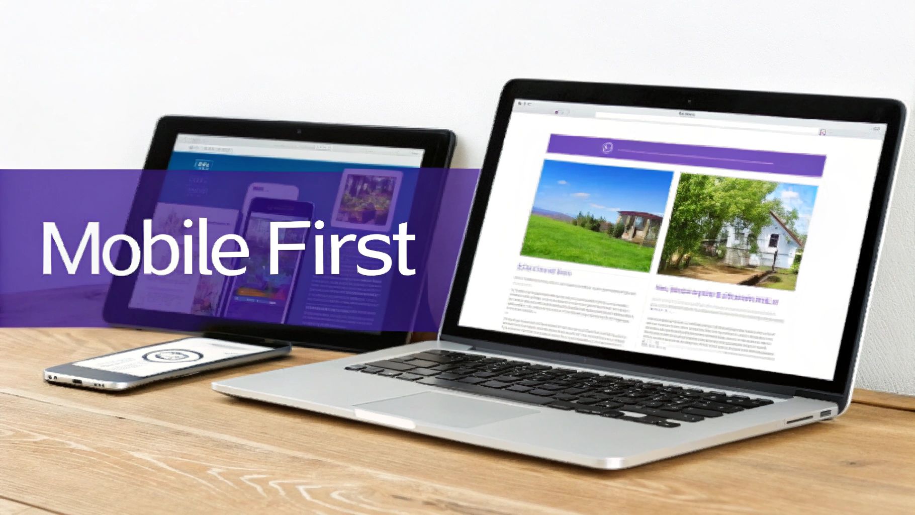
6. Responsive and Mobile-First Design
Responsive design ensures a website functions optimally across all devices and screen sizes, from large desktops to small smartphones. It uses fluid layouts, flexible images, and CSS media queries to adapt the viewing experience automatically. The mobile-first approach takes this further, prioritizing the mobile layout as the foundation and progressively enhancing it for larger screens.
With mobile devices now accounting for the majority of web traffic, this strategy is no longer optional. It is a fundamental requirement for modern websites. A cornerstone of modern web development is ensuring effective mobile website design, providing an optimal experience across all devices. This directly impacts user satisfaction, search engine rankings, and conversion rates.
Best Practices for Implementation
To build a truly seamless cross-device experience, follow these essential tips:
- Design Mobile-First: Start your design process with the smallest screen. This forces you to prioritize core content and functionality, leading to a cleaner, more focused user experience that can then be expanded for tablets and desktops.
- Use Divi's Responsive Tools: Extensively use the Divi Builder's device preview modes (desktop, tablet, and mobile) to check your layouts. Divi allows you to set different values for margins, padding, font sizes, and even module visibility on a per-device basis.
- Optimize Touch Targets: Ensure all buttons, links, and interactive elements are large enough to be easily tapped on a mobile screen. A minimum size of 44×44 pixels is a widely accepted standard to prevent user frustration.
- Simplify Mobile Navigation: Complex desktop menus don't translate well to small screens. Implement a streamlined "hamburger" menu or a simplified navigation bar that prioritizes the most important pages for mobile users.
Responsive and mobile-first principles are critical elements of a website design that cater to the modern user. By leveraging frameworks like Divi and focusing on the mobile experience from the outset, you create a site that is accessible, user-friendly, and optimized for today’s browsing habits.
7. Call-to-Action (CTA) Buttons and Strategic Placement
Call-to-action (CTA) buttons are the interactive elements designed to guide users toward a specific, desired action, such as making a purchase, signing up for a newsletter, or downloading a resource. They are arguably one of the most critical elements of a website design, as they directly bridge the gap between user engagement and conversion. The effectiveness of a CTA depends heavily on its design, copy, and strategic placement on the page.
Unlike passive text links, CTA buttons use visual cues like color, size, and shape to draw attention and create a clear path for the user journey. Their goal is to eliminate ambiguity and prompt an immediate response. Successful examples range from Amazon's unmistakable "Add to Cart" and "Buy Now" buttons to Slack's prominent "Try for Free" CTAs that dominate their homepage, making the next step obvious and compelling.
Best Practices for Implementation
To create CTAs that convert effectively and enhance the user experience, consider these actionable tips:
- Use Contrasting Colors: Your CTA button should stand out from the page background and surrounding elements. Use a color that is part of your brand palette but offers high contrast to ensure it immediately catches the eye. Divi’s built-in button styling options make it easy to test and implement this.
- Write Action-Oriented Copy: Replace generic words like "Submit" with specific, benefit-driven text. Phrases like "Get Your Free Guide," "Start My Trial," or "Claim My Discount" tell users exactly what they will get, increasing click-through rates.
- Prioritize Strategic Placement: Position your primary CTA "above the fold" or in a prominent location where users are most likely to see it without scrolling. For longer pages, repeat the CTA at key decision-making points to ensure it's always accessible.
- Optimize for Mobile: Ensure buttons are large enough to be easily tapped on smaller screens without accidental clicks on adjacent elements. A touch-friendly design is non-negotiable for mobile users.
Well-designed CTAs are fundamental elements of a website design that drive business goals. Mastering their design and placement is a core skill in conversion rate optimization, turning passive visitors into active customers.
8. Social Proof and Trust Elements
Social proof and trust elements are psychological triggers that build credibility and user confidence by demonstrating that other people value a product, service, or brand. These elements leverage the concept that people conform to the actions of others under the assumption that those actions are correct. Integrating testimonials, reviews, and trust badges are essential elements of a website design for converting skeptical visitors into loyal customers.
From Amazon's star ratings to a SaaS company's "Trusted By" logo bar, social proof works by validating a user's decision-making process. When visitors see that others have had a positive experience, it reduces their perceived risk and hesitation. This validation is critical at key decision points, such as near a "Buy Now" button or a subscription form.
Best Practices for Implementation
To effectively integrate social proof and build trust, consider these actionable strategies:
- Be Specific and Authentic: Vague testimonials like "Great service!" are less impactful. Instead, showcase reviews that highlight specific outcomes, such as "Increased our lead generation by 40% in three months." Always use real customer names and photos where possible to enhance authenticity.
- Place Strategically: Position your strongest social proof next to key calls-to-action (CTAs). Displaying a glowing testimonial or a security badge directly on a checkout page can significantly reduce cart abandonment.
- Showcase Diversity and Recency: Feature testimonials from various customer types or industries to appeal to a wider audience. Including dates on reviews also shows that your service is consistently valuable and relevant over time.
- Leverage Trust Badges: Prominently display security seals (SSL certificates), accepted payment method logos (Visa, PayPal), and industry certifications. These visual cues immediately communicate safety and professionalism, especially on e-commerce sites.
Social proof is one of the most persuasive elements of a website design, directly influencing conversion rates by alleviating customer concerns. For Divi users, showcasing client logos or building dynamic testimonial sliders is a straightforward way to integrate this powerful principle into any page layout.
9. Fast Loading Performance and Core Web Vitals Optimization
Website performance is no longer a technical afterthought; it is a foundational element of modern website design that directly impacts user experience, SEO rankings, and conversion rates. Fast loading speeds are critical for retaining visitor attention, while Core Web Vitals are Google's specific metrics used to measure the quality of a user's on-page experience. These vitals include Largest Contentful Paint (LCP), First Input Delay (FID), and Cumulative Layout Shift (CLS).
A slow website frustrates users and signals poor quality to search engines, leading to higher bounce rates and lower rankings. Optimizing for speed involves a multi-faceted approach, including efficient code, compressed media, and smart resource delivery. Divi's built-in performance features, such as dynamic CSS and JavaScript libraries, provide a solid starting point for achieving excellent scores in tools like Google PageSpeed Insights and GTmetrix.
Best Practices for Implementation
To deliver a lightning-fast experience and ace your Core Web Vitals, integrate these actionable strategies:
- Optimize Images and Media: Use lazy-loading for all images and videos below the fold. Compress images and serve them in next-gen formats like WebP to drastically reduce file sizes without sacrificing quality.
- Minify and Defer Resources: Minify CSS and JavaScript files to remove unnecessary characters and reduce file size. Use async or defer attributes on scripts to prevent them from blocking the initial rendering of the page.
- Leverage Caching and a CDN: Implement browser caching to store static assets locally for returning visitors. Use a Content Delivery Network (CDN) like Cloudflare to distribute your assets across global servers, reducing latency for users worldwide.
- Monitor and Refine: Regularly test your site using Google PageSpeed Insights. Pay close attention to the Core Web Vitals report in Google Search Console to identify and fix pages with poor user experience scores.
Optimizing performance is a crucial, ongoing process. To effectively deliver fast loading performance and optimize Core Web Vitals, it's essential to understand strategies to increase your page speed and continuously refine your approach.
10. Clear Value Proposition and Visual Hierarchy
A clear value proposition is the concise, powerful statement that communicates what makes your offering unique and valuable. It answers the visitor’s question: “What’s in it for me?” Paired with a strong visual hierarchy, which arranges elements to guide the user’s eye, these foundational elements of a website design ensure that your most important message is seen and understood instantly.
Visual hierarchy uses design principles like size, color, contrast, and whitespace to direct attention. A large, bold headline (the value proposition) naturally draws more focus than smaller subheadings or body text. This structured approach prevents cognitive overload and directs users toward key actions, such as signing up or making a purchase. Companies like Stripe and Slack excel at this, presenting their core benefit clearly above the fold.
Best Practices for Implementation
To establish a compelling value proposition and effective visual hierarchy, consider these actionable tips:
- Lead with the Primary Benefit: Your main headline, placed prominently above the fold, should immediately convey the primary benefit your user will receive. Use the Divi Builder to make this text the largest and most visually distinct element.
- Create Logical Scanning Patterns: Design your layout to follow natural eye movements, like the F-pattern or Z-pattern. Place the most critical information, such as your call-to-action, along these paths.
- Use Whitespace Deliberately: Ample empty space around elements reduces clutter and increases comprehension. It helps isolate important components, like a pricing table or a contact form, making them stand out.
- Limit Font Families: Stick to two or three font families to maintain consistency and clarity. Use variations in font weight (bold, regular) and size to establish a clear typographic hierarchy.
A strong value proposition and visual hierarchy are not just aesthetic choices; they are crucial elements of a website design that turn visitors into customers by providing a clear, effortless journey. Mastering these principles is fundamental to creating a user-centric and conversion-focused digital experience.
10 Website Design Elements Comparison
| Item | Implementation Complexity 🔄 | Resource Requirements ⚡ | Expected Outcomes 📊⭐ | Ideal Use Cases 💡 | Key Advantages ⭐ |
|---|---|---|---|---|---|
| Interactive Popups and Modal Windows | Moderate — trigger logic, targeting, A/B tests | Low–Moderate — plugin/asset load; monitor performance | ⭐⭐⭐⭐ — higher conversions & lead capture; measurable uplift | E‑commerce offers, newsletter signups, abandoned carts | Targeted personalization; flexible triggers; strong metrics |
| Mega Menus and Advanced Navigation | High — multi-column layouts, accessibility, mobile behavior | Moderate–High — design, content upkeep; media can slow pages | ⭐⭐⭐ — greatly improves discoverability and reduces clicks | Large catalogs, enterprise sites, content-heavy portals | Organizes complex content; enhances internal linking and UX |
| Fly-In Widgets and Sliding Panels | Low–Moderate — animation + trigger tuning | Low — small assets; requires mobile testing | ⭐⭐⭐ — good engagement without blocking content | Live chat, support, limited-time promotions | Visible yet non-intrusive; toggle/minimize options |
| Tooltips and Contextual Help Systems | Low — small components, positioning, accessibility | Low — minimal assets; content creation effort | ⭐⭐⭐ — improves usability and reduces support load | Forms, dashboards, complex features or product specs | Contextual guidance; non-cluttering help; boosts adoption |
| Content Injection & Dynamic Block Insertion | Moderate–High — rule complexity and testing | Moderate — targeting logic, scheduling, API integrations | ⭐⭐⭐⭐ — strong personalization and relevance; conversion lift | Personalized campaigns, A/B tests, role-based messaging | Insert content without template changes; targeted messaging |
| Responsive & Mobile-First Design | High — planning, breakpoints, cross-device testing | Moderate — design/dev time and device testing | ⭐⭐⭐⭐ — broader reach, better SEO and mobile conversions | Any site with mobile users; priority mobile-first projects | Single codebase across devices; SEO and UX benefits |
| Call-to-Action (CTA) Buttons & Placement | Low — design + placement testing | Low — copy/design variations and analytics | ⭐⭐⭐⭐ — direct, measurable conversion improvements | Landing pages, product pages, signup flows | Clear direction for users; easy A/B testing; measurable ROI |
| Social Proof and Trust Elements | Low–Moderate — collect/display testimonials and badges | Low — ongoing curation and review integrations | ⭐⭐⭐⭐ — significant trust and conversion lift | E‑commerce, SaaS signups, new visitors | Builds credibility; reduces purchase anxiety; cost-effective |
| Fast Loading & Core Web Vitals Optimization | High — technical profiling and fixes across stack | High — dev expertise, tooling, CDN and monitoring | ⭐⭐⭐⭐⭐ — better SEO, lower bounce rates, higher conversions | High-traffic sites, e‑commerce, SEO-critical projects | Improves Core Web Vitals; faster UX; long-term cost savings |
| Clear Value Proposition & Visual Hierarchy | Moderate — copy strategy + design iteration | Moderate — copywriting, design resources, testing | ⭐⭐⭐⭐ — faster comprehension and higher conversions | Landing pages, product pages, homepage hero sections | Reduces cognitive load; guides attention; boosts clarity |
Putting It All Together: Your Next Steps to a Better Website
Navigating the landscape of modern web design can feel like assembling a complex puzzle. We've explored ten critical elements of a website design, from the engaging power of Interactive Popups to the foundational necessity of a Clear Value Proposition. Each piece, whether it's the seamless navigation provided by Mega Menus or the trust-building authority of Social Proof, plays a distinct and vital role. However, the true artistry lies not in simply having these pieces, but in how you connect them to create a single, cohesive, and compelling user experience.
A website is a living digital ecosystem. The elements we've discussed are not a static checklist to be marked off once and forgotten. Instead, they are dynamic tools that must work in harmony. A lightning-fast site (optimized for Core Web Vitals) is of little use if the visual hierarchy is confusing and users can't find the strategically placed CTA buttons. Similarly, a brilliant Fly-In Widget will only annoy users if it obstructs a mobile-first design. The goal is to build a system where each component enhances the others, guiding the user on a frictionless journey from arrival to conversion.
From Knowledge to Action: Your Implementation Roadmap
Understanding these concepts is the first step; applying them is what generates results. To move forward effectively, avoid the temptation to overhaul everything at once. Instead, adopt a strategic, iterative approach to integrate these powerful elements of a website design into your Divi projects.
Here is a practical, step-by-step plan to get you started:
Conduct a User Experience Audit: Begin with a clear-eyed assessment of your current website. Where are the friction points? Use analytics to identify pages with high bounce rates or low conversion. This data-driven diagnosis will reveal your most significant opportunities, whether it's clarifying your navigation or improving mobile responsiveness.
Prioritize for Maximum Impact: Based on your audit, rank the elements in order of importance for your specific goals. If user engagement is low, perhaps implementing interactive Tooltips or Content Injection with Divi Areas Pro is your top priority. If your conversion rates are suffering, focus first on optimizing your CTAs and reinforcing them with social proof.
Implement and Test Methodically: Introduce one major change at a time. For example, if you decide to implement a Mega Menu, build it, deploy it, and then measure its impact on user navigation and time-on-site. A/B testing is your best friend here. This methodical process prevents you from guessing which changes are actually moving the needle.
Gather Feedback and Iterate: Your work is never truly done. Use feedback tools, conduct user surveys, and watch session recordings to understand how real people interact with your new features. Use these insights to refine and improve, ensuring your website continuously evolves to meet user expectations and business objectives.
Mastering these elements of a website design is what separates a forgettable online presence from a powerful, conversion-focused machine. It's the difference between a digital brochure and a dynamic business asset that works for you around the clock. By moving beyond theory and into strategic implementation, you can create a Divi website that not only looks stunning but also delivers tangible, measurable results for your business or your clients in 2026 and beyond.
Ready to implement these advanced elements of a website design without writing a single line of code? Divimode develops powerful plugins like Divi Areas Pro that empower you to create interactive popups, mega menus, fly-ins, and more, directly within the Divi builder. Unlock your Divi site's full potential and start building more dynamic and effective user experiences today at Divimode.
More Articles You Will Like