Popups for Divi
Create Popups in the Visual Builder!
- Transform every Section into a popup
- Unlimited Popups on every page
- Trigger popups via Button or Link
- Extendable via a professional JavaScript API
- No configuration, simply install and use
Popups in Divi. The way they should be.
Transform every Divi-section into a Popup without leaving the Visual Builder. The configuration is simple via our innovative UI.
Read more, to find out why Popups for Divi is the leading Popup plugin for your Divi website.
Simple
The plugin adds a brand-new Popup-tab to the section settings-modal. With those new options, you can turn a regular section into an interactive Popup.
Flexible
Show your Popups when you need them. For example, when clicking a link or button, or on exit-intent. You can even create advanced, custom triggers by using the plugins JavaScript API.
Fast & Responsive
Every line of code is optimized to load your page as fast as possible. It’s perfectly compatible with all caching plugins and all devices.
Integrated
Popups for Divi can display any default module that comes with Divi. It plays well with the Divi- and Extra theme, and the Divi Builder plugin, WooCommerce, etc.
Extendable
A stable and documented JavaScript API and possible customization via WordPress filters make this plugin even more versatile!
Free forever
Popups for Divi is 100% free, and will always remain free! Get incredible features included for free that other Divi Popup plugins charge for!
"Huge fan of your plugin"
I am a huge fan of your plugin Popups for Divi, as an independent web developer, I use it a lot for my clients!
Miguel
Your first popup, in 60 seconds!
- Install the plugin
Log into your admin dashboard and find the plugin Popups for Divi. Install and activate it. -
Define a Popup
Enter the Visual Builder and add a new section. In the section settings, enable the option “This is a Popup” and set the popup ID to “sample“. -
Trigger the Popup
Finally, add a new button to a different section, and set the link URL to “#sample“. -
Done
Now save your page, and load it without the Visual Builder – click the button to see your Popup in action!
Need more details?
We’ve created a free 6-day email course that walks you through all aspects of Popups for Divi – many samples, images, and even code snippets.
(opens in new tab)
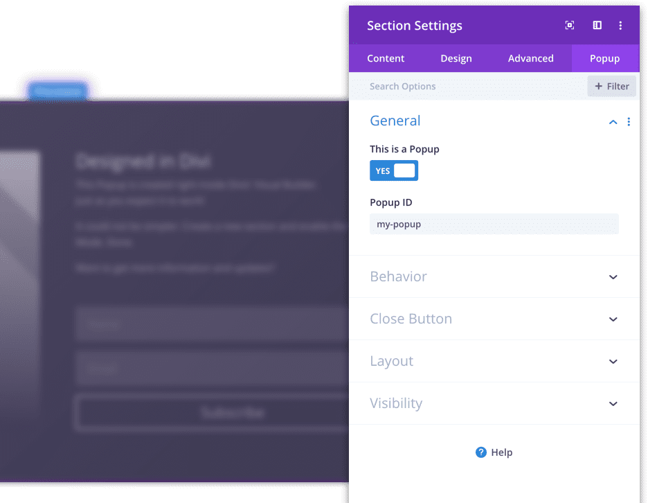
The first Popup
It’s so simple to turn a Divi section into a Popup!
All Popup Options
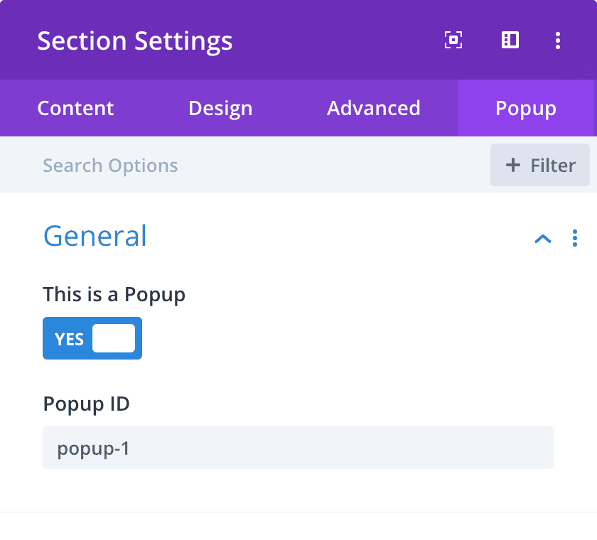
General
This is a Popup

Turns the current Divi section into a Popup. When enabled, additional options become available.
Popup ID

Assign a unique ID to the Popup. You can display this Popup by using this name in an anchor link, like “#slug”.
Behavior
Close on Background-Click
Here, you can decide whether the Popup can be closed by clicking somewhere outside the Popup.
When this option is disabled, the Popup can only be closed via a close button or pressing the ESC key on the keyboard.
Close other Popups
Here, you can decide whether this Popup should automatically close all other Popups when it is opened.
Enable Exit Intent
When you enable the exit intent trigger, the Popup is automatically opened before the user leaves the current webpage.
Note that this behavior only works on desktop browsers, not on touch devices like phones – Divi Areas Pro has a “back-button trigger” that works on all devices.
Close Button
Show Close Button
Do you want to display the default close button in the top-right corner of the Popup?
When the close button is hidden, the user can dismiss the Popup by clicking on the background overlay, or pressing the ESC key.
Button Color

Here, you can choose the color of the built-in close button. The default style is dark (i.e., the “x” icon is dark), which looks good when your Popup has a light background color.
When you design a Popup with a dark background color or image, when use a light button for better contrast.
Options:
- Dark
- Light
Transparent Background
This option allows you to remove the background color of the close button.
When enabling the transparent background, the close button only shows the x-icon and no square background.
Layout
Add a Default Shadow
Decide, whether you want to add a default shadow to your Popup.
You should disable this option, when you set a custom box shadow for this section.
Show Loader
Enable this to display a loading animation in the background of the Popup.
This should be turned on, when the Popup contains an iframe or other content that is loaded dynamically.
Visibility
Disable on

Here you can disable the Popup on selected devices.
Options:
- Phone
- Tablet
- Desktop
The JavaScript API
How to use the JS API
Looking for a step-by-step guide on how to add this code to your webpage? Here it is:
JS API Overview
Code Generator
A developer tool to help you to create custom JS snippets for Popups for Divi.
"Great contribution"
That is one awesome free plugin – and a real bonus having the API!
What a great contribution to the Divi user community.
Paul
Feature Comparison
See, what’s included in our plugins and why customers love them.
Forum
Forum
Forum
Forum
Forum
Forum
Forum
Demos
No Close Button
By default, every Popup displays a close button in the top-right corner. In the section settings, you can choose not to display that button.
Dark Background
You can customize the built-in close button in two ways: You can remove the background rectangle and only display the close Icon, and you can invert the colors to make the button look nice on dark backgrounds. This demo applies both changes.
Modal Popup
A modal Popup cannot be closed “accidentally”: It ignores any click that is outside the Popup. You need to close the Popup via the Close Button (or the Escape-Key).
Custom Close Button
You can even create your own Close Button and hide the default one. This is simple, as you only need to add the CSS class “close” to any button/link inside the Popup. The element will be turned into a Close Button.
Sample Opt-In Form
In this example, we use a two-column layout inside the Popup: The left column displays an image module, and on the right side contains an email opt-in module.
We’ve also applied some styles to the section – like dark background color, a maximum width of 1080 pixels, and some other changes.
Now it’s your turn!
To learn how to build those Popups, download the demo files. Inspect the Popups on your own website inside the Visual Builder and adjust them to your needs.
How do the demo files work?
We’ve prepared a zip package with some Visual Builder export files. To use those samples, you need to extract the JSON-files and then import the layout into your Visual Builder.
Then click through all elements to examine the section- and module settings.
What demos are included?
The zip package contains the following demo files:
- File 1: A single, basic Popup with a Button trigger.
- File 2: All samples from this page ←
- File 3: JS API sample – see the code module contents.
Demo Files
Download Divi Layouts with Popup demos and code samples
"Amazing Support"
Thank you for the help!!
I forgot to tell you … you’re the best! Have a good day
Jonathan
No Close Button
This Popup does not have a close button in the top right corner.
To close this Popup, either press the ESC key on your keyboard or click somewhere outside the Popup.
Dark Background
Take a look at the close button in the top right corner: It only displays an Icon (without the rectangle frame) and the icon is light, to match the dark background of this Popup.
Modal Popup
For this Popup we set the Option “Close on Background-Click” to No.
This creates a so-called “modal” Popup that can only be closed via the ESC key on your keyboard or a Close Button that is displayed in the Popup.
Custom Close Button
This Popup is a modal Popup that has no built-in Close Button.
So we have added a custom Close Button below, that you can use to close the Popup. By the way: You can style that custom Close Button in any way you like!
Close this Popup
Frequent questions. And answers.
Does Popups for Divi slow down my website?
No!
The plugin is tuned for maximum page performance with no bloat, no external libraries, no ads.
In all tests we’ve conducted on various websites, we’ve seen absolute no performance impact at all. Give it a try yourself!
The details: The plugin adds a single line of CSS and a small JS snippet to your page source code. Additionally, a minified JS and a very basic CSS file is loaded on the first page visit. All files are loaded asynchronously, and are cached by the browser.
Trust us, your visitors will not notice anything.
Is it compatible with my caching plugin?
Yes, absolutely!
This plugin does not create any dynamic HTML content, as other popup plugins do. We’ve built this plugin for best performance. This means: Popups for Divi embraces every caching plugin you could throw at it!
Really, there is almost no PHP (“dynamic”) logic at all. The actual plugin is a static JS file, which runs on the user’s browser. It typically is stored in browser-cache and can even be served via a CDN.
What are the requirements for this plugin?
To use Popups for Divi without complications, you need at least
- WordPress 5.6
- Divi/Extra theme or the Divi Builder plugin v4.0
- jQuery 3.5.1 – i.e., the default version shipped with WordPress
Most likely, the plugin will also work with much older versions of Divi or WordPress. But let’s be serious; why would anyone want to use outdated software!?
Which themes are supported?
We’ve built (and test) Popups for Divi using the Divi theme, but we support all elegant themes products: You can use it with the Divi theme, the Extra theme, or a custom theme that uses the Divi Builder plugin.
It’s your choice.
Is it compatible with the Divi Builder plugin?
Yes, we frequently test Popups for Divi with the latest version of the Divi Builder plugin and a default WordPress theme.
However, some themes can include CSS or JavaScript that interferes with Popups for Divi. When this is the case, please head over to divimode.com/get-support and let us know about the problems, and we’ll help you get the plugin working on your website!
Can I show a Popup on page load?
Here is a full list of all trigger options.
Can I use this plugin for exit-intent Popups?
Here is a full list of all trigger options.
Can I show Popups when the user clicks a button?
Here is a full list of all trigger options.
A shortcode/module/snippet is not showing up!
Popups for Divi can reliably display static content to your users.
Static means: The entire Popup content is available on page load and can be cached.
Dynamic content might be displayed correctly in some cases, but not reliably. If you want to use dynamic content inside Popups, please upgrade to Divi Areas Pro.
Dynamic means: The content is shows user-specific details (like a cart), is loaded via Ajax, or is generated by JavaScript.
Rule-of-thumb: When you need to use the code module, you possibly insert dynamic content into the Popup.
Something isn't working. Can you help me?
Of course, we do our best to provide support for this plugin via the wordpress.org support forums.
Really, this plugin has a fantastic community, and we love to be in touch with you and see how you use this plugin to improve your Divi sites. 😄
But please keep in mind that this is a free plugin, and we cannot answer all requests instantly.
In case you need priority-support, you can always purchase a Divi Areas Pro license and make use of the Live Chat support.
Popups for Divi is a very simple, and great plugin. In fact, it is the simplest plugin I have ever used
Simple to use right out of the gate. Very intuitive & can create the desired result without being a major techie
The beauty of this plugin is that your are able to have the full Divi experience in designing your popups. You can use all and multiple modules within a popup.
Other plugins just allow text input or the like. But this one gives you the whole experience of the Divi builder. Just nice!
A simple plugin that just work like it’s supposed to, for free, amazing work!!
This is one of the best Popup plugins in Divi with responsive support. Easy to use, no need for any technical knowledge.
More Features, New Area Types and Triggers
Level-up your Divi website today by adding three totally new Area types, 9 unique automatic triggers, support for dynamic content inside Popups (like HubSpot forms), GDPR-compliant usage tracking, and much more!
Test it risk-free for 14 days.