 Alex Martin
Designing a website header isn’t just a task to check off your list; it’s a strategic move that sets the tone for a visitor's entire journey. A great header is where brand identity, dead-simple navigation, and a clear call-to-action all come together to create a seamless experience. Get it right, and that critical first glance turns into real, lasting engagement.
Why Your Header Is More Than Just Navigation
That little strip at the top of your website? It’s the digital equivalent of a firm handshake and a friendly welcome. It’s almost always the first thing a visitor interacts with, and its design can make or break their experience in a fraction of a second.
This space does some serious heavy lifting. It's where your logo lives, constantly reinforcing your brand. It’s the primary roadmap that helps users find what they need, saving them from the frustration that sends them clicking the back button. Even more, a thoughtfully designed header builds instant trust and credibility.
The Science of First Impressions
A visitor forms an opinion about your website almost instantly. Research has shown that design influences a staggering 94% of visitors' first impressions, and it can take as little as 0.05 seconds for them to decide if your site is trustworthy. Since the header is front and center, it carries a massive amount of weight in that split-second judgment.
This is exactly why understanding the core principles of user experience design fundamentals is so important. A header isn’t just about looking good; it's about creating an intuitive pathway that serves your users' needs without making them think.
Your header is not just a container for links; it's a strategic asset. Every single element, from your logo's placement to the color of your call-to-action button, should have a clear purpose that ties directly back to your business goals.
Key Components of a High-Performing Header
To get started designing a website header that actually works, you need to understand its core building blocks and the job each one does. Every piece plays a part in the overall effectiveness, helping users get around while pushing your own objectives forward.
Let's break down the essential elements that every great header needs.
The table below outlines the core components of an effective header, detailing their strategic purpose and how they directly influence the visitor's experience. Think of it as your cheat sheet for building a header that's both user-friendly and goal-oriented.
Essential Header Elements and Their Strategic Role
| Component | Strategic Purpose | Impact on Visitors |
|---|---|---|
| Logo | Brand Recognition & Home Link | Establishes brand identity and provides a familiar, reliable way to return to the homepage. |
| Navigation Menu | User Guidance & Accessibility | Offers a clear, organized roadmap of the site's most important content, reducing confusion. |
| Call-to-Action (CTA) | Conversion & Goal Alignment | Directs users toward the most important action (e.g., "Shop Now," "Get a Quote"), guiding them down the funnel. |
| Search Functionality | User Empowerment & Efficiency | Allows visitors to find specific information quickly, which is critical for e-commerce or content-heavy sites. |
By strategically combining these elements, you move beyond a simple navigation bar. You create a powerful tool that drives user engagement, builds trust, and ultimately contributes to your business's bottom line. For more inspiration, check out our detailed guide for more examples of effective headers for website design to see these principles in action.
Mapping Out Your Header Strategy
Jumping straight into the Divi Theme Builder without a solid plan is a recipe for a headache. I’ve seen it happen countless times. Before you even think about adding a single module, take a step back and map out a clear strategy. This foundational work ensures every single element you build has a purpose and actually moves the needle for your business goals.
First things first: what is your header's primary job? Is it there to drive sales with a big, bold "Shop Now" button? Or maybe its main goal is to capture leads with a "Request a Quote" CTA. For content-heavy sites like blogs or news portals, the focus might be on making navigation dead simple so visitors can find what they're looking for without a fuss.
This single, core objective will shape every other decision you make down the line.
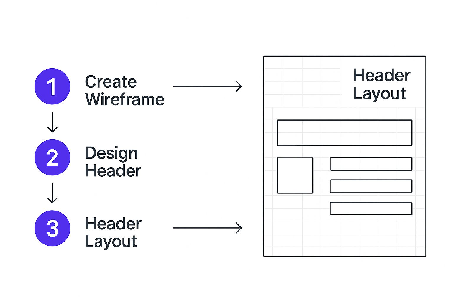
Trying to visualize the layout with a simple wireframe is a game-changer. It helps you organize all the moving parts before you get lost in Divi's design settings. The wireframe above is a perfect example of blocking out space for your logo, navigation, and CTA, establishing a clear visual hierarchy from the get-go.
Defining User Pathways and Header Types
With your main goal locked in, it’s time to think about the paths your users will take. An eCommerce customer has a totally different mindset and needs than someone looking for technical support. Your job is to map out the most important pages and structure your menu so it feels completely intuitive to your specific audience. This process will naturally lead you to the right header type for the job.
- Sticky Header: This is the header that stays fixed at the top of the screen as the user scrolls. It’s fantastic for keeping your main navigation and CTAs accessible at all times, which is a massive win for user experience, especially on longer pages.
- Transparent Header: This is a more modern style that overlaps the hero section of your page, creating a clean, seamless look. It works best when you have a strong hero image to show off and is a popular choice for portfolio or agency websites.
- Mega Menu: If you're running a site with a ton of content—think large online stores or sprawling news platforms—a mega menu is your best friend. It displays multiple levels of navigation in a large dropdown panel, preventing that cluttered, overwhelming feeling.
Wireframing Your Layout and Features
Okay, now grab a pen and paper (or your favorite digital tool) and sketch out a simple wireframe. This doesn't need to be a polished, high-fidelity design; a basic layout is all you need. Decide where your logo, menu, and primary CTA will live. Are you going to include a search bar? What about contact details or social media icons?
This planning phase is a small investment of time that pays off big time. In fact, research shows that for every dollar invested in user experience, businesses can see a return of $100. A well-planned header is a huge part of that experience, making your site both easier to use and more effective. You can dig into more of these powerful web design statistics and their impact if you're curious.
Planning isn't about avoiding mistakes; it's about making sure you're solving the right problem from the start. Your header strategy should directly address your users' needs and your business objectives, turning that prime real estate into a powerful conversion tool.
By clarifying your goals, understanding your users, and picking the right features before you even open Divi, you're setting yourself up for a much smoother build and a final product that actually works.
Building Your Custom Divi Header
Alright, with a solid strategy mapped out, it's time to roll up our sleeves and jump from planning into practice. This is the fun part—where we bring your vision to life inside the Divi Theme Builder. We're going to move beyond the basics here and focus on building a polished, professional header that's as functional as it is visually impressive.
First things first, we need to create a new global template. A global header is non-negotiable; it ensures your design appears consistently across your entire website, which is a cornerstone of good branding and a predictable user experience. Once you’re in the Theme Builder, you'll add a new template, assign it to "All Pages," and then you can start building.
If you need a more detailed walkthrough of that initial setup, we have a dedicated guide that shows you exactly how to create a global header with Divi.
Structuring with Sections and Rows
Every great Divi layout is built on a solid foundation. Inside your new header template, you'll start by adding a section and then inserting a row. The row structure you pick here is critical because it defines the entire layout for your core elements—the logo, the menu, and that all-important call-to-action button.
From my experience, a three-column row is one of the most common and effective layouts. It just works. This setup lets you place your logo on the left, your navigation menu smack in the center, and your CTA button on the right. This arrangement follows a natural eye-tracking pattern, making it instantly familiar and easy for visitors to use.
Adding and Customizing Core Modules
With the structure in place, it’s time to start populating it with Divi’s modules. These are the building blocks of your header, and each one comes with a huge range of styling options, so you can dial in the design to perfectly match your brand.
Here are the essential modules you'll almost certainly be using:
- Image Module (for your logo): Pop an Image module into the left column. Here's a pro tip: instead of uploading your logo image directly, use Divi’s Dynamic Content feature to pull in your Site Logo. This little trick saves a ton of headaches later. If you ever update your logo in the Theme Customizer, it'll automatically update everywhere.
- Menu Module: Drop the Menu module into the center column. This is where you’ll select the primary menu you set up earlier in WordPress. Divi gives you complete control over the typography, colors, and spacing of your menu links, so get in there and make it your own.
- Button Module: Finally, in the right-hand column, add a Button module for your primary CTA. This is your money-maker, so customize the text, colors, and hover effects to make it really pop and draw the user's eye.
A well-structured header should feel balanced and intuitive. Pay close attention to spacing and alignment within your rows and columns. Don't forget to check Divi's responsive settings to ensure your columns stack correctly on smaller devices, keeping everything clean and organized.
Refining the Details for a Professional Finish
The difference between a good header and a truly great one often comes down to the small details. Don't be afraid to get granular with Divi’s module settings to fine-tune every aspect of the design until it's pixel-perfect.
Here are a few finishing touches I always focus on:
- Sizing and Spacing: Play with the padding and margins of your section, row, and individual modules. This controls the header's overall height and creates that essential visual breathing room. A cramped header feels overwhelming; give your elements space to shine.
- Vertical Alignment: This is a big one. Use the column settings to vertically align your modules. Nine times out of ten, centering them is the best move, ensuring your logo, menu, and button are all perfectly aligned on the same horizontal axis.
- Hover Effects: Add subtle hover effects to your menu links and CTA button. This isn't just for looks; it provides crucial visual feedback to the user, confirming that an element is clickable and interactive.
By taking this structured approach—building the frame, adding the core components, and then polishing the details—you can create a custom Divi header that looks like it was designed by a seasoned professional. This hands-on process is where your strategic plan really starts to pay off.
Designing a Flawless Mobile Header Experience
A stunning desktop header means nothing if it falls apart on a smaller screen. I've seen it countless times—a beautiful design that becomes a jumbled mess on a phone. With mobile devices driving most web traffic today, designing with a mobile-first mindset isn't just a good idea; it's essential for survival.
A clunky, oversized, or confusing mobile header will send visitors running. Fast.
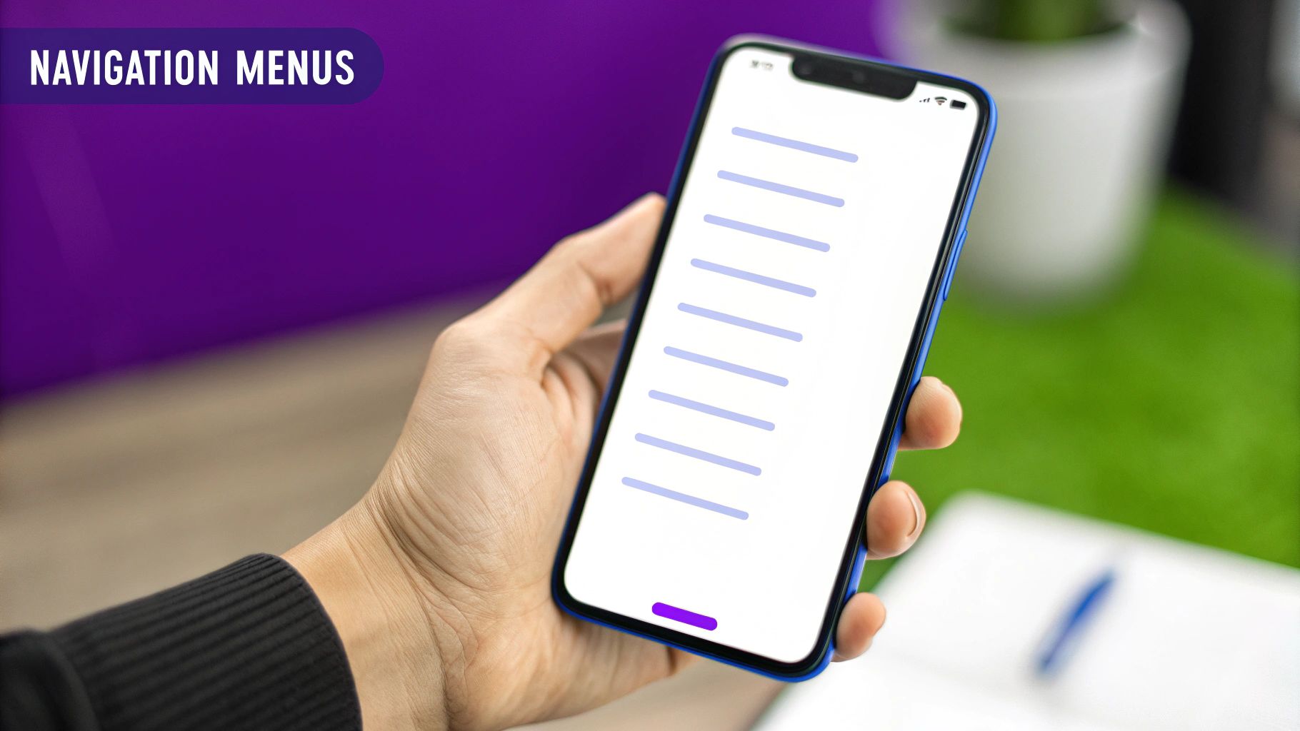
The whole goal is to smoothly transition from a wide, multi-column desktop layout to a clean, single-column experience that puts speed and usability first. This usually means swapping your horizontal navigation menu for that familiar, compact hamburger icon. Divi handles this swap automatically, but mastering the responsive controls is what separates an average mobile header from a great one.
Mastering Divi's Responsive Controls
Divi's Theme Builder is loaded with powerful responsive tools, giving you fine-grained control over how your header looks and functions on different devices. The good news? You don't need to build three separate headers. You just need to tweak the settings for tablet and mobile views.
You'll find these controls by clicking the small phone icon that appears when you hover over most design settings. This little icon is your key to setting unique values for desktops, tablets, and phones.
- Adjusting Spacing: Your desktop header might have 80px of top and bottom padding, which looks great on a big screen. On mobile, that's a massive waste of space. I typically dial it back to something like 20px to keep the focus on the content.
- Controlling Font Sizes: That elegant, large font you used for menu links on desktop will look clunky and oversized on a phone. Scale it down to a more readable, mobile-friendly size.
- Tweaking Layouts: You can easily change column structures or alignment to ensure elements stack cleanly and logically. Simple adjustments here make a world of difference.
A common mistake is simply letting the desktop header shrink down and hoping for the best. The best approach is to proactively design the mobile experience, making intentional choices about what users truly need when they're on the go.
Prioritizing and Hiding Non-Essential Elements
Let's be honest: not every element from your desktop header needs to make the journey to mobile. A smaller screen demands focus. Ask yourself: what are the absolute most critical actions a mobile user needs to take?
Usually, it’s the core navigation links and maybe one primary call-to-action. Things like secondary CTAs, social media icons, or extra contact info can often be hidden to kill the clutter. In Divi, you can use the Visibility settings under the "Advanced" tab of any module, row, or section to disable it on tablets, phones, or both. This keeps your mobile header lean and ruthlessly efficient.
When designing your mobile header, it's also crucial to remember the broader context of mobile-first design for better ranking and how it impacts your overall SEO strategy.
For more complex sites, you might even find you need completely different menus for each device. If that's your situation, our guide on how to show a different Divi navigation menu on desktop, tablet, and phone gives you a complete, step-by-step walkthrough. This technique offers the ultimate control over the user journey, no matter the screen size.
Advanced Divi Header Techniques
Once you've got the fundamentals of a solid header down, it's time to play with the advanced techniques that can seriously elevate the user experience. These features move your header from a simple navigation bar to a dynamic, intelligent tool. We’re not just talking about aesthetics; these are functional upgrades that make your site more usable and leave a polished, memorable impression.
Let's start with one of the most popular upgrades: the sticky header. This is the feature that keeps your main navigation accessible no matter how far a user scrolls down the page. It’s more than just a cool effect; studies have shown that sticky headers can make navigation up to 22% faster. That’s a huge improvement that cuts down on user frustration, especially on long-form content pages or eCommerce sites where quick access to the cart is a must.
Implementing Sticky and Transparent Headers
In Divi, making a header sticky is incredibly straightforward. Just head into your Theme Builder header layout, open the main Section settings, and go to the Advanced tab. Under "Scroll Effects," you'll find the "Sticky Position" option—simply set it to "Stick to Top."
My personal recommendation? Always set a background color for the sticky state. This ensures your menu remains legible as it scrolls over different types of content down the page.
Another go-to technique is the transparent header. This is what allows your menu to elegantly overlay your hero section, creating a clean, modern look right from the start. You can do this right in the Section settings as well. Just go to the "Background" option and set the color to be fully transparent.
The real magic happens when you combine the two. You can create a slick transition where the header is transparent on page load but gains a solid background color the moment the user starts to scroll. It’s a subtle touch that makes a site feel much more professional.
Unlocking Conditional Logic for Tailored Experiences
This is where things get really powerful. Divi’s conditional logic lets you show completely different headers on specific pages, posts, or even for certain user roles. This opens up a world of possibilities for creating a truly custom journey for your visitors.
Think about these real-world scenarios:
- eCommerce Store: You could display a header with a prominent "Sale" banner and a direct link to the cart, but only on your shop-related pages.
- Landing Pages: For a campaign, create a stripped-down header with no navigation links at all—just a single, focused call-to-action to maximize conversions.
- Blog Posts: Show a unique header on your posts that includes a search bar and links to popular categories, helping readers dive deeper into your content.
Using conditional logic transforms your header from a one-size-fits-all element into a context-aware guide. By showing users exactly what they need, right when they need it, you significantly improve their experience and guide them more effectively toward your goals.
To set this up, you just create a new header template in the Divi Theme Builder, design it for its specific purpose, and then use the template settings to assign it where you want it to appear. This level of control is what separates a standard website from a high-performing one, making every interaction feel intentional and user-focused.
Tackling Common Divi Header Questions
When you're deep in the weeds of building a website header, the same questions tend to bubble up. I've seen them pop up in forums and client meetings time and again. Let's run through some of the most common challenges and get you some quick, practical answers for building a better header in Divi.
How Many Menu Links Are Too Many?
One of the first questions I always get is about the ideal number of menu links. From my experience, the sweet spot is somewhere between five and seven top-level items. Once you go beyond that, you start to risk overwhelming your visitors. It’s a classic case of decision fatigue—too many choices, and people just freeze up.
If your site is naturally complex with lots of pages, don't try to cram everything into the main navigation bar. This is a perfect opportunity to use dropdowns or even a full-blown mega menu. The goal is to group related pages under clear, intuitive categories. Always aim for clarity over clutter.
What's the Best Header Type for eCommerce?
For any kind of online store, a sticky header is a no-brainer. It's almost always the right move. Think about it: keeping the navigation, search, and cart accessible while customers are scrolling through products is absolutely vital for a frictionless shopping experience.
Your eCommerce header needs a few non-negotiable elements, right up front:
- A search bar that's impossible to miss, so people can find products fast.
- A highly visible shopping cart icon.
- An easy-to-find link for account login or "My Account."
A sticky header on an online store isn't just a design choice; it's a usability powerhouse. It drastically reduces the clicks and scrolling needed to navigate or check out. This simple feature can directly lower cart abandonment rates and boost conversions by keeping those key actions within arm's reach at all times.
Should Every Header Be Sticky?
While a sticky header is a must for eCommerce, what about other sites? Generally, I'd say yes. It improves the user experience on most websites, especially those with long, scrolling pages, by keeping the navigation always available.
But there's a big "however" here: mobile. You have to be careful. A sticky header that’s too tall can chew up precious screen real estate on a phone, which is incredibly frustrating. Always, always test your header on multiple devices to make sure it's helping more than it's hindering.
How Do I Create Page-Specific Headers?
What if you need a completely different header for a specific landing page or a campaign? This is exactly where Divi’s Theme Builder conditions become an absolute game-changer.
It's surprisingly straightforward. You can create a new header template in the Theme Builder, design it exactly how you want, and then assign it to display only on specific pages, posts, or even entire categories. This is perfect for building minimalist headers on conversion-focused landing pages or custom headers for your blog archive without messing up the design of the rest of your site.
Ready to build headers that actually convert? Divimode provides the tools and know-how to create dynamic, high-performing websites. With powerhouse plugins like Divi Areas Pro, you can build advanced popups, mega menus, and much more, all without ever leaving the Divi Builder. Find out more at divimode.com.
More Articles You Will Like