
 Alex Martin
When we talk about the core design elements of a website, we're really talking about the building blocks of a great online experience. These are the fundamental pieces—things like layout, color, typography, and navigation—that come together to define a site's structure, its look and feel, and, most importantly, how easy it is to use.
Think of it like an architectural blueprint for a digital space. This blueprint is what dictates how users will move through your site and what they'll think of your brand when they get there.
The 11 Essential Website Design Elements
To make this easier to digest, here's a quick rundown of the 11 elements we'll be diving into. Think of this as your cheat sheet for building better Divi websites.
| Design Element | Core Purpose | Divi Best Practice |
|---|---|---|
| 1. Layout | Defines the structure and visual hierarchy of content on a page. | Use Divi's responsive column structures and spacing controls for balanced, intuitive layouts. |
| 2. Navigation | Guides users through your website, helping them find information easily. | Create a clear, logical menu using the Theme Builder and consider a sticky header. |
| 3. Header & Hero Section | Makes the first impression and communicates the site's primary purpose. | Design a compelling, above-the-fold hero in the Theme Builder with a strong headline. |
| 4. Typography | Establishes brand voice and ensures content is readable and engaging. | Set global fonts and sizes in the Theme Customizer for consistency across your site. |
| 5. Color Palette | Evokes emotion, reinforces brand identity, and guides user attention. | Define a global color palette in Divi's settings to maintain brand consistency effortlessly. |
| 6. Imagery | Captures attention, conveys information, and adds visual appeal. | Optimize all images before uploading and use Divi’s built-in lazy loading feature. |
| 7. Calls to Action (CTAs) | Prompts users to take a specific, desired action (e.g., buy, subscribe). | Use Divi’s Button or Call to Action modules with contrasting colors to make them stand out. |
| 8. Forms | Enables user interaction, from simple contact to complex data collection. | Utilize Divi’s Contact Form module for simple forms or integrate a dedicated form plugin. |
| 9. Microinteractions | Provides subtle feedback to users, making the interface feel more responsive. | Add hover effects and animations using Divi's built-in options for an interactive feel. |
| 10. Accessibility | Ensures all users, including those with disabilities, can access and use the site. | Use proper heading structures (H1, H2, H3), add alt text to images, and ensure color contrast. |
| 11. Performance | Determines how quickly a website loads and responds to user input. | Enable Divi’s performance options and use high-quality, lean plugins. |
Each of these elements plays a vital role in the final user experience. Now, let’s get into the why behind it all.
Building Your Website's Blueprint
Ever seen a house built without a blueprint? It's chaos. You'd end up with doors in weird places, hallways that lead to nowhere, and a kitchen that's a nightmare to cook in.
A website is no different. Your design elements are the architectural components that make sure your digital "home" isn't just pretty, but also functional and welcoming. This blueprint is what turns your ideas into a real, usable structure that guides visitors and helps you hit your goals.
Over the next few sections, we'll break down these 11 essential design elements every Divi designer needs to master. We're covering everything from the foundational layout to the small-but-mighty details that create a truly polished user experience. Getting these right is the secret to building sites that not only look great but also convert visitors and keep them coming back.
The Three Pillars of Web Design
To keep things organized, we can group these 11 elements into three core categories: Structure, Visuals, and Function. This handy diagram gives you a bird's-eye view of how these pillars work together to form a complete website blueprint.
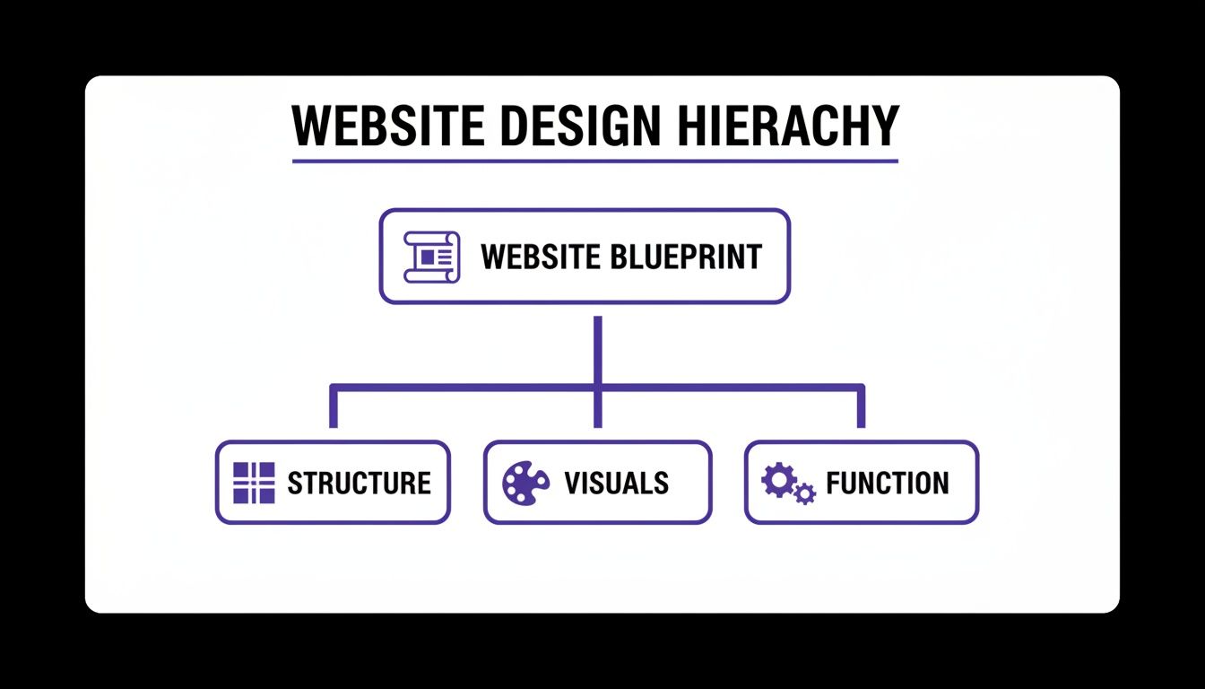
As you can see, a solid website always starts with a well-thought-out structure. From there, it's brought to life with compelling visuals and made truly effective through seamless functionality. Each pillar needs the other two to create something powerful.
Why Every Single Element Matters
Getting this blueprint right is non-negotiable, especially when you consider that 94% of a user's first impression is based on design. You have just 0.05 seconds to make that impression, so visual appeal and perceived performance are everything when it comes to earning a visitor's trust.
Every design choice you make directly impacts how people feel and what they do on your site.
A great website is a perfect marriage of form and function. It’s not just about how it looks, but about how it works and—most importantly—how it makes the user feel. If you neglect even one design element, the entire experience can fall apart.
When you're mapping out your website's blueprint, getting that foundational structure right is key. For larger projects, looking into professional website design services can help you build on solid ground from the start.
And if you want to go deeper, check out our comprehensive design guidelines for websites to make sure every project you build is based on proven principles.
Alright, let's dive into the first element.
Crafting Structure With Layout and Navigation
Think of your website's layout as its architectural blueprint. It's the very foundation of your design, dictating where content lives, how visual weight is distributed, and how a visitor's eye travels across the page. Without a logical layout, even the most brilliant content can feel chaotic and confusing.
A poor layout is like trying to navigate a grocery store with no aisles or signs—you’ll just get lost and frustrated. Your real goal is to create a clear path that guides visitors exactly where you want them to go.

This structure isn't just guesswork; it's built on established principles that align with how people naturally view things online. For Western audiences, the Z-pattern is a classic example. The eye instinctively scans from top-left to top-right, then diagonally down to the bottom-left, and finally zips across to the bottom-right. Grid systems are another powerful way to bring order to the chaos, creating a sense of balance and consistency.
In Divi, this is remarkably easy to pull off. You can use sections, rows, and columns to build any grid imaginable, from simple two-column layouts to complex, asymmetrical designs that create a dynamic, engaging visual flow.
Designing Your Website’s GPS System
If the layout is the blueprint, then navigation is the GPS. It’s the entire system of menus, links, and breadcrumbs that helps users find their way around your site. When you learn that 73% of users will leave a site with poor navigation, you realize getting this right is non-negotiable.
Your primary navigation menu should be simple, logical, and accessible from every single page. It needs to contain the essentials—links to your most important pages, like "Services," "About," and "Contact."
Your website's navigation should be so intuitive that a first-time visitor can find what they're looking for without a moment's hesitation. Clarity trumps creativity every time.
Beyond the main menu, other navigational tools are just as crucial:
- Footer Navigation: This is the perfect spot for secondary links that don’t belong in the main menu, like your privacy policy, terms of service, and career pages.
- Breadcrumbs: These are small navigational trails (e.g., Home > Blog > Article Title) that show users their current location. They’re especially useful for large, multi-level websites where it's easy to get lost.
For Divi users looking to take their user journey to the next level, certain plugins can transform a standard menu into something much more powerful. For instance, Divi Areas Pro allows you to build sophisticated mega menus that can display dynamic content, featured products, or even contact forms directly in the navigation bar. This approach streamlines the user experience by putting more relevant information just a click away, preventing unnecessary page loads and keeping your visitors engaged.
Making a Powerful First Impression
Think of your website's header and hero section as your digital handshake. They’re the very first things a visitor sees, giving you just a few precious seconds to communicate who you are and what you're all about. This "above the fold" content is prime real estate, and nailing it is what keeps people from hitting the back button.
A great header is your website's north star, always visible and reliable. It should prominently feature your logo for instant brand recognition and provide clear, simple navigation to your most important pages. The goal here is to make it dead simple for visitors to know who you are and what you do, building trust from the very first glance. If you really want to dig into this, our guide on website header design is the perfect next step.

Right below that header is your hero section—arguably your most powerful tool for persuasion. This is where you make your big promise. A truly effective hero section is a careful mix of three key ingredients that work together to capture attention and inspire action.
The Anatomy of a High-Converting Hero Section
A winning hero section is much more than just a pretty picture; it’s a strategic messaging powerhouse. In the blink of an eye, it needs to answer three questions for your visitor: What is this site about? What can I do here? And why should I even care?
To pull this off, you need these three elements working in harmony:
- A Compelling Headline: A short, punchy statement that grabs attention and sums up your unique value.
- Supportive Subheading: This text builds on the headline, adding a little more detail or context about your offer.
- A Clear Call-to-Action (CTA): A can't-miss button telling the user exactly what to do next, like "Get Started" or "Learn More."
Building this in Divi is straightforward. Use a fullwidth section with a great background image or video, then layer on a Text module for your headline and a Button module for your CTA. With Divi's design controls, you can make sure your text is perfectly readable and that your button pops right off the screen.
Your hero section should be a perfect blend of clarity and intrigue. It needs to be direct enough to be understood in seconds, yet compelling enough to make the user want to scroll down and learn more.
Using Imagery to Tell Your Story
The final piece of your first impression puzzle is imagery. The photos, illustrations, and icons you use do more than just fill empty space—they set the tone and visually broadcast your brand’s personality. The right images can make your content far more engaging and your message stick.
But there's a catch. Beautiful, high-resolution images are often the biggest culprits behind slow-loading websites. Always, always compress your images before you upload them. Divi also has a lifesaver feature called lazy loading, which you should enable. It ensures images only load as the user scrolls, which dramatically speeds up that critical initial page load. Mastering this balance between visual punch and snappy performance is what separates the pros from the amateurs.
Defining Your Brand With Typography and Color
If your website's layout is the skeleton, then typography and color are its voice and personality. These two elements team up to broadcast your brand’s identity, stir up emotions, and make your content genuinely enjoyable to read. They're what separates a website that feels sharp and professional from one that just feels… off.
Typography is so much more than picking a font you happen to like. It's the art of arranging text to be legible, readable, and appealing. A well-chosen font family can set a specific mood instantly—think serious and traditional with a serif font like Garamond, or modern and friendly with a sans-serif like Montserrat.
Ultimately, this is all about creating a clear visual hierarchy. Your headings (H1, H2, H3) need to pop out from your body text, guiding the reader’s eye right where you want it to go. With Divi, you can lock this entire system down in the Theme Customizer to set global fonts, making sure every single page maintains a consistent, polished look. For a deeper dive, check out our guide on Divi typography and how to pair fonts for some expert tips.
Building an Emotional Connection With Color
Color is a potent psychological tool. It can sway moods, snatch attention, and cement your brand identity in the blink of an eye. In fact, studies show that color can boost brand recognition by up to 80%, which makes your palette a critical business asset. The colors you choose have to line up with the emotions you want your brand to spark.
A financial services website, for example, might lean on blue to signal trust and security. On the other hand, a wellness brand might go for green to suggest health and nature.
Your color palette is the emotional shorthand for your brand. A cohesive and intentional color scheme doesn't just look good—it builds an immediate, subconscious connection with your audience.
To sidestep a chaotic, amateurish look, many designers swear by the 60-30-10 rule. It’s a straightforward framework for creating a balanced and visually pleasing color scheme:
- 60% Primary Color: This is your dominant brand color that sets the website's overall tone. You’ll typically see it used for large background areas.
- 30% Secondary Color: This color should complement your primary hue. It’s perfect for highlighting key sections or subheadings.
- 10% Accent Color: This is a contrasting color used sparingly for high-impact elements like calls-to-action (CTAs) and important links that you want people to notice.
Putting this into practice in Divi is incredibly efficient. Once you set up your primary, secondary, and accent colors in Divi's Global Colors palette, you can apply them consistently across your entire site. This simple step ensures every module, button, and link reinforces your brand, creating a memorable user experience that builds trust and drives engagement.
Driving Action and Engagement
A website that looks great but doesn't actually do anything is like a beautiful storefront with a locked door. It misses the whole point. To be successful, your design needs to actively guide visitors toward a goal. This is where action-oriented elements come into play, turning passive browsers into active participants.
The most important tool in your toolbox here is the Call-to-Action (CTA). Think of a CTA as your digital signpost, telling users exactly what to do next—whether that’s "Buy Now," "Sign Up," or "Learn More." A good CTA is impossible to miss. It should use a color that pops against the background, persuasive copy that creates a little urgency, and a design that practically screams "click me."
Next up are your forms. Every form on your site, from a simple contact field to a full-blown checkout process, is a potential roadblock. In fact, poorly designed forms are one of the biggest reasons people abandon shopping carts and you lose out on leads. The trick is to make filling them out as painless as possible.
Designing for Conversions
To make these interactive elements work, you need to obsess over clarity and simplicity. Every click should feel natural and rewarding, not like you're making your visitors do homework.
Here are a few tried-and-true best practices for CTAs and forms that get results:
- Keep Forms Short: Only ask for what you absolutely need. Every extra field you add is another reason for someone to just give up and leave.
- Use Clear Labels: Don't make people guess. Clearly label each field (e.g., "First Name," "Email Address") so they know exactly what to type.
- Provide Visual Feedback: Use inline validation to give users real-time feedback. A little green checkmark for a correct entry or a red outline for a mistake goes a long way.
Finally, let's talk about microinteractions. These are the small, often subtle, animated responses that happen when a user does something on your site. Think of a button that changes color when you hover over it, a gentle loading animation, or an icon that wiggles just a bit to get your attention.
Microinteractions are the subtle whispers of a user-friendly interface. They provide immediate feedback, confirm actions, and make the entire digital experience feel more responsive and alive.
These tiny details have a surprisingly huge impact on usability. They reassure the user that the system is working and their actions have been registered, which builds trust and cuts down on confusion. In Divi, it's easy to add simple hover effects and animations to buttons and modules to create these little moments of engagement.
For more advanced interactions, a tool like Divi Areas Pro opens up a world of possibilities. For example, you could have a subtle contact form fly in from the side after a user has scrolled 70% down a sales page. This catches their interest at just the right moment without being obnoxious. It’s a simple way to turn a static page into an experience that actively drives action.
10. Performance & Accessibility: Ensuring a Flawless User Experience
Let's be honest: a gorgeous website that takes an eternity to load is like a Ferrari with no engine. It looks incredible, but it's completely useless. This is where two of the most critical—and often most neglected—elements of design come into play: performance and accessibility.
These two pillars are the foundation of a great user experience. They’re what make your site fast, responsive, and usable for everyone, not just some people.
Good design is often invisible; it just works. A slow website, on the other hand, is impossible to ignore and incredibly frustrating. In fact, just a one-second delay in page load time can cause a 7% drop in conversions. That’s why performance isn't just a technical problem for your developer to fix later. It's a core design principle that directly hits your bottom line.
Optimizing Your Site for Speed
Fortunately, Divi gives you some powerful tools to keep your site lean and fast right out of the box. A great starting point is to head into Divi's theme options and enable the built-in performance settings, which take care of things like CSS minification and deferring scripts that block page rendering.
Beyond that, here are a few high-impact optimizations you should always make:
- Image Compression: This is non-negotiable. Always, always compress your images before you upload them to the media library. This shrinks file sizes way down without any noticeable drop in quality.
- Quality Hosting: A cheap, overloaded hosting plan will sabotage even the most perfectly optimized website. You have to invest in a reliable provider that can actually handle your traffic.
- Caching Plugin: A good caching plugin creates static, saved versions of your pages. This dramatically speeds up load times for returning visitors because the server doesn't have to rebuild the page from scratch every single time.
Taking these steps ensures your site meets modern user expectations, especially on mobile. Responsive design isn't just a trend anymore; it's the standard. Mobile visits now make up between 60–63% of all global web traffic, and it's projected that by 2025, around 90% of websites will use responsive layouts to cater to this audience. It's a must-have for engagement and sales.
Designing for Everyone With Accessibility
Accessibility, often shortened to a11y (because there are 11 letters between 'a' and 'y'), is the practice of making your website usable by as many people as possible. This includes people with disabilities who might use screen readers or navigate with a keyboard.
This isn't just some box-ticking exercise or an ethical obligation. It’s a brilliant business move that expands your potential audience and gives your SEO a nice boost. An accessible site is, at its core, simply a more usable site for every single visitor.
Designing for accessibility isn't about accommodating a niche group; it's about applying universal design principles that improve the experience for every single user. A clear, accessible structure benefits everyone.
For instance, when designing any element meant to drive action, remember that the final conversion depends on a frictionless user journey. Looking into best practices for ecommerce checkout reveals how many accessibility principles—like clear labels and logical flow—are also just good design.
Here are the absolute basics you should implement in Divi to get started:
- Proper Heading Structure: Use headings logically. There should only be one H1 per page, followed by H2s for main sections, and H3s for subsections. This hierarchy is crucial for how screen readers and search engines make sense of your content.
- Alt Text for Images: Every meaningful image needs descriptive alt text. This provides context for visually impaired users and also helps search engines understand what your images are about.
- Sufficient Color Contrast: Make sure your text is easy to read against its background. Don't make your users squint! Use a free online contrast checker to ensure your color choices meet Web Content Accessibility Guidelines (WCAG).
Got Questions? We've Got Answers.
Jumping into website design can feel like you're learning a new language. Don't worry, it's normal to have questions. Here are some straightforward answers to the ones we hear most often, so you can build better Divi sites with total confidence.
What Are the Most Important Design Elements of a Website?
While everything has its place, if you're just starting out, laser-focus on three core elements: Layout, Navigation, and the Header/Hero section. Think of these as the foundation of your entire user experience.
A sensible layout and clear navigation are what keep people from getting lost and frustrated. Your hero section? That's your one shot—your billboard—to grab someone's attention and tell them why they should care. If you nail these three, you've built a solid base that makes people want to stick around and see what else you've got.
A website's success really boils down to one thing: can a user find what they want, fast? If the answer is no, the most stunning design in the world won't save it. Always put clarity first.
How Do Design Elements Affect SEO?
The link between design and SEO is huge, even if it's not always direct. A clean layout, snappy performance, and a design that works on any screen create positive signals for search engines. When Google sees people staying on your site longer and not immediately hitting the "back" button, it takes that as a sign of quality and rewards you for it.
Beyond that, some design choices give you direct SEO wins:
- Typography: Using heading tags (H1, H2, H3) the right way is like giving Google a table of contents for your page. It helps them understand what's important.
- Accessibility: When you add descriptive alt text to your images, you're not just helping visually impaired users; you're giving search crawlers more context about your content.
- Performance: Site speed isn't just a suggestion; it's a confirmed ranking factor. A faster website literally helps you climb higher in search results.
How Can I Ensure My Website Design Is Consistent?
The absolute best way to keep your design consistent is to create a basic style guide and lean heavily on your builder's global settings. For Divi users, this is a game-changer that saves a ton of time and stops your branding from going off the rails.
Before you even think about building a page, go straight to Divi's Global Colors and Global Fonts. Set up your primary, secondary, and accent colors. Define the styles for all your headings and body text. Once you apply these defaults across your site, you've locked in a cohesive look. Better yet, if you ever need to update your brand colors or fonts down the road, you can change them in one spot, and the update will roll out everywhere automatically. It’s the key to a professional, consistent feel.
Ready to push your Divi site beyond the basics? With Divimode, you can build stunning, interactive experiences that grab attention and get results. Start creating advanced popups, dynamic mega menus, and engaging fly-ins today.
Explore our suite of powerful Divi plugins and tutorials at divimode.com.
More Articles You Will Like