 Alex Martin
You know the workflow. The homepage looks sharp in the Divi Builder, spacing is clean, the hero lands exactly where it should, and the popup converts nicely on desktop. Then a client opens the site on a tablet and sends the message every Divi developer gets sooner or later: the layout feels off, the menu is awkward, and the popup is either too big or too cramped.
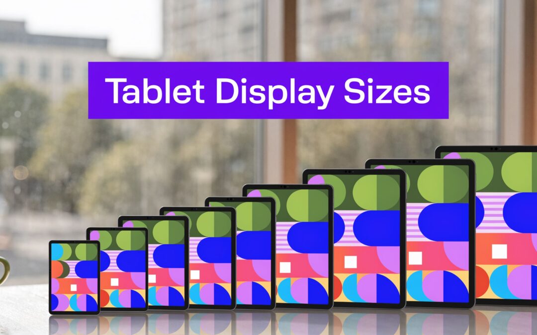
That usually happens because “tablet” isn’t one layout target. It’s a range of physical sizes, resolutions, aspect ratios, and browser viewports that don’t behave like either phones or laptops. If you treat tablets as a single middle state, your design will break in the places that matter most, especially navigation, overlays, WooCommerce product grids, and any content built with conditional display rules.
A lot of the confusion starts with a weak definition of responsiveness. If you want a quick refresher on what responsive web design means, that piece is useful because it frames responsiveness as adaptation, not simple shrinking. That distinction matters on tablets more than anywhere else.
For Divi work, the practical goal is simple. You need to understand which tablet display sizes affect your layout, which dimensions matter in CSS, and how to target tablet users without creating a maintenance nightmare. If your navigation also needs different behavior by device, this guide on showing a different Divi navigation menu on desktop, tablet and phone is a good companion because menus are often the first thing that fails on tablet screens.
Why Your Perfect Desktop Design Breaks on Tablets
Desktop-first polish often hides tablet problems.
A desktop layout has room for generous padding, multi-column rows, wide menu labels, and popups that sit comfortably in the center of the screen. On a tablet, those same decisions collide with narrower viewports, touch interaction, and different screen shapes. The result isn’t always a dramatic break. More often, it’s friction.
Three patterns cause most tablet issues in Divi projects:
- Columns collapse too late: A row that still looks reasonable at a wide desktop width starts feeling cramped on tablets, especially when text, icons, and buttons all compete for horizontal space.
- Navigation stays too ambitious: Desktop menus with several top-level items, icons, or utility links rarely translate cleanly to a tablet held in portrait.
- Popups inherit desktop assumptions: Width, padding, and trigger timing may all feel acceptable on desktop but become intrusive or awkward when the same modal appears on a touch device.
The frustrating part is that Divi’s responsive previews can make a layout look “close enough,” while real devices expose the actual weak points. A tablet user doesn’t interact like a desktop user. They tap, rotate, scroll with thumbs, and often expect less visual density.
Practical rule: If a desktop section only works because it has extra horizontal space, assume it needs tablet-specific adjustments.
In Divi, that usually means editing more than font size. You’ll often need to change row structure, module spacing, menu strategy, and popup width together. Tablet design is a systems problem, not a typography problem.
The good news is that tablet breakage isn’t random. Once you understand the underlying screen logic, you can predict where layouts fail and fix them before clients ever see the issue.
Decoding Tablet Screens Pixels Points and PPI
The fastest way to get better at tablet display sizes is to separate hardware specs from layout space.
A tablet may advertise a very high resolution, but that doesn’t mean you get a huge CSS canvas. That’s the part many designers mix up. You build against a logical viewport, not against every physical pixel on the panel.

Pixels are hardware
A pixel is the smallest physical light element on the display.
When a tablet lists a resolution like 2560×1600 or 2800×1752, that describes the physical pixel grid built into the screen. It tells you about display sharpness and rendering capacity. It does not automatically tell you how wide your website feels in the browser.
A brick wall is a good analogy. Individual bricks are physical pixels. The wall can use tiny bricks packed tightly together, but the room behind that wall doesn’t automatically become bigger.
Points and viewport pixels are what you design against
Browsers and operating systems abstract dense screens into logical units. On the web, you usually think in CSS pixels, which behave similarly to density-independent units in app design.
That’s why two tablets with very different hardware resolutions can present a similar effective browsing experience. The browser maps many physical pixels to fewer logical layout pixels so buttons, text, and interface elements stay usable.
For Divi work, this is the critical mindset shift:
- Hardware resolution affects clarity
- Viewport width affects layout
- Your CSS responds to the viewport
If you ignore that distinction, you’ll overestimate how much room you have for sections, menus, and popups.
PPI affects sharpness, not layout width
PPI means pixels per inch. It tells you how densely the screen packs pixels into physical space.
A higher PPI usually produces sharper text and cleaner images. But it doesn’t mean your Divi row suddenly has more logical width to work with. It just means the same layout can appear crisper.
This is also why screenshots from premium tablets can be misleading. They look spacious and sharp, but the usable browser viewport may still demand the same tablet breakpoint decisions as a less expensive device.
A sharp screen can still be a cramped screen.
That matters when you style thin borders, lightweight icons, or small type. The screen may render them crisply, but the viewport can still make the layout feel crowded.
Why benchmarking across devices still matters
As of March 2026, 768×1024 held 9.45% of global tablet screen resolutions and 1280×800 held 7.36%, which is a useful reminder that tablet viewports remain fragmented rather than standardized (Wikipedia list of tablet PC dimensions and case sizes). That same source notes that sub-200PPI devices can amplify aliasing in high-DPI Divi fonts by up to 22%.
For practical Divi work, that creates two immediate consequences:
| What you test | What you learn |
|---|---|
| Older or lower-density tablets | Whether thin type, fine dividers, and small icons hold up visually |
| Mid-range common viewports | Whether row structures and popups fit without awkward wrapping |
| Larger premium tablets | Whether desktop-like assumptions make the design feel oversized or under-optimized |
The mental model that helps
When I’m reviewing a tablet layout, I use a simple rule set:
- Ignore the marketing spec first. Start with the viewport behavior.
- Check density second. Make sure text and fine UI details still look clean.
- Test touch targets third. A visually correct layout can still be annoying to use.
That order prevents a common mistake. Designers often see a premium tablet’s high-resolution screen and assume the desktop design can stay mostly intact. It can’t, at least not reliably.
In Divi, your job isn’t to design for a spec sheet. Your job is to design for the space the browser gives you.
The Shifting Landscape of Common Tablet Sizes
Tablet display sizes aren’t standing still. The market has moved toward larger devices, and that shift changes how tablet users experience websites.

The old assumption was simple. Tablets were mostly compact browsing and media devices. That’s less true now. Larger screens and detachable form factors pushed tablets closer to lightweight productivity machines, which means users increasingly expect more desktop-like behavior from websites.
According to Telecoms.com, tablets over 10 inches accounted for 56% of shipments in 2020, and that segment was projected to reach 64% by 2025. The same report states that detachable tablets grew from 17% of market share in 2017 to 40% in 2020, with that segment projected to hold at 40% through 2025 (Telecoms.com on larger tablet growth).
What that means in real Divi projects
Larger tablets change user expectations in a few clear ways:
- Users tolerate more complex layouts: A product comparison section or a two-column content area can feel natural on a larger tablet held horizontally.
- Keyboard use becomes more common: Detachable devices blur the line between tablet browsing and light workstation use.
- Navigation can’t be purely mobile-minded: A cramped hamburger menu may be safe, but it isn’t always the best experience on a larger tablet.
That doesn’t mean you should build a mini-desktop for every tablet. It means tablet layouts now need more intentional decisions, especially around information density.
Older patterns still matter
The shift toward larger screens doesn’t let you ignore older or more established tablet viewport patterns.
A lot of agencies make that mistake. They test on one premium modern tablet, approve the layout, and assume the job is done. Then a client opens the site on an older iPad-style viewport and the spacing, columns, or popup width no longer feels balanced.
This is why tablet design needs prioritization, not guesswork. You aren’t trying to support every device equally. You’re trying to identify the tablet categories most likely to expose layout weaknesses.
Field note: The tablet experience usually fails at the edges. Older common viewports reveal cramped layouts, while larger modern tablets reveal underused space.
A better way to prioritize testing
Instead of testing random devices, divide your checks into three groups:
| Device group | What to validate |
|---|---|
| Legacy-style tablet widths | Portrait content flow, menu stacking, popup width |
| Mid-size modern tablets | General row balance, form usability, product grids |
| Large productivity tablets | Whether tablet layouts feel wasteful or oddly oversized |
That approach mirrors how the market itself has evolved. Some users still browse in classic tablet conditions. Others are closer to lightweight laptop behavior.
If you build tablet layouts in Divi as if all tablet users are doing the same thing, the design will feel wrong to both groups.
Why Aspect Ratio Matters More Than Screen Size
Diagonal inches don’t tell you enough.
Two tablets can both be called 10-inch devices and still produce very different design problems. One may feel tall and square in portrait. Another may feel wide and compressed. For Divi layouts, that difference often matters more than the headline screen size.

Many buying guides focus on diagonal measurement and stop there. But a 10-inch 4:3 tablet and a 10-inch 16:10 tablet display content differently, which is especially important for designers working with interactive elements like popups and fly-ins (Laptop Outlet on measuring tablet screen size).
The practical difference
A 4:3 tablet gives you a squarer canvas. In portrait, it usually feels roomier for text blocks, forms, and modal content. When held horizontally, it can become short faster than expected, especially when you add a sticky header or browser UI.
A 16:10 tablet gives you a wider canvas. That can help with product cards, split layouts, and horizontal navigation, but it can also make centered overlays feel too wide unless you cap their width carefully.
This is why “works on a 10-inch tablet” isn’t a useful design conclusion. You need to know the screen shape, not just the diagonal.
Where Divi layouts usually go wrong
Aspect ratio affects several Divi patterns immediately:
- Hero sections: A fullwidth header that feels balanced on a squarer tablet can become shallow and awkward on a wider one.
- Popup layout: A popup built for a tall, centered reading flow may feel oversized on a wider tablet held horizontally.
- Mega menus and fly-ins: Width assumptions that hold on one shape can crowd links or produce excessive empty space on another.
- Two-column rows: A row with text and image may feel elegant on a wider tablet but stack too late or too awkwardly on a squarer one.
A better design habit
When I test a tablet layout, I stop asking, “What inch size is this?” and start asking two better questions:
- How much horizontal room does this shape give the module?
- Does this interaction still feel comfortable with touch and browser chrome?
That shift changes decisions fast. You stop chasing device names and start tuning for layout behavior.
The same diagonal can produce a different reading rhythm, a different popup footprint, and a different navigation tolerance.
What to do in Divi
Use aspect ratio as a layout cue:
- On squarer tablets, reduce horizontal ambition. Wider button groups, multi-item inline controls, and spacious menu bars become risky sooner.
- On wider tablets, protect readability. Limit text line length and don’t let popups stretch just because there’s room.
- For overlays, set sensible max-width values and test both orientations. A popup that only works in portrait isn’t finished.
- For fly-ins and menus, check whether the interactive area still feels intentional once the canvas changes shape.
Tablet display sizes only become useful design information when you combine screen size with aspect ratio. If you skip that second part, you’ll keep solving the wrong problem.
Practical Responsive Breakpoints for Divi Designers
Divi gives you desktop, tablet, and phone editing modes. That’s helpful, but it’s still broad. For effective tablet layouts, you need more precise breakpoint thinking.
One viewport range deserves special attention. As of March 2026, 768×1024 remained one of the most common tablet resolutions globally with 9.45% market share, which is why the 768px to 1024px CSS range remains the foundation for tablet responsive work (Statista tablet screen resolutions).
Start with a working tablet range
This is the baseline I use for Divi projects when tablet behavior needs custom support:
@media (min-width: 768px) and (max-width: 1024px) {
  /* Core tablet styles */
}
That range is broad enough to catch the classic tablet scenario without swallowing small laptops.
Use it for high-level changes such as:
- adjusting row width
- reducing section padding
- switching navigation behavior
- controlling popup dimensions
- changing column stacking rules
Add orientation-aware rules only when needed
Don’t write orientation-specific CSS by default. Write it when the design behaves differently in portrait and horizontal orientation.
For portrait-first fixes:
@media (min-width: 768px) and (max-width: 1024px) and (orientation: portrait) {
  .tablet-popup .et_pb_module {
    max-width: 90vw;
  }

  .tablet-two-col .et_pb_column {
    width: 100%;
    margin-right: 0;
  }
}
For horizontal orientation refinements:
@media (min-width: 768px) and (max-width: 1024px) and (orientation: landscape) {
  .tablet-menu .et-menu-nav {
    display: flex;
    flex-wrap: wrap;
  }

  .tablet-product-grid .et_pb_column {
    width: 48%;
  }
}
These examples aren’t magic snippets. They reflect common tablet realities. Portrait tends to punish width-heavy layouts. The horizontal orientation often gives enough room for partial multi-column recovery.
Where Divi’s built-in controls help
Divi’s responsive settings are still the first place to work.
Use them for:
- Typography changes: Font size, line height, letter spacing
- Spacing changes: Padding and margin adjustments by device
- Visibility controls: Hiding redundant decorative elements that crowd the tablet layout
- Module-level tuning: Image sizing, button alignment, blurbs, and form fields
Then use CSS for the things Divi doesn’t handle elegantly enough, especially layout logic that needs more than one “tablet” state.
A strong workflow is:
- Set the broad tablet behavior in Divi’s responsive options.
- Test the actual layout in browser dev tools and on real hardware if possible.
- Add CSS only where Divi’s generic tablet state isn’t precise enough.
Treat popups and images as part of the breakpoint system
Designers often tune the page layout and forget the assets and overlays attached to it.
If you’re resizing imagery for tablet-specific use, a tool like a secure image online resizer can help you prep alternate assets without adding unnecessary friction to your workflow. That matters when a popup background, product image, or feature graphic looks fine on desktop but becomes too heavy or visually dominant at tablet widths.
For broader implementation guidance inside the builder, Divi-specific responsive design best practices are worth keeping nearby because the best breakpoint strategy is always tied to the modules you’re using.
Breakpoint advice: Don’t create a different layout for every tablet. Create a stable tablet system, then patch the few places where orientation and screen shape cause real friction.
A practical breakpoint stack
Here’s a clean way to think about it in Divi projects:
| Range | Use case |
|---|---|
| Below tablet range | Phone-first stacking and compressed navigation |
| 768px to 1024px | Core tablet restructuring |
| Above tablet range | Transition toward desktop spacing and multi-column confidence |
That middle band does the heavy lifting. If you define it clearly, most tablet design issues become predictable instead of reactive.
Advanced Targeting with Divi Areas Pro and Popups for Divi
Breakpoints control layout. Targeting controls experience.
That distinction matters when you’re building for tablet users inside Divi. A tablet visitor may need a different offer, a different menu treatment, or a simpler interaction pattern, even when the base page layout is already responsive.

When simple popups are enough
If the goal is straightforward, use the lighter approach.
A basic tablet-friendly popup works well when you need to:
- announce a sale
- collect newsletter signups
- show a coupon
- highlight one WooCommerce category
- surface a short support message
For those cases, keep the design restrained. Tablet users don’t need a desktop-style modal packed with multiple columns, long text, and extra navigation choices.
When advanced rules are worth it
Use more advanced targeting when the content should appear only under specific conditions.
Good examples include:
- a simplified promo shown only on tablet-sized devices
- a WooCommerce upsell shown only on certain product pages
- a fly-in that appears only after scroll activity on touch-oriented layouts
- a menu replacement that makes sense for tablet users but not for phones or desktops
Conditional logic matters more than visual styling. The best tablet overlay is often the one that appears only for the right person, in the right place, under the right context.
A practical setup for tablet-specific content
A clean workflow looks like this:
- Build the content area first. Keep it modular. One offer, one message, one action.
- Size it for tablet reading. Use moderate width, generous padding, and short form fields.
- Apply device targeting. Limit display to tablet-relevant conditions.
- Layer behavior carefully. Add triggers like scroll or time delay only if they improve timing.
- Test orientation changes. A popup that works in portrait can become clumsy when held horizontally.
The main mistake I see is combining too many ambitions in one tablet popup. Designers try to fit desktop campaign logic into a screen that rewards restraint. Tablet users usually respond better to less clutter and clearer hierarchy.
Don’t just ask whether a popup can appear on tablets. Ask whether the tablet context changes what the popup should say and how it should behave.
Tablet targeting strategies that work
Here are a few patterns that consistently hold up:
| Scenario | Better tablet decision |
|---|---|
| Large desktop promo modal | Shorter modal with one CTA |
| Full mega menu | Streamlined navigation surface |
| Dense WooCommerce cross-sell | Focused offer tied to the current page |
| Wide two-column popup | Single-column tablet version |
Keep behavior tied to user intent
Device targeting alone isn’t enough.
A tablet user on a product page behaves differently from a tablet user reading a long-form article. The same is true for someone browsing in portrait versus horizontal orientation. The strongest setups combine device logic with page context and user behavior.
If you’re exploring those kinds of conditional experiences, the best place to start is this overview of Divi Areas Pro features every web designer should be using. It’s useful because it maps feature depth to actual design scenarios rather than just listing options.
In practice, I use a simple decision rule:
- use a lightweight popup approach when the message is generic and broad
- use advanced conditional targeting when the content needs context, timing, or device-specific control
That’s how tablet targeting becomes useful instead of intrusive.
Reference Table of Popular Tablets and Viewport Sizes
Most tablet spec sheets aren’t written for web designers. They tell you hardware details, but not what to test in a Divi layout.
For quick reference, it helps to separate what’s known from what still needs live testing. Samsung’s current premium range is a good example. The Galaxy Tab S9 has an 11-inch display at 2560×1600, while the Galaxy Tab S9+ has a 12.4-inch display at 2800×1752 (Samsung tablet screen size guide). Those hardware specs matter, but the browser viewport still depends on device behavior and rendering context.
Popular Tablet Viewport Dimensions 2026
| Device | Physical Resolution | DPR | Viewport (Portrait) | Viewport (Landscape) |
|---|---|---|---|---|
| Samsung Galaxy Tab S9 | 2560×1600 | Varies by device/browser | Test in browser dev tools | Test in browser dev tools |
| Samsung Galaxy Tab S9+ | 2800×1752 | Varies by device/browser | Test in browser dev tools | Test in browser dev tools |
| Legacy 4:3 style tablet | 768×1024 class viewport common in market | Varies | Often near classic portrait tablet behavior | Often short in landscape |
| Wide Android tablet | 1280×800 class resolution family appears in market | Varies | Depends on browser scaling | Depends on browser scaling |
This table is intentionally conservative. If you don’t have verified viewport and DPR values, don’t guess. Check them live.
How to use this in a Divi workflow
- Start with the hardware class: Know whether the device is compact, mid-size, or large.
- Test the actual viewport: Browser tools and real devices beat assumptions.
- Save your own internal device sheet: Once you verify a tablet in your workflow, document it for future projects.
That last step pays off fast. Agencies waste time re-checking the same devices because nobody keeps a practical testing reference after launch.
Frequently Asked Questions About Tablet Design
Should I prioritize portrait or landscape on tablets
Prioritize the orientation your audience is more likely to use, but don’t leave the other one broken.
For content sites, portrait often deserves first attention because reading flows naturally there. For WooCommerce catalogs, dashboards, or comparison-heavy layouts, the horizontal orientation often exposes more of the important layout decisions. Analytics should guide the priority, but both orientations need a usable outcome.
Do I need a unique design for every tablet
No. You need a solid tablet system.
That means a dependable breakpoint strategy, flexible rows, controlled popup widths, and navigation that adapts to touch and reduced space. Then you test edge cases and patch the weak points. Trying to design for every named device separately creates maintenance debt fast.
What breaks first on tablets in Divi
Usually one of four things:
- Navigation gets cramped
- Columns stay side by side too long
- Popups inherit desktop width
- Spacing looks oversized or uneven
If you fix those first, most tablet issues become manageable.
How should I test tablet layouts without buying lots of devices
Use browser dev tools first, then validate on at least one real tablet when the project depends heavily on overlays, menus, or WooCommerce interaction.
Dev tools catch structural issues quickly. Real devices catch touch behavior, browser chrome quirks, and the “feels wrong” problems that screenshots won’t show.
What’s the best mindset for tablet display sizes
Don’t think of tablets as halfway between phone and desktop.
They’re their own interaction environment. Users tap more, rotate more, and tolerate less clutter than desktop users. Once you design for that reality, your Divi layouts start feeling intentional instead of merely compressed.
If you want more control over tablet-specific popups, fly-ins, mega menus, and conditional content inside Divi, Divimode is worth a look. Its tools and tutorials are built for developers and designers who need precise behavior across devices without fighting the builder on every project.
More Articles You Will Like