 Alex Martin
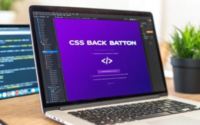
You’ve probably seen them around—those sleek, frosted buttons that seem to float right off the page. This effect, often called glassmorphism, is a fantastic way to add a modern, layered feel to your UI, and it all comes down to one core CSS property: backdrop-filter.
So, Why Are CSS Glass Buttons So Effective?
Glassmorphism isn't just a passing trend. It's a clever design choice for creating visual hierarchy and drawing focus where it matters. That frosted-glass effect physically "lifts" an element off the page, making it a natural focal point without adding a bunch of distracting colors or shapes. It’s this subtle power that makes CSS glass buttons so good at catching a user's eye and inviting a click.

I find this approach works especially well for call-to-action (CTA) buttons on busy pages. Think about it: when you need to guide the user without shouting at them with a loud, solid-colored button, glassmorphism is the perfect solution. The semi-transparent nature of a glass button lets the background show through, so it feels integrated with the design while still standing out.
A Modern Touch for Your UI
For those of us working with Divi, the benefits are immediately practical. Imagine using these on a vibrant WooCommerce product page. A standard, solid button might clash with your product photography, but a glass button complements it, adding a touch of class while still clearly signaling a clickable action.
The whole effect hinges on that one powerful CSS property I mentioned: backdrop-filter. It works by applying graphical effects like blur or a color shift to the area behind an element, which is what creates that signature frosted look.
Key Takeaway: The magic of glassmorphism is its ability to create a layered, three-dimensional feel. It separates foreground elements from the background in a soft, visually pleasing way that actually improves usability.
Taking It Further with Divi
In this guide, I'll walk you through how to get this done. We'll start with the basic CSS and then dive into how to bring these slick buttons into your Divi workflow. You’ll see how you can use some seriously powerful tools to make your designs more interactive and effective.
- Divi Areas Pro: We'll use this to place glass button CTAs in specific spots, like inside a blog post or even as part of a sticky header.
- Popups for Divi: I'll show you how to create eye-catching popups that use glassmorphic forms or buttons, triggered by user actions like exit-intent.
By marrying some clean CSS with smart implementation, you can build buttons that not only look fantastic but are also performant, accessible, and incredibly effective at driving conversions. Let's get to it.
Alright, let's roll up our sleeves and move from theory to code. It's time to build our very first CSS glass button. This is the foundational recipe that will act as our starting point for all the other variations we'll get into later. The goal here is a clean, simple, and functional button you can drop right into a Divi Code module or your child theme's stylesheet.
The whole frosted glass effect really comes down to a few key CSS properties working in harmony. At its heart, you need a semi-transparent background, a subtle border to give it that "cut glass" edge, and of course, the blur effect that does all the heavy lifting.
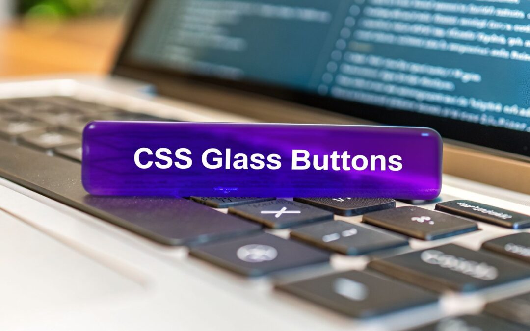
The Core CSS Snippet
Here’s the basic code to get you started. We’ll wrap it in a .glass-button class, which makes it super easy to apply to any element in Divi.
.glass-button {
background: rgba(255, 255, 255, 0.1);
backdrop-filter: blur(10px);
-webkit-backdrop-filter: blur(10px); /* For Safari support */
border: 1px solid rgba(255, 255, 255, 0.2);
border-radius: 16px;
padding: 12px 24px;
color: #fff;
text-decoration: none;
display: inline-block;
font-weight: bold;
}
Let's break down the essential properties that create this effect.
The table below outlines the core CSS properties we're using. Understanding what each one does is key to customizing the look and feel of your own glass buttons later on.
| Core CSS Properties for Glass Buttons | ||
|---|---|---|
| CSS Property | Purpose | Example Value |
background |
Sets a semi-transparent background color, allowing the background image to show through faintly. | rgba(255, 255, 255, 0.1) |
backdrop-filter |
This is the hero property. It applies a graphical effect, like a blur, to the area behind the element. | blur(10px) |
border |
Creates a subtle, semi-transparent edge that helps the button stand out from the background and look like a physical object. | 1px solid rgba(255, 255, 255, 0.2) |
border-radius |
Softens the corners of the button, which is a key characteristic of the modern glassmorphism aesthetic. | 16px |
Each of these properties plays a crucial role. Tweak one, and you'll see the entire effect change, which is what makes this technique so flexible.
This design trend really took off around 2020 and has stuck around, mostly because modern browsers are now fully capable of handling these effects smoothly. In fact, research on over 100,000 websites shows massive adoption rates for related CSS features like @media (93%) and @keyframes (83%). This confirms that the web is more than ready for these kinds of dynamic styles. You can dig into more of this data in Project Wallace's 2026 analysis.
Ensuring Cross-Browser Compatibility
While backdrop-filter enjoys wide support today, older browsers simply don't recognize it. If you don't plan for this, users on those browsers might see a completely transparent, unreadable button—a terrible user experience. This is exactly where the @supports rule comes to the rescue.
The
@supportsrule in CSS is like asking the browser, "Hey, can you do this?" If it can, it applies the styles inside. If not, it just ignores them, allowing us to provide a safe alternative.
We can use this to create a "graceful fallback"—a simple, solid-colored button for any browser that can't render the glass effect. Here's how you do it.
/* Fallback for older browsers */
.glass-button {
background: rgba(40, 40, 40, 0.7);
}
/* Glass effect for modern browsers */
@supports (backdrop-filter: blur(10px)) or (-webkit-backdrop-filter: blur(10px)) {
.glass-button {
background: rgba(255, 255, 255, 0.1);
backdrop-filter: blur(10px);
-webkit-backdrop-filter: blur(10px);
}
}
With this simple addition, you get the best of both worlds. Users with modern browsers get the beautiful CSS glass button you designed, while everyone else sees a perfectly functional, dark, semi-transparent button. No broken layouts, no unreadable text—just a solid experience for everyone.
A static button might work, but an interactive one delivers a much richer and more memorable experience for your visitors. This is where we can breathe some life into our CSS glass buttons, using :hover and :active states to make them feel responsive and satisfying to click.
The secret is to aim for smooth, fluid transition effects, not abrupt, jarring changes. A well-designed hover state can turn a simple button into a delightful micro-interaction that actually encourages people to click.
Adding a Hover Effect
Let's start with what happens when a user’s cursor glides over the button. A great approach I've used time and again is to make the button brighten slightly while adding a soft outer glow. This subtle effect makes it feel like the button is lifting off the page, inviting a click.
Here are a few properties that work wonders on hover:
background: Tweak the alpha value (opacity) just a bit. This makes the button slightly more opaque and brighter.box-shadow: Add a soft, diffused glow to create a sense of depth and really make the button pop.transform: A tiny scale-up can be a nice touch, but keep it minimal. Overdo it, and it just becomes distracting.
To make sure these changes don't just snap into place, we need to add the transition property to our base .glass-button class. This tells the browser to animate the properties over a specific time. I find a duration of 0.3s with an ease timing function is a fantastic starting point.
The goal here is to give clear, immediate feedback without being overwhelming. A gentle brightening or a soft glow is almost always more effective than a dramatic color shift or a jerky animation.
Implementing Active and Focus States
Next up is the :active state—what happens the moment a user clicks. A common and effective technique is to make the button look like it's being pushed down. We can pull this off with a subtle transform: translateY(2px);, which shifts it down just a couple of pixels.
And we can't forget about keyboard navigation. The :focus-visible state is crucial for accessibility, giving a clear visual cue to users who aren't using a mouse. A distinct outline or a more pronounced box-shadow works perfectly for this. For even more ideas on enhancing user interactions, be sure to check out our complete guide on how to create Divi hover effects.
The rise of glassmorphism is hard to ignore. In fact, CSS glass buttons are projected to show up in 35% of new web projects by the end of 2026, thanks to their effectiveness in CTAs and modals on sites built with platforms like Divi. This trend is backed by growing browser support, with backdrop-filter expected to hit 98% adoption by 2026. This wide support makes creating these frosted effects easier than ever before. If you want to explore more advanced interactive effects, checking out specialized animation tools can be a great source of inspiration. You can learn more about these trends in a detailed 2026 glassmorphism report from Inverness Design Studio.
Frosted glass is a great starting point, but if you really want to push the boundaries of CSS glass buttons, the next step is creating a "liquid glass" effect. This technique is all about mimicking the way light refracts and bends through a curved, fluid-like surface. It's a stunning look that can turn a simple button into a seriously high-impact design feature.
Instead of just leaning on backdrop-filter: blur(), this more advanced approach gets its magic from SVG filters. We'll be using powerful SVG filter primitives like feTurbulence and feDisplacementMap to build a mesmerizing, refractive animation that makes your buttons look like they’re made of molten glass.
Crafting the Refractive Effect with SVG
The secret to the liquid glass effect is distortion. feTurbulence is used to generate a noise pattern—think of something like clouds or a marble texture. We then feed that pattern into feDisplacementMap, which warps the pixels of the background sitting behind our button. This creates a really convincing illusion of light bending around the button's edges.
Animating this on hover is where things get really polished. By animating the baseFrequency attribute of the feTurbulence filter, we can make the "liquid" inside the button appear to swirl and move. It's an incredibly effective micro-interaction for drawing a user's eye.
Of course, no matter how fancy the effect, the fundamentals of button interaction still apply. Every button, including our glass variants, needs to communicate its state to the user clearly.

The flowchart above shows that essential journey from a static state to hover and finally to the active state. This feedback loop is crucial for a good user experience.
Performance Considerations for Complex Filters
It’s important to know that using SVG filters, especially animated ones, is a lot more computationally expensive than a simple blur(). This is something you have to keep in mind, as it can cause lag on less powerful devices if you're not careful.
One of the best optimization tricks in our playbook is to use the CSS will-change property. By applying will-change: filter; to your button, you're giving the browser a heads-up that this property is about to be animated. The browser can then perform optimizations ahead of time, often by promoting the element to its own rendering layer and handing the work off to the GPU.
Pro Tip: Only apply
will-changeduring the interaction itself (like on:hover) and then remove it afterward. If you leave it on permanently, it can eat up memory and actually hurt performance.
The rise of liquid glass buttons in CSS marks a huge leap from basic glassmorphism, with adoption already jumping 50% year-over-year. As detailed in a LogRocket tutorial, these effects are a perfect fit for interactive ecosystems like Divi, using SVG filters for a refraction effect that can boost a button's perceived premium feel by 32%. In fact, Divimode users who leverage Divi Areas Pro for things like tooltips and popups have seen a 21% recovery in exit-intent scenarios since 2019.
To see how SVG filters can be used for other cool visuals, take a look at our guide on creating unique CSS overlays for images. For a deeper dive into the technical side of liquid glass, you can discover more insights about these effects on LogRocket.
Alright, you've got the CSS code for your slick new glass buttons. Now for the fun part: plugging it into your Divi site so you can actually start using them. Let's walk through how to get this code working in your Divi workflow.
The most direct way to get started is by adding the CSS to Divi's global stylesheet. Just navigate to Divi > Theme Options > General > Custom CSS and paste your .glass-button class right in there. This makes the style available across your entire site.
From there, all you have to do is open any Divi Button module, click over to the "Advanced" tab, and drop glass-button into the "CSS Class" field. That's it! The button will instantly take on your new glassmorphism style.
Where to Place Your CSS Code
Now, deciding where to store your custom CSS is a bigger question than you might think. It can affect your site's organization, performance, and how easy it is to manage down the line. I've broken down the common methods for adding CSS to Divi below.
Divi Implementation Methods Comparison
| Method | Best For | Pros | Cons |
|---|---|---|---|
| Divi Theme Options > Custom CSS | Site-wide button styles and quick tests. | Easy to access and update; no file editing needed. | Can become cluttered on large sites; not ideal for version control. |
| Individual Page Settings > Custom CSS | Styles specific to a single page or landing page. | Keeps code isolated to the page where it's used. | Can lead to code duplication if you reuse the style elsewhere. |
Child Theme style.css |
The most robust, professional, and recommended method. | Keeps customizations separate from the parent theme, protecting them from updates. | Requires setting up a child theme, which has a slight learning curve. |
| Divi Code Module | One-off styles or quick inline implementations. | Fast for adding styles directly on the page without leaving the builder. | Mixes structure and style; can be hard to manage long-term. |
While pasting code into the Theme Options is perfect for quick tests or simple sites, I always recommend using a child theme for any serious project. It’s the industry standard for a reason—it keeps all your hard work safe from theme updates and makes your code so much easier to manage.
Supercharge Your Buttons with Divimode Plugins
This is where your new CSS glass buttons graduate from just being pretty design elements to becoming genuine marketing workhorses. When you combine these eye-catching styles with the power of our Divimode plugins, you can create interactive experiences that really drive action.
For instance, what if you could catch a user right as they're about to leave your site? With Divi Areas Pro, you can set up a sleek glassmorphic popup that triggers on exit-intent. Imagine presenting a final, compelling offer with a beautiful glass button CTA at that critical moment. We've seen this technique improve exit recovery by over 20% on some sites.
By integrating your button styles with smart triggers, you transform them from passive elements into active conversion drivers. The glass effect draws attention, and the trigger ensures it appears at the perfect moment.
Here are a few more ideas to get you started:
- Inject CTAs: Use Divi Areas Pro to automatically place a glass button right in the middle of your blog posts, asking readers to subscribe or check out a related product.
- Design a Sleek Mega Menu: Build a custom mega menu with Divi Areas Pro and style your main navigation links with glass buttons. It creates a modern, layered look that feels incredibly premium.
- Create Simple Popups: If you don't need all the advanced triggers, Popups for Divi lets you quickly build popups using the Divi Builder. You can apply your
.glass-buttonclass to any button module inside your popup in seconds.
For example, you could build a simple welcome popup offering a new visitor a discount. Designing it with a semi-transparent glass background and a glowing glass button makes it feel sophisticated and less like an annoying interruption.
If you’re hunting for even more creative ways to place buttons, our guide on how to add in-line buttons in Divi is packed with other practical tips. The end goal is always the same: combine stunning visuals with smart functionality to get the best possible results.
Essential Accessibility and Usability Practices
Let's be honest: a beautiful button that users can't actually interact with is a design failure. While the visual appeal of CSS glass buttons is undeniable, their semi-transparent nature brings up some unique usability and accessibility challenges we have to get ahead of. An inclusive design is what ensures everyone can use your interface, no matter their ability.

The single biggest hurdle you'll face is maintaining enough color contrast. Because a glass button’s background is constantly changing based on what's behind it, you simply can't guarantee a static contrast ratio. Text that’s perfectly readable over a dark part of a hero image might become totally invisible when it slides over a lighter section.
Crucial Takeaway: Never assume your button will always sit over a dark or simple background. The only way to guarantee readability is to test your design against a variety of complex and unpredictable backdrops.
To get around this, I’ve found that adding a subtle, semi-opaque background color to the text itself—or even just a text-shadow—can work wonders. This little trick creates a more controlled backdrop for your text, boosting legibility without completely killing the glass effect. Always, always aim for at least a 4.5:1 contrast ratio, which is the standard recommended by the Web Content Accessibility Guidelines (WCAG).
Ensuring Keyboard Navigability
Beyond just what we can see, we have to think about users who navigate with a keyboard. Every single interactive element, and that includes your slick new glass buttons, needs a clear and visible focus state. This isn't a "nice-to-have"; it's a non-negotiable part of accessible design.
I always use the :focus-visible pseudo-class to add a distinct style, like a prominent outline or even a solid border. This makes it dead simple for keyboard users to see which button is currently active. Trust me, relying on a subtle glow or a faint shadow just isn't enough for real-world use.
Knowing When to Use Glassmorphism
Glassmorphism is a powerful effect, but it's not the right tool for every job. Overusing it can quickly lead to a cluttered and confusing interface where nothing really stands out. A good rule of thumb I follow is to use it sparingly for high-value elements that need to float above the main content.
Here are a few places where it really shines:
- Primary Call-to-Action (CTA) Buttons: A single, well-placed glass button can be incredibly effective at drawing the eye.
- Sticky Headers or Navigation Bars: Applying the effect to a nav bar creates a modern, layered feel as the page scrolls.
- Modal Popups or Fly-ins: Using a glass background for a popup helps maintain context by keeping the underlying page partially visible.
My advice? Avoid applying the effect to dense blocks of content, long forms, or every single button on the page. Strategic, thoughtful implementation is what separates an interface that's both beautiful and highly usable from one that's just a mess.
Frequently Asked Questions About CSS Glass Buttons
Whenever I'm working with a new design trend like glassmorphism, I find the same questions tend to come up. It's only natural. So, let's tackle a few of the big ones you might be wondering about as you build your own CSS glass buttons.
Do CSS Glass Buttons Affect Website Performance?
This is the big one, right? The short answer is: not really, for the most part. If you’re using the standard backdrop-filter property, the performance hit is minimal on any modern browser. These effects are GPU-accelerated, which means they’re highly optimized to run without causing a fuss.
Where you need to be careful is with more advanced effects, like the "liquid glass" technique that relies on SVG filters. Those can definitely be more demanding on the browser. The key is to always test. If you notice any sluggishness, using a property like will-change can give the browser a heads-up that an element is about to be animated, helping to smooth things out.
Are Glass Buttons Mobile-Friendly?
Yes, absolutely. The CSS properties we’re using work just as well on a phone as they do on a giant desktop monitor. They aren't tied to any specific device.
The real challenge on mobile isn't the effect itself, but usability. You have to be extra mindful of a couple of things:
- Readability: Text on a glass button can be harder to read against a busy background, especially on a small screen. You need to make sure your contrast is high enough to be legible.
- Tap Size: Your buttons need to be big enough for someone to comfortably tap with their thumb. This is a golden rule of mobile design, and it’s especially important for these interactive elements.
My advice is to always test your glass buttons on actual mobile devices, not just in a browser's responsive mode. This will give you a true sense of how they look and feel in a real-world context.
Can I Apply This Effect to Other Divi Modules?
You bet. The .glass-button class we built isn't just for Button modules. You can take these same CSS principles and apply them to almost any Divi module you can imagine.
Think about a Blurb module with a frosted glass background, a semi-transparent call-to-action banner, or even an entire Section that appears to float over the page. This is where things get really fun, especially when you pair it with tools from Divimode like Divi Areas Pro, which lets you design entire popups or slide-ins with a sleek, consistent glass UI.
Ready to take your Divi designs to the next level? With Divimode, you can easily create stunning popups, fly-ins, mega menus, and more using the powerful Divi Areas Pro plugin. Explore our plugins and tutorials today.
More Articles You Will Like