 Alex Martin
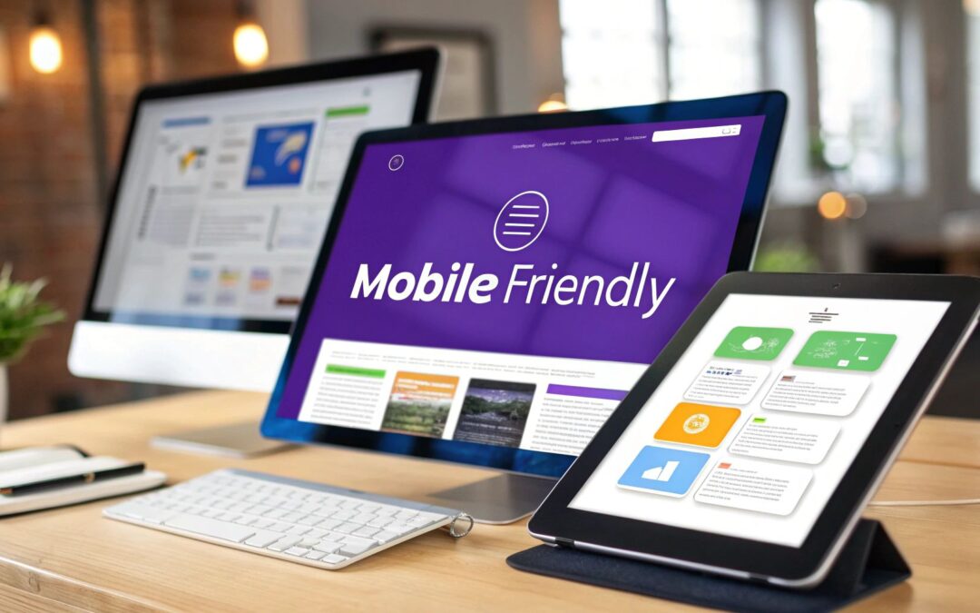
Making your site mobile-friendly is more than just a technical checklist. It's about using a responsive theme, smart image optimization, and simplifying how people navigate on smaller screens. For those of us using Divi, this really comes down to mastering its built-in responsive tools. We're talking about adjusting layouts, tweaking text sizes, and controlling what shows up on tablets versus phones to guarantee a smooth experience for every single visitor.
Why a Mobile-Friendly Site Is Your Biggest Asset
Let's just get this out of the way: a mobile-friendly site isn't optional anymore. It's the cost of entry. Whether you're a freelance designer building a portfolio or an e-commerce store owner, a clunky mobile experience is a direct shot to your bottom line. I'm not being dramatic—this has real-world consequences that hurt your brand and your bank account.
Imagine a potential client trying to check out your design work on their phone. They're met with overlapping images and text that runs right off the screen. What do they do? They don't wait around. They close the tab and find a competitor whose site just works. That's not just a lost lead; it's a ding to your reputation.
The Real Cost of a Poor Mobile Experience
The damage goes way beyond one lost visitor. A bad mobile experience screams a lack of professionalism and attention to detail. It's like telling your users you don't value their time or their business, which actively pushes them toward your competition. In today's market, that's a mistake you simply can't afford.
This isn't just a hunch; the numbers are impossible to ignore. In May 2023, mobile devices were responsible for a staggering 65.49% of all global website traffic. That trend has been climbing steadily since early 2017. If you ignore this massive group, you're intentionally shutting out nearly two-thirds of your audience. You can discover more insights about mobile traffic trends on HubSpot if you want to dig deeper into the stats.
From Responsive Design to Real Conversions
Thinking about how to make your site mobile-friendly is less of a technical chore and more of a core business strategy. It's not just about looking good. To really grasp the importance of mobile readiness, you have to understand how to create a mobile phone website that converts with a mobile-first user experience and snappy performance.
For Divi users, the good news is that the platform gives us some seriously powerful tools to get started. The Visual Builder has responsive options baked right in, allowing you to fine-tune just about any setting for different devices.
This screenshot shows exactly what I'm talking about. See that little phone icon? Clicking it lets you customize module settings specifically for desktop, tablet, and mobile. This simple feature is your command center for building a truly adaptive design, making sure every element lands perfectly on every screen.
Key Takeaway: A mobile-friendly site is no longer a "feature"—it's the very foundation of your online presence. It directly shapes user perception, brand credibility, and ultimately, your ability to turn visitors into paying customers.
Using Divi's Native Responsive Toolkit
This is where the magic really happens. Divi's true power isn't just in building pages, but in its built-in responsive controls. These tools let you fine-tune your design for different devices without ever leaving the Visual Builder. You're not making three separate sites; you're just making smart adjustments to one design so it looks fantastic everywhere.
The heart of this system is the set of responsive view icons—Desktop, Tablet, and Mobile—tucked away at the bottom left of your Divi Builder screen. A simple click on these icons instantly resizes the canvas, giving you a live preview of how your page will look on that device. This immediate feedback is absolutely essential for dialing in a mobile-friendly experience.
It’s more than just a nice feature; it’s critical for your bottom line.
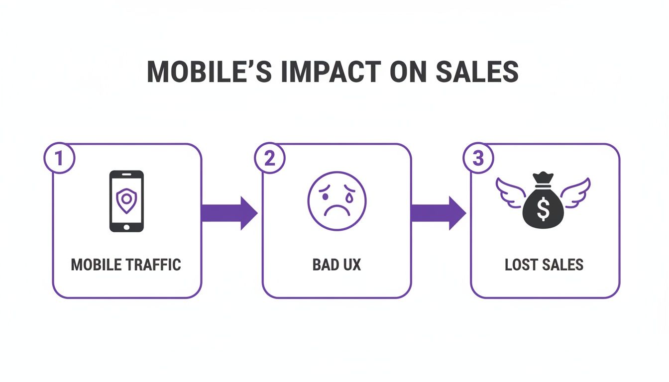
As you can see, ignoring the user experience for the majority of your traffic—which is almost always mobile—is a surefire way to lose sales.
Mastering Device-Specific Adjustments
The real control comes when you start tweaking module settings. Hover over almost any setting in a Divi module, and you'll spot a small mobile phone icon. Clicking this icon opens up the responsive tabs, letting you set a unique value for desktop, tablet, and mobile.
Let's walk through a common scenario. Imagine you have a big, bold headline in your hero section that looks amazing on a desktop but is just way too big on a phone. Instead of finding a "good enough" size that's mediocre everywhere, you can set the perfect font size for each device.
- Desktop: Keep it impactful, say 72px.
- Tablet: Scale it back to 48px so it fits better.
- Mobile: Drop it to a readable 32px so it doesn't take over the whole screen.
You can apply this same logic to just about any design setting, like margins, padding, and even letter spacing. For instance, maybe a two-column layout feels a bit tight on a tablet. No problem. Just increase the padding specifically for the tablet view, and you've given it the breathing room it needs without messing up your desktop or mobile designs. Checking out some solid responsive web design examples can give you a ton of ideas on how to apply these techniques effectively.
Using Responsive Visibility for a Smarter UX
Sometimes, just adjusting a module isn’t going to cut it. Certain elements that are great on a desktop—like a heavy video background or a complex interactive map—can be a total disaster on mobile. They kill load times, drain data, and just add clutter.
This is exactly what Divi's visibility settings are for. You'll find them under the "Advanced" tab of any section, row, or module. The "Visibility" options give you the power to completely hide an element on specific devices.
Here’s a practical example. A restaurant website might have a gorgeous, high-res video of their kitchen in action on the desktop homepage. It looks great, but it’s a performance nightmare on mobile. The fix is surprisingly simple:
- Duplicate the Section: Make a copy of that hero section.
- Create Two Versions: On one section, swap the video background for a lightweight, optimized static image. Keep the video on the other.
- Set the Rules: Go into the visibility settings. For the static image section, set it to be visible only on tablet and phone. For the video section, do the opposite: set it to be hidden on tablet and phone.
Just like that, mobile users get a fast, clean experience, while desktop users still see the full cinematic effect. You haven't compromised; you've adapted. It's a powerful way to truly optimize the user experience.
Pro Tip: Don't just hide things—replace them. Instead of simply hiding a detailed contact form on mobile, you could hide the form and show a big, tappable "Call Us Now" button. You're anticipating what a mobile user actually needs and giving them a direct path to it.
Fine-Tuning Layouts with Responsive Columns
Multi-column layouts are another classic responsive challenge. A four-column row of service icons looks clean on a desktop monitor, but on a phone, it becomes a long, annoying scroll as each column stacks vertically.
Divi handles this stacking for you, but you can definitely take more control. While you could use custom CSS to change how columns stack, there's often a smarter, no-code way using the visibility settings we just talked about.
For instance, you could create a separate two-column row that is only visible on mobile and tablet. Inside, you can arrange your four services into a much more compact 2×2 grid. Then, you just hide the original four-column row on smaller devices. By creatively combining Divi's native tools, you can solve almost any responsive puzzle without touching a line of code. For a deeper dive into more advanced strategies, you might want to check out some responsive design best practices for Divi.
Optimizing Media for Peak Mobile Performance
Slow-loading pages are the absolute kryptonite of a good mobile experience. You can have the most stunningly designed site on the planet, but it won't matter if users have to sit and wait for it to load. Heavy images and unoptimized media are almost always the biggest culprits behind this, especially on image-heavy Divi sites. Making your site truly mobile-friendly means tackling this problem head-on with a smarter media workflow.

The stakes here are incredibly high. Study after study confirms that a staggering 53% of mobile users will bounce if a page takes longer than three seconds to load. This is such a common pitfall for sites that don't bother to compress their media. By keeping users engaged with fast load times, you're directly impacting retention and, ultimately, conversions. You can read the full research on mobile user behavior on HubSpot to see just how critical every second is.
Choosing the Right Image Format
Your journey to a faster mobile site starts with something simple: picking the right file type for your images. While JPEGs have been the go-to for years, modern formats blow them out of the water in terms of performance.
WebP is the undisputed champion here. Developed by Google, this format provides far superior compression compared to JPEG and PNG. In plain English, that means you get much smaller file sizes with little to no noticeable drop in quality. Smaller files mean faster loading times—exactly what you need for visitors on the go.
Think about it: a 300KB hero image saved as a JPEG could easily shrink to under 100KB as a WebP without looking blurry. While you could convert images manually, plugins like ShortPixel or Smush can automatically convert your existing library to WebP and serve them to browsers that support it.
Key Insight: Don't just compress your images; convert them. Switching to WebP is one of the single most effective changes you can make to slash mobile page load times. It's a low-effort, high-impact optimization that directly benefits every single mobile visitor.
Smart Loading Techniques in Divi
Beyond just shrinking file sizes, you have to be smart about how your media loads. Forcing a browser to download every single image on a page the moment a user arrives is horribly inefficient and slows everything to a crawl. This is where lazy loading saves the day.
Lazy loading is a clever technique that puts off loading off-screen images until the user actually scrolls down to them. The best part? Divi has this feature built right in.
You can flip it on by navigating to Divi > Theme Options > General > Performance and toggling on "Lazy Load Images."
This simple switch ensures your initial page load is as fast as possible because the browser only has to render the content that's immediately visible. For a deeper dive into this, check out our complete guide on optimizing images for WordPress.
Setting Responsive Image Sizes
Here’s a classic mistake I see all the time that absolutely cripples mobile performance: loading a massive, 1920px-wide desktop image on a tiny phone screen. The browser still has to download that huge file, even though it's just going to shrink it down to fit. This is a massive waste of bandwidth and a primary cause of slow load times.
The fix is to serve appropriately sized images for different devices. WordPress helps out by creating multiple sizes of each image you upload, and you can leverage this right inside Divi's modules. When you add an image, you can often select which pre-generated size to use.
Here’s a practical workflow you can use right now:
- Use Divi's Responsive Visibility: Start by creating two versions of an image module.
- Assign Different Images: In one module, use your large, high-resolution image. For the second module, select a much smaller, optimized version (like the "medium" or "large" size that WordPress creates).
- Set Visibility Rules: Go into the module settings and set the first one (with the big image) to be visible only on desktop. Then, set the second module to be visible only on tablet and mobile.
This straightforward technique guarantees that mobile users download a much smaller file, significantly speeding up their experience without sacrificing quality on larger screens. It's an absolutely crucial step in making your Divi site truly mobile-friendly.
Designing a Superior Mobile User Experience
Having a responsive layout is just the price of admission. To really win, you need to craft an experience that feels completely natural in the palm of your user's hand. This is where you graduate from a site that simply works on mobile to one that actively converts.

The difference in results is dramatic. Mobile-optimized websites see conversion rates 64% higher than their clunky counterparts—a massive gain for anyone running a WooCommerce store. Some reports even show that well-optimized sites can convert up to 2.4 times better, proving how much this stuff directly fuels revenue.
And yet, there's a huge disconnect. While mobile drives 65% of all traffic, its average e-commerce conversion rate is a dismal 2.49%, compared to desktop's 5.06%. That gap? That's where poor mobile UX is costing businesses dearly. You can discover more insights about mobile optimization on Aumcore.
Designing for Thumbs
The first rule of mobile UX is to design for how people actually hold their phones. Most of us navigate with our thumbs, which means buttons, links, and other interactive elements need to be placed within easy reach. This is the "thumb-friendly" zone.
Think about the ergonomics of a phone screen. The center and bottom areas are prime real estate for your most important calls to action. Jamming critical links into the top corners forces frustrating hand gymnastics.
Equally important is tap target size. Have you ever tried tapping a tiny link on your phone, only to hit the one next to it by mistake? It’s an instant source of friction. Make sure your buttons and links have enough padding to create a generous tap area, preventing those annoying miss-taps. A good rule of thumb is to aim for a minimum tap target of around 44×44 pixels.
Simplifying Navigation and Menus
A sprawling, multi-level desktop menu is a complete disaster on a mobile device. For your mobile visitors, navigation needs to be clean, simple, and immediate. The "hamburger" menu became a universal symbol for a reason—it tucks away complexity until it's actually needed.
Using the Divi Theme Builder, you can create a custom global header specifically for mobile. This gives you total control to craft a streamlined menu that only presents the most essential links. Don't just cram every page from your desktop site in there. Instead, focus on what a mobile user is most likely to need right now:
- Key Services or Products: Direct links to what you sell.
- Contact Information: A quick way to get in touch.
- A Prominent Search Bar: For users who know exactly what they want.
By building a dedicated mobile menu, you guide users to their destination faster.
Streamlining Forms for Mobile Input
Filling out long, complicated forms on a phone is a surefire way to kill your conversion rates. Typing on a small keyboard is tedious, and users have zero patience for it. Your goal should be to make your forms as painless as possible.
Start by ruthlessly cutting any non-essential fields. Do you really need their fax number? Probably not. Stick to the absolute minimum information required to complete the action.
Then, you can leverage HTML5 input types to trigger the right keyboard on mobile devices. For instance, using type="email" for an email field brings up a keyboard with the "@" symbol handy. Using type="tel" for a phone number shows the numeric keypad. These small tweaks remove friction and make the whole process feel much smoother.
Creating Smart, Device-Specific Interactions
This is where you can elevate the mobile experience from good to truly great. Instead of just showing the same content on all devices, you can create interactions tailored specifically to the mobile context.
With a tool like Divi Areas Pro, this becomes incredibly straightforward. You can set up device-specific rules to show or hide content based on whether the visitor is on a desktop, tablet, or phone. This opens up a world of powerful, context-aware optimizations.
Imagine these scenarios:
- The "Click to Call" Button: A mobile user looking at a local business's site is far more likely to want to call than to fill out a contact form. You can create a prominent "Click to Call" button that only appears for mobile users, giving them a direct path to action.
- Mobile-Only Promotions: Display a sticky footer bar with a special offer that's exclusively visible to visitors on their phones, encouraging immediate engagement.
- Simplified Content: Hide data-heavy tables or complex infographics on mobile and replace them with a simple summary or a button to download the full version.
By thinking about what your mobile user needs in that specific moment, you can turn your website into an intelligent, conversion-focused tool that adapts to them—not the other way around.
Key Takeaway: A superior mobile experience isn't about shrinking your desktop site. It's about rethinking it from the ground up, prioritizing simplicity, speed, and thumb-friendly interactions to guide users effortlessly toward conversion.
Here's a quick checklist to help you nail the mobile UX on your Divi site. Run through these points to make sure you're not leaving conversions on the table.
| Mobile UX Checklist for Divi Websites |
|---|
| A quick reference guide to ensure your mobile site provides an excellent user experience and is optimized for conversions. |
| UX Element |
| Best Practice |
| Divi Implementation Tip |
| Thumb-Friendly CTAs |
| Place primary buttons and links in the lower/central part of the screen for easy thumb access. |
| In the Divi Builder, use custom spacing (padding/margins) to position buttons lower in their sections for mobile views. |
| Generous Tap Targets |
| Ensure buttons and links are at least 44×44 pixels to prevent accidental clicks. |
| Use the mobile responsive settings in the Button module to increase padding for Tablet and Phone views. |
| Simplified Navigation |
| Use a hamburger menu with only essential links (e.g., key services, contact, search). |
| Use the Divi Theme Builder to create a separate Global Header for mobile, hiding complex menus. |
| Optimized Forms |
Remove non-essential fields and use HTML5 input types (email, tel, number) for the right keyboards. |
| In Divi's Contact Form module, use the Field ID to target specific fields with custom jQuery to add the correct input types. |
| Legible Typography |
| Use a minimum font size of 16px for body text. Ensure high contrast between text and background. |
| In the module's Design tab, use Divi's responsive settings to set a larger font size specifically for mobile. |
| No Intrusive Popups |
| Avoid full-screen popups that are hard to close. If used, ensure the "X" is large and easy to tap. |
| Use a plugin like Divi Areas Pro to create less intrusive fly-ins or banners that are targeted only to specific devices. |
| Device-Specific Content |
| Show mobile-only elements like "Click to Call" buttons; hide complex desktop elements like large data tables. |
| In any Divi module's Advanced tab, use the "Visibility" settings to hide or show the module on Desktop, Tablet, or Phone. |
By thoughtfully addressing each of these points, you move beyond basic responsiveness and start building a mobile experience that's not just functional, but genuinely effective at engaging users and driving results.
Go Beyond Responsive with Divi Areas Pro
Getting your Divi site to look good on a phone is a great start, but it's really just the foundation. A truly mobile-friendly experience doesn't just shrink to fit a screen; it adapts to what the user is actually trying to do. This is the leap from a site that works on mobile to one that excels, actively boosting engagement by anticipating what a mobile visitor needs.
While Divi's built-in tools are fantastic for adjusting layouts and hiding sections, you need something more powerful to create genuinely intelligent, device-specific interactions. This is where a dedicated tool like Divi Areas Pro completely changes the game. It lets you build dynamic content that only appears when specific conditions are met—including the visitor's device.
Creating Context-Aware Mobile Experiences
Let’s imagine a real-world scenario: an e-commerce store built with WooCommerce. A visitor adds a couple of items to their cart on their phone but hesitates on the checkout page. With Divi Areas Pro, you can create a sleek, non-intrusive fly-in that slides into view offering a small discount coupon.
The crucial part? You can set this fly-in to only appear for mobile users who are specifically on the checkout page.
This isn’t just another generic popup. It's a targeted solution to a specific problem: mobile cart abandonment. You're not interrupting the desktop experience or annoying tablet users. You’re delivering a helpful nudge exactly where and when it’s most likely to convert. This level of granular control is how you craft a site that feels genuinely smart.
For local businesses, the applications are even more direct. Someone visiting on a desktop might prefer filling out a contact form, but a mobile user is often just looking for a phone number. Using Divi Areas Pro, you can create a "Tap to Call" button in a sticky footer that is set to be visible only on mobile devices.
Meanwhile, the standard contact form remains visible for desktop users. It’s a simple but incredibly effective way to improve your site's mobile experience by aligning the design with the user's most likely goal.
Advanced Targeting with Device Conditions
The real magic behind these examples is the ability to set specific display conditions. Divi Areas Pro lets you build any kind of content—a popup, a slide-in, even a full mega menu—and then define precisely who gets to see it.
This screenshot from the Divi Areas Pro settings shows just how easy it is to set a condition to display content only on mobile phones.
This simple toggle is your control center for creating a truly adaptive experience.
By selecting "Device" as your condition, you can choose to show or hide your created "Area" on desktops, tablets, or phones. This opens up a world of strategic optimizations:
- Mobile-Only Mega Menus: Build a streamlined, touch-friendly mega menu with big, tappable buttons that only loads for mobile visitors. Desktop users can still see your more complex version.
- Targeted Tooltips: Display helpful tooltips that explain complex form fields, but only for mobile users who might find them harder to navigate on a small screen.
- Device-Specific Banners: Promote an app download with a banner that’s only visible to the mobile users who can actually act on it.
Expert Insight: The goal is always to reduce friction. When you show mobile users content that is specifically designed for their device and situation, you remove unnecessary steps and guide them more effectively toward your conversion goals.
For thousands of Divimode users since 2019, this is where Divi Areas Pro shines. You can craft mobile-targeted tooltips, exit-intent popups, or device-specific mega menus to guide users through checkout without a hitch.
Ultimately, going beyond basic responsive design means thinking strategically about the user journey on different devices. It’s not just about making things fit. It’s about delivering a smarter, more relevant experience that acknowledges the unique context of a mobile visitor. With the right tools, you can transform your Divi site from merely functional into a high-performing conversion machine.
If you want to dig deeper into how this works, you can check out our guide on displaying content using Divi Areas Pro.
How to Test and Validate Your Mobile Site
After all that work tweaking your mobile design, it's tempting to hit "Publish" and call it a day. But hold on. Publishing without testing is like sending a ship out to sea hoping it doesn't have any leaks. A solid testing process isn't just a good idea; it's the final, non-negotiable step to guarantee your visitors have a great experience.
Don't get me wrong, Divi's built-in responsive views for Desktop, Tablet, and Mobile are fantastic for quick sanity checks while you're designing. They give you a decent idea of how things will stack up. But that's all they are—a simulation. They can't possibly replicate every browser, operating system, or spotty network connection out there. Think of them as the starting block, not the finish line.
Using Browser Developer Tools
For a more accurate picture, your browser's developer tools are your best friend. In Chrome, Firefox, or Edge, just right-click anywhere on your page and hit "Inspect." This opens up a powerful console where you can instantly see how your site looks on dozens of different devices, from the latest iPhone down to older Android models.
This is where you'll catch layout breaks and alignment issues that Divi's simple preview might have missed. Even better, you can simulate different network speeds. Try throttling your connection down to "Slow 3G" to get a sobering, real-world glimpse of how your site performs for someone on a shaky connection. If your page takes an eternity to load, you've got more optimization work to do.
Key Takeaway: Testing on a simulated slow network is a game-changer. It exposes performance bottlenecks that are completely invisible when you're working on a blazing-fast Wi-Fi connection.
Validating with External Tools
Browser tools are great for spotting visual bugs, but to really dig into performance and usability, you need to bring in the specialists. These dedicated services don't just show you what your site looks like; they tell you exactly what's wrong with it from a technical standpoint.
Two of the best—and totally free—tools come straight from Google:
- Google's Mobile-Friendly Test: This is a simple pass/fail gut check. It tells you in no uncertain terms if Google thinks your page is easy to use on a mobile device. It'll flag common culprits like text that’s too small to read or buttons that are too close together.
- PageSpeed Insights: This one gives you a much deeper dive. It scores your site's performance for both mobile and desktop, grading you on crucial metrics like loading speed and interactivity. Then, it hands you a prioritized to-do list of specific, actionable steps to improve your score.
The Ultimate Test: Physical Devices
At the end of the day, no simulation can perfectly capture the feel of using a site on an actual device. That's why the final step is always testing on real smartphones and tablets.
This is where you’ll notice the little things that simulations miss—like touch targets that are just a bit too awkward to tap or animations that feel janky in your hand. Grab your own phone, borrow one from a friend, and get a colleague to test on their device. Make sure you're checking on both iOS and Android. This last hands-on step ensures every interaction on your mobile site is as smooth and intuitive as you planned.
Got Questions? We've Got Answers
Even with Divi's incredible toolset, you're bound to hit a few tricky spots when you're dialing in your mobile design. That’s totally normal. Here are some of the most common questions I hear from designers, along with practical answers to get you back on track.
How Should I Handle Big, Ugly Data Tables On Mobile?
Ah, the classic data table headache. They look sharp and organized on a desktop, but on a phone, they're a disaster—either breaking the layout entirely or forcing that dreaded horizontal scroll. My best advice? Don't even try to show the full table on mobile.
Instead, get a little creative:
- Show a Simpler Version: This is my go-to. Use Divi’s responsive visibility settings to hide that clunky desktop table and show a stripped-down version for mobile users. Think a simple summary list or a clean two-column layout that gets the main point across.
- Visualize the Data: Can you turn that table into a chart or graph? A simple bar chart can often communicate the most important takeaways far more effectively on a small screen than a dense grid of numbers.
- Let Them Download It: For really complex datasets, sometimes the best user experience is to just get it out of the way. Hide the table on mobile and pop in a clear button that lets users download the data as a PDF or CSV file if they really need it.
Is Custom CSS Still Necessary for Tricky Responsive Designs?
While Divi's built-in responsive controls can handle probably 90% of what you'll ever need to do, custom CSS definitely still has its place. Think of it as your secret weapon for those unique situations where the builder's options just don't quite cut it. You might need it to wrangle the styles of a third-party plugin or to create complex animations that need to act differently on mobile.
For instance, let's say you want to flip the stacking order of your columns on mobile—making the right column appear above the left one. A few lines of custom Flexbox CSS is by far the quickest and cleanest way to pull that off.
The key is to always start with Divi's native options first. Only reach for custom code when you've genuinely hit a wall with the builder's tools.
Can Plugins Actually Hurt My Mobile Performance?
Oh, absolutely. It's a trap many people fall into. While plugins are fantastic for adding new features, every single one you activate adds more code to your site. More code can mean longer load times, and a poorly built or bloated plugin can be absolutely devastating for your mobile speed.
Be ruthless with your plugins. Before you install anything, vet it. Check the reviews, see when it was last updated, and scan the support forums for complaints about performance. After you install a new plugin, run your site through PageSpeed Insights again. Did your mobile score take a dive? If so, you know who the culprit is. Being selective is the secret to keeping your mobile site lean and lightning-fast.
Ready to create a truly intelligent mobile experience? With Divimode, you can build dynamic popups, targeted fly-ins, and device-specific content that adapts to every visitor. Learn more at divimode.com.
More Articles You Will Like