
Getting your settings for content popups just right is what separates a genuinely helpful marketing tool from just another annoying interruption. These settings are your control panel, letting you decide exactly who sees your popup, when they see it, and what it says. This is how you turn a generic message into a laser-focused call to action that actually works.
Why Smart Content Popups Are a Game-Changer
Let's clear the air about popups. For way too long, they’ve gotten a bad rap as intrusive, clunky ads that just get in the way. But when you dial in the settings correctly, they become one of the most powerful tools you have. I've seen a well-thought-out popup strategy completely transform a website's performance.

This shift from annoyance to asset isn't just anecdotal. The market reflects it. The global popup software market is expected to climb from around USD 0.18 billion to USD 0.24 billion by 2033. This growth is all about the demand for smarter, more personalized ways to engage users in a very crowded online world.
Moving Way Beyond a Simple Email Form
Modern popups aren't just for newsletter signups anymore. They are incredibly versatile, context-aware tools that can help you hit very specific business goals. Once you get comfortable with the settings, you can start doing some really cool things:
- Slash Cart Abandonment: Picture this: a user with items in their cart heads for the exit button. A popup appears with a last-minute discount. I've seen this single trick recover countless sales for WooCommerce stores.
- Generate High-Quality Leads: Instead of a generic e-book offer, you can show it only on relevant blog posts. You're capturing leads who have already proven they're interested in that specific topic.
- Boost Average Order Value: When a customer is viewing their cart, you can suggest related products or remind them they're just a few dollars away from free shipping. It's a simple, effective upsell.
- Deliver Personalized Deals: You can roll out the red carpet for first-time visitors with a special welcome discount, or reward loyal customers with an exclusive offer just for them.
The magic of a popup isn't the popup itself—it's the intelligence driving it. The triggers, targeting rules, and content are what make it either a valuable asset or a brand-damaging nuisance.
One of the key jobs of a smart popup is creating a sense of urgency. If you're curious about the "why" behind this, understanding the psychology of urgency in sales is a fascinating read and explains why these tactics drive so much growth.
This is exactly why taking the time to learn your settings is a crucial investment. It’s the foundation for creating a website that feels responsive and helpful, not pushy. To get your strategy in order, a great place to start is our guide on https://divimode.com/popup-marketing-how-to-build-a-successful-strategy/.
Choosing the Right Content for Your First Popup
Even the most advanced popup settings in the world won’t save you if the content inside is an afterthought. At the end of the day, a popup is just a container; its real value comes from what you decide to put in it. This is where we move from theory to practice, picking a content source that directly serves your goal.

This screenshot from Divi Areas Pro shows just how crucial this first step is. Your choice of content source dictates whether you're building from scratch, pulling from a template, or repurposing existing content. That single decision gives you incredible flexibility.
Instead of just typing out some plain text and calling it a day, think bigger. Modern popup tools let you embed dynamic, rich content that feels like a natural part of your site, not some jarring interruption.
Exploring Your Content Source Options
When you create a new popup, one of the first things you'll decide is where the content is coming from. This isn't just about looks—it's a strategic choice that impacts both your workflow and the user's experience. Let's break down the usual suspects.
- Standard Editor Content: This is the most direct path. You build the content right inside the popup editor, pretty much like you would a normal WordPress page or post. It's perfect for simple messages, images, and basic layouts.
- Divi Library Layout: For Divi users, this is a total game-changer. You can design an entire layout in the Divi Library—with all its modules, rows, and custom styling—and then just select it as your popup's content. This is a massive time-saver and guarantees perfect brand consistency.
- Pre-made Templates: Many plugins, including Divi Areas Pro, ship with a collection of professionally designed templates. These are fantastic for getting off the ground quickly. You can launch a great-looking popup for a flash sale, a lead magnet, or an important announcement in just a few minutes.
Of course, the words you use are just as important as the design. For a little inspiration, check out these powerful examples of popup copywriting to make sure your message really connects.
Practical Scenarios for Dynamic Content
The real magic happens when you start using popups to solve specific problems. Let's say you're running a WooCommerce store. Instead of a generic "Shop Now" popup, you could show a visitor a specific best-selling product directly inside the popup the moment they show signs of leaving the site.
A popup’s content should feel like a direct response to a user's action or need. It's not about interrupting their journey; it's about providing a timely, relevant next step.
Here are a few more real-world examples to get your gears turning:
- Lead Generation with Forms: Embed a contact or email signup form from a plugin like Contact Form 7 or Gravity Forms right into your popup. This creates a seamless way to capture leads without forcing users to navigate to another page.
- Displaying Blog Posts: You could set up a popup to display the content of an entire blog post. Imagine featuring a "Post of the Day" on your homepage to give new content an immediate visibility boost.
- Video Tutorials: Use a popup to showcase a helpful video tutorial. On a complex product page, for instance, you could have a button that, when clicked, opens a popup with a video demonstrating exactly how the product works.
By thoughtfully selecting your content source from the get-go, you lay the foundation for a popup that not only looks great but also achieves a clear, measurable business goal. This is the first—and most important—step in mastering your settings for content popups.
Configuring Popup Triggers for Perfect Timing
A brilliant message delivered at the wrong moment is just noise. The real magic behind a successful popup isn't just what it says, but when it says it. This is where triggers come in—they're the specific events that tell your popup when to appear, turning a potential interruption into a helpful, timely interaction.
Think of triggers as the answer to the question, "When is my visitor most receptive to this message?" Getting this right is crucial. A poorly timed popup feels aggressive and sends people running for the exit, while a well-timed one feels like a natural part of their journey.
From Simple Delays to Smart Interactions
The most common trigger you'll see is a simple time delay. You can set a popup to appear 5, 10, or 30 seconds after someone lands on a page. This gives them a moment to get their bearings before you present an offer, and it's a solid, reliable starting point for general announcements or homepage newsletter signups.
But honestly, a more nuanced approach almost always gets better results. Instead of just waiting out the clock, you can tie the popup's appearance to a user's actual engagement.
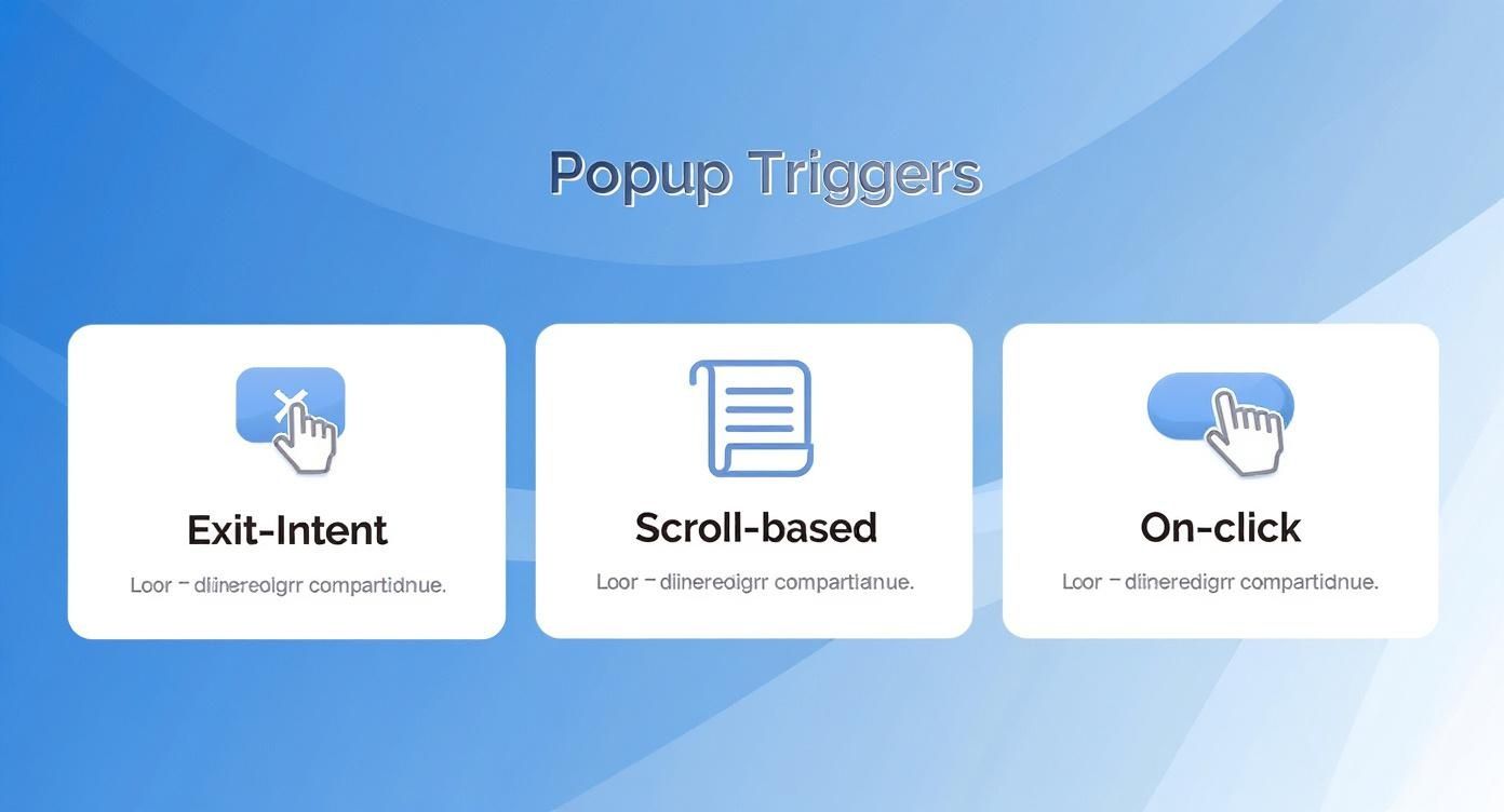
- Scroll-Based Triggers: These activate after a user has scrolled a certain percentage down the page, say 70%. This is incredibly effective on long blog posts. If someone has read that far, they're clearly hooked, making them a prime candidate for a related offer or a content upgrade.
- On-Click Triggers: This lets you turn any link, button, or image into a trigger. It’s perfect for creating slick, interactive elements. For example, you could have a "Login" button in your header that opens a login form in a popup without reloading the entire page, keeping the experience smooth and contained.
The goal is to match the trigger to the user's intent. An on-click trigger respects their explicit action, while a scroll trigger responds to their implicit interest. Both are far more effective than a generic, one-size-fits-all delay.
The Power of Exit-Intent Technology
One of the most valuable triggers in your entire toolkit is exit-intent. This clever tech tracks the user's mouse movement and speed. When it detects that the cursor is moving rapidly towards the top of the browser—a dead giveaway they're about to close the tab or hit the back button—it fires the popup.
This is your last-ditch effort to grab their attention. For an e-commerce store, it’s the perfect moment to flash a cart abandonment offer with a discount code. For a blog, it's a great time to offer a compelling lead magnet to get their email address before they vanish for good.
Each of these triggers serves a different strategic purpose, and choosing the right one depends entirely on your specific goal for that popup. For a deeper dive into the technical setup, you can explore all the options available in The Trigger Tab for Divi Areas Pro. Mastering these settings is the key to creating popups that actually convert without annoying your visitors.
Advanced Targeting Rules to Reach the Right Audience
Timing is only half the battle. The other, arguably more important, half is making sure your perfectly timed message reaches the right person. This is where advanced targeting rules come in, transforming your settings content popups from a generic megaphone into a precision tool.
Instead of shouting at everyone who lands on your site, you can start having personal conversations with specific segments of your audience.
This is the kind of control that separates popups that convert from those that just annoy. Imagine showing a special offer exclusively on your best-selling product pages, or creating entirely different popups for mobile and desktop users. These aren't just minor tweaks; they're strategic moves that directly impact how relevant and welcome your message feels to each visitor.
Moving Beyond One-Size-Fits-All Popups
Your website visitors are not all the same, so why should your popups be? Diving into targeting rules lets you tailor the experience based on who the user is, where they are on your site, and what device they're using.
Here are a few of the most effective targeting conditions you can start using right away:
- Page-Level Targeting: This is the most fundamental rule. You can choose to show (or hide) a popup on specific pages, posts, or even entire categories. For a WooCommerce store, you could display a popup offering a guide on "How to Choose the Right Coffee Beans" only on your coffee-related product pages. Simple, but effective.
- Device Targeting: The user experience is wildly different between desktop and mobile. A smart move is to create a streamlined, thumb-friendly popup for mobile users and a more detailed one for desktop visitors. This ensures your design is always optimized for the screen it's on.
- User Role Conditions: Reward your loyal customers. You can configure a popup to appear only for logged-in users, giving them access to an exclusive discount. On the flip side, you can target first-time visitors (logged-out users) with a special "10% Off Your First Order" welcome offer.
The most effective popup feels like a helpful, personal suggestion, not a generic advertisement. Granular targeting is how you create that feeling. It shows your visitors that you understand who they are and what they might be interested in.
Behavioral Targeting for Engaged Visitors
Behavioral rules take your strategy a step further by targeting users based on their actions, not just their identity. This is all about responding to their engagement in real time. For instance, you could trigger a feedback survey popup only after a user has viewed three specific pages, signaling that they're deeply engaged with your content.
This infographic breaks down a few of the most common user actions that can be used to trigger a popup.
Each of these triggers corresponds to a specific user behavior, allowing you to deliver the right message at the peak moment of interest.
The data backs this up, big time. Targeted popups simply perform better, and the numbers don't lie.
Impact of Targeting on Popup Conversion Rates
This table compares the average conversion rates of popups with specific targeting rules versus those with no targeting, highlighting the effectiveness of personalization.
| Targeting Strategy | Average Conversion Rate | Performance Increase |
|---|---|---|
| No Targeting (Generic) | 2.30% | Baseline |
| URL-Targeted | 5.80% | +152% |
| Interactive (e.g., Cart-Based) | Up to 24.12% | Over +900% |
The takeaway is crystal clear: URL-targeted popups convert 5.80% of visitors, a 152% increase compared to the 2.30% rate for non-targeted campaigns. And when you get even more specific with interactive popups tied to events like cart interactions, conversion rates can soar as high as 24.12%.
If you want to dig deeper into these figures, you can find more detailed popup statistics on Wisepops. This proves that the more specific your targeting, the better your results. It’s that simple.
Popup Design and Performance Best Practices
A stunning popup that grinds your website to a halt is a total conversion killer. On the flip side, a lightning-fast popup that looks completely out of place with your brand just feels amateur. The real sweet spot is finding the right balance between slick design and snappy performance for your popups.

Ultimately, you want the experience to feel like a natural part of your website—not some jarring, third-party ad. Nailing that requires a careful eye for both the visual style and the technical details under the hood.
Crafting a Cohesive Visual Experience
Your popup absolutely must look like it belongs on your site. This means ditching the default plugin styles and dialing in your branding to create a seamless experience for your visitors.
- Brand Alignment: Pull in your website's main colors, fonts, and button styles. A plugin like Divi Areas Pro makes this a breeze by letting you build popups directly with the Divi Builder, which guarantees perfect consistency.
- Overlay Style: The overlay is that semi-transparent background that dims the page. A subtle, dark overlay is a classic choice that helps the popup stand out, but don't be afraid to experiment with a lighter tone or even a blurred-glass effect if it fits your site's vibe.
- Close Button Design: Don't just slap an "X" on there and call it a day. The close button needs to be obvious, easy to tap (especially on mobile), and stylistically on-brand. While an "X" is standard, you could also use a simple text link like "No, thank you" for softer offers.
- Entrance Animations: A gentle fade-in or slide-in animation can make the popup's arrival feel much smoother and less abrupt than just having it instantly appear. It's a small touch that makes a big difference in user experience.
The best popup designs don’t scream for attention with obnoxious graphics. They earn it by presenting a clear, valuable message in a design that respects the user's flow and your site's aesthetic.
Protecting Site Speed and User Experience
Looks are important, but performance is everything. A slow-loading popup can wreck your site's Core Web Vitals and send visitors bouncing before they even see what you're offering. This isn't a small corner of the web, either. The global Point of Purchase (POP) display market, which includes digital popups, was valued at USD 13.71 billion in 2023 and is on a massive growth trajectory. To get your slice, performance has to be a priority. You can dive deeper into these trends by checking out the full Zion Market Research report.
This is where asynchronous loading becomes your best friend. In simple terms, it means your popup's code loads separately from your main page content. Your page can become fully interactive right away, without having to wait for the popup to finish loading—a critical step for keeping users happy.
Finally, always keep accessibility in mind. Can the popup be closed with the keyboard (usually the 'Esc' key)? Is there enough color contrast for all text to be easily readable? An accessible popup isn't just a compliance issue; it's a better experience for every single user.
Got Questions About Content Popups?
Even with the best tools in hand, you're bound to have some questions pop up (pun intended) when you start diving into a new strategy. When it comes to configuring popups, I hear the same handful of concerns from developers and site owners all the time. Getting straight answers is key to building a campaign you can feel confident in.
Let’s tackle some of the most common questions I get and clear up any lingering doubts you might have.
Can Popups Wreck My SEO?
This is the number one fear, and it's a totally valid concern. Nobody wants to see their rankings tank after adding a new feature.
The short answer is: no, popups won't hurt your SEO if you use them correctly. Google's main beef is with "intrusive interstitials"—those annoying popups that block the entire screen the second a user lands on a mobile page from a search result.
To keep Google happy, just play by a few simple rules:
- Make them easy to close. Your close button (the 'X') needs to be obvious and work instantly. No hiding it.
- Don't ambush mobile visitors. Avoid immediate, full-screen popups on mobile. Give people a chance to actually see your content first.
- Use them for legal stuff. Popups for cookie consent or age gates are completely fine and won't get you in trouble.
A well-timed exit-intent popup, a small slide-in that doesn't cover everything, or even a click-triggered popup are all perfectly safe for SEO. It's all about the user experience.
How Do I A/B Test Popups for Better Results?
If you're just guessing what works, you're leaving conversions on the table. The only way to truly dial in your popups is to test them. A/B testing (or split testing) is just creating two versions of a popup and showing them to different groups of visitors to see which one performs better.
The real goal of A/B testing isn't just to find a "winner." It's to understand why it won. Those insights are what you'll use to build smarter campaigns down the road.
The trick is to test just one element at a time. If you change the headline, the image, and the button color all at once, you'll have no idea which change actually made the difference.
Here are a few great places to start:
- The Headline: Try a direct, benefit-driven headline versus one that asks a question.
- The CTA: Test different button text. Does "Get My Discount" pull better than a simple "Shop Now"?
- The Offer: Pit a 15% discount against a free shipping offer to see which one your audience really wants.
- The Visuals: Test a popup with a strong product image against a version with no image at all. Sometimes, simplicity wins.
Keep an eye on metrics like conversion rate and close rate to pick your winner. This data-driven approach is how you turn a decent popup into a lead-generating machine.
At Divimode, we build tools that make this level of control simple and intuitive. If you're ready to create smarter, higher-converting popups for your Divi website, check out our powerful plugins and resources at https://divimode.com.
More Articles You Will Like