 Alex Martin
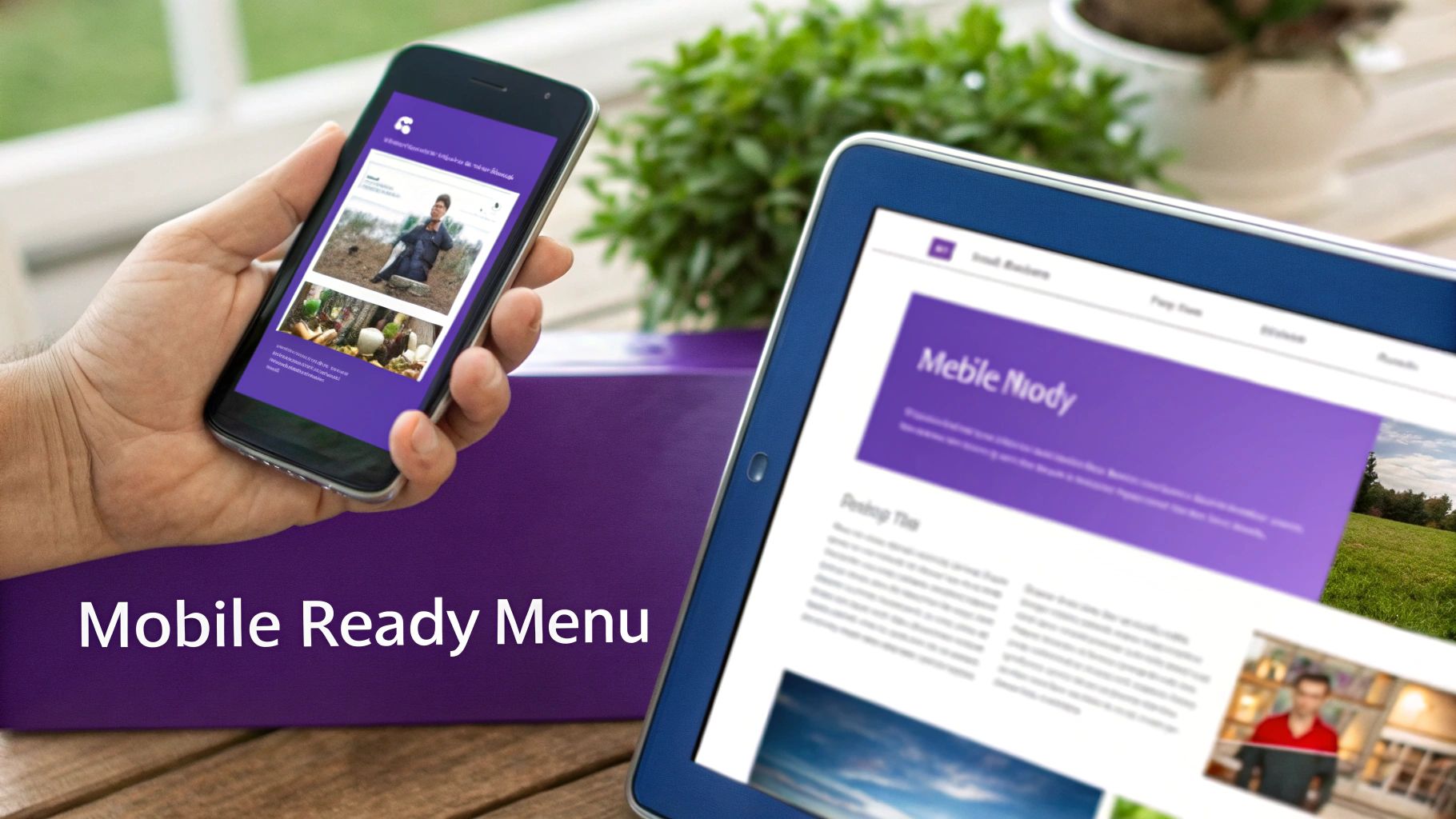
Adding a menu with image goes way beyond a simple design tweak. It’s a strategic upgrade that can turn your website's navigation from a boring list of links into a genuinely intuitive and visually guided journey for your visitors. With a tool like Divi Areas Pro, you can build these rich, interactive menus that grab attention and make the user's path through your site dead simple.
Why a Visual Menu With Image Is a Game Changer
Let's stop thinking about navigation as just a functional checklist. A visual menu is a powerful tool for communication. When someone lands on your site, the first thing they usually do is scan the navigation to figure out what you're all about. A text-only menu makes them stop, read, and process. A menu with images, on the other hand, gives them instant context.
This is a visual shortcut that taps directly into how our brains are wired; we process images way faster than text. By showing a picture of a product category or a service, you’re cutting down on the mental effort it takes for visitors to find what they need.
Guide User Attention and Drive Action
A well-placed image acts like a signpost, drawing the user's eye to the most important parts of your website. For an e-commerce store, imagine featuring a crisp, high-quality photo of a bestseller right there in the mega menu. That one image can directly influence clicks and funnel traffic straight to that product page. This isn't just about making things look pretty; it's about actively steering your users.
A visual menu transforms passive browsing into an interactive experience. It tells a story, clarifies complex options, and builds brand identity before a user even clicks a link. This strategic approach is fundamental to improving user engagement.
This subtle guidance is a cornerstone of conversion rate optimization. By making the path to a purchase or an inquiry more intuitive and visually appealing, you're removing friction and encouraging people to take action. If you're new to this concept, you can learn more in our guide on https://divimode.com/what-is-conversion-optimization/.
The Growing Importance of Visual Navigation
The move toward more visual interfaces is happening all over the web, and it's especially obvious in certain industries. Take the hospitality sector, for example. Applying some of these top restaurant website design tips—particularly those about visual menus—can be a huge factor in bringing in more customers.
The trend is backed by some serious market growth. The global market for E-Menus is projected to hit $2,500 million by 2025, a jump fueled by the demand for better customer interaction. That data really drives home how adding images to menus can directly boost engagement and even order volumes.
To give you a clearer picture, here’s a quick breakdown of the core advantages:
Key Benefits of Adding Images to Your Divi Menu
| Benefit | Impact on User Experience | Business Outcome |
|---|---|---|
| Increased Engagement | Makes navigation more interactive and less passive, encouraging exploration. | Higher time-on-site and lower bounce rates. |
| Faster Recognition | Users process images faster than text, helping them find what they need quickly. | Reduced friction and a smoother user journey. |
| Guided Navigation | Draws attention to key pages, promotions, or popular product categories. | Increased clicks on high-value pages and higher conversion rates. |
| Enhanced Brand Identity | High-quality images reinforce your brand's style and professionalism. | Stronger brand recall and a more memorable user experience. |
As you can see, the benefits go far beyond aesthetics. A visual menu is a functional tool that directly contributes to a better-performing website by making it easier and more enjoyable for your visitors to use.
Setting the Stage With Divi Areas Pro
Before we start building a slick menu with an image, we need to get our foundation right. This is where Divi Areas Pro enters the picture; it's the engine that lets us break free from standard menu limitations and build pretty much anything we can imagine.
Think of it this way: Divi Areas Pro lets you create a blank canvas using the Divi Builder. You can then drop any Divi module you want onto that canvas and trigger it to appear from a menu link. It's a game-changer.
After you've installed and activated the plugin, the first thing you'll do is create a Divi Area. This is just a self-contained layout that can be displayed anywhere, but for our goal, we'll be triggering it from our main navigation.
Creating Your First Divi Area
It all starts in your WordPress dashboard. Head over to Divi > Divi Areas and hit "Add New." The screen that pops up will feel just like creating a new page or post, which is great because there's no learning curve.
Give your Area a name that makes sense, like "Shop Mega Menu" or "Services Dropdown." Trust me, you'll thank yourself later when you're trying to find it in a list.
Once you've set a title, you'll see a panel of options that control how the Area works. This is the command center for your new visual menu.
The screenshot above gives you a peek at the key settings you'll be working with. You can set the Area Type, how it's triggered, and even add some slick animations. Getting these initial settings dialed in is absolutely crucial for a good user experience.
Choosing the Right Settings
For a menu with images, the two most important settings are the Area Type and the Trigger. These two work together to dictate how your visual menu appears and behaves. Nailing this part is fundamental.
Here’s the breakdown of what you need to choose:
- Area Type: This one's easy. Select Mega Menu. This option is specifically built for this job and makes sure your Area behaves like a proper menu dropdown, handling all the positioning and visibility for you.
- Trigger: You’ve got a couple of choices here, mainly On Hover or On Click. For desktop menus, 'On Hover' is the classic, intuitive choice. The menu appears as soon as the user's mouse moves over the parent link.
- Closing Behavior: You can also decide if the menu should disappear when the mouse leaves the area or only after a click. For most menus, closing on mouse-out feels the most natural to users.
A common mistake I see people make is choosing 'Popup' or 'Inline' as the Area Type when building a menu. You'll save yourself a lot of headaches by always selecting 'Mega Menu' to ensure your layout aligns perfectly with your navigation bar.
With these core settings locked in, you're ready to fire up the Divi Builder and get to the fun part—designing the actual visual menu. By the way, you've just unlocked a ton of power. You can learn more by checking out these Divi Areas Pro features every web designer should be using.
Now that our foundation is solid, let's move on to the creative stuff.
Alright, let's get your first visual menu item built. Now that you've got your Divi Area set up, this is where the fun really begins—actually designing inside the Divi Builder. We’ll start with something simple: a single, good-looking link with an image. Mastering this is the perfect stepping stone to creating more advanced mega menus down the line.
The idea here is pretty simple. We're going to build a small, self-contained unit that has an image and something to click on. Once that's done, we’ll hook it up to a parent link in your main WordPress menu, giving your navigation an instant visual upgrade.
Building the Visual Component
Fire up the Divi Builder for the Area you just made. Here’s a key tip: don't think of this as a full webpage. Treat it like a small, reusable component you're building. Just like any other Divi layout, your first move is to add a new section and a row. A simple single-column row is almost always the best place to start.
Next, pop an Image module into your column. This image is going to be the visual hook for your menu item. Choose something that makes sense for the link—maybe a photo of a key product or a clean icon that represents a service.
Right underneath that Image module, add either a Text module or a Button module. A Text module is great for simple linked text, but a Button module gives you more built-in styling options for a really obvious call to action. Whichever you go with, don't forget to add your destination link.
Here's a little pro-tip from my own experience: link the Image module itself, too. This gives your users a much bigger, friendlier target to click. People just instinctively expect images like this to be clickable, and meeting that expectation makes for a much smoother experience.
Optimizing for Speed and Interaction
Before you hit save, we need to talk about two things that make a huge difference: performance and user feedback. A massive, unoptimized image in your menu will slow down every single page of your website.
- Image Dimensions: This one is huge. Resize your image before you upload it. If it’s only going to show up at 200px wide in the menu, there’s zero reason to upload a 2000px wide file. Seriously, this one step will have a massive impact on your site's load time.
- File Compression: Run your image through a tool like TinyPNG or use an optimization plugin. You can slash the file size without any noticeable drop in quality.
- Hover Effects: Give users some instant feedback that an element is interactive. Add a subtle hover effect to your row or the modules inside it. A slight box shadow, a gentle lift, or an overlay color are all great options. You can set this up right in the module’s Design tab under "Transform" or "Box Shadow."
Nailing these little details is what separates an amateur menu from one that feels truly professional and polished.
Connecting Your Area to the WordPress Menu
Once your Divi Area is saved, the last piece of the puzzle is hooking it into your site's main navigation. Just head back to your WordPress dashboard and navigate to Appearance > Menus.
Find the menu item that you want to trigger this new visual dropdown. Click the little arrow to expand its settings. You should see a brand new dropdown field that Divi Areas Pro has added, probably labeled "Divi Area." All you have to do is select the Area you just designed from that list.
Save your menu, and you're done! Go check out the front end of your site. When you hover over the parent menu item, your new visual menu should pop right into view. It's a quick win that's a huge confidence booster, and it perfectly sets the stage for building out even cooler designs.
Designing an Immersive Mega Menu Experience
Alright, let's move beyond a simple visual link and build something truly immersive: a full-blown mega menu. This is where you swap a plain dropdown for a large, high-impact background image that acts as a canvas for an entire navigation panel. Instead of a single link, you're creating a destination—a rich, multi-column layout that guides users to key parts of your site, all framed by a single, compelling visual.
This approach is a game-changer for e-commerce stores wanting to show off featured categories or for corporate sites that need to highlight core services. The background image sets the tone, and the content layered on top handles the navigation.
The workflow for pulling this off with Divi Areas Pro is surprisingly simple. You're basically looking at a three-part process.
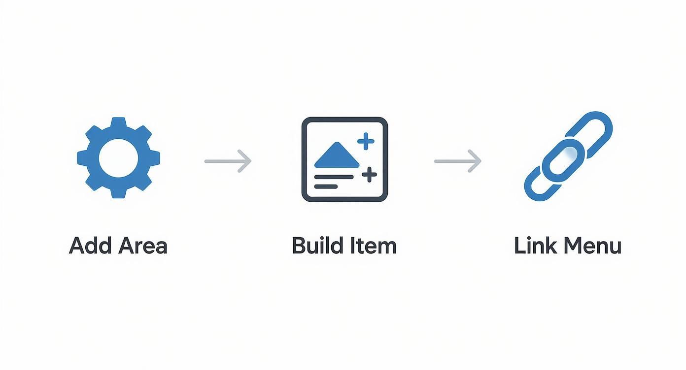
First, you configure the Divi Area. Then, you jump into the Divi Builder to design the content. Finally, you just link it up to your main menu. Easy as that.
Structuring Your Mega Menu Layout
Start by creating your Divi Area and adding a Section module. This is your foundation. Head into the Section's settings, pop over to Background > Image, and upload a high-quality, wide-format photo that fits the menu's theme.
Next, add a Row inside that Section. I find that three or four columns usually hit the sweet spot. This structure keeps the menu from feeling cluttered and gives each group of links its own breathing room. You can dedicate each column to a different sub-category, using Text modules for headlines and individual links.
Here's a pro tip I use all the time: add a background color overlay to your Section. A semi-transparent dark overlay makes your text links pop against the background image, which dramatically improves readability without sacrificing that visual punch.
This method transforms a standard dropdown into a navigation hub that's both engaging and highly functional. For a deeper dive into different layouts and more advanced techniques, check out our complete guide on creating AI-generated images that convert.
Balancing Visuals and Usability
While a stunning background image is great, remember the menu's primary job is still navigation. Your link text needs to be crystal clear, concise, and easy to read. Use Divi's design settings to dial in your font sizes, weights, and colors for perfect contrast against whatever background you've chosen.
Don't be afraid to mix and match different modules to get the layout you want. Here are a few ideas to get you started:
- Column 1: A big, bold headline with a short paragraph describing the main category.
- Column 2: A simple bulleted list of links pointing to key sub-pages or products.
- Column 3: A small gallery of product thumbnails or even a styled call-to-action button.
This idea of using visuals to guide choices isn't just for websites, either. The restaurant industry saw a huge shift toward visual menus. By 2024, over 52% of U.S. restaurants adopted QR code menus that often feature images to make dishes more appealing. A study of 2,500 consumers found that 51% had a better experience when menus included photos, proving just how much visuals can simplify decisions.
By strategically layering clear text, organized columns, and calls-to-action on top of your background, you create a menu that's not only beautiful but also incredibly effective at guiding your users where they need to go. For more on this, explore our complete guide on building powerful https://divimode.com/divi-mega-menus/.
Making Your Visual Menu Work Everywhere
Let's be honest: a fantastic mega menu on a desktop can quickly turn into a frustrating mess on a smartphone. A great menu with image has to perform flawlessly across all devices. This means diving headfirst into responsive design and accessibility—two sides of the same user-first coin.
Fortunately, the Divi Builder gives you incredibly granular control over how your layouts adapt. Nearly every setting, from column structures to font sizes, can be adjusted specifically for tablet and mobile views. This isn't just a nice-to-have; it's absolutely essential for a good user experience.
As you're designing your Divi Area, you'll see small device icons next to many of the settings. Clicking these is your command center for creating a truly adaptive visual menu, letting you set different values for desktop, tablet, and mobile.
Mastering Divi's Responsive Controls
Your first priority should be the column layout. A four-column mega menu that looks brilliant on a widescreen monitor will be hopelessly squished on a phone. The best practice here is almost always the same: stack your columns into a single, vertical layout for mobile.
You can do this right in the row settings for your mobile view. Just tell the columns to stack on top of each other, and you'll get a clean, scrollable list. From there, it's all about fine-tuning the details.
- Image Sizing: Those big, beautiful desktop images might be too large and slow to load on a mobile connection. Use Divi's responsive settings to shrink an image's max-width or even swap it out entirely for a smaller, optimized version using the visibility controls.
- Text and Spacing: Text that’s perfectly readable on a large screen can become tiny and cramped on a mobile device. Tweak font sizes and padding specifically for mobile to keep everything legible and tap-friendly.
- Hiding Elements: Sometimes, less really is more. For a streamlined mobile menu, you might decide to hide certain decorative images or less critical links that you show on the desktop version. You can do this easily in the
Advanced > Visibilitysettings to disable specific modules on phones or tablets.
Here's a critical step people often miss: testing the hover trigger. 'On Hover' doesn't exist on touch devices. For the best experience, make sure your Divi Area is also set to trigger 'On Click' for mobile users. This provides a predictable and reliable interaction they'll expect.
Building an Accessible Visual Menu
Beyond just screen sizes, a truly functional menu has to be accessible to everyone, including visitors who rely on screen readers. Visuals are powerful, but they become barriers if not implemented correctly. This is where accessibility isn't just a recommendation—it's non-negotiable.
The most important rule? Provide descriptive ALT text for every single image in your menu. This text is what gets read aloud by screen readers, giving visually impaired users the context they need to understand and navigate your site.
Don't just phone it in with generic ALT text like "menu image." Be specific. If an image links to your women's shoe collection, the ALT text should say something like, "A collection of high-heeled women's shoes." This simple practice makes your menu usable for all and, as a nice little bonus, gives valuable context to search engines, which can help your SEO.
Once you start exploring what's possible with image-based menus, a few questions almost always come up. Answering them now will save you headaches down the road and give you the confidence to get even more creative with your designs. Let's break down some of the most common things Divi users ask.
A big one is whether you're stuck with just static pictures. The short answer? Not at all. And that opens up some really interesting possibilities.
Can I Use a Video Instead of an Image?
Absolutely. Because you're crafting the menu inside a Divi Area, you have the entire Divi Builder at your command. That means you can drop in any module you want, including the Video module or even a video background for a whole section.
But, you'll want to be careful here. A video, especially one set to autoplay, can seriously slow down your menu's load time and be a major distraction for visitors. It's a high-impact feature that should be used sparingly. If you do go for it, make sure the video file is aggressively compressed and optimized to keep your site from grinding to a halt.
I always ask myself one simple question: does this video actually help the user, or is it just a cool trick? If it doesn't make it easier for someone to navigate or understand what you offer, a crisp, high-quality static image is almost always the smarter choice for performance and usability.
How Do I Optimize Images for Faster Loading?
This part is non-negotiable. A slow-loading menu is a frustrating experience and can tank your site's overall speed. Thankfully, getting it right is pretty straightforward.
Just follow these three key steps:
- Resize Before Uploading: Figure out the exact size the image will be displayed at within your menu, then resize it to those dimensions before it ever touches your WordPress media library. There's zero reason to upload a 2000px wide image if it's only ever going to be seen at 300px.
- Compress the File: Use a service like TinyPNG or a good image optimization plugin. These tools can often shrink file sizes by over 70% without any noticeable drop in quality. It’s a game-changer.
- Use Modern Formats: Whenever you can, use a modern format like WebP. They offer much better compression than old-school JPEGs and PNGs, which translates directly to faster load times.
Will Adding Images to My Menu Hurt SEO?
Not if you do it right. In fact, a well-implemented visual menu might even give you a tiny SEO edge. The whole game is about making sure your menu is still perfectly readable for search engine crawlers.
The single most important thing is to use descriptive ALT text for every single image you add. This text tells search engines what the image is about and how it fits into your site's navigation. Since the menu links themselves are just standard HTML <a> tags, crawlers will have no problem following them.
Where you can get into trouble is with a poorly built menu—like using one giant, un-optimized image map with no actual text links. Stick to the best practices we've covered, and you'll build a menu that's fantastic for your visitors and perfectly fine for search engines.
Ready to build your own stunning visual menus? Divimode provides the tools and tutorials you need. Get started with Divi Areas Pro and transform your site's navigation today at https://divimode.com.
More Articles You Will Like