 Alex Martin
So, what exactly is a Divi mega menu? Think of it as a supercharged dropdown menu. Instead of a simple list of text links, you get a large, multi-column navigation panel built with the Divi Builder. This lets you pack in images, icons, and all sorts of interactive elements that a standard menu just can't handle. It's a game-changer for improving the user experience on sites with a lot of content.
Why a Standard Menu Is No Longer Enough
For a simple brochure site, Divi's default menu works just fine. It gets the job done. But as your website grows, that same menu can quickly become a major bottleneck.
A long, cascading list of dropdown items is overwhelming. It makes it tough for visitors to find what they're looking for, and that friction often leads to frustration. Before you know it, your bounce rate is climbing.
Picture a large e-commerce store with dozens of product categories. A standard menu shoehorns them into a nested series of text links, which isn't just visually boring—it's inefficient. Users have to perform a delicate dance with their mouse, hovering over multiple levels just to see the options available.
Limitations of Divi's Default Menu
When you get down to it, Divi’s standard navigation has some clear drawbacks for more complex websites:
- Limited Content: You're pretty much stuck with simple text links and sub-menus. That's it.
- Poor Visual Hierarchy: It’s almost impossible to visually group related items or draw attention to your most important pages.
- Lack of Engagement: There’s no room for images, icons, or calls-to-action that can help guide your users.
This is exactly where a purpose-built Divi mega menu becomes essential. It transforms your navigation from a simple list into an organized, visual guide. As you think about why standard menus fall short, it's worth remembering that a smooth user journey is critical for converting visitors, no matter where they come from, including those driven by the role of navigation in successful email marketing campaigns.
The Power of Visual Navigation
Instead of just telling users what you offer, a mega menu lets you show them.
For an online store, this could mean displaying featured product images right inside the navigation panel. A corporate site could use icons and brief descriptions to make its complex services much easier to grasp at a glance.
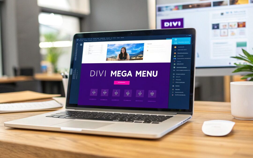
Take a look at this screenshot. It shows a Divi mega menu built with Divi Areas Pro, and you can immediately see the difference—multiple columns, images, and custom styling all working together.
This image really highlights how you can break free from the rigid constraints of default menus to build a rich, user-friendly experience. This visual approach isn't just about making things look pretty; it's about clarity and efficiency. You can dive deeper into these techniques in our other guide about https://divimode.com/divi-mega-menus/.
A well-designed mega menu doesn’t just list options; it organizes your site’s architecture into a clear, scannable, and visually engaging roadmap for your visitors.
Mega menus have become indispensable for e-commerce sites and content-heavy platforms because they give users a direct path to deeper sections of a site. It's not just a trend; recent analysis confirms that this approach boosts discoverability and makes navigation easier, which directly improves user engagement. A tool like Divi Areas Pro is really the key to unlocking this potential on your own Divi site.
Setting Up Divi Areas Pro for Menu Creation
Before we can jump into building a slick Divi mega menu, we need to get the foundation right. That means getting Divi Areas Pro installed and activated on your WordPress site. The whole process is pretty standard—if you’ve installed a premium plugin before, you’ll feel right at home. Just download the ZIP file, upload it, and activate. Simple as that.
If you hit a snag or just want a click-by-click walkthrough, our guide on how to install and activate Divi Areas Pro has you covered. Making sure the plugin is set up correctly from the start is the best way to avoid any weird technical hiccups down the road.
Once the plugin is active, you'll spot a new "Divi Areas" item in your WordPress dashboard menu. This is your command center, the hub where you'll create and manage all the dynamic content for your mega menus and anything else you dream up.
Understanding the Concept of "Areas"
The magic behind Divi Areas Pro is a simple but incredibly powerful concept: the "Area." Think of an Area as a blank canvas where you can unleash the full power of the Divi Builder.
You can drop any Divi module you can think of into an Area—text, images, contact forms, even entire product grids. Once you’ve designed it, you then decide what makes it appear.
An "Area" is a self-contained piece of Divi Builder content that can be displayed anywhere on your site based on a specific trigger, like a user clicking a button, hovering over a menu item, or even trying to leave the page.
For our project here, we’re going to set up our Area to become the content of our mega menu. But trust me, its potential goes way beyond just navigation.
This modular approach is what gives the plugin its flexibility. You're not just building a menu; you're creating a reusable block of content that can be deployed in countless ways. It's a huge step up from the rigid, traditional menu tools you might be used to.
Initial Configuration and Settings
After you click into the Divi Areas section, it's worth taking a quick look around the plugin's settings. The default configuration is solid enough for most projects, but it never hurts to know what your options are. This is where you can manage your license, user permissions, and other general settings.
When it comes to building a mega menu, the most important settings are actually configured for each individual Area, which we'll dive into next. For now, the main thing to remember is that you have a new, dedicated space in your dashboard just for building these rich content blocks.
Once you’re comfortable with the interface, you’re ready to get creative. This setup is the necessary first step that unlocks the complete design freedom of the Divi Builder for your site's navigation. Your journey to an amazing mega menu starts right here.
Designing Your Mega Menu Content with Divi Builder
Alright, this is where the fun really begins. Now that Divi Areas Pro is installed, you’ve unlocked the full creative power of the Divi Builder to craft your mega menu content. We're about to move past simple dropdown lists and build something truly interactive.
First things first, head to Divi Areas in your WordPress dashboard and click Add New. Be sure to give your new Area a clear title—something like "Services Mega Menu"—so you can easily find it later. As soon as you do, you’ll be greeted by the familiar Divi Builder, a blank canvas ready for your masterpiece.
To make this practical, I'll walk you through a real-world example I've built before: a "Services" menu for a digital marketing agency. The challenge is always the same—how to show off a bunch of different offerings without overwhelming the visitor.
Structuring Your Menu Layout
Before you start adding modules, you need a solid structure. For a Divi mega menu, you can't go wrong with a classic multi-column layout. It’s clean, organized, and guides the user’s eye exactly where you want it to go. For our agency example, a three-column row is the perfect starting point.
Each column will house a core service category, immediately creating a sense of order.
Once the columns are in place, you can start dropping in standard Divi modules. This is the real magic of using Divi Areas Pro—if you know Divi, you already know how to build your menu.
- Image or Blurb Modules: Pop one of these at the top of each column. A simple icon or a small, relevant image makes the menu much more scannable than just a wall of text.
- Text Modules: Add a bold headline for each category (e.g., "SEO," "PPC," "Content Marketing"). Just below it, a quick one-sentence description can add some much-needed context.
- Button Module: Why not turn your menu into a lead-gen machine? A well-placed "Get a Free Quote" button in one of the columns or in its own row below can work wonders.
Think of your mega menu less like a list and more like a mini landing page. Your job is to provide instant clarity and guide users to their next click.
The flexibility of Divi is why it's now powering roughly 1.58 million websites across the globe. That incredible growth has led to a massive ecosystem of resources, including over 2,600 free layouts. So as you build, remember there's a world of inspiration out there to help your navigation stand out. You can learn more about Divi's impressive market share on mycodelesswebsite.com.
Adding Your Content and Styling
With the structure in place, it’s time to fill in the blanks. For our agency menu, this means populating the text modules with the actual service names and descriptions. The process is exactly the same as building any other page in Divi, so you have complete control over every font, color, and spacing detail.
Don't hold back on the design. A subtle background color for the entire row or a soft box shadow can make the menu feel like it's floating above the page content. The goal is to create something that feels intentional and aligns perfectly with your brand.
And if you’re short on time or just need a creative jumpstart, you can always use a pre-made design. We’ve built a whole library of Divi Areas Pro layouts that can save you hours of work. Just import a template, swap out the content, and you’re good to go. It’s the perfect way to get a professional result, fast.
Connecting Your Area to a Navigation Menu Item
You've designed a beautiful, content-rich panel for your Divi mega menu. Now, the big question is how to get it to show up on your site. We need to bridge the gap between your design and your website's main navigation. This is where we tell a specific menu item, "When a user hovers over you, show this awesome Area."
Believe it or not, this entire connection hinges on a small but powerful feature in WordPress called CSS Classes.
First things first, head over to Appearance > Menus in your WordPress dashboard. Look in the top-right corner and click on the "Screen Options" tab. A panel will slide down with several checkboxes—make sure the one for CSS Classes is checked. This little step adds a new field to each of your menu items, which is exactly what we need.
Assigning a Unique CSS Class
With the CSS Classes option enabled, find the top-level menu item you want to act as the trigger for your mega menu. For my agency example, this would be the main "Services" link.
Click the small arrow next to it to expand its settings. You'll see a new text field labeled "CSS Classes (optional)". This is where the magic happens.
Type in a short, descriptive class name. Keep it simple—no spaces or special characters. Something like services-trigger is perfect. It’s a good habit to keep your class names logical and consistent. If you plan on adding more mega menus later, you could use about-trigger or products-trigger. This simple naming convention will save you a lot of headaches down the road.
Think of this CSS class as a unique handshake. Your menu item offers the handshake (
services-trigger), and your Divi Area will be configured to accept it. That's what completes the connection and displays your content.
Once you've added the class, don't forget to click Save Menu. It's a small step, but it's surprisingly easy to forget, and the whole setup won't work without it.
This infographic breaks down the core workflow you just followed for designing your menu content.
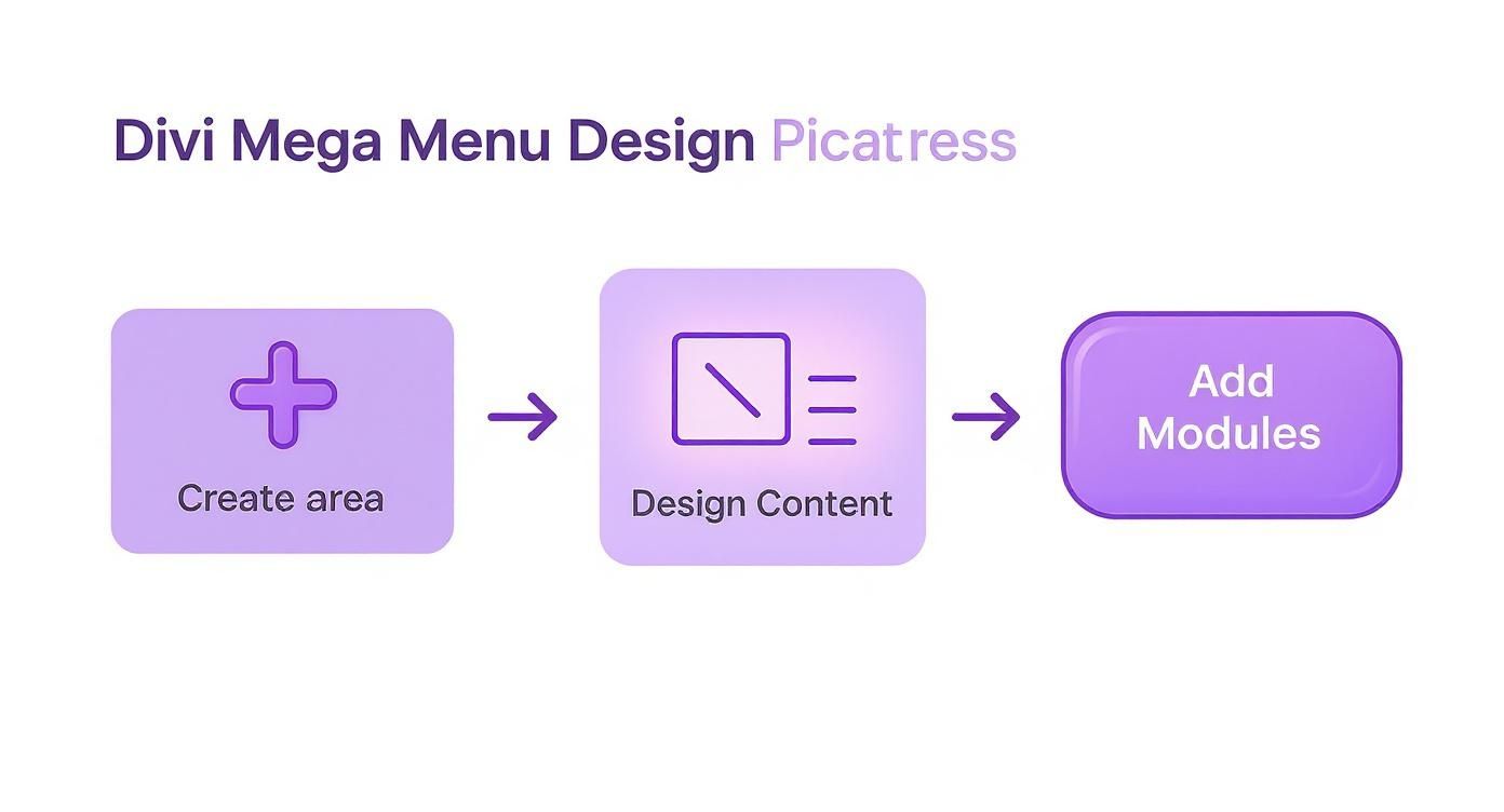
As you can see, creating the Area, designing it with modules, and then connecting it are distinct yet interconnected stages.
Configuring the Divi Area Trigger
Alright, let's complete the connection. Head back to your saved Area by navigating to Divi > Divi Areas and open the "Services Mega Menu" you designed earlier.
On the right-hand side, you'll see the "Divi Areas" settings panel. This is the control center for all the display logic.
In the "Display Mode" dropdown, select Mega Menu. This tells the plugin that this Area is specifically intended to function as a menu. As soon as you select it, new options will appear, letting you fine-tune its behavior. The most important one here is "CSS Selector."
In this field, you need to enter the exact same class name you just assigned to your menu item, but with one crucial addition: a period (.) in front of it. So, you’ll type .services-trigger into the box. That period is a standard CSS selector that tells the browser, "Hey, look for an element with this specific class."
From here, you can also adjust settings like the entrance animation and alignment to make sure the menu appears exactly how you want it. Once you have everything configured, hit Update to save your changes.
Now for the fun part! Go visit your site's front end and hover over "Services." Your beautifully designed Divi Area should appear seamlessly, right where it belongs.
Advanced Mega Menu Tips and Customizations
Alright, so you've built your Divi mega menu. That's a huge step forward, but the real magic is in the details. Honestly, these next few tweaks are what separate a good menu from a truly great one—the kind that feels like a seamless, intentional part of your site's design. Let's push past the basics and really polish this thing up.
One of the first things I almost always change is the entrance animation. A menu that just pops into existence can feel a bit abrupt. A subtle fade-in or slide-down animation, which you can set up right in the Divi Area settings, adds a touch of class and makes the whole interaction feel smoother.
Another quick fix is the menu's width. Right out of the box, your Divi Area might not perfectly match your header's layout. Divi Areas Pro gives you exact control here, letting you set a specific width or stretch it full-width to get that perfect alignment.
Mastering Responsive Design
Look, a mega menu that shines on desktop but falls apart on mobile is a user experience fail. This is where you need to lean into Divi's responsive tools. Just open your Divi Area, toggle the tablet and mobile views, and you can build completely different layouts for smaller screens.
For example, a clean three-column layout on a desktop can be easily restacked into a single, scrollable column on a phone. Making sure your menu is truly responsive is a non-negotiable part of modern customization; you can dive deeper into responsive web design to really nail it for every device.
You can also use Divi's visibility controls to hide certain elements—like big, heavy images—on mobile. This cleans up the interface and helps your pages load faster for people on the go.
Unlocking Dynamic Display Conditions
This is my absolute favorite pro-level trick because it transforms your menu from a static list of links into a smart, dynamic asset. Divi Areas Pro comes packed with powerful display conditions that let you show or hide your mega menu based on rules you define.
Just think about the possibilities here:
- For Logged-In Users: You could show a "My Account" link or a special members-only promo right in the main navigation, but only for people who are actually signed in.
- On Specific Pages: How about a unique mega menu just for your blog section that highlights recent posts or popular categories? Easy.
- Time-Sensitive Offers: You could automatically display a banner for a holiday sale in your menu, and have it disappear the day the sale ends.
By using dynamic conditions, your Divi mega menu becomes an active part of your marketing and user engagement strategy, not just a simple navigation tool.
This level of control is a big reason why the Divi ecosystem is so popular. Think about it: WordPress powers a massive 43.6% of all websites, and Divi has carved out a huge space in that market. The platform’s flexibility, especially with advanced features like this, is why so many of us stick with it. These customizations allow you to build a smarter, more personalized user journey, starting right from the main header.
Got Questions About Divi Mega Menus?
As you start piecing together your own Divi mega menu, a few questions almost always come up. It's one thing to follow a tutorial, but it’s another to feel confident about how your shiny new menu will behave out in the wild. Let's get ahead of the curve and tackle the most common ones right now.
Probably the biggest worry I hear is about mobile devices. Will this beautiful, multi-column menu collapse into a jumbled mess on a phone?
Will My Divi Mega Menu Be Mobile Responsive?
Yes, absolutely—as long as you build it that way. The real magic here is that your mega menu's content is created entirely with the Divi Builder. That means you get to use all of Divi’s powerful responsive design controls, just like you would for any other page section.
You have total control over the mobile experience.
Just hop into the Divi Builder for your Area, switch to the tablet or mobile preview, and you can tweak every single element. This lets you:
- Restack Columns: Your fancy multi-column layout on desktop can instantly become a clean, single column on a phone.
- Adjust Sizing: Easily dial in different font sizes, padding, and margins that look perfect on smaller screens.
- Hide Elements: Got a big image that looks great on desktop but just clutters things up on mobile? You can hide it for smaller devices to simplify the menu and keep things snappy.
Some designers even prefer to hide the mega menu entirely on mobile and stick with Divi's default hamburger menu for a more streamlined feel. The choice is completely yours.
Can I Use Multiple Mega Menus on the Same Website?
Of course. This is a super common need for larger sites, and it's something Divi Areas Pro handles beautifully. You can create a unique Area for every top-level menu item if that's what your project calls for.
The workflow is the same for each one. Just create a new Area, design its content, and give it a unique CSS class to act as the trigger. For example, your "Services" menu might be triggered by .services-trigger, while your "About Us" menu uses .about-trigger. This approach keeps everything modular and lets you build out fully customized menus across your entire navigation.
Think of each Area as its own independent component. By assigning distinct triggers, you guarantee that hovering over one menu item only ever reveals its own specific mega menu. Everything stays clean, organized, and works exactly as expected.
Does Using a Mega Menu Slow Down My Website?
Performance is always a fair question, but Divi Areas Pro was built from the ground up to be lightweight. While adding any visually rich element can add some weight to a page, the impact here is typically minimal.
The key thing to know is that the menu's content isn't loaded when the page first renders. It’s loaded on-demand when a user actually interacts with the trigger (like hovering over a menu link). This smart approach prevents the mega menu from bogging down your site's critical initial load time.
As always, just follow web best practices—like optimizing any images you use in your menu—and everything will stay fast and fluid for your visitors.
Ready to build a smarter, more engaging navigation experience? The power and flexibility of Divimode’s Divi Areas Pro make it simple. Get started today at divimode.com.
More Articles You Will Like


