 Alex Martin
Compressing images for the web is all about one thing: shrinking the file size without making the picture look terrible. You do this by picking the right format (like JPEG or the more modern WebP), resizing the image to the exact dimensions it will appear on the screen, and then running it through a compression tool.
It’s a simple process, but it’s hands-down one of the most effective ways you can speed up your website.
Why Image Compression Is Crucial for Site Speed
Before we get into the how, let’s talk about the why. Unoptimized images are the number one reason websites feel sluggish. Every single oversized photo on your site adds to the total page weight, forcing your visitors to sit and wait for content to load.
This isn't just a minor annoyance; it directly impacts your bottom line.
Think about an e-commerce store with beautiful, high-resolution product photos that take forever to pop in. A potential customer gets frustrated and clicks away before they even see what you're selling. That’s a lost sale. A blog with slow-loading featured images? Readers will bounce before they even get to your first sentence.
This GTmetrix report shows a real-world example of how large, uncompressed images can tank your key speed metrics.

You can see it right there in black and white—unoptimized images are identified as a primary performance bottleneck. That's a clear signal that something needs to be fixed, and fast.
The Real Cost of Slow Images
Slow load times don’t just test patience; they actively drive people away. Research from 2023 showed that if a page takes more than 3 seconds to load, over 50% of visitors are gone. Since images are almost always the heaviest part of a webpage, they're the main culprit.
Properly compressing your images can slash page load times by up to 25%. That's a massive improvement that directly impacts user retention and, ultimately, conversions.
The table below breaks down just how damaging those heavy images can be.
Impact of Uncompressed Images on Key Metrics
| Metric | Impact of Uncompressed Images | Benefit of Compression |
|---|---|---|
| Page Load Time | Significantly increased, leading to user frustration. | Dramatically faster load times, improving UX. |
| Bounce Rate | Higher, as users abandon slow-loading pages. | Lower, as users stay engaged with fast content. |
| Conversion Rate | Lower, especially on e-commerce and lead-gen sites. | Higher, as a seamless experience encourages action. |
| SEO Rankings | Negatively impacted, as search engines penalize slow sites. | Positively impacted by improved Core Web Vitals. |
| Server Load | Increased bandwidth usage and server strain. | Reduced bandwidth costs and less stress on hosting. |
As you can see, the benefits go far beyond just a faster-feeling site. It's a foundational piece of the puzzle.
Image compression isn't just a technical chore—it's a fundamental part of creating a great user experience and a high-performing website. Think of it as a strategic priority for anyone serious about their online presence.
This is what makes learning how to compress images a non-negotiable skill. A zippy, responsive site keeps users happy, which sends all the right signals to search engines. It's a core concept in any serious website performance optimization strategy.
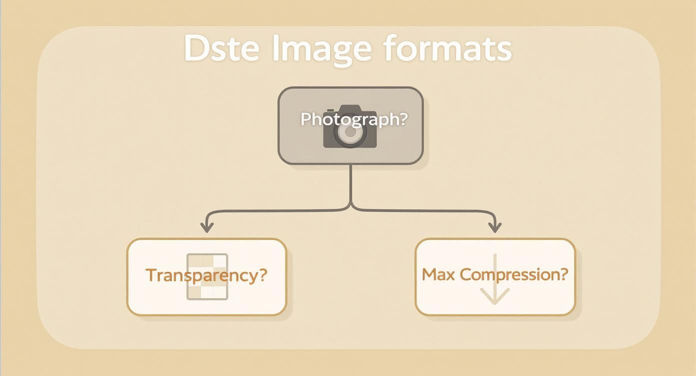
Choosing the Right Image Format
Before you even touch a compression slider or worry about quality settings, the first domino to fall is picking the right image format. Get this wrong, and you're fighting an uphill battle. Getting it right, however, lays the groundwork for a fast, beautiful website.
Think of an image format as the container for your visual data. Each one has its own quirks, strengths, and weaknesses, making it a better fit for certain types of images. You wouldn't take a briefcase on a hiking trip, right? Same principle applies here.
For years, two formats have done most of the heavy lifting on the web, and for good reason. They are the reliable workhorses you can count on.
- JPEG (or JPG) is your go-to for photographs. It's brilliant with complex images packed with millions of colors and subtle gradients. It uses lossy compression to make file sizes dramatically smaller, which is perfect for those detailed product shots and hero images.
- PNG is the undisputed champ for any graphic that needs a transparent background, like a logo or an icon. It uses lossless compression, which means every single pixel is preserved. This keeps lines and text perfectly crisp, though it often comes at the cost of a larger file size compared to JPEG.
If you're looking for a deeper dive into the specifics, especially when it comes to photos, understanding the best image formats like JPEG and PNG is a great resource for getting more clarity.
The Rise of Modern Image Formats
While JPEG and PNG are still your bread and butter, modern browsers have opened the door to next-gen formats that offer far better compression. The most important one to know is WebP, a format developed by Google.
WebP really changed the game. It's a true all-rounder, capable of handling both lossy and lossless compression. It even supports transparency and animation, making it incredibly versatile. On average, WebP files are 25% to 34% smaller than JPEGs at the same visual quality. That means your 1 MB hero image could shrink down to around 660-750 KB as a WebP without anyone noticing a difference. You can learn more about these WebP findings directly from Google.
This screenshot from Can I Use shows just how widespread WebP support has become.
As you can see, we're at a point where WebP is supported by every major modern browser. It's a safe, smart, and highly effective choice for pretty much any website today.
When to Use Each Format
So, how do you make the call? Here's a simple framework I stick to:
- Use JPEG for: Any complex, colorful photograph that doesn't need transparency. Think blog post images, product photos, and portfolio galleries.
- Use PNG for: Logos, icons, and simple graphics where you need a transparent background or perfectly sharp lines and text.
- Use WebP for: Pretty much everything. Many modern plugins and tools can automatically convert your JPEGs and PNGs to WebP and serve them only to browsers that can handle it, giving you the best of both worlds without any extra work.
The real goal here is to match the image's job to the format's strengths. Don't fall into the trap of using one format for everything. A thoughtful choice at this stage is the easiest performance win you'll ever get.
By taking just a moment to pick the right format, you're making sure your images are as lean as possible before you even start compressing them. It’s a strategic first step that makes every other optimization that much more effective.
Now that you have a solid grasp of the different image formats, the next step is picking the right tool for the job. There are tons of options out there, which can feel a bit overwhelming at first, but they really just boil down to a few key categories, each built for a different kind of workflow.
The real goal is to find a solution that fits so seamlessly into your process that compressing images becomes second nature—something you do automatically without even thinking about it.
Easy Online Compression Tools
Sometimes you just need a quick fix without a lot of fuss. For those fast, one-off optimizations, nothing beats a simple online tool. These are perfect when you’ve only got a handful of images and don't want the hassle of downloading and installing software.
The undisputed king in this space is TinyPNG. You just drag your JPEG or PNG files onto the page, and its smart lossy compression gets to work, often slashing file sizes dramatically while keeping the quality surprisingly high.
The process couldn't be more straightforward, as you can see here.
Its dead-simple interface is precisely why it’s a favorite for quick tasks. It handles everything in seconds and gives you a download link. No logins, no settings, just results.
Powerful Desktop Applications
When you need more fine-grained control or have to process a whole folder of images at once, a dedicated desktop app is your best friend. These tools run right on your computer, so you're not dependent on an internet connection, and they typically offer advanced settings to really dial in your compression.
- ImageOptim (Mac): This is a fantastic—and free—tool for anyone on a Mac. It’s known for its simple drag-and-drop interface and its knack for automatically finding the best compression settings. It goes the extra mile by stripping out unnecessary metadata and color profiles to shave off every last kilobyte.
- RIOT (Windows): The Radical Image Optimization Tool (RIOT) is a powerful free option for Windows users. It features a great side-by-side view, letting you compare the original and compressed images in real-time. This makes it incredibly easy to tweak the settings until you find that perfect balance between file size and visual quality.
These apps are workhorses for designers, photographers, and developers who deal with images in bulk and need a reliable, offline workflow they can count on.
The key is to find a tool that matches your volume. If you optimize five images a month, a web tool is perfect. If you’re optimizing five hundred, a desktop batch processor will save you hours of tedious work.
Comparison of Image Compression Tools
To help you decide at a glance, here’s a quick breakdown of which tool type might be the best fit for your needs. Think about your typical workflow—do you need speed and convenience, or power and control?
| Tool Category | Best For | Key Features | Example Tools |
|---|---|---|---|
| Online Tools | Quick, one-off compressions and small batches. | Browser-based, no installation required, very easy to use. | TinyPNG, Squoosh |
| Desktop Apps | Bulk processing, offline work, and fine-tuning quality. | Advanced settings, batch processing, no internet needed. | ImageOptim (Mac), RIOT (Windows) |
| WordPress Plugins | Automated, hands-off optimization directly within your website. | "Set and forget," bulk optimizes media library, compresses on upload. | Smush, ShortPixel |
| Developer Tools (CLI) | Integrating compression into an automated development workflow. | Scriptable, highly configurable, powerful for build processes. | ImageMagick, Pngquant |
Each category has its place. Your job is to pick the one that removes the most friction from your process, ensuring that image optimization actually gets done every single time.
Automated WordPress Plugins
For anyone managing a WordPress site, the most efficient approach is almost always a plugin that handles the heavy lifting for you. These tools can automatically compress images the moment you upload them, resize them to fit your theme’s specifications, and even go back and optimize your entire existing media library.
Plugins like Smush or ShortPixel live right in your WordPress dashboard and work quietly in the background. This "set it and forget it" method is a lifesaver for busy site owners or multi-author blogs where you can't manually inspect every single image that gets uploaded.
Getting your images in check is one of the most impactful things you can do for site speed. In fact, for a deeper look at improving your site's performance, check out these 8 steps to decreasing website loading time by 50%, where image optimization plays a starring role.
Mastering Lossy and Lossless Compression
When you start digging into image optimization, you'll run into two terms over and over: lossy and lossless. Getting a feel for how these two methods work is the key to shrinking your file sizes without making your images look terrible. It's all about finding that perfect balance.
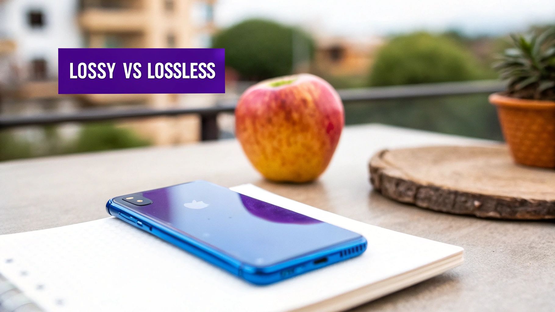
Think of it this way: lossless compression is like putting your files in a ZIP folder. It reorganizes the data to take up less space, but when you "unzip" it, every single bit of the original information is still there, completely intact. Nothing is lost.
Lossy compression is a bit more aggressive. It intelligently throws away tiny bits of data that the human eye is unlikely to even notice, like subtle shifts in color between neighboring pixels. This allows for massive file size reductions, but that data is gone for good.
When to Choose Lossless Compression
Since lossless compression keeps every single pixel exactly as it was, it's the only option for images where perfect clarity is non-negotiable.
You'll want to stick with lossless for things like:
- Logos and Icons: Any blurring or artifacts around sharp lines and solid colors would be immediately obvious.
- Technical Diagrams: Every line and number in a schematic needs to be perfectly crisp.
- Screenshots: When you need text and user interface elements to be completely legible, lossless is the way to go.
The trade-off, of course, is that the file size savings are pretty modest. You’ll get some reduction, but it won't be the dramatic drop you need for large, high-resolution photographs.
Lossless is your go-to for technical precision. It’s about maintaining perfect data integrity, even if it means a slightly larger file. It’s non-negotiable for graphics where every pixel counts.
Finding the Sweet Spot with Lossy Compression
For the overwhelming majority of images you see on the web—especially photographs—lossy compression is the clear winner. The file size savings are huge, and when you get the settings right, the difference in quality is often impossible to spot with the naked eye. This is the magic behind fast-loading blogs, e-commerce stores, and online portfolios.
Most tools that use lossy compression give you some kind of quality slider, usually from 0 to 100. I've found that a setting of around 80% is often the sweet spot. It provides a huge reduction in file size with almost no perceptible loss in quality. You can even push it down to 60-70% for smaller images and still get great results.
This is where modern image formats really shine. Take AVIF, for example, which came on the scene in 2020. It uses incredibly advanced lossy compression that can achieve file sizes up to 50% smaller than a JPEG at the same visual quality. In real-world terms, a 1 MB JPEG photo can often be saved as a 500 KB AVIF file and look just as sharp. You can check out some of the best image optimization tools that leverage these formats to see this in action.
The most important takeaway here is to always preview your work. Tweak the settings, compare the before and after, and find that perfect point where the file size is as low as it can go while still looking great to you.
Automating Your Image Optimization Workflow
Compressing images one by one is fine when you're just starting out or working on a small project. But let's be real—for any website that's regularly updated, that manual process becomes a serious time-suck.
The real key to long-term performance is to build a system that handles optimization for you. You want a workflow that runs in the background, making sure every single image is as lean as possible without you ever having to think about it.
This "set it and forget it" approach saves you countless hours and, just as importantly, ensures consistency. It eliminates the risk of human error, like that one time a massive, unoptimized hero image slips through and slows your entire homepage to a crawl. Automation is how you scale your performance efforts.
Serve Perfectly Sized Images with Code
One of the most powerful automation techniques doesn't even require a special plugin or external tool—it's built right into HTML. By using responsive image attributes like srcset and the <picture> element, you can let the browser do the heavy lifting.
This bit of code essentially tells the browser, "Hey, I've got a few different sizes of this image available." The browser then intelligently selects and downloads only the most appropriate one for the user's specific screen. It's a game-changer.
For example, the srcset attribute provides a list of image sources and their widths:
photo-small.jpg 480w(for small mobile screens)photo-medium.jpg 800w(for tablets and larger phones)photo-large.jpg 1200w(for desktop displays)
Adding this to your <img> tag is a simple move that prevents a small mobile device from needlessly downloading a massive, high-resolution desktop image. This is a foundational technique for building fast, adaptive websites, and it's a core part of modern web development. When you’re focused on optimizing images for WordPress, understanding how the CMS handles these responsive image sizes automatically is a huge advantage.
By implementing responsive images, you're not just compressing files; you are delivering an entirely different, smaller image file to smaller devices. This results in one of the most significant performance gains you can make.
Leverage Content Delivery Networks for On-the-Fly Optimization
For the ultimate hands-off workflow, nothing beats a Content Delivery Network (CDN) with built-in image optimization. Services like Cloudinary or the image optimization features in Cloudflare can completely transform how you handle media.
Instead of optimizing images before you upload them, you just upload one high-quality original. The CDN takes it from there.
When a user’s browser requests an image, the CDN performs several actions automatically and in real-time:
- Resizing: It detects the user's screen size and serves a perfectly scaled version.
- Compression: It applies smart, lossy compression to shrink the file size without wrecking the quality.
- Format Conversion: It checks if the user's browser supports next-gen formats like WebP or AVIF and converts the image on the fly, delivering the most efficient file type possible.
This dynamic approach ensures every single visitor gets the fastest possible image for their specific context—their device, screen size, and browser. It's a truly powerful system that all but makes manual image compression a thing of the past.
Got Questions About Image Compression? Let's Clear Things Up.
As you start dialing in your image compression workflow, a few questions always seem to pop up. It's totally normal. Getting straight answers to these common sticking points is the key to building an optimization strategy that actually works, without any guesswork.
Let's tackle some of the most frequent ones I hear.
Will Compressing My Images Make Them Blurry?
Not if you do it right. The fear of ending up with a pixelated mess is real, but smart compression is all about finding that sweet spot—it's a balance, not a demolition.
First off, lossless compression will never, ever reduce quality. It just shuffles the file's data around to be more efficient. That's it.
When you get into lossy compression (which is what you'll use for JPEGs and WebP images), aiming for a quality setting of 70-80% is usually the magic number. This can often slash the file size dramatically with zero difference visible to the naked eye. Always, and I mean always, preview your compressed images next to the original. If you can't spot the difference, your visitors won't either.
What's the Ideal File Size for a Web Image?
There isn't a single magic number that fits every situation, but having some targets in mind is incredibly helpful.
For big, splashy hero images that stretch across the full width of the screen, try to keep them under 200 KB. For the smaller pictures you sprinkle throughout your blog posts or product pages, a good goal is under 100 KB.
The real objective here is to get the file as small as humanly possible without a noticeable drop in visual quality. Don't be afraid to experiment. And remember, tools like Google PageSpeed Insights are fantastic for sniffing out any images that are still too beefy and hurting your load times.
Should I Resize Images Before I Compress Them?
Yes. A thousand times, yes. This is non-negotiable.
Resizing an image to its actual display dimensions is the single most impactful step you can take right from the start. Compression algorithms have to work with the data you give them, so feeding them less data to begin with is a massive head start.
Think about it: if your website's main content area is 800px wide, there is absolutely no reason to upload a monster 4000px-wide image. Sizing it down to 800px first will slash the file size before you even open a compression tool, setting you up for the best possible outcome.
How Does Image Compression Affect My SEO?
It has a huge—and hugely positive—impact. Site speed is a confirmed Google ranking factor. By compressing your images, you directly shorten your page load times. This sends a strong signal to search engines that your site provides a great user experience, which can give your search rankings a real boost.
But it goes deeper than that. Faster load times also lead to lower bounce rates and higher user engagement. People stick around longer when a site feels snappy. These are more positive signals that search engines love to see. It’s a win for your users and a clear win for your SEO.
At Divimode, we believe a fast, engaging website is your most powerful asset. For Divi users looking to create stunning popups, fly-ins, and other interactive elements without slowing things down, explore Divi Areas Pro.
More Articles You Will Like