
You've probably seen them before: you're about to leave a website, and just as your mouse moves to close the tab, a message slides into view. That's an exit-intent popup. It's a clever bit of tech that uses cursor tracking to figure out the exact moment you're about to bounce, giving the site one last shot to grab your attention.
It's your final chance to turn a departing visitor into a subscriber or a customer before they disappear.
Why a Pop Up Exit Strategy Is a Game Changer

Before we jump into the "how-to," it's worth understanding why this strategy is so effective. This isn't about annoying users with disruptive popups. It’s about re-engaging them at a make-or-break moment. Think of it as a friendly tap on the shoulder, not a roadblock.
The magic behind it all is exit-intent technology. A script on the page watches the user's mouse movements. When it detects a high-velocity move toward the top of the browser—the universal sign for "I'm outta here"—it triggers the popup. This precise timing makes it feel much less intrusive than the popups that jump out the second you land on a page.
Turning Bounces into Conversions
One of the biggest wins with an exit popup strategy is how well it tackles visitor loss. By dropping a last-minute offer, you can seriously improve your strategies to reduce website bounce rate. Instead of just letting someone walk away, you’re giving them a compelling reason to stick around.
Here are a couple of real-world examples I see all the time:
- E-commerce: Someone has a few items in their cart but gets cold feet at checkout. As their cursor drifts away, a popup appears offering 15% off to complete the purchase right now. That small nudge can be all it takes to close the sale.
- Blogs & Content Sites: A reader finishes a great article and is about to leave. An exit popup offers them a free eBook or a handy checklist on the same topic in exchange for their email. You capture a lead who you know is already interested in what you have to say.
The psychology here is pretty straightforward. You're making a relevant, timely offer at the exact moment of departure. It’s a helpful nudge, not an obnoxious interruption. This is the core idea behind a great Divi exit-intent popup strategy.
The Growing Impact of Exit-Intent
There's a reason these tactics have become a go-to for conversion optimization. A well-executed pop-up exit strategy can convert an extra 2% to 4% of your abandoning visitors—that's a huge lift. This approach is part of a much bigger trend, with the global pop-up retail market projected to hit $80 billion by 2024–25.
Now, let's get our hands dirty and actually build one.
Let's Build Your First Exit-Intent Popup in Divi
Alright, enough theory. Let's get our hands dirty and actually build your first exit-intent popup. We'll be using the free Popups for Divi plugin for this walkthrough. It's the perfect way to get a feel for the core mechanics before you even think about the more advanced stuff.
What I love about this approach is that it uses the native Divi Builder. You’re not learning some clunky new interface. You'll design your popup exactly like you'd design any other section on a page, which gives you total creative freedom right out of the gate.
Designing the Popup Layout
First things first, you need to create a new layout in your Divi Library. Just think of this layout as a tiny, focused landing page. Your mission is to stop someone dead in their tracks, so the design has to be sharp and the message crystal clear.
Let's imagine we're building a popup for an online store that wants to offer a last-minute discount. Here's what that layout needs to nail:
- A Punchy Headline: This is your hook. Forget "Sign Up" and go for something that screams value, like "Wait! Get 10% Off Your First Order."
- Concise Body Text: Get straight to the point. No fluff. Something like, "Don't go just yet! Use code SAVE10 at checkout for an instant discount." is all you need.
- A Clear Call-to-Action (CTA): The button needs to tell people exactly what to do next. "Shop Now" or "Apply Discount" are perfect.
- High-Contrast Design: Your popup has to pop. If your website has a light theme, use a darker overlay or a ridiculously bright button to immediately draw the user's eye.
One of the biggest mistakes I see is people trying to cram too much into their popups. You literally have seconds to make an impact. Keep the copy minimal, the offer obvious, and the action simple.
Setting the Exit-Intent Trigger
Once you've got your layout designed and saved in the Divi Library, it's time to bring it to life. Head over to the "Popups" menu in your WordPress dashboard and create a new one. This is where you'll tell the plugin to use the Divi Library layout you just built.
And now for the magic. Inside the popup settings, you'll find the trigger options. The one we care about is "On Exit Intent." Selecting this tells the plugin to start watching the visitor's cursor. As soon as that cursor heads for the exit (the close tab button), your popup will spring into action.
You can also get more granular with display conditions. For our e-commerce example, you'd probably want this popup to appear only on product pages or the cart page. That's where a discount offer is most powerful. It would feel completely out of place on your "About Us" page, right? Targeting is key.
Finalizing and Testing Your Popup
With the design locked in and the trigger set, the last piece of the puzzle is to save your changes and see it in action.
The best way to test is by opening your website in a new incognito window. This simulates a first-time visitor experience. Navigate to one of the pages where you’ve set the popup to display.
Now, move your mouse up towards the browser's close button. If you've set everything up correctly, your beautifully designed exit popup will appear, presenting that last-chance offer at the perfect moment.
Congratulations! You've just armed your site with a powerful tool to re-engage visitors and rescue otherwise lost conversions.
Unlocking Advanced Targeting with Divi Areas Pro
While the free Popups for Divi plugin is a fantastic starting point, Divi Areas Pro is where you really level up your strategy. This is how you stop blasting every visitor with the same generic pop up exit offer and start delivering the perfect message, to the right person, at exactly the right time.
The real magic is in its advanced targeting rules. These let you create hyper-specific conditions for when and where your popups show up. It’s the difference between shouting into a crowd and having a quiet, one-on-one conversation that actually connects.
From Broad Strokes to Surgical Precision
Instead of a one-size-fits-all popup, Divi Areas Pro empowers you to segment your audience based on their behavior, their login status, and even the device they're using. Honestly, this level of control opens up a ton of strategic possibilities that just aren't on the table with basic tools.
Think about these real-world scenarios:
- Logged-In Customers vs. New Visitors: You could show a special "Welcome Back" discount to a returning customer who is logged in, while a first-time visitor sees a popup offering 10% off their first purchase.
- Mobile vs. Desktop Users: A desktop user might get a detailed popup with a multi-field form, but a mobile user sees a clean, streamlined version with just a single-tap button. No one likes a clunky experience on a small screen.
- Specific Page Targeting: Imagine displaying a unique pop up exit on your pricing page that directly tackles common sales objections, maybe by offering a free trial or a money-back guarantee.
The core idea is simple: match the message to the user's context. A visitor deep into a blog post about email marketing is way more likely to grab an exit offer for an "Email Headline Swipe File" than a generic newsletter signup.
This visual flow gives you a bird's-eye view of creating a Divi popup, from the initial design all the way to setting the trigger and defining the final action.
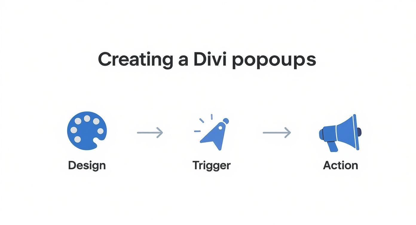
This entire process becomes exponentially more powerful once you start layering in the advanced targeting options that Divi Areas Pro brings to the trigger and action stages.
Dive Deeper with Actionable Targeting Examples
Let's break down how this works in practice. With Divi Areas Pro, you can move beyond simple page rules and get much, much more granular.
Example 1: The Content Upgrade
Let's say you have a popular blog post about Divi performance optimization. Using Divi Areas Pro, you can create a popup that only appears on that specific URL. The offer? A free PDF checklist titled "10 Steps to a Faster Divi Site." It’s hyper-relevant, and your conversion rate will thank you.
Example 2: The Cart Abandonment Saver
If you're running a WooCommerce store, this one's a classic. You can set up a pop up exit to appear only when a user has items in their cart and tries to leave the checkout page. The popup could dynamically offer free shipping or a small discount to nudge them over the finish line. It's an incredibly effective way to recover sales you were about to lose.
Divi Areas Pro vs. Popups for Divi Targeting Options
So, what's the real difference between the free and pro versions when it comes to targeting? The free plugin gives you the basics, but Divi Areas Pro unlocks a whole new level of precision. Here's a quick comparison to help you see when it makes sense to upgrade.
| Feature | Popups for Divi (Free) | Divi Areas Pro |
|---|---|---|
| Trigger Types | On-Click only | On-Click, On-Hover, Exit-Intent, Time-Delay, Scroll-Depth, Back-Button |
| Page Targeting | Limited (must be on the page) | All pages, specific pages/posts, post types, archives, taxonomies |
| User Targeting | None | Logged-in/out status, specific user roles |
| Device Targeting | None | Desktop, tablet, mobile |
| Referrer Targeting | None | Show based on referring URL (e.g., from Google, Facebook) |
| URL Parameter | None | Trigger based on a parameter in the URL |
| Date & Time | None | Schedule popups for specific dates, times, or recurring weekly |
As you can see, the Pro version is built for marketers who need to create intelligent, context-aware campaigns that adapt to each user's journey.
The sheer number of rules allows for some seriously creative combinations. To really grasp the possibilities, I recommend you create better popups with Divi Areas Pro and see the full feature set. By combining user roles, page visits, and referral sources, you can build a truly smart popup system that feels less like an interruption and more like a helpful guide.
Optimizing Your Popups for Maximum Conversions
Getting your pop up exit live is a solid first step, but the real magic happens in the fine-tuning that comes after. Just setting it and forgetting it is one of the biggest mistakes I see people make. Your goal should be to constantly evolve your strategy based on how real visitors are actually interacting with your offers.
Success comes from treating your popups like a bit of a science experiment. You need to test, measure, and tweak everything from the headline to the button color. This process of continuous improvement is what turns a popup that gets ignored into a reliable conversion machine for your business.
A/B Testing Your Way to Success
The single most powerful tool you have for optimization is A/B testing. It's pretty simple: you create two or more versions of your popup and show them to different groups of visitors to see which one performs best. The key is to avoid testing everything at once—focus on changing just one element at a time so you know exactly what made the difference.
Here are the key elements I always recommend testing:
- The Headline: Try pitting a question against a statement. Test a headline that screams benefits against one that creates a sense of urgency.
- The Call-to-Action (CTA): Experiment with different button text ("Get My Discount" vs. "Shop Now") and, importantly, the color. A high-contrast color that really pops against your site's design often pulls the best results.
- The Offer: Is a 15% discount more appealing than free shipping? Does a free checklist convert better than a video tutorial? You won't know until you test.
- Imagery: Test a version with a product image against one with a smiling person, or even a minimalist design with no image at all.
Start with your biggest, boldest ideas. A tiny tweak might give you a small bump, but testing a completely different offer or headline could lead to a massive lift in your conversion rates.
Writing Copy That Converts
Your popup copy has just a few seconds to grab someone's attention. It needs to be direct, compelling, and laser-focused on what the user gets out of it. Ditch the fluffy language and get straight to the value.
A great exit popup answers the visitor's silent question: "What's in it for me?" Focus entirely on the benefit they will receive by taking action right now, not on the features of your product.
I also find that adding a little urgency or scarcity can work wonders. Phrases like "Limited Time Offer" or "Claim Your Discount Before It's Gone" can give a hesitant visitor that final nudge they need to take action.
Tracking the Right Metrics
Data is your best friend when it comes to optimization. To figure out if your changes are actually working, you have to track the right performance metrics. For any pop up exit campaign, these are the two most important numbers to watch:
- Conversion Rate: This is the percentage of people who saw your popup and actually did what you wanted them to do (like submitting an email or using a coupon). It’s your ultimate measure of success.
- Click-Through Rate (CTR): This is the percentage of viewers who clicked the button on your popup. A high CTR but a low conversion rate can be a red flag, often pointing to an issue on the landing page after the click.
Performance can vary wildly. Some recent research shows the average popup conversion rate is around 4.65%, but the top 10% of campaigns hit an incredible 19.77%. That huge gap really shows how much optimization matters.
Interestingly, the data also shows that mobile popups are clear winners, with engagement rates 42.04% higher than on desktop. This is a huge reason to make sure your popups are designed with a mobile-first approach.
Of course, popups are just one piece of the puzzle. You can also explore other proven strategies to improve website conversion rates to lift your site's overall performance. And for more specific guidance on this topic, check out our detailed guide on exit-intent popup best practices to dive even deeper.
Common Pop Up Exit Mistakes to Avoid

There’s a fine line between a pop up exit that feels like a helpful assistant and one that feels like a digital roadblock. A well-timed, relevant offer can genuinely guide a user back to something valuable. But get it wrong, and you just annoy someone who was already on their way out.
The difference often comes down to avoiding a few common, but critical, mistakes. The most frequent blunder I see is presenting a weak, generic offer. A vague "Join Our Newsletter" plea is almost guaranteed to fail when someone has already decided your site isn't for them.
Think of it as a value exchange. You have to offer something compelling enough to make them pause. A specific discount, a free resource, an exclusive guide—something genuinely useful that earns back their attention.
The Pitfalls of Poor Design and Targeting
Another massive issue is just plain bad design and a clunky user experience. We've all been there: popups with a microscopic 'X' button that seems to dodge your cursor, or a layout that takes forever to load on mobile. These flaws create instant frustration and make your brand look unprofessional, or even a bit deceptive.
The goal of a pop up exit is to re-engage, not to trap. If a user can't easily dismiss your offer, you've already lost their trust and any chance of a conversion.
Equally damaging is showing the exact same popup on every single page. This one-size-fits-all approach completely ignores user context. Someone browsing your "About Us" page has a very different mindset than someone who just added a product to their cart. Your popups need to reflect that awareness.
Striking the Right Balance
When they're done thoughtfully, popups are incredibly effective. But you have to manage them carefully to avoid that user fatigue. Recent data shows that the average signup rate for popups is a solid 3.77%, which completely blows away the 0.21% rate you see from passive, embedded forms.
The key to hitting those higher conversion numbers without alienating your audience is simple: provide real value and make it effortless to say no. If you want to dive deeper into the numbers, you can find more insights about popup conversion rates on omnisend.com. By steering clear of these common mistakes, you can make sure your popups are a powerful tool, not just an intrusive annoyance.
Still Have Questions About Exit Popups?
Even with the best tools, you're bound to have a few questions as you start building out your pop up exit strategy. Let's tackle some of the most common ones we hear, covering everything from performance concerns to strategic best practices.
This should help clear up any lingering confusion and get you on the right track.
Will an Exit Popup Slow Down My Website?
This is a totally valid concern. After all, site speed is everything for user experience and SEO.
The short answer is no—not if you're using a well-coded plugin like Popups for Divi or Divi Areas Pro. These tools are built to be lightweight and load their scripts asynchronously.
In plain English, that means the popup's code doesn't load until it's actually needed, so it won’t bog down your initial page load time. The trigger script itself is tiny and has a negligible effect on performance, ensuring your site stays quick and responsive.
How Often Should I Show an Exit Popup?
There's nothing more frustrating than dismissing a popup only to have it jump out at you again moments later. Overexposure is a surefire way to annoy your audience and burn through their goodwill.
The best practice here is to set a cookie that prevents the same popup from bothering a visitor for a set period.
- For first-time visitors: Showing it once every 7 to 14 days is a reasonable starting point.
- For specific campaigns: If you have a time-sensitive offer, you might show it a bit more frequently, but always give users an easy way to opt out for good.
Divi Areas Pro gives you precise control over these cookie settings, letting you fine-tune the experience to avoid that dreaded popup fatigue.
Can Exit Popups Even Work on Mobile?
Yes, but they function a little differently. The classic "exit-intent" trigger relies on tracking a mouse cursor moving towards the browser's close button—something that obviously doesn't exist on a touchscreen. To pull off a mobile pop up exit, you need a different approach.
On mobile, the most effective "exit" trigger is often the back button. Divi Areas Pro includes a Back-Button Trigger that displays a popup when a user taps their browser's back button, creating a similar last-chance opportunity to engage them.
Another smart mobile strategy is to use a scroll-based trigger. For example, showing a popup after a user scrolls 70% down a page can catch them at the perfect moment—just before they've finished consuming your content and are deciding what to do next.
What Makes an Exit Popup Offer Compelling?
A generic "Join Our Newsletter" just doesn't cut it anymore. Your offer needs to provide immediate, tangible value that actually makes sense in the context of what the user is doing. Think about what a visitor on a specific page might really want.
- On a Blog Post? Offer a related content upgrade like a checklist, a handy template, or a deeper-dive eBook.
- On a Product Page? Hit them with a discount, free shipping, or a "buy one, get one" deal.
- On a Pricing Page? Address potential sticker shock with an offer for a free trial or a case study that proves your value.
The more relevant and genuinely helpful the offer, the higher your conversion rate will be. A great pop up exit feels less like an interruption and more like a perfectly timed solution to a problem your visitor didn't even know they had.
Ready to build smarter popups that actually convert? Divimode provides the tools and tutorials you need. Get started with Divi Areas Pro and turn departing visitors into loyal customers.
More Articles You Will Like