In today's crowded digital landscape, a visually appealing website is just the starting point. True success hinges on usability – how easily and intuitively a visitor can interact with your site to achieve their goals. A poor user experience leads directly to high bounce rates, abandoned carts, and a damaged reputation, making a structured audit critical for survival and growth.
This comprehensive website usability checklist provides a clear, actionable framework to enhance your site's performance. We'll guide you through eight essential pillars, moving beyond generic advice to offer specific steps and real-world examples. By systematically evaluating your site's navigation, performance, and accessibility, you can identify and fix hidden usability issues that frustrate users.
To truly embrace a usability-first mindset, it's crucial to employ effective methodologies for understanding your audience. Explore these essential user research methods to gather the actionable insights needed to inform your design decisions. This checklist will equip you with the practical tools to transform those insights into a seamless experience that captivates users, builds trust, and ultimately drives conversions. Let's begin the audit.
1. Navigation and Information Architecture
Navigation and Information Architecture (IA) are the bedrock of your website's usability. IA is the practice of organizing and structuring content in an effective and sustainable way, while navigation is the system of menus, links, and buttons that users interact with to move through that structure. A well-designed system acts as a clear roadmap, guiding users to their destination with minimal friction and cognitive load. This is a critical first step in any website usability checklist because if users can't find what they need, all other design elements become irrelevant.
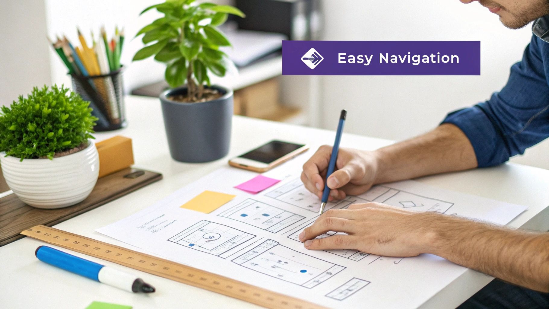
Pioneered by figures like Peter Morville and Lou Rosenfeld, and popularized by Steve Krug's mantra "Don't Make Me Think," the goal is to create pathways that align with users' mental models. For example, Apple’s website uses a minimalist top navigation with broad categories, allowing users to quickly self-identify and dive deeper into product ecosystems. In contrast, Amazon employs a complex mega-menu to handle its vast and diverse inventory, providing multiple routes to the same product.
Key Principles for Implementation
To build an intuitive navigation system, start by understanding your user's goals. This approach ensures your site structure serves their needs first, which is a core tenet of a strong website usability checklist.
- Follow the 7±2 Rule: Limit your main navigation menu to between five and nine items. This prevents decision paralysis and keeps the interface clean. For Divi users, this means being selective about what goes into your primary menu bar.
- Use Descriptive Labels: Avoid jargon or overly creative menu labels. Use clear, predictable terms like "Services" instead of "What We Do." Clarity always trumps creativity in navigation.
- Implement Breadcrumbs: For sites with deep hierarchies, like a WooCommerce store with many categories, breadcrumbs show users their current location and provide an easy way to backtrack.
- Ensure Accessibility: Your navigation must be fully functional without JavaScript and operable using only a keyboard. This is a non-negotiable for inclusivity and SEO.
Testing Your Information Architecture
Before committing to a design, validate your structure with real users. Card sorting is an excellent, low-cost method where you ask participants to group topic cards into categories that make sense to them. This reveals how your audience naturally organizes information, helping you build a more intuitive site map from the ground up.
2. Page Load Speed and Performance
Page Load Speed and Performance is the measure of how quickly your website's content loads and becomes interactive for users. This critical factor directly impacts user satisfaction, search engine rankings, and conversion rates. It’s not just about the initial page load; it covers how fast a user can click a button or scroll through content. A slow website frustrates users and leads to high bounce rates, making performance a non-negotiable part of any serious website usability checklist.

Pioneered by web performance experts like Steve Souders and heavily emphasized by Google's Core Web Vitals initiative, the principle is simple: faster is better. The data backs this up. Walmart discovered that for every one-second improvement in page load time, conversions increased by 2%. Similarly, Pinterest reduced perceived wait times by 40% and saw a 15% increase in sign-ups. These examples prove that optimizing for speed is a direct investment in your business goals.
Key Principles for Implementation
To improve your site's performance, focus on optimizing assets and server response times. This ensures a snappy, responsive experience for all users, regardless of their device or connection speed. This is especially crucial for Divi users who want to balance rich design with fast loading.
- Optimize Images and Media: Use modern image formats like WebP, which offers superior compression compared to JPEG and PNG. Implement lazy loading so that images and videos below the fold only load when they are scrolled into view.
- Leverage Caching and Compression: Enable browser caching to store static files locally on a user's device, speeding up subsequent visits. Use GZIP compression on your server to reduce the size of your HTML, CSS, and JavaScript files.
- Use a Content Delivery Network (CDN): A CDN stores copies of your site's assets on servers around the world. It serves content from the server closest to the user, dramatically reducing latency and load times.
- Minimize HTTP Requests: Reduce the number of files the browser has to download. Combine CSS and JavaScript files where possible and eliminate unnecessary plugins or scripts that slow down your site.
Testing Your Page Speed
Regularly auditing your website's performance is essential for maintaining a positive user experience. Tools like Google PageSpeed Insights provide a detailed report with actionable recommendations. By analyzing metrics like Largest Contentful Paint (LCP) and First Input Delay (FID), you can pinpoint specific bottlenecks and systematically improve your site's speed. For Divi-specific guidance, you can learn more about how to speed up your Divi website on divimode.com.
3. Mobile Responsiveness and Touch-Friendly Design
Mobile responsiveness is no longer an optional feature; it's a fundamental requirement for modern websites. This principle involves designing a site that seamlessly adapts its layout, content, and functionality to various screen sizes and orientations, from desktops to tablets and smartphones. With mobile traffic consistently surpassing desktop usage, ensuring a smooth, touch-friendly experience is crucial for reaching and retaining your audience. This item is a cornerstone of any website usability checklist because a poor mobile experience can alienate more than half of your potential users.
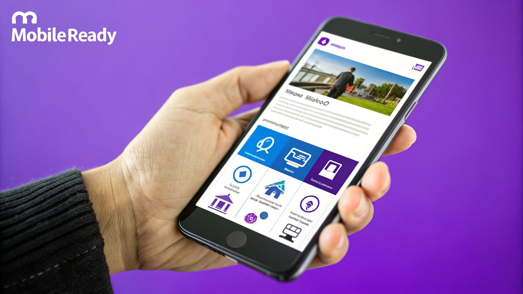
Pioneered by Ethan Marcotte, who coined the term "Responsive Web Design," and heavily influenced by Luke Wroblewski's "Mobile First" philosophy, the goal is to design for the smallest screen first and then progressively enhance the experience for larger devices. Starbucks' mobile site is a prime example, offering a streamlined, thumb-friendly interface for quick orders. Similarly, Shopify has built its entire platform around optimizing the mobile commerce experience, recognizing that many shoppers browse and buy on their phones.
Key Principles for Implementation
Building a truly responsive site goes beyond simply shrinking content. It requires a thoughtful approach to interaction design and performance to ensure the experience is excellent, not just functional.
- Prioritize Touch-Friendly Targets: Ensure buttons, links, and form fields are large enough to be easily tapped with a finger without accidental clicks. A minimum size of 44×44 pixels is a widely accepted standard.
- Implement a Thumb-Friendly Layout: Place primary calls-to-action and navigation elements within the "thumb zone," the area of the screen easily reachable with one-handed use. This is especially vital for e-commerce and lead-generation sites.
- Use CSS Media Queries: Define breakpoints in your CSS to apply different styles based on screen width. This allows you to control everything from font sizes to entire layout structures for an optimized view on every device.
- Optimize Images and Media: Serve appropriately sized images for different screen densities and resolutions to reduce load times on mobile connections, which can often be slower.
Testing Your Mobile Experience
Emulators are useful, but nothing replaces real-world testing. To validate your design, you must interact with it on actual physical devices. This is the only way to accurately assess touch target accuracy, gesture responsiveness, and performance on different mobile networks. For those using Divi, there are specific techniques to refine your layouts. You can get more insights on improving your site's mobile performance by reviewing some key tips for better Divi mobile responsiveness.
4. Clear Visual Hierarchy and Content Organization
Visual hierarchy is the principle of arranging elements to show their order of importance. It tells users what to look at first, what to read next, and which actions are most critical. A strong visual hierarchy uses size, color, contrast, and placement to create a clear path for the user's eye, making content scannable and easy to digest. This is a vital component of any website usability checklist because it reduces cognitive load and allows users to find information effortlessly, preventing them from feeling overwhelmed and abandoning the page.

This concept, heavily influenced by Gestalt psychology and championed by design experts like Robin Williams in "The Non-Designer's Design Book," is about creating order out of chaos. For instance, Stripe’s website uses bold headings, ample white space, and subtle color accents to guide users through complex financial information, making it feel simple and approachable. Similarly, Dropbox strategically uses negative space and a clean layout to draw immediate attention to its primary call-to-action buttons.
Key Principles for Implementation
To establish a clear visual hierarchy, you must deliberately guide the user’s attention. This ensures your most important content and calls-to-action are impossible to miss, a key goal for a practical website usability checklist.
- Follow the F-Pattern: Eye-tracking studies show users often scan web pages in an F-shaped pattern. Place your most critical information along the top and left side of the page to align with this natural behavior.
- Use Size and Contrast for Focal Points: Make your most important elements, like main headlines and "Buy Now" buttons, larger and more visually prominent. Use high-contrast colors to make them stand out.
- Group Related Information: Use proximity and common regions, like placing related items inside a card or a bordered box, to signal that they belong together. This technique is fundamental to creating a logical flow in your Divi layouts.
- Leverage White Space: Don't crowd your elements. Generous spacing between content blocks, paragraphs, and images reduces clutter and improves readability by creating clear distinctions between different sections.
Testing Your Visual Hierarchy
A simple yet powerful method to evaluate your design is the "squint test." Step back from your screen and squint your eyes until the text becomes blurry. The elements that still stand out are the ones with the greatest visual weight. This test quickly reveals if your intended focal points, such as your primary headline or CTA, are truly grabbing the user's attention or getting lost in the design.
5. Accessibility and Inclusive Design
Accessibility and Inclusive Design refer to the practice of creating websites that are usable by everyone, regardless of their abilities or disabilities. It's about ensuring equal access to information and functionality for all users, including those with visual, auditory, motor, and cognitive impairments. This isn't just a compliance issue; it's a fundamental aspect of good design and a critical part of any comprehensive website usability checklist. An accessible site expands your audience, improves SEO, and builds a more ethical, user-centric brand.
The modern accessibility movement was championed by figures like Tim Berners-Lee, who stated, "The power of the Web is in its universality. Access by everyone regardless of disability is an essential aspect." Organizations like WebAIM and advocates such as Haben Girma have further advanced this cause. Excellent examples include Microsoft's inclusive design principles, which treat accessibility as an opportunity for innovation, and GOV.UK, which has built its entire digital presence on an accessibility-first foundation, proving that universal design leads to a better experience for all.
Key Principles for Implementation
Building an accessible website means considering diverse user needs from the very start of the design process, not as an afterthought. This proactive approach ensures usability is baked into your site’s DNA.
- Use Semantic HTML: Structure your content with proper HTML tags (e.g.,
<nav>,<main>,<article>,<h1>). This provides a logical outline that screen readers can easily interpret, making your site navigable for visually impaired users. - Ensure Keyboard Navigability: All interactive elements, including menus, links, buttons, and form fields, must be fully operable using only a keyboard. Users should be able to see a clear focus indicator as they tab through elements.
- Provide Sufficient Color Contrast: Text must have a high contrast ratio against its background to be legible for users with low vision. Use tools like the aXe DevTools or WebAIM's Contrast Checker to verify your color choices meet WCAG standards.
- Include Alt Text for Images: Every informative image needs descriptive alternative text. This allows screen readers to describe the visual content to users who cannot see it, ensuring they don't miss crucial information.
Testing Your Accessibility
You cannot assume your website is accessible without testing it with the right tools and, most importantly, with real users. A combination of automated and manual testing is essential for a truly inclusive experience.
Automated tools like WAVE or aXe can quickly scan your site to identify common accessibility violations, such as missing alt text or low contrast. However, they can't catch everything. Manual testing, especially with screen readers like NVDA (free) or JAWS, is crucial for understanding the actual user experience. The best practice is to include users with disabilities in your testing process to gain invaluable, firsthand feedback on your site's real-world usability.
6. Error Prevention and Handling
A robust system for Error Prevention and Handling is essential for creating a smooth, frustration-free user experience. This involves designing interfaces that preemptively guide users away from making mistakes and, when errors do occur, providing clear, constructive ways to recover. A forgiving website builds user trust and confidence, making this a critical component of any comprehensive website usability checklist. If users feel blamed or get stuck in an error loop, they are likely to abandon the task and your site altogether.
Pioneered by usability experts like Jakob Nielsen in his heuristics ("Error prevention" and "Help users recognize, diagnose, and recover from errors"), the goal is to design for success. For example, Gmail's "Undo Send" feature offers a brief window to reverse an action, preventing a common and potentially serious error. Similarly, Stripe’s real-time payment form validation checks card details as they are typed, providing instant feedback and preventing submission failures.
Key Principles for Implementation
To minimize user frustration, your design should be both a guide and a safety net. This proactive approach ensures users can complete their goals efficiently, a key measure of website usability.
- Use Inline Validation: Provide real-time feedback on forms as users fill them out. This immediately confirms correct inputs and flags errors before the user hits "submit," reducing friction.
- Write Specific, Actionable Messages: Avoid generic messages like "Invalid Input." Instead, say "Please enter a valid email address (e.g., name@example.com)." Clear instructions empower users to fix the problem quickly.
- Offer Confirmation Dialogs: For destructive actions like deleting an account or an important file, use a confirmation modal. This gives users a final chance to reconsider, preventing irreversible mistakes.
- Preserve User Input: When a form submission fails, ensure all correctly entered data is retained. Forcing a user to re-enter information is a guaranteed source of frustration and a common reason for abandonment.
Testing Your Error Scenarios
Before launch, intentionally try to break your website. Test forms with incorrect data, attempt invalid actions, and simulate network failures. A basic but crucial first step is using a tool like an HTML validator to ensure your code is clean, which can prevent many rendering and functional errors from the start. Thoroughly testing your error states ensures your handling mechanisms are as well-designed as your primary user flows.
7. Search Functionality and Findability
While navigation provides a structured path, on-site search functionality offers users a direct, high-speed shortcut to their desired content. A powerful search feature is crucial for findability, which is the ease with which users can discover information. It moves beyond passive browsing, empowering users to articulate their needs and receive immediate answers. For large content hubs or e-commerce sites, a robust search is not a luxury; it's a fundamental component of a successful website usability checklist.
Pioneers in information-seeking behavior like Marcia Bates and search experts such as Avi Rappoport have shown that users expect search to "just work," similar to their experience on Google. Amazon's search is a prime example, offering auto-suggestions, typo tolerance, and extensive filtering that allows users to pinpoint a single product among millions. Similarly, Etsy’s faceted search lets buyers refine results by handmade status, price, and location, directly catering to their specific purchasing criteria.
Key Principles for Implementation
An effective search system anticipates user intent and gracefully handles imperfections. The goal is to minimize "no results found" pages and guide users toward success, even when they aren't sure what they are looking for.
- Make it Prominent: Place the search bar in the header, where users instinctively look for it. Use a clear icon like a magnifying glass and ensure the input field is large enough for typical queries.
- Implement Smart Features: Use typo tolerance (autocorrect) and show auto-suggestions as users type. This speeds up the process and helps prevent failed searches. For Divi sites, plugins like SearchWP can add this advanced functionality.
- Provide Filters and Sorting: On results pages, allow users to sort by relevance, date, or price. For WooCommerce stores, faceted search (filtering by attributes like size, color, or brand) is non-negotiable for a good user experience.
- Analyze Search Data: Regularly review what users are searching for in your site's analytics. This data is a goldmine for identifying content gaps, popular products, and confusing terminology on your site.
Testing Your Findability
Beyond just having a search bar, you need to ensure your content is discoverable. To ensure your website is discoverable by users through external search engines, it's essential to understand the underlying processes. For a comprehensive guide to search engine indexing, consider this resource. Internally, you can test findability by giving users specific tasks, like "Find a blue cotton t-shirt under $20," and observing their search journey to identify friction points and opportunities for improvement.
8. Trust Signals and Credibility Elements
Trust signals are the visual and textual cues that assure users your website is legitimate, secure, and trustworthy. In an online environment where users are rightly cautious about scams and data privacy, establishing credibility is not just a best practice; it's a prerequisite for conversion. These elements work together to reduce user anxiety, making them feel comfortable enough to share personal information, make a purchase, or engage with your brand. This factor is a cornerstone of any effective website usability checklist because without trust, even the most functional site will fail to retain users.
The concept of building trust through design has been heavily influenced by research from institutions like the Nielsen Norman Group and BJ Fogg's work on persuasive technology. The core idea is that credibility is a combination of expertise and trustworthiness. For instance, Amazon masterfully uses its customer review and rating system to build social proof, while payment gateways like PayPal display security badges at critical transaction points to reassure users their financial data is safe.
Key Principles for Implementation
To effectively build credibility, you must strategically embed trust signals throughout the user journey, especially at points of friction like sign-up forms or checkout pages.
- Display Security Badges: Prominently feature SSL certificates (the padlock icon) and well-known payment security logos (Visa, Mastercard, PayPal) on your checkout pages. For Divi and WooCommerce users, this is a simple but powerful way to reduce cart abandonment.
- Showcase Social Proof: Use authentic customer testimonials, case studies, and reviews. Real photos and specific stories are far more persuasive than generic praise. There are many excellent plugins to help you boost trust and credibility on WordPress.
- Make Contact Information Obvious: A visible physical address, phone number, and email address signal that a real business with real people is behind the website. An easily accessible "Contact Us" page is non-negotiable.
- Maintain Professional Design: An updated, error-free, and professional design inherently builds more trust than a site that looks dated or broken. Consistent branding across all pages reinforces this perception.
Testing Your Credibility
Gauging trust can be subjective, but you can measure its impact indirectly through user testing and analytics. Run A/B tests on pages with and without certain trust seals, like a "Money-Back Guarantee" badge, and monitor the conversion rate. During usability tests, ask users directly what elements on the page make them feel secure and what, if anything, causes hesitation. This feedback is invaluable for refining your credibility strategy.
Website Usability Checklist Comparison
| Aspect | Navigation and Information Architecture | Page Load Speed and Performance | Mobile Responsiveness and Touch-Friendly Design | Clear Visual Hierarchy and Content Organization | Accessibility and Inclusive Design | Error Prevention and Handling | Search Functionality and Findability | Trust Signals and Credibility Elements |
|---|---|---|---|---|---|---|---|---|
| Implementation Complexity 🔄 | Medium to high; complex for large sites | High; requires technical skills and continuous tuning | Medium to high; needs design adaptation & device testing | Medium; balancing elements with consistency needed | High; needs specialized knowledge and thorough testing | Medium to high; complex UX and technical integration | High; complex search algorithms and continuous updates | Medium; requires regular updates and design balance |
| Resource Requirements 💡 | Moderate; user testing and ongoing maintenance | High; CDN, hosting upgrades, image optimization | Moderate; multiple device testing and optimization | Moderate; design resources and user feedback | High; accessibility auditing and compliance tools | Moderate; UX design and testing resources | High; developer time and advanced tools | Moderate; content creation and maintenance effort |
| Expected Outcomes 📊 | ⭐⭐⭐⭐ Improved usability, SEO, engagement | ⭐⭐⭐⭐⭐ Faster loading, higher conversions, better SEO | ⭐⭐⭐⭐ Broader reach, SEO boost, consistent UX | ⭐⭐⭐⭐ Enhanced comprehension and trust | ⭐⭐⭐⭐ Expanded user base, legal compliance, SEO | ⭐⭐⭐⭐ Reduced errors, improved trust and conversions | ⭐⭐⭐⭐ Better task completion, insights, conversion | ⭐⭐⭐⭐ Increased trust, conversions, brand reputation |
| Ideal Use Cases 💡 | Content-heavy, large sites needing strong navigation | Sites prioritizing performance, e-commerce, media | Sites with significant mobile users | Sites focusing on content clarity and user guidance | Sites targeting diverse users including disabilities | Forms-heavy sites, complex user workflows | Large catalogs, content-rich sites with search needs | E-commerce, service sites needing user trust |
| Key Advantages ⭐ | Clear structure, reduces user frustration | Significantly improves experience and SEO ranking | Seamless multi-device experience | Guides attention, reduces cognitive load | Inclusive access, reduces legal risks | Enhances user confidence, lowers support tickets | Increases findability and user satisfaction | Builds credibility, reduces abandonment |
Turn Your Usability Insights into Action
Navigating this comprehensive website usability checklist is a crucial first step, but the true transformation happens when you translate these insights into tangible improvements. We've moved beyond abstract theory, delving into the practical mechanics of creating a superior user experience, from optimizing navigation and information architecture to ensuring your site is accessible to all users. Each point on this checklist, whether it’s enhancing page speed, refining mobile responsiveness, or implementing clear trust signals, represents a direct opportunity to eliminate friction and guide visitors more effectively toward their goals.
The most important takeaway is that usability is not a static, one-and-done project. It is a dynamic, continuous cycle of refinement. The digital landscape and user expectations are constantly evolving, and a site that feels intuitive today might feel clunky tomorrow. Embracing this reality means committing to an iterative process: test, measure, learn, and improve. Think of your website as a living entity that thrives on user feedback and thoughtful adjustments.
Your Actionable Path Forward
So, where do you begin? The sheer number of potential improvements can feel overwhelming. Start by prioritizing. Use analytics and user feedback to identify the areas causing the most significant friction for your audience.
- Tackle Low-Hanging Fruit: Begin with fixes that are relatively easy to implement but have a high impact. This could be clarifying your navigation labels, adding alt text to critical images for accessibility, or improving the contrast on your call-to-action buttons.
- Establish Baselines: Before making significant changes, document your current metrics. Track conversion rates, bounce rates, time on page, and user task completion rates. This data will be essential for measuring the success of your usability enhancements.
- Implement and Test: Roll out your changes, but don’t stop there. Use A/B testing, heatmaps, and user session recordings to validate that your solutions are actually working. Sometimes, a change you believe is an improvement can have unintended negative consequences.
Committing to this user-centric philosophy is what separates a good website from a great one. A truly usable site does more than just present information; it builds trust, fosters loyalty, and ultimately drives business results. By methodically working through your own personalized website usability checklist and dedicating resources to ongoing optimization, you are investing directly in the satisfaction and success of your users, which in turn fuels the success of your brand.
Ready to elevate your Divi site’s usability with powerful, expert-built tools? Explore the full suite of plugins from Divimode, designed to implement many of the advanced features discussed in this checklist with ease. From creating dynamic mega menus to building sophisticated popups, Divimode provides the professional solutions you need to turn usability insights into an exceptional user experience.
