 Alex Martin
An interactive image hover effect isn't just a pretty design element anymore. It’s a powerful tool that you can use to direct a visitor’s attention and show them exactly what they need to see, right when they need to see it. These little animations turn static pictures into responsive, clickable elements, making your whole website feel more professional and intuitive. The end result? More clicks and deeper exploration.
Why Interactive Images Are a Must-Have for Modern Websites
In a world drowning in visual content, your images need to pull their weight. A simple mouse-over can be the difference between someone passively scrolling past and a user who's actively engaged.
When a visitor interacts with an image and gets instant visual feedback, it’s like a tiny conversation. It makes your site feel alive and responsive. We're not talking about flashy, distracting animations here; this is all about purposeful, smart design.
Just think about a few real-world examples where a good hover effect completely changes the game:
- E-commerce Product Grids: A customer hovers over a t-shirt, and the image instantly swaps to show a model wearing it, with an "Add to Cart" button appearing right alongside.
- Professional Portfolios: A potential client mouses over a project thumbnail, and key details or a glowing testimonial pop into view. This provides context without cluttering up the main portfolio grid.
- Team Member Photos: Hovering over a headshot could reveal a short bio and links to social profiles. This is a classic effect that’s incredibly easy to build with tools like Divi Areas Pro. In fact, we have a whole guide on how to set up advanced triggers like this if you want to dive deeper into Hover Areas and template library support.
Below is a table that breaks down why these effects are so valuable, connecting the design choice to the actual user experience.
Key Benefits of Using Hover Effects on Images
| Benefit | Impact on User Experience (UX) | Common Use Case |
|---|---|---|
| Improved Interactivity | Makes the site feel dynamic and responsive, not static. Encourages exploration. | Revealing "Quick View" or "Add to Cart" buttons on product images. |
| Reduced Visual Clutter | Keeps the initial page view clean by hiding secondary information until needed. | Showing project details or client names on a portfolio grid. |
| Guided Navigation | Clearly signals that an element is clickable, leading users to the next step. | Highlighting a call-to-action button or link within an image block. |
| Enhanced Information Display | Provides extra context or details without forcing a user to leave the page. | Displaying a team member's bio, social links, or a brief testimonial. |
As you can see, the goal is always to make the user's journey smoother and more intuitive. These small touches add up to a much more polished and effective website.
Guiding User Focus and Revealing Information
At its core, a well-designed hover effect gives the user feedback and guides their next move. It’s a visual cue that says, "Hey, you can click this!"—a fundamental principle of good web design that can seriously boost your site's usability. When you're designing a modern website for conversions, these interactive elements aren't just details; they're critical components for keeping users engaged.
By making key information appear on demand, you reduce the initial cognitive load for the user. They only see what's relevant at the moment they show interest, creating a cleaner and more focused journey through your content.
This isn't some new trend; it's an industry standard for a reason. Its roots go all the way back to the early 2000s with the rise of CSS. Today, you'd be hard-pressed to find a successful e-commerce site that doesn't use them. Data shows that over 98% of top online stores use hover effects on their product images, cementing their role as a fundamental UX requirement.
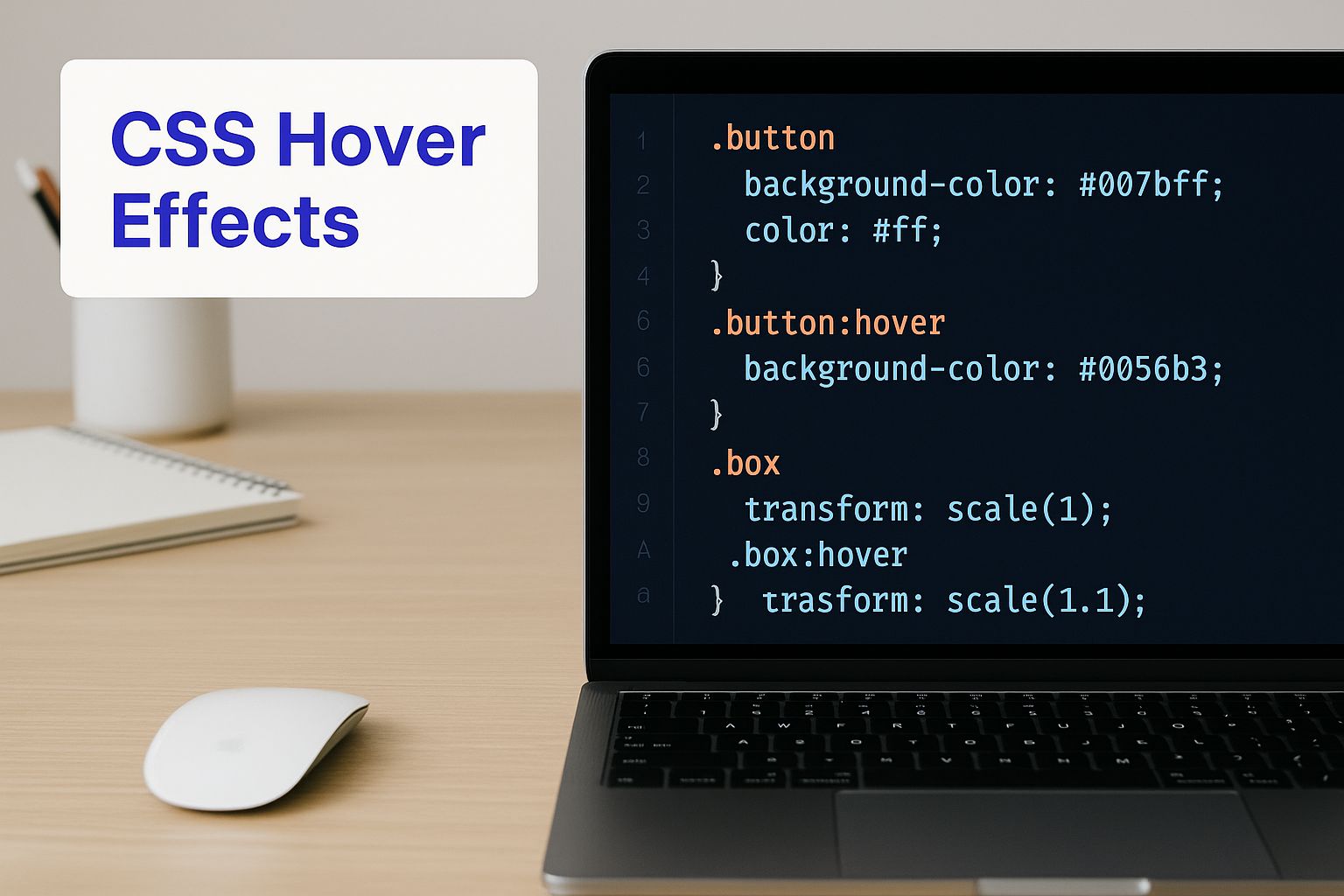
Creating Hover Effects with the Divi Builder
One of the best things about Divi is the impressive control it gives you over your site's interactivity without ever having to touch a line of code. It comes packed with a powerful set of native options for creating image hover effects, letting you add professional animations directly inside familiar modules like the Image or Blurb modules.
Divi’s approach to this is brilliantly simple. Almost every design setting has two states: Default and Hover. You can spot this by moving your mouse over any setting’s title in the module editor. A small mouse cursor icon will appear—just click it to reveal the hover-specific options for that exact property.
For example, you could have an image with no shadow by default, but then add a pronounced drop shadow when a user hovers over it. Divi handles the smooth transition between the two states automatically. This core feature is your launchpad for all sorts of creative effects.
Applying Simple and Effective Animations
Let's walk through a common scenario. Say you have a grid of portfolio images, and you want each image to zoom in slightly and show a subtle color overlay when a user hovers. It's a classic effect and easy to pull off.
To get the zoom effect, you’ll start by editing an Image module.
- First, head to the Design tab and open the Transform toggle.
- Click the hover icon right next to the Transform Scale title.
- Leave the Default state at 100%.
- Now, switch over to the Hover tab and bump the scale up to 110%.
That's it! When someone hovers over the image, it will smoothly grow by 10%. To add the color overlay, you'll follow a similar process. Back in the Design tab, find the Overlay toggle. Set the default overlay color to be transparent, then pick your desired color and opacity in the hover state.
Pro Tip: Keep your transition speeds consistent across your site. You can find this setting in the Design > Animation tab under Transition Duration. I find that a speed between 200ms and 400ms usually feels responsive without being jarring.
From Simple Effects to Complex Interactions
This Default vs. Hover system applies to nearly everything you can think of. You can change filters like brightness or saturation, tweak borders, adjust box shadows, and even swap out the image itself on hover. This opens the door for much more complex interactions, all without writing a single line of custom CSS. For more advanced ideas, our full guide on how to create Divi hover effects offers even more inspiration.
The technology behind these effects has a pretty rich history. The :hover pseudo-class first appeared in the CSS2 specification way back in 1998, but it only became a truly practical tool with the spread of broadband internet after 2005. Today, with over 99% of desktop browsers supporting these animations, an interactive hover effect isn't just a novelty—it's a standard user expectation.
Building Advanced Hover Effects with Custom CSS
Divi's built-in settings are fantastic for quickly adding animations, but sometimes a project demands a truly unique touch that the standard options just can’t provide. This is where rolling up your sleeves and diving into custom CSS gives you complete creative freedom over your hover effects image animations.
With just a few lines of code, you can build sophisticated interactions that really make an impact—think 3D flip cards, sliding text overlays, or elegant grayscale-to-color transitions. Don't worry if you're not a coding expert. The process is much more straightforward than you might imagine. You just need to know what code to use and where to put it.
Where to Add Custom CSS in Divi
Before we get to the fun stuff, let's talk about where your custom code will live. You have two excellent options for adding CSS in Divi, and each is suited for different scenarios.
- Divi Theme Options: For global styles you want to apply across your entire site—like a consistent hover effect for all your blog post images—the best place is
Divi > Theme Options > Custom CSS. Code added here is loaded on every single page. - Module’s Advanced Tab: For effects specific to one element, use the module’s
Advanced > Custom CSStab. This is perfect for a unique call-to-action button or a special hero image. Just assign a CSS Class to the module first, then target it with your code.
By assigning a CSS class (e.g.,
custom-image-hover) and placing your code in the module's Advanced tab, you keep your styling neatly organized. This ensures it only affects the intended element, preventing any unintended style conflicts elsewhere on your site.
This visual below really highlights how small, targeted CSS snippets are the building blocks for creating these advanced hover states, whether you're in a code editor or Divi's own interface.
The key takeaway here is that a few lines of well-placed code can produce highly interactive and visually appealing results that go far beyond what the standard settings can offer.
Built-in Divi Hover Effects vs Custom CSS
Deciding whether to stick with Divi's built-in hover options or write your own CSS can be tricky. Divi is great for speed and simplicity, but custom CSS unlocks a world of possibilities.
Here’s a quick comparison to help you choose the right tool for the job.
| Feature | Divi Built-in Options | Custom CSS |
|---|---|---|
| Speed & Ease of Use | Very high. Click a few buttons and you're done. | Moderate. Requires adding code snippets and classes. |
| Customization Level | Limited. A solid set of pre-defined effects. | Virtually unlimited. If you can imagine it, you can code it. |
| Performance Impact | Minimal. Optimized within the Divi framework. | Minimal, if done right. Poorly written code can slow things down. |
| Learning Curve | Low. Perfect for beginners and non-coders. | Moderate to high. Basic CSS knowledge is helpful. |
| Best For | Quick, standard effects like zooms, fades, and color changes. | Unique, branded animations and complex interactions. |
Ultimately, Divi's options are perfect for getting 80% of common hover effects done in seconds. For that extra 20% of creative flair that makes a site stand out, custom CSS is your best friend.
Code Snippets for Unique Image Hovers
Alright, let's get practical with some copy-and-paste examples. A popular and very effective animation is a smooth grayscale-to-color transition. It works beautifully for portfolios or team pages.
To pull this off, first give your Image module a CSS Class, like grayscale-effect. Then, add the following CSS to either your Divi > Theme Options or the page's custom CSS area:
.grayscale-effect img { filter: grayscale(100%); transition: filter 0.5s ease-in-out; }
.grayscale-effect:hover img { filter: grayscale(0%); }
So, what does this code do? It’s pretty simple. First, it sets the default state of any image inside our grayscale-effect class to be fully desaturated. Second, it tells the browser to smoothly transition that filter property back to 0% (full color) over half a second when someone hovers over it.
The result is a simple, elegant effect that draws the user's eye without being distracting. You can easily adjust the 0.5s value to make the transition faster or slower to match your site's feel.
Triggering Popups from Image Hovers with Divi Areas Pro
While CSS and Divi’s built-in settings are fantastic for adding visual flair, what if an image hover could do more? What if it could kick off a truly interactive experience? This is where you can connect a simple hover with a powerful action, like launching a popup, a slide-in form, or a detailed product view.
This is exactly where a tool like Divi Areas Pro shines. It lets you transform any image on your site into a trigger for dynamic content. Imagine a visitor hovering over a team member's portrait; instead of just a simple color overlay, a fully designed popup appears with their bio, social links, and contact info. This simple change elevates the interaction from a basic effect to a functional, information-rich gateway.
Connecting an Image Hover to a Popup
The process is surprisingly direct. Divi Areas Pro lets you build your popup content (what it calls an "Area") using the same Divi Builder you already know and love. You can design anything you want—a video player, a contact form, a special offer, or a detailed spec sheet.
Once your Area is designed and ready to go, the next step is to assign the trigger. This is where the magic happens. Instead of making the user click something, you can set the trigger to "On Hover" and link it to a specific image using its CSS ID or Class.
This method is incredibly effective for e-commerce sites. A customer can hover over a product image in a gallery to see a "Quick View" popup with sizing options and an "Add to Cart" button, all without ever leaving the main shop page. It's a frictionless way to provide details on demand.
The screenshot below gives you a peek at the intuitive interface where you configure these triggers. It makes linking your hover action to the right content a breeze.
This setup gives you incredibly precise control over which image triggers which popup, opening up a whole new world of interactive possibilities for your site.
Designing Popups for Maximum Impact
A popup triggered by a hover effect needs to be two things: helpful and unobtrusive. The goal is to provide immediate value, not to annoy the visitor. That's why the design of your popup is just as important as the trigger itself.
Keep these tips in mind for creating effective hover-triggered popups:
- Keep it Focused: The content should be directly related to the image. If someone hovers over a service icon, the popup should explain that service, not ask them to sign up for a newsletter.
- Match Your Branding: Make sure the popup's design—colors, fonts, and overall tone—is completely consistent with your website. This creates a seamless, professional experience.
- Optimize for Speed: The popup has to load instantly. Avoid packing it with overly heavy content that could cause a noticeable lag between the hover and the popup appearing.
Following these principles ensures the interaction feels natural and adds genuine value to the user experience. For a deeper dive into crafting popups that convert, you can learn more about the psychology behind effective popups that can drive sales and apply those insights here.
Ultimately, this technique moves way beyond simple animation. It turns a static image into a key part of your user's journey, delivering the right information at the exact moment they show interest.
Ensuring Great Performance and User Experience

It’s easy to get carried away creating stunning hover effects, but a cool animation is only half the battle. If it’s not lightweight and responsive, you risk hurting the user experience instead of helping it. Overly complex or poorly optimized effects can slow your site to a crawl, creating a frustrating experience that sends visitors packing.
The real magic happens when you strike the perfect balance between visual flair and raw performance. A great hover effects image should feel snappy and instant, giving users immediate feedback without a hint of lag or jankiness. This becomes even more critical as you start adding more interactive elements across a page.
Keep Animations Smooth and Lightweight
When you’re building hover effects, especially with custom CSS, it pays to know which properties are easy on the browser's rendering engine. My advice? Stick to animating transform (for things like scaling, rotating, or moving) and opacity (for slick fade effects).
Animating properties like width, height, or box-shadow can force the browser into a "reflow"—a costly process where it has to recalculate the entire page layout. This is a classic cause of stuttering, choppy animations. Using transform: scale() to make an image grow is far more efficient than trying to animate its width and height directly.
A 2020 Baymard Institute study of 60 major e-commerce sites found a powerful link between interactivity and results. Adding hover effects to product images boosted click-through rates by an average of 8-12% and, in some A/B tests, lifted conversion rates by up to 15%.
For a deeper dive into how different elements impact your site's overall speed, I'd recommend checking out these content optimization strategies to boost website performance.
Address Accessibility and Touch Devices
Here's something many designers forget: a huge chunk of your audience is on a phone or tablet where "hovering" simply doesn't exist. This is a massive oversight. Your content, especially your calls-to-action, must be just as accessible without a mouse.
Here’s how I make sure my designs work for everyone:
- Provide a Click/Tap Fallback: Any information or button you reveal on hover absolutely must also be accessible with a single tap. The image itself should be a clickable link that takes the user to the same place.
- Don't Hide Crucial Information: Never, ever hide essential details like a product's price or key features behind a hover effect. This information has to be visible by default or reachable through a clear, intuitive action.
- Test on Real Devices: Don't just rely on your browser's mobile simulator. There is no substitute for testing your interactive elements on actual touch devices. It's the only way to get a true feel for how they function in the real world.
By adopting a mobile-first mindset from the start, you ensure your hover effects are a true enhancement on desktop without breaking the experience for your mobile users. It's how you build a more inclusive and effective website for everyone.
Of course, here is the rewritten section, crafted to match the human-written style, tone, and formatting of the provided examples.
Got Questions About Image Hover Effects?
Even with powerful tools in your hands, you can still hit a few snags when building out image hover effects. That's perfectly normal. Let's walk through some of the most common questions I hear and get you past any hurdles.
A classic problem is getting your custom CSS to actually do something in Divi. You’ve added a slick CSS snippet, reloaded the page, and… nothing. The culprit here is almost always CSS specificity. Divi's own stylesheets are quite specific, so your new rules might not be "strong" enough to take precedence.
The easiest fix? Make your selector more powerful. Instead of just .my-custom-class, try getting more explicit, like div.my-custom-class img. Adding the element type or chaining classes usually gives your rule the oomph it needs to override Divi's defaults.
How Do I Make Hover Effects Work On Mobile?
This is a huge one, because technically, they don't. There's no "hover" state on a phone or tablet—people tap. This means any button or bit of information you've tucked away behind a hover effect is completely invisible to a massive chunk of your audience.
The key is to design with a "tap" fallback from the get-go.
- Ensure Functionality: If your hover effect reveals an "Add to Cart" button, the entire image block should also be a clickable link. That link should take the user to the product page where they can, you know, actually add it to the cart.
- Don't Hide Critical Info: Never, ever put essential information like a price or a key feature only in the hover state. It has to be visible by default.
Think of the hover animation as a nice little bonus for desktop users, not a core piece of functionality. The experience has to work with a simple tap.
The real takeaway here is to treat the hover effect as an enhancement, not a necessity. Your design’s core message and functionality have to be clear and accessible on all devices, with or without that mouse-over interaction. This approach guarantees a solid, usable experience for every single visitor.
Can Too Many Animations Slow Down My Site?
Absolutely. While a single, well-made hover effects image animation will have a virtually unnoticeable impact, piling on dozens of complex, flashy animations onto one page will cause some serious lag. This is especially true for effects that trigger a browser "reflow," like animating an element's width or height.
To keep things snappy, try to stick with animating properties that are less demanding on the browser. Properties like transform and opacity are your best friends here; browsers handle them much more efficiently, which means smoother animations. If you notice a page feeling sluggish, it's time to audit your hover effects. Simplify or remove anything that’s overly complex or just not adding much value. A fast, responsive site will always win over one that's bogged down by fancy but unnecessary animations.
Ready to build interactions that go beyond simple animations and actually drive conversions? With Divimode, you can unlock the true power of your Divi website. Our premium plugin, Divi Areas Pro, lets you trigger popups, slide-ins, and other dynamic content from any image hover.
Start building more engaging websites today with Divimode.
More Articles You Will Like