
 Alex Martin
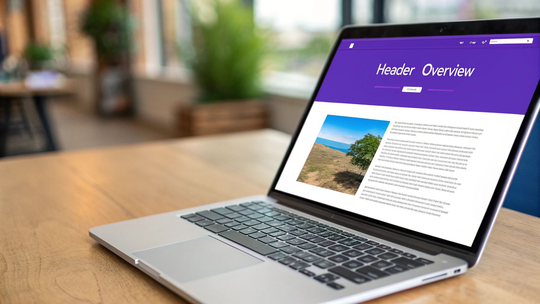
Your website's header is its digital handshake. It’s the very first thing people see and the first thing they interact with, making it one of the most powerful tools you have for keeping them around.
A great header instantly builds trust, makes navigation a breeze, and puts your brand front and center.
Why Your Header Is Your Website's First Impression
Think of your header like the entrance to a physical store. If the entrance is clean, well-lit, and clearly signed, you feel welcome and confident you’ve come to the right place. But if it’s cluttered, confusing, or sketchy, you'll probably turn around and walk right back out.
Your website header works the exact same way.
It’s the first element a visitor lays eyes on, and it shapes their entire perception of your brand in just a few milliseconds. That first interaction has a massive impact on whether they see you as credible and decide to stay or hit the back button. In fact, research shows that a whopping 94% of a visitor's first impression is purely design-related, and the header plays the starring role.
The Immediate Impact of Header Design
A strong header isn't just about looking good; it's a workhorse doing several critical jobs at once to create a smooth, intuitive experience for your visitors.
- Establishes Credibility: A professional, polished header tells people your business is legitimate and trustworthy.
- Simplifies Navigation: It acts as a roadmap, helping users find exactly what they’re looking for without getting frustrated.
- Reinforces Brand Identity: Your logo and brand colors anchor your visual identity, making your brand more memorable.
- Drives Key Actions: It’s prime real estate for your most important call-to-action (CTA), guiding users toward your main goal.
Take Apple's website, for instance. Their header uses radical simplicity to make a powerful first impression.
It’s completely minimalist—a central logo, clean navigation links, and a couple of subtle icons. This immediately communicates sophistication and ease of use. That strategic simplicity ensures visitors aren't overwhelmed and can find their way to a product category in a single click.
Your header isn't just a collection of links. It's a strategic tool that sets the tone for the entire user journey and serves as the foundation for a positive user experience.
Getting this right is the first step toward creating a header that works for you, not against you. Every little detail matters, from where you place your logo to how clear your CTA is. If you're using Divi, learning https://divimode.com/the-basics-of-building-website-headers-with-divi/ is a great starting point. Once you grasp this foundational role, you can start breaking down what makes a header truly effective.
The Anatomy of a High-Performing Header
To build a website header that actually works, you have to understand what it's made of. It’s not just one big block at the top of your site; think of it more like a well-oiled machine where every single gear has a critical job to do. When all those pieces mesh together perfectly, they create a seamless, intuitive experience that gets visitors exactly where they need to go.
Going beyond a simple checklist, you start to see the why behind each component. A thoughtfully designed header is your secret weapon for guiding user behavior, cementing your brand in their minds, and—most importantly—driving business goals. Let's pull back the curtain and break down the parts of this digital command center.
Your Brand's Visual Anchor: The Logo
Your logo is the single most consistent, recognizable piece of your brand. By placing it in the header, you guarantee it’s visible on every single page. It becomes a visual anchor, building that crucial familiarity and trust with anyone who lands on your site.
Over and over, studies have confirmed that users instinctively look for a logo in the top-left corner. This convention is so deeply rooted that it can lead to an 89% increase in brand recall compared to logos stuck on the right. It also serves a key navigational purpose: everyone expects that clicking the logo will take them back home. It's a simple, universal shortcut.
The User's Roadmap: Clear Navigation
If the logo is your anchor, the navigation menu is the map. Its one job is to give users a dead-simple path to the most important parts of your website. Vague labels or a cluttered menu are a one-way ticket to frustration, sending your bounce rate through the roof.
The goal here is to help people find what they need with the least amount of brainpower. That means using straightforward language and organizing your links in a way that just makes sense. A good navigation system anticipates what a user is looking for and presents the options so naturally that they don't even have to think about it.
This infographic breaks down the hierarchy of these crucial header elements.
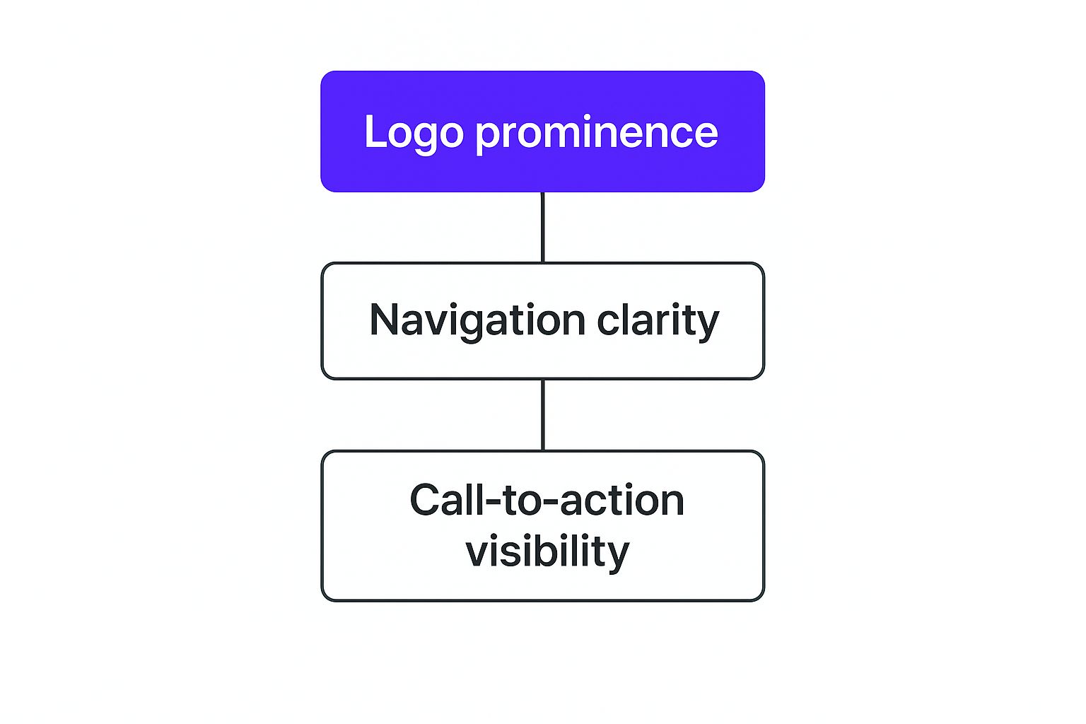
This visual hierarchy shows that while everything has its place, a strong brand presence (the logo) is the foundation. Clear navigation and a compelling call-to-action are then built right on top of it.
The Conversion Catalyst: The Call to Action
The Call to Action (CTA) is, without a doubt, the most business-critical element in your entire header. This is the button or link that funnels users toward your main goal, whether that’s “Get a Quote,” “Shop Now,” or “Sign Up.”
Its design and placement are everything. A powerful CTA usually has:
- Contrasting Color: It needs to pop. It should stand out from everything else in the header without clashing with your brand’s palette.
- Action-Oriented Text: The label has to be short, sweet, and tell the user exactly what happens when they click.
- Prominent Placement: The top-right corner is prime real estate for a reason. It lines up perfectly with how people naturally scan websites, making it almost impossible to miss.
A well-executed CTA doesn’t just beg for a click. It offers a clear answer to the user’s problem and a direct path to getting value.
Before we wrap up this section, let's break down these essential components into a quick reference table. This makes it easy to see how each part contributes to the whole.
Essential Header Components and Their Purpose
| Component | Primary Function | Best Practice Example |
|---|---|---|
| Logo | Brand recognition & homepage navigation | Always in the top-left corner; links back to the homepage. |
| Navigation Menu | Provides clear paths to key site sections | Uses simple, descriptive labels like "Products" or "About Us". |
| Call to Action (CTA) | Drives users toward a primary business goal | A brightly colored "Request a Demo" button in the top-right. |
| Search Bar | Enables users to find specific content quickly | A must-have for e-commerce or large blogs. |
| Login/Account Link | Offers easy access for returning users/members | A simple "Login" link, often near the CTA. |
| Shopping Cart Icon | Allows e-commerce users to view their cart | A universally recognized cart icon, usually with an item count. |
This table neatly summarizes the "who's who" of a great header, showing that every element has a distinct role to play in creating a functional and effective user experience.
Essential Supporting Elements
Beyond the big three—logo, navigation, and CTA—a few other supporting players can seriously level up the user experience, depending on your site’s purpose.
A search bar is non-negotiable for content-heavy sites like blogs or massive e-commerce stores. It gives users the power to find exactly what they’re looking for in seconds. For sites with a member area, a login link provides a frictionless way for returning users to get back in.
And for any e-commerce site, a shopping cart icon is an absolute must. It gives customers a persistent, familiar way to check their selected items and head to checkout. Each of these parts adds another layer of functionality, making your header more helpful and user-friendly.
Core Principles of Great Header Design
A truly great website header isn’t about chasing the latest design trends; it’s about mastering a few timeless principles that quietly guide your visitors and build their trust. While the visible parts—the logo, the links, the buttons—provide the structure, these core principles are the strategic foundation holding everything together.
They are the invisible forces that turn a merely functional header into one that feels intuitive, professional, and genuinely helpful. A great header doesn't just show people where to go—it makes them feel confident and understood from the very first click. By focusing on clarity, hierarchy, consistency, and responsiveness, you can build a header that works hard for both your brand and your visitors.

Prioritize Clarity and Simplicity
Here’s the golden rule of header design: a confused user never converts. Your header's number one job is to orient people, not overwhelm them with choices. Simplicity isn't just about minimalism for its own sake; it’s about cutting out the friction and making the user’s next step completely obvious.
Think of it like good signage on a highway. Big, clear signs help drivers navigate with ease. But signs cluttered with tiny text, confusing symbols, or bad placement just lead to frustration and missed exits. Your header needs to be a beacon of clarity.
This means using simple, direct language for your navigation links (think "Services" instead of "Our Strategic Offerings") and avoiding clutter. Every single element in your header must have a clear and necessary job. If it doesn't help the user or move a business goal forward, it's just noise.
Establish a Strong Visual Hierarchy
Not everything in your header is equally important, and your design needs to reflect that. A strong visual hierarchy acts like a subtle tour guide for the user's eye, telling it where to look first, second, and third. This subconscious guidance is all about using size, color, spacing, and placement to give more visual weight to the most critical components.
You can create a clear order with a few simple techniques:
- Size: The most important element—usually your logo or a primary call-to-action—should be large enough to grab attention without dominating the entire space.
- Color and Contrast: A brightly colored "Get Started" button will naturally pop against more muted navigation links. That contrast is a powerful way to direct action.
- Placement: We've already touched on this, but it bears repeating. Users expect the logo on the top-left and the main CTA on the top-right. Sticking to these conventions works with natural scanning patterns, not against them.
By creating this visual order, you make the header instantly scannable and reduce the mental effort required from the user. They can process the information faster and with less work.
A well-structured header acts as a visual tour guide. It silently points out the most important landmarks on your website, ensuring visitors never feel lost and always know the next logical step to take.
This structured approach ensures that users can find what they need in milliseconds, creating a seamless experience from the moment they arrive.
Maintain Design Consistency
In web design, consistency is the bedrock of trust and usability. Your header should look and behave the exact same way on every single page of your site. When the logo, navigation, and CTA are always in the same spot, users build a mental map of your site, making it feel predictable and effortless to get around.
This consistency reinforces your brand identity and builds a user's confidence in your site. Imagine if the steering wheel and pedals in your car changed positions every time you turned a corner—it would be pure chaos. The same logic applies to your header.
This principle goes beyond just your own website. It also means using branding elements—your logo, color palette, and fonts—that are consistent with your overall brand guidelines. This creates a cohesive, professional, and reliable experience for everyone who visits.
Embrace Mobile Responsiveness
These days, designing for mobile isn't an afterthought; it's a flat-out requirement. A header that looks amazing on a desktop but falls apart on a smartphone is, simply put, a failure. Responsive design ensures your header adapts flawlessly to any screen size, giving every user an optimal experience on any device they choose.
Responsive design is now the standard, with forecasts showing that around 90% of websites in 2025 will use responsive frameworks to optimize headers for mobile devices. This isn't just a trend; it's driven by results. Mobile optimization is a key feature in 62% of top-ranking websites, which tells you everything you need to know about its importance for both user experience and SEO. You can find more web design trend insights to see why this is such a critical focus.
For headers, responsive design usually means:
- Implementing a Hamburger Menu: That little three-line icon is a lifesaver, neatly tucking away navigation links to free up precious screen real estate.
- Ensuring Tappable Targets: Buttons and links need to be large enough for someone to easily tap with their thumb, without hitting the wrong thing.
- Simplifying Navigation: Mobile headers should only feature the absolute most essential links. Anything extra is just clutter.
Ultimately, a responsive header guarantees that your site’s most important navigational tool always works and is always easy to use, no matter how someone is accessing your site.
Choosing the Right Type of Website Header
Picking the right website header isn't about chasing the latest design trend; it's a strategic choice that fundamentally shapes how people use your site. There’s no silver bullet here. The perfect header for a minimalist portfolio would be a disaster on a massive e-commerce store.
Think of it like choosing the entrance to a building. A grand, multi-door entrance is perfect for a bustling department store, but a simple, elegant door is all you need for a small boutique. Your header has to match your site's purpose, the amount of content you have, and your brand's personality to create a smooth, intuitive journey for your visitors.
Let's break down the most common header styles, looking at their strengths, weaknesses, and where they shine. Understanding these options will help you pick a design that truly supports your content and guides your visitors exactly where they need to go.

The Classic Static Header
The static header is the old reliable of the web. It sits at the top when you first land on a page and then scrolls out of view as you move down. It's simple, predictable, and puts the focus squarely on your content by freeing up maximum screen space once someone starts reading.
This approach is a great fit for sites with shorter pages or a clean, minimalist vibe where you don't need the navigation front-and-center at all times. The big drawback? On longer pages, your visitors have to scroll all the way back to the top just to find the menu again, which can be a real pain.
- Best For: Simple blogs, portfolio sites, and landing pages.
- Advantage: Provides an uncluttered reading experience that lets content shine.
- Disadvantage: Navigation vanishes on scroll, forcing users to go back to the top.
The Ever-Present Sticky Header
A sticky header—also called a fixed or persistent header—does exactly what the name suggests. It "sticks" to the top of the screen as the user scrolls, keeping your logo, main navigation, and key CTAs always in sight.
This style is a game-changer for usability on long pages, making it a go-to for e-commerce sites and content-heavy blogs. In fact, studies have shown that sticky navigation can help people find what they're looking for up to 22% faster.
The real power of a sticky header is uninterrupted access. It keeps your site's most critical pathways constantly visible, reducing friction and making it effortless for users to explore or take action.
The only potential downside is that it takes up a permanent sliver of your screen. A clever way around this is to use a "shrinking" header that gets smaller on scroll, giving you the best of both worlds: constant access and more screen space.
The Immersive Transparent Header
A transparent header is all about making a stunning first impression. It has no background color of its own, so it blends seamlessly into the hero image or video behind it. This creates a modern, immersive look that’s perfect for brands that want to lead with powerful visuals.
While it looks incredible, this style needs careful planning. Your navigation links and icons have to have enough contrast to stay readable against the background image. To solve this, designers often make the transparent header sticky, adding a solid background color as soon as the user scrolls past the hero section.
- Best For: Visually-driven brands, creative agencies, and portfolios.
- Advantage: Creates a sleek, modern, and immersive user experience.
- Disadvantage: Can cause legibility issues if contrast isn’t handled perfectly.
The Content-Rich Mega Menu Header
When you're running a massive website with tons of pages and categories, a simple dropdown just won’t do. That’s where the mega menu comes in. Instead of a single list of links, hovering over a navigation item reveals a large, multi-column panel.
This format lets you organize a huge number of links into logical groups, often using icons and images to make everything easier to scan. It’s the powerhouse behind big retailers, universities, and news sites that need to show a vast amount of content without overwhelming their audience. If you're building a highly custom navigation experience, you might also find value in learning how to create a responsive Divi popup menu to complement your header design.
By understanding the strategy behind each header type, you can make a smart choice that boosts your website’s usability and perfectly meets your users' needs.
Common Header Design Mistakes to Avoid
Knowing what to do is only half the battle; knowing what not to do is just as important when it comes to header design. A few common missteps can quickly turn your most valuable digital real estate into a source of user frustration, damaging your credibility and hurting your bottom line.
Think of it this way: a great header is like a skilled concierge at a luxury hotel—helpful, discreet, and always pointing you in the right direction. A poorly designed one is like a loud, confusing lobby with no clear signs. It leaves visitors feeling lost and eager to walk right back out the door.
Avoiding these pitfalls is the key to making a stellar first impression.
Overloading the Navigation Menu
One of the most frequent errors is trying to cram every single page link into the main navigation. This creates a cluttered, overwhelming menu that throws users into "analysis paralysis." When faced with too many choices, people are more likely to make no choice at all. And that means they'll just leave.
Your header navigation should be a curated list of the absolute essentials. The goal is to guide, not to offer a sitemap.
A crowded header is a sign of unclear priorities. If everything is important, then nothing is. Aim for clarity and focus by limiting your main navigation to between five and seven key items.
Using Vague or Unclear Labels
Another classic mistake is using clever or jargon-filled labels instead of simple, descriptive ones. Sure, "Our Philosophy" might sound sophisticated, but a visitor is almost always looking for "About Us." In the same way, "Solutions" is far less clear than "Services" or "Products."
Clear labeling isn't about dumbing down your content; it's about respecting your user's time. They should know exactly where a link will take them without having to guess. This builds trust and makes navigating your site feel effortless.
Hiding or Weakening the Call to Action
Your Call to Action (CTA) is arguably the most critical element for driving your business goals forward. A huge mistake is letting it blend in with the rest of the navigation. When your CTA is the same color, size, and style as your other menu links, it becomes practically invisible.
Your main CTA needs to stand out. Here are a few ways to give it the spotlight it deserves:
- Contrasting Color: Pick a color that pops against the header's background and is distinct from everything else around it.
- Button Styling: Giving your CTA a button shape, rather than just making it a text link, adds visual weight and makes it look clickable.
- Strategic Placement: The top-right corner is prime real estate because it aligns with how people naturally scan websites.
Making these small adjustments can have a massive impact on your conversion rates. For more ideas on boosting your site's effectiveness, check out these tips to create a high-converting Divi website.
Ignoring Poor Color Contrast
Legibility is non-negotiable. A beautiful design is completely useless if people can't actually read the text. A surprisingly common error is choosing text and background colors that don't have enough contrast, making navigation links a real pain to decipher, especially for users with visual impairments.
Always test your color combinations with a contrast checker tool to make sure you're meeting accessibility standards. Good contrast isn't just a box to tick for accessibility; it's a fundamental principle of good design that makes the experience better for everyone.
Using Slow-Loading Header Images
Large, unoptimized images or videos in your header can absolutely kill your page load time. Since the header is the first thing to load, this delay can cause visitors to bounce before they even see your content. Studies consistently show that even a one-second delay can lead to a 7% reduction in conversions.
Always compress your images and use modern formats like WebP. If you’re using a video in your hero section, make sure it’s properly optimized for the web. Just as these header mistakes can be detrimental, you should also be aware of how outdated website design hurts business in general. A fast, clean header sets a positive tone for the entire user journey.
Answering Your Website Header Design Questions
Diving into the specifics of header design always brings up a few common, yet crucial, questions. You can know all the core principles, but applying them to your own project can feel a bit tricky. Getting these details right is what separates a header that just sits there from one that actively helps your visitors.
This section is all about giving you direct, no-fluff answers to the questions we hear most often. We’ll cut through the noise to give you clear guidance, helping you make confident decisions that line up with best practices. Think of it as your go-to cheat sheet for solving those final header puzzles.
How Many Items Should Be in a Navigation Menu?
This is one of the biggest dilemmas for designers. While there isn't a single magic number that works for every single website, a ton of usability research points to a solid guideline: aim for five to seven main items.
Why that range? It all comes down to avoiding "analysis paralysis"—that feeling of being so overwhelmed by choices that you just give up. A lean, focused menu forces you to prioritize what really matters, giving your visitors a clear and simple path.
If your site is complex and needs more categories, the answer isn't to just cram them all in. Instead, you need to get smarter with your organization.
- Group Related Items: Tuck secondary pages under a broader, more intuitive category. For example, pages like "Our Team" and "Our Mission" can live happily together under a single "About Us" link.
- Consider a Mega Menu: For massive e-commerce stores or content-heavy sites, a mega menu can elegantly show off a ton of options without making the main header bar feel chaotic.
At the end of the day, clarity is king. A visitor should be able to glance at your navigation and instantly know what their options are.
Should a Header Be Sticky or Static?
The choice between a sticky or static header really changes how people interact with your site, especially on longer pages. A sticky header stays glued to the top of the screen as someone scrolls, while a static one disappears.
So, which one is right for you? A sticky header is almost always the better choice when you want to provide constant, easy access to navigation. It’s particularly effective for:
- E-commerce sites, where you want the cart and search bar always within reach.
- Long-form content, like blog posts or guides, where scrolling all the way back to the top is a pain.
- Sites with a critical CTA, like a "Book a Demo" button that needs to be permanently visible to drive action.
On the other hand, a static header can work well for minimalist designs or on very short pages where maximizing every pixel of content space is the number one priority. The only way to know for sure is to A/B test both options and see what your audience responds to.
Where Should a Call to Action Button Go?
Where you place your main call-to-action (CTA) button can have a huge impact on your conversion rates. The most effective, time-tested spot is the top-right corner of the header.
There's a good reason for this. It lines up perfectly with how we naturally scan websites. Most people scan in a "Z-pattern," starting at the top-left (your logo), moving across to the right, then down the page. Putting your CTA in the top-right corner puts it right where the user’s eye lands at the end of that first horizontal sweep.
By placing your main CTA in the top-right, you make it one of the last, most memorable elements a user sees before engaging with your page content. This high-visibility spot separates it from the navigation and signals its importance.
To give it even more punch, use a color that contrasts sharply with the rest of your header. You want it to stand out as the most important thing a visitor can do.
How Do I Make My Header Mobile-Friendly?
Making your header mobile-friendly isn't just a good idea—it's absolutely essential. A responsive header adapts smoothly to smaller screens, making navigation feel natural on any device.
The star of any mobile-friendly header is the "hamburger" menu icon. Those three little horizontal lines have become a universal symbol for a hidden menu. Tapping it reveals the navigation links, which keeps the header looking clean and uncluttered.
Beyond the hamburger icon, here are a few other must-dos:
- Ensure Tappable Targets: All buttons and links need to be big enough to be tapped easily with a thumb. A minimum size of 44×44 pixels is the gold standard here.
- Simplify the Menu: Your mobile menu should only show the most critical links. Cut out any secondary or "nice-to-have" items to reduce clutter and make it easier for users to find what they need.
- Test on Real Devices: Don't just rely on simulators. Always pull out a few different smartphones and tablets to make sure your header looks and works perfectly for everyone.
Ready to build advanced headers, popups, and fly-ins with total creative control? Divimode offers powerful tools like Divi Areas Pro, designed to help you create a high-performing, interactive Divi website. Unlock advanced targeting, triggering, and design options today at https://divimode.com.
More Articles You Will Like