 Alex Martin
Tooltips are one of the most underrated UI elements in web design. When done right, they guide users, clarify complex features, and drive conversions without cluttering the interface. When done poorly, they become distracting, annoying, and ultimately, ignored. The difference between a helpful hint and a digital nuisance often comes down to design, context, and implementation. This curated list is built for designers and developers who want to move beyond basic, generic tooltips and explore what’s truly possible.
We've compiled a definitive collection of tooltip examples from various platforms, each chosen to illustrate a specific strategy or design pattern. You won't just see static images; you'll get a deep-dive analysis into why each example works, complete with strategic insights, actionable takeaways, and direct links to the source.
Whether you're looking for slick CSS-only animations, interactive product tour guidance, or powerful Divi-specific solutions using Divi Areas Pro, this guide has you covered. We'll break down how to replicate these effective designs for your own projects, helping you enhance user experience, reduce user friction, and achieve your specific conversion goals. Let's explore the examples that will elevate your next project.
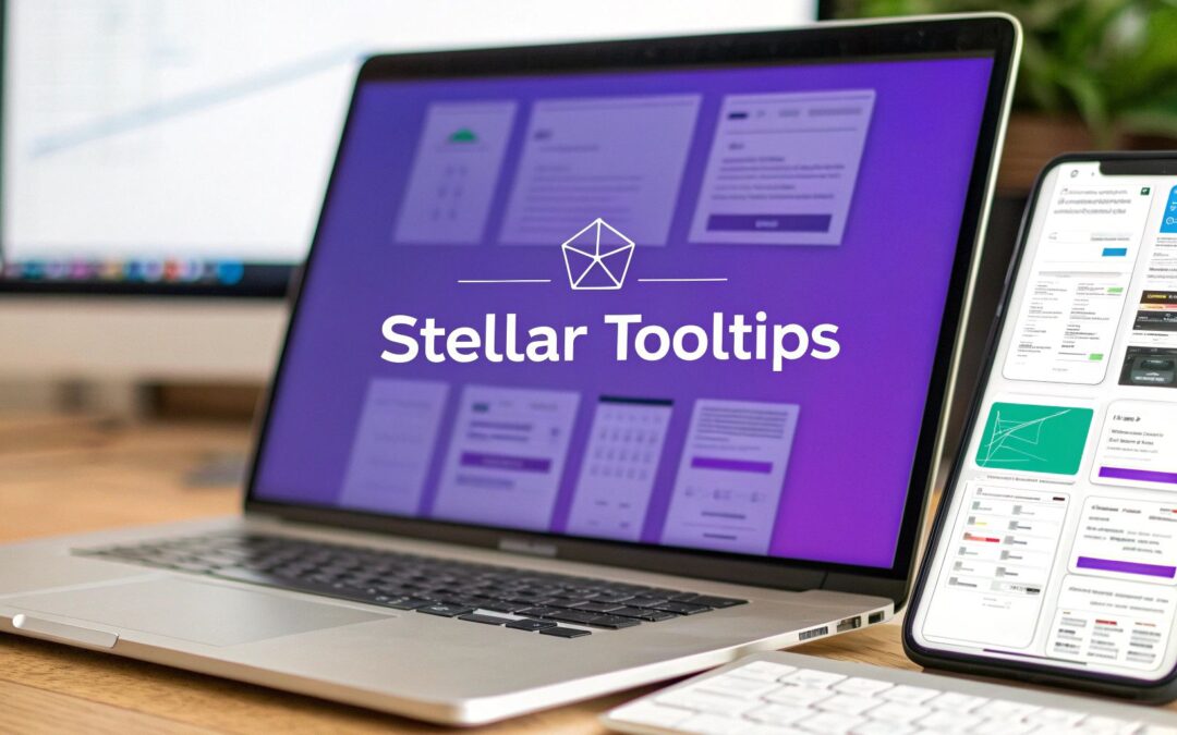
1. Divi Areas Pro
For Divi theme users, Divi Areas Pro is not just a tool; it's an indispensable ecosystem for creating sophisticated, context-aware user interactions. While it offers a suite of features like popups and fly-ins, its tooltip capabilities are particularly robust, providing a powerful solution for designers and developers aiming to build more intuitive and engaging web experiences. It transforms the standard tooltip from a simple text box into a dynamic, highly targeted content element.
What sets Divi Areas Pro apart is its seamless integration with the Divi Builder. Users can design tooltips using the familiar drag-and-drop interface, embedding any Divi module-from text and images to videos and contact forms-directly inside a tooltip. This native workflow eliminates the need for third-party builders or custom code, streamlining the entire design process.
Strategic Analysis: Beyond Basic Information
Divi Areas Pro elevates tooltips from simple definition providers to strategic conversion tools. Its strength lies in its advanced triggering and display logic, allowing for the creation of truly intelligent tooltip examples.
Key Insight: The power of Divi Areas Pro isn't just in creating tooltips, but in controlling who sees them, when, and why. This precision targeting turns a simple UI element into a personalized marketing channel.
The plugin provides an extensive set of triggers, including:
- User Interaction: Clicks, hovers, and even form submissions.
- Behavioral Cues: Exit intent, scroll depth, and back-button detection.
- Contextual Rules: Device type, user role (e.g., logged-in vs. guest), and specific page URLs.
This level of control allows for hyper-specific use cases. For instance, you can display a "New User Discount" tooltip over a checkout button exclusively for first-time visitors or show a detailed video tutorial inside a tooltip when a logged-in member hovers over a complex feature. These are not just tooltips; they are micro-experiences. For a deeper dive, you can explore this detailed review that covers a first impression of Divi Areas Pro.
Actionable Takeaways & Use Cases
| Feature | Actionable Takeaway | Practical Use Case |
|---|---|---|
| Divi Builder Integration | Build tooltips with any Divi module. Embed videos, forms, or custom layouts without writing code. | Create a tooltip on a product image that contains a short demo video and an "Add to Cart" button. |
| Advanced Triggers | Use exit-intent triggers on pricing table tooltips to present a special offer just before a user leaves the page. | When a user moves their cursor to exit, a tooltip appears over the "Pro Plan" with a "15% Off Your First Year" message. |
| User Role Targeting | Display different tooltip content for logged-in members versus guest visitors to personalize the user journey. | A "Quick Start Guide" tooltip for new members, and a "Sign Up to Unlock" tooltip for guests on the same feature. |
| Developer API | Extend functionality with custom triggers or integrate with other systems for maximum flexibility. | Trigger a custom tooltip based on a user's progress in an online course hosted on a separate platform. |
Pros & Cons
- Pros:
- Unmatched customization within the Divi ecosystem.
- Advanced targeting and trigger rules for strategic content delivery.
- Seamlessly integrates with Divi, Extra, and WooCommerce.
- Developer-friendly with a clean and extendable API.
- Cons:
- It is a premium plugin, which requires a budget.
- The extensive features may present a learning curve for beginners.
Website: divimode.com
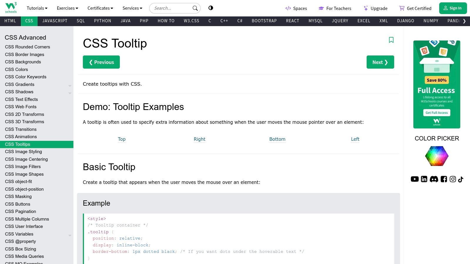
2. W3Schools
W3Schools serves as a foundational resource for anyone diving into web development, and its section on CSS tooltips is a perfect starting point. It provides clear, no-frills tutorials that break down the core concepts of creating tooltips using only HTML and CSS. This approach makes it an essential bookmark for both beginners seeking to understand the fundamentals and experienced developers needing a quick, reliable reference.
What makes W3Schools stand out is its "Try it Yourself" interactive editor. This feature allows you to see live tooltip examples, immediately tweak the CSS, and observe the results in real-time. This hands-on learning method solidifies understanding far more effectively than static code blocks, making it an incredibly efficient way to master tooltip positioning, styling, and trigger events without setting up a local development environment.
Strategic Analysis & Takeaways
W3Schools excels in demonstrating the fundamental mechanics of a CSS-only tooltip. The core strategy revolves around using a <span> element with a tooltiptext class, initially hidden with visibility: hidden; and then revealed on hover. This is a classic, lightweight approach that avoids JavaScript, ensuring maximum performance.
- Positioning Logic: Their examples clearly illustrate how to use
position: relative;on the container andposition: absolute;on the tooltip itself. They provide separate code snippets for top, bottom, left, and right positioning, giving you a ready-to-use blueprint for any layout. - Accessibility Hint: While not explicitly deep on accessibility, the use of
::afterpseudo-elements to create the tooltip's arrow is a clever, CSS-only technique that keeps the semantic HTML clean. - Actionable Tip: The "Try it Yourself" editor is your playground. Experiment with adding CSS transitions to the
visibilityandopacityproperties to create a smooth fade-in effect, elevating the basic example into a more polished user experience.
Key Insight: W3Schools proves that you don't need complex libraries for simple, effective tooltips. Mastering the CSS
position,visibility, and pseudo-element properties provides a powerful, performance-friendly foundation.
Divi & Divi Areas Pro Application
For Divi users, the pure CSS from W3Schools can be directly applied.
- Add a Text module and switch to the "Text" view.
- Wrap your desired trigger text in a container element like
<div class="tooltip">Hover over me<span class="tooltiptext">Tooltip text!</span></div>. - Place the corresponding CSS from W3Schools into Divi > Theme Options > Custom CSS.
This manual method is excellent for simple, isolated tooltips. However, for dynamic or site-wide tooltips, Divi Areas Pro offers a more robust, no-code solution that aligns better with the Divi workflow.
Website: https://www.w3schools.com/css/css_tooltip.asp
3. UserGuiding Blog
While code-centric platforms show you how to build a tooltip, UserGuiding Blog excels at teaching you why and when to use one. Their content shifts the focus from technical implementation to strategic user experience. This makes it an invaluable resource for designers, marketers, and product managers who need to justify design choices with data-driven UX principles.
What makes the UserGuading Blog a standout is its deep dive into the psychology of user onboarding. Instead of just providing code snippets, their articles present a variety of real-world tooltip examples from successful SaaS platforms, analyzing what makes them effective. They explore concepts like context, timing, and copy, helping you design tooltips that genuinely guide users rather than just cluttering the interface. This strategic, results-oriented approach is perfect for anyone building user-centric products.
Strategic Analysis & Takeaways
UserGuiding's core strategy is to treat tooltips not as isolated UI elements, but as critical components of a larger user engagement and retention funnel. The articles are built around best practices that prioritize clarity, purpose, and user-friendliness, moving far beyond basic hover effects.
- Context is King: The blog consistently emphasizes that a tooltip’s value is tied to its context. They show examples of tooltips that are triggered by specific user actions or appear during an onboarding sequence, making the information relevant and immediately applicable.
- Design for Readability: UserGuiding highlights the importance of visual design. This includes using high-contrast colors, concise microcopy, and clear iconography to ensure the tooltip is easily noticed and understood without overwhelming the user.
- Actionable Tip: Before designing a tooltip, map out the user's journey. Use UserGuiding’s examples to identify the key moments where a user might feel confused or need encouragement. Place your tooltips at these specific friction points for maximum impact.
Key Insight: An effective tooltip is less about clever code and more about thoughtful UX strategy. UserGuiding proves that the best tooltips are purposeful, contextual, and designed to solve a specific user problem.
Divi & Divi Areas Pro Application
The strategic insights from UserGuiding are crucial for Divi users aiming to create more than just decorative elements. You can use the blog for inspiration on what your tooltips should say and where they should appear. Learn more about improving user experience on the Divi Mode blog.
With Divi Areas Pro, you can directly implement UserGuiding’s strategic advice.
- Use the "On-Click" or "On-Hover" triggers to create contextual help tooltips for complex forms or feature-rich modules in Divi.
- Apply the visual design best practices by styling your Area's background, text, and borders within the Divi Builder to ensure high readability.
- You can even create multi-step product tours, as advocated by UserGuiding, by stringing together multiple Divi Areas with specific triggers.
Website: https://userguiding.com/blog/tooltip-examples/
4. Appcues Blog
Appcues shifts the conversation from how to build a tooltip to why and where you should use one. As a leader in user onboarding solutions, their blog provides a masterclass in using tooltips as strategic instruments for guiding users, announcing features, and improving overall product adoption. It’s an essential resource for anyone looking to move beyond basic hover-text and into purposeful, user-centric design.
What makes the Appcues Blog so valuable is its focus on the psychology and strategy behind effective tooltips. Instead of code snippets, you'll find real-world tooltip examples from successful SaaS platforms, deconstructed to reveal the strategic thinking behind their placement, copy, and design. This perspective is crucial for developers and designers who want to create interfaces that don't just function but actively help users succeed.
Strategic Analysis & Takeaways
Appcues champions the tooltip as a core component of user onboarding and feature discovery. Their strategy centers on context and purpose, arguing that a tooltip's success is measured by its ability to deliver the right information at the exact moment of need, thereby reducing friction and increasing engagement.
- Contextual Guidance: The blog emphasizes using tooltips to explain non-obvious UI elements or guide users through a new workflow. The key is triggering them based on user actions, not just on a generic page load.
- Feature Adoption: They provide excellent examples of using tooltips to announce new features without being disruptive. This targeted approach ensures that active users see the update in a relevant context.
- Actionable Tip: When designing a feature tour, use a sequence of tooltips as Appcues suggests. Instead of a one-size-fits-all modal, guide users step-by-step through the interface, with each tooltip pointing to a specific element and explaining its value.
Key Insight: Appcues teaches that a tooltip is not just a UI element; it's a conversation with your user. Its effectiveness hinges on timing, context, and a clear purpose that drives user action.
Divi & Divi Areas Pro Application
While Appcues focuses on strategy over code, the principles are directly applicable to Divi. The concepts they discuss are exactly what Divi Areas Pro is built to accomplish.
- Design your tooltip's content and style within a Divi Area.
- Use Divi Areas Pro's trigger settings to define the context. Instead of a simple hover, you can set the tooltip to appear on-click, after a time delay, or even when a user scrolls to a specific element.
- This aligns perfectly with Appcues' strategy of delivering contextual help, allowing you to create sophisticated onboarding flows and feature announcements directly within the Divi ecosystem.
Website: https://www.appcues.com/blog/tooltip-best-practices
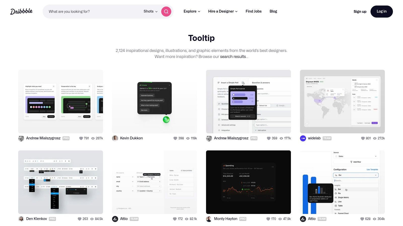
5. Dribbble
Dribbble serves as a visual playground for designers, and its collection of tooltip concepts is an unparalleled source of inspiration. Unlike tutorial-focused sites, Dribbble showcases the art of the possible, pushing creative boundaries with animated, interactive, and beautifully styled tooltip examples. It's the ideal destination when you're looking to move beyond functional basics and explore what’s trending in UI/UX design.
What makes Dribbble invaluable is its focus on high-fidelity design concepts. Designers often share short videos or GIFs demonstrating the tooltip's motion and user interaction, providing a much richer preview than a static image ever could. Browsing these "shots" helps you absorb modern aesthetics and discover novel approaches to conveying information, from micro-interactions to stylized, illustrative tooltips that enhance a brand's personality.
Strategic Analysis & Takeaways
Dribbble's value lies in conceptual ideation rather than code implementation. It’s where you go to answer "How could this look?" before asking "How do I build this?". The platform excels at demonstrating how animation and creative styling can transform a simple tooltip into a delightful user experience.
- Motion & Micro-interactions: Many examples showcase sophisticated animations, like spring-loaded bounces or subtle fades combined with movement. These visual cues draw attention and make the interface feel more responsive and alive.
- Branding & Style: Designers on Dribbble often integrate brand colors, custom icons, and unique typography directly into their tooltips. This transforms a utilitarian element into a cohesive part of the overall brand identity.
- Actionable Tip: Use Dribbble for your mood board. When you find a tooltip animation you love, use a screen-to-GIF tool to capture it. This GIF becomes a clear visual reference you can share with developers or use as a guide when building custom CSS animations for your own tooltips.
Key Insight: Dribbble proves that tooltips don't have to be boring. They are a prime opportunity for brand expression and micro-interactions that can significantly elevate the perceived quality of a user interface.
Divi & Divi Areas Pro Application
While Dribbble doesn't provide code, it provides the "why" and "what" for your Divi implementation. A design you find might inspire a more advanced tooltip that requires a dedicated tool like Divi Areas Pro.
For example, if you see a tooltip that contains a button, an image, and text, that's beyond the scope of simple CSS. With Divi Areas Pro, you can build that exact layout using the Divi Builder itself and trigger it as a tooltip on hover or click. This bridges the gap between the high-level design inspiration on Dribbble and practical, powerful implementation on your Divi site.
Website: https://dribbble.com/tags/tooltip
6. Frontendin
Frontendin serves as a carefully curated gallery for developers seeking creative and modern tooltip examples. Instead of providing a single tutorial, it aggregates over 30 distinct CSS tooltip styles from various creators on CodePen. This makes it an invaluable resource for inspiration, allowing you to browse a wide spectrum of designs, from minimalist hints to intricate, animated reveals, all in one place.
What makes Frontendin particularly effective is its direct, no-fuss approach. Each example is presented with a live demo, letting you see exactly how the tooltip behaves and looks without leaving the page. With a single click, you are taken to the corresponding CodePen, where you can access the complete HTML, CSS, and sometimes JavaScript source code. This immediate access to functional, ready-to-use code snippets significantly speeds up the development process.
Strategic Analysis & Takeaways
Frontendin's strength lies in its diversity, showcasing a multitude of strategic approaches to tooltip design. It moves beyond basic positioning and explores how animation, pseudo-elements, and even SVG can be used to create memorable user interactions. This platform is less about foundational learning and more about expanding your creative toolkit.
- Animation & Effects: Many examples demonstrate sophisticated use of CSS transitions and animations on properties like
transform,opacity, and evenclip-path. This provides a blueprint for creating tooltips that slide, bounce, or fade in with style, enhancing the user experience. - Creative Styling: You'll find tooltips with custom shapes, gradient backgrounds, and icon integration. This is a masterclass in using
::beforeand::afterpseudo-elements not just for arrows, but for creating unique visual flairs that align with a brand's identity. - Actionable Tip: Don't just copy and paste. Use the provided CodePens as a starting point. Isolate the animation logic from one example and combine it with the positioning logic from another to create a truly unique tooltip tailored to your project's specific needs.
Key Insight: Frontendin proves that tooltips don't have to be boring. By curating a wide range of community-driven examples, it encourages developers to think of tooltips as an opportunity for creative expression and micro-interactions.
Divi & Divi Areas Pro Application
The code snippets from Frontendin are perfect for Divi users who are comfortable with code.
- Find a tooltip style you like on Frontendin and open its CodePen.
- Add the necessary HTML structure to a Divi Code or Text module.
- Copy the CSS and paste it into the Advanced > Custom CSS tab of the module or into your child theme’s stylesheet for broader use.
While this works well for one-off implementations, the complexity of some animated examples can be tricky to manage. Divi Areas Pro can simplify this by letting you build the tooltip's content with the Divi Builder and use its built-in trigger options, avoiding the need to manually manage complex HTML and CSS across your site.
Website: https://frontendinspiration.com/css-tooltip-examples
7. UserOnBoarding Academy
UserOnBoarding Academy shifts the focus from code implementation to strategic design, making it an invaluable resource for product managers, UX designers, and anyone concerned with the why behind a tooltip, not just the how. It provides in-depth articles that analyze tooltips as a critical component of the user onboarding process, framing them as tools to guide users, explain features, and ultimately improve retention.
What makes this resource unique is its high-level, strategic perspective. While other sites show you how to build tooltip examples, UserOnBoarding Academy teaches you where to place them, what to write in them, and when to show them for maximum impact. This focus on user psychology and product strategy provides the crucial context that turns a simple UI element into a powerful driver of user engagement, a perspective often missing from purely technical tutorials.
Strategic Analysis & Takeaways
The core strategy advocated by UserOnBoarding Academy is using tooltips purposefully to reduce friction and educate users contextually. Their approach is less about technical flair and more about communication effectiveness, ensuring every tooltip serves a clear, user-centric goal. This is a vital lesson for anyone creating interactive guides or product tours.
- Clarity and Brevity: The platform emphasizes that tooltip copy should be exceptionally clear and concise. The goal is to provide a quick hint, not a full paragraph of documentation.
- Context is King: A key principle is that tooltips should only appear when they are directly relevant to the user's current action or focus. Unprompted, irrelevant tooltips create noise and frustration.
- Actionable Tip: Before designing a tooltip, explicitly define its purpose. Ask yourself: "What specific action do I want the user to take after reading this?" If you can't answer this, the tooltip may be unnecessary. This aligns with the broader principles taught in design and UX courses, like those found in the DiviMode Academy.
Key Insight: An effective tooltip is a conversation starter, not a manual. UserOnBoarding Academy proves that the strategic placement and messaging of a tooltip are far more important than its technical complexity.
Divi & Divi Areas Pro Application
The principles from UserOnBoarding Academy are directly applicable to Divi Areas Pro, which excels at creating contextual, trigger-based popups that function like advanced tooltips.
- Use Divi Areas Pro to create a "Tooltip" Area.
- Design the content based on the Academy's principles: keep it brief and focused on a single, clear message.
- Set the trigger to "On-Click" or "On-Hover" for a specific element (like a button or an icon) to ensure it only appears in the right context.
This method allows you to implement the user-centric strategies from the Academy using Divi's powerful no-code tools, creating a strategically sound and technically robust user experience.
Website: https://useronboarding.academy/tooltips
Tooltip Examples Comparison Table
| Tool / Resource | Implementation Complexity 🔄 | Resource Requirements ⚡ | Expected Outcomes 📊 | Ideal Use Cases 💡 | Key Advantages ⭐ |
|---|---|---|---|---|---|
| Divi Areas Pro | Moderate to High – advanced targeting and customization | Moderate – premium plugin, some learning curve | High – interactive, targeted user engagement | Designers, developers, marketers building Divi sites | Highly customizable, advanced triggers, developer API, strong support |
| W3Schools | Low – beginner-friendly tutorials | Low – free, accessible anywhere | Moderate – foundational knowledge and basic tooltips | Beginners learning tooltip basics | Clear tutorials, free access, interactive coding |
| UserGuiding Blog | Low to Moderate – reading and applying insights | Low – free blog content | Moderate – improved UX and engagement through best practices | UX designers and businesses improving onboarding | Practical, well-researched UX strategies, free access |
| Appcues Blog | Low – reading expert insights | Low – freely accessible blog | Moderate – better feature adoption and user-centric design | Product managers and UX designers | Real-world examples, user-centric focus, expert-backed content |
| Dribbble | Low – browsing and exploring designs | Low – free browsing, account for interaction | Variable – creative design inspiration | Designers seeking visual ideas | High-quality visuals, community feedback, diverse styles |
| Frontendin | Moderate – copy and adapt code snippets | Low – free, no registration needed | High – immediate tooltip implementation | Developers needing ready-to-use CSS tooltips | Large example collection, live demos, easy implementation |
| UserOnBoarding Academy | Low – reading and applying guidelines | Low – free content | Moderate – enhanced user retention and onboarding quality | Product managers, designers focused on onboarding | Practical onboarding tips, user-centric, free access |
From Examples to Execution: Your Next Steps
We've journeyed through a comprehensive gallery of tooltip examples, from the foundational CSS of W3Schools to the sophisticated, user-centric patterns showcased by Appcues and UserGuiding. The examples curated from Dribbble and Frontendin provided a wealth of visual inspiration, while the practical, goal-oriented implementations using Divi Areas Pro demonstrated how to translate theory into tangible results on your Divi website. The key takeaway is clear: tooltips are far more than just small boxes of text; they are powerful, micro-interactions that can significantly enhance user experience, guide user actions, and drive conversions when executed strategically.
Across all these examples, a few core principles consistently emerged as the foundation for effective tooltip design. Context is king. The most successful tooltips appear precisely when and where the user needs them, offering just-in-time information without disrupting their workflow. Similarly, clarity and conciseness are non-negotiable. Users glance at tooltips for quick answers, not to read a manual.
Strategic Insight: The difference between an ignored tooltip and an impactful one often lies in its trigger mechanism and timing. Moving beyond simple hovers to incorporate click-triggers, focus-based activation for form fields, or even automated sequences for onboarding can dramatically increase engagement and utility.
Turning Inspiration into Implementation
So, how do you move from inspiration to execution? Your next steps involve a blend of strategic planning and choosing the right tools for the job. Before writing a single line of code or installing a plugin, define the specific problem you are trying to solve. Are you aiming to reduce form abandonment, clarify confusing interface elements, or onboard new users to a complex feature? Your goal will dictate the type of tooltip you need.
Here’s a simplified decision-making framework based on your needs:
- For Custom Code Enthusiasts: If you have development resources and require absolute control over every pixel and behavior, resources like W3Schools and Frontendin provide the foundational HTML, CSS, and JavaScript snippets you need. This path offers maximum flexibility but requires technical expertise.
- For Rapid Prototyping & Inspiration: When you're in the initial design phase, platforms like Dribbble are invaluable. Use them to gather visual ideas and explore innovative UI patterns before committing to a specific design.
- For Comprehensive User Onboarding: If your primary goal is creating guided tours, product walkthroughs, or in-app messaging sequences, dedicated platforms like UserGuiding or Appcues are the industry standard. Their powerful analytics and segmentation tools are built for this purpose, though they often come with a higher price tag.
- For Integrated Divi & WooCommerce Solutions: If you are a Divi user, Divi Areas Pro is your most powerful and integrated solution. It allows you to build rich, interactive tooltips, popups, and fly-ins directly within the Divi Builder, providing unmatched convenience and design consistency without needing to write code or bolt on external services.
Final Thoughts on Effective Tooltips
Ultimately, the best tooltip examples are those that feel like a natural, helpful extension of the interface. They anticipate user questions and provide answers so seamlessly that the user barely notices the interaction itself, only the clarity it provides. Strive for this level of intuitive design in your own projects. Test your tooltips with real users, gather feedback, and iterate. A small, well-placed tooltip can be the difference between a confused user and a confident, happy customer.
Ready to create stunning, interactive tooltips on your Divi site without the headache of custom code? Divimode provides the tools you need, like Divi Areas Pro, to build everything from simple informational tooltips to complex, triggered popups directly within the Divi Builder. Elevate your user experience and start building more effective websites today with powerful solutions from Divimode.
More Articles You Will Like